In our large-scale usability testing of product pages, we observe that product images are very effective at showing scale, highlighting features, and getting users excited about products — while text in product descriptions and specs gives users a comprehensive overview of all the product details.
However, both images and text have their drawbacks.
Images are limited by the fact that they must communicate all of their information visually. Yet investigating images is a very popular product-exploration strategy for users — during testing 56% of users investigated product images as their first action when arriving at the product details page (PDP), even when it was an inefficient strategy when compared to simply reading the product description.
On the other hand, text can be intimidating to read and many users don’t have the inclination to do so — during testing many users were observed to simply skip or skim quickly over product descriptions, even when a question they had would have been answered by the description.
Consequently, some of these users will abandon a perfectly suitable product — simply because they never find the information they’re looking for in product images or in the description or specs.
Instead, combining images and text, by adding descriptive text or graphics to product images, can be an effective way to communicate a great deal of information to users quickly and efficiently.
However, our large-scale Product Details Page usability testing reveals that 52% of sites don’t use descriptive text or graphics for their top-selling products — which represents a missed opportunity.
In this article, we’ll discuss the test findings from our Product Details Page usability study related to using descriptive text or graphics with product images, including:
- The limitations inherent in trying to communicate product features through either images or text
- How product images with descriptive text or graphics can “fill the gap” between images and text
The Strengths and Weaknesses of Product Images versus Text
Product images on the product details page are crucial to users’ ability to evaluate the suitability of a particular product — 56% of users’ first actions during testing, upon arriving on the product details page, was to explore the images.
“I guess for me the most important information is the picture. And the different pictures as well”. Many users during our Product Page testing pointed out the critical importance of product images to their purchase-decision process.
Indeed, images can be extremely effective at conveying key product features and helping users evaluate a product — especially if the product under consideration is visually driven (e.g., apparel).
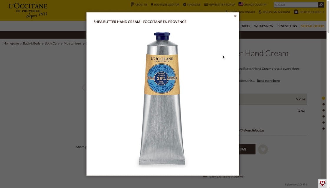
“Well it doesn’t really say that it’s a certain scent”. This user was hoping information about the scent of the hand lotion would be provided in the product image. Abstract concepts like scent can be difficult to convey using images.
However, there are limitations to what can be conveyed visually through product images — the biggest being the challenge in highlighting product details that aren’t obvious from images alone.
This is especially true when it’s nonvisual or abstract information, such as weather resistance, weight, or scent. Still, during testing, subjects tried to obtain this very information visually from product images.
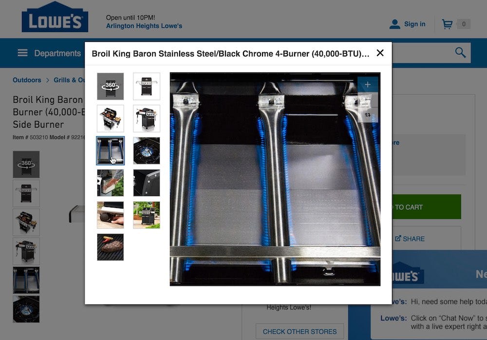
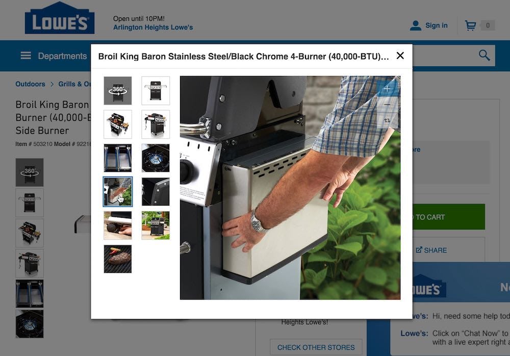
“What is that?” a user said when viewing an image of a burner at Lowe’s (first image). “They should caption some of these, because I have no idea what the hell that is. I see a flame but I don’t know what that is”. When moving to the second image he added, “I don’t know what that does”. Users will often benefit from clarifying text (e.g., as captions) that describes what is shown in product images.
Additionally, sometimes product images can be ambiguous. This can often be a problem when images are heavily cropped to highlight a key feature of a product (e.g., the burners above) — users may lose a sense of where the feature is on the product or what its purpose is. Consequently, they will have trouble determining what a particular image is showing.
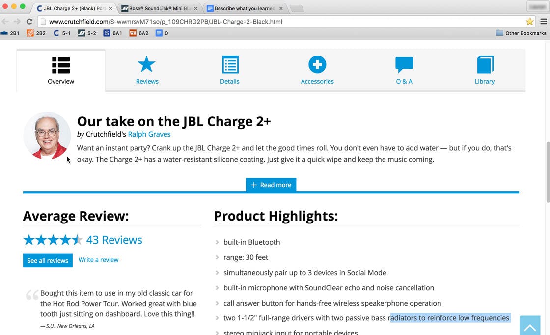
Product descriptions can be overlooked by some users, especially if content is hidden or scattered on the PDP. Here, 21% of users at Crutchfield overlooked the additional textual information hidden in horizontal tabs, despite looking for the very content placed within the tabs.
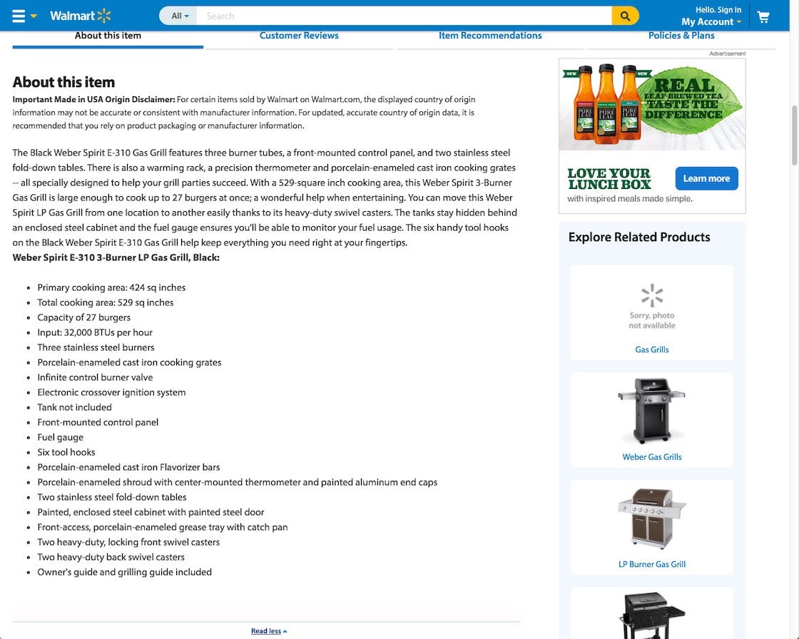
Product descriptions (here, from Walmart) can be intimidating for users, even if fairly well written and structured. Users browsing many different products may be unwilling to read long product descriptions, at least before they’ve zeroed in on a few potential candidates.
Product descriptions and specs, on the other hand, present a different kind of communication challenge.
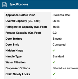
While great at describing product details in-depth, they often are overlooked by users quickly scanning a product page, as they can be difficult to find. Additionally, reading long product descriptions or scanning spec sheets requires an investment of time a user may be unwilling to provide (especially at early, exploratory phases of product browsing).
To Help Highlight Key Features, Combine Product Images with Descriptive Text or Graphics
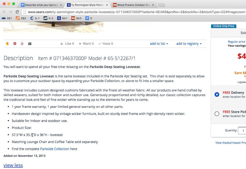
“I wonder if the seat cushions, do I have to take it in when it rains, because it certainly does rain…I’m concerned about the cushions”. A user during testing tried to evaluate the weather resistance of patio furniture, first from the product images (first image), then from the description (second image). “Either they don’t tell me, or I overlooked it. I don’t like this one, show me another”. Unable to find information on weather resistance in either the product images or the product description — despite “all weather fabric” being part of the description — this user abandoned out of frustration.
While product images and text descriptions can be great in their own way, and should likely be included on nearly all PDPs, there is often a communication “gap” created that images or text alone can’t fill.
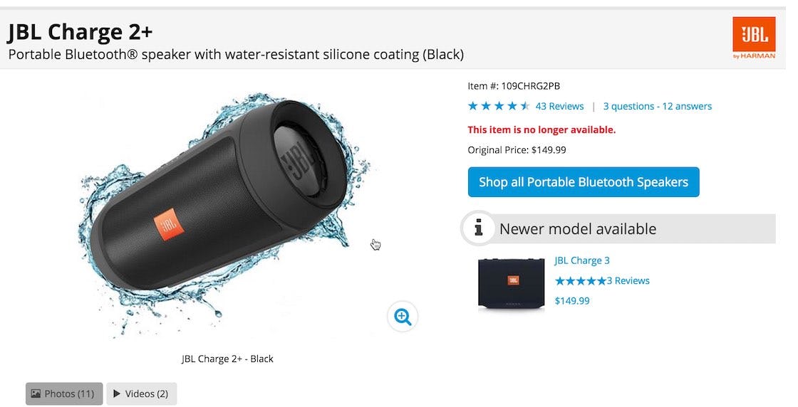
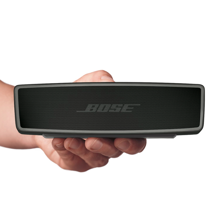
“Maybe it’s waterproof? Is it waterproof?…Yeah, it is, cool!”. During testing, the graphic of splashing water around the speaker clued users in to the water resistance of the speaker, which some users then double-checked by reading the product headline or description. As another user said, “I like that the image has the water around it…That’s a great initial visual, that tells me a lot of selling features right upfront”.
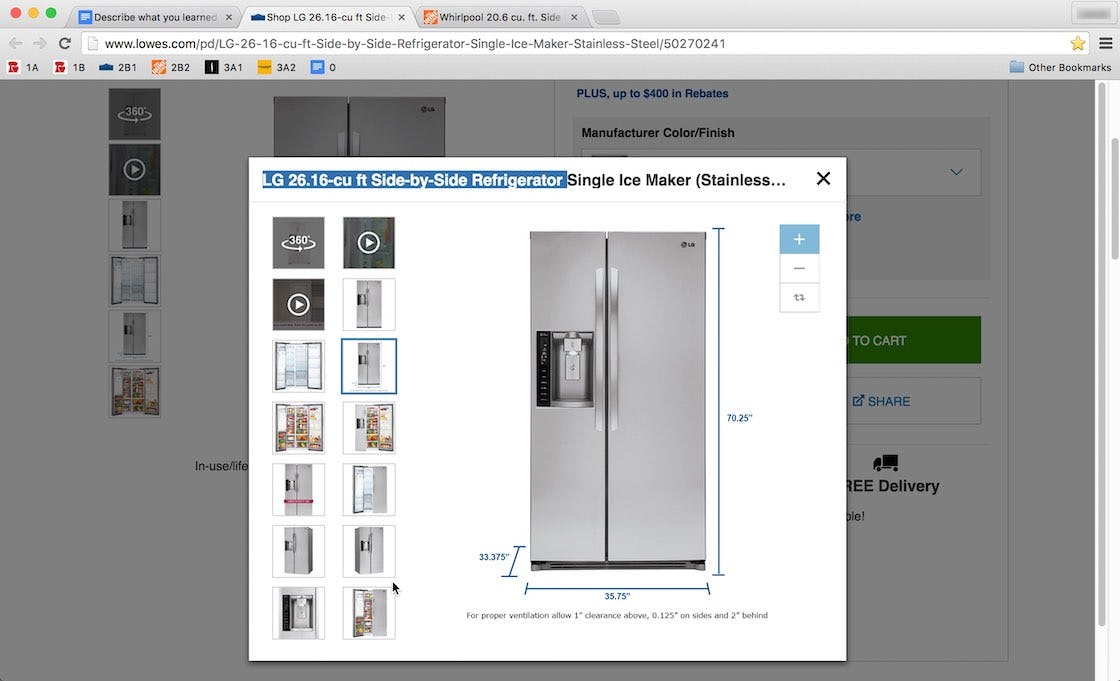
“I like the dimension picture”. Several users during testing commented that the marked-up refrigerator product images at Lowe’s showing the dimensions were helpful. Note the additional venting information, a specification that would otherwise have been very difficult to locate on the product page (it’s in the owner’s manual).
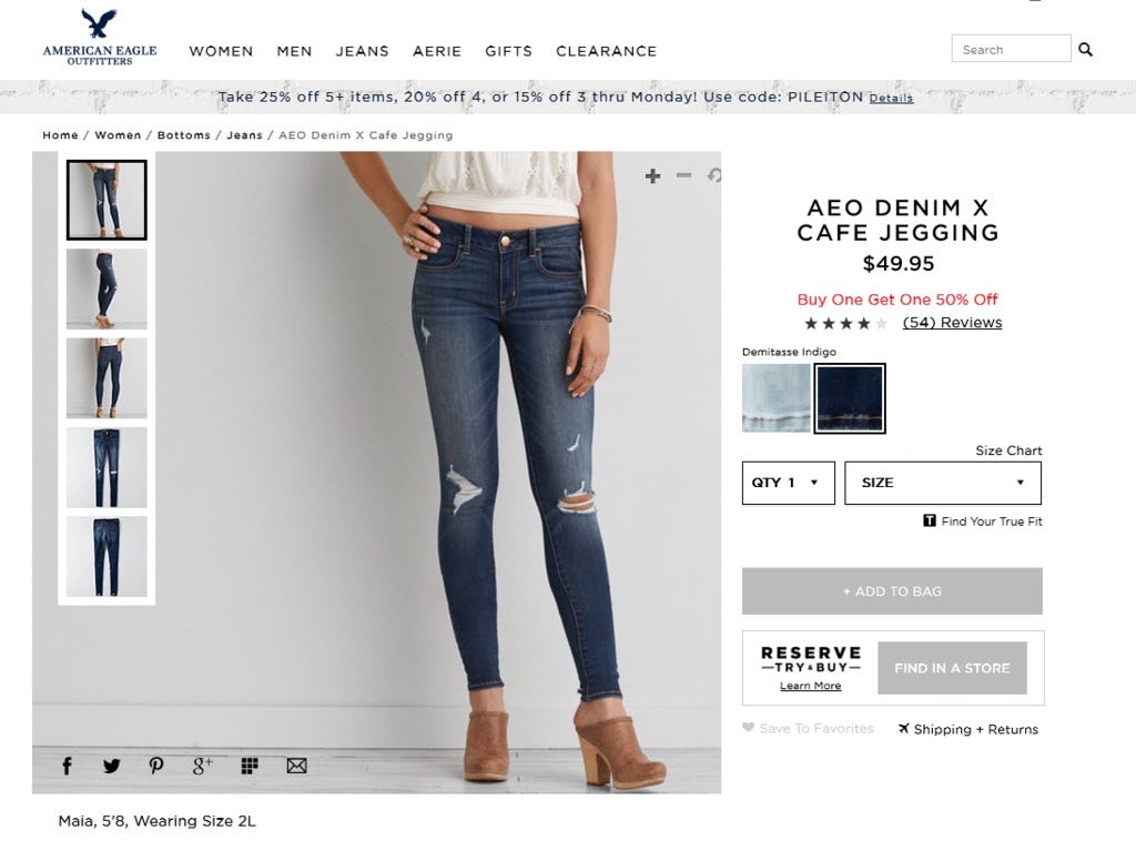
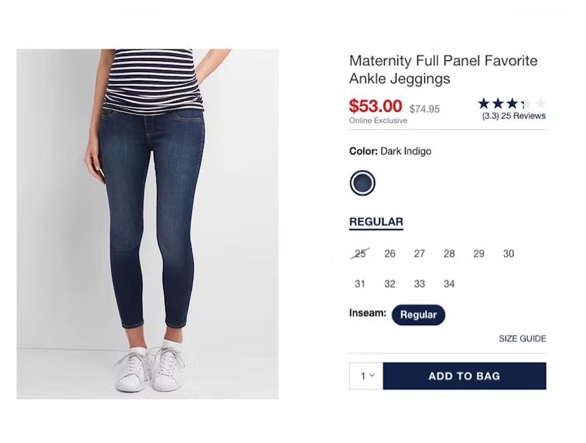
American Eagle provides users with a model’s height and the size of the clothes depicted — here, “Maia, 5´8, Wearing Size 2L” — to help them better understand the product image. Having this information will help users determine the appropriate clothing size for themselves.
However, testing revealed that product images with descriptive text or graphics are well-performing additions that effectively communicate key product features that some users would otherwise miss. Users respond well to images with descriptive text or graphics, as they are able to discover features quickly, which then entices them into exploring the product further.
On the other hand, not including descriptive text or graphics for top-selling products represents a missed opportunity to sell a product to users.
Given the expense of taking high-quality product images, it is a waste of resources if users aren’t able to tell what is being highlighted for them in a product image without some textual description.
Furthermore, it can’t be assumed that users will bring expert-level knowledge with them and will immediately understand the feature being highlighted in a particular product image without accompanying text. Features that are obvious to users who’ve purchased a particular type of product before will often be unclear to users who haven’t.
These users may abandon simply because they didn’t see or understand all of the product’s features.
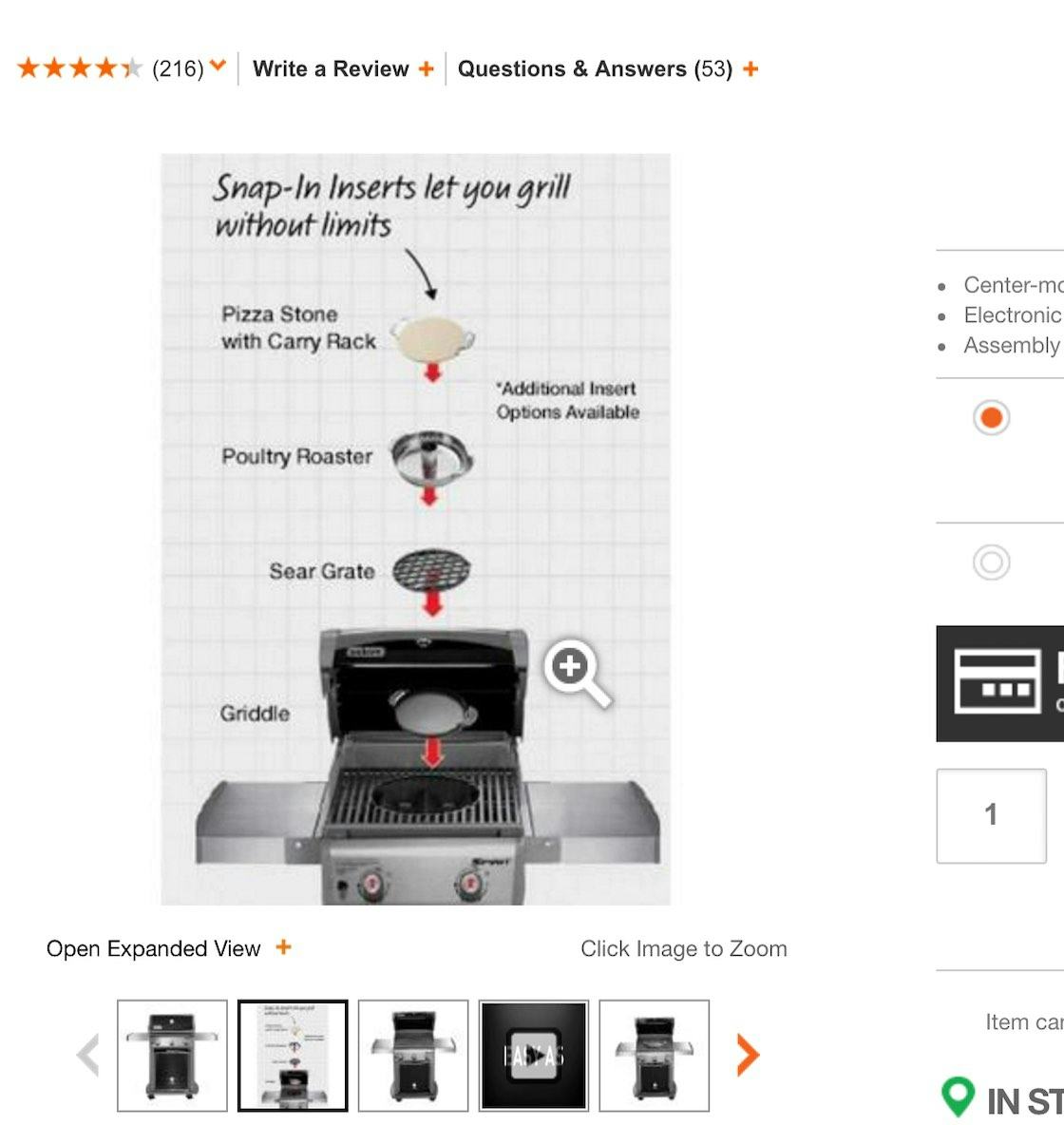
“The pictures are nice, oh, it actually says what else you get with it”. Users during testing responded well to the combined product photo, graphics, and text showing the available grill inserts at Home Depot — although there was some confusion regarding whether the inserts were included in the purchase price. This confusion could have been alleviated by providing a separate image that showcased the product’s included accessories (see guideline #745 in Baymard Premium).
Additionally, creatively combining product images with descriptive text and graphics can save sites from having to shoot multiple images of product features, cutting down on the overall expense of creating the product page images.
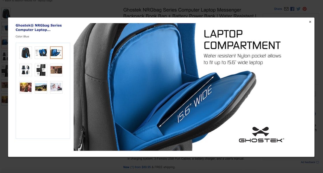
At Amazon, a laptop bag includes descriptive text stating the size of the laptop pocket. Note also how text states that the bag is “water resistant” and mentions the material — conveying a great deal of information in a single product image.
The process can even be partly automated by adding descriptive text or graphics to existing product images — for example, ensuring all laptop bags include text stating what size laptop fits in the bag, rather than reshooting multiple different images that show different-sized laptops fitting into different bags. This is especially important for e-commerce sites with a large product catalogue, which may not have the ability or resources to shoot multiple images of a product.
A word of caution on the technical implementation and its compliance with the mobile platform. If text is embedded in an image file itself, and that same image is used on both desktop and mobile platforms, the text will often be illegible when scaled down on the mobile device. There are multiple approaches to solving this issue:
-
One is to not technically embed the text within the image file itself, but rather show it as a caption below the image (depending on the mobile product page layout, potentially only in the “enlarged” image view).
-
Another is changing how images with embedded text are created in the organization, and ensuring that the mobile view is considered when creating the image with the embedded text (e.g., by using large title-sized text callouts, or by using different images for desktop and mobile).
Entice Users to Explore Products in Detail
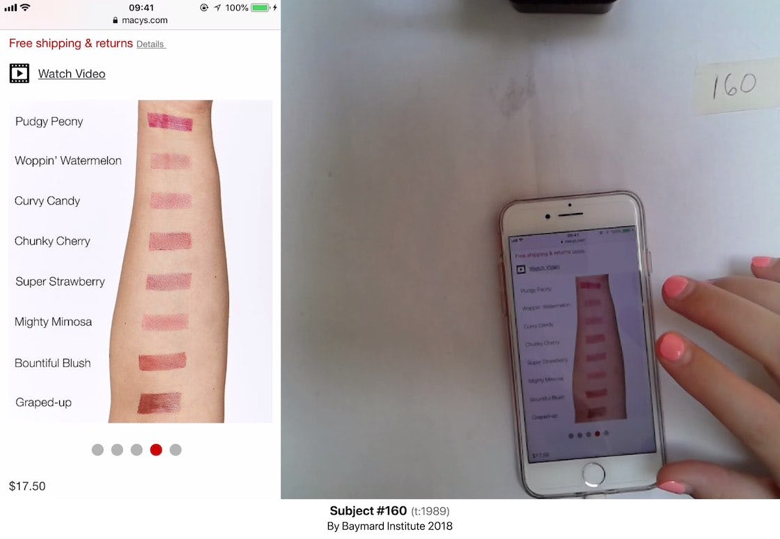
A user at Macy’s pauses to examine an image with descriptive text, which conveys visual information on lipstick shades along with their names.
When testing with users, it’s often the case that they are moving very quickly when browsing products — especially on mobile.
Product images with descriptive text or graphics, however, are observed to often slow users down as they consider the feature highlighted. Often the response is positive, as users learn of a feature they hadn’t known about or considered for this particular product.
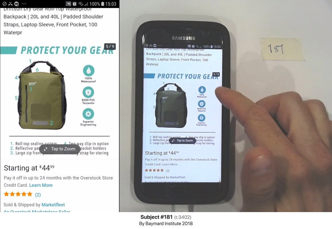
“This kind of picture is good because it’s more convincing…It’s telling me it’s 100% waterproof”. A user at Overstock learns key product features from a product image with descriptive text and graphics.
Images with descriptive text or graphics are also great for accidental discovery of product features — which for some users will be a decisive factor in their decision to purchase a product.
And yet 52% of sites don’t provide product images with descriptive text or graphics for even their top-selling products.
This article presents the research findings from just 1 of the 650+ UX guidelines in Baymard – get full access to learn how to create a “State of the Art” ecommerce user experience.

