Key Takeaways
- For most users considering the billing fields is redundant
- Yet billing address fields on many sites take undue attention, bringing users to a stop
- Setting “Billing = Shipping” by default is best for most sites
Video Summary
For most B2C sites, the majority of users ordering products will want them to be delivered to their own address, making the “Shipping” and “Billing” addresses the same.
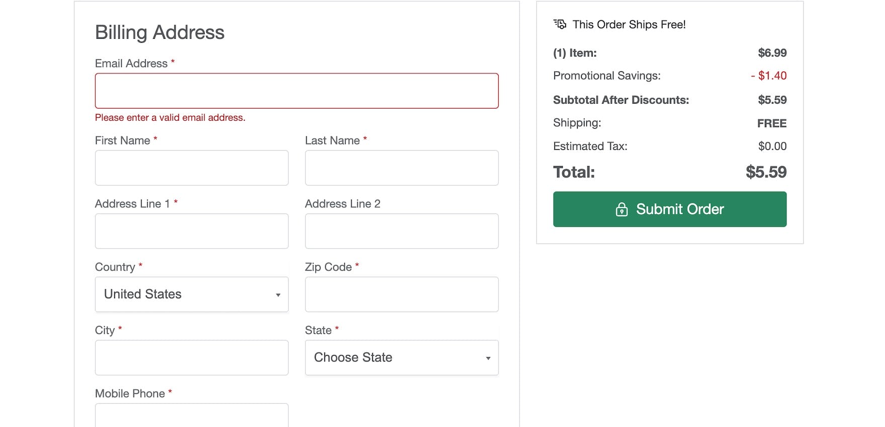
Despite this, some sites during large-scale testing still required participants to manually input their billing address, forcing participants to complete what is, for most, a redundant collection of fields.
Even on sites that allow users to manually select that their billing address is the same as their shipping address, we’ve repeatedly observed participants become distracted and frustrated by the need to consider and review these fields, again making the process of getting through checkout more cumbersome.
In essence, sites where the billing address is not the shipping address by default force users to spend additional effort opting in to something that, for most users, doesn’t truly require their input.
Yet 16% of mobile sites in our e-commerce UX benchmark have severe issues implementing “Billing = Shipping”, such that users will be forced to slow down to complete checkout — if they don’t simply abandon due to the increased friction.
In this article we’ll discuss our Premium research findings with regards to “Billing = Shipping”:
- 2 ways users can be severely sidetracked by billing address issues
- How to implement “Billing = Shipping” so that users proceed efficiently through checkout (and when not to set the billing address to be the same as the shipping address)
- 3 key implementation details to ensure high performance
2 Ways Users Can Be Severely Sidetracked by Billing Address Issues
Across multiple rounds of checkout testing, we’ve observed 2 critical ways that sites fail to streamline the entry of the billing address:
- Not allowing users to set “Billing Address = Shipping Address” at all
- Forcing users to select “Billing Address = Shipping Address” manually
1) Not Allowing Users to Set “Billing Address = Shipping Address” at All
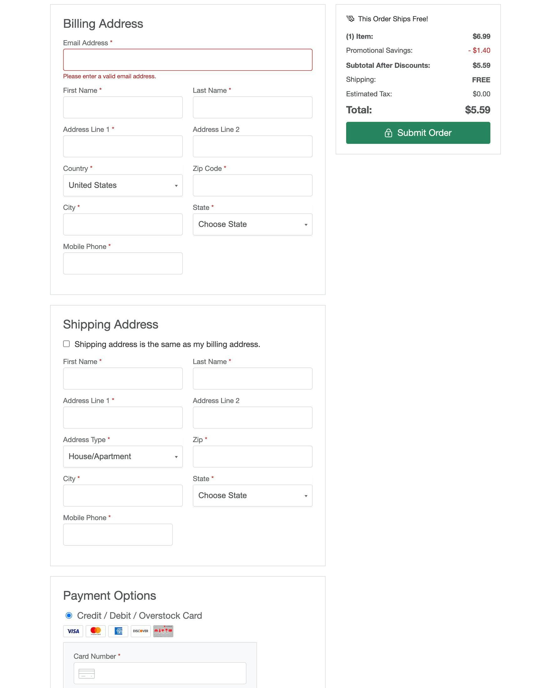
The most severe issue identified during testing was when there is no option for “Billing address = Shipping address” at all.
This forces nearly all users to complete redundant fields.
In testing, participants generally expected the billing address to be set to the shipping address by default — as this will naturally be the case for the majority of users who are purchasing something for themselves — and were dismayed when sites broke this expectation.
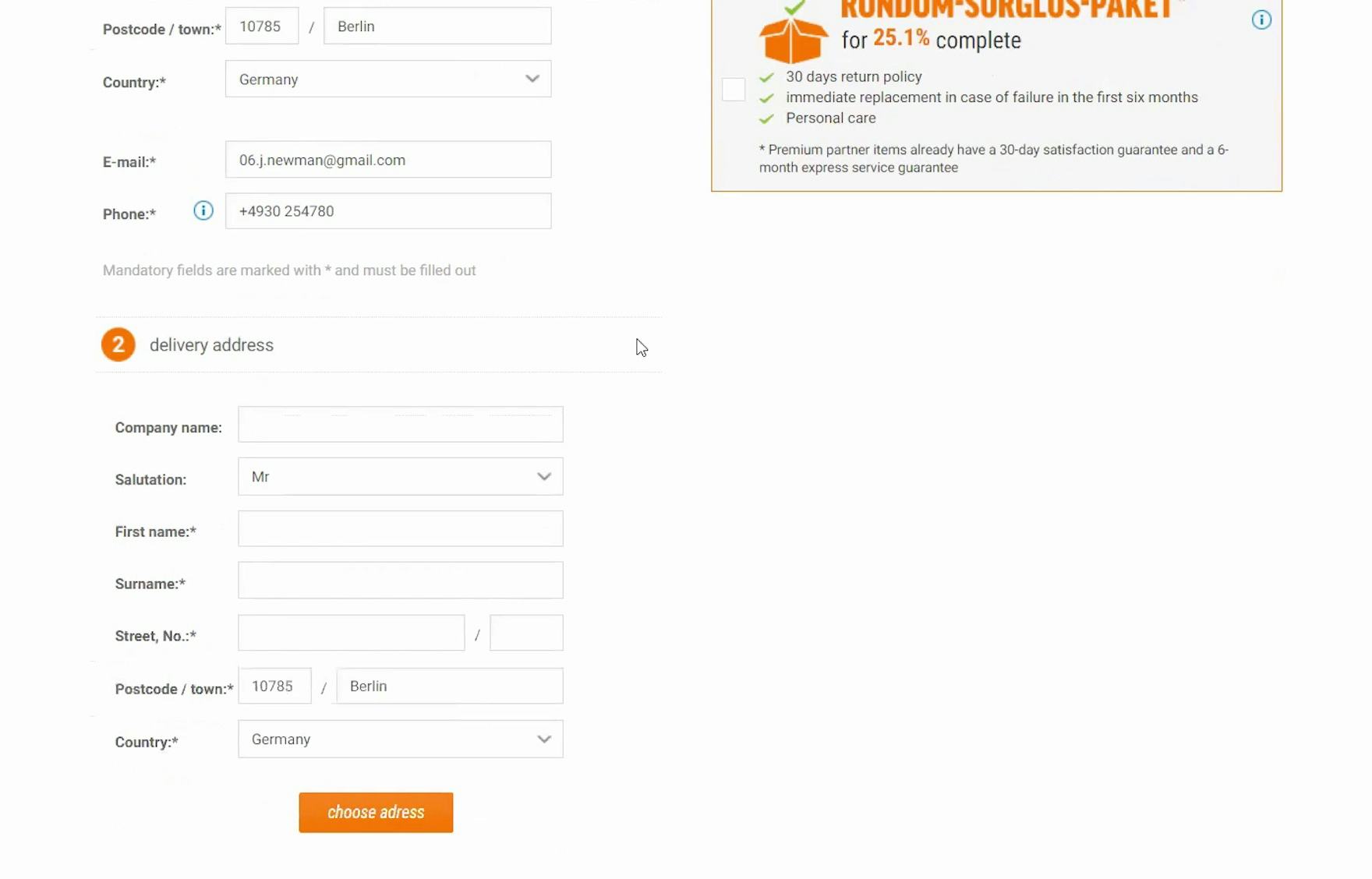
“No, here it is giving me a delivery address. Normally there is an option to choose the ‘billing address’ for the same as the delivery address, and I’m not seeing that option here, so I have to enter all the information again.” This participant on the German site Notebooksbilliger was frustrated when he had to reenter his delivery address, having already provided a billing address earlier.
Faced with the need to retype their address, many participants expressed surprise and disappointment, resulting in a diminished overall perception of the site.
In practice, this perceived additional workload can also increase the risk of checkout abandonment, as the checkout form appears longer and more intimidating.
On mobile sites, not defaulting to “Billing = Shipping” is even more severe of an issue than on desktop due to the increased difficulty of typing on mobile devices and the reduced overview users must contend with when navigating checkout.
While users who are able to rely on browser autofill to complete the address fields may experience less of an issue, as they likely only have a few extra clicks to make to autofill the fields, testing also revealed frequent issues with some autofill experiences, which can be distracting — not to mention that users are still being asked to complete an unnecessary step.
2) Forcing Users to Select “Billing Address = Shipping Address” Manually
More commonly, many sites offer the option for setting “Billing = Shipping” — but force users to opt in to what is likely the most commonly desired option.
In practice, the requirement to manually select this option unnecessarily increases the effort required for the vast majority of users.
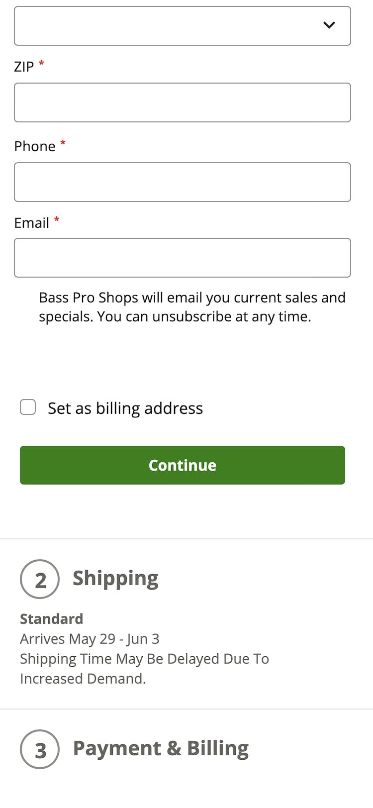
What’s more, sites with a manual opt-in for “Billing = Shipping” often continue to display the billing address fields, copying the shipping address after users select “Billing = Shipping”.
Displaying billing address form fields naturally invites undue attention, slowing users’ progress as they consider the fields and whether further input is necessary.
Displaying unnecessary billing address form fields also makes the checkout form appear longer and more complicated than it really is, which distracts users and and can increase the risk of abandonment (especially on mobile sites).
How to Implement “Billing = Shipping” So That Users Proceed Efficiently through Checkout
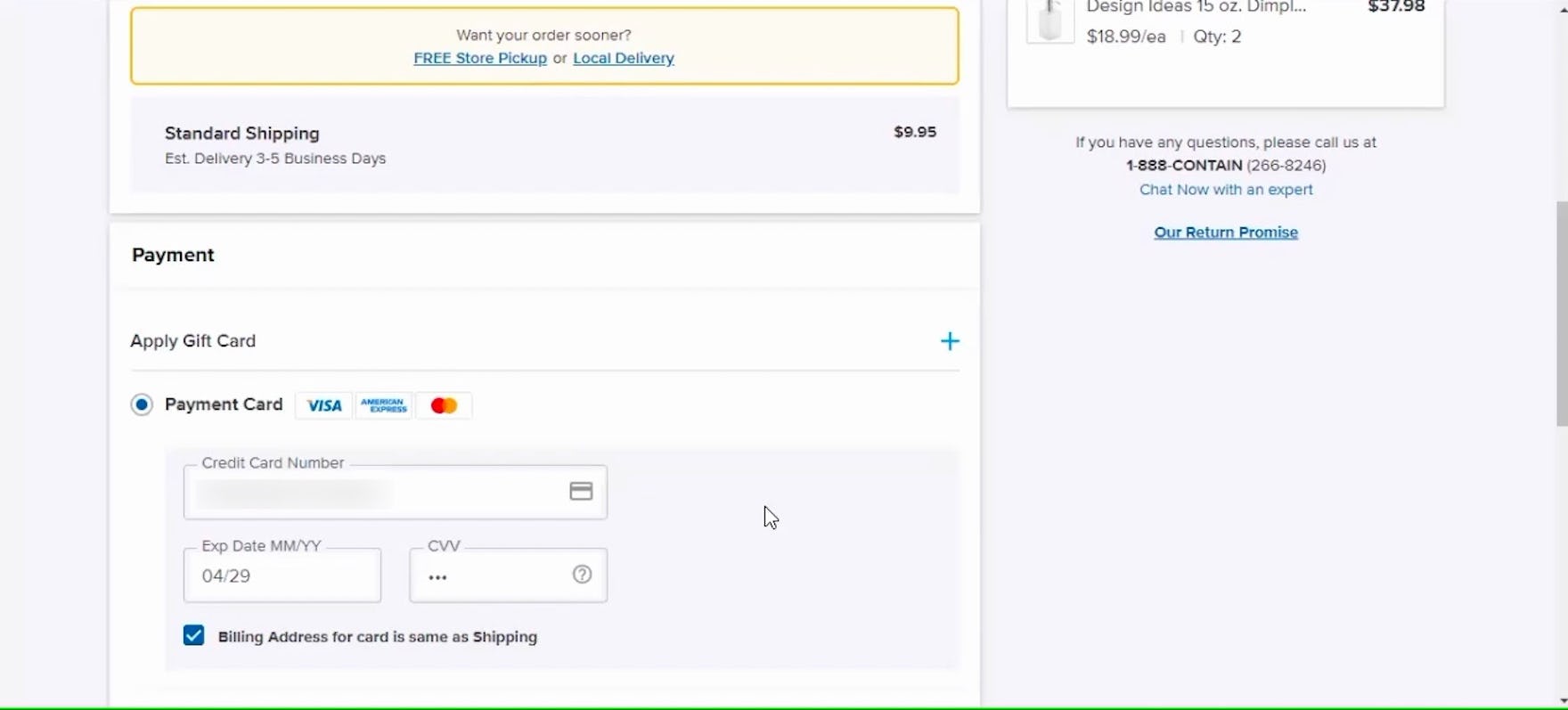
‘Billing address for the card is the same as shipping.’ Yes, it is.” At The Container Store, the “Billing = Shipping” option was selected by default on the payment step, saving this participant time and effort as she progressed through checkout.
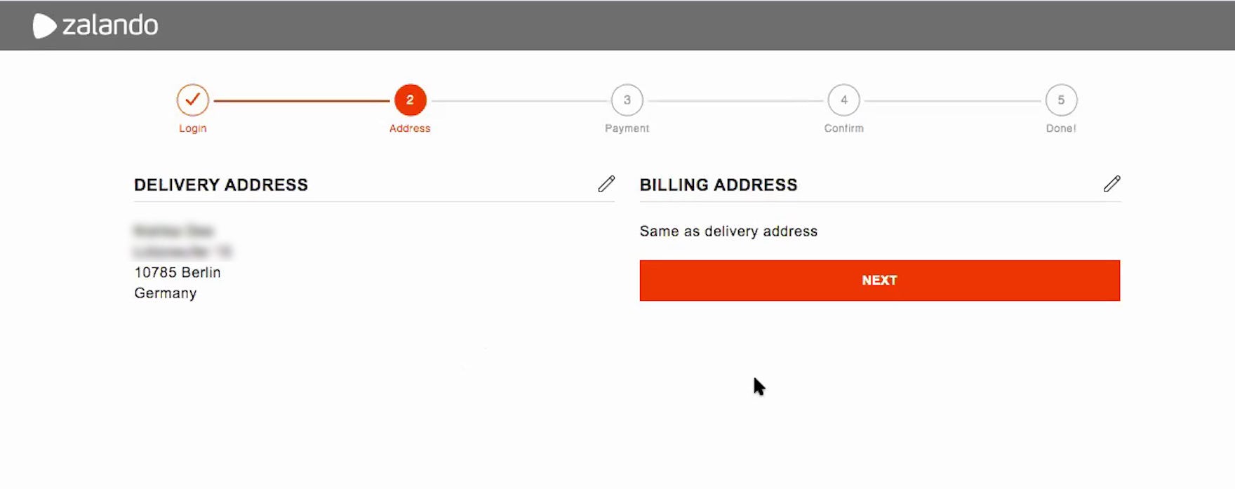
“Yeah. Same as the delivery address, yeah. Okay.” On Zalando.de, this participant was able to very easily confirm that the billing address was the same as that she had entered in the shipping address form. With a hidden billing address form, users don’t have to work out what a billing address is, they just have to accept the default value — while still having the option of specifying a different billing address if needed.
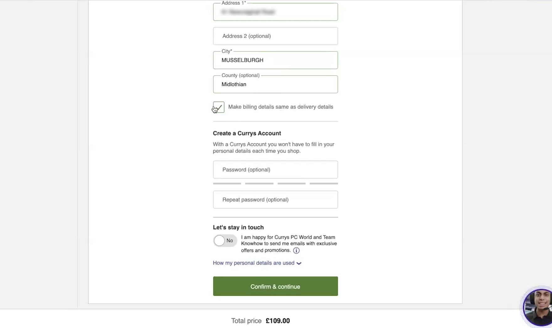
“I also really like this. So if the billing and the delivery is the same, I don’t need to do anything else about it.” Likewise, this test participant on the UK site Curry’s appreciated the fact that the checkbox to confirm that the billing address was the same as the shipping address was ticked by default. Most users have the same billing and shipping addresses and not having to think about a second address simplifies checkout.
To best serve the majority of users and make checkout more efficient, the billing address should default to the previously entered shipping address, with the billing address fields hidden to streamline the checkout form (except in certain very specific contexts, see below).
In testing, participants completing checkout on sites that did so were much less distracted and were able to complete checkout more efficiently and with fewer errors.
Removing these redundant fields minimizes the burden of unnecessary data entry, making the checkout process faster and easier to complete.
For sites that sell many orders as gifts, or B2B sites, it may be better to not default “Billing = Shipping”.
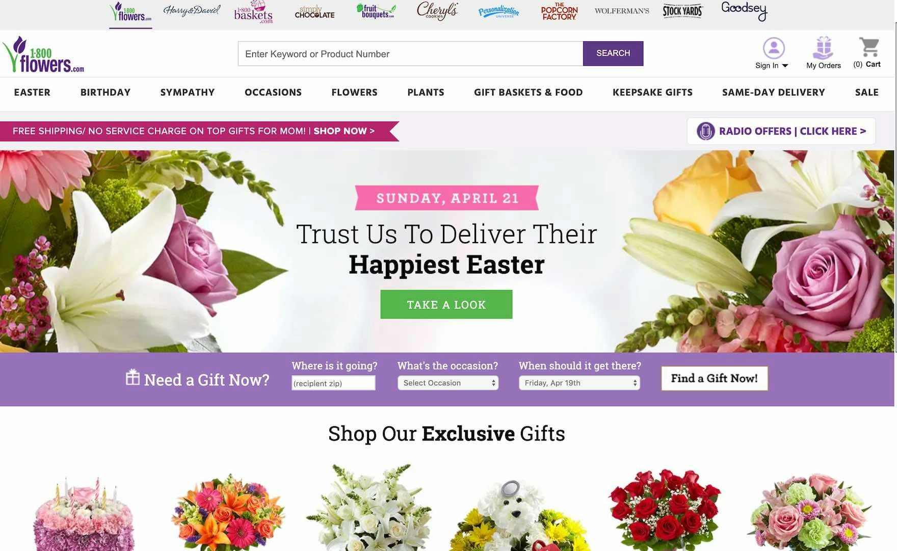
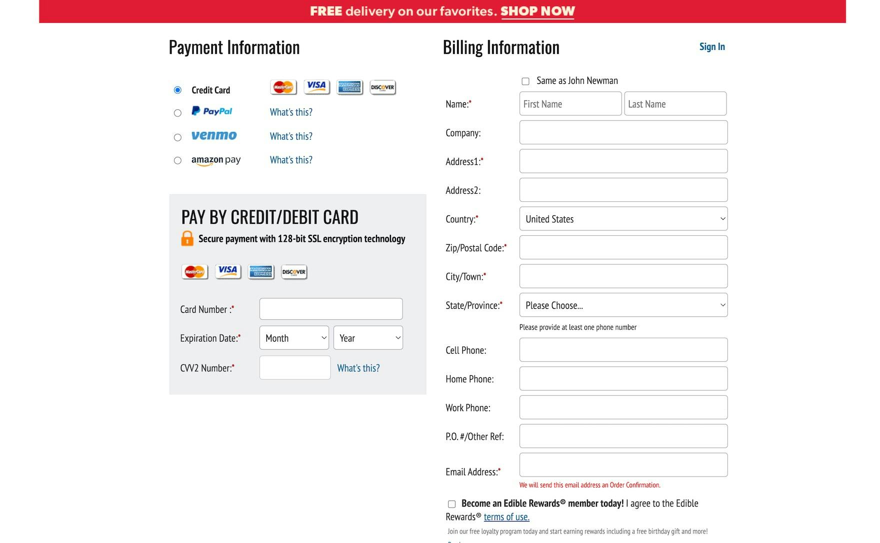
At Edible Arrangements, which focuses heavily on gifts, the “Same as recipient” option on the billing step is unchecked by default, as users will most likely include their own address as the billing address.
However, there are some exceptions to defaulting to “Billing = Shipping”.
For example, in certain site contexts, such as B2B sites and gifting-dominated sites (e.g., flower sites, toy sites, etc.), the overwhelming majority of users may instead opt for different shipping and billing addresses, which should then be supported as the default.
The same is true for orders that are marked as gifts in or before the cart and in-store pickup orders.
3 Key Implementation Details to Ensure High Performance
Across multiple rounds of testing, we’ve observed 3 additional implementation details for implementing the “Billing Address = Shipping Address” selection:
- Use a preticked checkbox for defaulting to “Billing = Shipping”, and hide the billing fields
- Use “Billing = Shipping”, not the other way around
- Summarize the previously entered shipping address directly on the page
1) Use a Preticked Checkbox for Defaulting to “Billing = Shipping” and Hide the Billing Fields
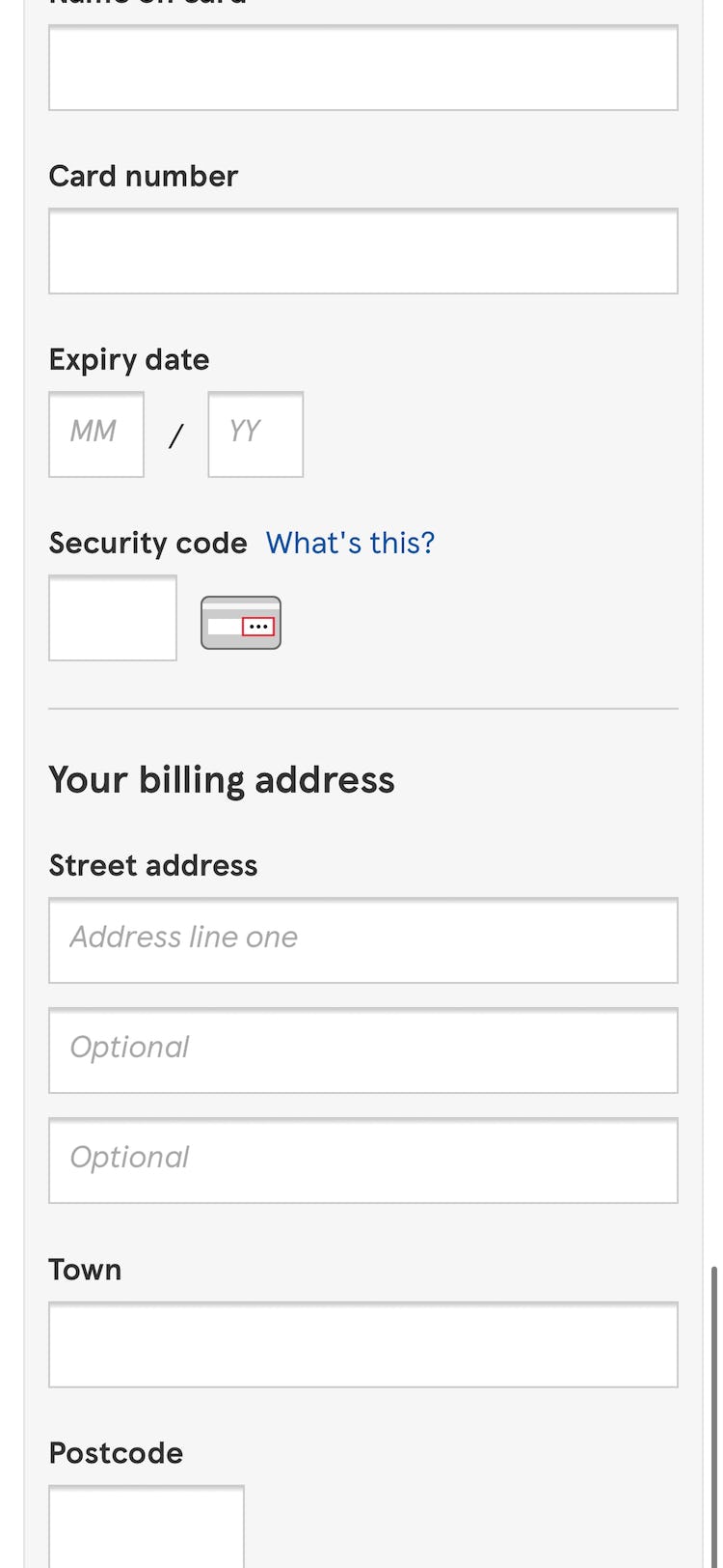
At CVS, billing address fields autopopulated with the previously entered shipping address. As a consequence, this participant sending his order to a different shipping address needed to manually clear each address field before entering the correct billing address, requiring unnecessary time and effort.
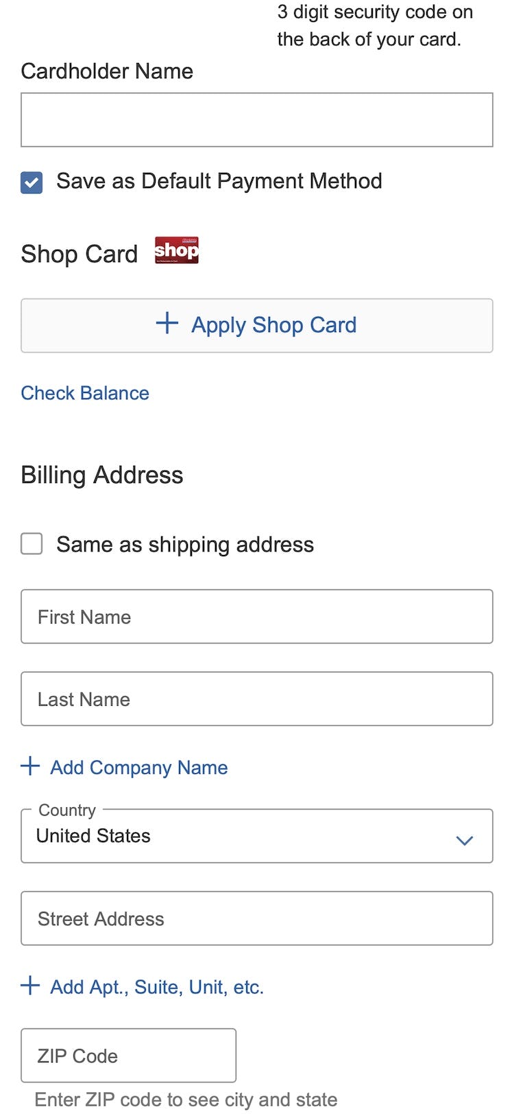
At Macy’s, when “Billing = Shipping” is selected, the previously entered shipping address is simply copied into the billing address fields. However, this will be confusing to many users, as it’s simply unclear whether the checkbox or what’s in the prefilled fields takes precedence if users edit the fields. Furthermore, having the fields visible by default still makes for an intimidating appearance.
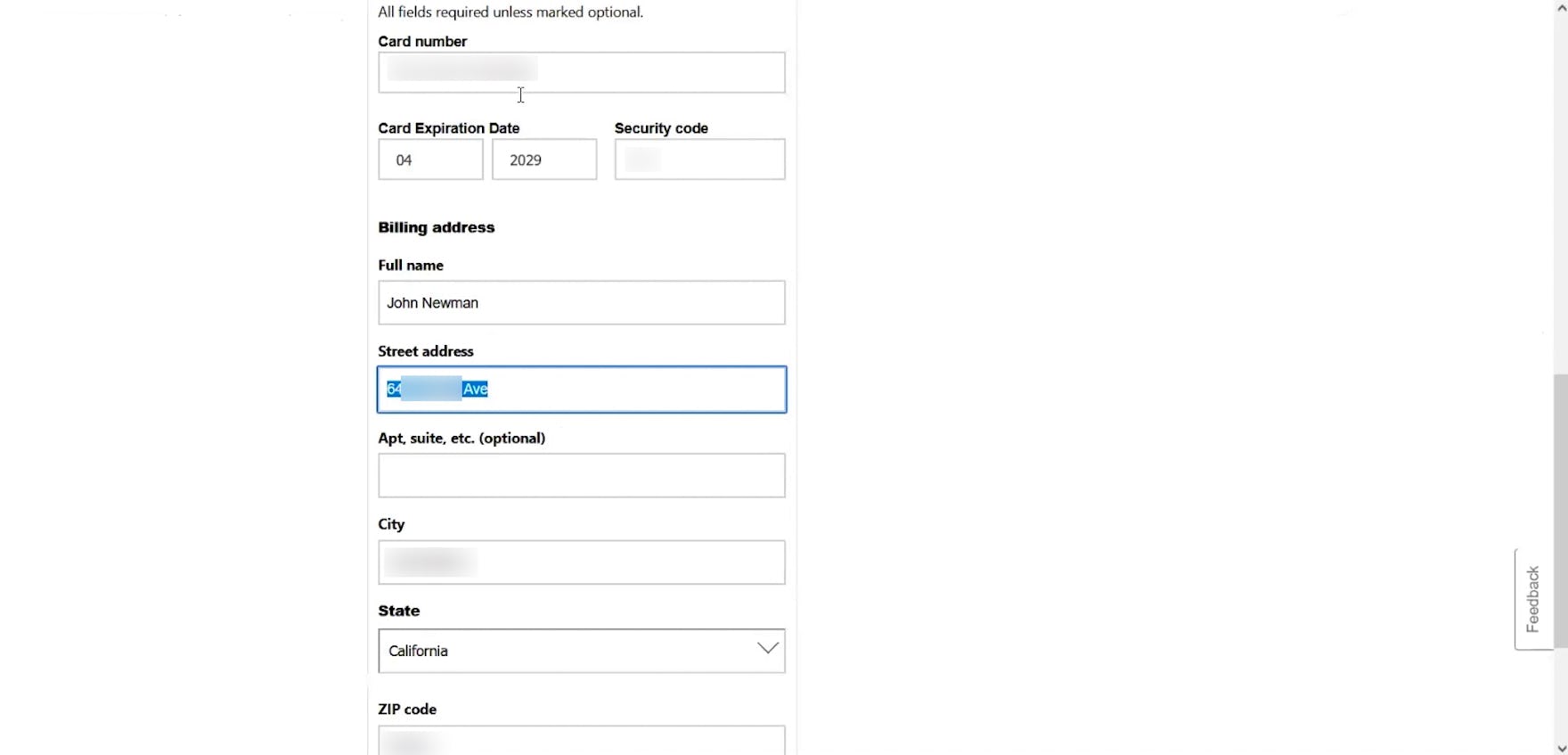
In testing, some sites defaulted the billing address to be the same as the shipping address — but still displayed all the billing address fields, with the shipping address information copied into them.
Users who need to edit their billing address therefore have to manually clear the entry in each field before entering the correct one, requiring additional time and effort.
Even for those for whom the billing and shipping addresses are the same, the display of these fields attracts unnecessary attention, significantly delaying users’ progress through this step of checkout as they slow to review the redundant fields.
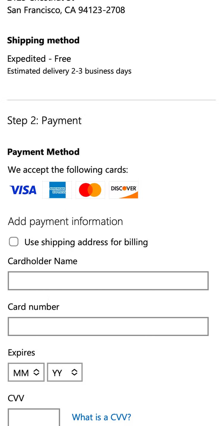
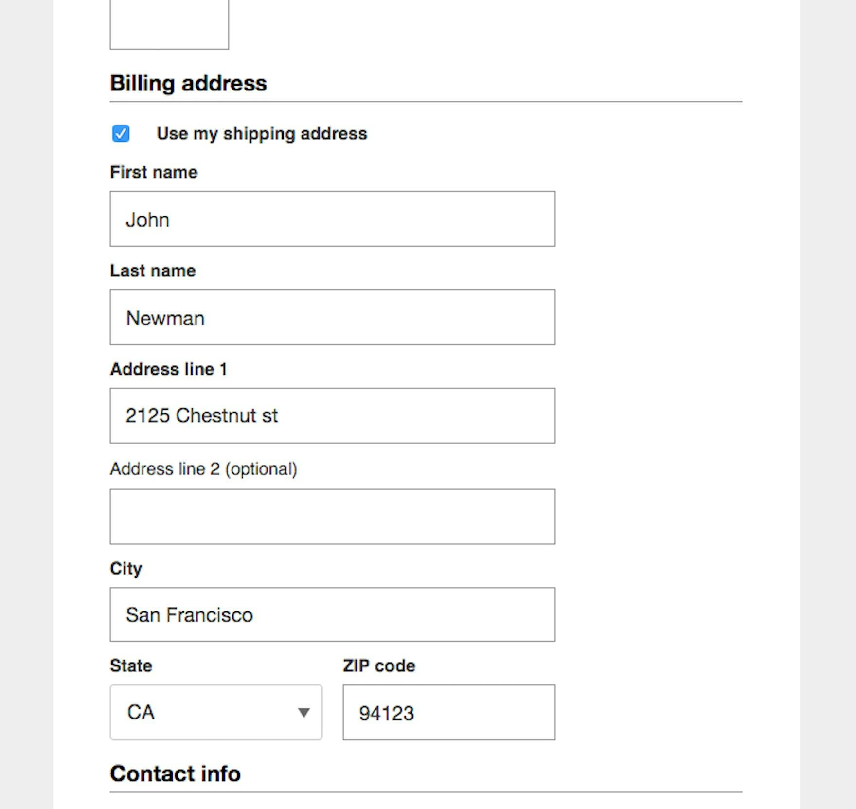
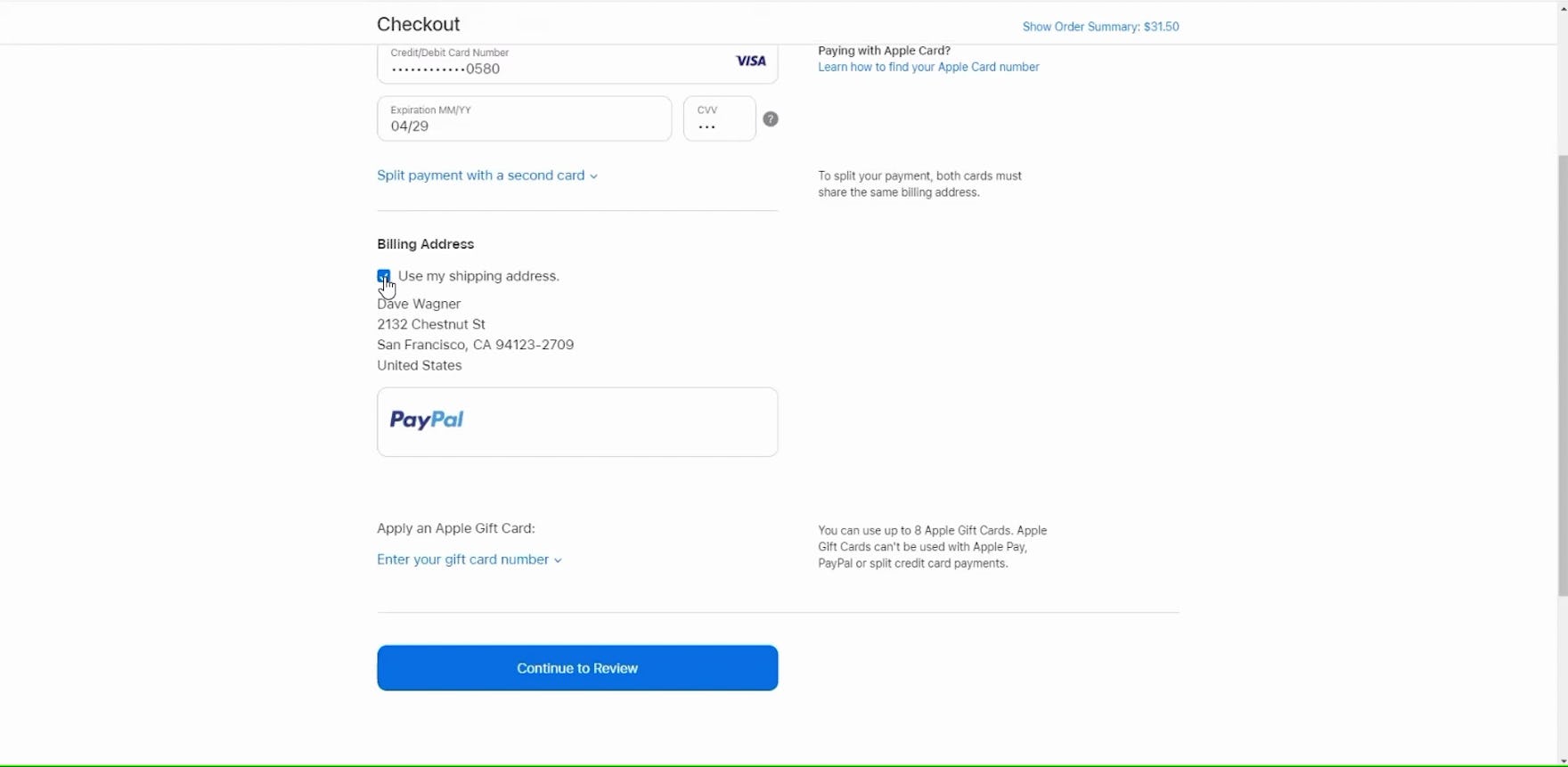
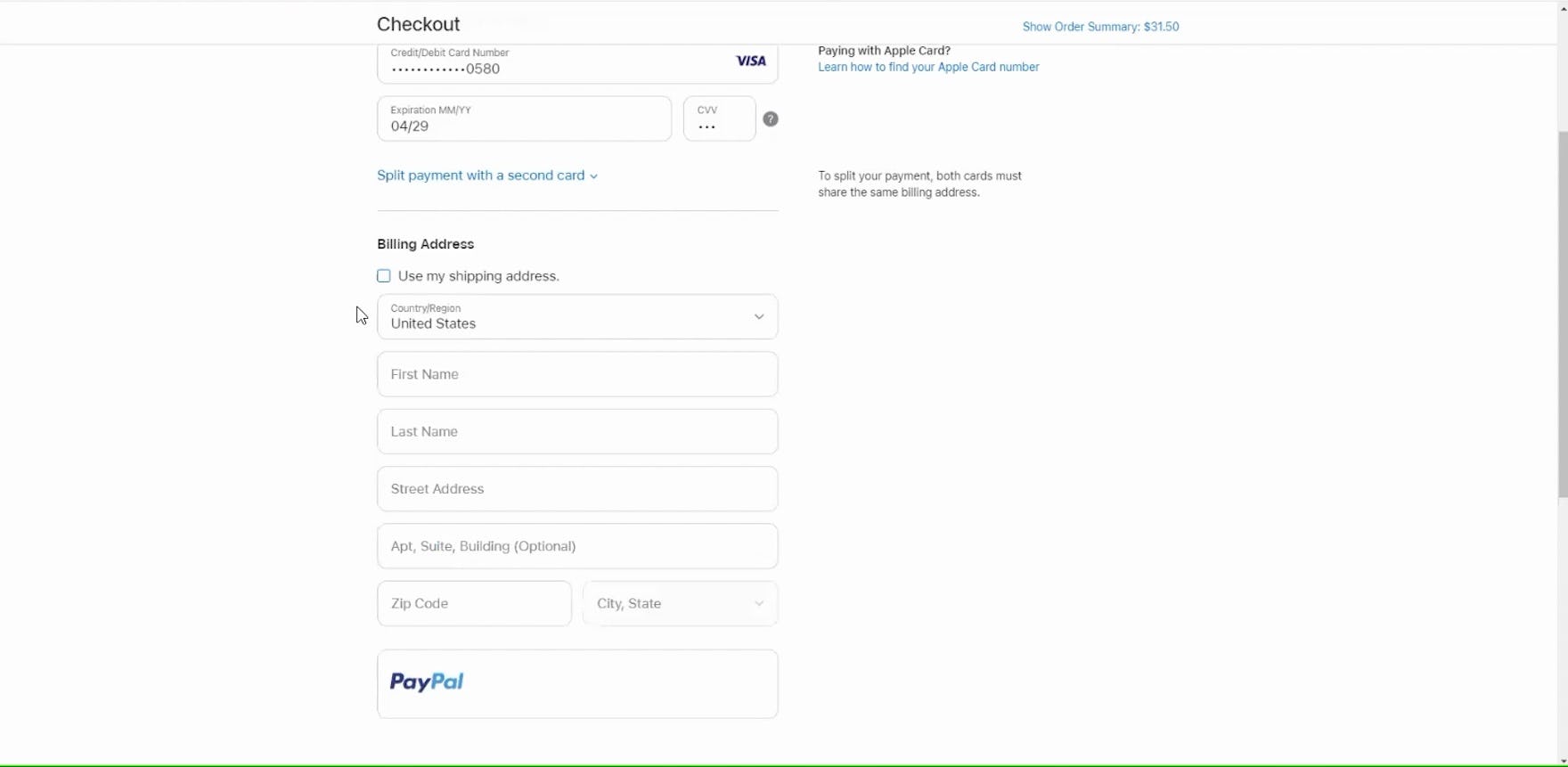
When purchasing a gift from Apple, this participant unchecked the default “Use my shipping address” selection (first image), revealing previously hidden fields for inputting the gift sender’s billing address (second image).
Instead, providing a preticked “Billing = Shipping” checkbox, with the billing address fields hidden by default, allows users who need a different billing address to untick the box to reveal the billing address fields and fill out the separate address.
Meanwhile, the vast majority of users can proceed with checkout uninterrupted by billing address fields.
As with all checkboxes, the label should be included in the interactive hit area, helping both desktop and mobile users deselect this option.
2) Use “Billing = Shipping”, Not the Other Way Around
In testing, some participants became disoriented when asked for their billing address before the shipping address, requiring them to pause and consider the distinction more carefully.
As more users can relate to what a shipping address is, sites should always ask users to type their shipping address and then default to using the billing address as the shipping address, and not the other way around.
3) Summarize the Previously Entered Shipping Address Directly on the Page
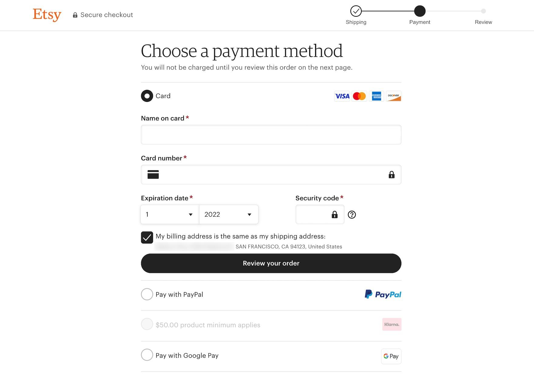
At Etsy, the billing address is set to the shipping address by default, with the billing address fields hidden to streamline the payment step. The previously entered shipping address is presented on the page as a reminder to users who may realize at this step that they need to change or update it.
Even when the billing address is set to be the same as shipping, users can still benefit from being shown the inferred billing address.
Providing a textual summary of the billing address during the checkout reminds users of what will be used as their billing address, prompting them to consider whether they need to change or update it — a critical step when the billing address is used to validate the credit card, as a mismatch can lead to a validation error.
Avoid the Billing Address Becoming a Stumbling Block for Users
The vast majority of users on B2C e-commerce sites have only a single address they need to input — their shipping address.
While sites need to know if a user’s billing address differs from their shipping address, this will likely only be the case for a subgroup of users — who are already likely aware of and looking for the option to edit their billing address.
Yet 16% of mobile sites in our e-commerce UX benchmark have severe implementation issues when it comes to the billing address — such as not defaulting “billing” to be the same as “shipping” — that can lead to users abandoning their checkout.
To avoid disrupting users, it’s key to ensure the following when it comes to implementing billing address fields:
- Set the billing address to equal the shipping address by default
- Use a preticked checkbox for “Billing = Shipping” and hide the billing address fields
- Ask users to fill out the shipping address fields instead of the billing address fields
- Summarize the entered shipping address when displaying the “Billing = Shipping” checkbox
Of course, if the site context warrants it, billing address fields can be displayed by default — but this should only be done after careful consideration of the typical orders placed on the site.
Getting the details right when it comes to the billing address fields will allow users to proceed faster and more smoothly through checkout — instead of getting hung up on what for most will be superfluous fields to consider.
This article presents the research findings from just 1 of the 700+ UX guidelines in Baymard – get full access to learn how to create a “State of the Art” ecommerce user experience.
If you want to know how your website performs and compares, then learn more about getting Baymard to conduct a UX Audit of your site.

