- ProductRead 200+ Testimonials
“Intelligent, consumer-focused insights that are clear and actionable.”
Will Close, Director of A/B testing at Nike.com
- UX AuditUX Audit Services
"An eye opener. This UX audit helped validate assumptions we had and provided visibility on issues we overlooked."
Michael Tran, Sr. Business Analyst at Sony PlayStation
Read 200+ Testimonials - Research FocusRead 200+ Testimonials
“Intelligent, consumer-focused insights that are clear and actionable.”
Will Close, Director of A/B testing at Nike.com
- Resources
Dan Murphy’s UX Case Study
This is a case study of Dan Murphy’s ecommerce user experience (UX) performance. It’s based on an exhaustive performance review of 447 design elements. 343 other sites have also been benchmarked for a complete picture of the ecommerce UX landscape.
Dan Murphy’s overall ecommerce UX performance is xxxx xx xxxxxxxxx xxxxxx xx xxxx xx xxxx xx-xxxx xxxxxx xx xxxxxxxxxx, xxx xxxxxxxxx xx xxxxxxxxx xxxxxx xx xxxxxxx xx xxxxxxx xxxxxxxx & xxxxxxxxx xxxxxxxxxxx Upgrade to access Dan Murphy’s case study.
First benchmarked in September 2025.
Dan Murphy’s UX Performance upgrade

Benchmark Chart
Get Baymard Premium access
This UX performance chart is part of Baymard's premium UX research. Get in touch to find the right plan and unlock full access for your team.
With Baymard Premium you get access to:
- UX insights based on 200k+ hours of large-scale usability testing.
- Instant answers to any UX question backed by evidence proven to convert.
- A personalized dashboard based on your UX focus area and needs.
To learn how we calculate our performance scores and read up on our evaluation criteria and scoring algorithm head over to our Methodology page.
Dan Murphy’s Desktop Web Ecommerce Design
18 pages of Dan Murphy’s ecommerce site, marked up with 157 best practice examples:


Dan Murphy’s Mobile Web Ecommerce Design
20 pages of Dan Murphy’s ecommerce site, marked up with 168 best practice examples:


Explore Other Research Content
Every week, we publish a new article on how to build “state of the art” ecommerce experiences — here’s 5 popular ones:

Drop-Down Usability: When You Should (and Shouldn’t) Use Them
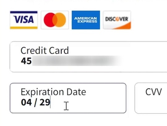
Format the “Expiration Date” Fields Exactly the Same as the Physical Credit Card (72% Don’t)

Avoid Using “Horizontal Tabs” for the Main Product Page Sections (29% Don’t)
Form Field Usability: Avoid Extensive Multicolumn Layouts (16% Make This Form Usability Mistake)
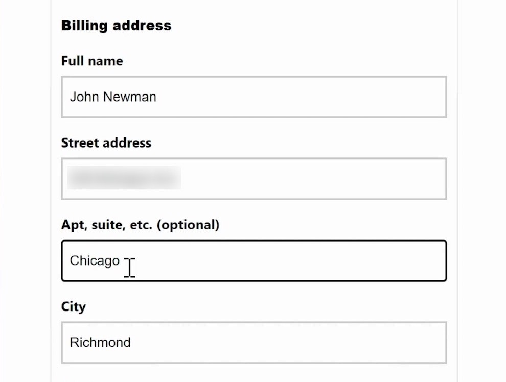
Form Usability: Getting ‘Address Line 2’ Right
See all 468 articles in the full public archive.