Key Takeaways
- Our new research has uncovered 1,720+ usability issues specific to Apparel & Accessories e-commerce sites
- The research has resulted in 500+ guidelines that describe the issues, as well as design patterns verified to perform well for users
- In particular, the research provides insights on the content and features Apparel and Accessories sites need to offer users to ensure they’re able to make a purchase decision
At Baymard our research team has just spent 1,765 hours performing usability testing and researching Apparel & Accessories website features, layouts, content, and designs — leading to our new study on Apparel & Accessories UX.
This study included 18 sites focused on apparel, sportswear, jewelry, and footwear, ranging from medium to large catalog sites.
All the study sites are omnichannel, with both an online and brick-and-mortar presence, and covered own-brand and multiple brand sites.
Finally, a cross-section of price points is represented, with both discount and midrange brands included, though excluding luxury retail (which forms a separate industry).
The 18 test sites were based in the U.S. and Europe and included the following:
- Apparel sites: Express, Francesca’s, Gerry Weber, Levi’s, Madewell, UNIQLO
- Sportswear sites: adidas, Columbia Sportswear, Nicce, Nike, Puma
- Jewelry sites: All Saints, Catbird, Ted Baker, Pandora
- Footwear sites: Cole Haan, Designer Shoe Warehouse, Hush Puppies
This research is based on more than 370 qualitative participant/site usability test sessions on desktop and mobile following the “Think Aloud” protocol (1:1 remote moderated testing).
During testing the participants encountered 1,720+ medium-to-severe usability issues.
These issues have subsequently been analyzed and distilled into the 500+ UX guidelines found within our Apparel & Accessories UX research study (all of which are available as part of our Premium research findings).
The 500+ guidelines cover aspects of the apparel and accessories product-finding experience, at both a high level of general user behavior as well as at a more granular level of specific issues users are likely to encounter.
In this article we’ll introduce 3 high-level UX findings for apparel and accessories sites, all related to size selection, which was critical to participants’ ability to find suitable products during testing:
- Clear size selection in product list filters is crucial for users
- Users rely on the “Size Chart” to determine their size
- A coherent color-size selection experience helps users efficiently navigate the variation selectors
1) Clear Size Selection in Product List Filters (and Search Results) Is Crucial for Users
Users want to quickly select their size in the “Size” filter so that they can focus on browsing items in their size in the product listings.
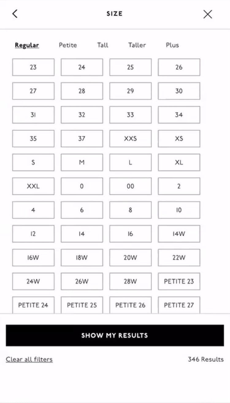
Given that there is no universal standard for apparel sizing, and that many clothing types often require several sizing parameters — for example, a pair of jeans may be offered in “Petite”, “Regular”, or “Plus”, etc., in addition to specifying “Waist” and “Length” — users may need to take into consideration a multiplicity of sizing options in order to ensure they select the correct size.
However, during testing, some users had trouble navigating “Size” filters that offered a variety of size options for a given product type.
If the display of size filter options makes it difficult for users to understand what the sizing options actually are, some will forgo size filtering entirely — leading to more difficulty finding the right product — or abandon the site.
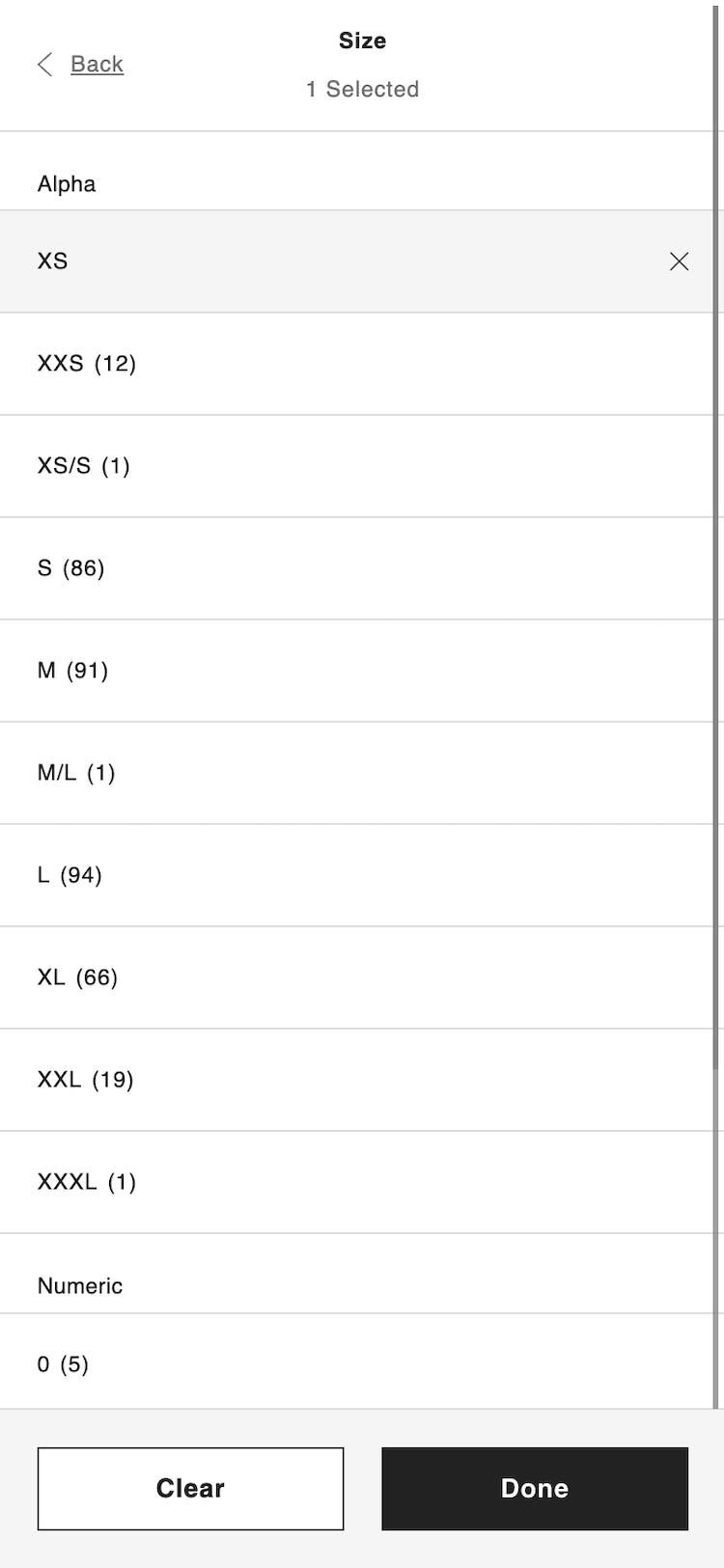
During testing, participants faced with “Size” filter interfaces with a jumble of numeric options tried to interpret the sizes on their own, mentally sorting the size-selector values into sizing groups that they recognized.
Several of these participants were unable to interpret the numeric sizes or else misinterpreted them and therefore picked the wrong size.
When “Size” filter options make it difficult to identify what size types or additional size options the size selectors refer to, they place an undue burden on users, who are forced to figure this out on their own, often causing them to misinterpret, overlook, or even doubt the size filter options.
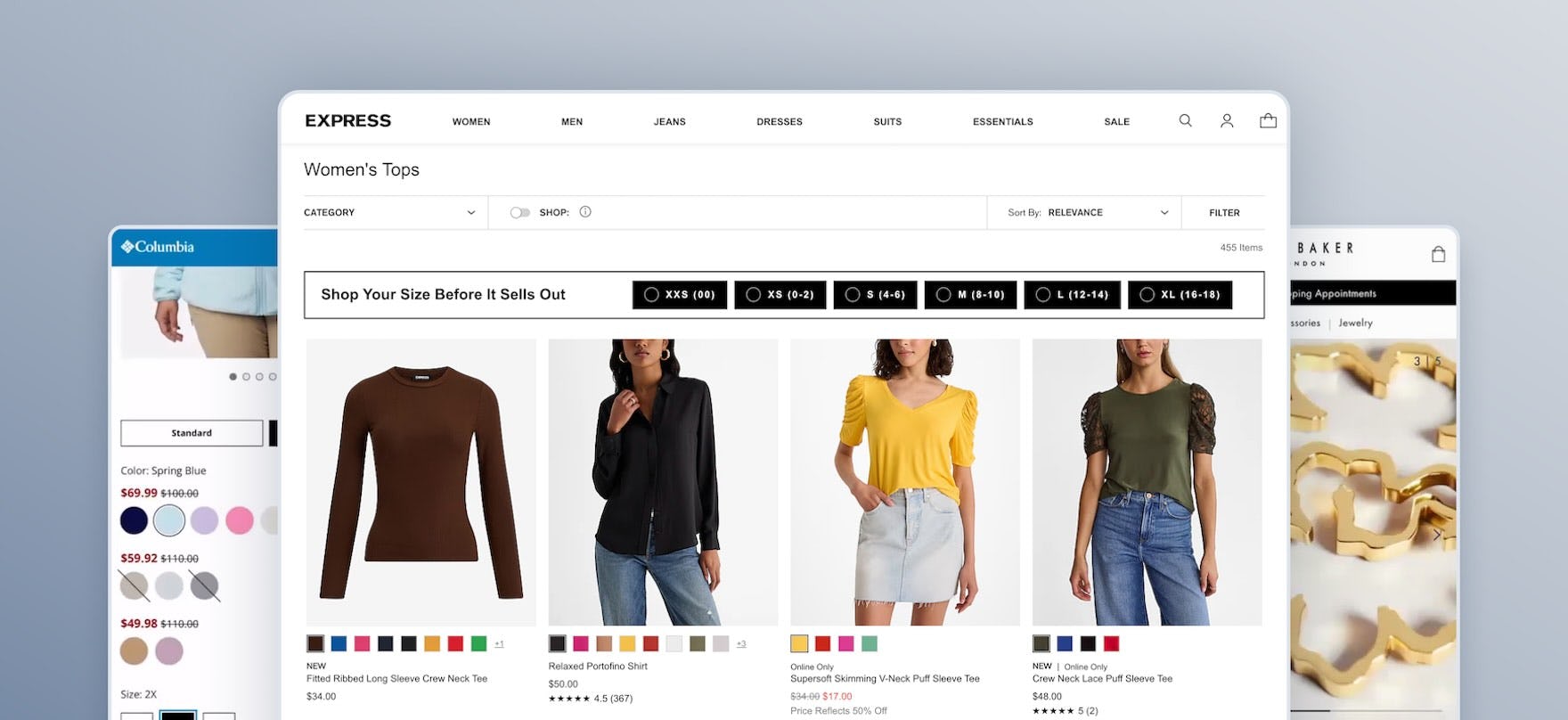
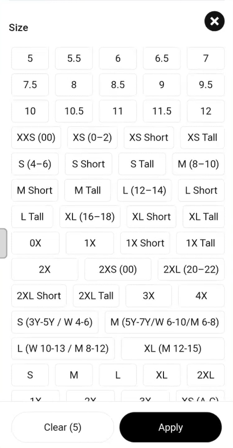
”I’m also going to click on size because I’ve been doing that. Oh, this is fun [sarcastic]! Lots of different types of sizes! I have to figure it out. I also have to figure out is ‘Waist’ first or is ‘Length’ first? I think ‘Waist’ is first, but…I have to interpret what this means, so this is not easier.” A participant was taken aback by the “Size” filter selectors at Express because he did not know which of the combined measurements referred to “Waist” and which to “Length”.
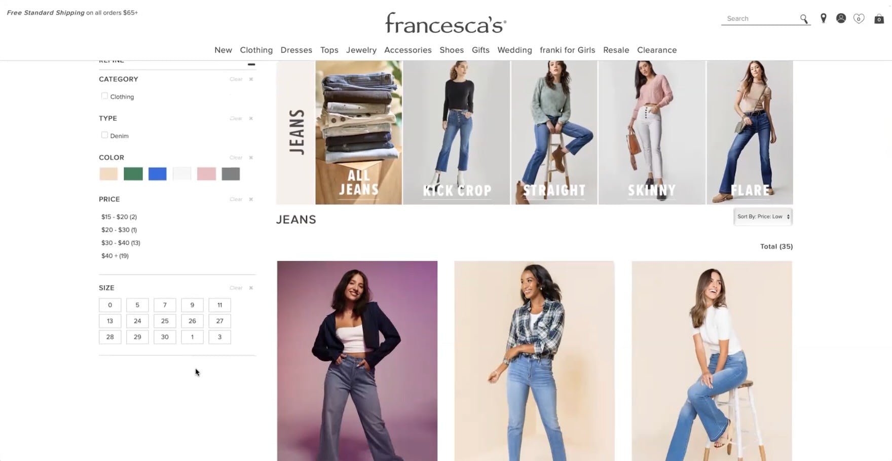
”Sizing looks a little bit different for me…I would wear ‘27’ waists usually, or like a ‘28’. It gives me that option, but I’m also not sure what the ‘0’, ‘5’, ‘7’, ‘9’ is. My thought process right now is I’ll go through, look for a pair of jeans that I like and then from there see the sizing and see what sizes are offered”, reasoned this participant at Francesca’s who, despite having recognized her jeans “Waist” size, decided to skip size selection entirely because she was confused by the “Juniors” sizes (“0, 5, 7, 11, 13” at the beginning of the filter options and “1” & “3” at the end) also mixed in the “Size” filter interface.
Moreover, even when they correctly identified their size in the “Size” filter, the presence of unfamiliar size options made participants doubt their size selection.
In fact, some participants felt compelled to understand all of the size options offered in “Size” filters with several size types, even when they could identify their own size; without this sense of mastery over the “Size” filter their confidence to proceed with size selection was eroded.
Consequently, some users who see their size will nonetheless abstain from filtering by size if they cannot understand all of the size options.
For others who correctly select their size, the presence of other size options that they can’t identify will nevertheless introduce anxiety to their “Size” filtering process.
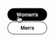
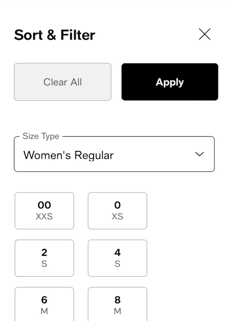
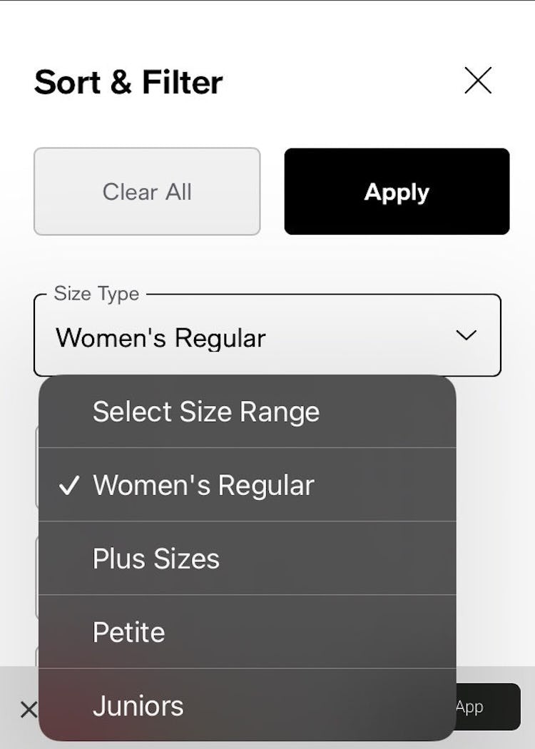
At Macy’s, the numeric sizes for “Women’s Blazers” are easy to identify (first image). Note the use of a drop-down to allow for easy selection of one’s preferred “Size Type” (second image).
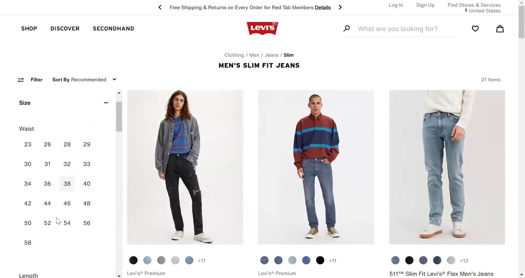
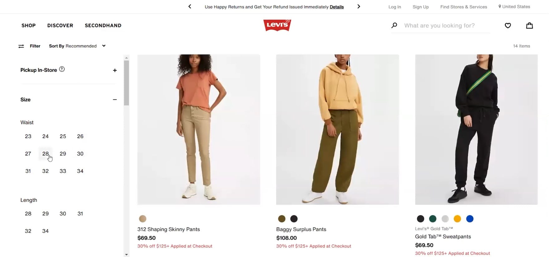
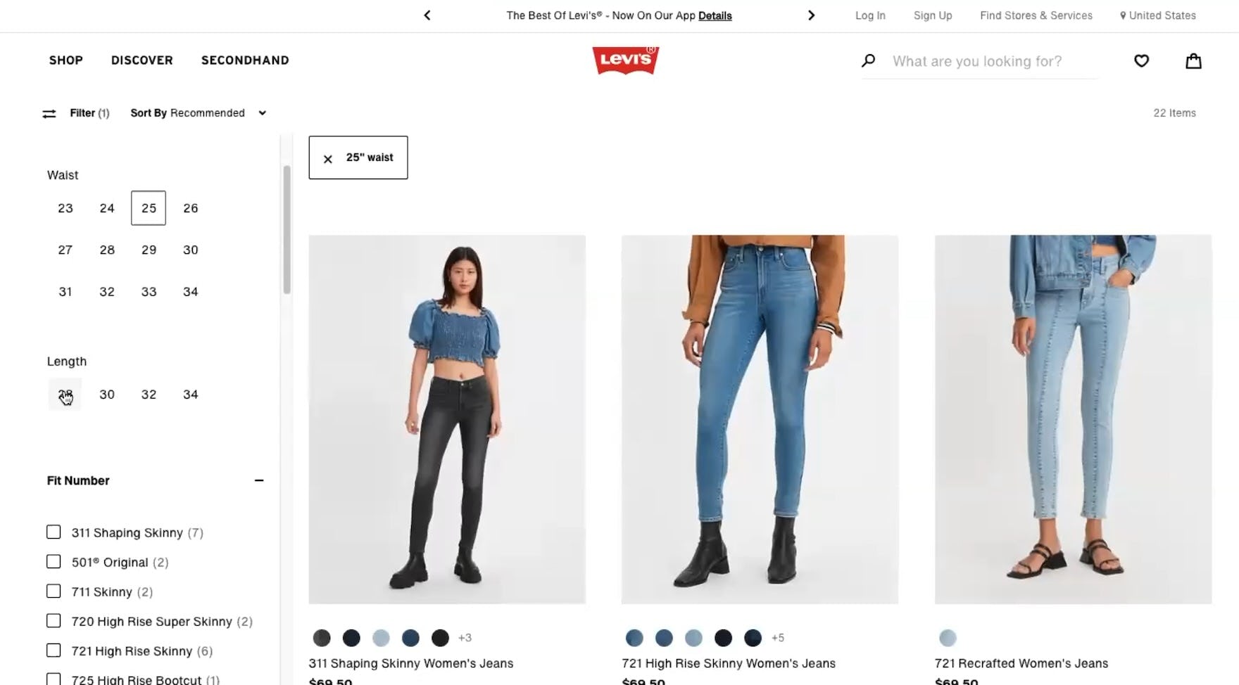
”I feel like this is like the best in terms of filtering, just because it specifies what the ‘Waist’ size is and what the ‘Length’ size is”, praised a participant at Levi’s who was able to easily select his jeans size.
”I’d start with pants and then the ‘Waist’ size and the ‘Length’ and then I guess I would just start scrolling”, commented another participant shopping for jeans at Levi’s.
”I’m going to select my ‘Waist’ then the ‘Length’.” A different participant at Levi’s similarly had no trouble identifying the “Waist” and “Length” options she wanted in the “Size” filter.
Therefore, in order to ensure that users don’t misinterpret or doubt “Size” filter options while interacting with “Size” filter interfaces, separate “Size” filter options by clearly grouped size types.
For example, “Waist” size filter options should be grouped together, “Inseam” size filter options should be grouped together, “Juniors” options should be grouped, and so on.
In addition to grouping related “Size” filter options together, it’s key to also provide a clear header — for example, letting users know that the numeric “Size” filter options they see are for “Waist” size or “Inseam”.
Providing headers aids users’ ability to quickly scan the “Size” filter types in order to find the options they want to select.
2) Users Rely on the “Size Chart” to Determine Their Size
Generally represented as a chart or table, the “Size Chart” provides measurements and size ranges for specific apparel types — such as jackets or pants — in order to help users select their correct size.
Regardless of any other sizing help on the “Product Details Page”, the “Size Chart” forms the only comprehensive source of an apparel item’s measurements, as reflected by the fact that most participants during testing were interested in finding the “Size Chart” to obtain sizing info.
Nevertheless, in testing, several participants were unable to access the sizing information they needed, leaving them uncertain about what size to select.
Users may consequently be forced to abandon items they want, due to uncertainty over whether a desired item will fit.
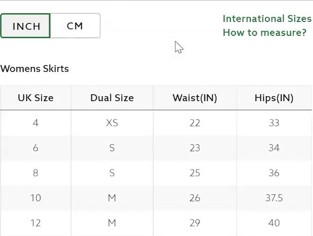
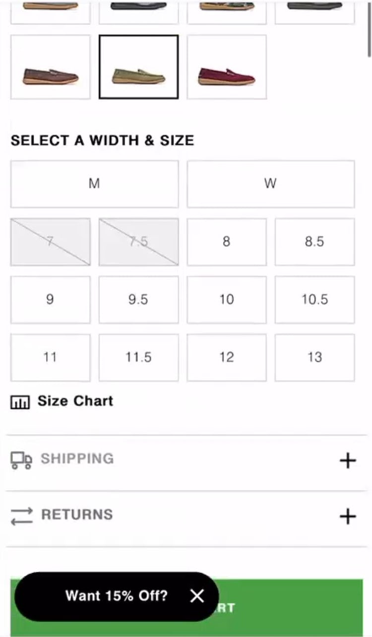
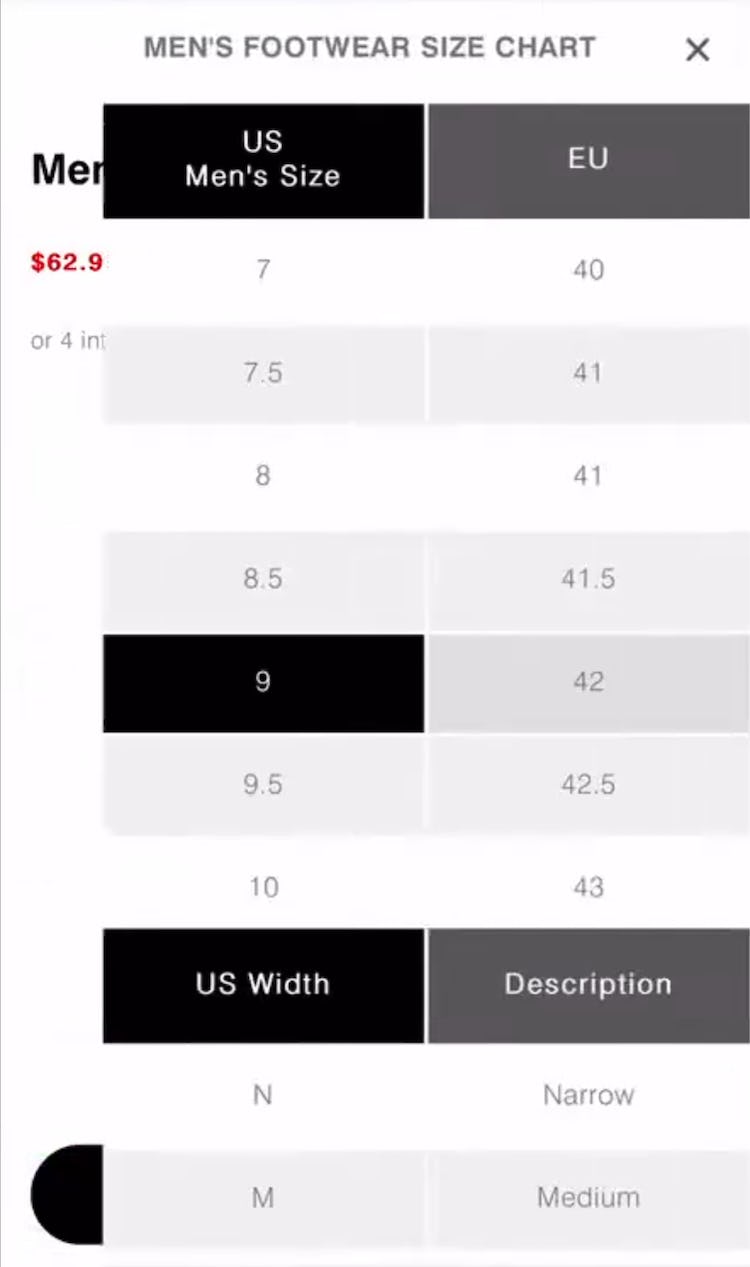
”So this one I’ll need the ‘Size Chart’…not too helpful. It’s just basic European to US [conversions]. So I’ll have to kind of take a chance.” At Hush Puppies, a participant who wanted to verify the measurements for a pair of loafers (first image) was unable to because the “Size Chart” was in fact a “Conversion Chart” (second image) — electing nevertheless to add the loafers in size “9” to his cart in the hopes they would fit him (third image).
”Let’s see if they have my size, I am a size ‘9’ or ‘9.5’, depending on the boot. So I would look at the ‘Size Chart’.” A different participant at Hush Puppies, interested in a pair of boots that came in US sizing (first image), wanted to know if a size “9” would fit her but was only able to determine its European conversion in the “Size Chart” (second image): ”[size] ‘9’…that’s what it is in European, ‘41’.” Unable to find the information she was looking for, she decided to stick with size “9” even though she was unsure of sizing for this new-to-her brand.
Including a “Size Chart” is a convention for apparel sites: during testing, only 1 of our test sites didn’t provide a “Size Chart”.
Note too that the “Size Chart” is most often nested within the “Size Guide” (which may also include international conversions and measurement instructions) — though both terms are often used interchangeably.
Failing to provide information on basic measurements, which form the core of the “Size Chart”, leaves users with no clear recourse regarding sizing and uncertain about how to proceed next.
Other users who go forward with purchasing will have misgivings about the fallback size they select, or even resort to purchasing items in 2 sizes in order to ensure 1 of them will fit (with the resulting strain on customer service resources).
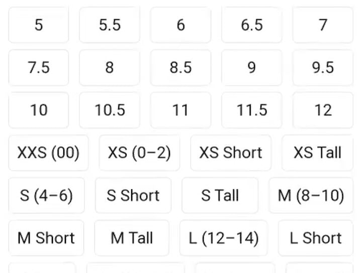
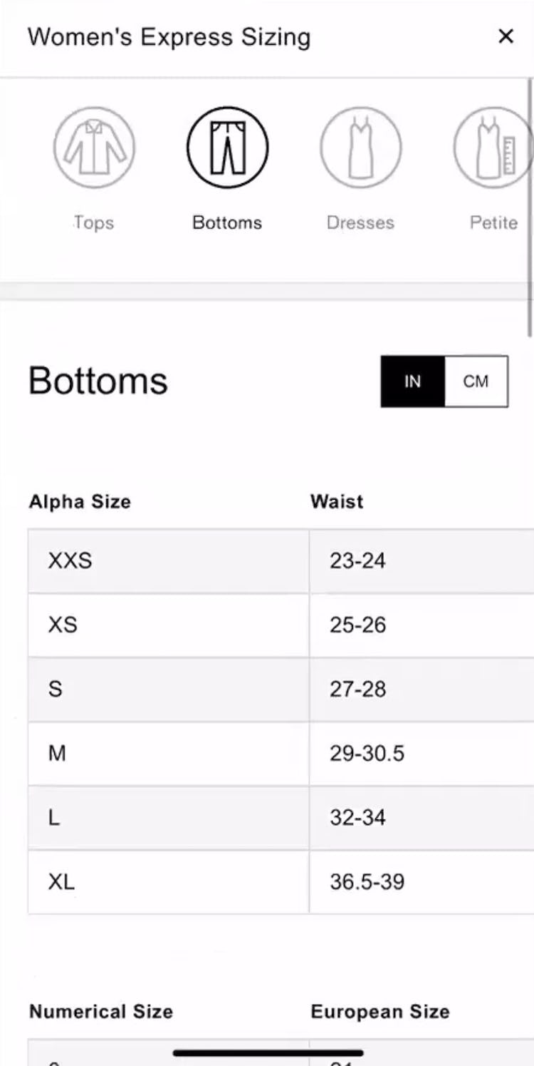
”Mmm these look kind of interesting…Okay let’s hit the ‘Size Chart’ again.” Intrigued by a pair of jeans that came in numeric sizing (first image), a participant at Express opened the “Numerical Size Chart” but was unable to use it because it provided a “European Size” conversion instead of the measurement info she was looking for (second image). In fact, the measurements she needed (and had scrolled past) were on the first chart (third image), but they were associated with alpha sizes, not the default numeric sizes the jeans came in. Frustrated at not being able to use the “Size Chart”, this participant left the site: ”I don’t think I would [buy these jeans]. I would probably go for a different website.”
”So I’m not really sure what size I would be in Express…So I’m going to go to the ‘Size Chart’.” Unfamiliar with the numeric sizing for a pair of jeans (first image), another participant at Express opened the “Size Chart” but was confused because she saw alpha sizes and not the default sizes the jeans were offered in (second image): ”So ‘Bottoms’…It started off with the alpha sizes but that’s not the [default size of the] jeans.” She scrolled down to a second chart where she did find the default numeric sizes she was looking for (third image) — but they were associated with “European Size” conversions, rather than measurements. She ended up misinterpreting the charts and selecting the wrong size.
”Just because I’m not familiar with ‘Taller’ [sizing], I’m going to check the ‘Size Chart’.” Curious about the “Taller” sizing offered for jeans at Madewell (first image), this participant opened the “Size Chart” hoping to find the “Taller” measurements, but this info wasn’t provided (second image): ”Ok, well, it doesn’t describe ‘Taller’ in this chart.” She eventually found the “Taller” sizing information in the “Product Details”.
”Aw man, I always liked these frayed jeans! But let’s see how tall they are. Okay, ‘Sizing Info’.” Excited by a pair of jeans at Francesca’s (first image), a participant looked for the “Inseam” measurements in the “Size Chart” (second image) but, because this measurement info wasn’t provided, she abandoned the jeans: ”This does not tell me how long they are. Yeah, so like I have no idea! It doesn’t really tell me the inseam length to know how long or short they would be for me, like I’m ‘6’1”’, so very tall. So let me go back and look at some other jeans.”
More common in testing were “Size Charts” that omitted critical measurements, with 58% of test sites deficient in this regard.
At the extreme end of the spectrum were “Size Charts” that didn’t include measurements for the default sizing the product was offered in — for example, failing to provide measurements for the “Small”, “Medium”, or “Large” sizing options that the product came in.
Similarly confusing for participants were “Size Charts” that, even though they did provide the default size, nevertheless buried the default size in the wrong chart (putting it in the “Conversion Chart”, for instance), — with this confusion causing participants to misinterpret sizing in the “Size Guide” to the point of selecting the wrong size.
At the lesser end of the spectrum, several participants expected more measurements in the “Size Chart” than were provided — with “Inseam” being a popular measurement that participants wanted for pants, for instance.
And without the full range of measurements they need to determine their sizing for specific apparel items, some users will discard items they want to purchase.
”They have a ‘Size Guide’. Yeah, that’s my size, ‘Medium’. Should be fine.” At Columbia Sportswear, a participant looking for a jacket opened the “Size Chart” (first image) and, hovering over the “Chest” measurements, was reassured that he should get his regular “Medium” size after considering the “Chest” and other measurements provided (second image).
”I think I will be ‘34’ if I’m not mistaken.” This participant at Nike initially thought he should get size “34” for a pair of pants (first image), but realized that he should size down after looking at the measurements in the “Size Chart” (second image): ”Actually, I probably should look at the ‘Sizing Guide’ again. Maybe ‘32’ will be better anyways…I was looking at the ‘34’…and I think ‘32’ will be the best one.”
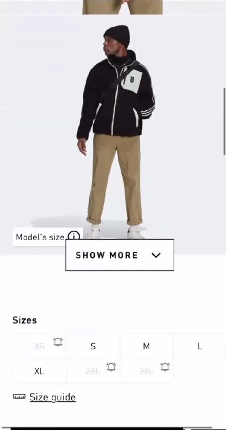
”Oh, this jacket, that’s pretty cool! I think that would go with my style. So, let’s look at the ‘Size Guide’ again.” At adidas, a participant who was enthused about a jacket opened the “Size Guide” (first image) to verify the “Chest” measurements (second image) but, undecided about which size to get, also took into account the “Waist” measurements to help him select a size (third image): ”I am a ‘42’ ‘Chest’, so it looks like we’re right there in between a ‘Large’ and ‘Extra Large’. But again, the ‘Waist’ is so friggin’ huge on ‘Extra Large’! I think that I’m better off with a ‘Large’ and just being slightly tight in the chest. Awesome! So I’m going to select size ‘Large’, add to the bag.” A comprehensive range of measurements allows users to feel confident about finding the right size.
”So it’ll tell you if you’re ‘Narrow’, ‘Regular’, or ‘Wide’, and then other US sizes…Sometimes my foot tends to be more wide or regular and definitely not narrow, so I would like to see that information, and that’s pretty easy to use.” A participant at Cole Haan was pleased that the “Size Chart” for a pair of shoes included several width measurements (right side of image).
”I love when pants have an ‘Inseam’ or ‘Short’, Petite’, or ‘Regular’! I’m kind of in that size that’s right between ‘Petite’ and ‘Regular’. Sometimes ‘Petites’ are a little short…But to have an actual ‘Inseam’ number, I know what that looks like on my body. So, a ‘Short’ pant would be probably what I would be looking for.” A participant at Columbia Sportswear who opened the “Size Guide” for a pair of pants (first image) was delighted that it included “Inseam” measurements for different size options (e.g., “Short”, “Regular”, “Long”, etc.).
”I would like to see maybe an ‘Inseam’ measurement on the pants just to see if it appears to run a little bit longer or shorter.” Interested to know the “Inseam” for a pair of waterproof pants, this participant at adidas opened the “Size Guide” (first image) and was able to determine that the pants were too long for him (second image): ”They all have relatively the same ‘Inseam’. So these sizes would be a bit too long for me, so I would go back, and I wouldn’t get these pants just because I wear about a ‘30-inch’ ‘Inseam’, not a ‘32-inch’.”
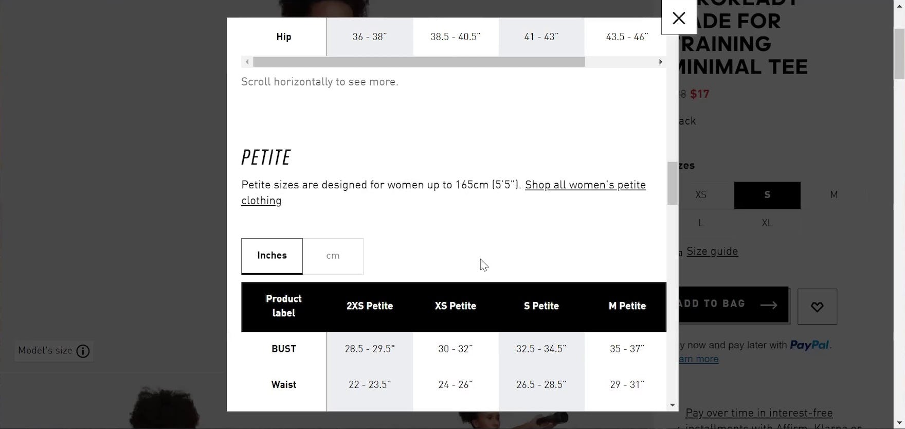
”It does say if you’re ‘Petite…up to 5’5”’…So that does give me some good thoughts there.” At adidas, another participant looking at t-shirt measurements in the “Size Chart” appreciated that “Petite” sizing information was provided.
Therefore, always include a “Size Chart” that provides measurement information for the apparel product under consideration so that users will feel confident they are finding their best fit.
For example, a “Size Chart” for women’s shoes should include the length (in inches or centimeters) that’s appropriate for various sizes (e.g., “Size 8: 24 cm”), while a “Size Chart” for “Women’s Tops” could supply “Bust”, “Waist”, and potentially “Hip” measurements (depending on the garment’s length), and a “Size Chart” for “Men’s Pants” could include “Waist” and “Length” measurements.
Supplying measurements that users can confirm by measuring their own body will provide them with the confidence they need to make a purchase decision (and reduce returns issues down the road).
Additionally, sites with international users should always provide “Size Chart” measurements in both cm and inches — while country-specific sites should likewise consider doing so to avoid users misinterpreting the chart.
3) A Coherent Color-Size Selection Experience Helps Users Efficiently Navigate the Variation Selectors
The interplay between size and color is a critical factor affecting users’ ability to determine which colors for an apparel item are in stock in their size.
However, in testing, several participants were unable to easily determine what colors were available for their selected size.
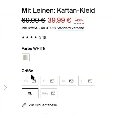
When color swatches appear to be available for all sizes when in fact some colors are unavailable, users experience needless frustration trying to find a color-size combination that meets their requirements.
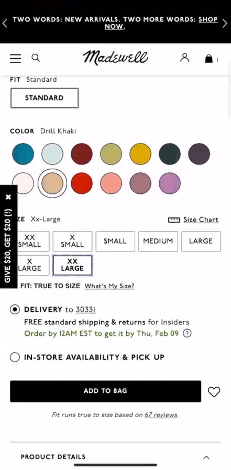
”I got a white shirt, so I’d probably get a darker top.” A participant at Madewell selected her size (“XX Large”) for a t-shirt in the default selected “Drill Khaki” color and determined that all colors were available for her size (first image). But after choosing the “Burnished Mahogany” color she was confused that she couldn’t add it to her cart — finally realizing that the “XX Large” button was disabled because “Burnished Mahogany” wasn’t available in her size after all (second image): ”It’s not letting me add it to the bag. Oh! It looks like they’re out of ‘2X’ in that color!”
”Okay, ‘Medium’…It looks like everything’s available.” A participant at adidas had already filtered for his size “M” in the product list. When he opened the product page for a hoodie he was pleased that all colors seemed available in his size, which was preselected (first image; note that color variations are on the main product image). But when he clicked other color variations than the default “Grey”, he wasn’t impressed to discover that his size was not available for every color after all (second image): ”They don’t filter out the colors based on size.”
”I do like this long sleeve.” After selecting size “M” for a top she was interested in, a participant at UNIQLO was under the impression that all colors were available in her size (first image). However, when she made a different color selection she was taken aback to find out that “M” was not in stock (second image): ”And that shirt is out of stock!” She resorted to tapping different colors to see which ones were actually available in her size (third image): ”So let’s check out a different one. That one’s also out of stock.”
”I do really like that one!…I would put this one in the cart.” At Express, this participant selected size “M” for a bodysuit, whereupon it looked like all color variations (including the default selected “Pecan”) were in stock (first image). But when she clicked on a different color she was annoyed that her size wasn’t in fact available (second image; note how “Size M” has been removed): ”Darn it they don’t have my size, which is a huge bummer!” She therefore resorted to selecting each color in turn to check her size availability for that color: ”Oh, nope, can’t do that one either! They don’t have my size.”
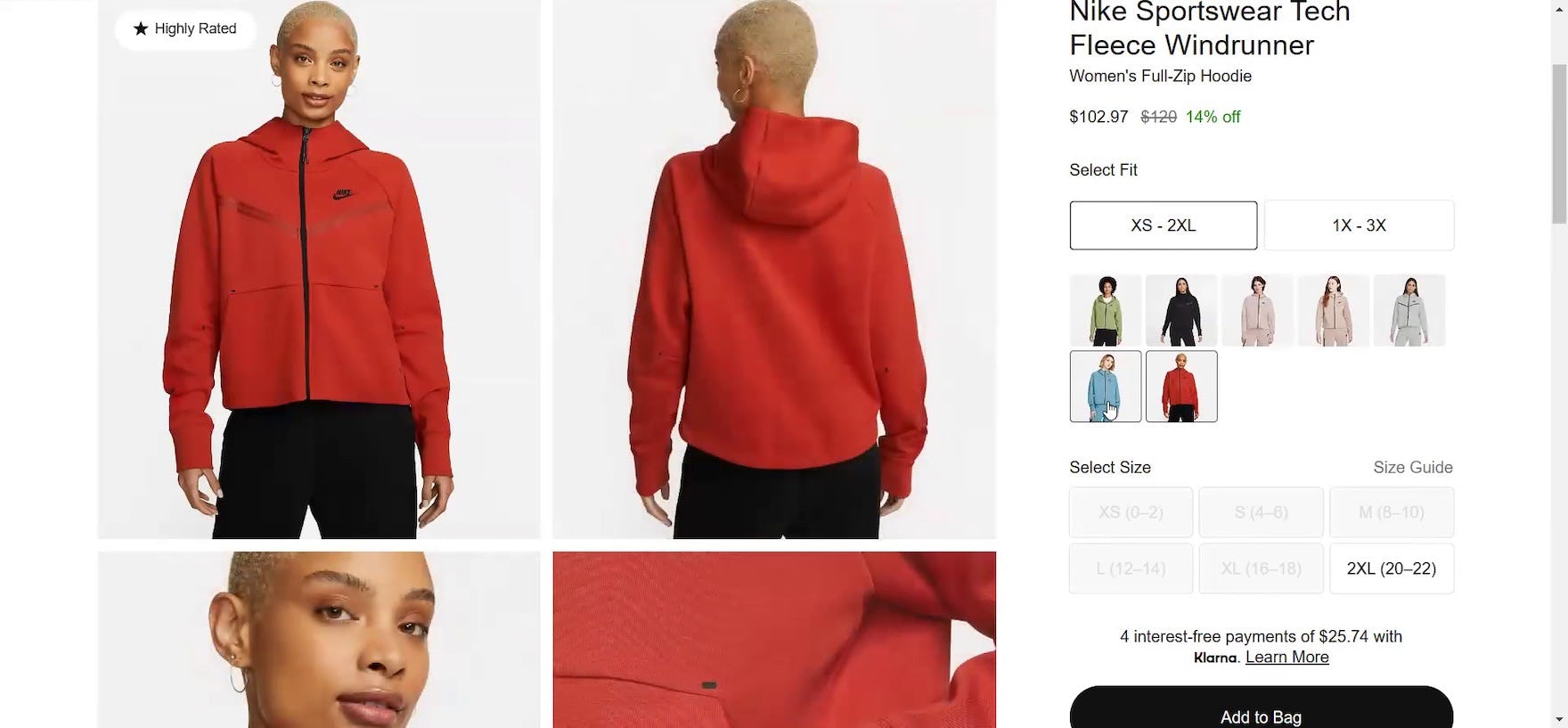
”I’d click my size first to see, sometimes it crosses out different colors that aren’t available.” At Nike, all colors for a hoodie (including the default selected beige color seen here) seemed available so this participant selected her “L” size hoping that unavailable colors would disable (first image). However, the second she hovered over different color variations she realized that her size was not in stock for all of them, requiring her to check each color one by one for its corresponding size availability (second image).
Having earlier filtered for his size “Small” in the product list, a participant at Madewell arrived on the product page for a shirt he liked and added the default selected “Rich Burgundy” color to his cart (first image). He next wanted to purchase the same shirt in a different color, but to his surprise discovered that not all variations were available in his size as he was led to think, forcing him to click each color swatch in turn to see whether it was available in a “Small” (second image): ”Yeah, and I like this one too, so I’ll…Oh! there’s no ‘Small’.”
During testing, participants who were interested in purchasing an item they liked inevitably sought, on the product page, to make sure it was available in their size and in colors that pleased them.
Often a default color was already selected for the item so that participants simply proceeded to choose their size.
However, several participants were disappointed to discover, when they selected different color variations, that their selected size was not in fact available, forcing them into the annoying rigmarole of selecting each color in turn to discover whether it was available in their size.
Notably, testing revealed that, while users may be willing to consider alternative colors if their preferred color isn’t available in their size, they rarely will consider alternative sizes — a user who needs a size “L” isn’t likely to size down or up because “L” isn’t available, whereas a user who prefers “red” may be willing to consider “black”.
Furthermore, in cases where items came in many colors — one participant dealt with 19 different color variations for a top — having to check each color individually for its corresponding size availability constituted a veritable memory exercise.
If they are unable to remember which colors come in their size, some users will be forced to check the same colors several times in order to settle on a choice for purchase.
Yet regardless of how many colors are provided in the variation selector, users who have to interact with each separate color swatch to verify whether their size is available — despite having already selected their size — will experience needless friction finding suitable items.
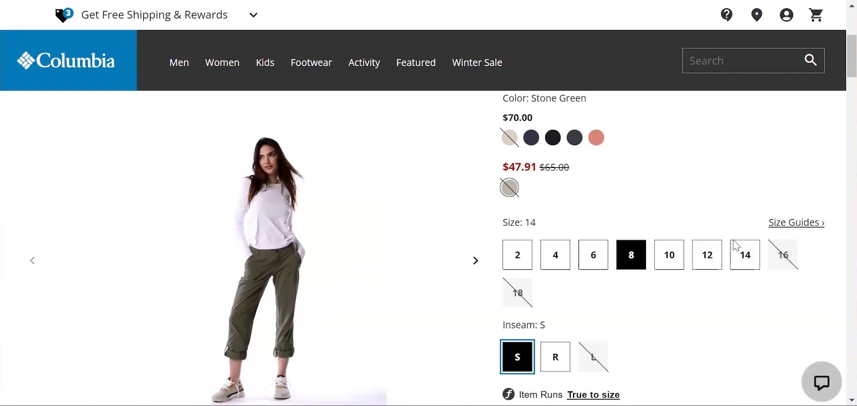
”I like that I can click on a size and it automatically cuts out what’s not available. That’s handy!” At Columbia Sportswear, a participant who had selected her size (“8”) for a pair of pants was easily able to decide what color to get because unavailable colors (as well as inseam lengths) were crossed out.
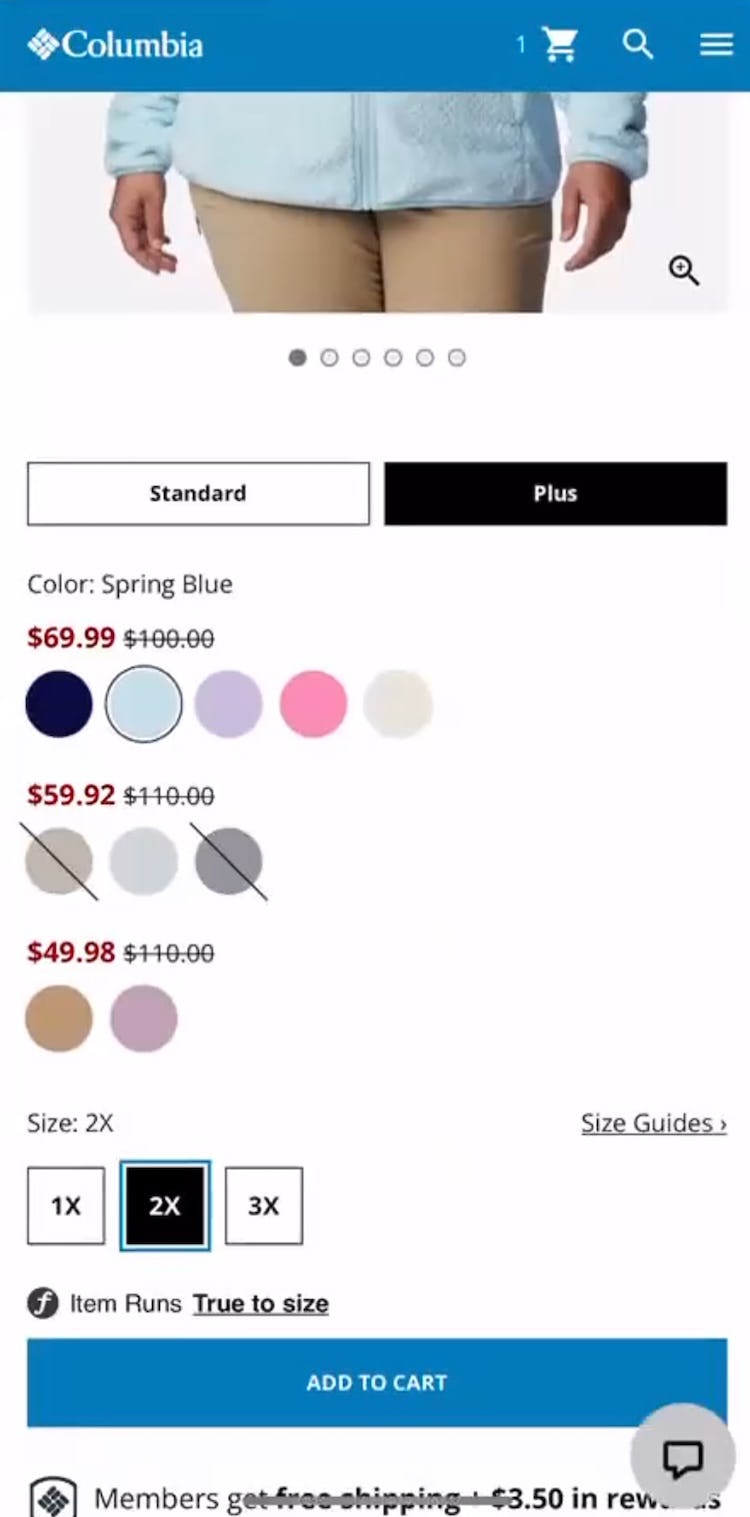
A different participant at Columbia Sportswear, interested in a jacket that came preselected in “Spring Blue” (first image) selected her size (“2X”) and in a single glance could determine which colors were available in her size (second image).
Again at Columbia Sportswear, a different participant who had first selected size “L” for a top (first image) and then decided to size down to a “M” had no trouble determining which colors to consider because color availability was automatically updated (second image): ”Okay, so these two colors are available, which again, simple basic, which is fine.”
I’ll select my ‘Waist’ because I need to see what colors are available…select my ‘Waist’ and then the ‘Length’. Okay, except this [one], all the colors are available.” The color availability for a pair of jeans at Levi’s updated instantly when this participant selected a “Waist” size — with availability becoming further refined when she also selected “Length” — allowing her to efficiently decide on a suitable color.
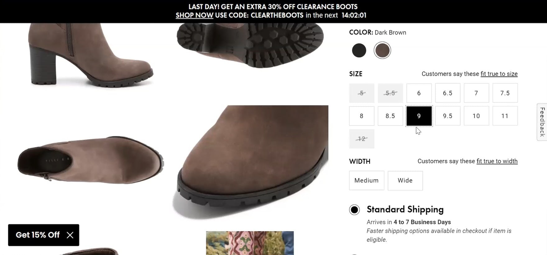
At DSW, a participant who selected size “9” for a boot in the default selected “Dark Brown” could see that the black variation was also available (first image). The clarity of the selection indicators at DSW were further evident when she next selected the “Medium” “Width”, whereupon the “Black” variation became disabled because it was no longer available for that sizing combination (second image).
Therefore, ensure that unavailable colors are clearly indicated for sizes that have been selected.
Unavailable color variations should be indicated regardless of whether a user has already made a size selection in the product list (and the selection is remembered on the product page) or whether they select a size on the product page.
Disabling color swatches for a corresponding size that is selected contributes to a more coherent size-selection experience by allowing users to gain an instant overview of colors available to them.
In fact, many users now expect such size-color interdependency, and sites that don’t offer this feature will give users the impression that something is amiss — as was the case for this participant: “So I like this green color, but I want a ‘Medium’…so they don’t have my size. Although perhaps if I highlight [hover], it will X out what colors don’t have that size…No, it doesn’t appear to be…Well, that would be helpful.”
Disabling unavailable colors helps users quickly navigate the variation selectors for size and color so they can more efficiently make a purchase decision.
Ensure Users Shopping for Apparel and Accessories Can Easily Evaluate and Select Sizing for Items
Size selection and sizing concerns are especially important to apparel and accessories shopping, and sites that can address them up front will make it easier for users to evaluate and select their size, so that they will have confidence in completing their purchases.
However, size selection and exploration is only one part (albeit a crucial one) of Apparel and Accessories UX.
In particular, a surprising finding during testing was that apparel users rely much less on search compared to other general e-commerce users (with 100% of apparel test participants primarily relying on the main navigation and manual product browsing; only 10% of apparel participants used search at some point in testing).
Additionally, user reviews — which provide crucial information on nearly all e-commerce sites — were heavily used by apparel users (again, in particular reviews were scrutinized for sizing and fit information).
Therefore, in order to have a high-performing apparel or accessories site, it’s crucial to ensure the site performs well across a wide range of UX considerations, from the Homepage to Category Taxonomy to Checkout, along with Product Details Pages and Product Lists and Filtering. (Search, as noted above, is less of a priority for apparel users.)
Making sure the site performs well across the spectrum of e-commerce UX will set a solid foundation for user success, which can then be perfected by applying the Apparel & Accessories–specific guidelines included in this new study.
Getting access: all 500+ Apparel & Accessories UX guidelines are available today via Baymard Premium access. (If you already have an account open the Apparel & Accessories study.)
If you want to know how your apparel or accessories desktop site, mobile site, or app performs and compares, then learn more about getting Baymard to conduct an Apparel & Accessories UX Audit of your site or app.

![”Let’s see what their sizes are. Okay, I hate that when they do that!…I don’t know those sizes…I don’t know if that’s your ‘Waist’? Maybe it’s just the ‘Skinny Jeans’. Let’s see. No, it’s all of them. I don’t think I would shop here!…Just [because of] the sizes alone.” This participant looking for “Skinny Jeans” at Francesca’s was so frustrated at being unable to interpret the sizes that she left the site.](https://baymard-assets-cdn.imgix.net/research/media_files/attachments/97085/original/research-media-file-7ee2b6e1b8da7b6ebbff266a66bae103.jpg?auto=format&dpr=2&fit=max&q=50&w=880)
![”I’m also going to click on size because I’ve been doing that. Oh, this is fun [sarcastic]! Lots of different types of sizes! I have to figure it out. I also have to figure out is ‘Waist’ first or is ‘Length’ first? I think ‘Waist’ is first, but…I have to interpret what this means, so this is not easier.” A participant was taken aback by the “Size” filter selectors at Express because he did not know which of the combined measurements referred to “Waist” and which to “Length”.](https://baymard-assets-cdn.imgix.net/research/media_files/attachments/97097/original/research-media-file-f294f977b4af7df84da4c6f0f44ec486.jpg?auto=format&dpr=2&fit=max&q=50&w=880)















![I’ll select my ‘Waist’ because I need to see what colors are available…select my ‘Waist’ and then the ‘Length’. Okay, except this [one], all the colors are available.” The color availability for a pair of jeans at Levi’s updated instantly when this participant selected a “Waist” size — with availability becoming further refined when she also selected “Length” — allowing her to efficiently decide on a suitable color.](https://baymard-assets-cdn.imgix.net/research/media_files/attachments/123704/original/research-media-file-c22f4a2509066be057c635c6fc0d23f3.jpg?auto=format&dpr=2&fit=max&q=50&w=880)
