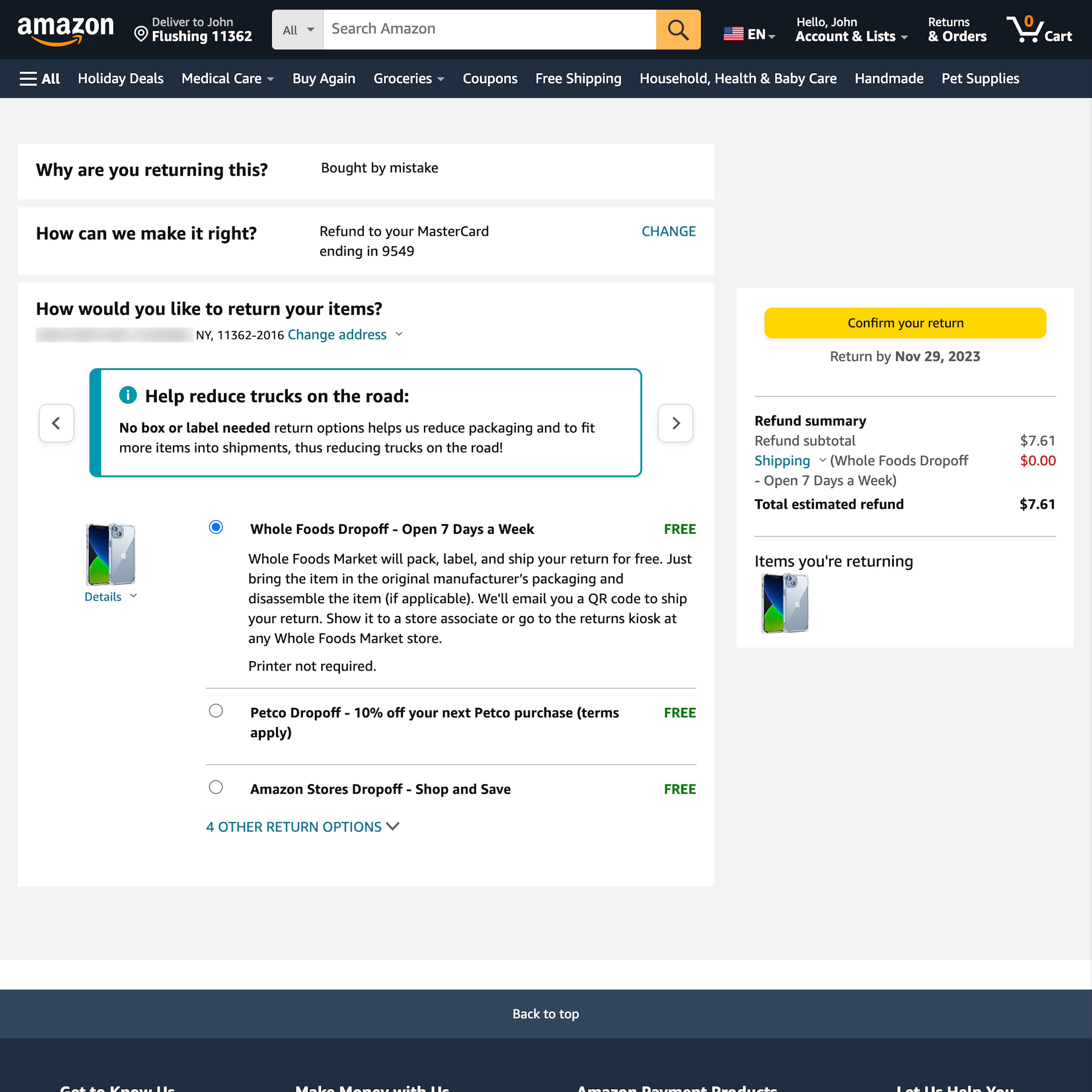
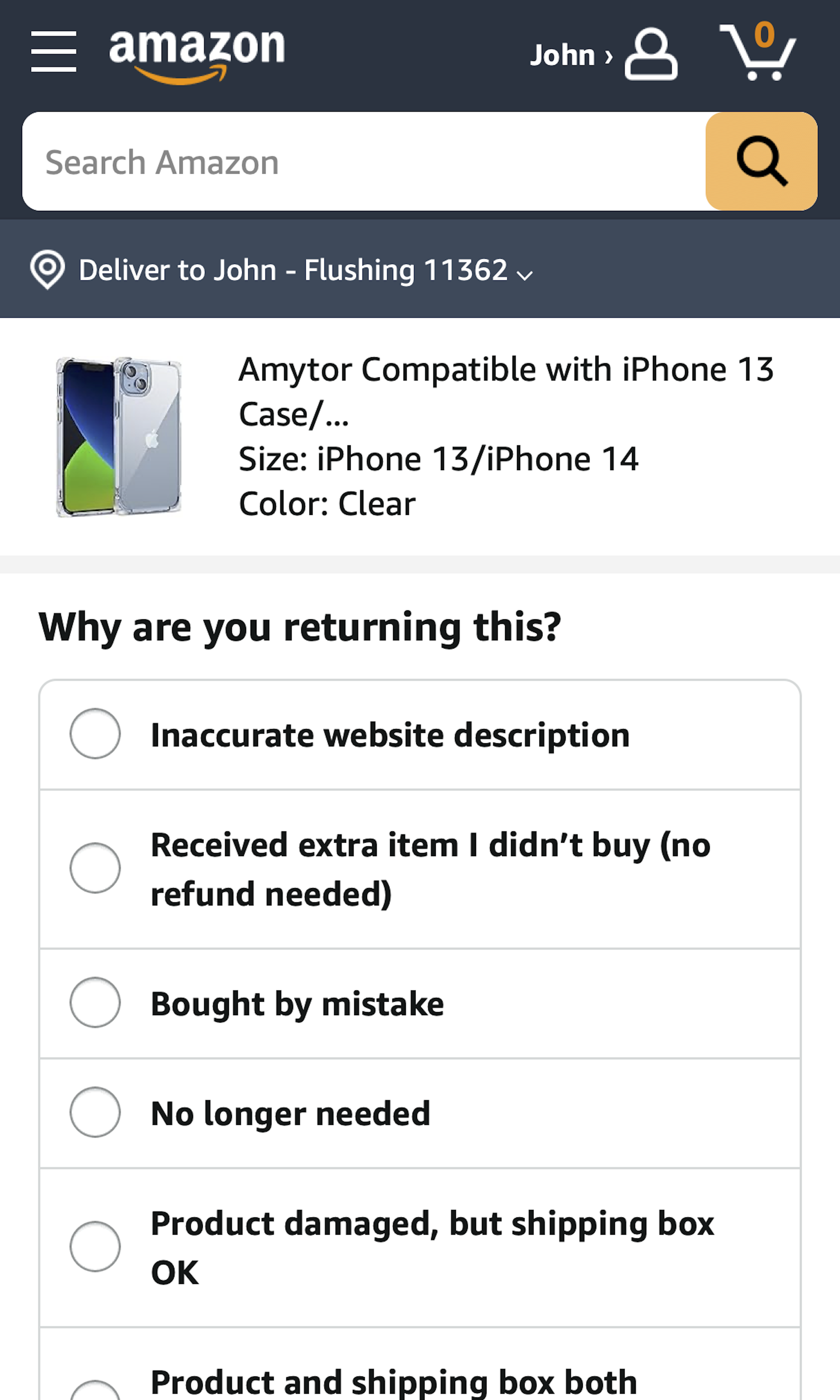
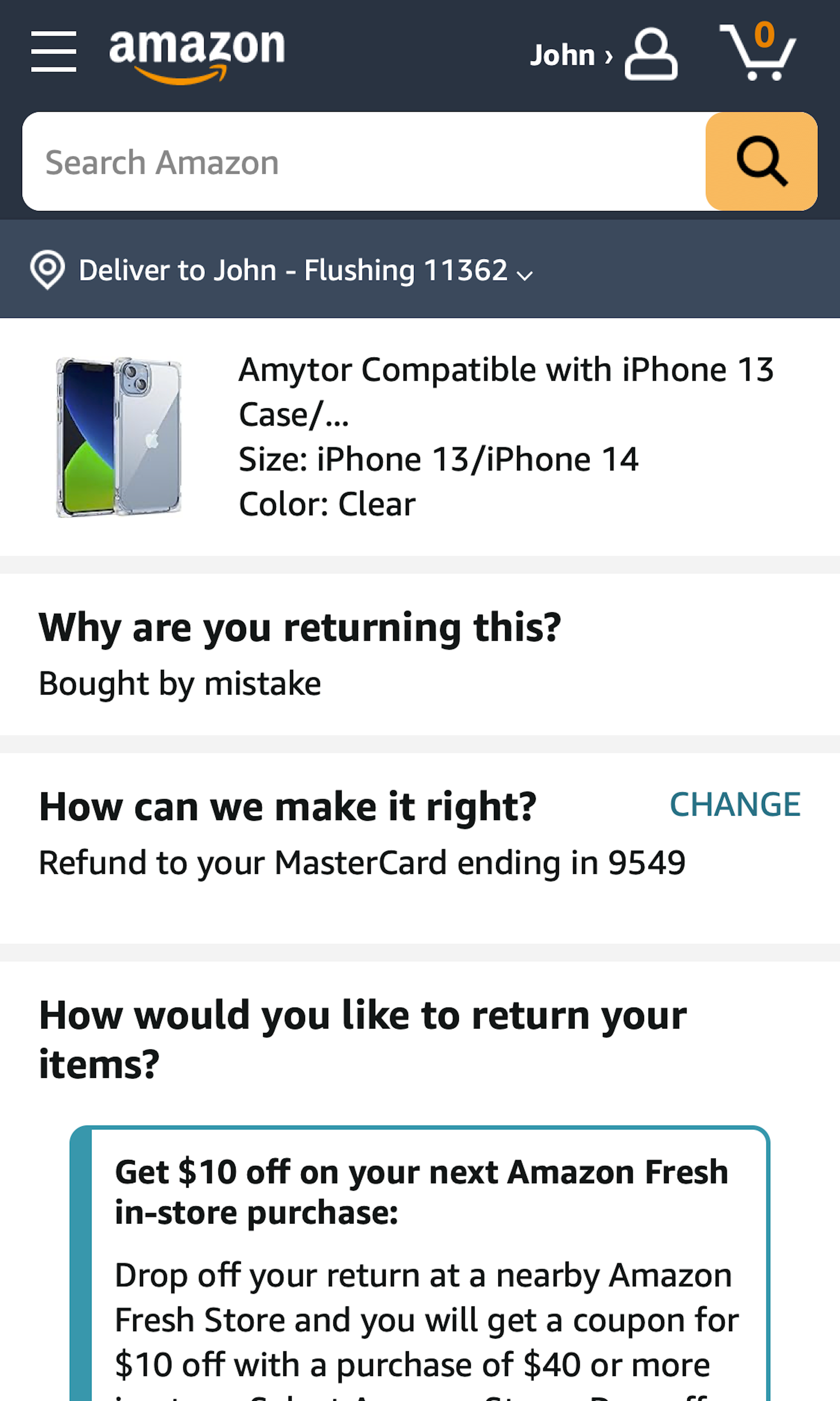
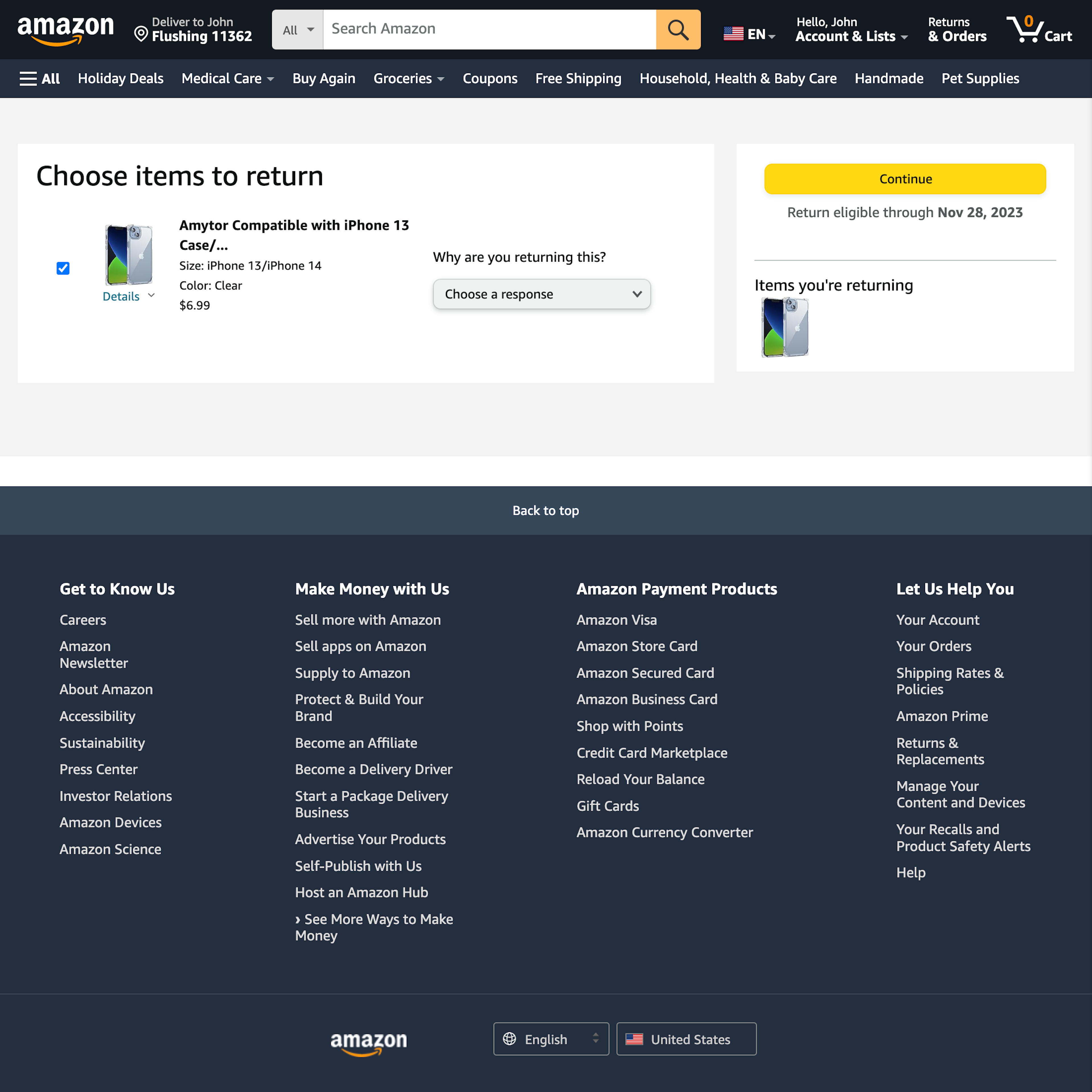
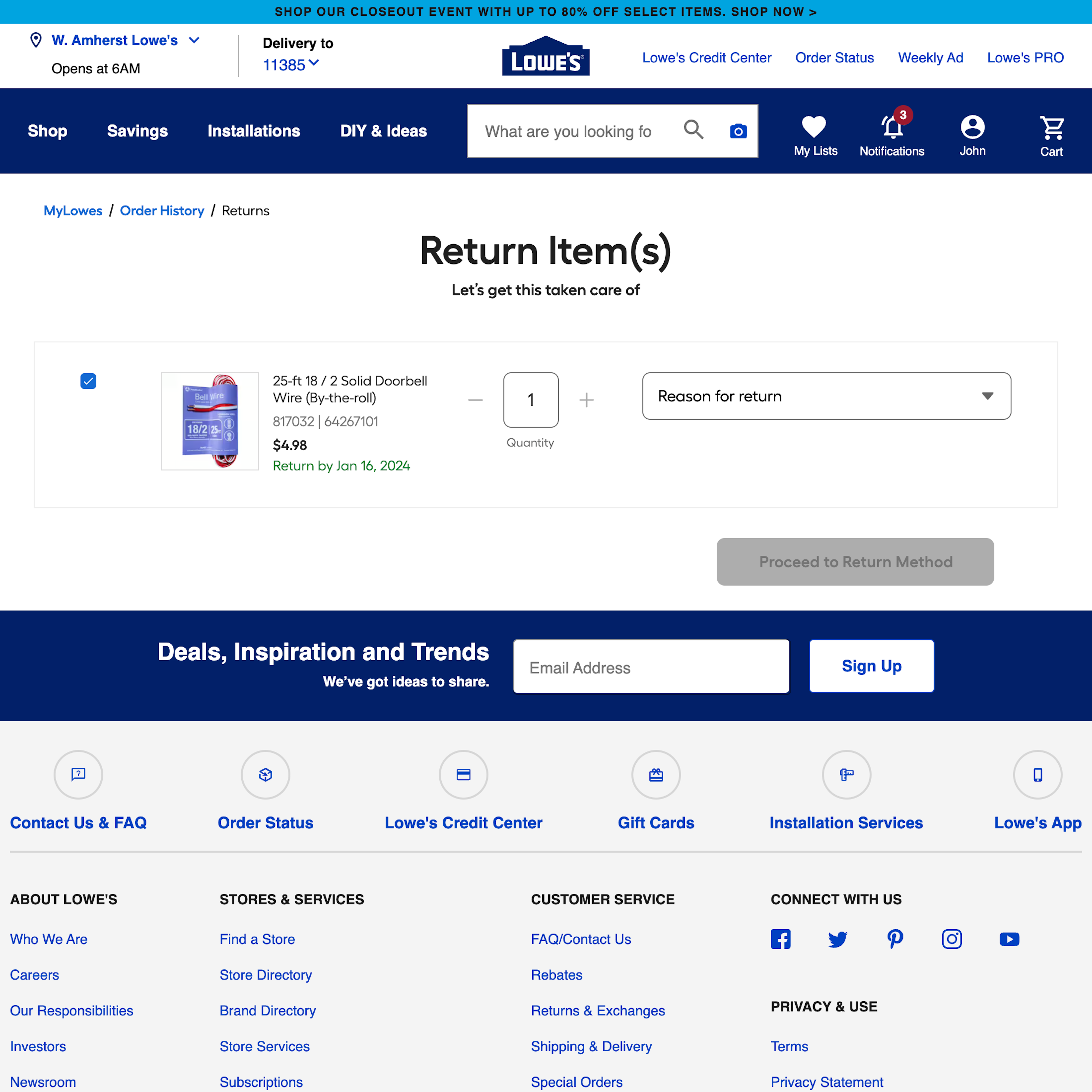
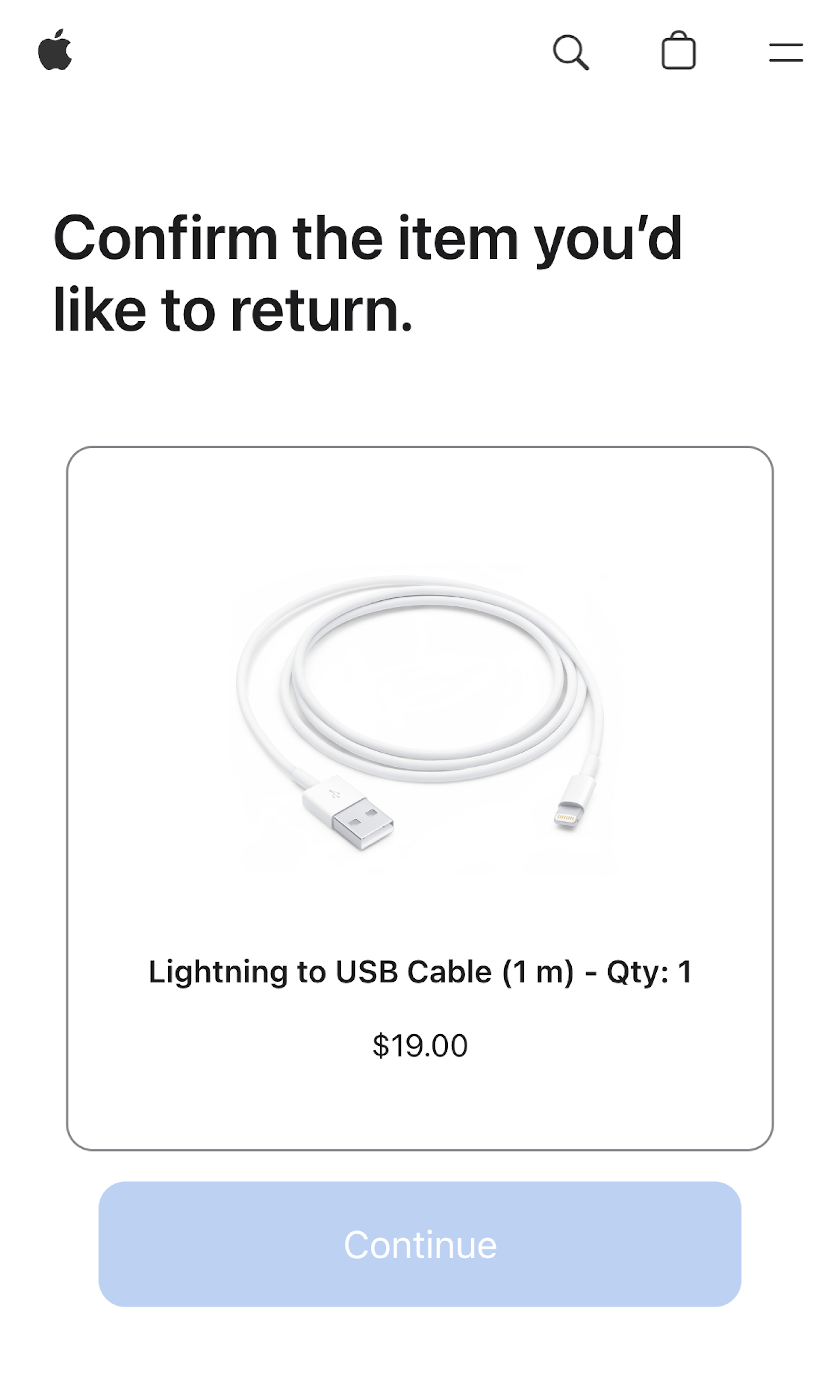
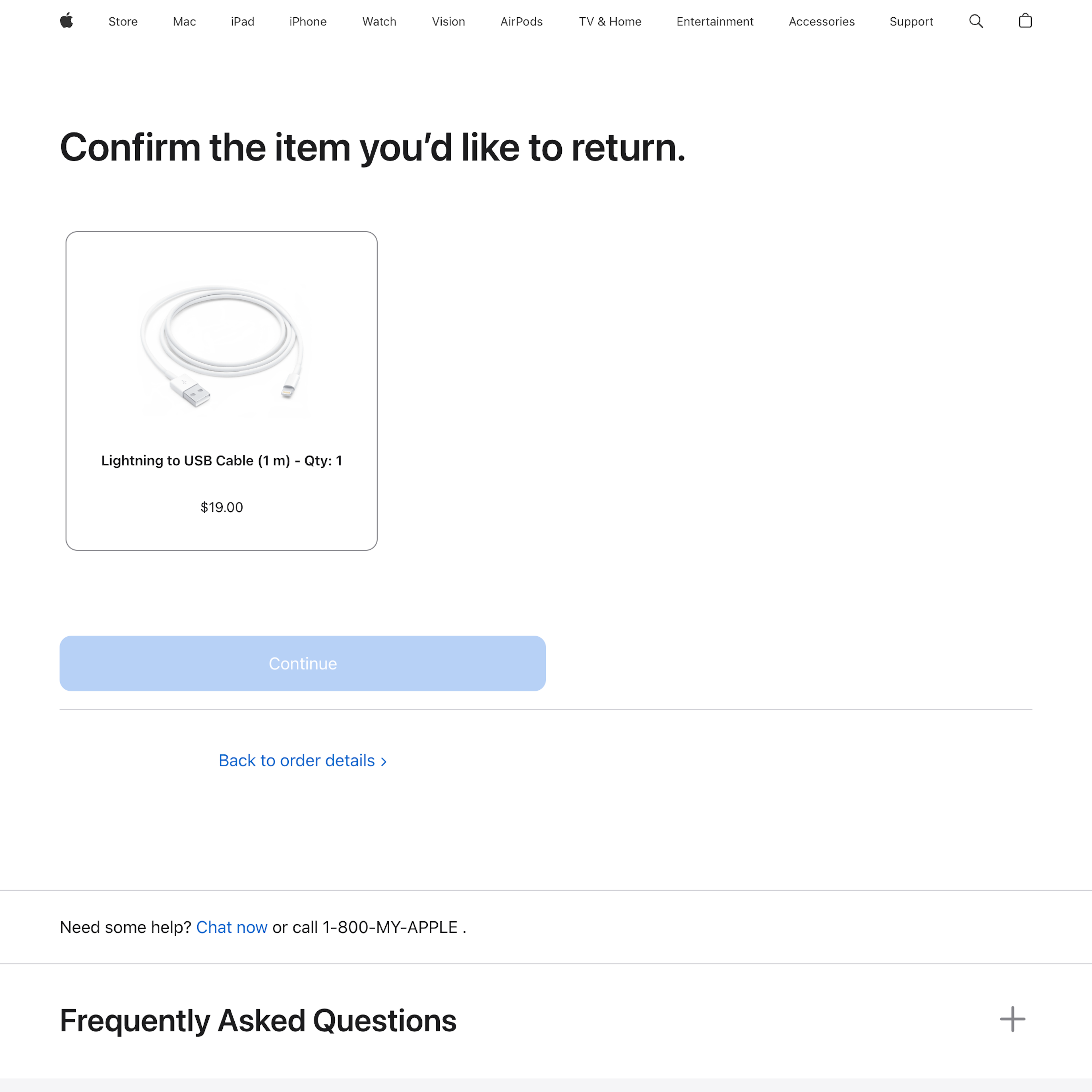
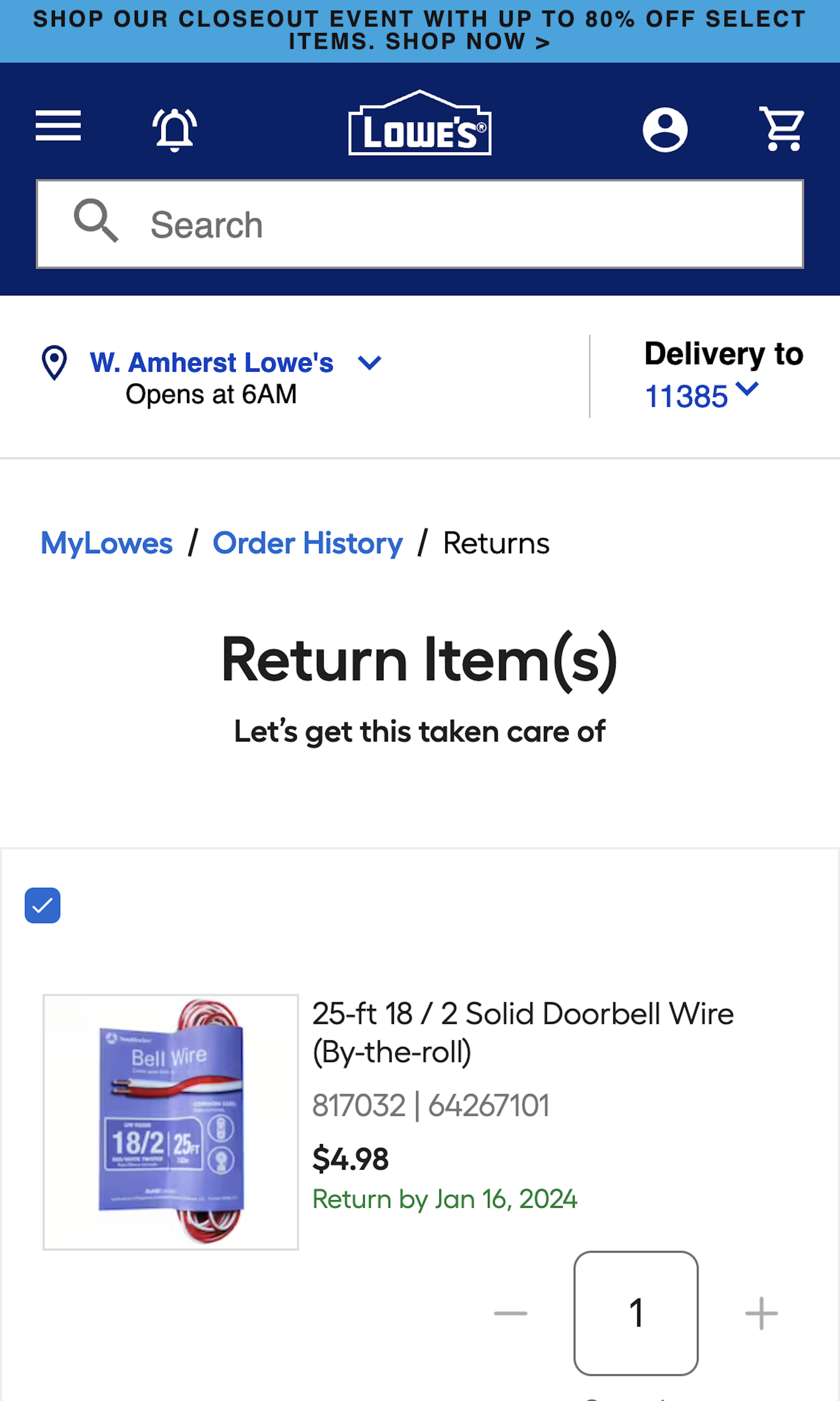
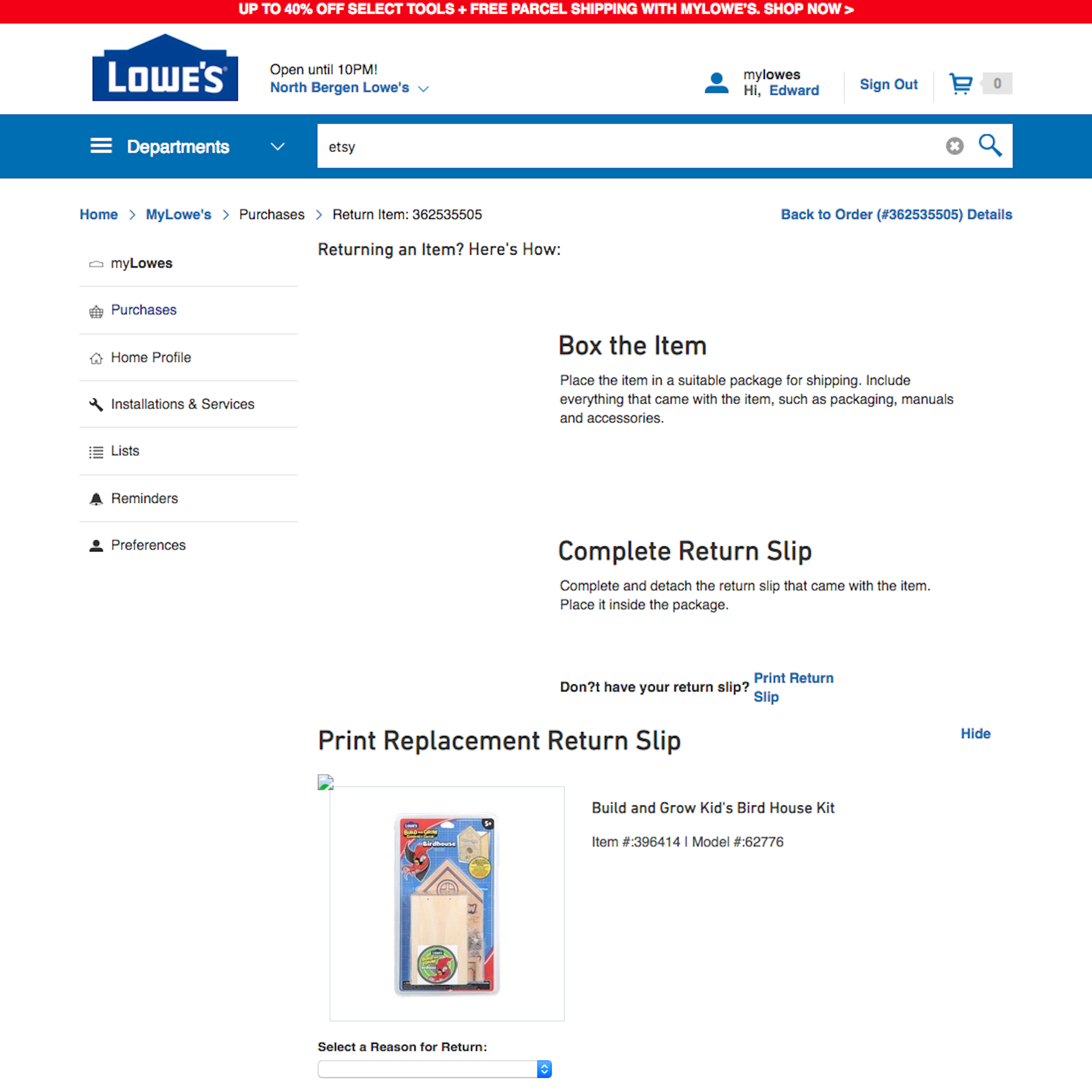
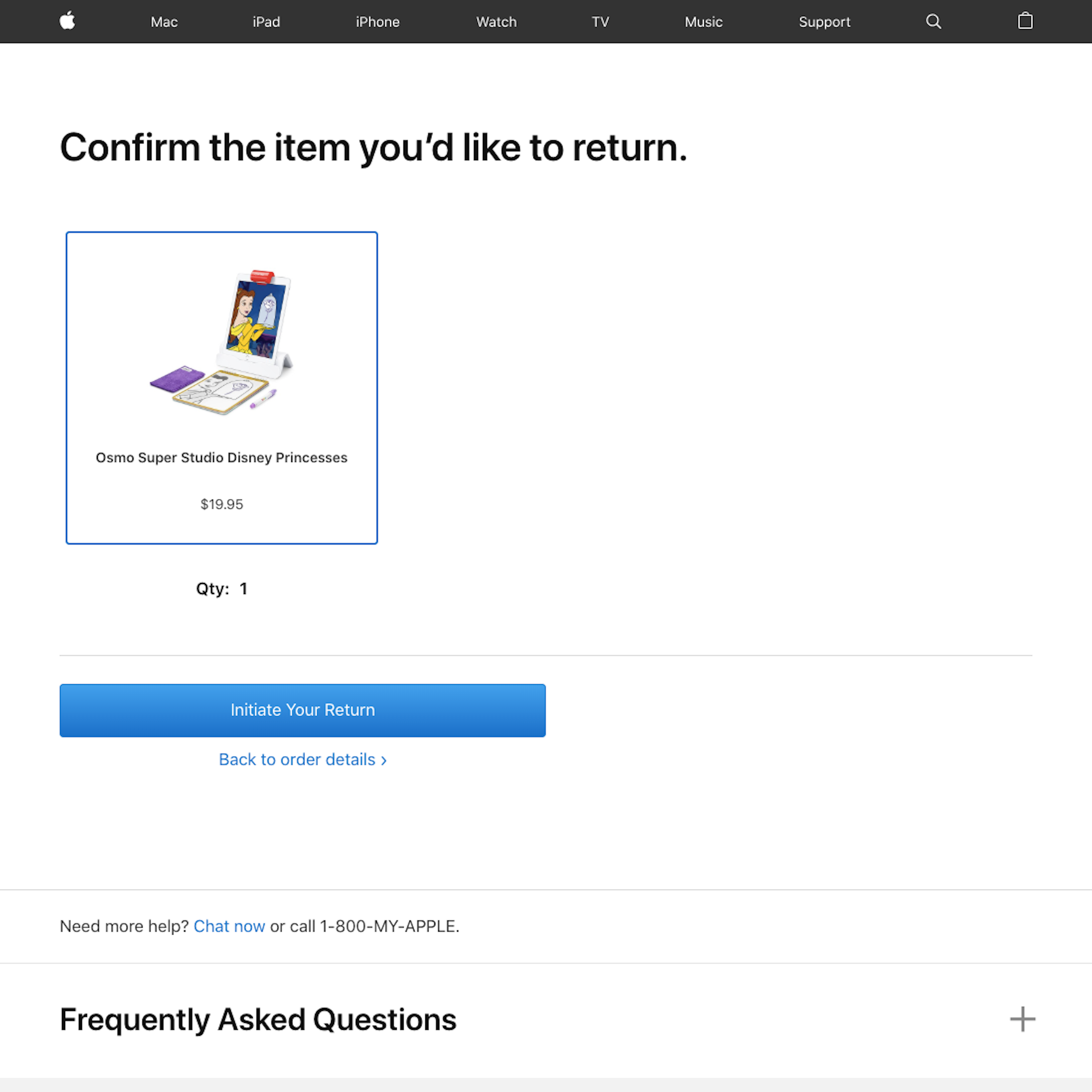
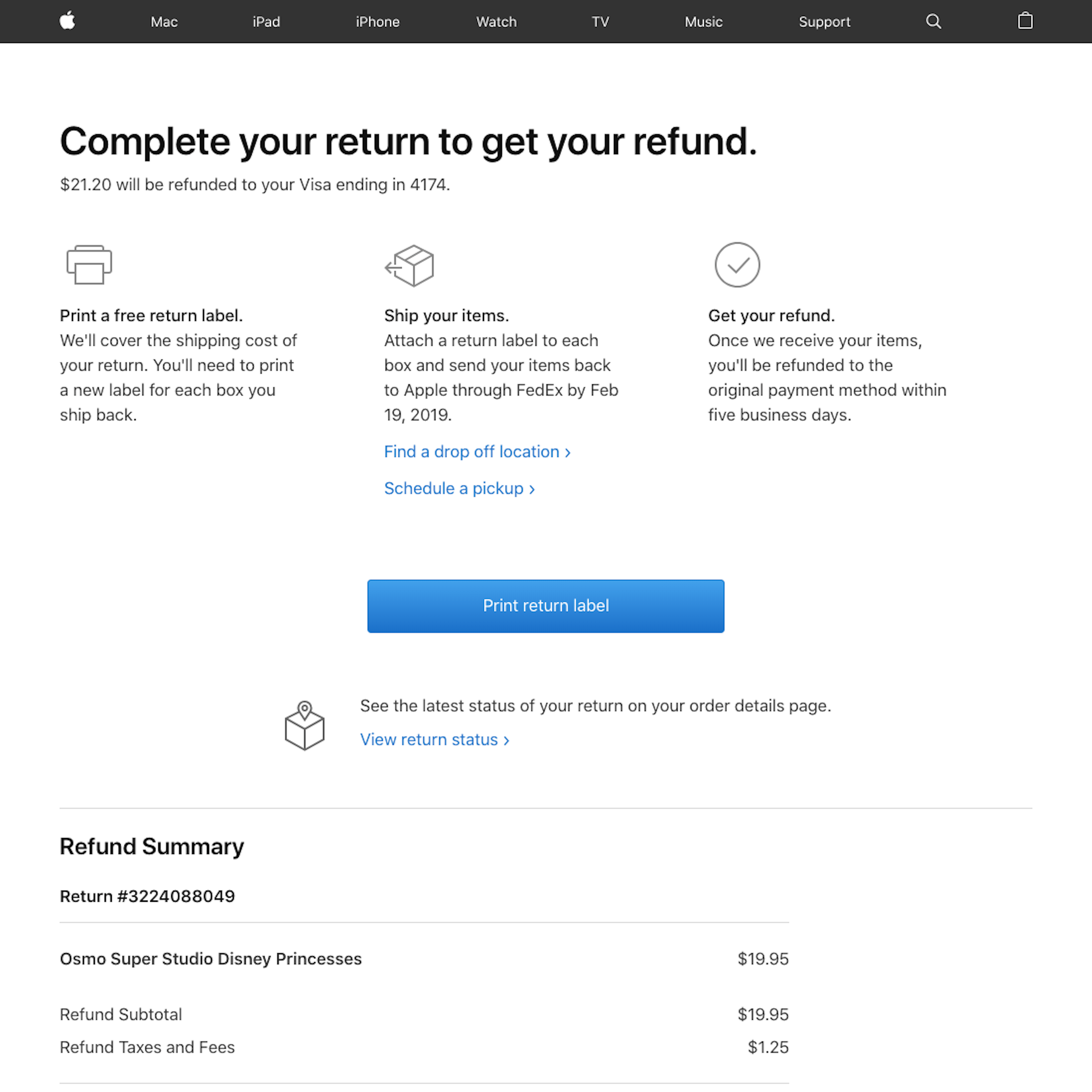
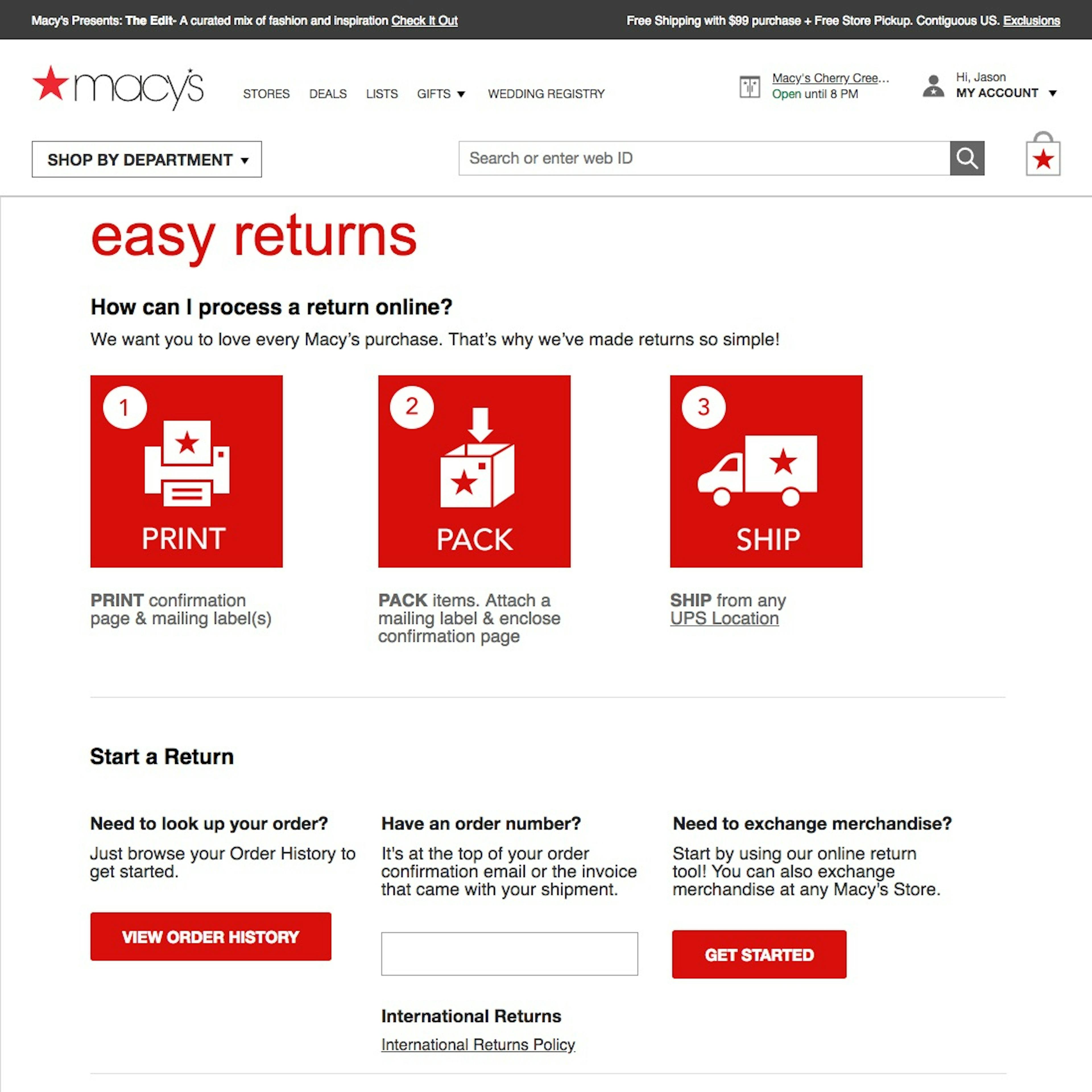
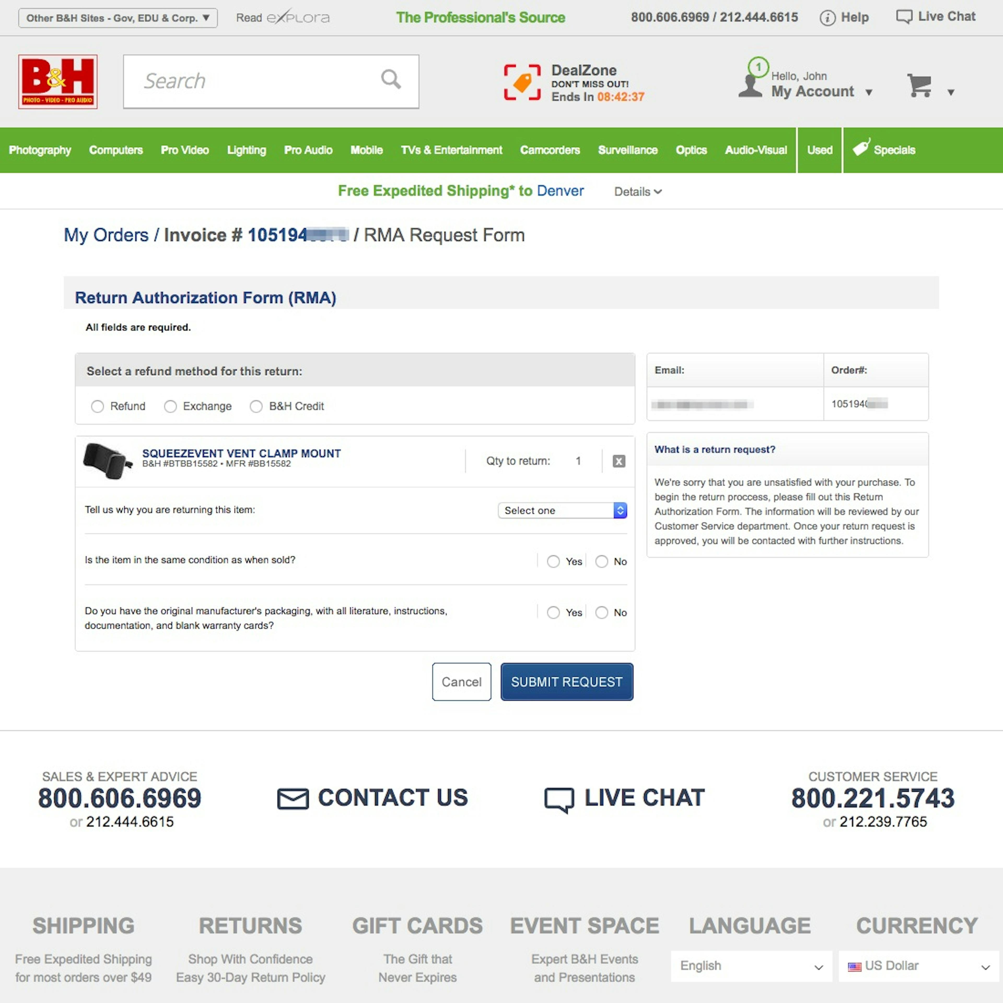
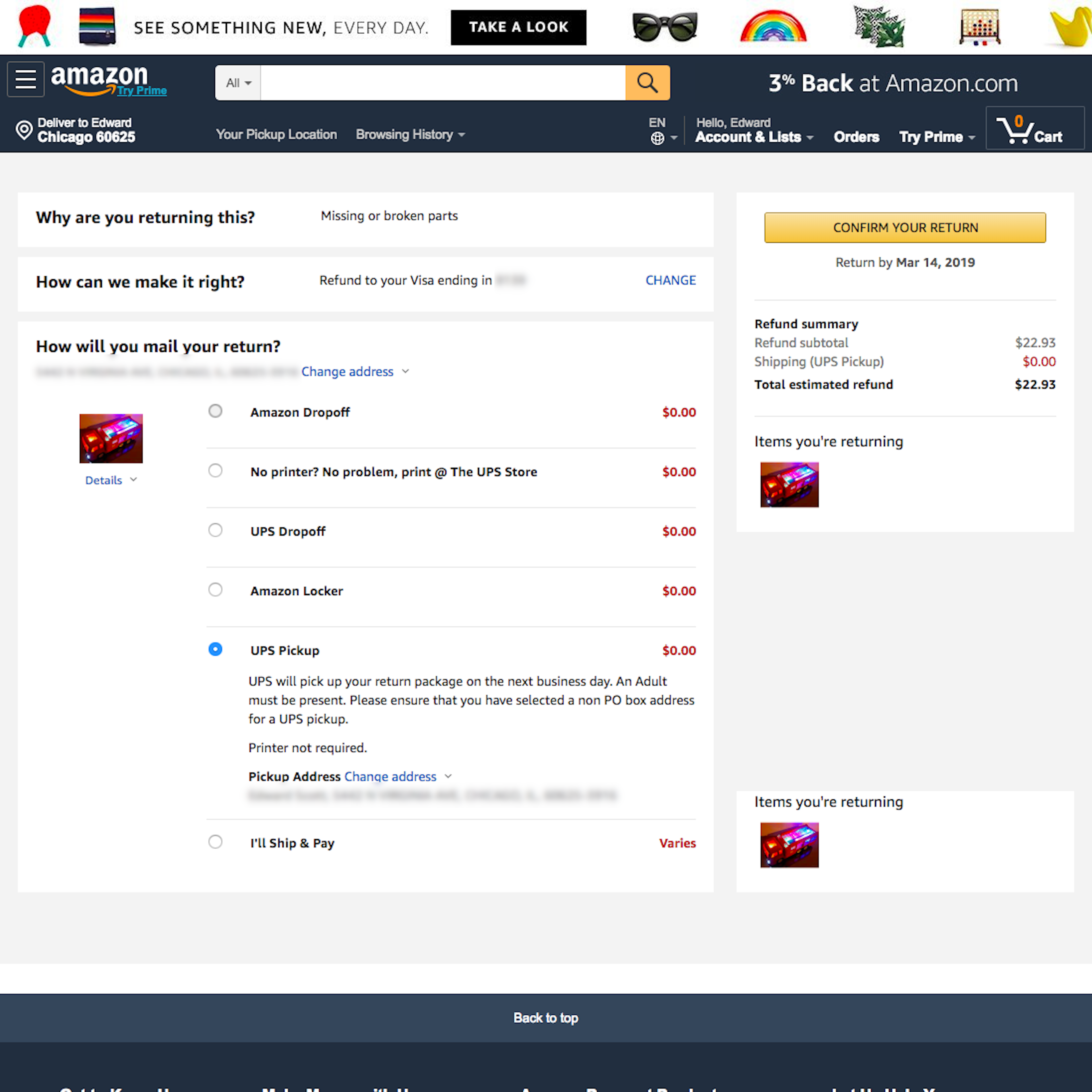
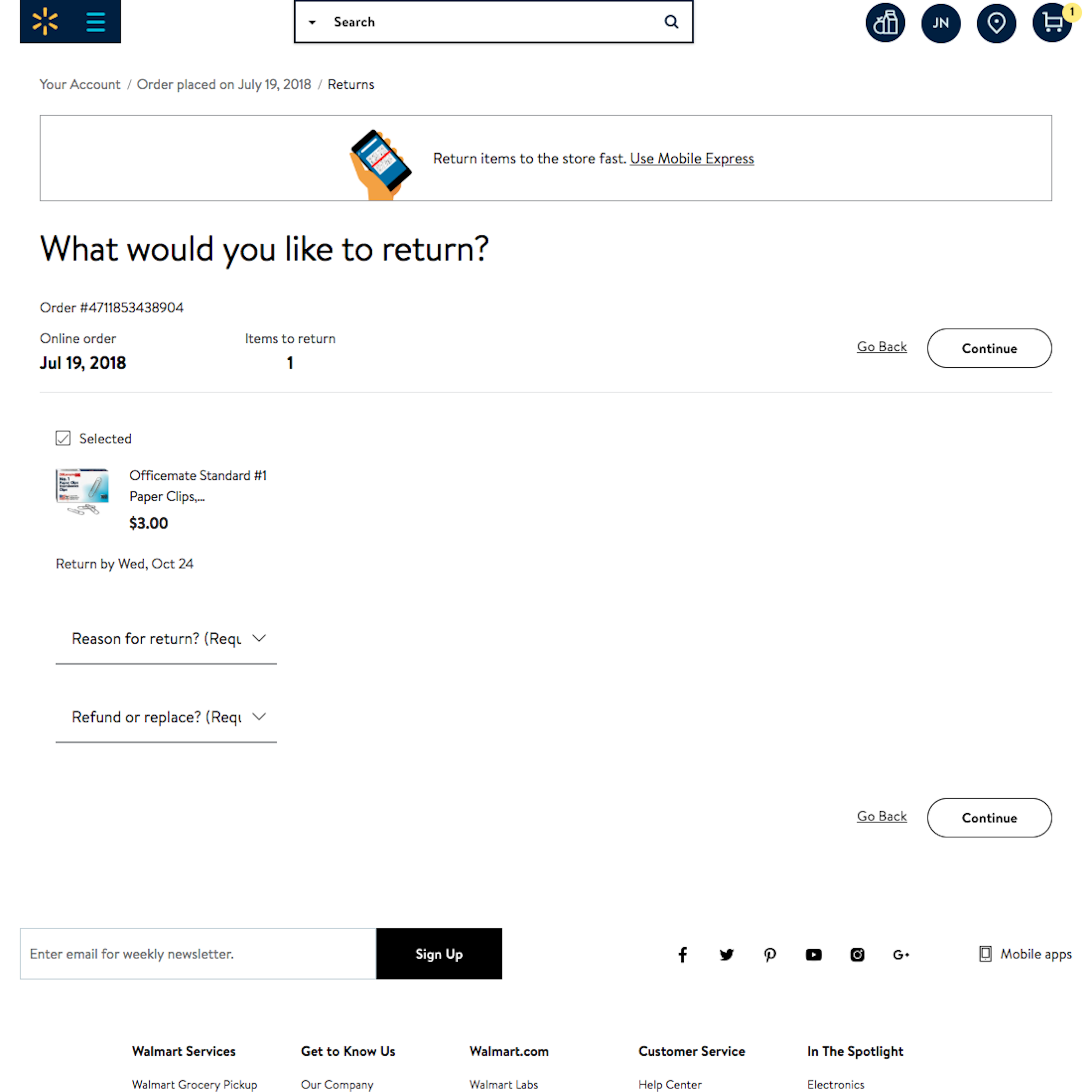
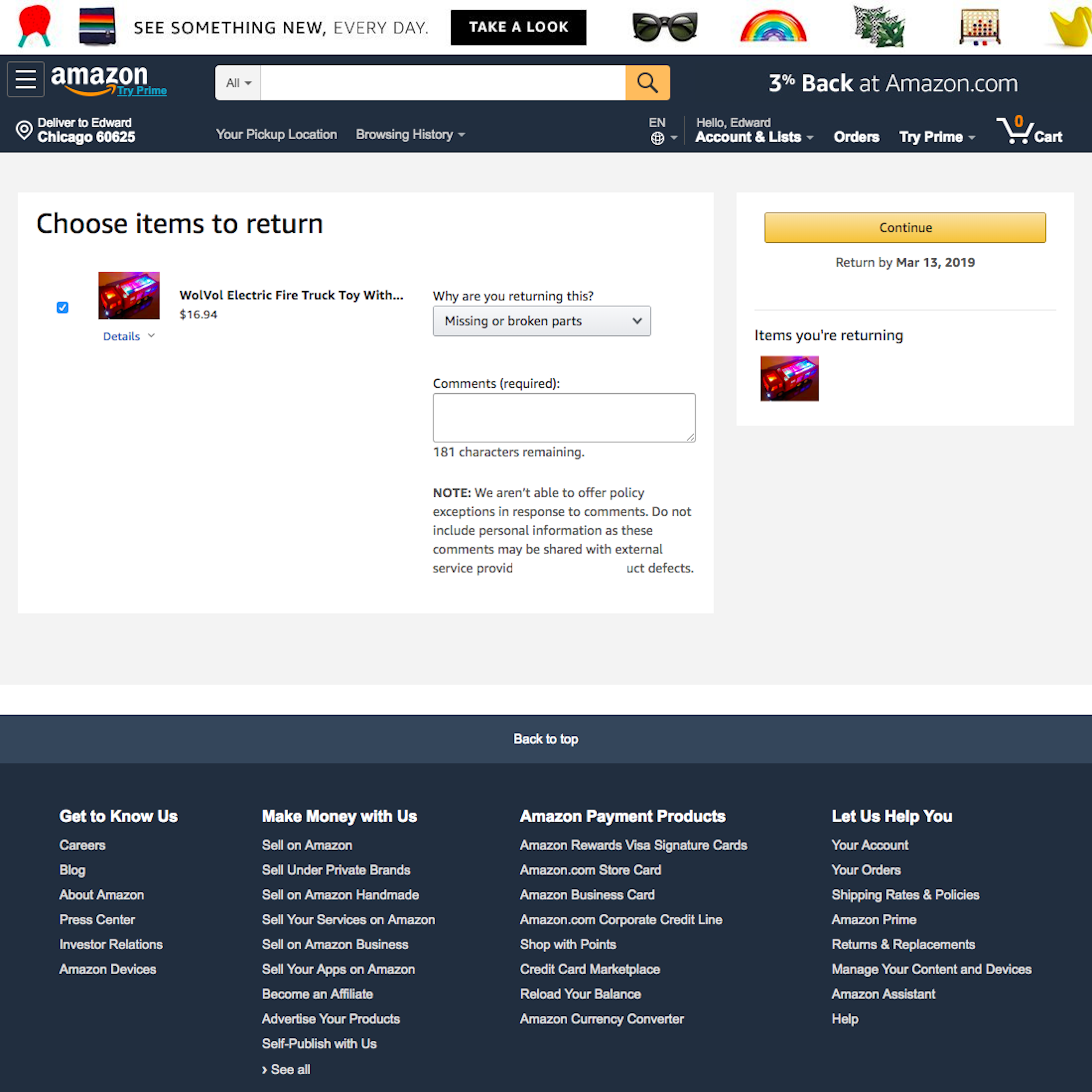
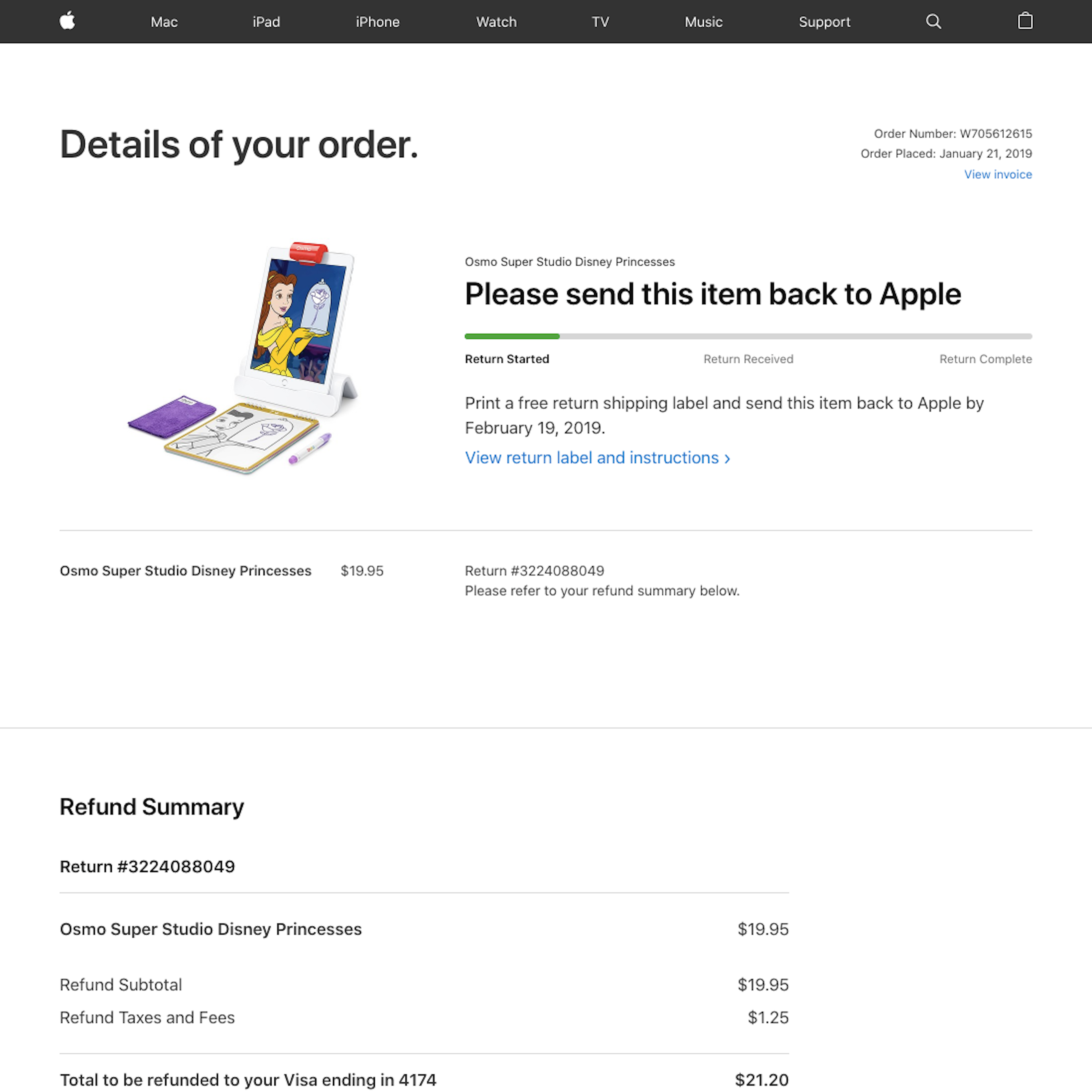
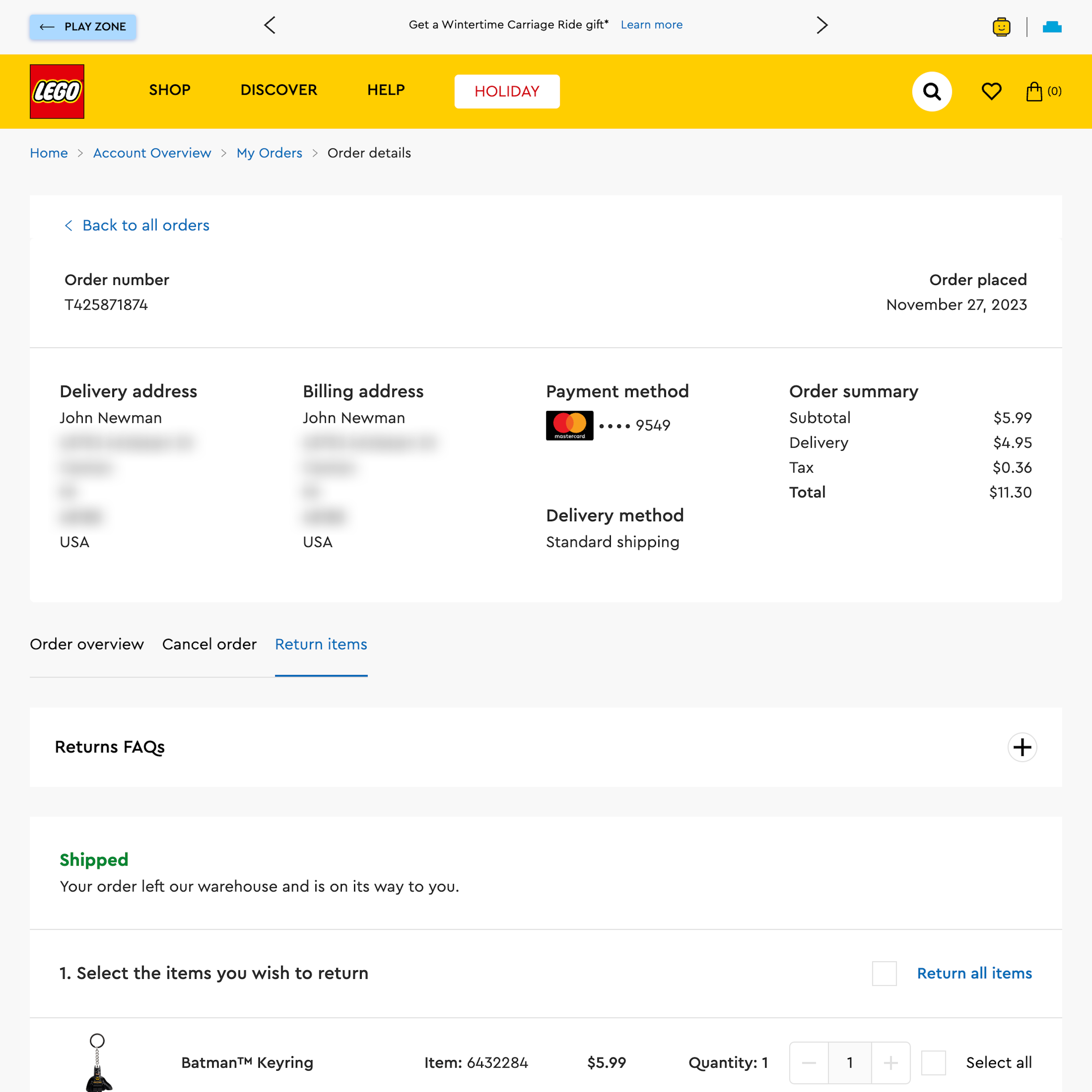
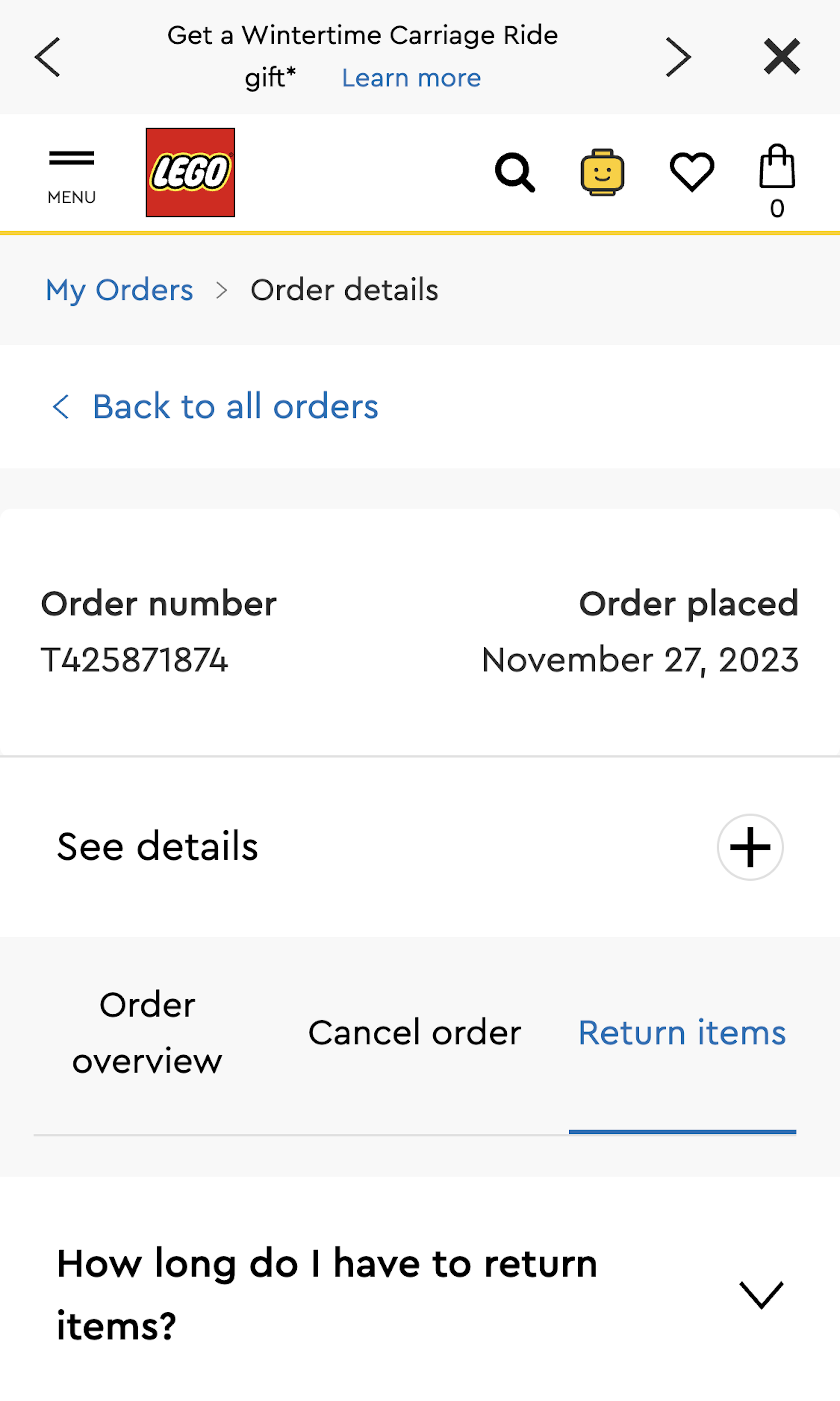
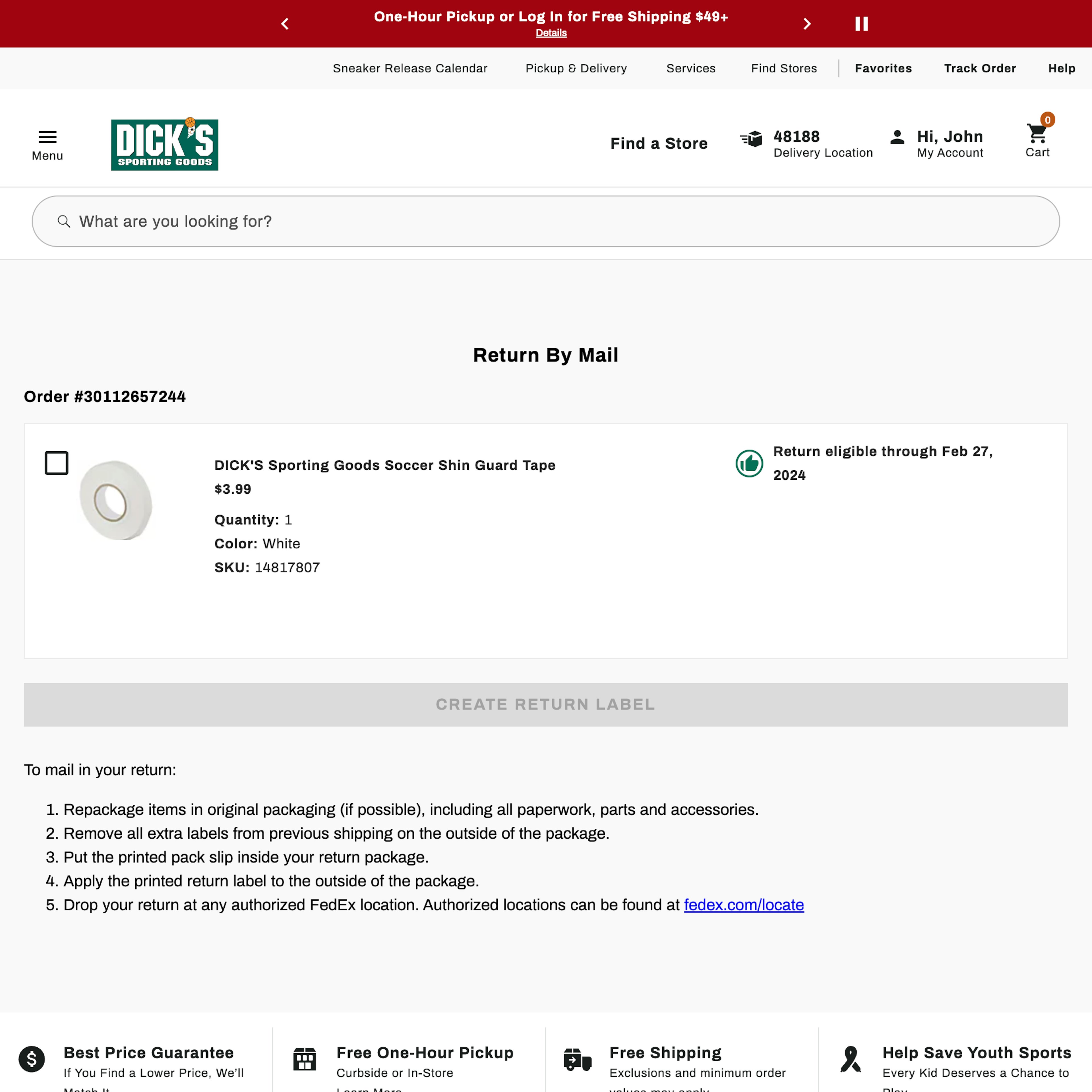
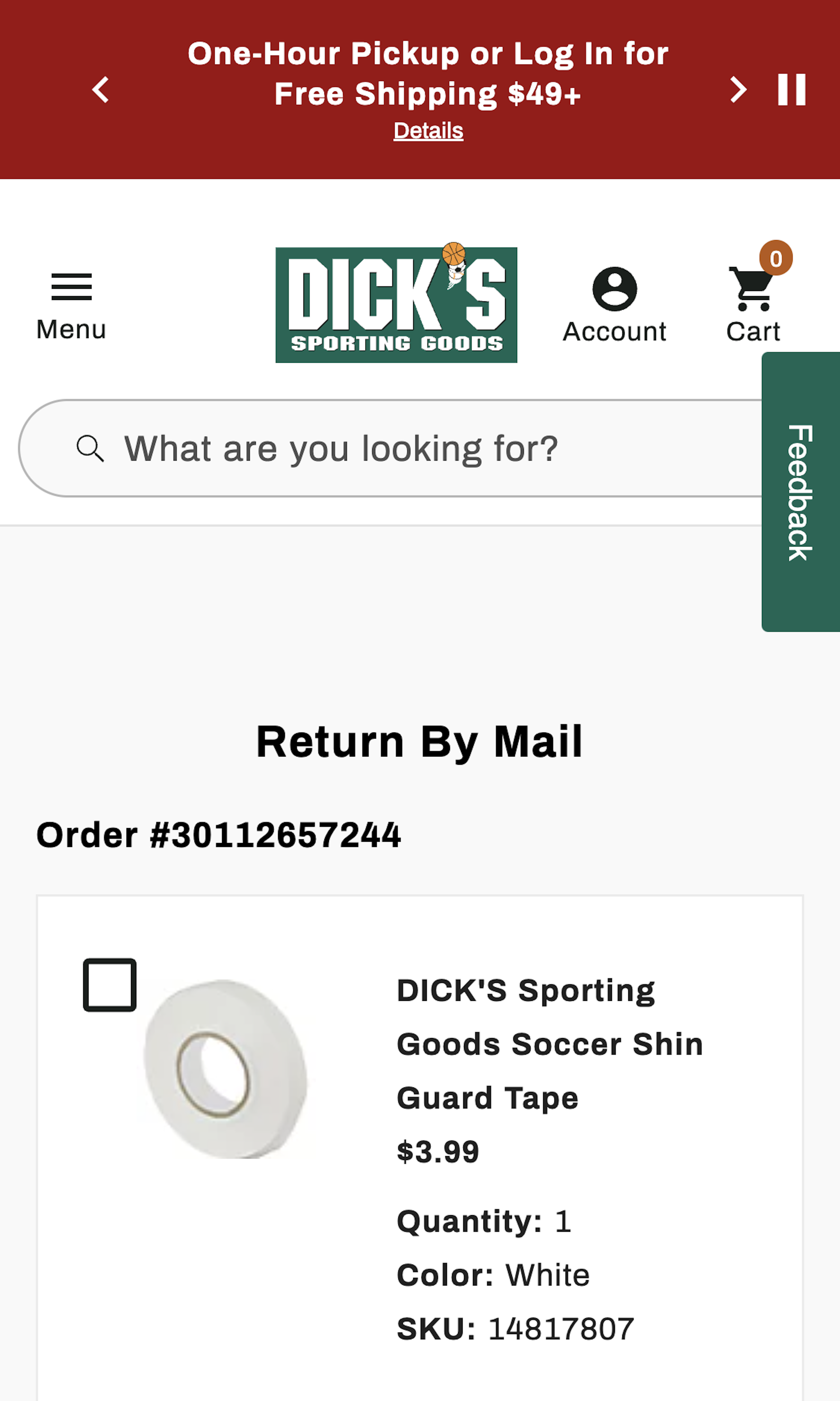
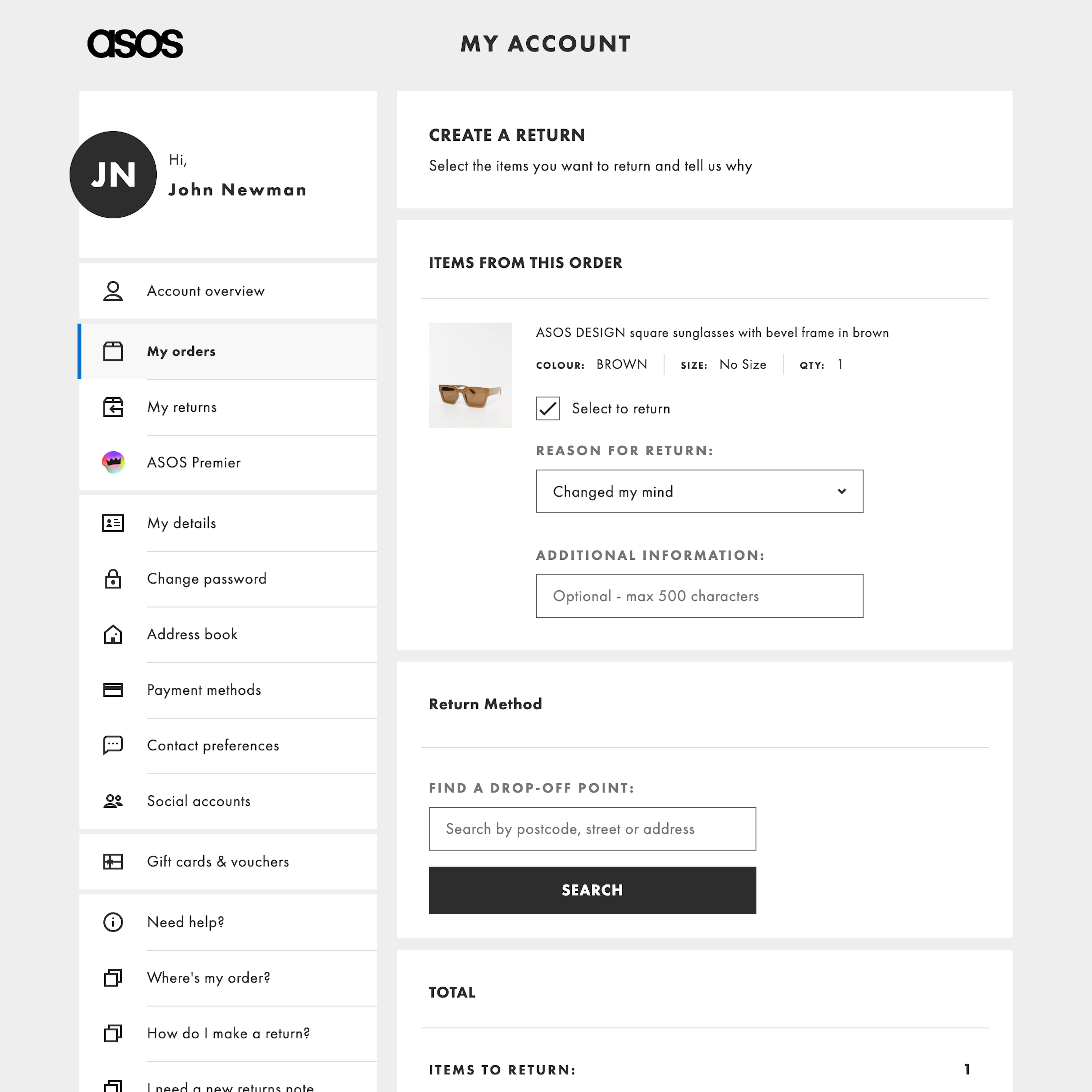
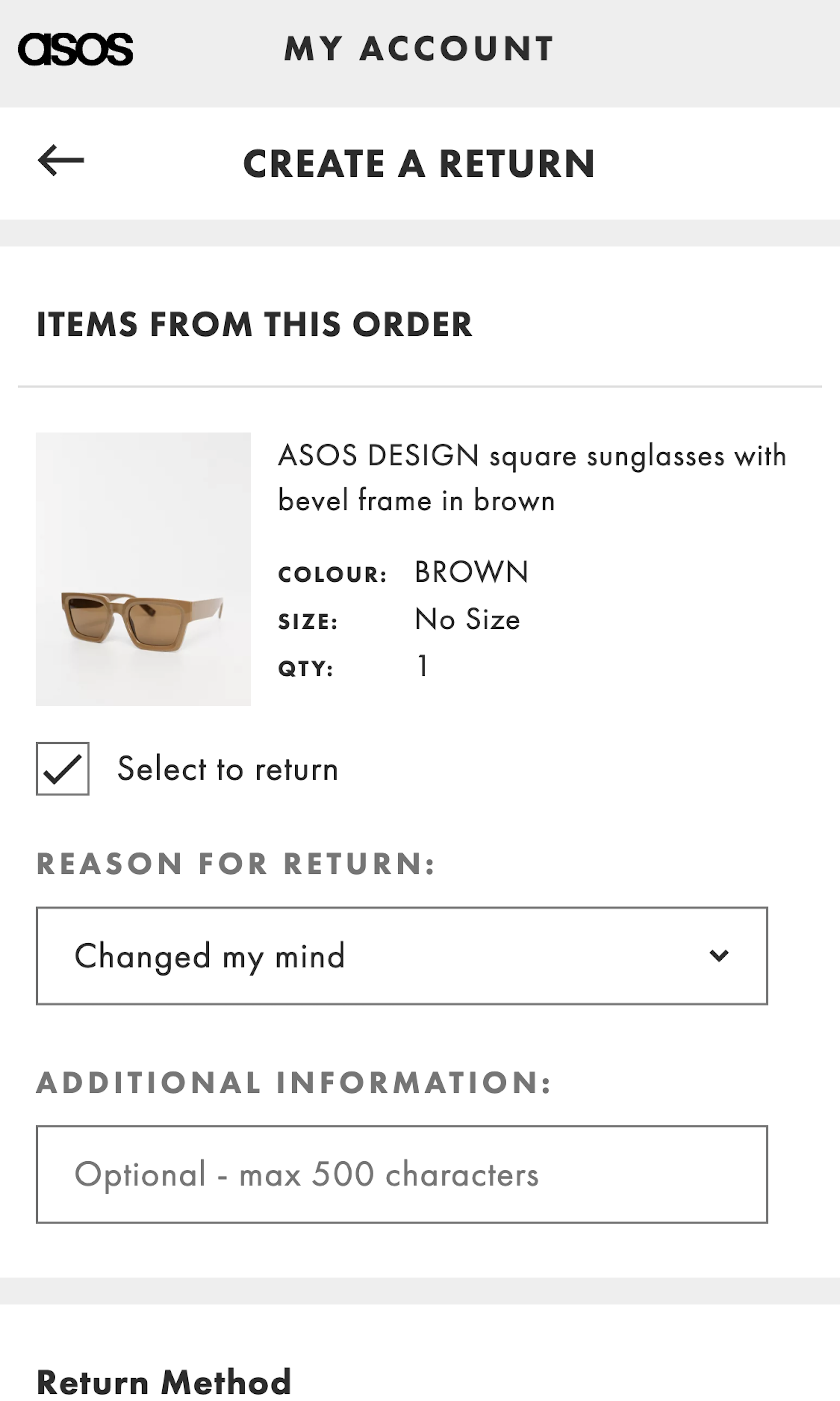
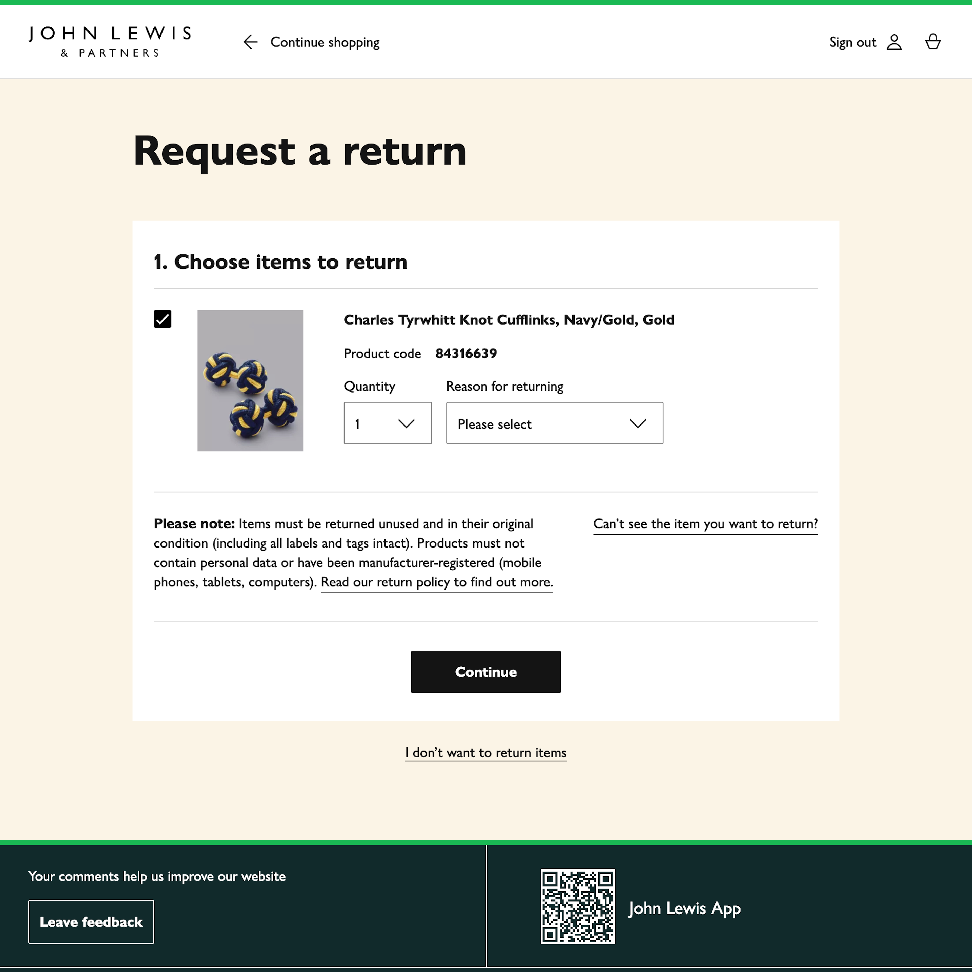
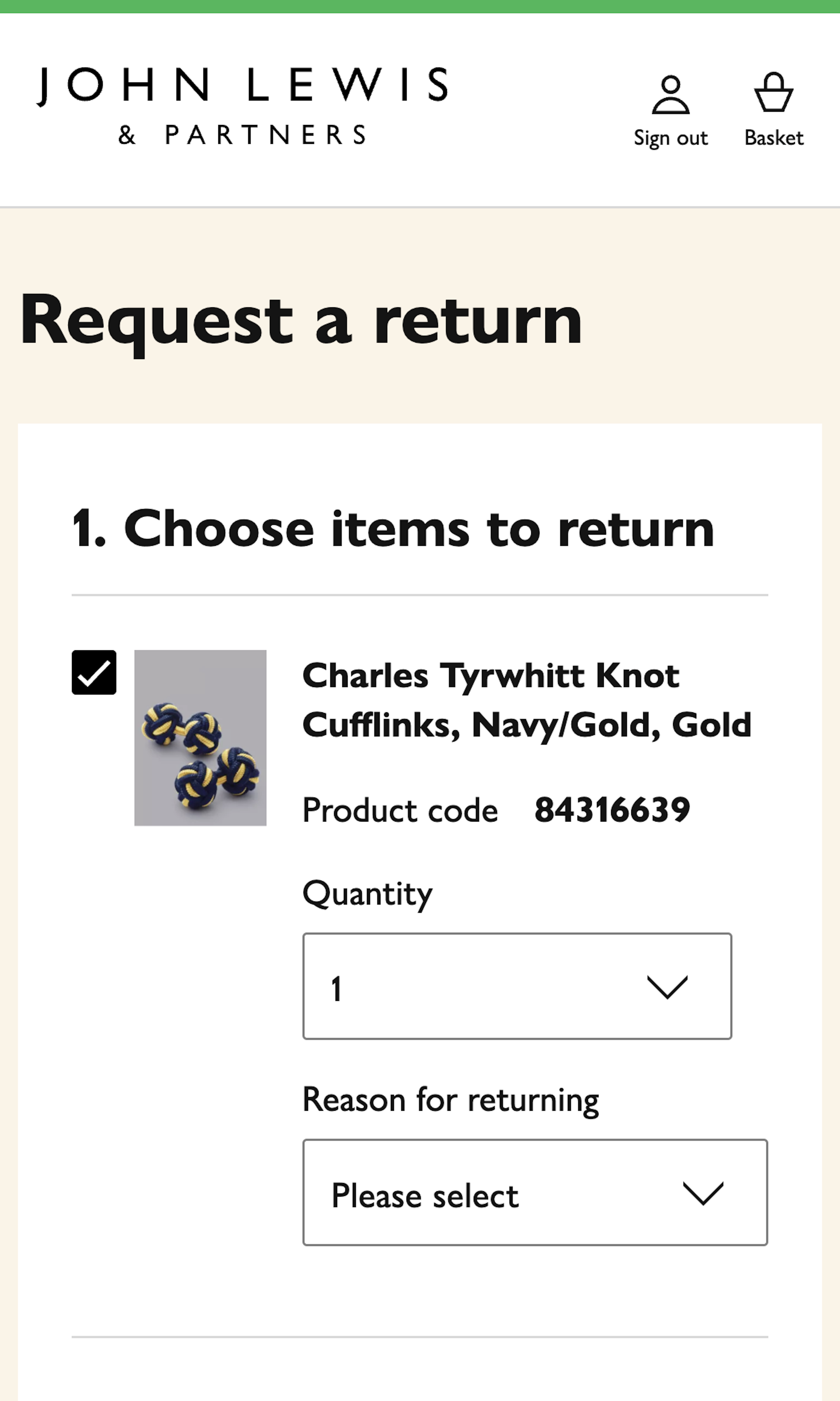
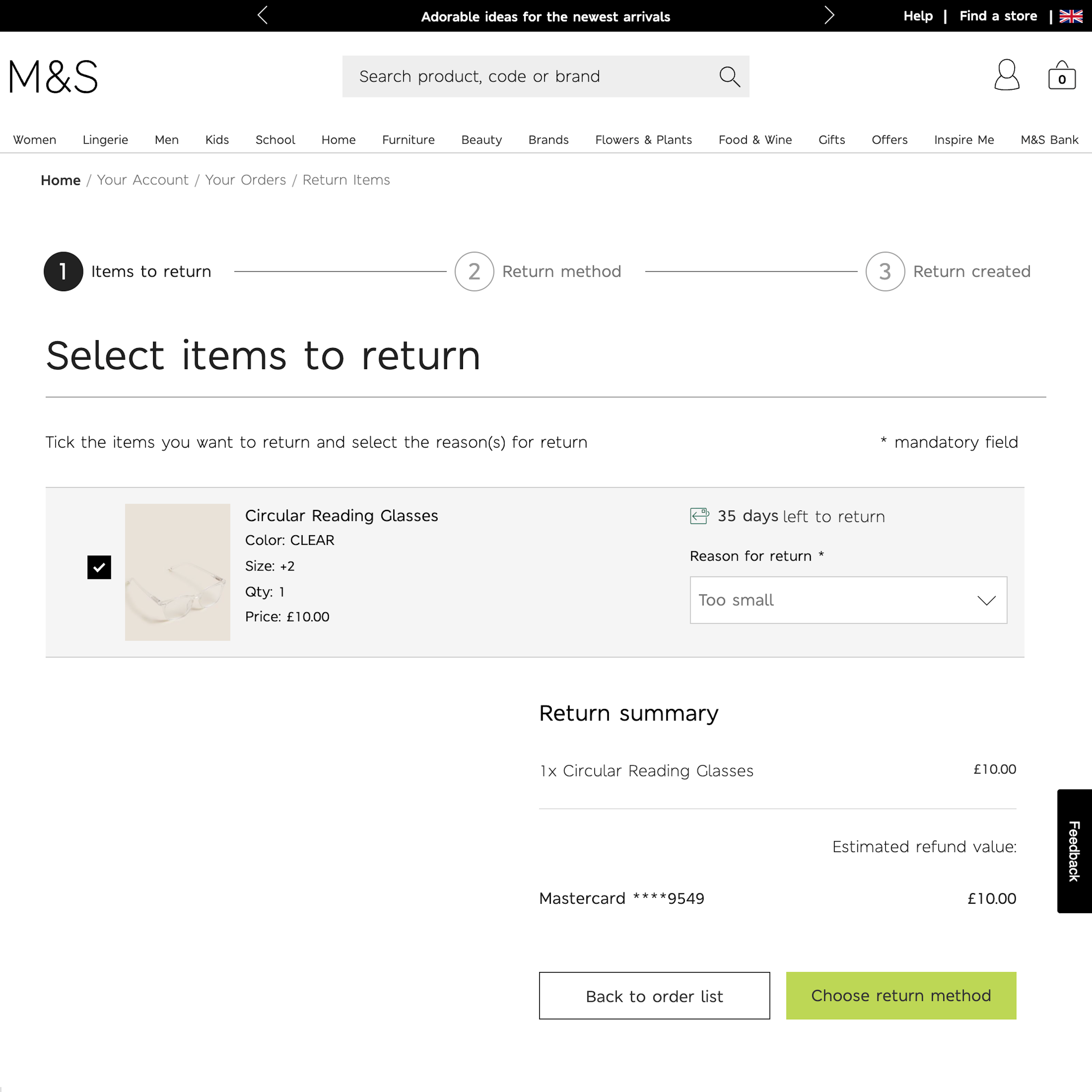
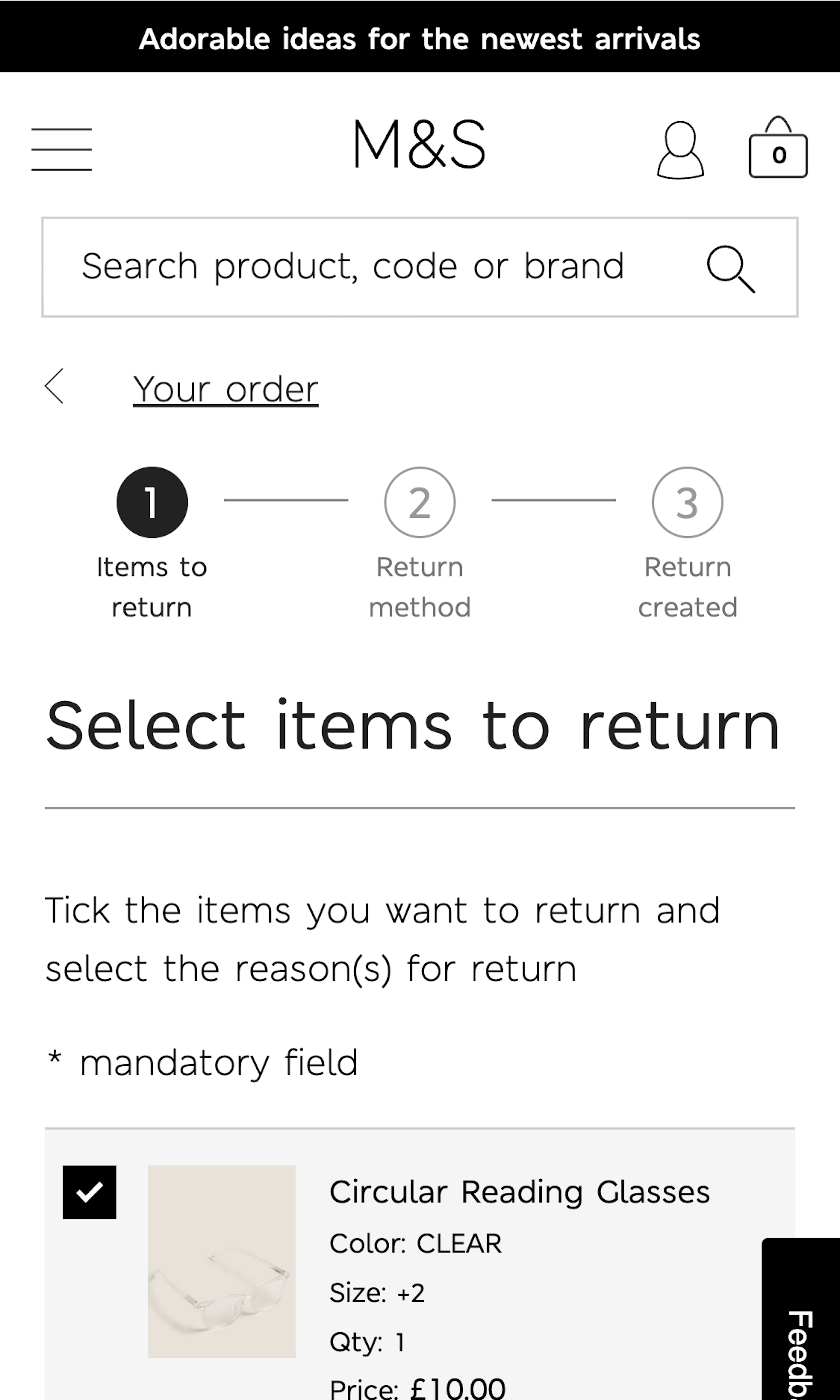
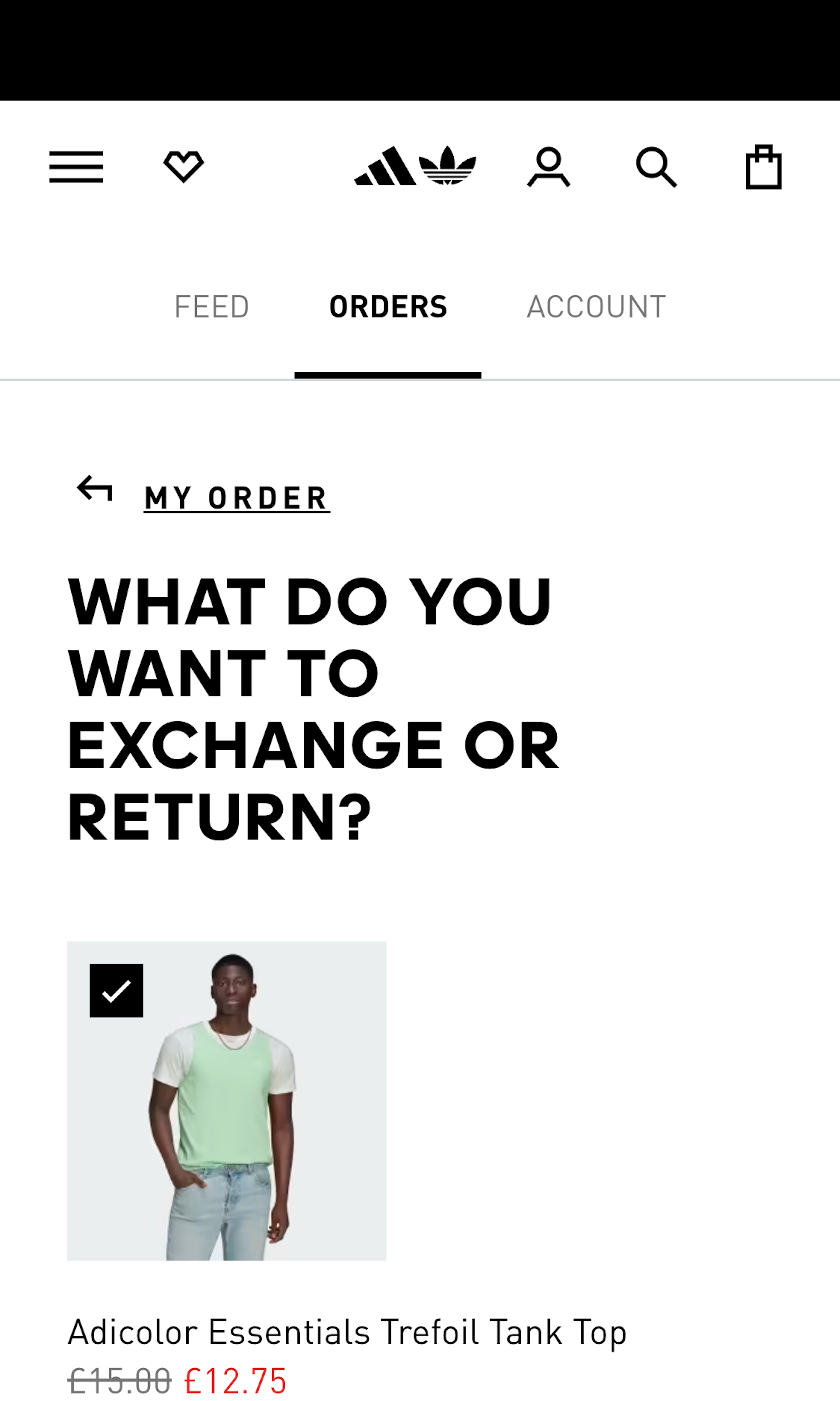
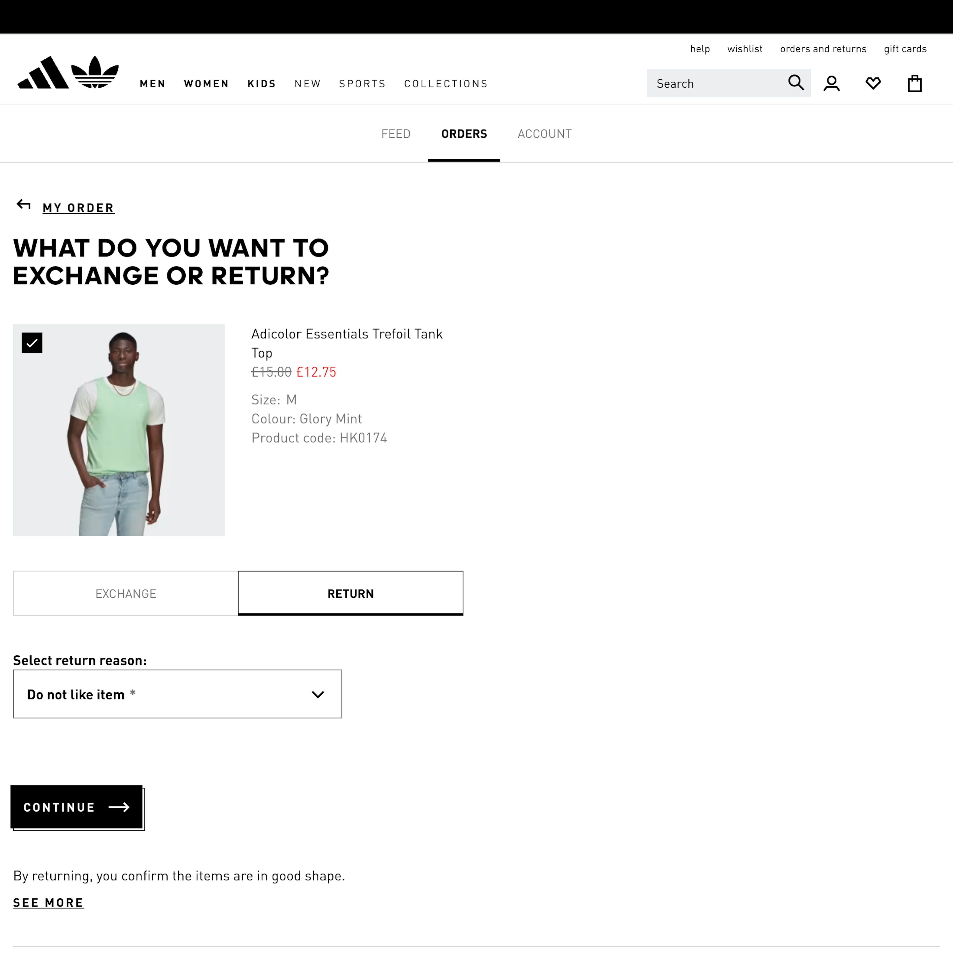
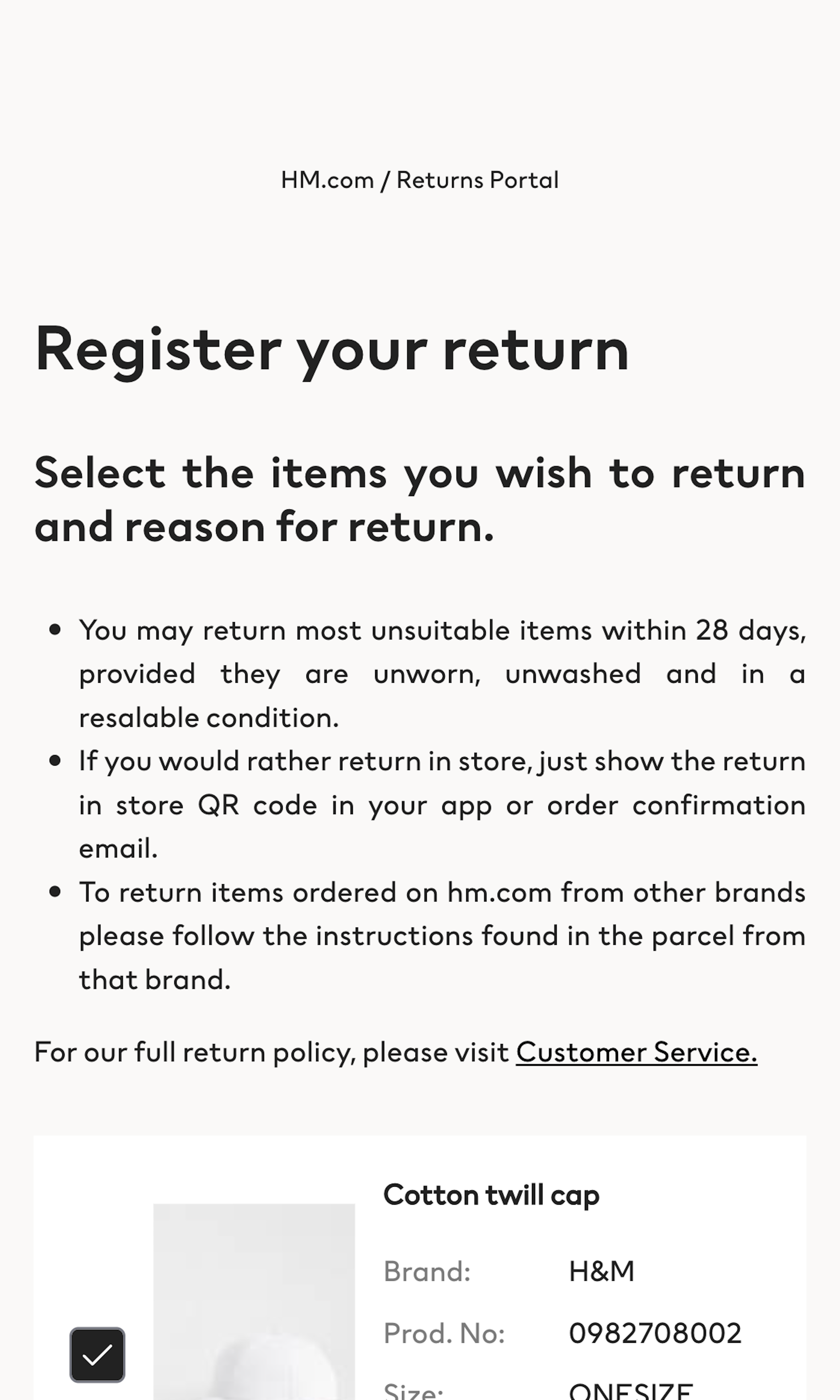
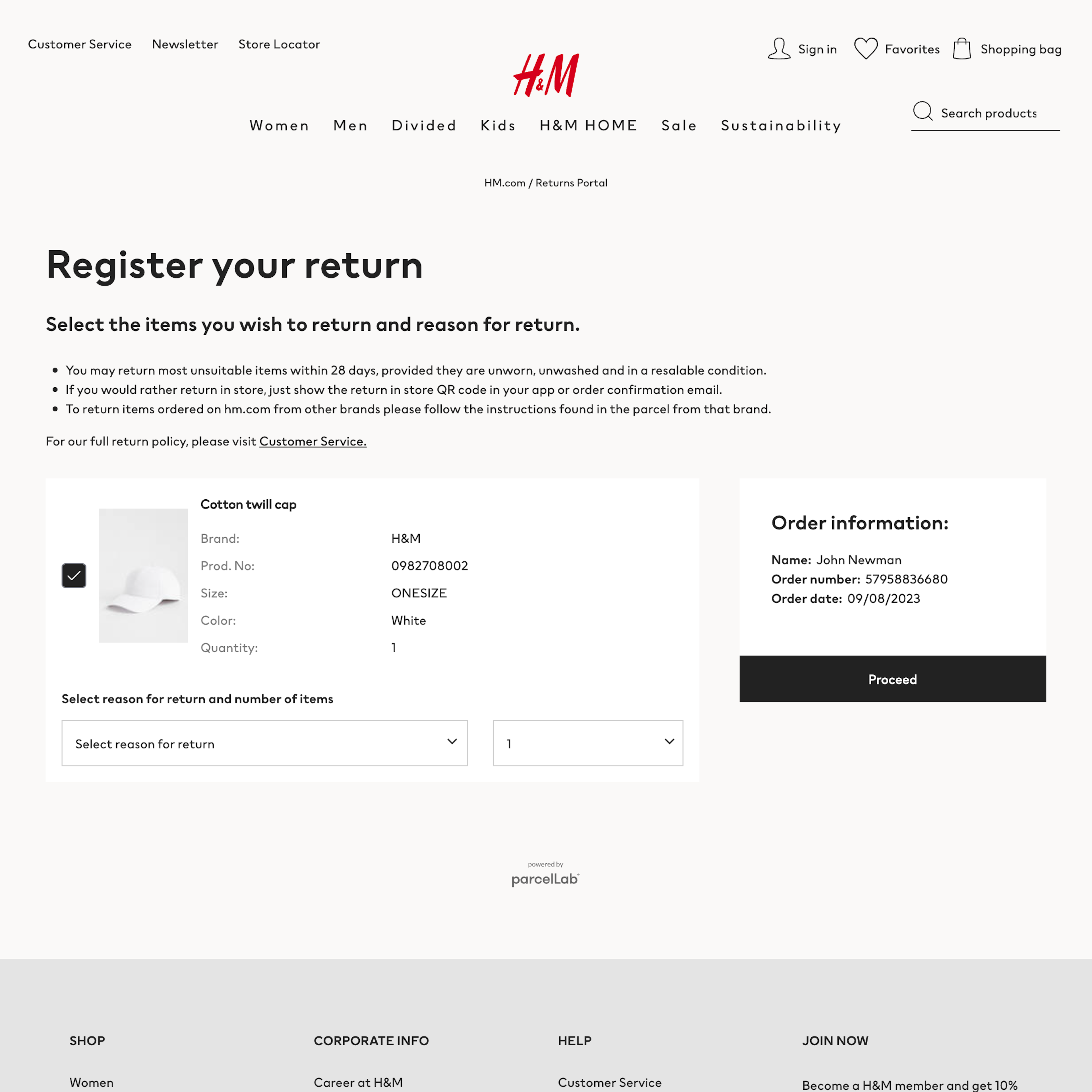
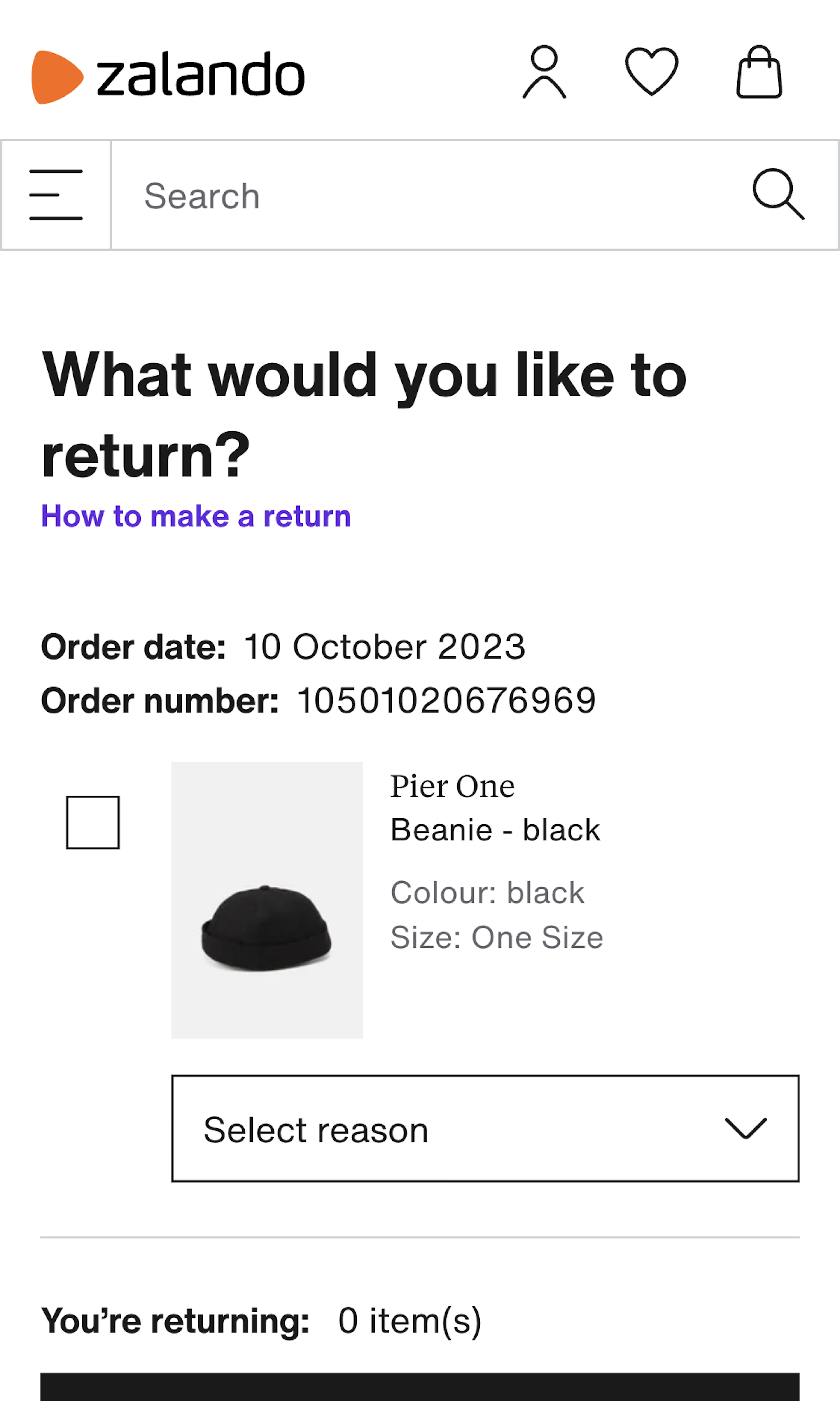
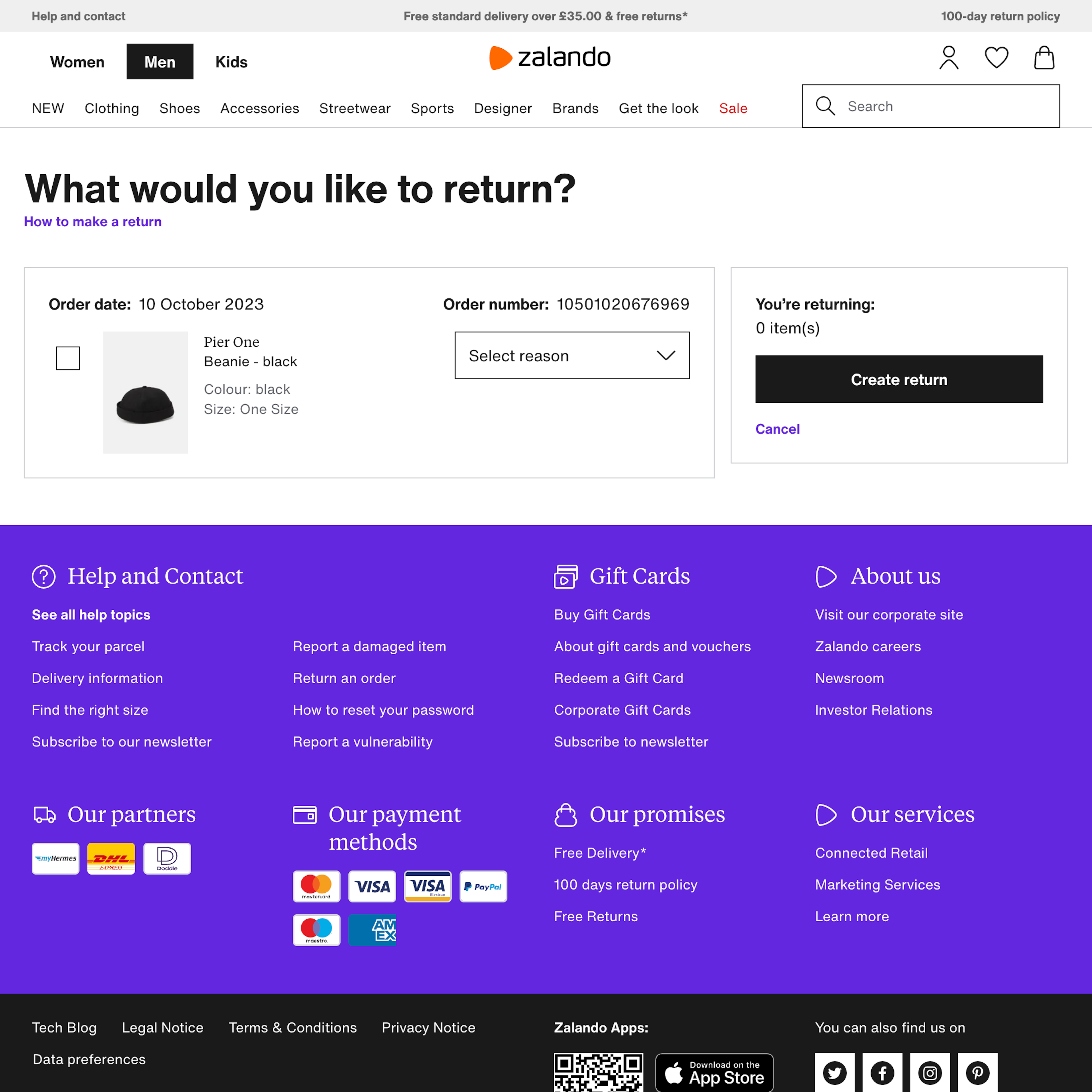
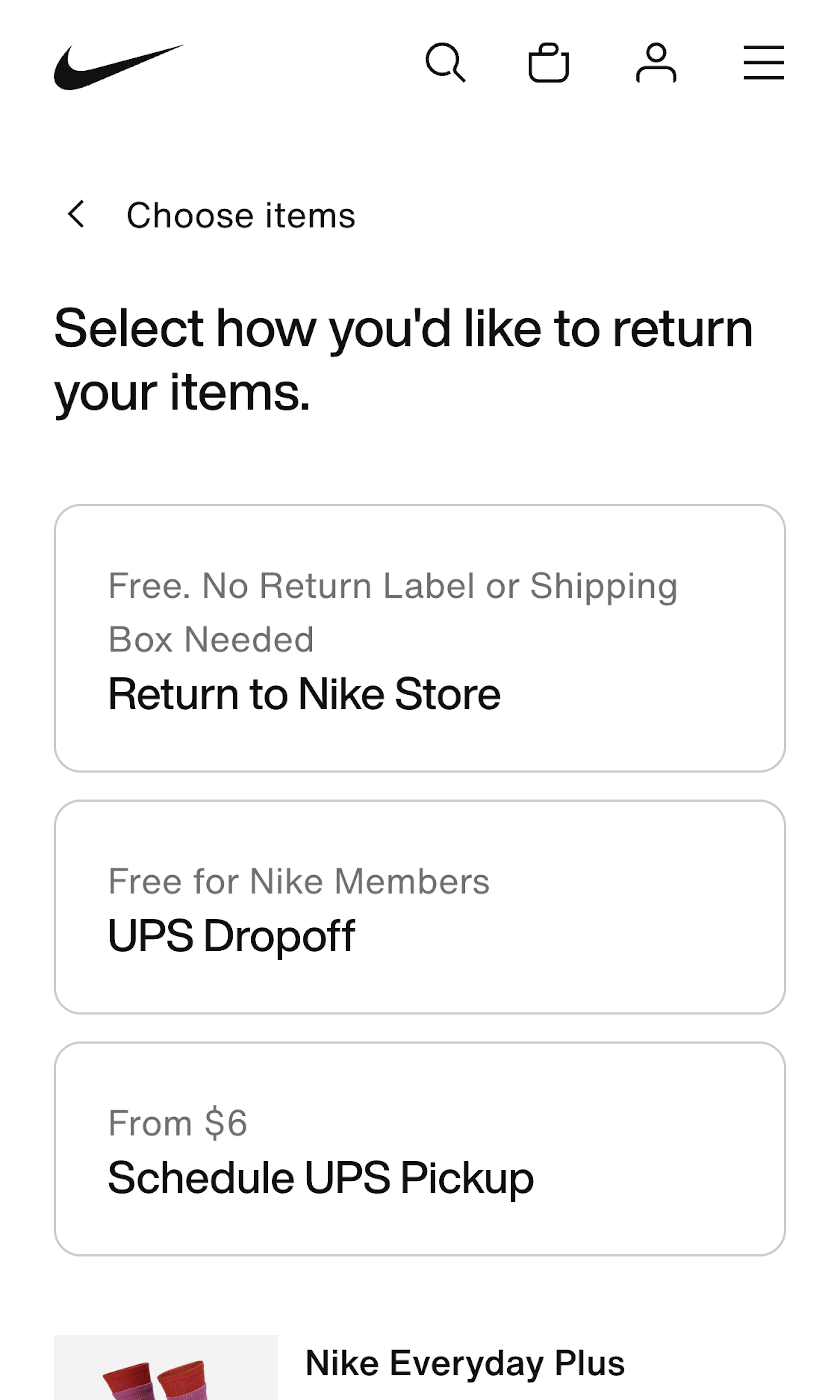
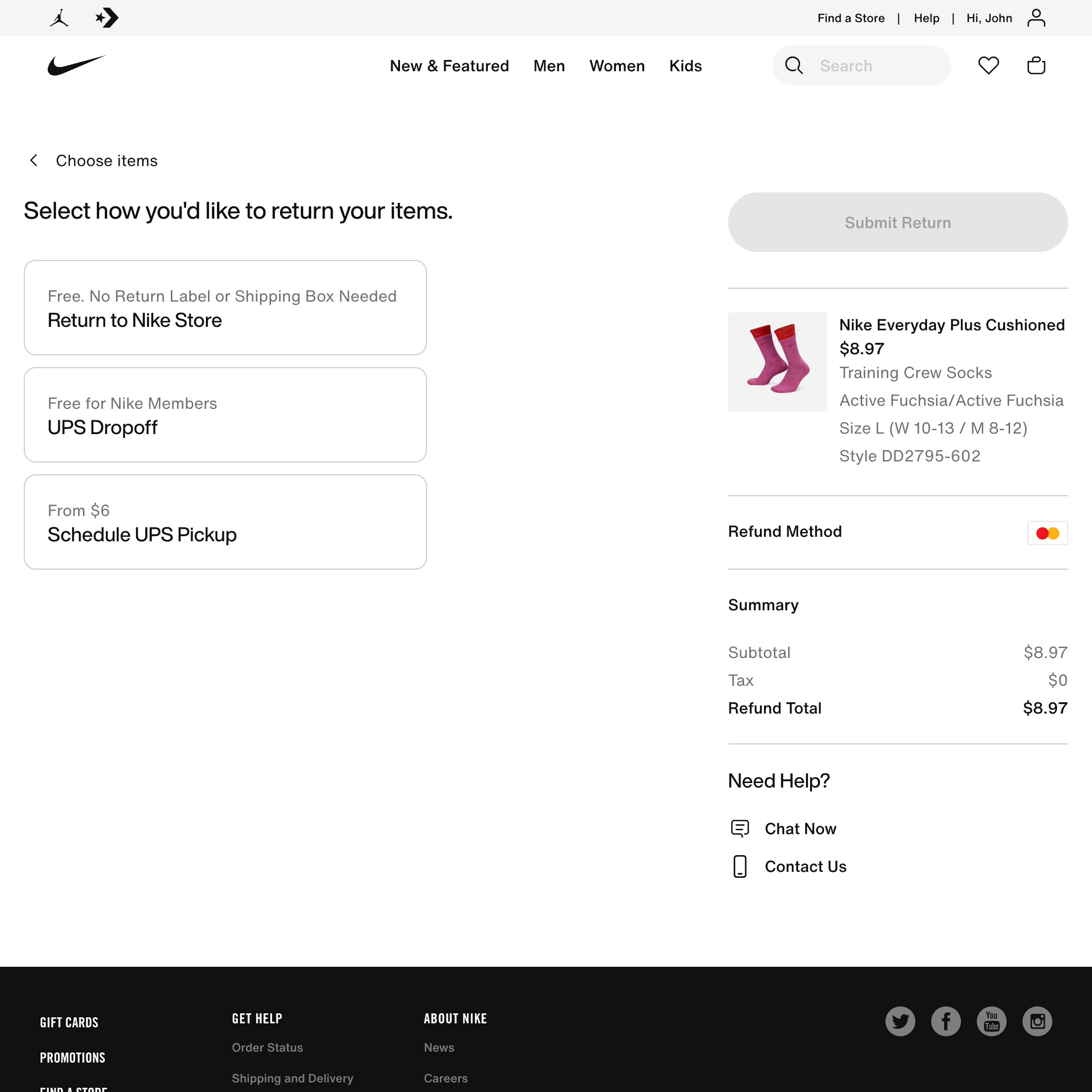
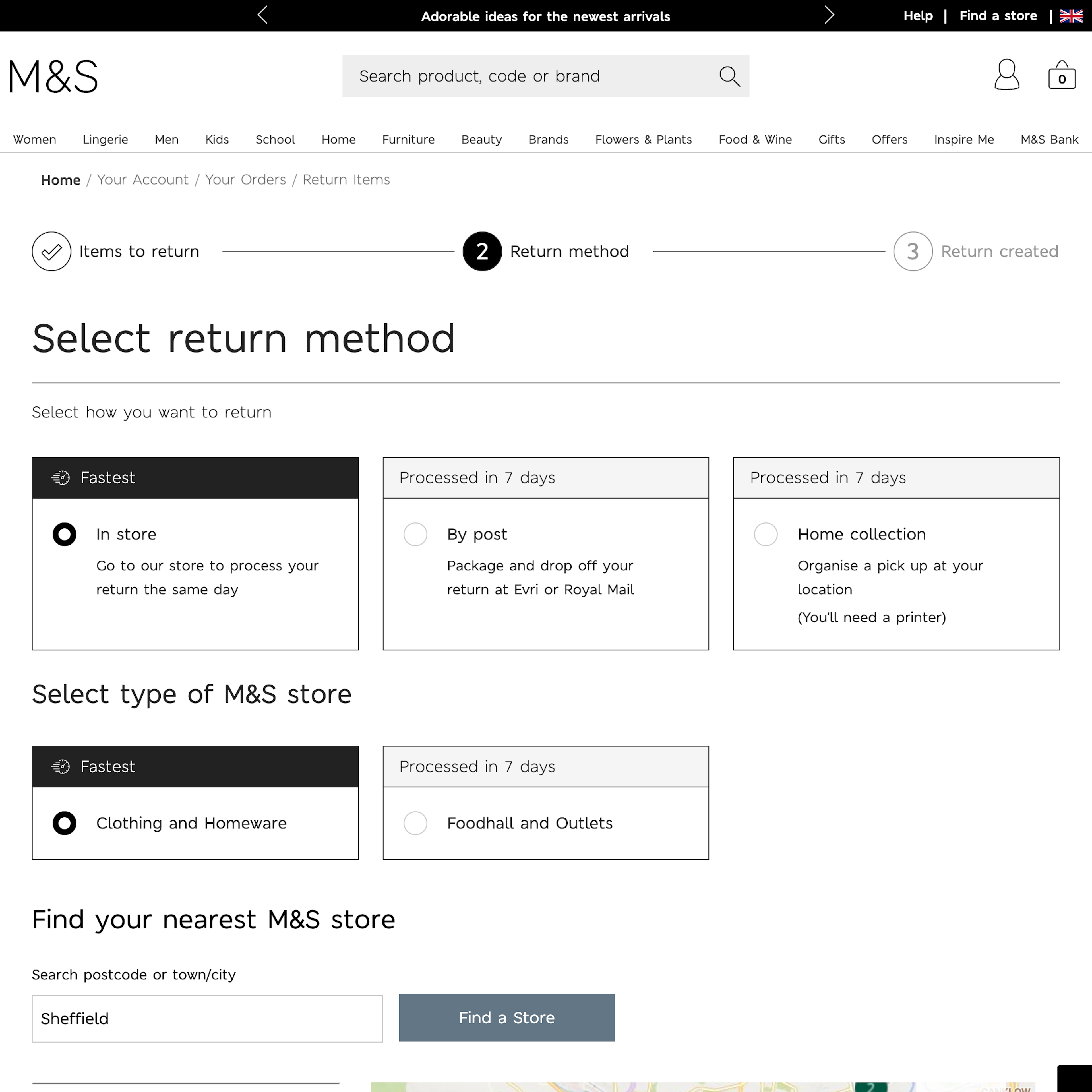
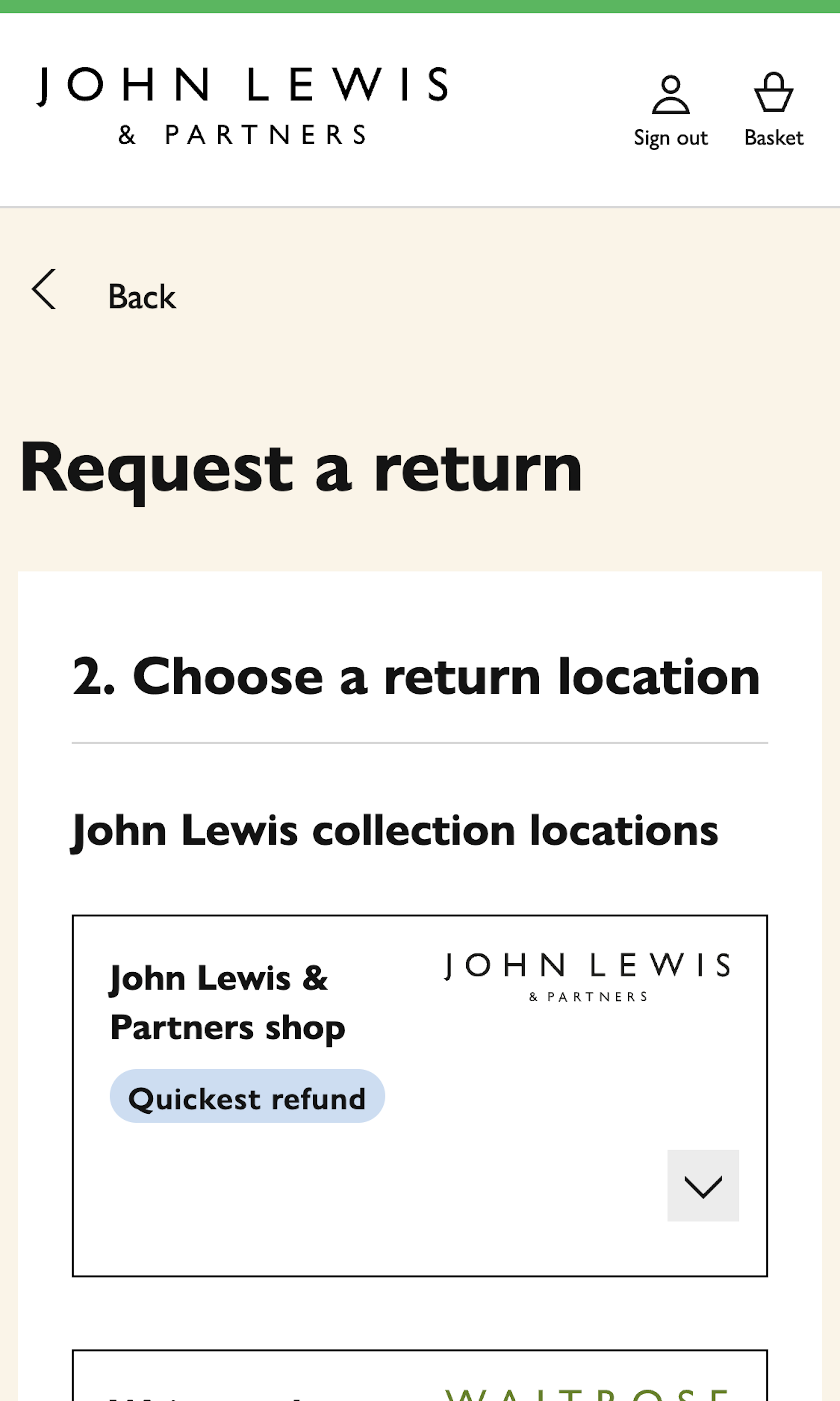
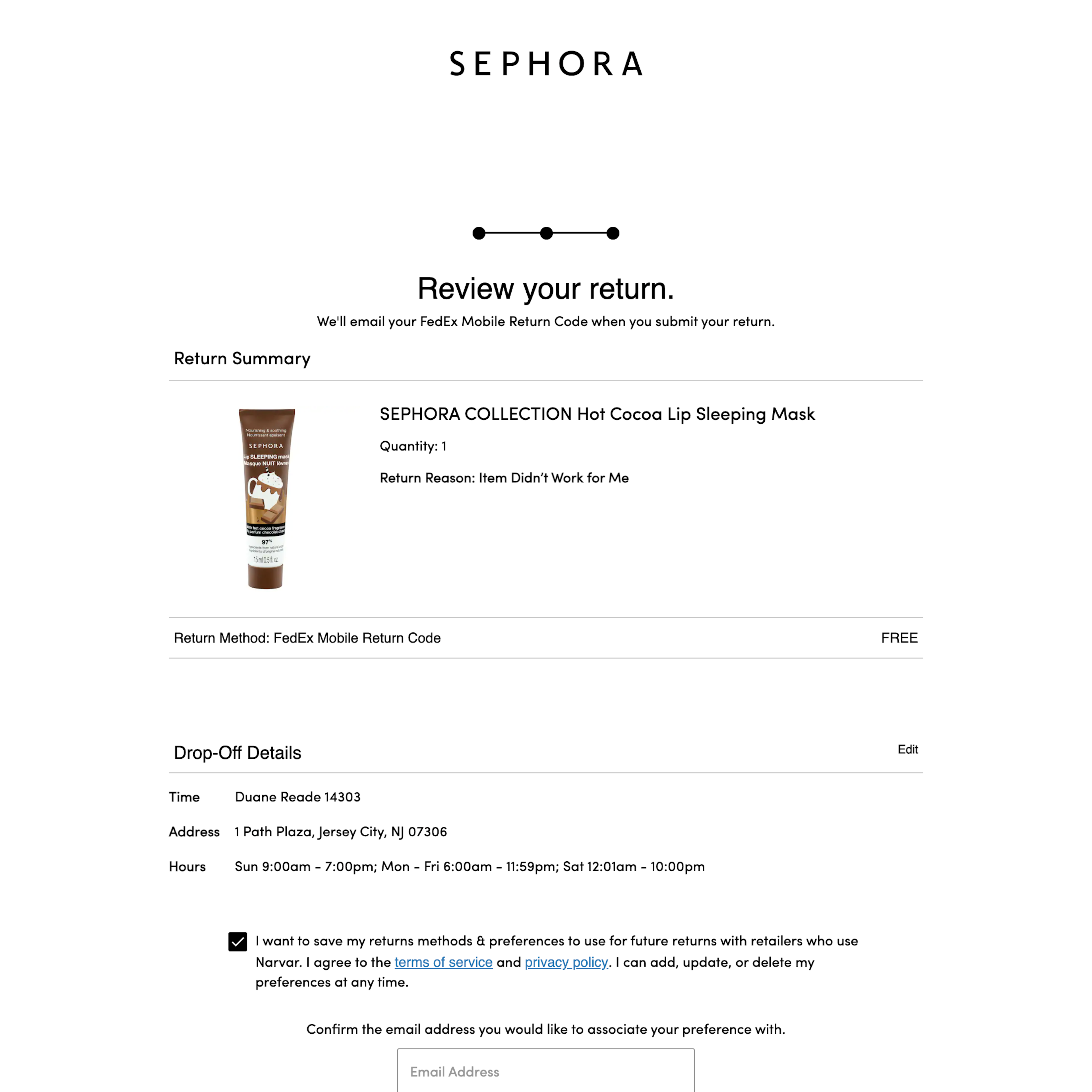
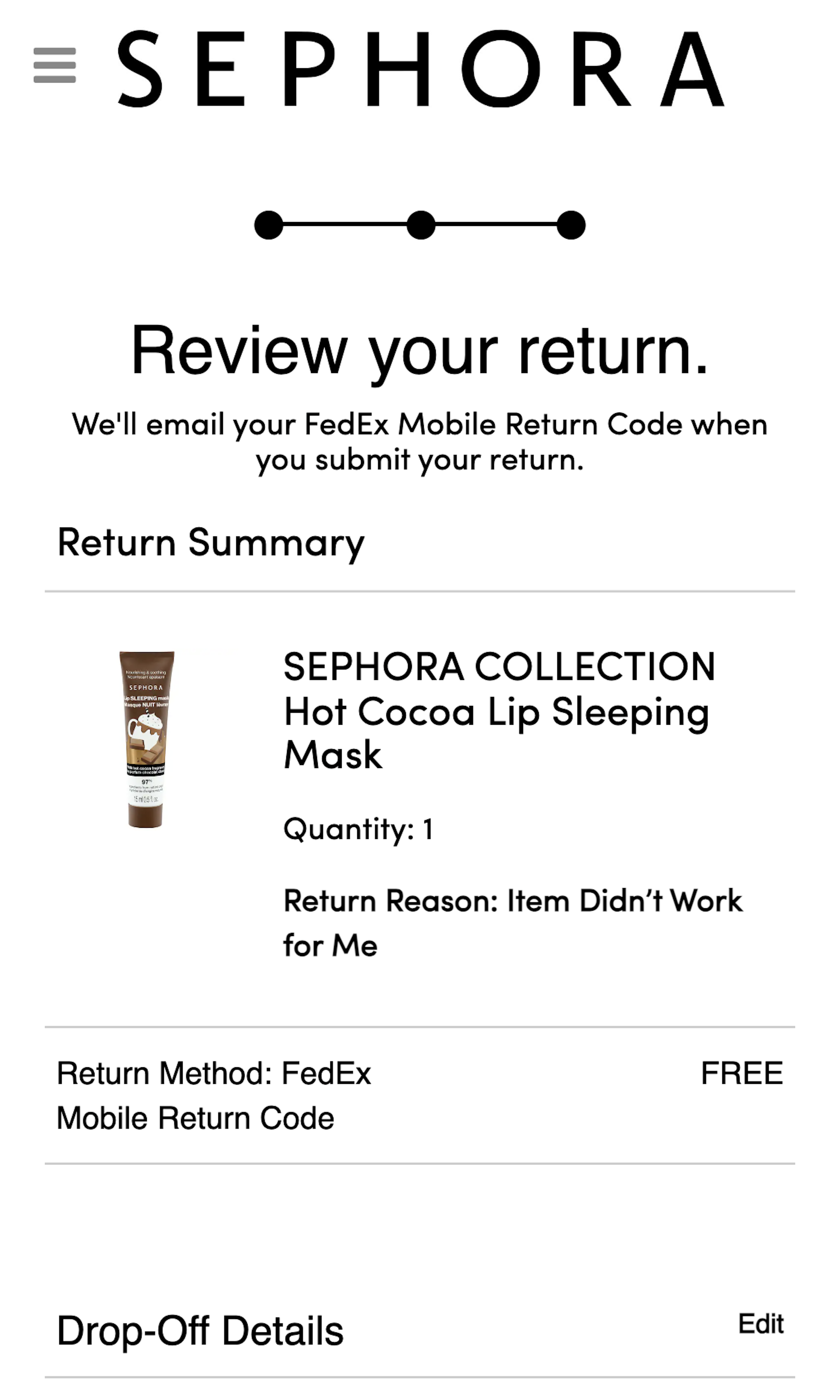
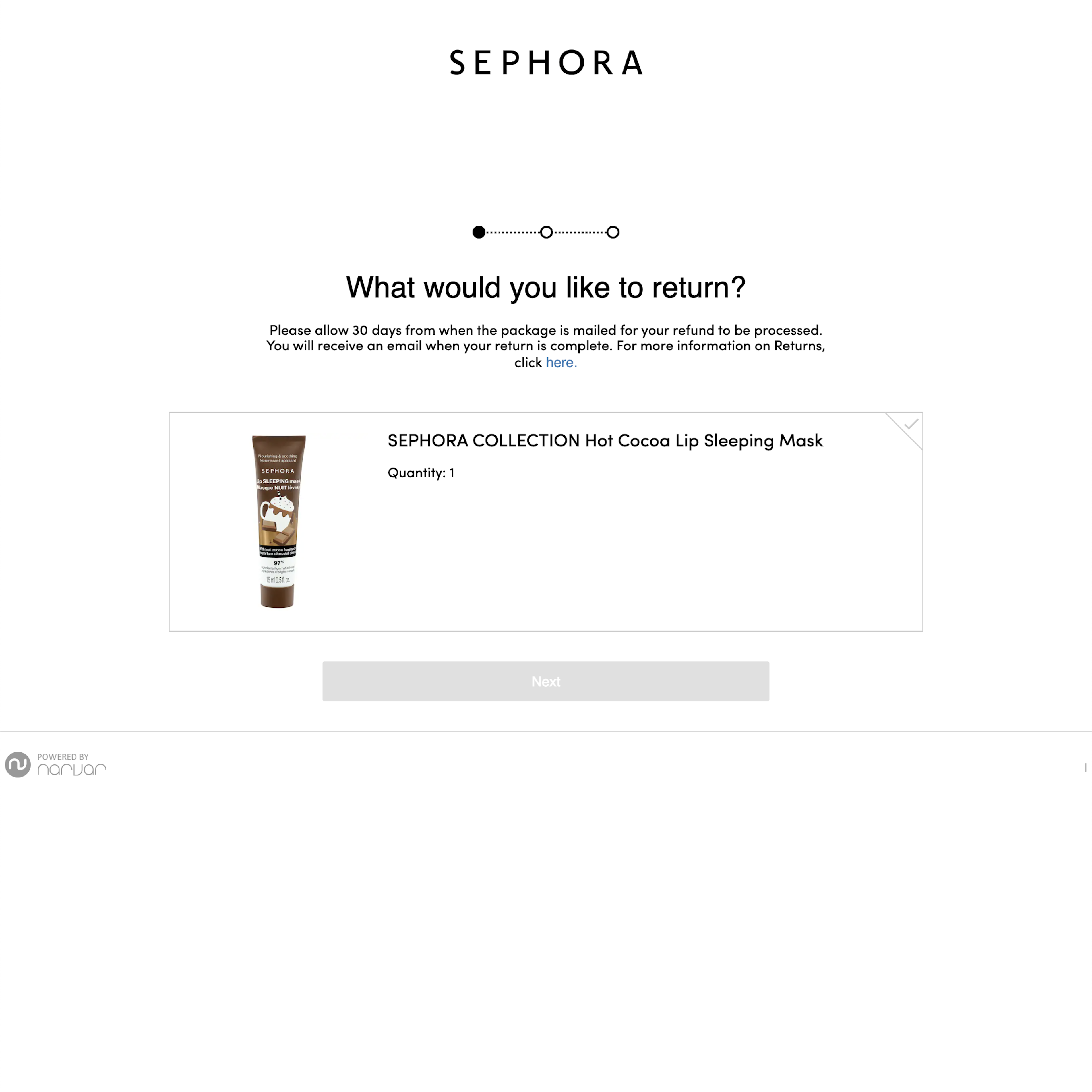
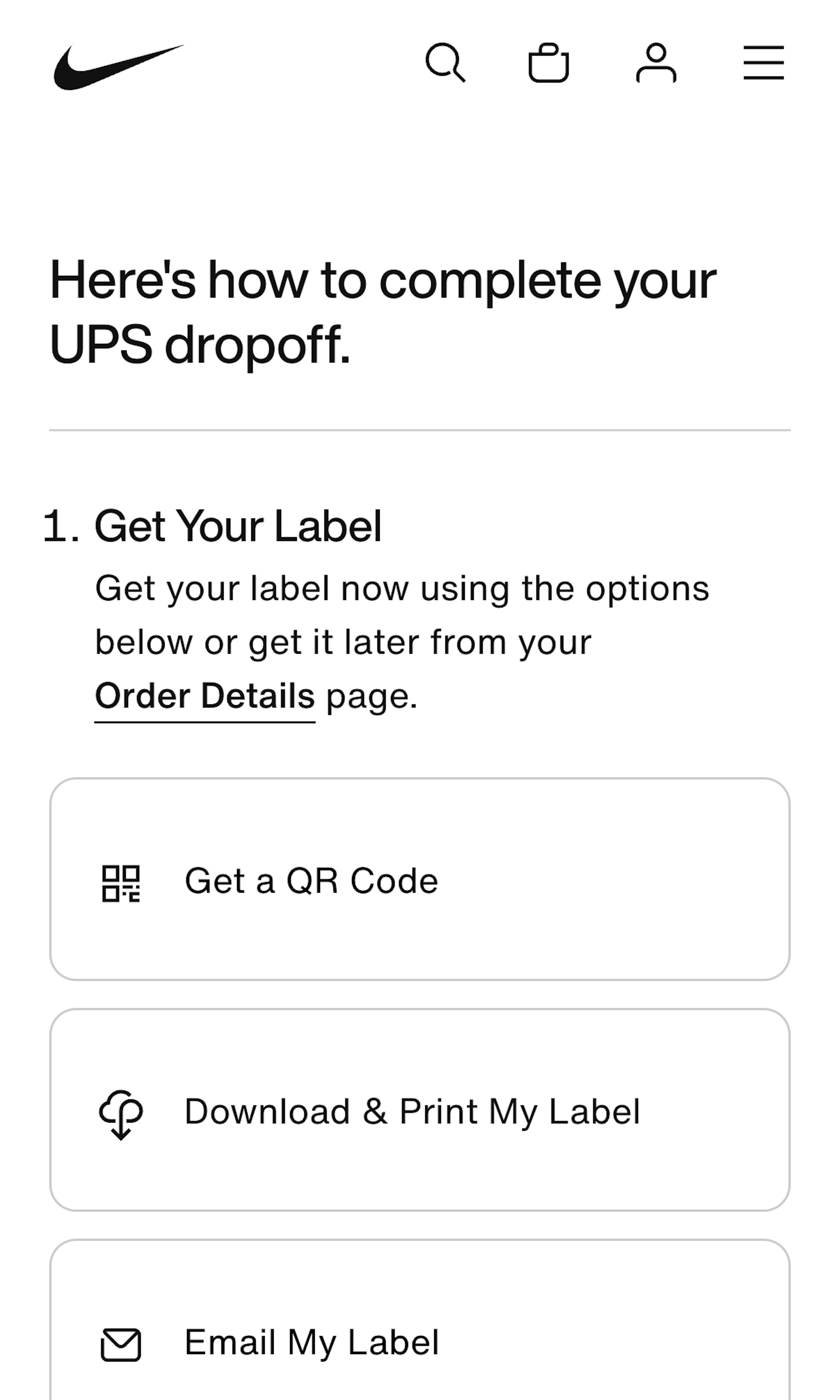
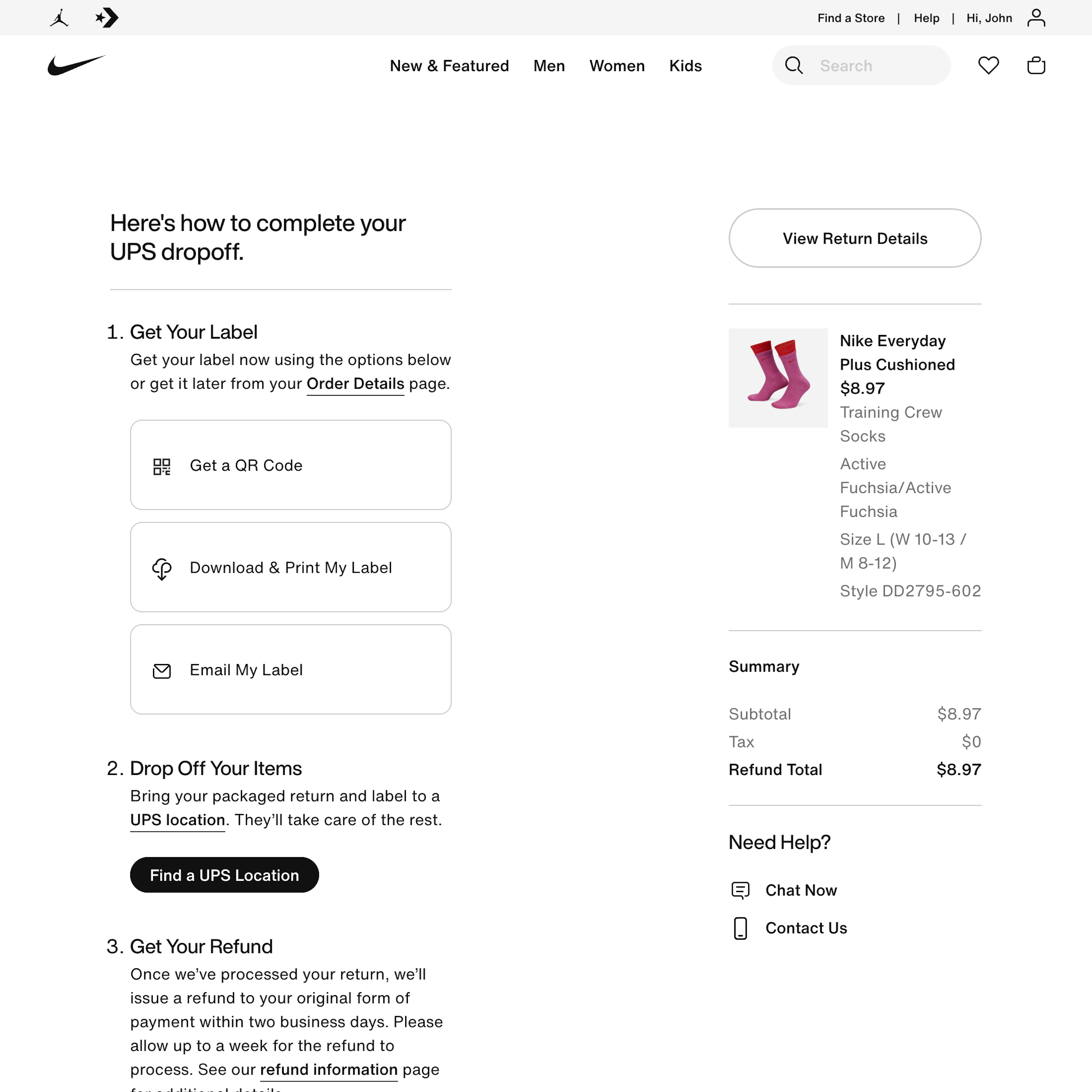
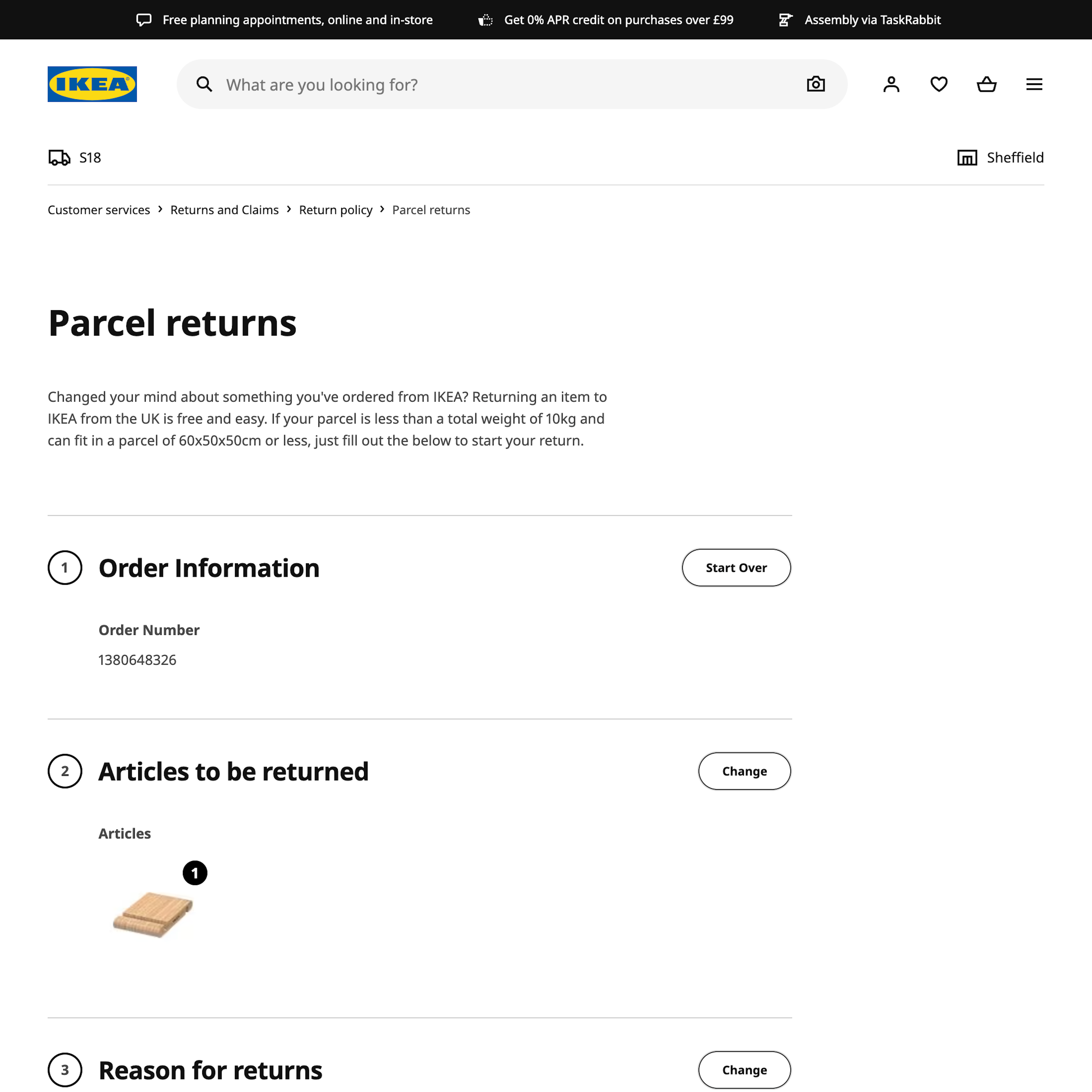
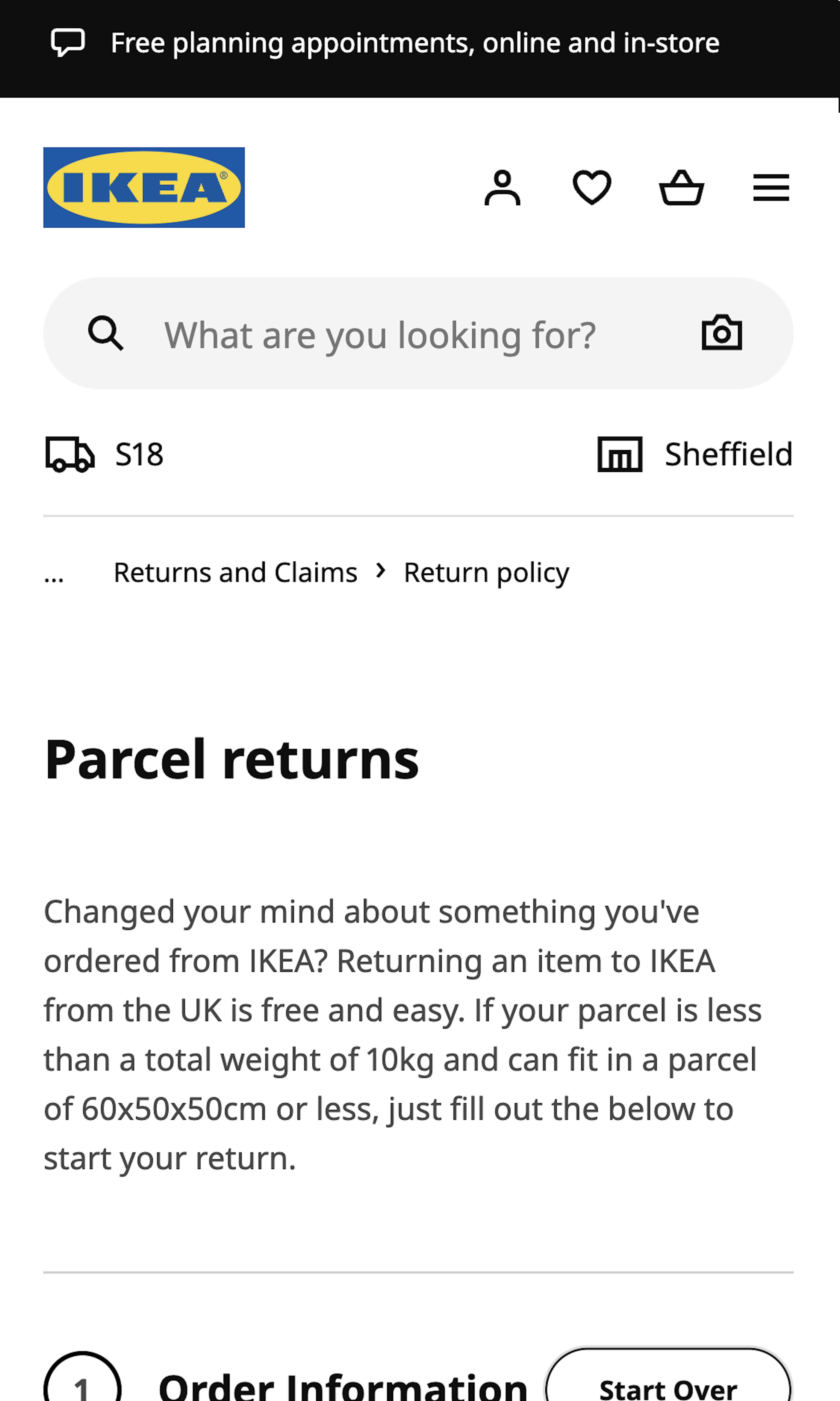
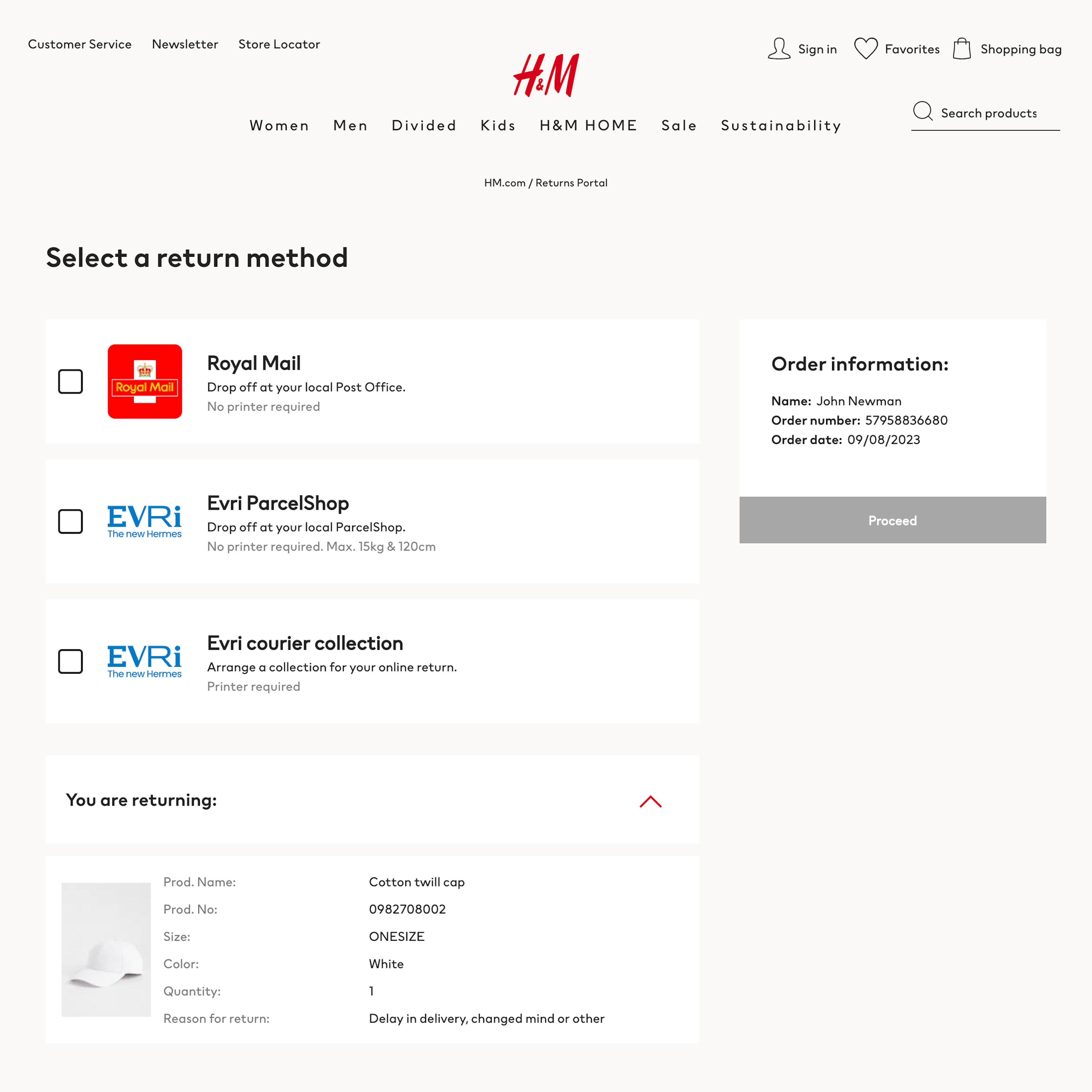
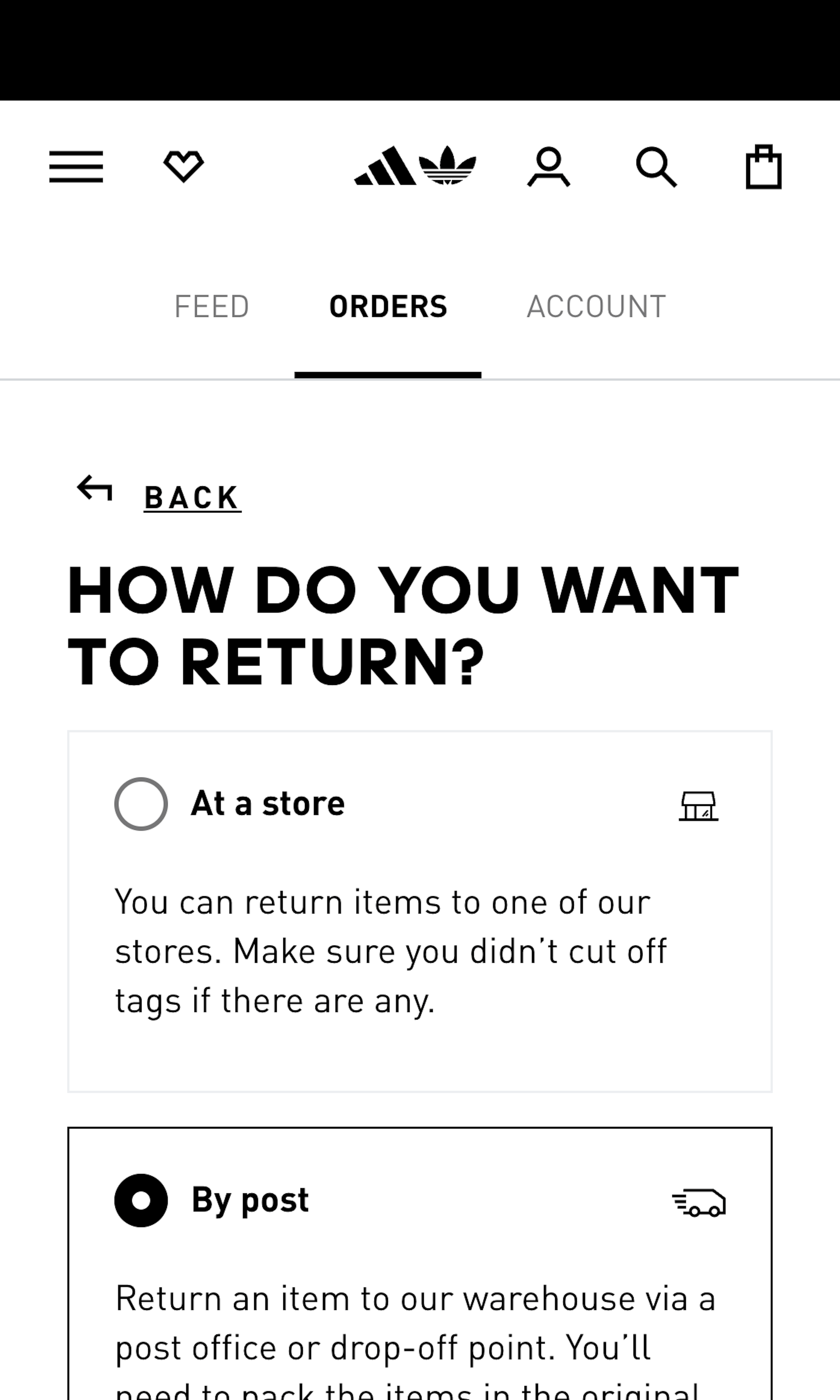
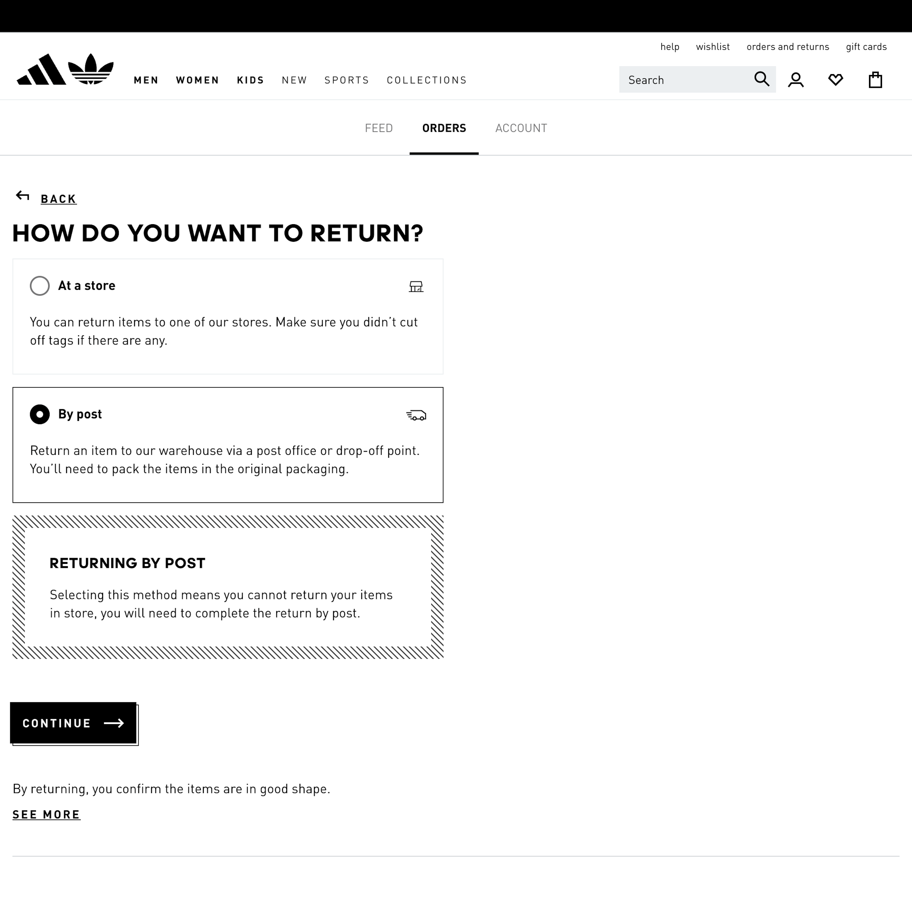
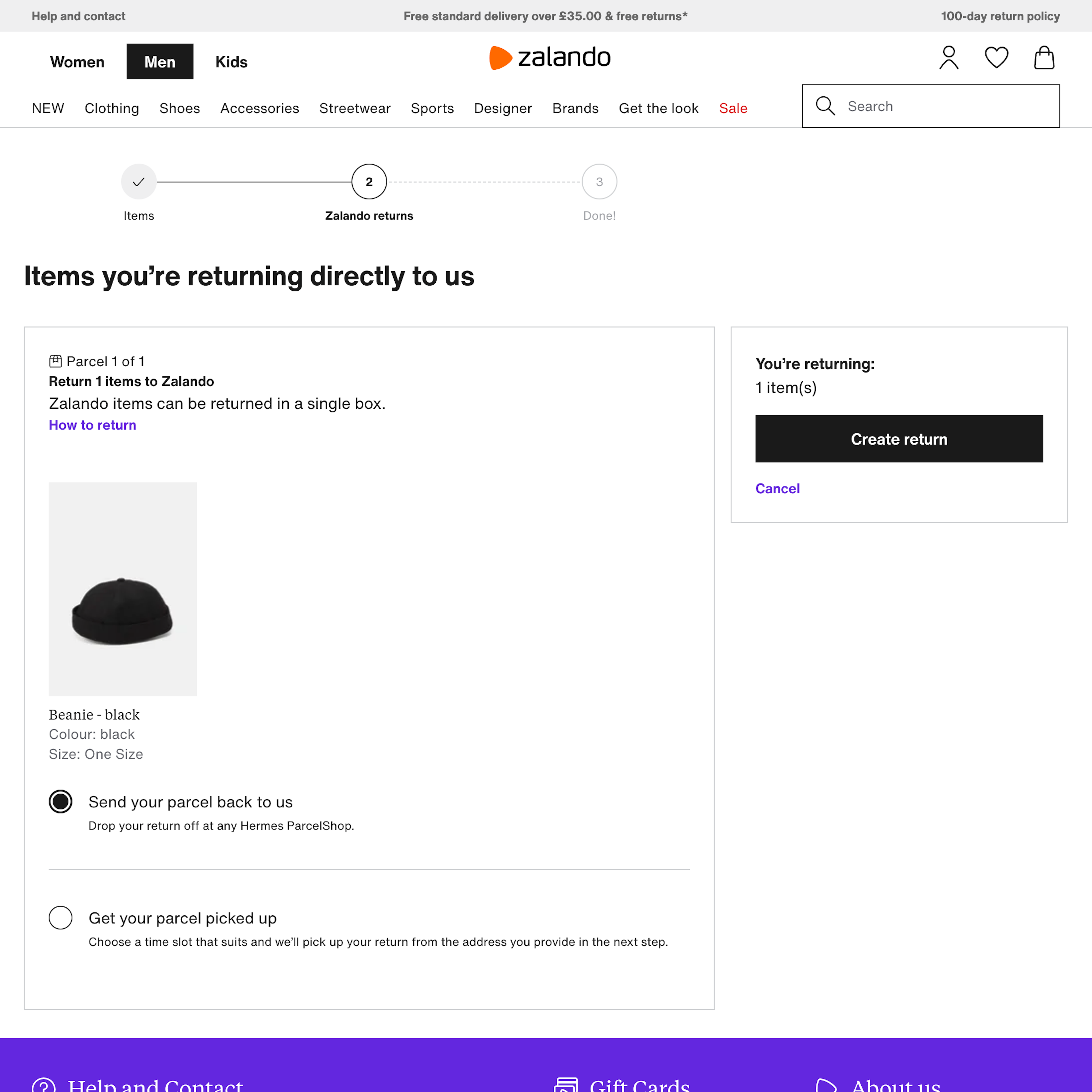
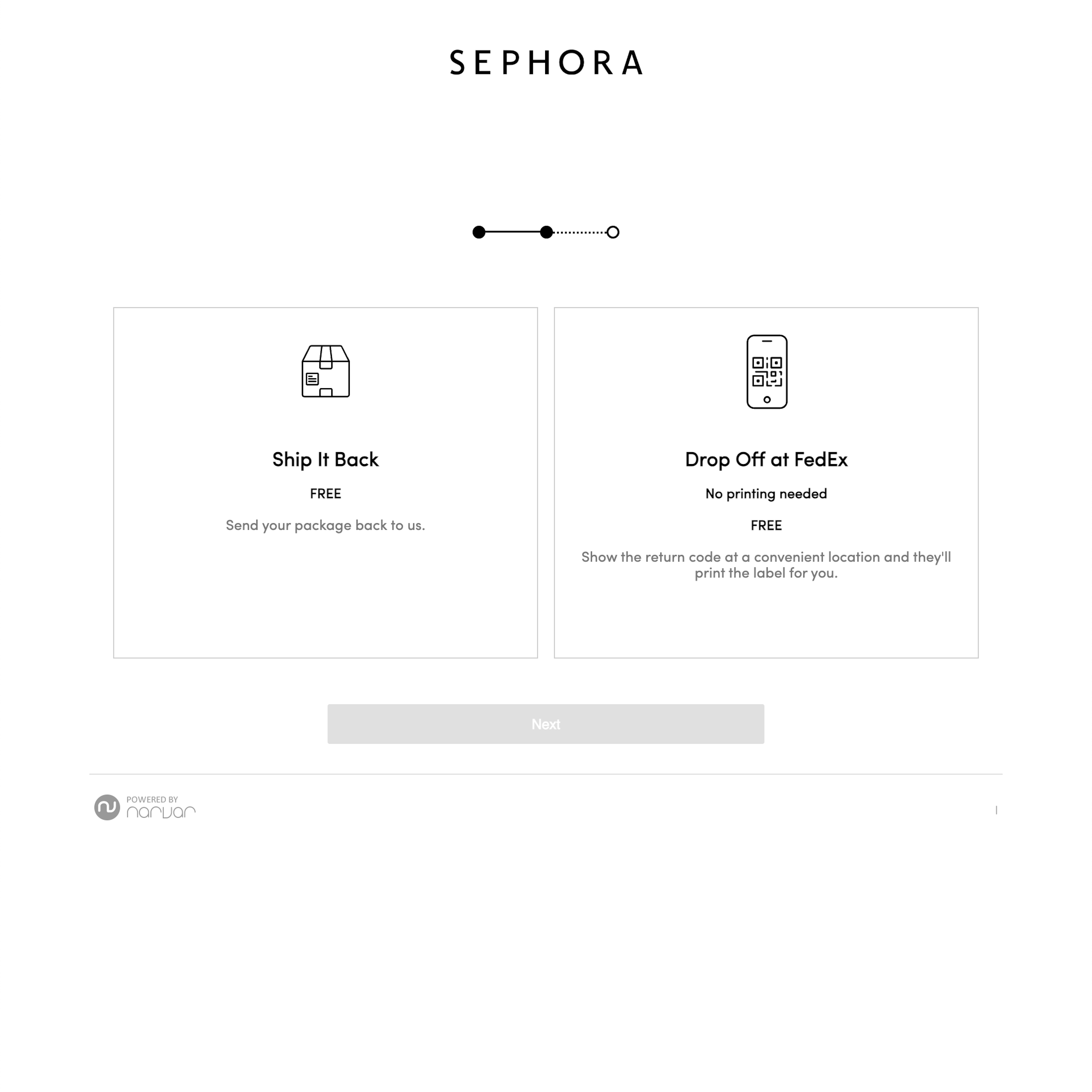
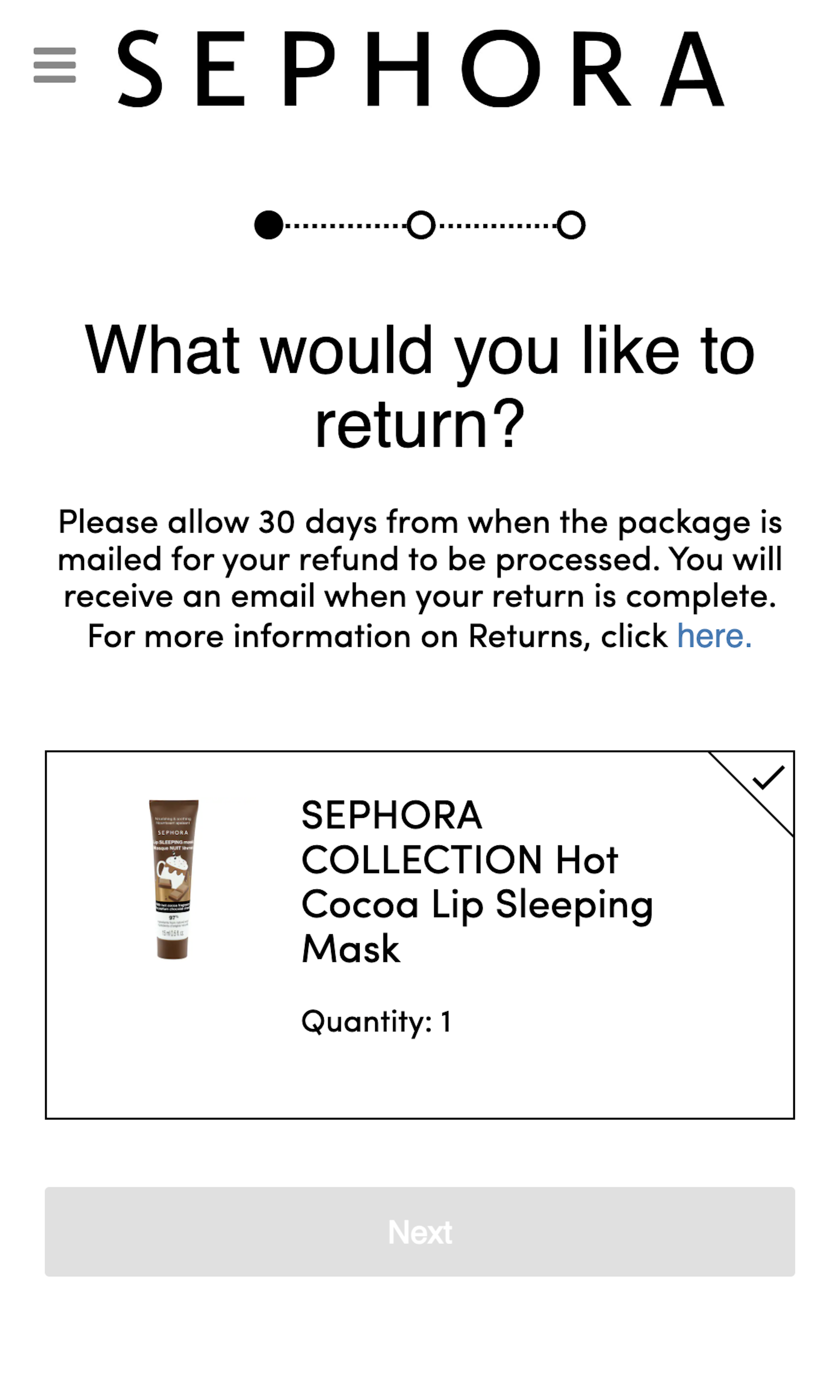
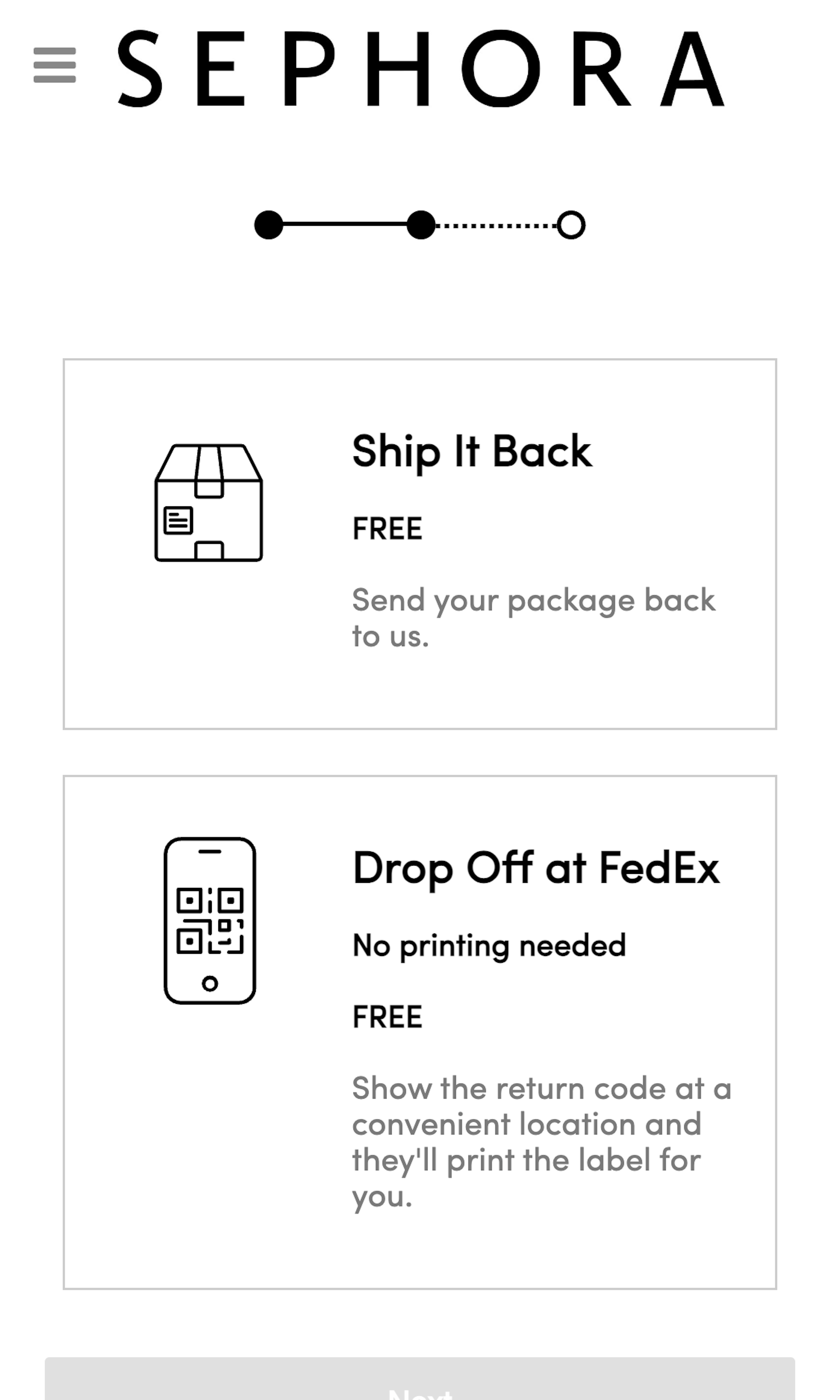
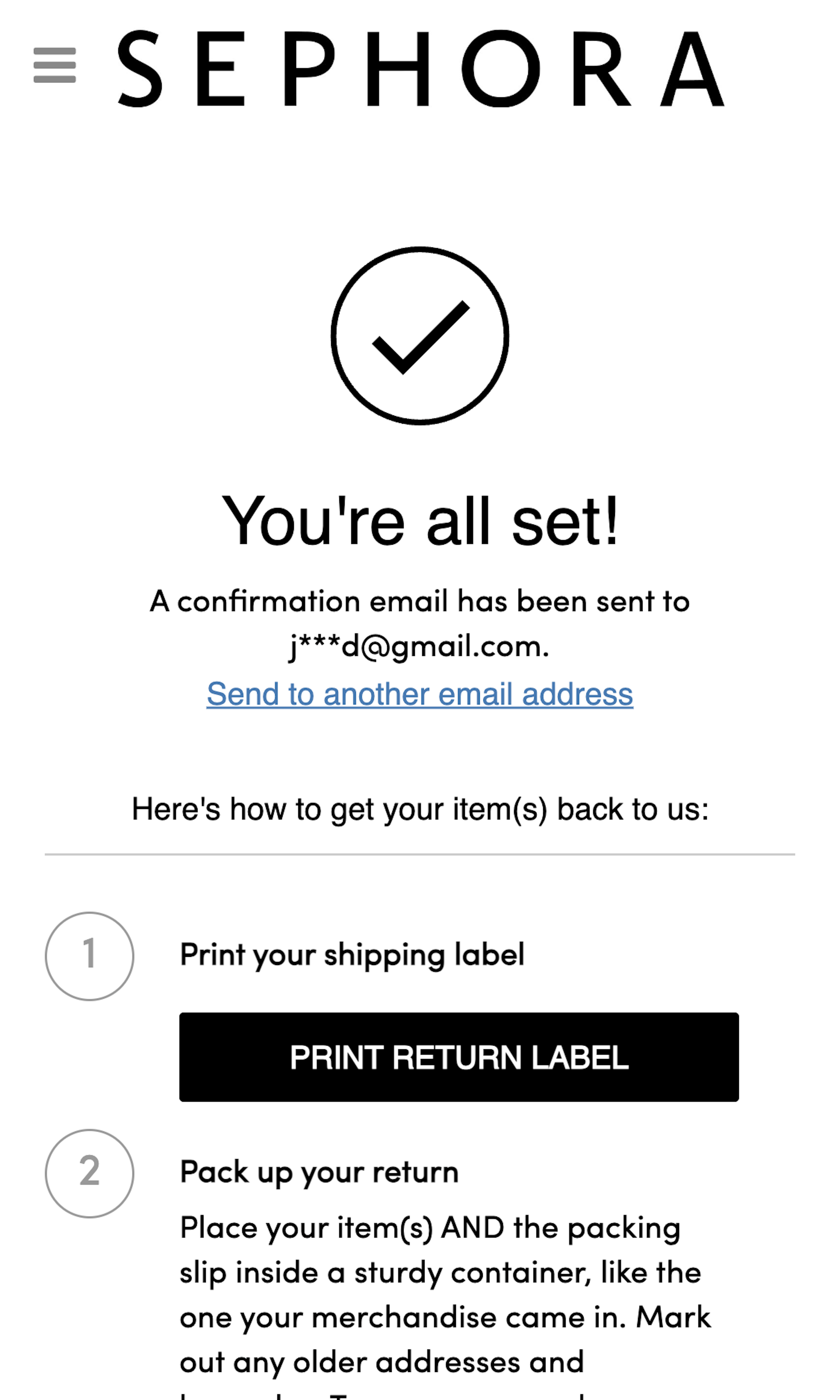
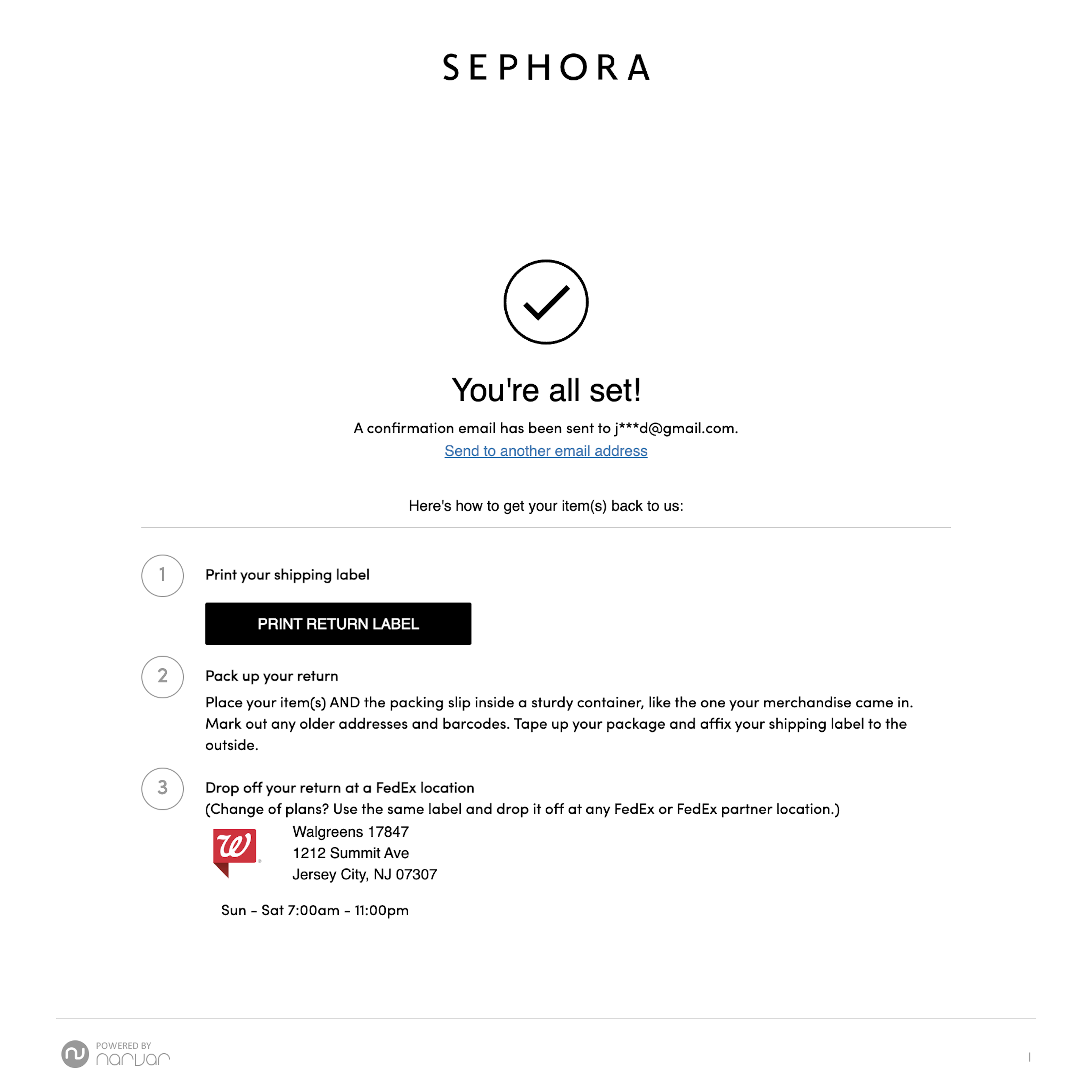
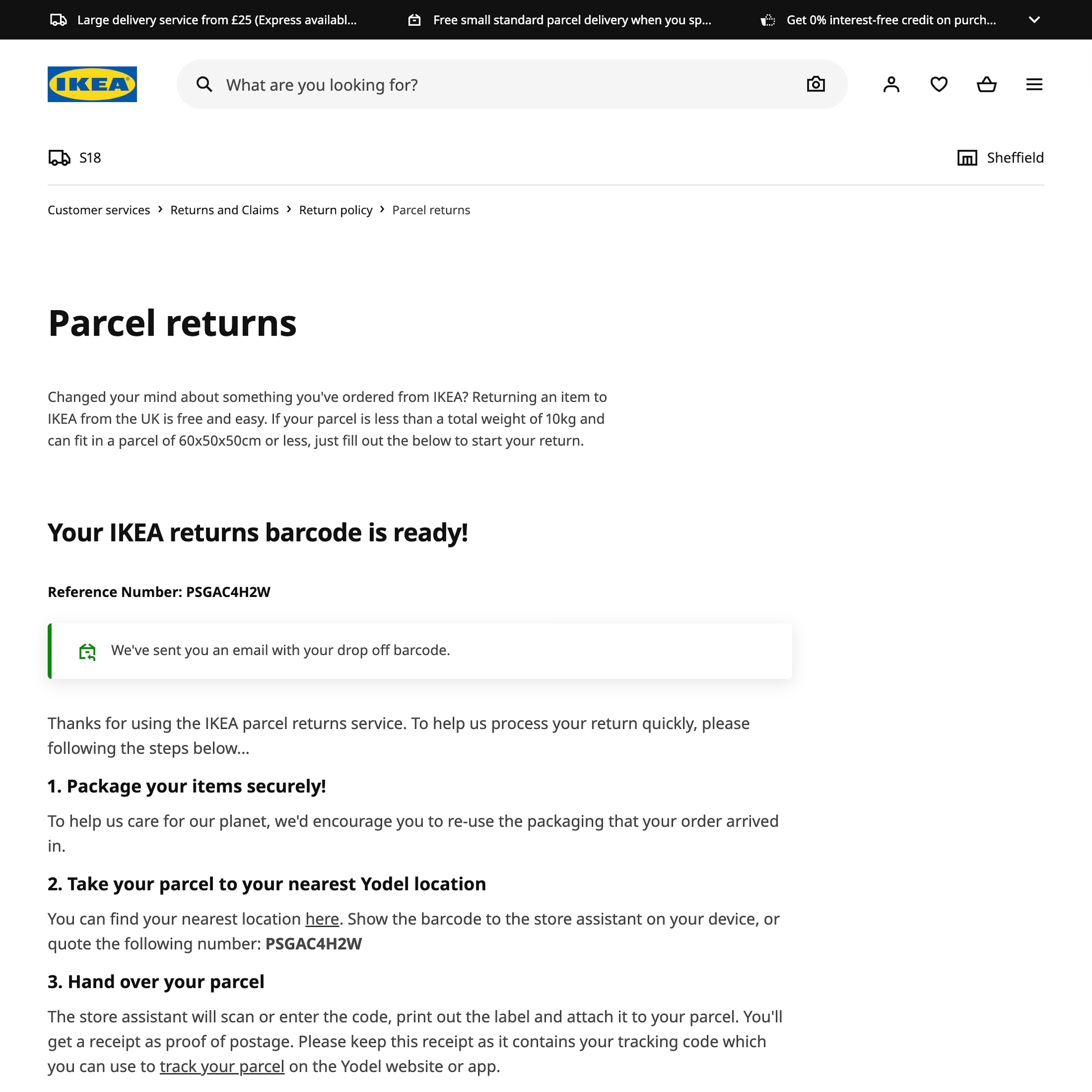
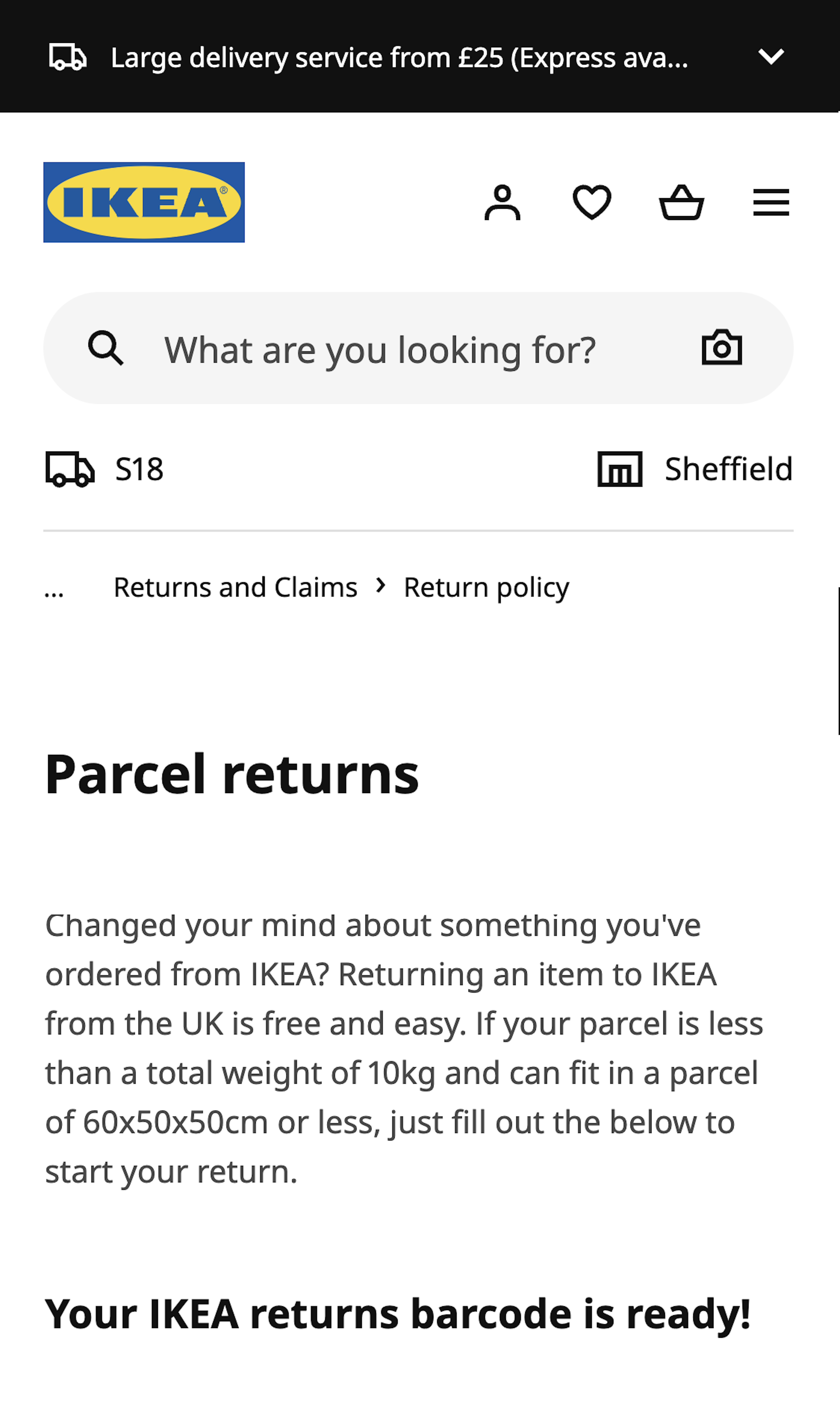
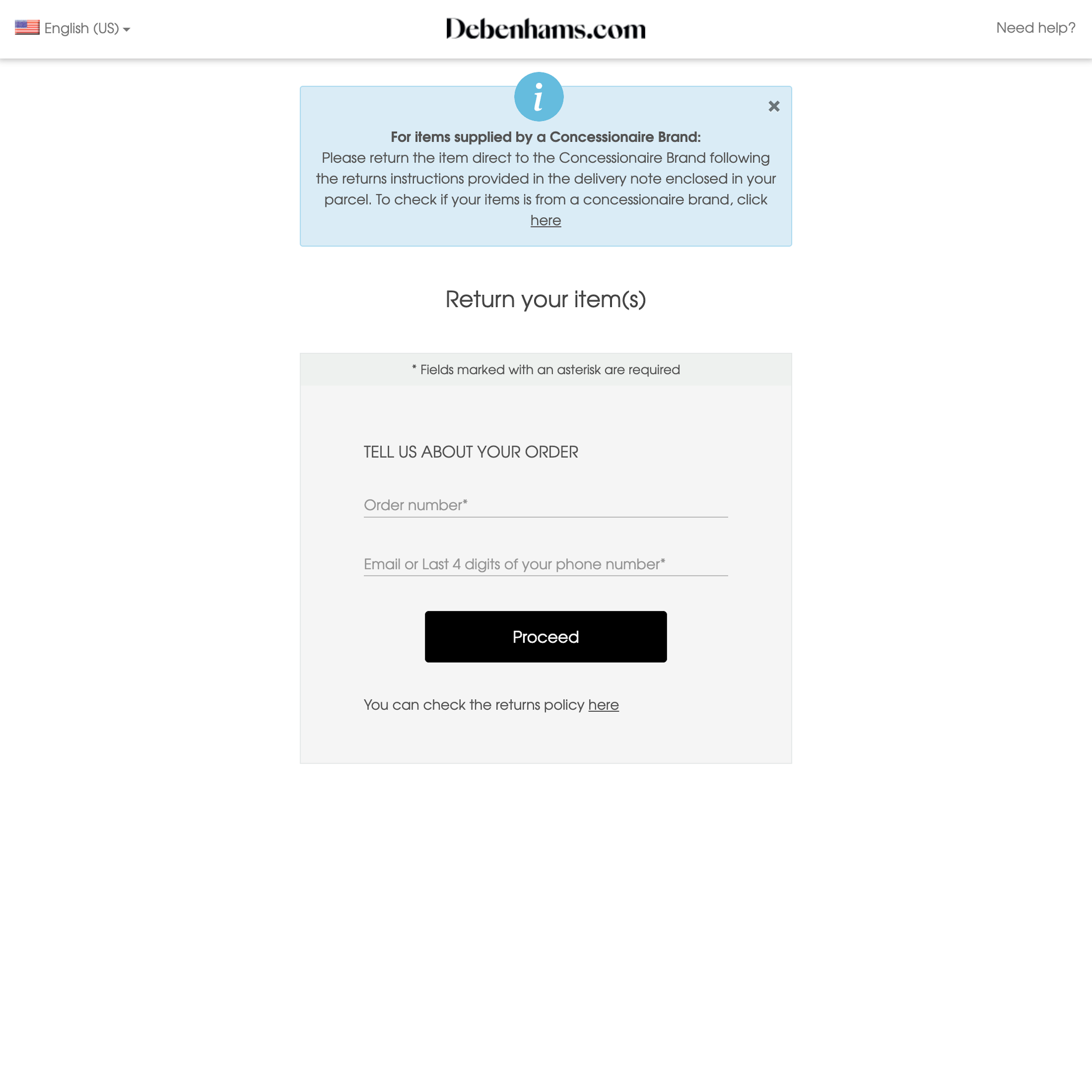
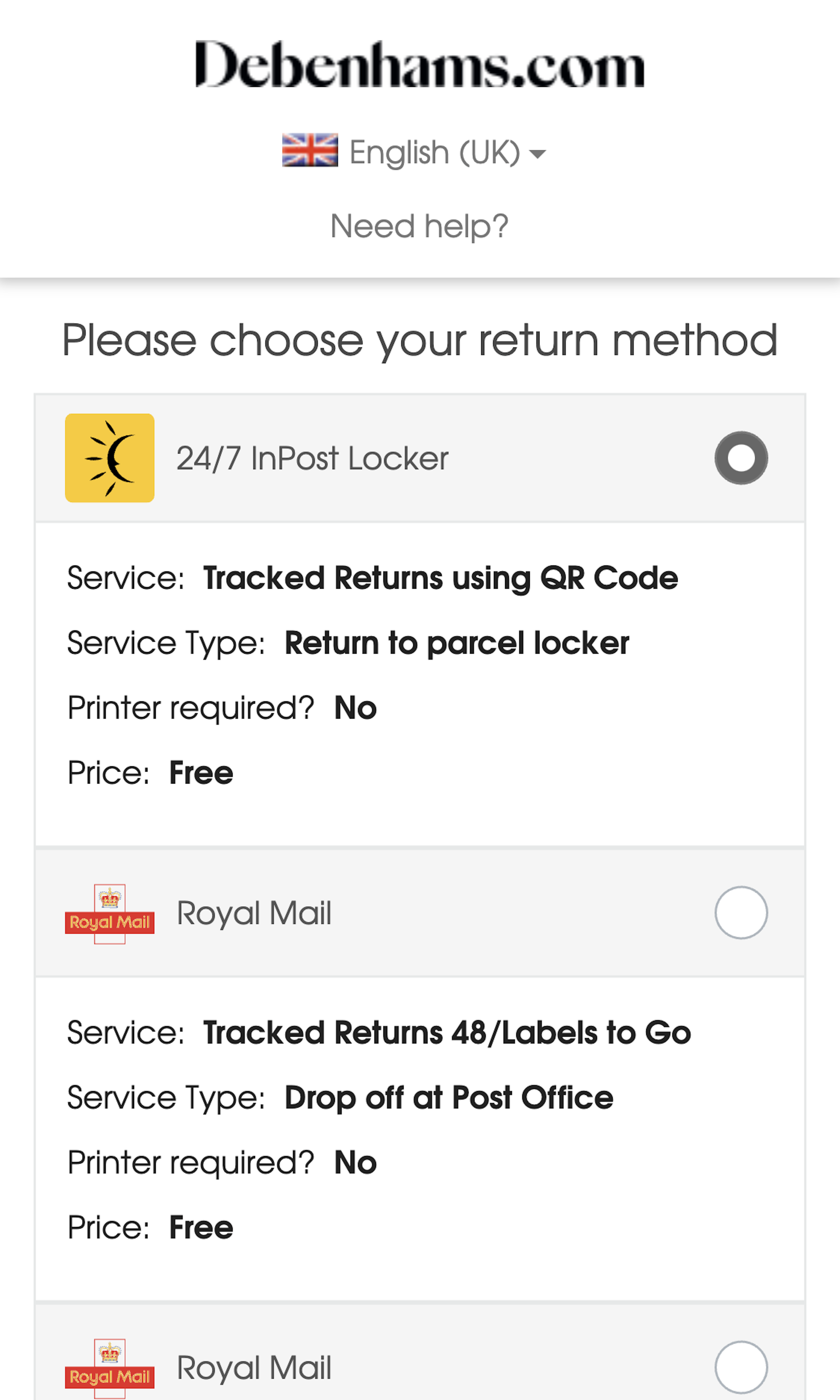
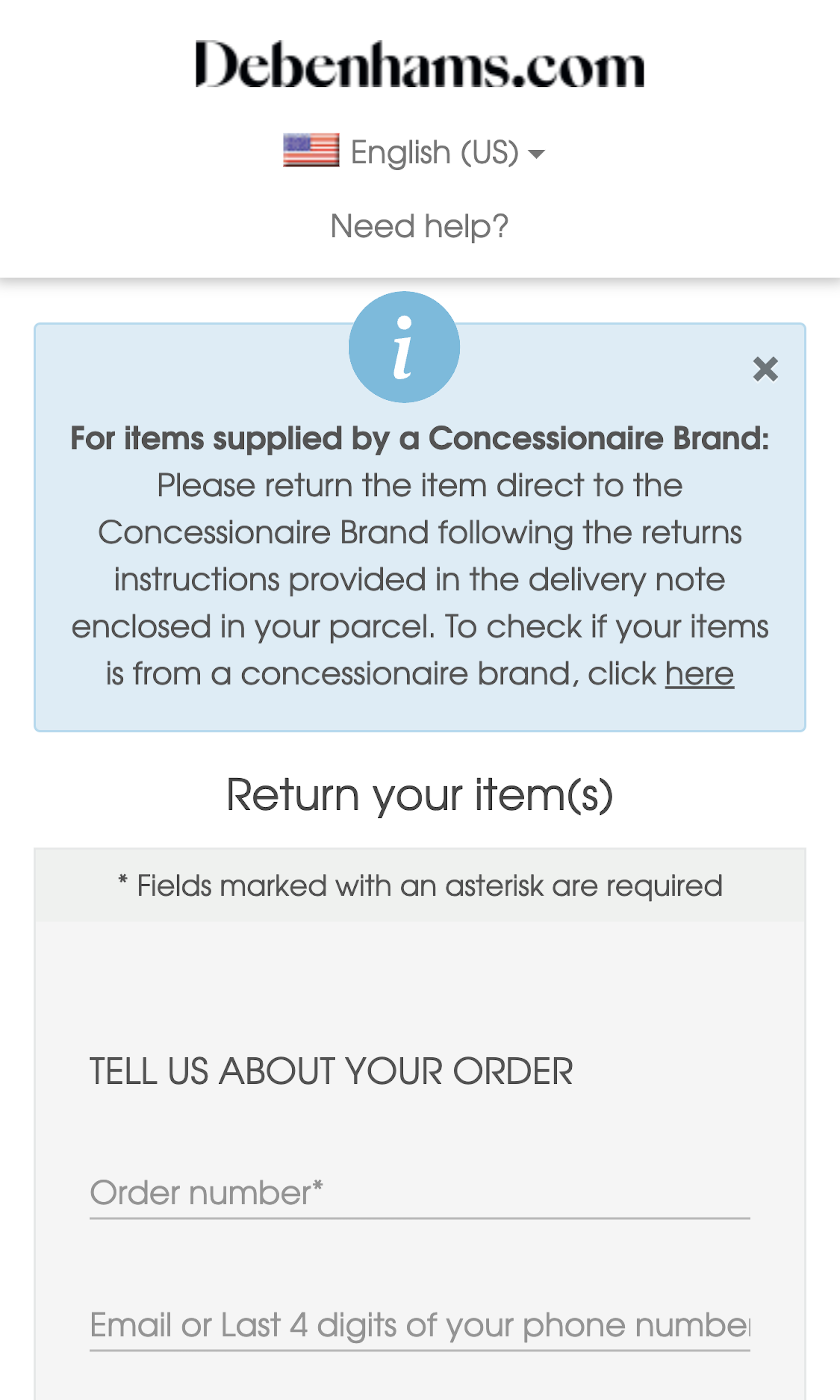
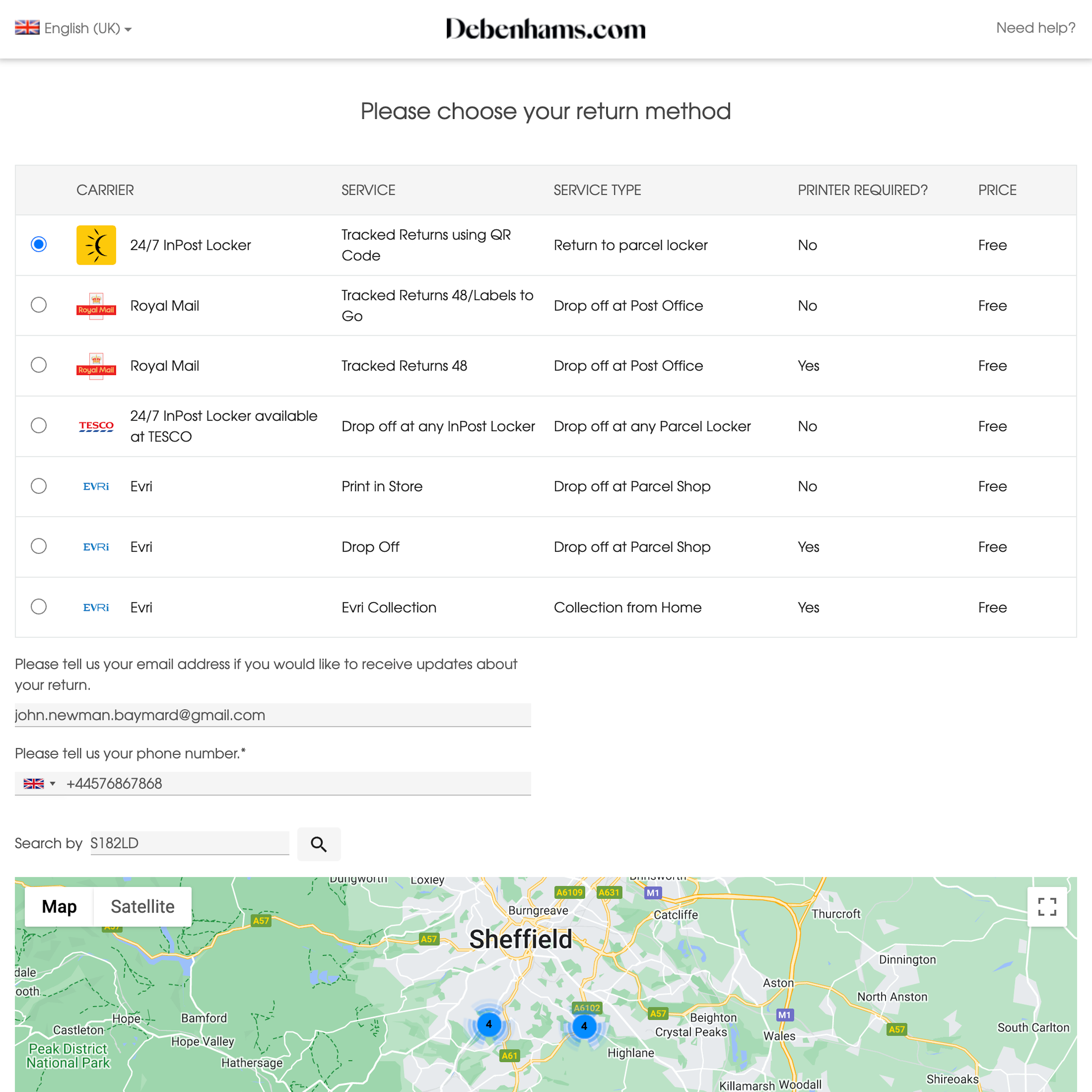
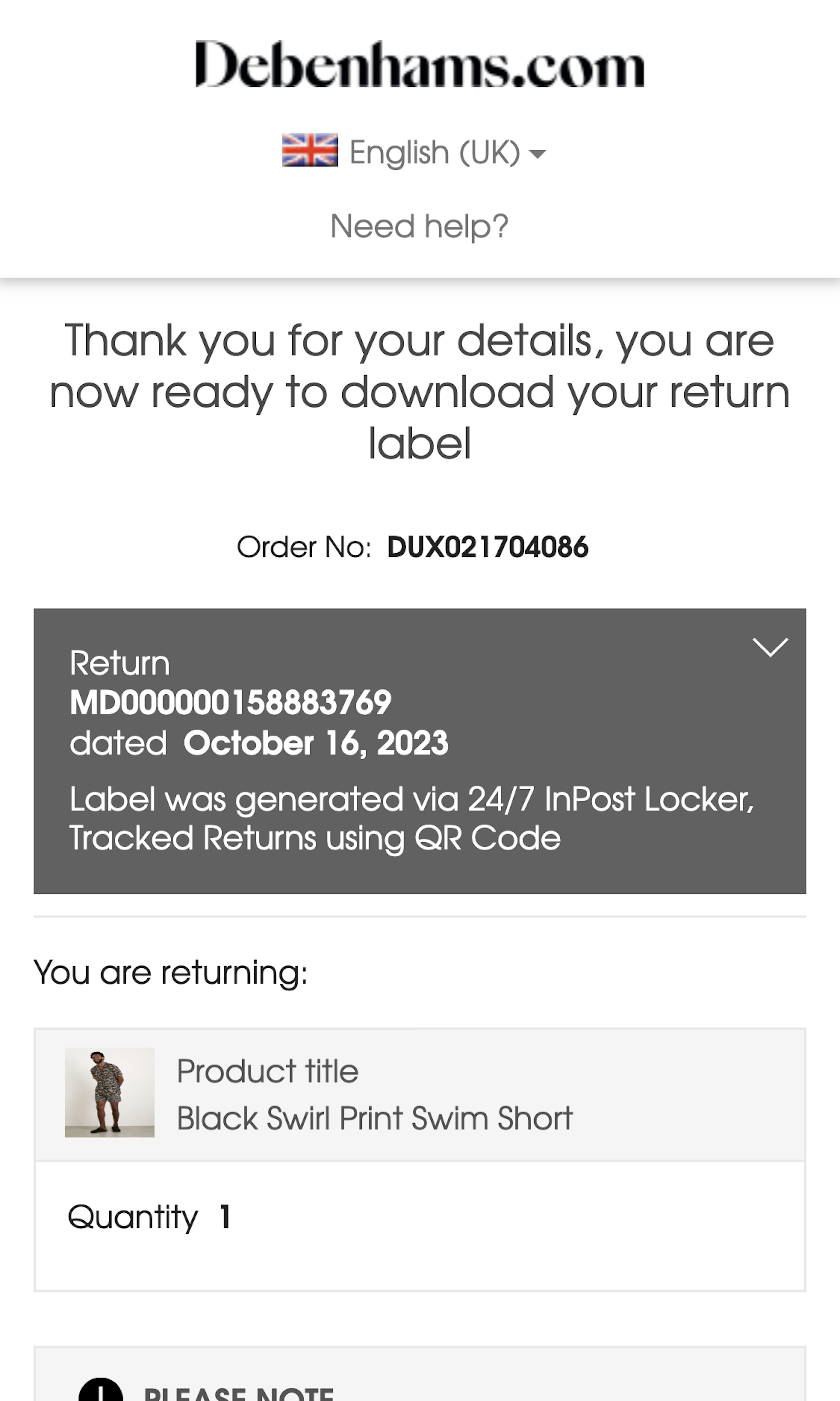
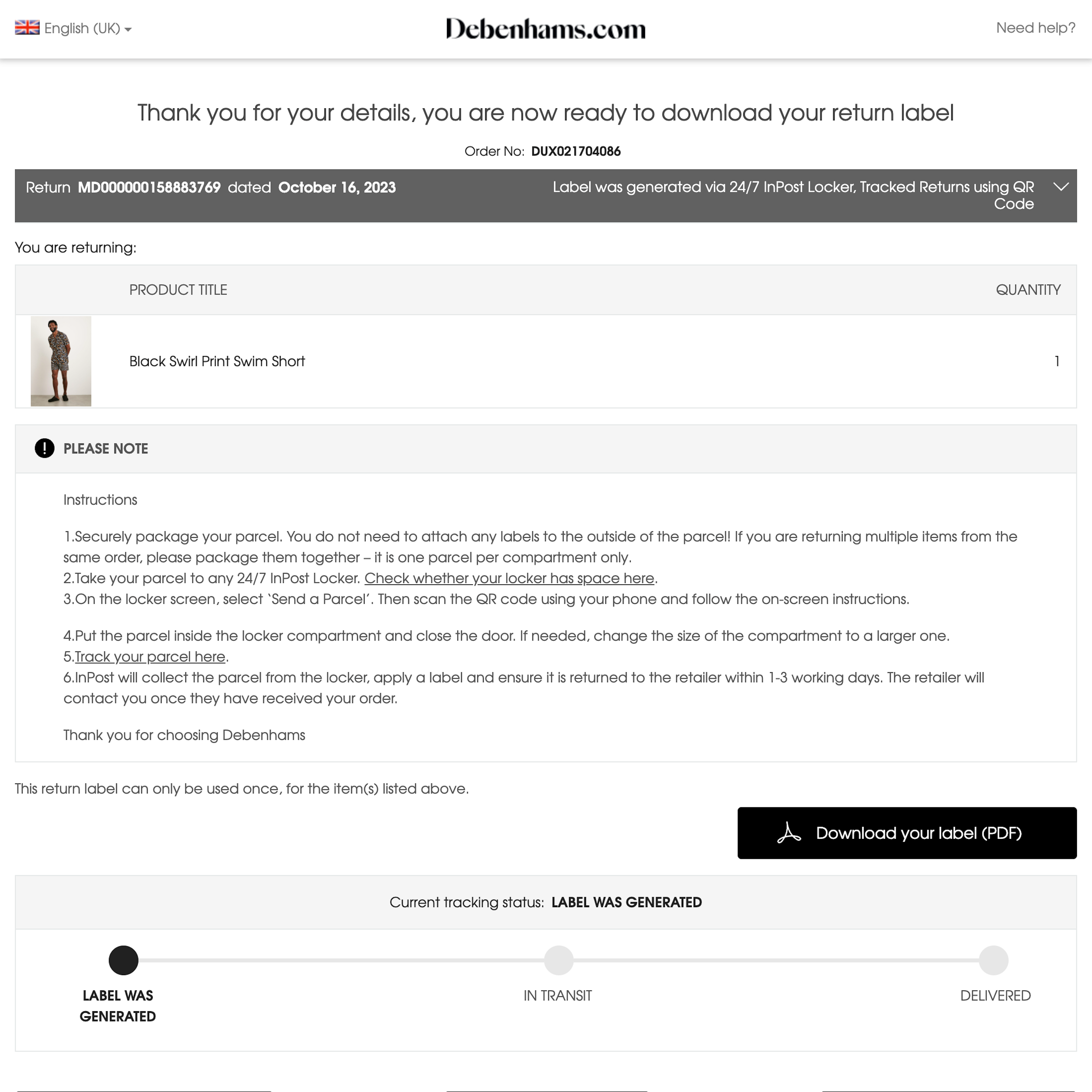
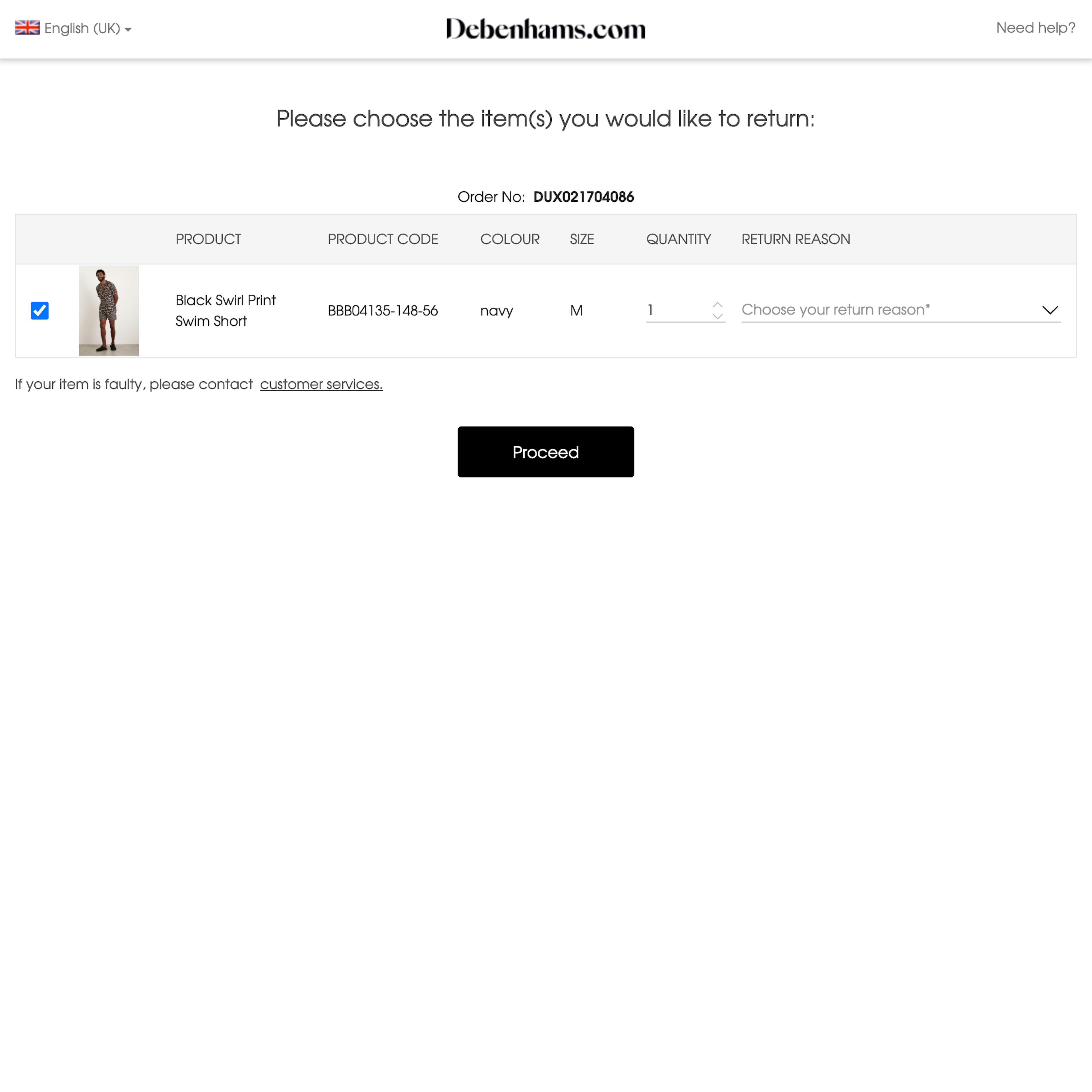
130 ‘Order Returns’ Design Examples
Also referred to as: Return Flow, Returns, Product Returns
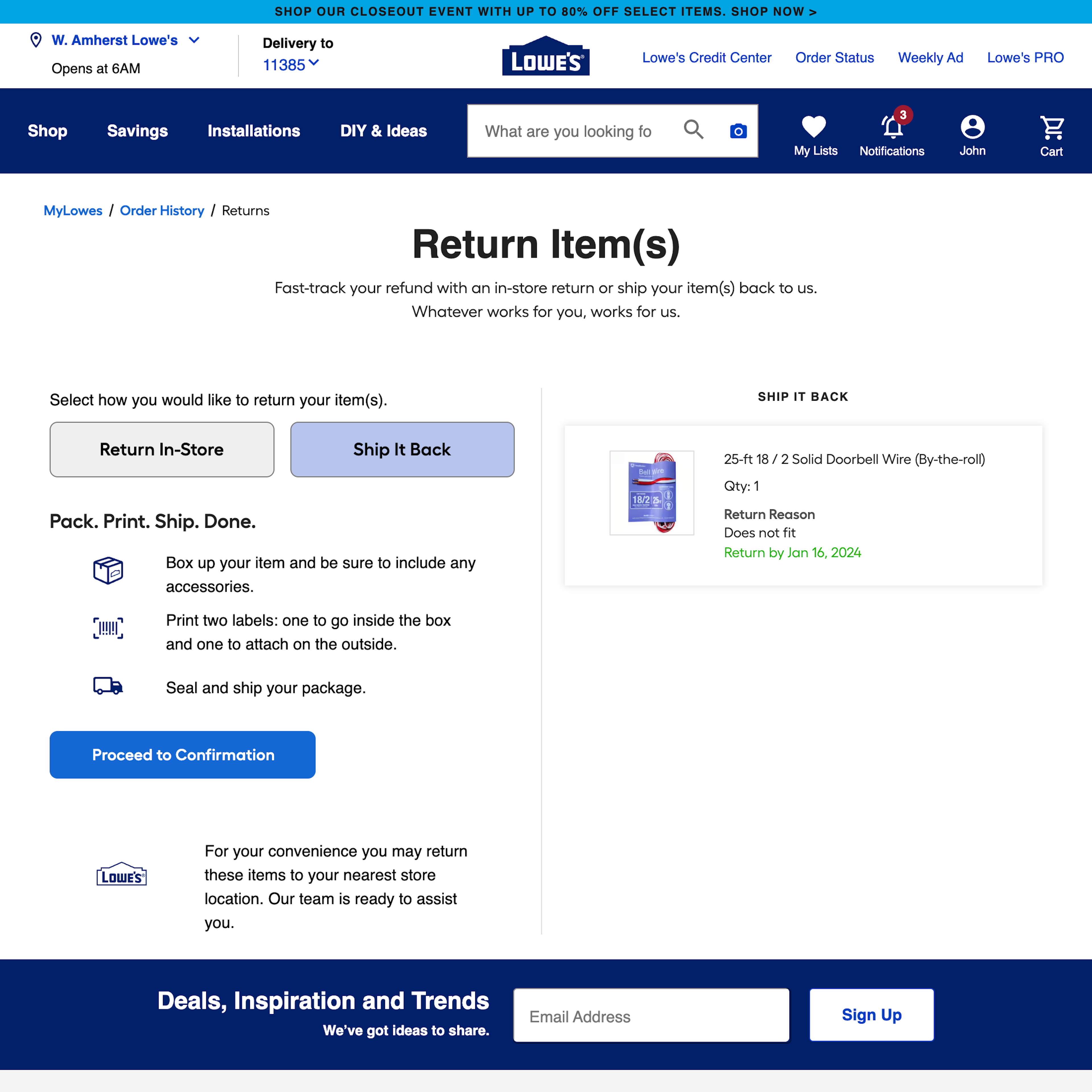
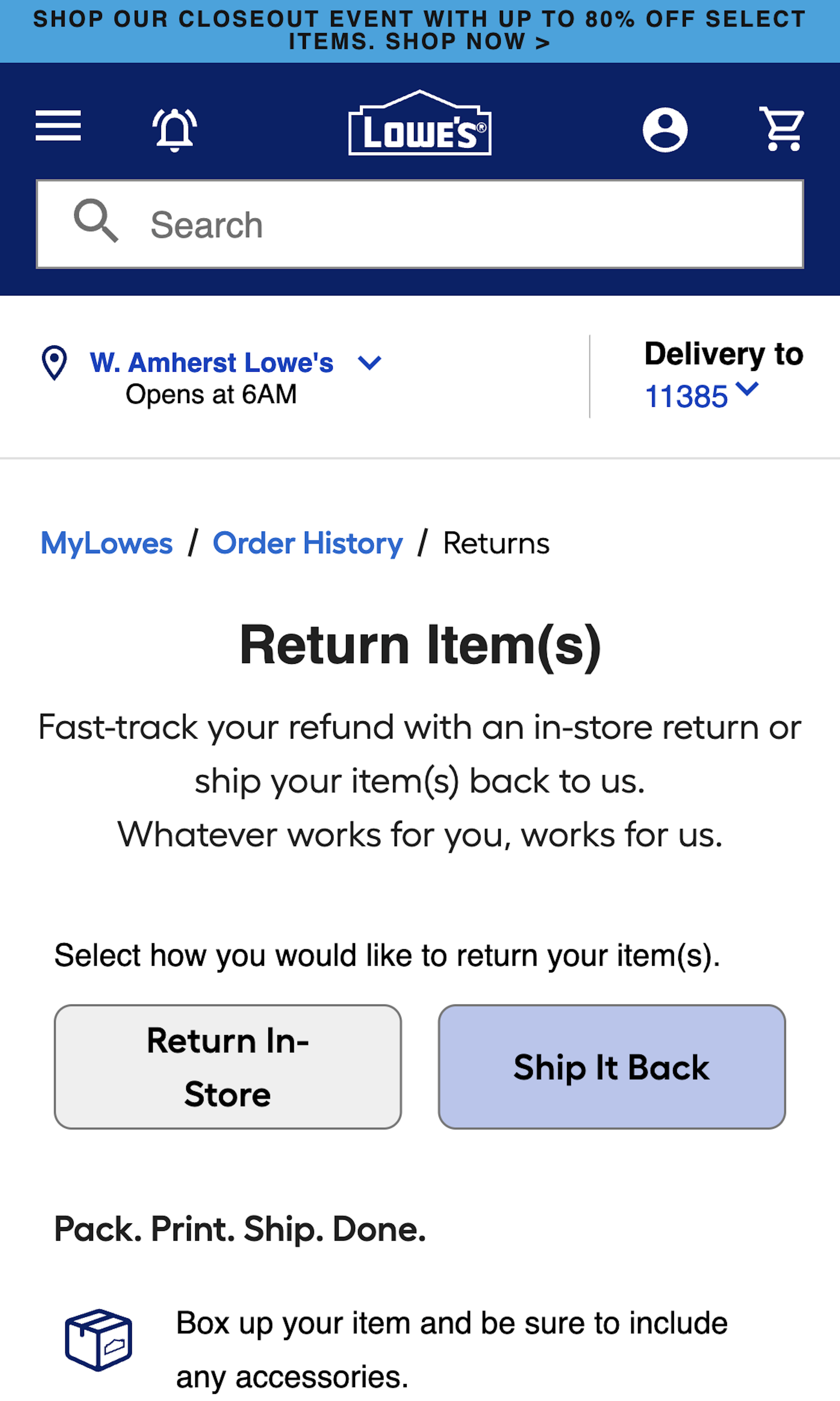
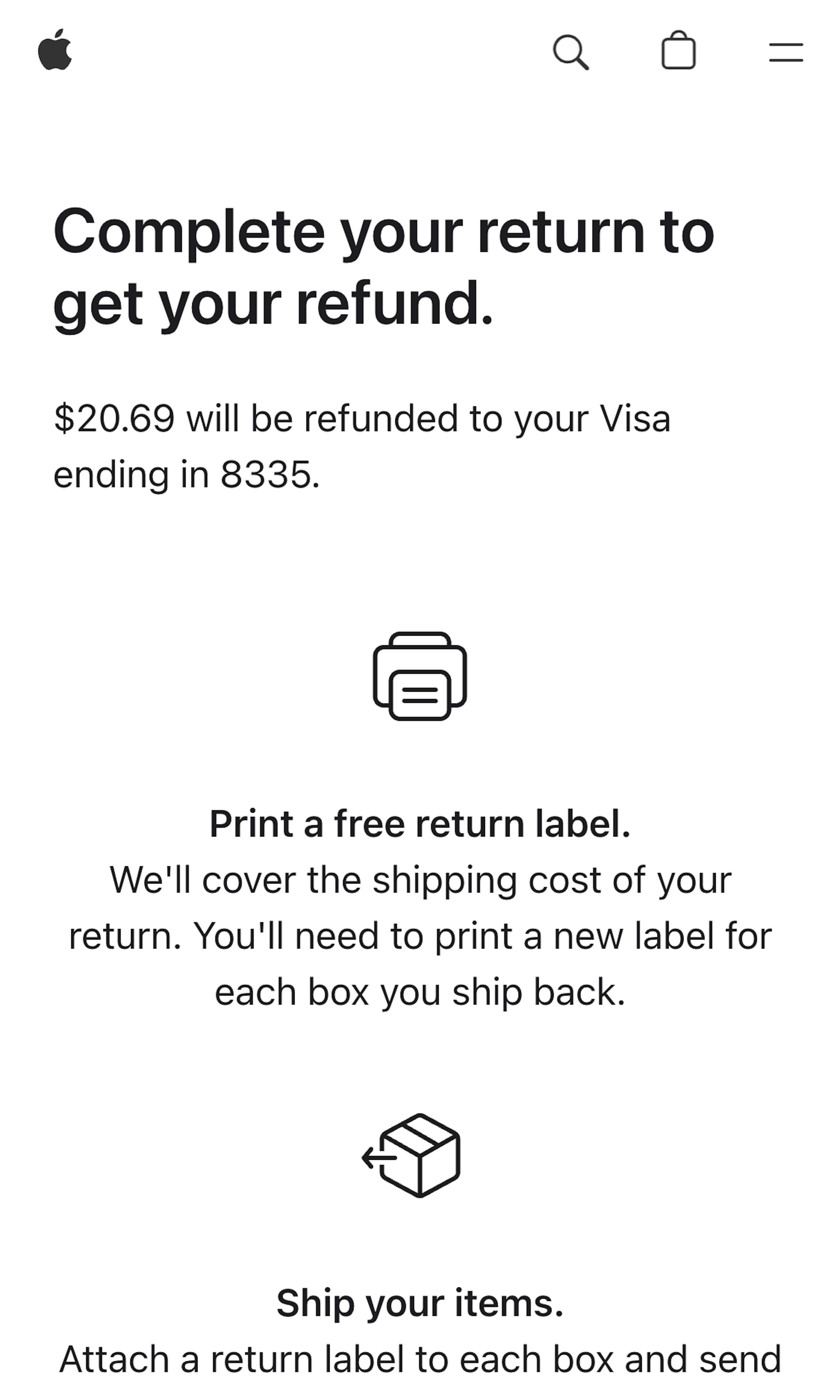
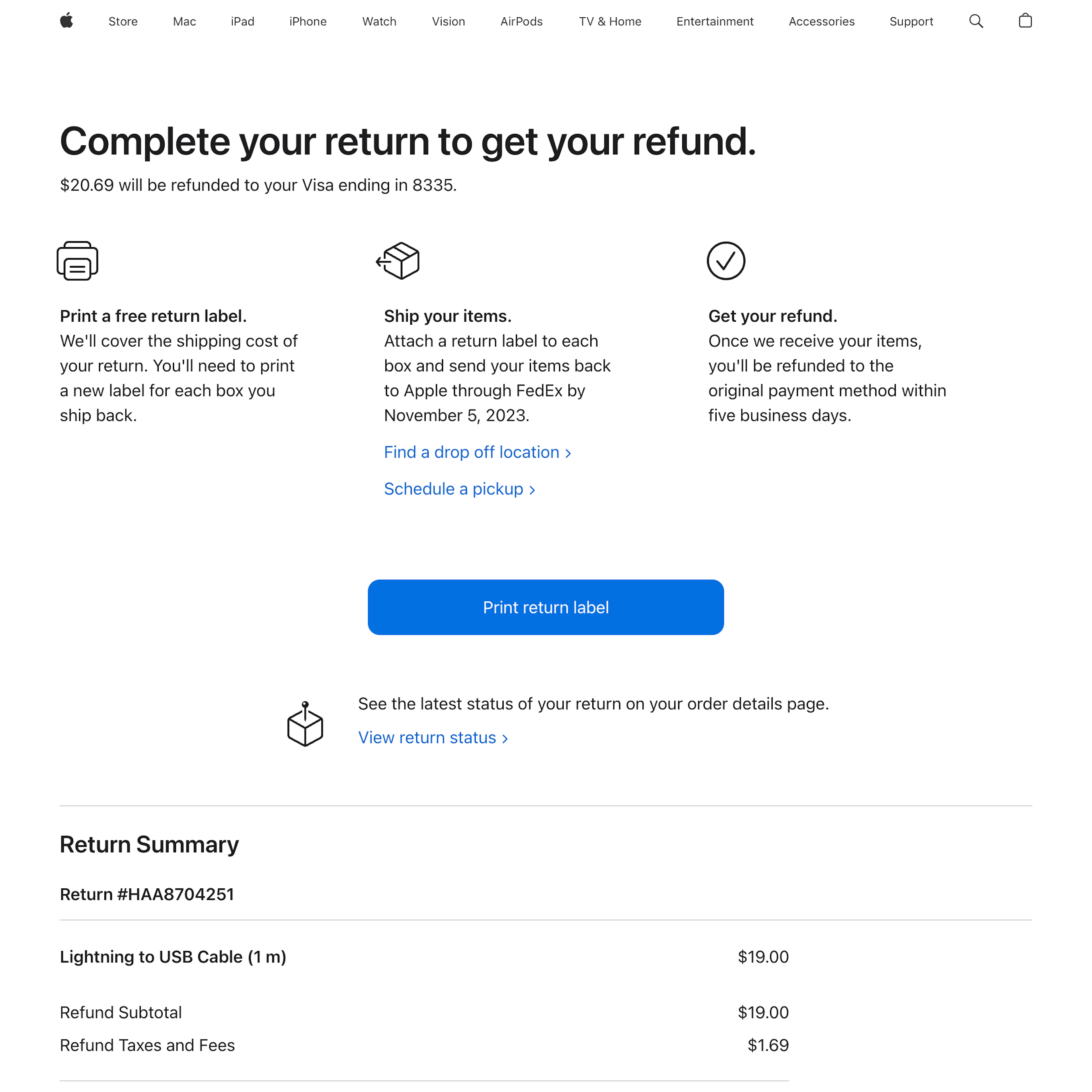
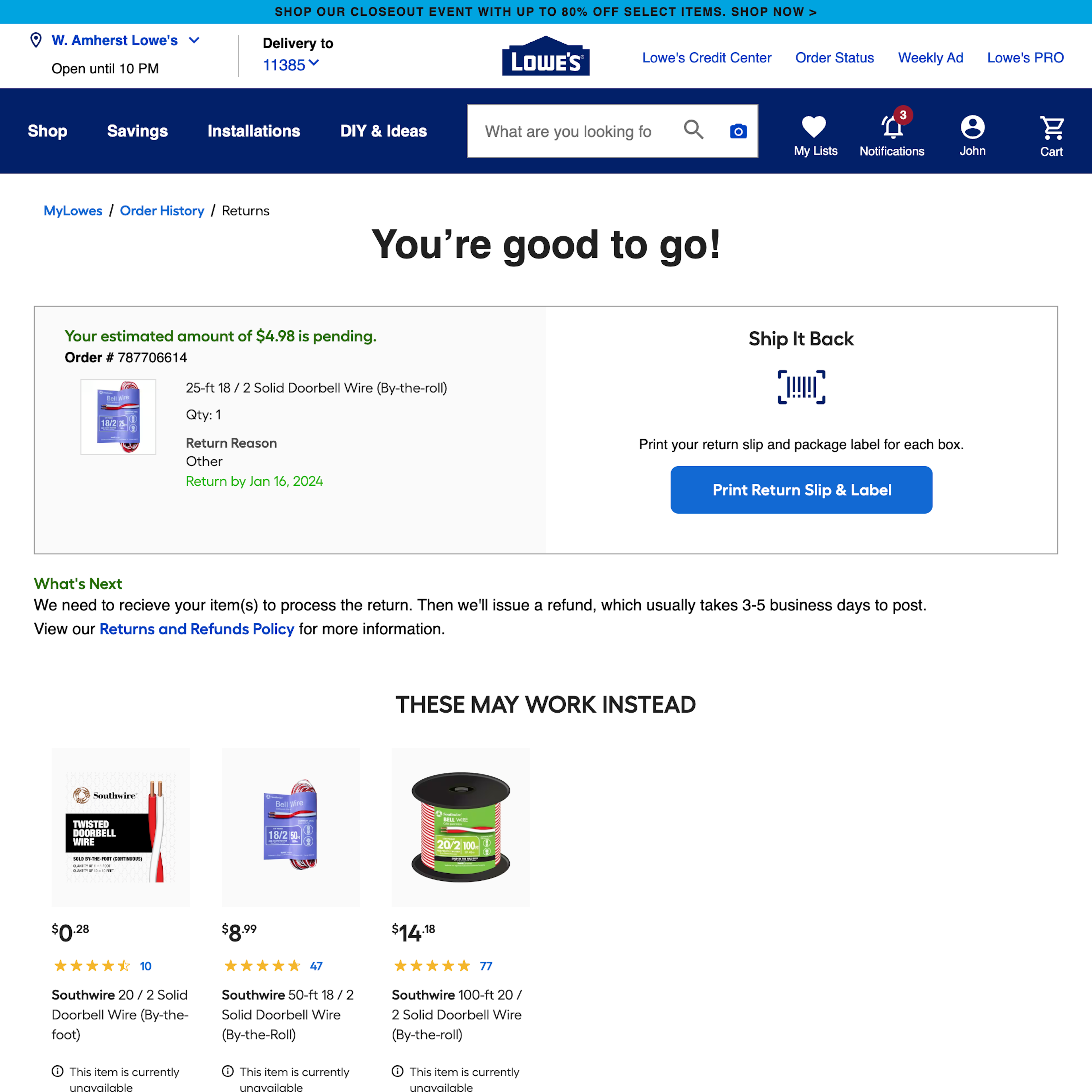
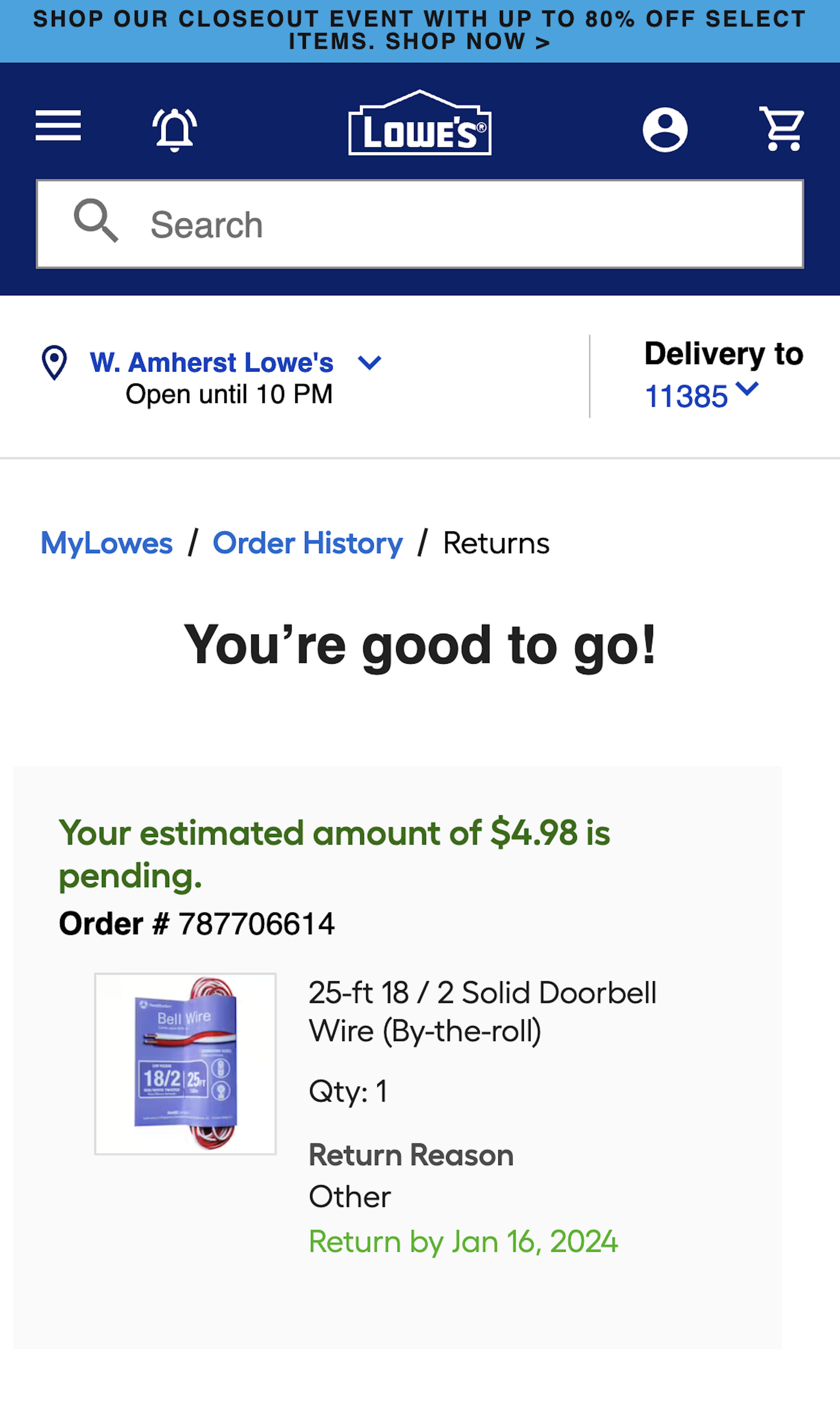
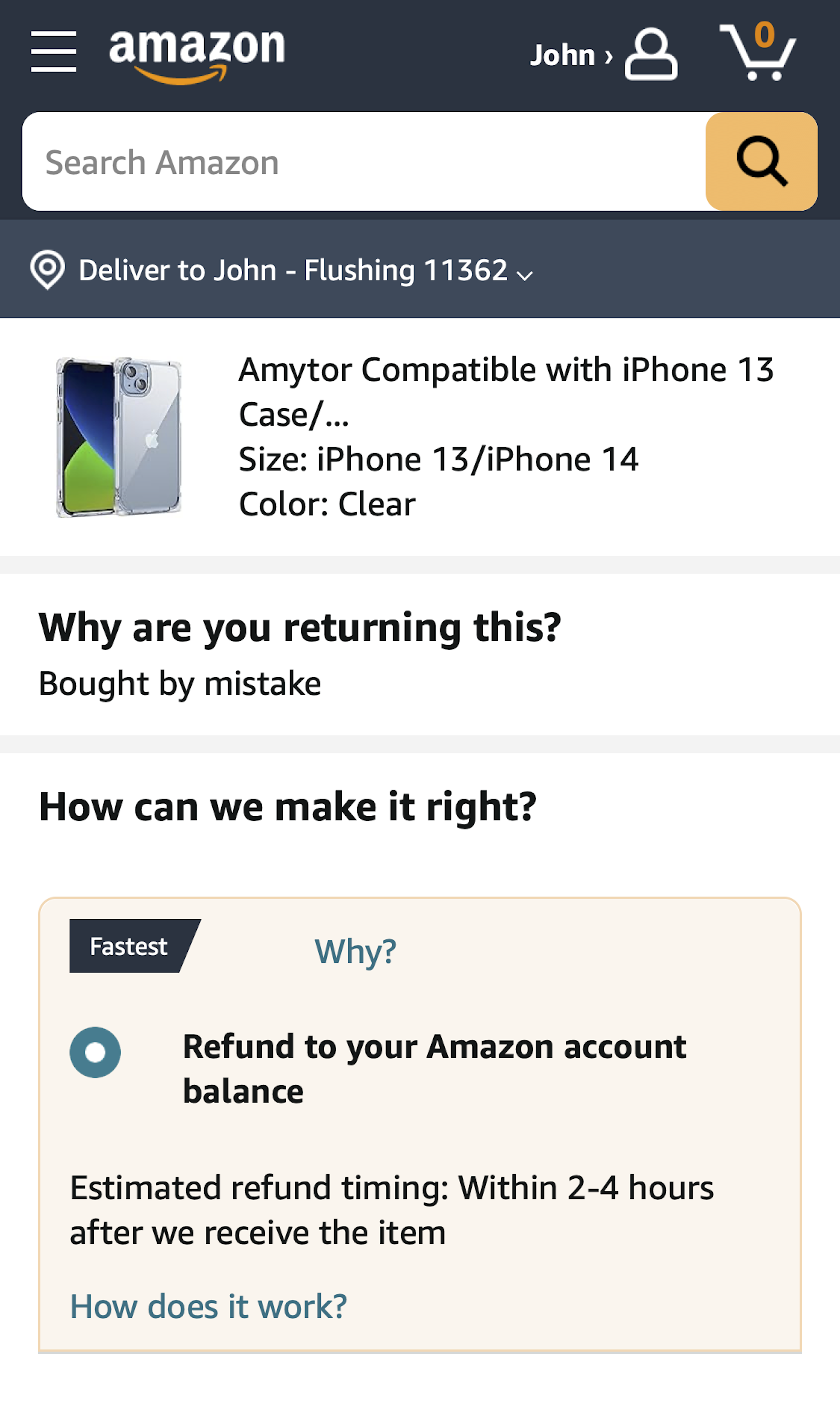
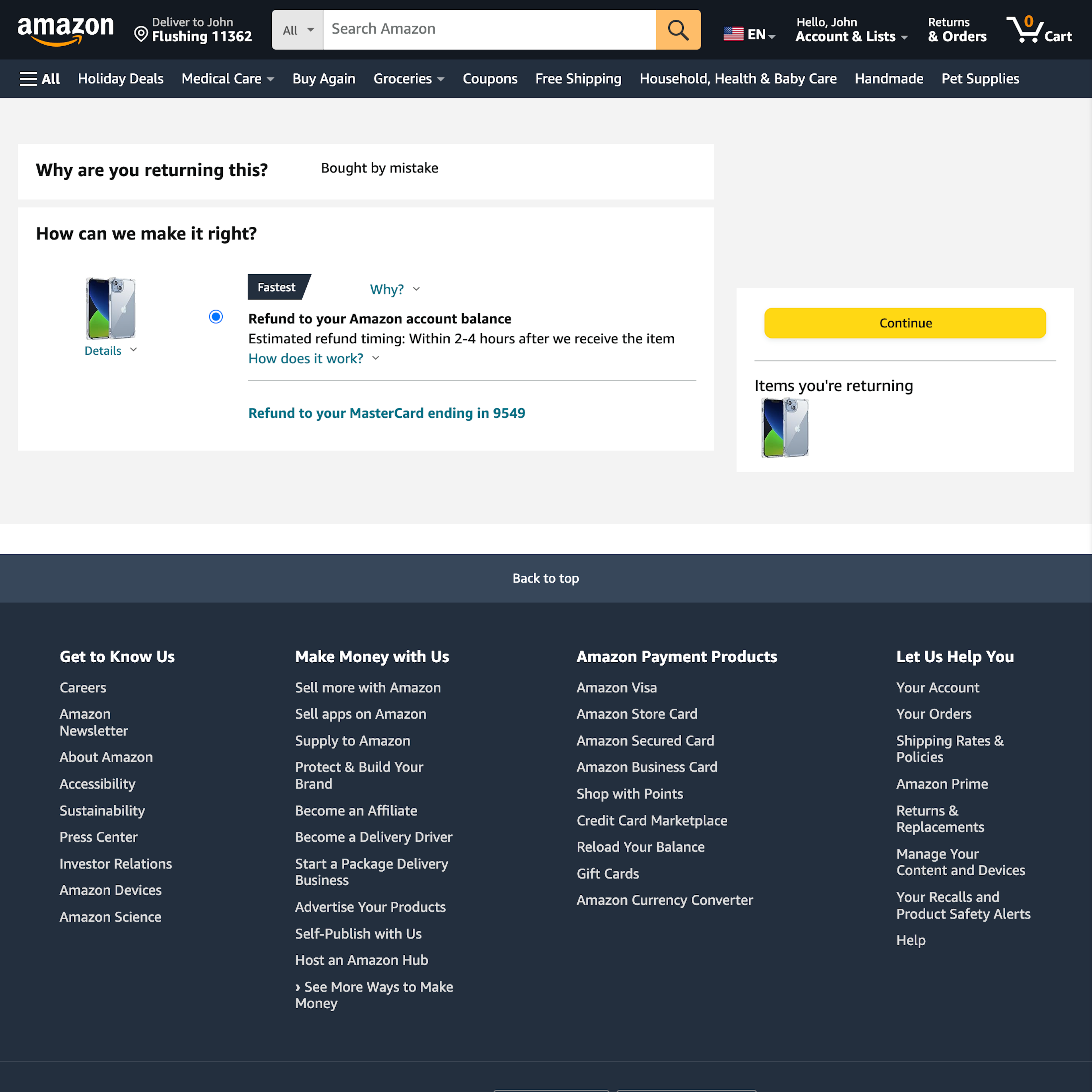
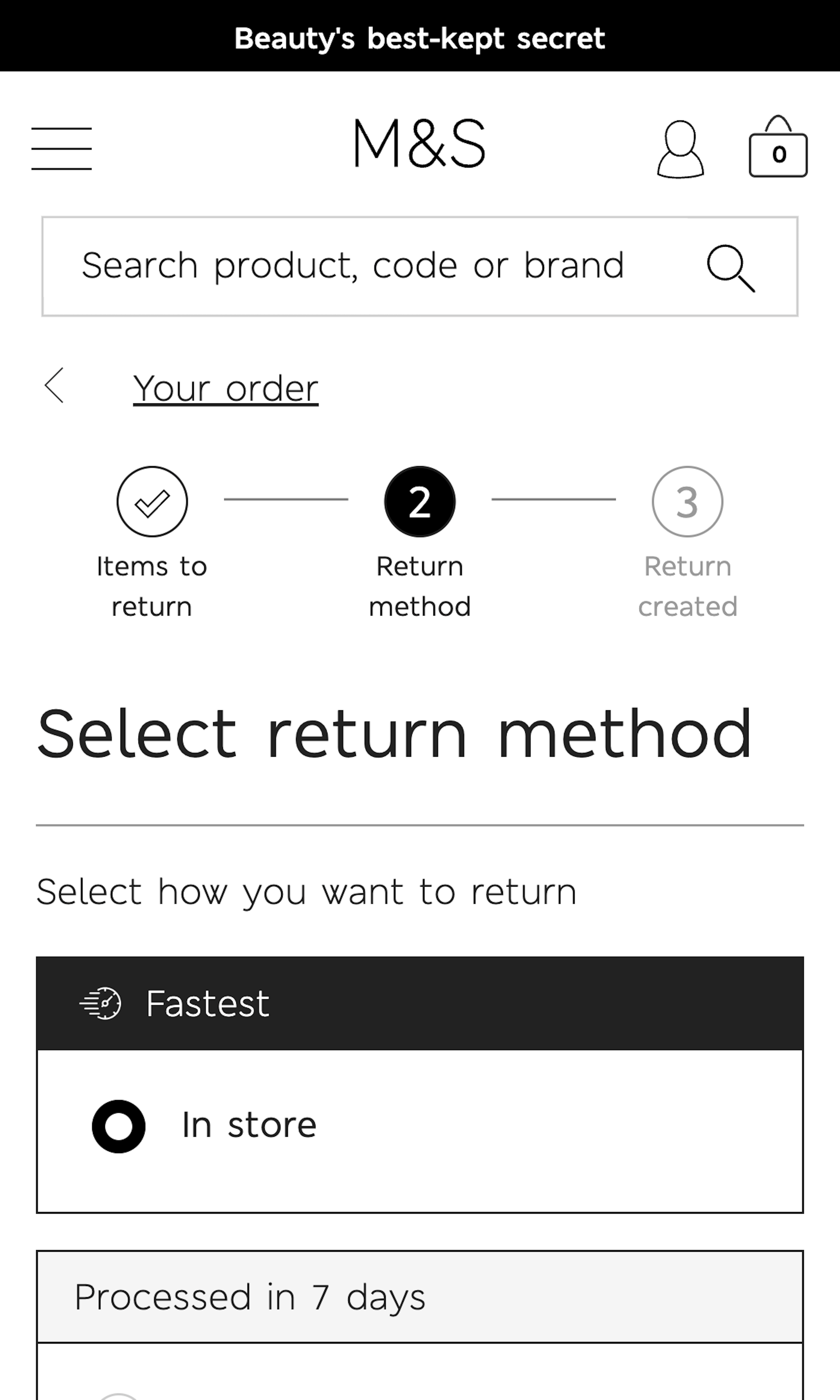
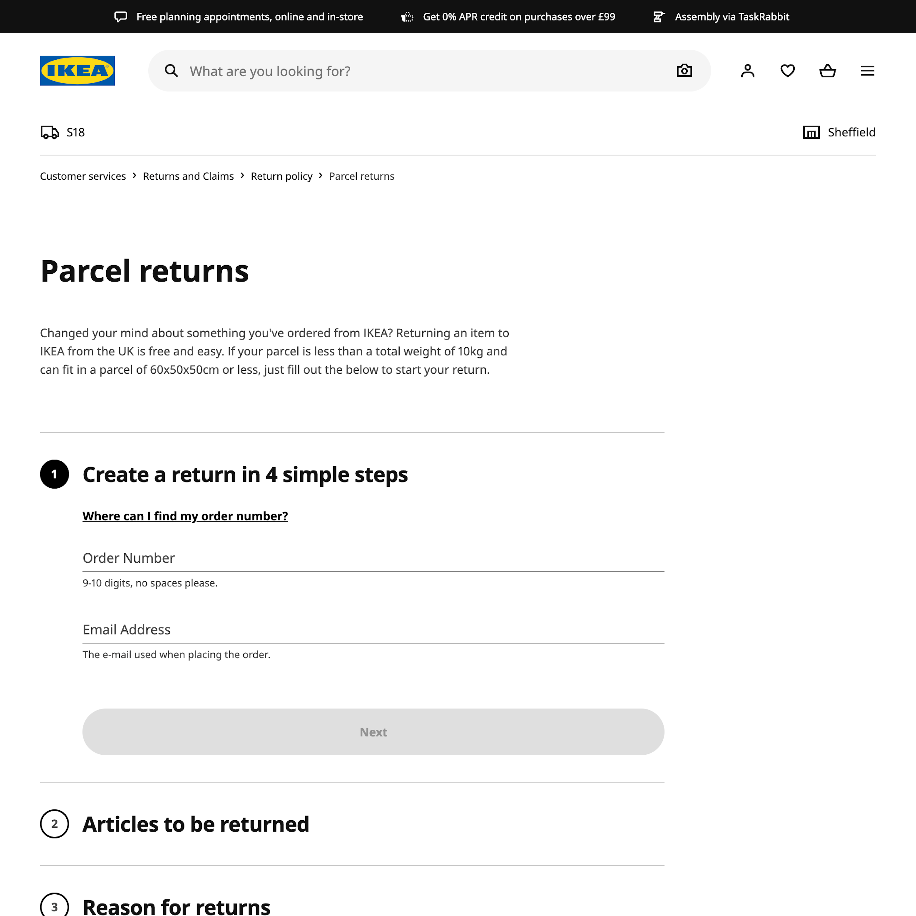
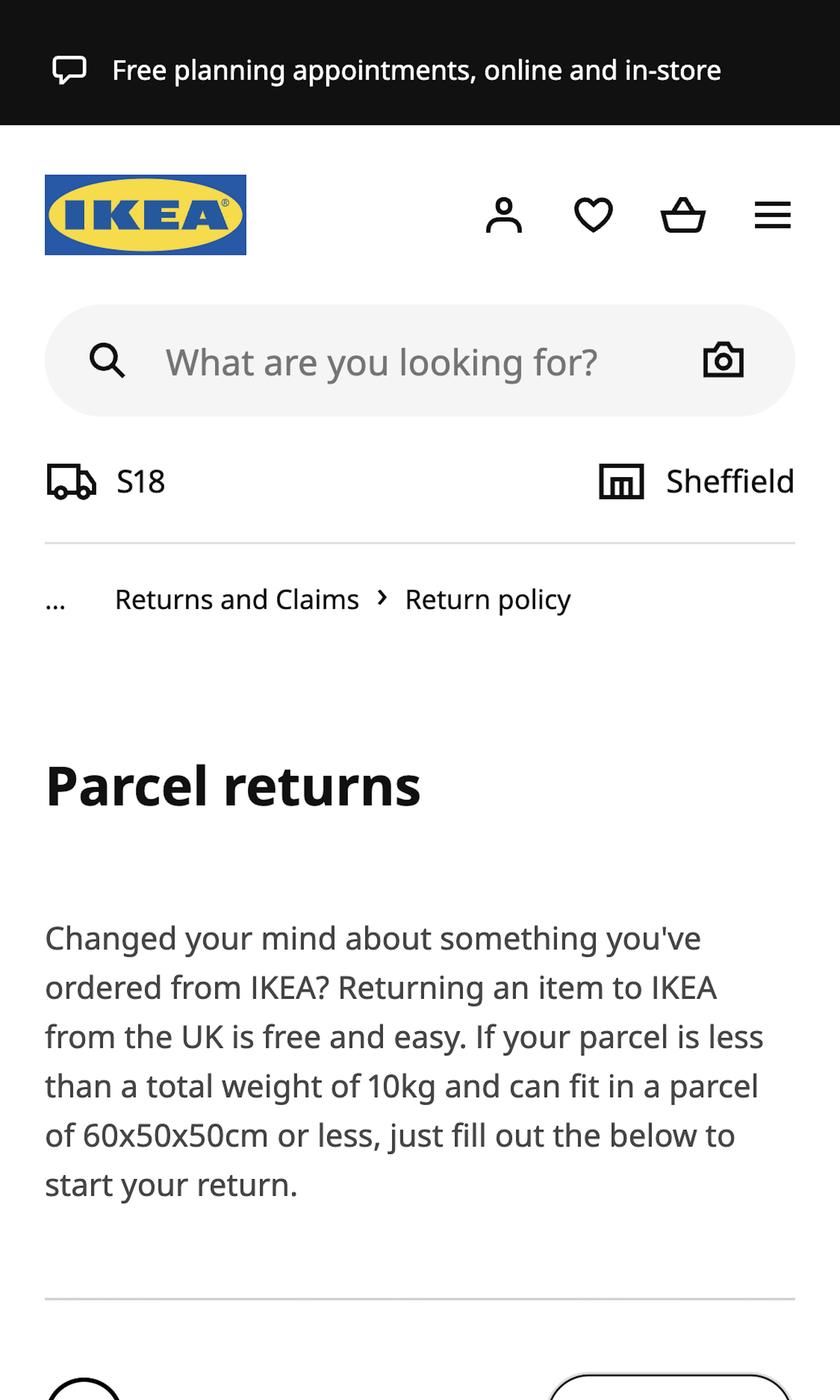
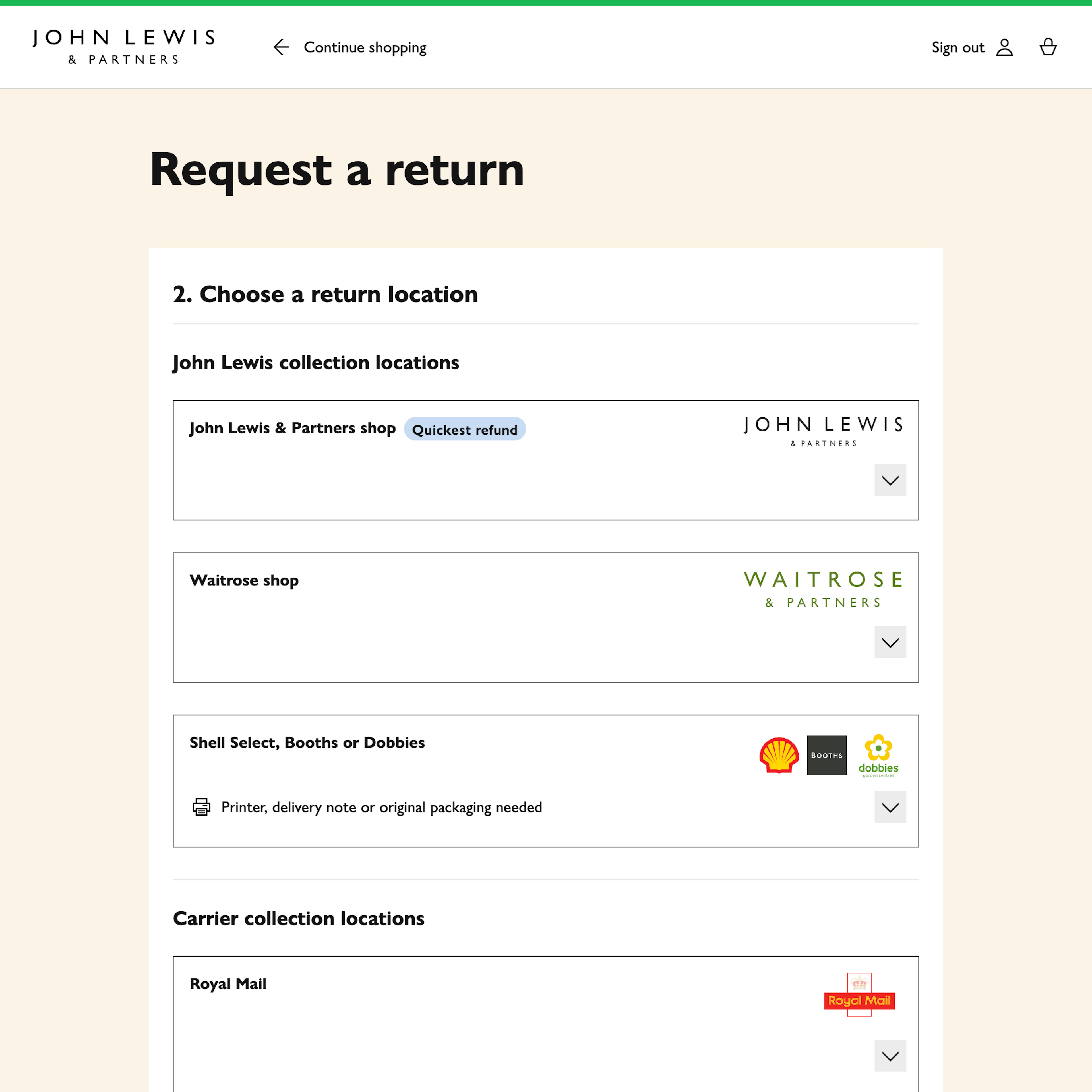
What’s this? Here you’ll find 130 “Order Returns” full-page screenshots annotated with research-based UX insights, sourced from Baymard’s UX benchmark of 327 e-commerce sites. (Note: this is less than 1% of the full research catalog.)
Our quantitative research reveals that 26% of e-commerce users who access their e-commerce account, do so to initiate, manage, or complete an order return. Furthermore, we’ve found that 58% of users returned at least one item in the past year to an e-commerce site, and we found that 15% of users have abandoned at least one purchase in the past quarter solely due to an unsatisfactory returns policy.
Despite the importance of order returns, during our large-scale usability testing of the returns processes and the return UIs at e-commerce sites, we’ve found this to be the single feature (related to “Self-Service & Accounts”) that generates the most frustrations and usability issues for users.
Indeed, our quantitative study of 818 US adults documents that 12% of users would never purchase from a particular e-commerce site again, while an additional 11% would be unlikely to do so — solely due to a negative order return experience.
More ‘Order Returns’ Insights
-
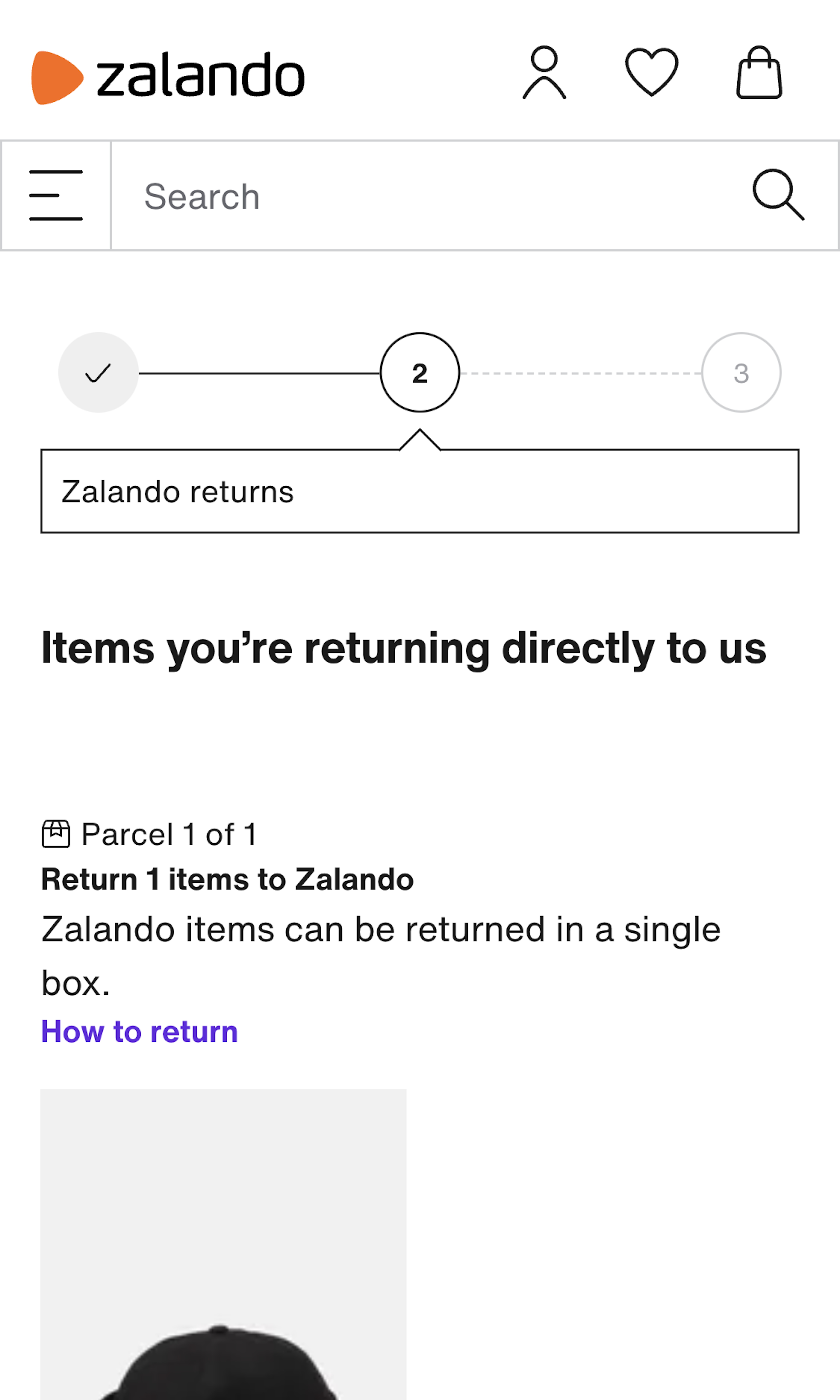
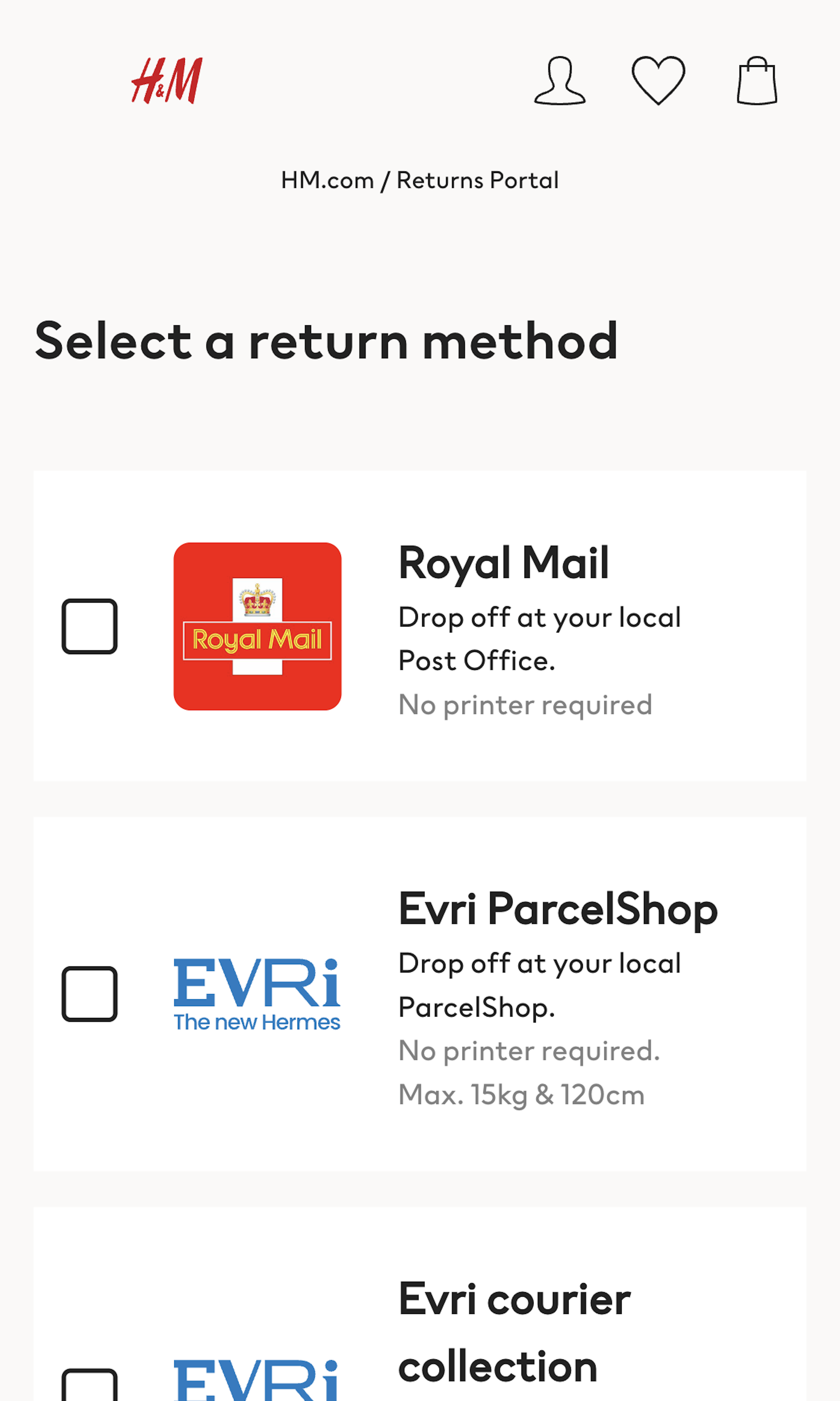
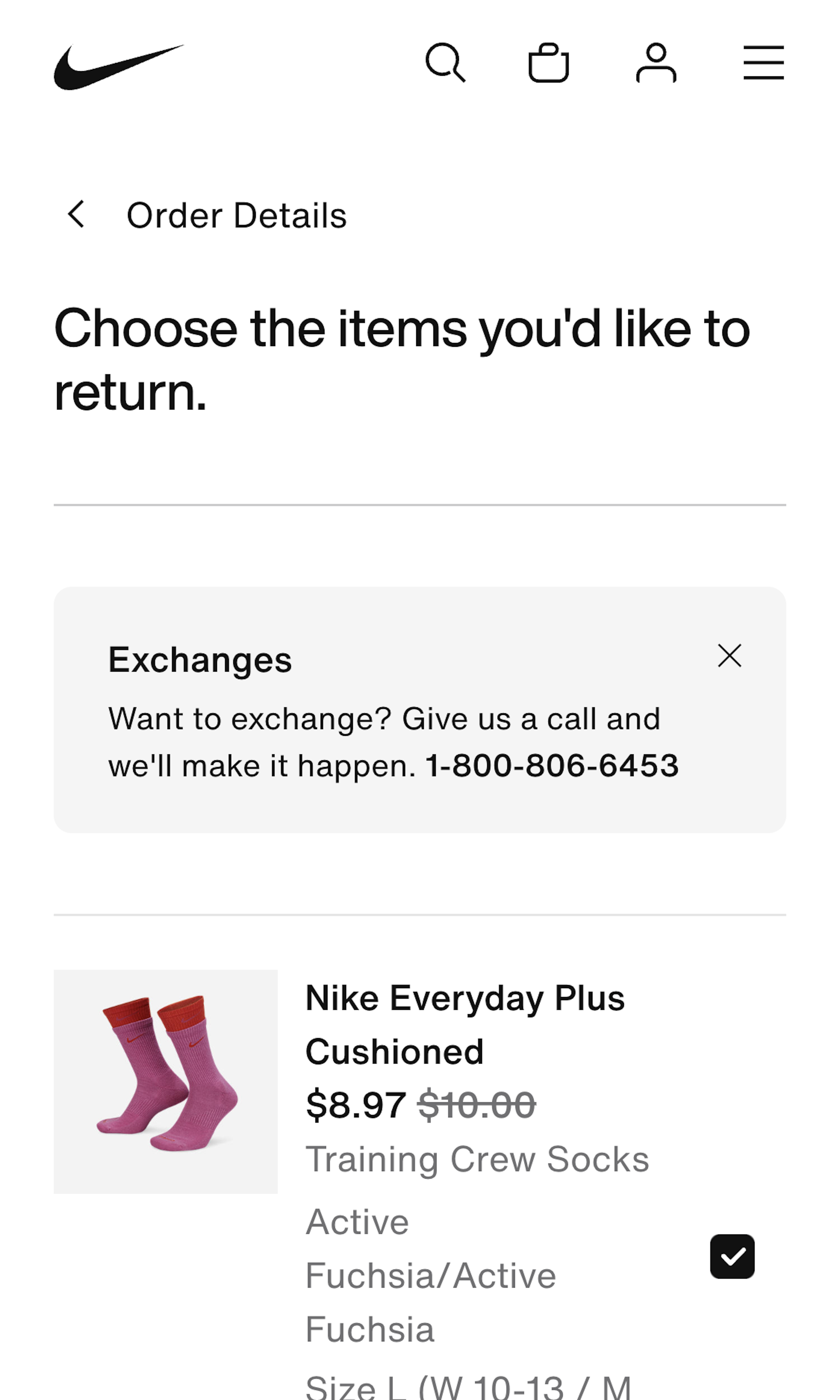
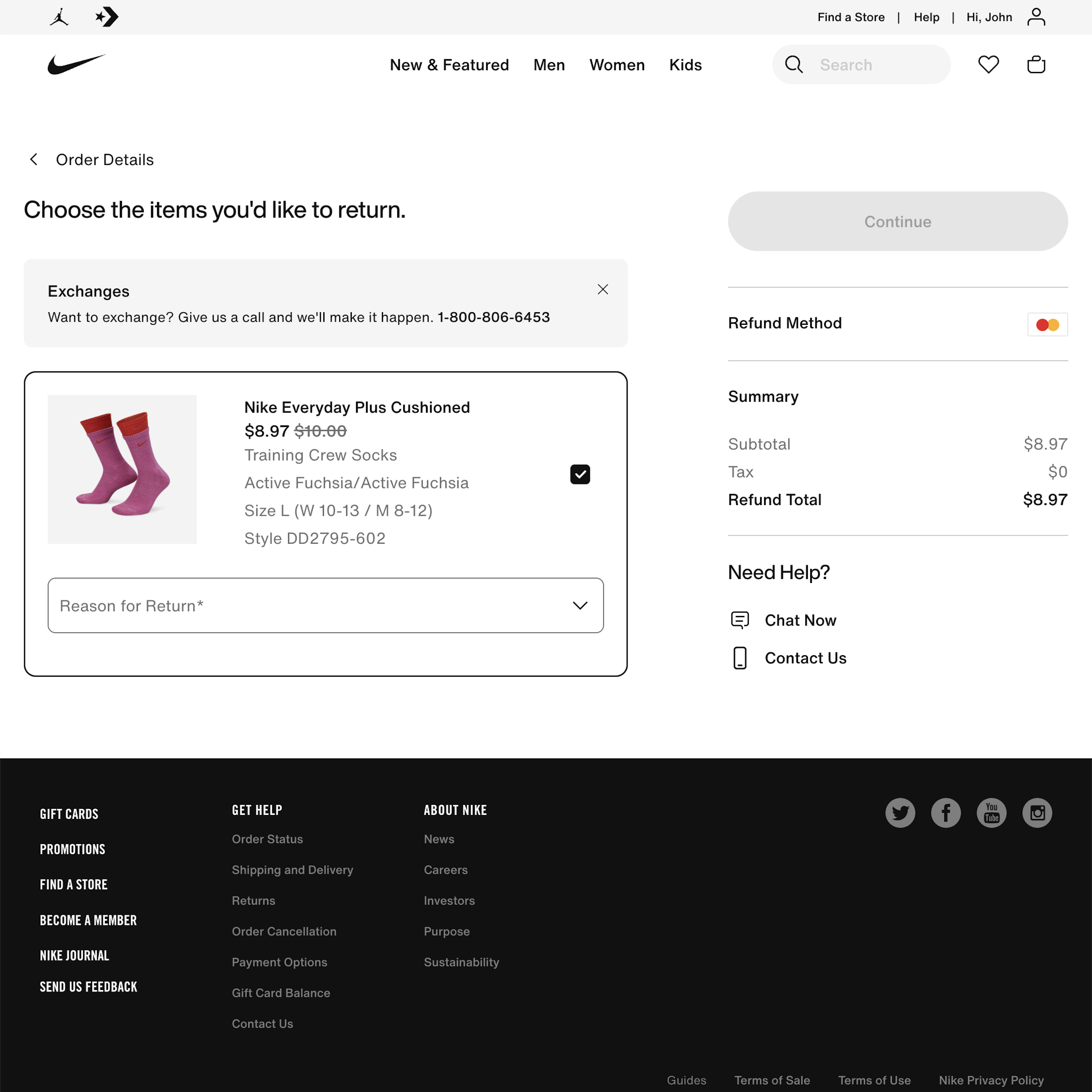
Our testing reveal a long array of potential pitfalls in the online returns experience, such as initiating the return on the e-commerce site, moving through the return flow, printing the shipping label, returns costs, returns shipping methods, in-store returns, and communicating the status of an ongoing return. Unfortunately our testing also revealed that while a pre-printed return label in the original package is greatly appreciated by some users it doesn’t replace having an online returns flow.
-
Learn More: Besides exploring the 130 “Order Returns” design examples below, you may also want to read our related articles on “54% of E-Commerce Sites Have a Returns Interface with Substantial Usability Issues” and “New Research Findings on ‘Accounts & Self-Service’ UX”.
-
Get Full Access: To see all of Baymard’s design guidelines on Accounts & Self-Service pages and features you’ll need Baymard Premium access. (Premium also provides you full access to 200,000+ hours of UX research findings, 650+ e-commerce UX guidelines, and 275,000+ UX performance scores.)
User Experience Research, Delivered Weekly
Join 60,000+ UX professionals and get a new UX article every week.

User Experience Research, Delivered Weekly
Join 60,000+ UX professionals and get a new UX article every week.

Explore Other Research Content

300+ free UX articles based on large-scale research.

327 top sites ranked by UX performance.

Code samples, demos, and key stats for usability.

