
User-Centered Design: Principles and Examples of UCD

Human-centered innovation is now at the center of many companies’ design and development decisions. Instead of pushing products to market as fast as possible, these companies are switching to a model of user-centered design.
By focusing on the user experience, design and development teams create high-performing digital products that specifically match users’ needs.
In this post, we will explain what user-centered design is, its primary principles, and what a user-centered design process looks like.
Then, we’ll show you ten examples from desktop and mobile websites that highlight user-centered design for e-commerce.
Access research-backed UX guidelines
Make best-in-class design decisions and improve conversions with 200,000+ hours of validated, industry-specific UX research and benchmarks.
What Is User-Centered Design?
User-Centered Design
User-centered design (UCD) means designing from the point of view of the user. Design and development teams use data on users’ needs, goals, and feedback to create highly usable and accessible websites and apps.
UCD involves users throughout the design process through in-depth UX research on their preferences and behaviors regarding the features of the product. Every touchpoint a customer has with the site should be analyzed to ensure their experience is as smooth and delightful as possible.
There are four essential elements for UCD:
- Visibility: From the second they land on your page, can users see what your website is about and understand how to use it?
- Accessibility: Is your site accessible to users? Can they find information quickly? They should be able to easily locate call-to-action buttons, menus, filters, and search options.
- Legibility: Is the text easy for users to read?
- Language: Is the language easy for users to understand? Do you avoid industry jargon in UX writing that can cause confusion and hesitation?
User-Centered Design Principles
There are several major principles of user-centered design:
- Early and active involvement of the user during the design process. Design decisions are based on what the user needs and wants.
- Clarification of user and task requirements. Identifying these requirements is critical, and business goals should be aligned with clearly defined user needs.
- User feedback is incorporated into the product’s lifecycle. Design teams collect and analyze user feedback and perform regular usability testing.
- The product is improved using an iterative design process. Designers and developers make changes gradually as they test features and gain a deeper understanding of their target audience.
The User-Centered Design Process
To create a website that puts users at the center of the experience (and increases your e-commerce conversion rate), follow these four primary UCD steps:
1. Research
In this phase of the UCD process, you will identify the people who will use your website and under what conditions they’ll be using it.
Create personas to show your team examples of the user you’re building the website for. A persona represents your target audience as an individual with the same behavior, goals, needs, skills, background, and attitudes as your ideal user.
Personas can help you simulate customers and identify requirements and user goals that must be met.
When you’re creating personas, ask yourself:
- Who will use your product?
- What are that user’s goals (what are they searching for or what do they want to accomplish on your site?)
- How do users view the process of completing tasks on your site?
- What does the user feel, think, say, and do?
- How much time does it take a user to figure out how to accomplish a task?
Take the time to create a detailed user persona, or multiple personas, to ensure you have a clear understanding of the people who will be using your site. If you don’t understand your target customer, you’ll be more likely to create the wrong solution for them.
2. Ideation
Now that your initial research is complete and you have a deep understanding of your target user and the problem you’re attempting to solve, you can dig into creating a solution.
Journey mapping and storyboarding can be helpful tools during the ideation stage of user-centered design.
What is Journey Mapping?
Journey mapping is a simulation of the steps each user persona will take to reach their end goal. It visualizes how the user will interact with the website so designers can see the site from the user’s point of view.
Storyboarding allows you to convey the user's emotional state at each step of their journey with your website by breaking down the action into individual panels. This technique illustrates the interaction between the user and your site in a narrative format that might include drawings, sketches, or words. Good storyboards allow design teams to understand the flow of users' experiences during different parts of the journey.
3. Validation
During the validation stage, you’ll put theory into practice by evaluating how users interact with your site. With usability testing, you can validate your ideas by seeing how they work with your target customers. Validation is an iterative process that will continually happen as you work on your site.
Another validation method is to measure your site against established UX design best practices in your market. You can also pre-validate design choices and page designs if you know what’s already working well for high-performing sites targeting the same users.
4. Improvement
Using the quantitative and qualitative data you gather during the validation stage, improve the UX and UI of your site to boost conversions and create a site that puts users at the center of the experience at all times.
Through ongoing review and testing, as well as UX competitive analysis, you can continue to uncover opportunities to improve your site’s UX performance.
→ Sign up free to free research-backed UX guidelines and start improving your site today.
User-Centered Design Examples
Looking for examples of user-centric design for e-commerce sites?
Although no site has a perfect score in our testing, we have included 10 e-commerce sites evaluated during our benchmarking research of both good and bad UCD (five desktop sites and five mobile sites).
Take a look to learn why these specific elements and features can be recognized as examples of great user-centered design – or designs that create issues for users.
1. Home Depot’s Order Cancellation (Desktop)

Home Depot mitigates user anxiety by immediately updating the order status page after a user completes a cancellation request. There is also a message in large font stating that the order has been canceled and it is clear the user hasn’t been charged.
Most users understand there’s a limited amount of time available to cancel an order and are often anxious when submitting cancellation requests. The user wants to know when and if their request has been received, whether their request has been accepted, and specifically how payment is impacted.
By considering users’ anxiety around order cancellation, sites can ensure the process is user-centered with clear messaging throughout the process, including updates to the order status page and detailed cancellation emails.
2. Crutchfield’s Search Field Design (Desktop)
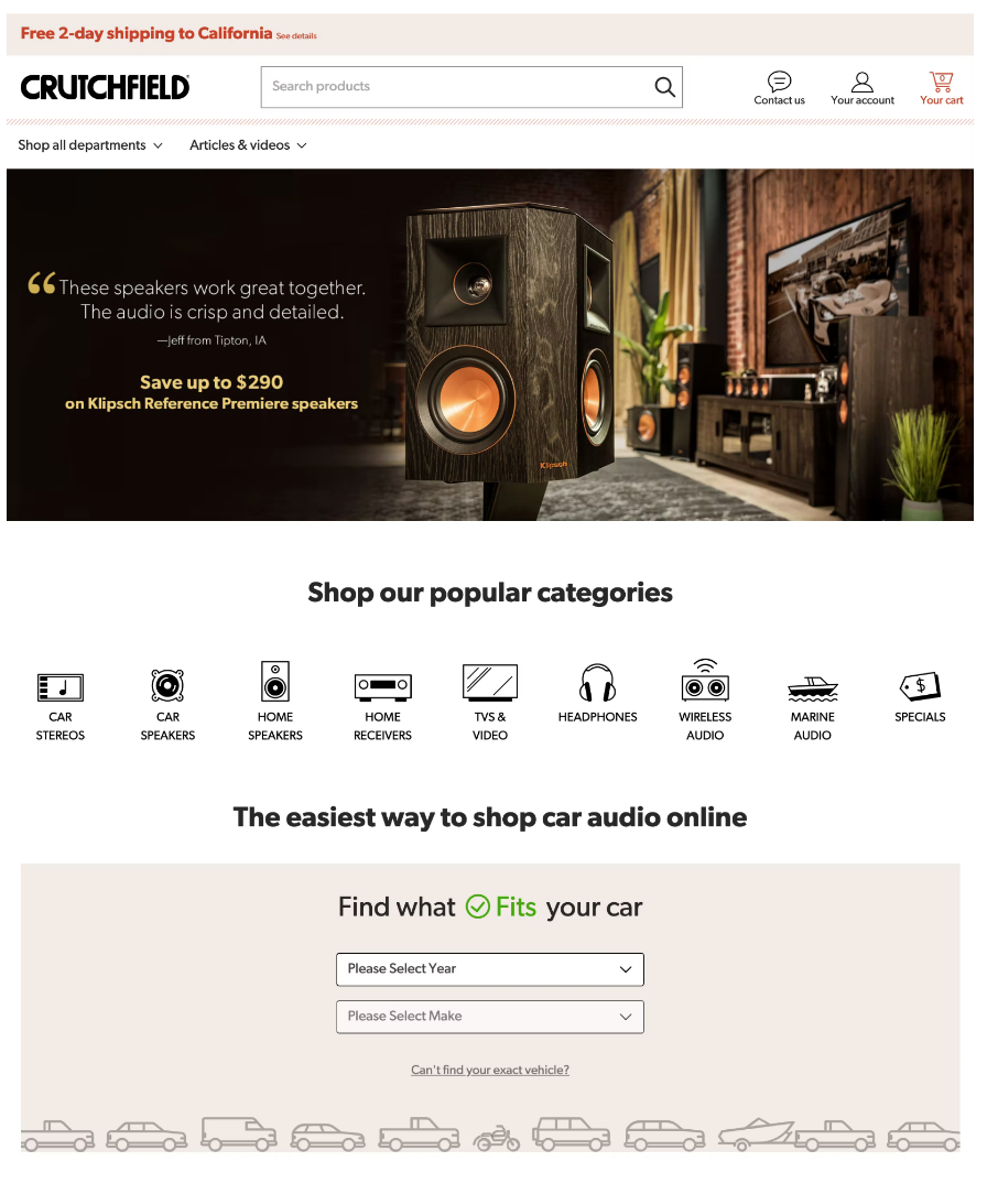
Crutchfield’s home page includes a noticeable search field as part of their search design, making this a good example of user-centered design.
One of the principles of UCD is considering the requirements and tasks of the user. Since the first tasks a user attempts when landing on an e-commerce site is often to search for a product, search field UX design plays an important role.
The prominence and aesthetic appeal of the search field indicate how strongly the site recommends using the search function to find products (rather than trying to steer users through categories using the site menus).
3. REI’s Account drop-down menu (Desktop)
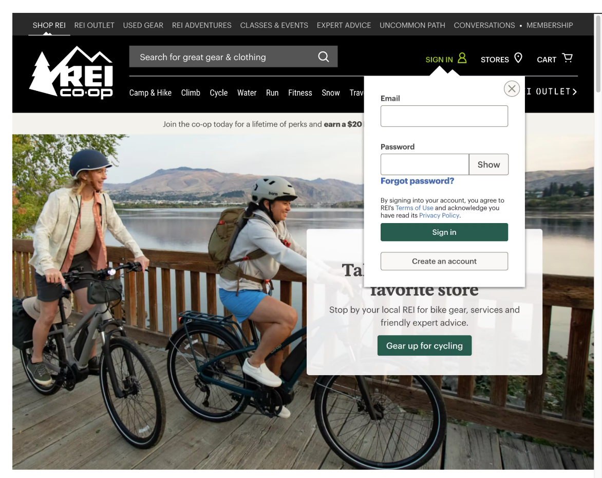
REI’s self-service UX makes it easy for users to access the most relevant features by providing a single, dedicated “Account” drop-down in the main site navigation. Users can log into the account menu directly from that drop-down to access all account features.
During our Accounts and Self-Service usability testing, the drop-down menu was the navigational anchor users often turned to when searching for various account features. But poorly designed drop-down menus can create confusion, leading to site abandonment and negative perceptions of the site or brand.
Taking a user-centered approach, UX designers determine which features are most important to users when it comes to their accounts and prioritize those features in the menu. Giving users a primary path to log in to their account prevents frustration and provides a positive self-service UX.
4. Sears’s Category Filtering (Desktop)
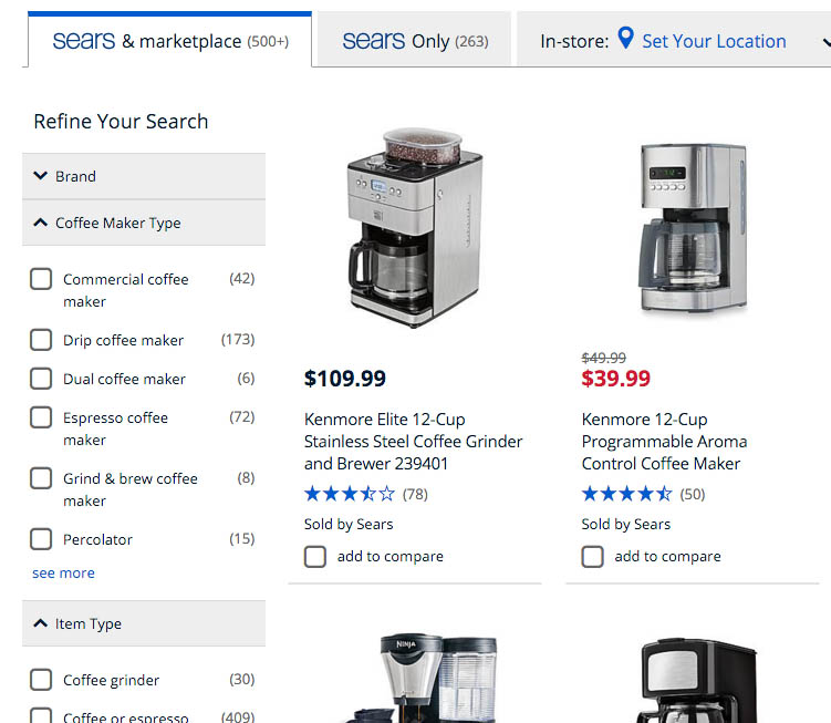
Sears enables users to combine multiple values by implementing “Coffee Maker Type” as a filter rather than a category. This makes shopping easier for users interested in more than one type of coffee maker.
Over-categorizing product types into mutually-exclusive category scopes can cause significant usability issues as users navigate e-commerce sites. If you “silo” users into overly narrow category scopes, you could be preventing them from combining product types to match their purchasing preferences. This can cause site abandonment.
Effectively using category filtering allows users to have a broader choice of categories and types to choose from and combine, leading to a better user experience. UCD, in this context, increases the chances a customer will find what they are looking for and their overall satisfaction with the site.
5. Costco Not Persisting a User Search Query (Desktop)
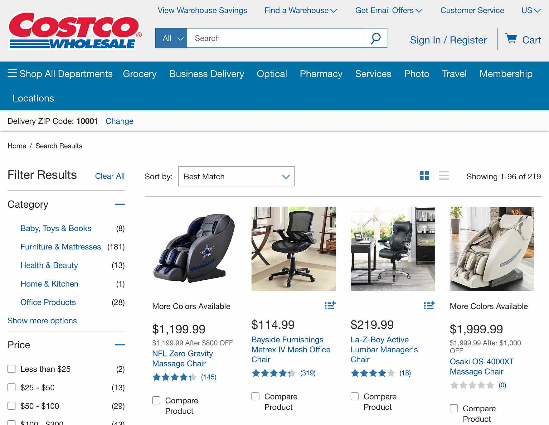
Costco’s desktop site users will need to retype their full query if they want to search again with slightly different parameters. The user’s query does not persist onto the results page.
On most sites, the user’s search query is retained in the search box when they reach the search results page. On sites where the search term is cleared and users have to retype their query, it takes longer to iterate the search process, creating friction in the shopping experience and causing some users to abandon using the search field on the site.
An important goal of user-centered design is to keep the user on the page. By having a persisting search query, the user does not need to reenter their information every time they perform a search.
6. Amazon Date of Delivery (Desktop)
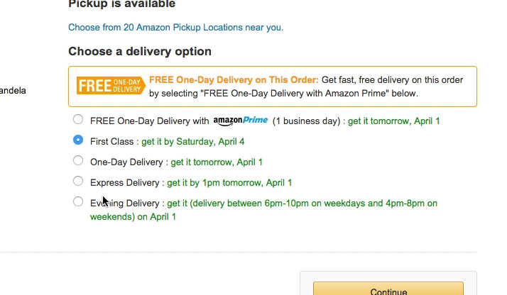
Sites like Amazon that display delivery dates fare much better in usability testing. On Amazon’s site, shoppers instantly get a clear idea of when they will receive their order without having to perform complicated calculations or estimates.
When users on your e-commerce site are going through the checkout process, they want to know how soon they will receive their order. By knowing what your users want and at what point, you can tailor the checkout process so it is focused on “date of delivery” rather than “shipping speed” during these critical last few steps.
Many participants in our usability testing had significant trouble comparing shipping options that displayed shipping speeds rather than delivery dates. Users often misinterpreted shipping speeds and miscalculated arrival dates, potentially leading to customer service inquiries and dissatisfied customers.
7. Build.com Rating Design (Mobile)
Build.com’s product page includes a prominent and clickable ratings average at the top of the page that displays the number of reviews. Users can easily see the sample size the average is based on and determine if they find that sufficient or not.
Our latest UX testing of product pages found that 95% of users relied on reviews to learn more about products. However, product review averages aren’t much use unless users can also see how many ratings that average is based on.
By applying UCD methods, e-commerce sites can tailor their rating design to include both the total number of reviews and their average to provide information customers want during the decision-making process.
8. Best Buy Checkout UX (Mobile)
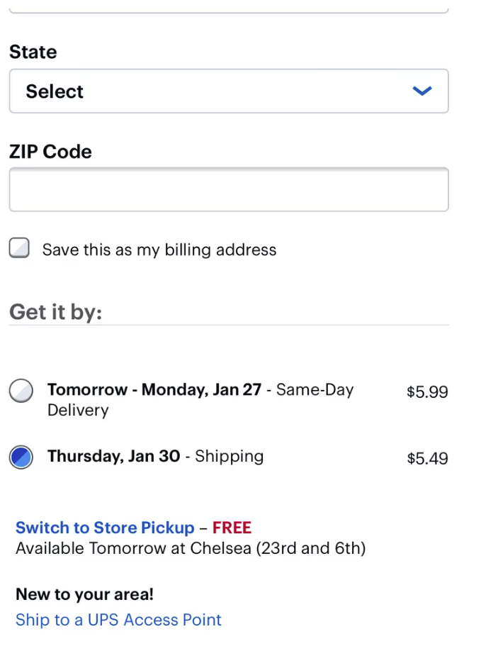
Best Buy’s checkout features store pickup options within the shipping interface, as a direct alternative to the home shipping options (while still keeping the most affordable shipping option the default selection).
Sixty percent of users have abandoned carts due to extra costs added during checkout — which is why offering store pickup as an option has become increasingly important in e-commerce.
Knowing what customers want at all points of the customer journey is essential to UCD. By displaying store pickup as an equal option in the checkout UI, not as a separate checkout flow or delivery tab, you provide all possible delivery costs in one place.
This makes comparison easier for price-conscious users to weigh paying shipping costs against the inconvenience of going to a store.
9. Grainger Matching Category Scopes (Mobile)
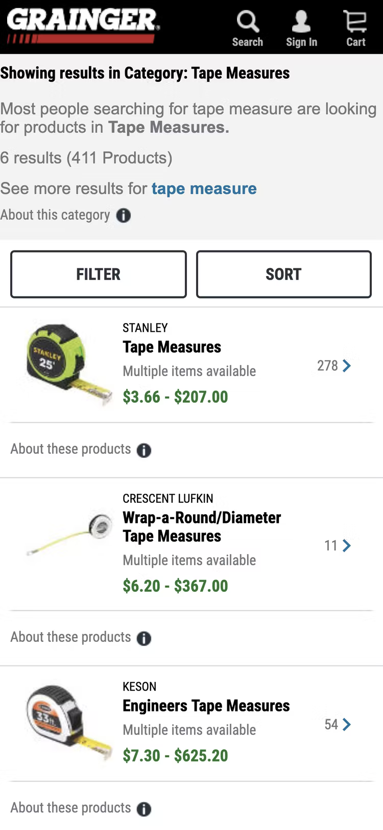
Grainger’s search results page redirects users to matching category scopes when they submit a query that is a one-to-one match with a category name.
A key part of UCD is determining how to answer a user query with the correct information. Many users will search for a product type like “men’s shirts” instead of trying to find a category that matches their search term. When these users aren’t guided to matching category scopes or subcategories, they can receive an overwhelming number of results, or get irrelevant results, which makes them unable to find the products they want.
When a user’s search query is (more or less) a one-to-one map to an existing category or subcategory, they should automatically be directed to the appropriate category page.
10. Lowe’s Placement of Labels Above Fields (Mobile)
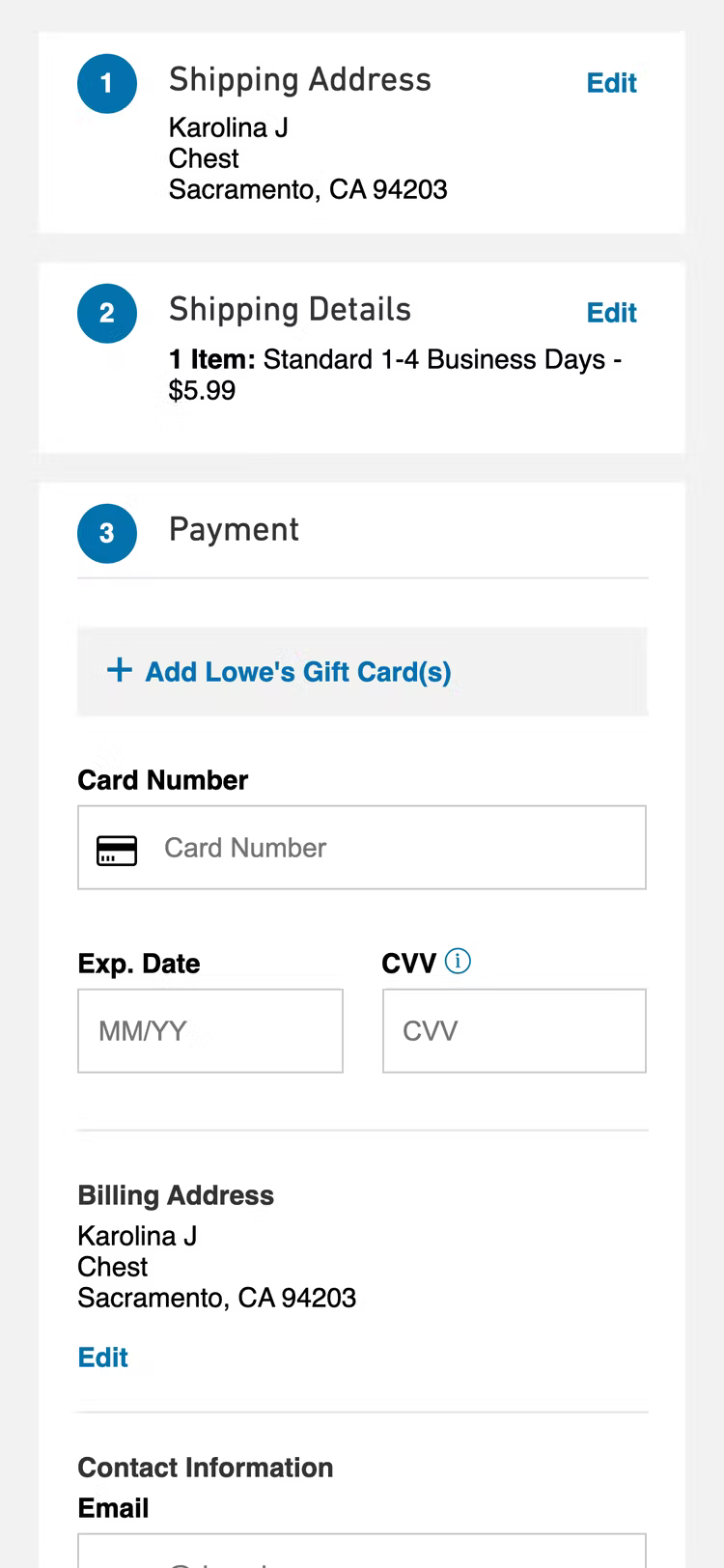
Lowe’s makes it easier for users to input and check data in the checkout form fields by placing labels above the fields.
When forms include labels to the left of their corresponding fields, users must continually look back and forth between the label and the form field, which can lead to confusion. When labels are placed above the field, tracing the label is easier for the user.
During testing, when the labels were placed above the field, we observed that participants frequently started by looking at the label then at the field. This design results in a smooth input field UX and an easier-to-navigate checkout form.
Helpful Tools for User-Centered Design
User-centered design is about turning understanding of the users’ thoughts, feelings, and goals into specific product requirements to guide your website. The UCD process can help decrease personal bias because every decision made is implemented based on research and testing.
With Baymard Premium, you get access to a wide variety of tools that will help you put users at the center of your design process, all based on 78,000+ hours of research and testing – the same tools used by many of the world’s high-performing e-commerce sites.
Find out more about how Baymard’s actionable recommendations, UX case studies, and benchmarking data can help you create successful, innovative, and user-focused designs.
Research Director and Co-Founder
Christian is the research director and co-founder of Baymard. Christian oversees all UX research activities at Baymard. His areas of specialization within ecommerce UX are: Checkout, Form Field, Search, Mobile web, and Product Listings. Christian is also an avid speaker at UX and CRO conferences.