
We took a quick look at The Pure Edit's online shopping experience
From product discovery to checkout, a few things stood out that may be worth exploring further.
The observations below are based on Baymard's ecommerce UX research and homeware industry benchmarks.

“Having Baymard is like having access to a magical UX super power. I can't believe how helpful and easy to use it is, given the vast array of tools and information they provide!”
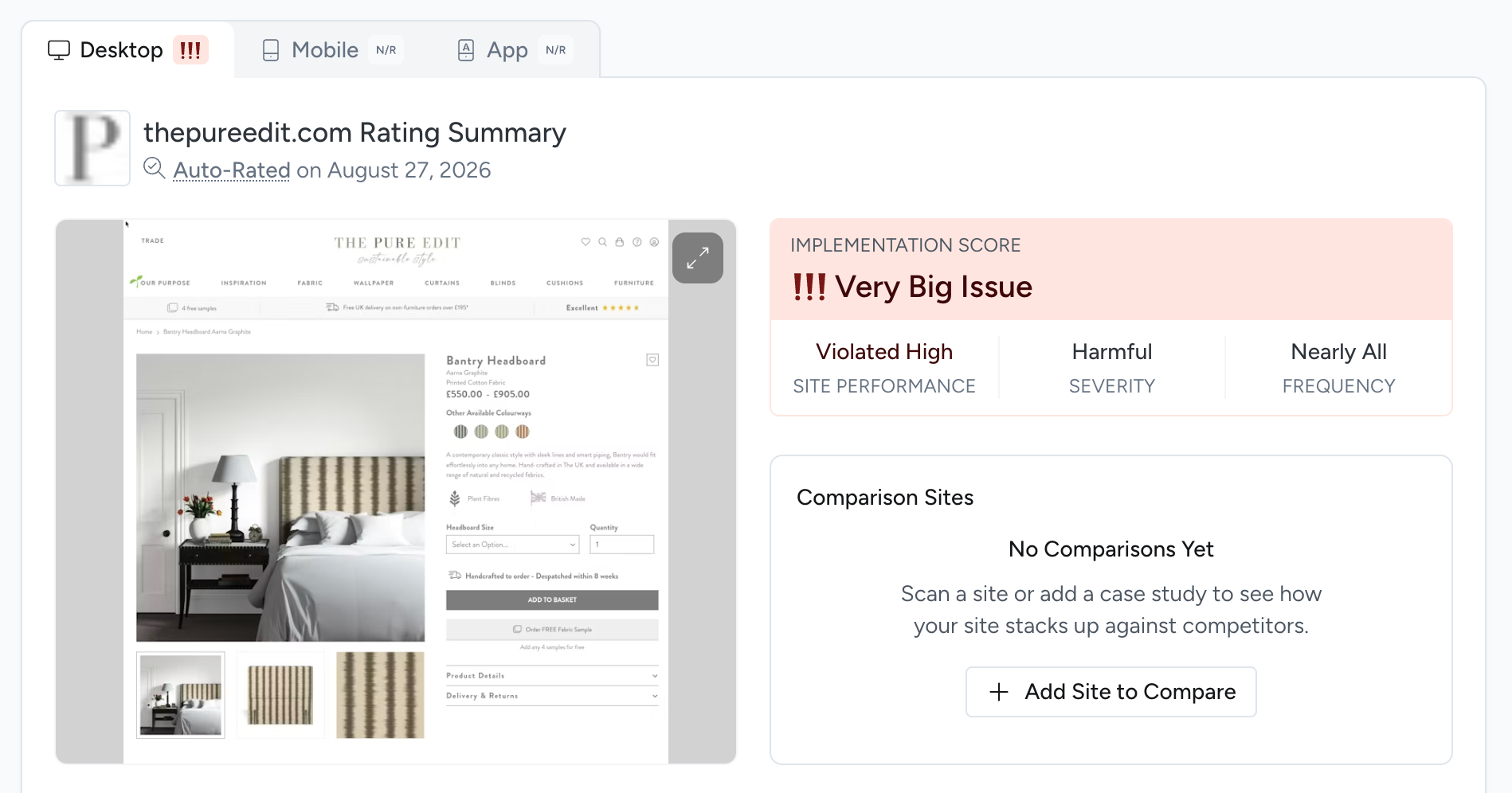
PDPs - Always Provide a "Dimensions" Image for Furniture and Home Decor Products
Because written dimensions are difficult to translate into the real size and shape of a product, especially when there are multiple measurements or unfamiliar terms.
Without a clear visual reference, users are left to interpret complex dimensions themselves. That increases uncertainty and the risk of choosing the wrong product, making abandonment more likely.
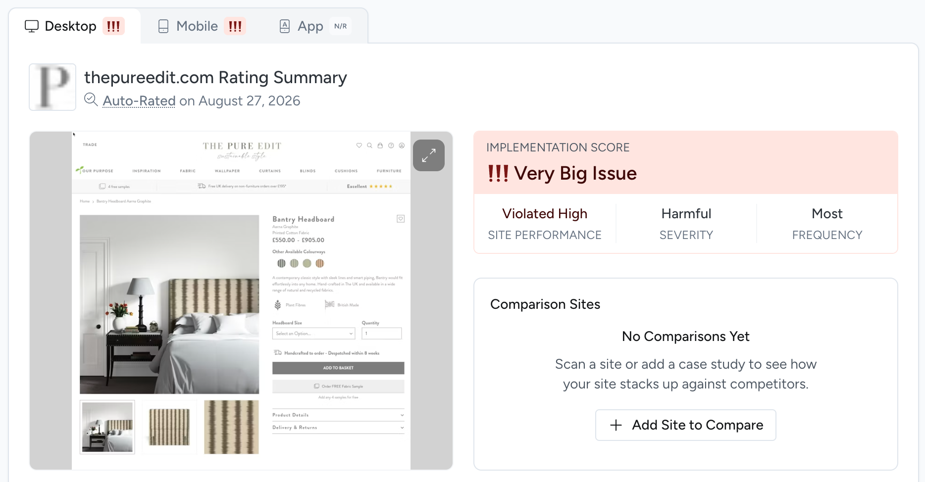
PDPs - Use Both “Bullet Lists” and “Blocks of Text” for Product Descriptions
Large blocks of product copy are difficult to scan and can make important information feel buried.
Users typically rely on bullet points for a quick overview and text for deeper detail. Without that hierarchy, finding relevant information takes more effort, increasing the chance that users judge the product information as insufficient and abandon the product.
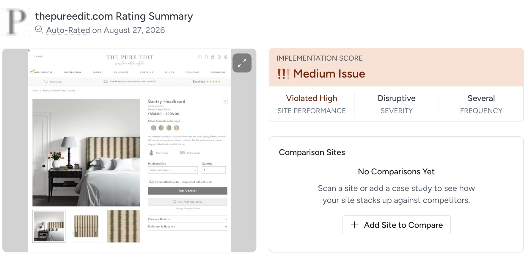
Cart & Checkout - Place "Free Shipping" Information In or Near the "Buy" Section
Because users often miss sitewide shipping banners, especially when they resemble ads. If free shipping isn’t shown near the Buy section, shoppers may assume extra costs apply or have to add the item to cart just to find out.
That creates unnecessary uncertainty at a high-intent moment and hides a potentially powerful purchase incentive.

“Intelligent, consumer-focused insights that are clear and actionable. The team in the room really loved the way the Baymard Institute highlighted the optimizations in the various user experience elements (copy, layout, design, calls-to-action…), from the perspective of consumer struggles. Baymard’s Usability research really complements our other existing research tools.”
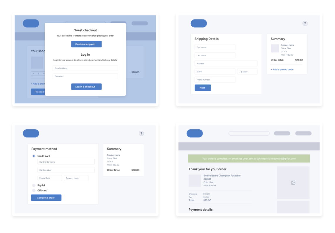
How leading homeware ecommerce teams approach these challenges
High-performing ecommerce teams typically combine multiple sources of insight when improving customer experiences:
- UX research
- Industry benchmarking
- Competitive analysis
- Design pattern libraries
- Team training and enablement
- Expert guidance when needed
The goal is not simply identifying issues, but building confidence in which improvements will have the greatest impact.
Find the UX issues costing your team conversions
The opportunity is bigger than these three findings.
Speak to a Baymard expert to uncover where friction is limiting product discovery, weakening purchase confidence, and slowing shoppers down before checkout. We’ll show how Baymard’s research and benchmarks help your team prioritize the improvements with the greatest commercial impact.
Explore All Features
Research-Backed UX Insights
UX Best Practice Guidelines
UX Audit Service
UX-Ray
UX-Query
UX Benchmarking
Review Tool
Research Personalization
UX Design Examples
Training & Certification