Key Takeaways
- Despite browser autofill and address lookup features, a subgroup of users still run into issues when entering their shipping address
- Typos are even more prevalent for mobile users
- An address validator serves as a key backup — yet 47% of sites don’t provide one
Across multiple rounds of Baymard’s large-scale testing, we’ve observed participants occasionally made mistakes when entering their shipping address (as opposed to using an “Automatic Address Lookup” feature).
For example, users making a typo, forgetting an apartment number, or inadvertently selecting the wrong state or entering an incorrect ZIP code.
In reality, such errors can result in great costs when unremedied, causing users’ orders to be misdelivered or not delivered at all.
In such cases, frustrated users must then invest additional time and effort contacting the site’s customer service or shipping courier to track down their package.
In short, the risks of entering an invalid or undeliverable shipping address demand an additional failsafe to ensure the entirety of the user’s experience — including postpurchase and delivery — is as seamless as possible.
Yet our e-commerce UX benchmark shows that 47% of sites don’t provide an address validator — a failsafe that testing has shown to be crucial to a subgroup of users.
In this article, we’ll discuss our Premium research findings related to address validators:
- How users run into issues when inputting their address
- How address validators are key for a subgroup of users
- 1 detail on implementing address validators so they perform best for end users
How Users Run into Issues When Inputting Their Address
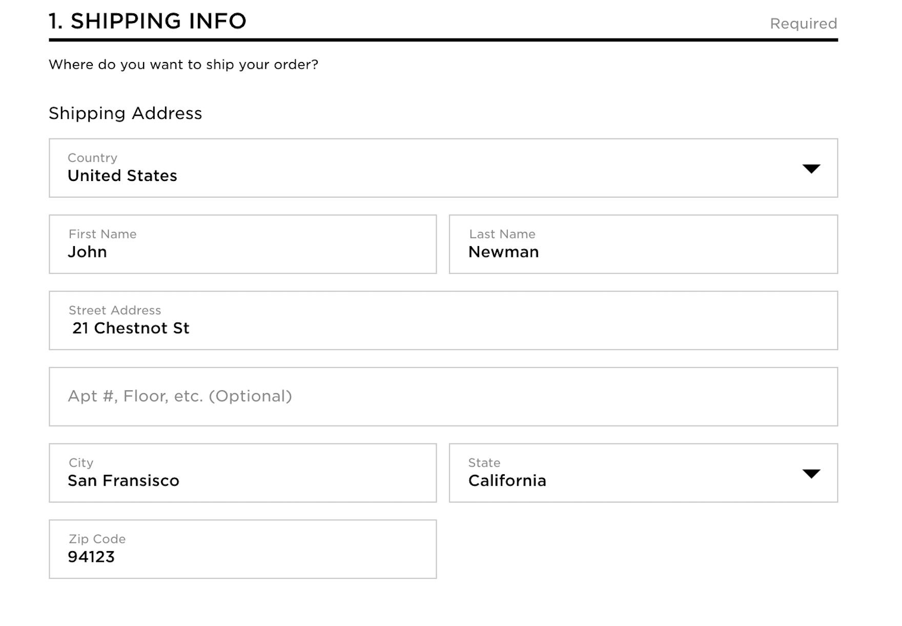
At Lowe’s, users can complete checkout without being alerted to mistakes in address fields, such as the incomplete address shown here. Without adequate notification, some users may not notice their mistake until it’s too late, leading to significant customer service issues.
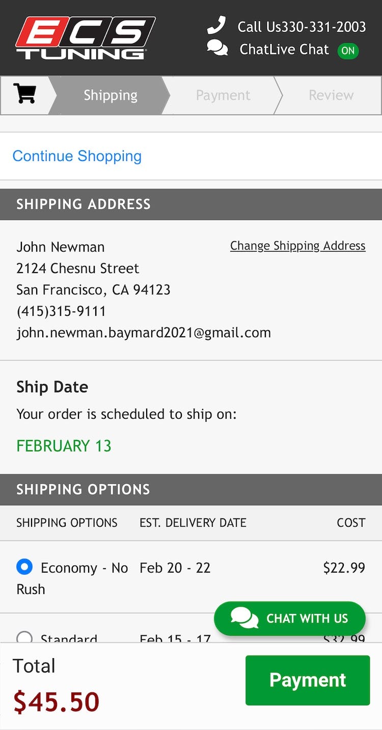

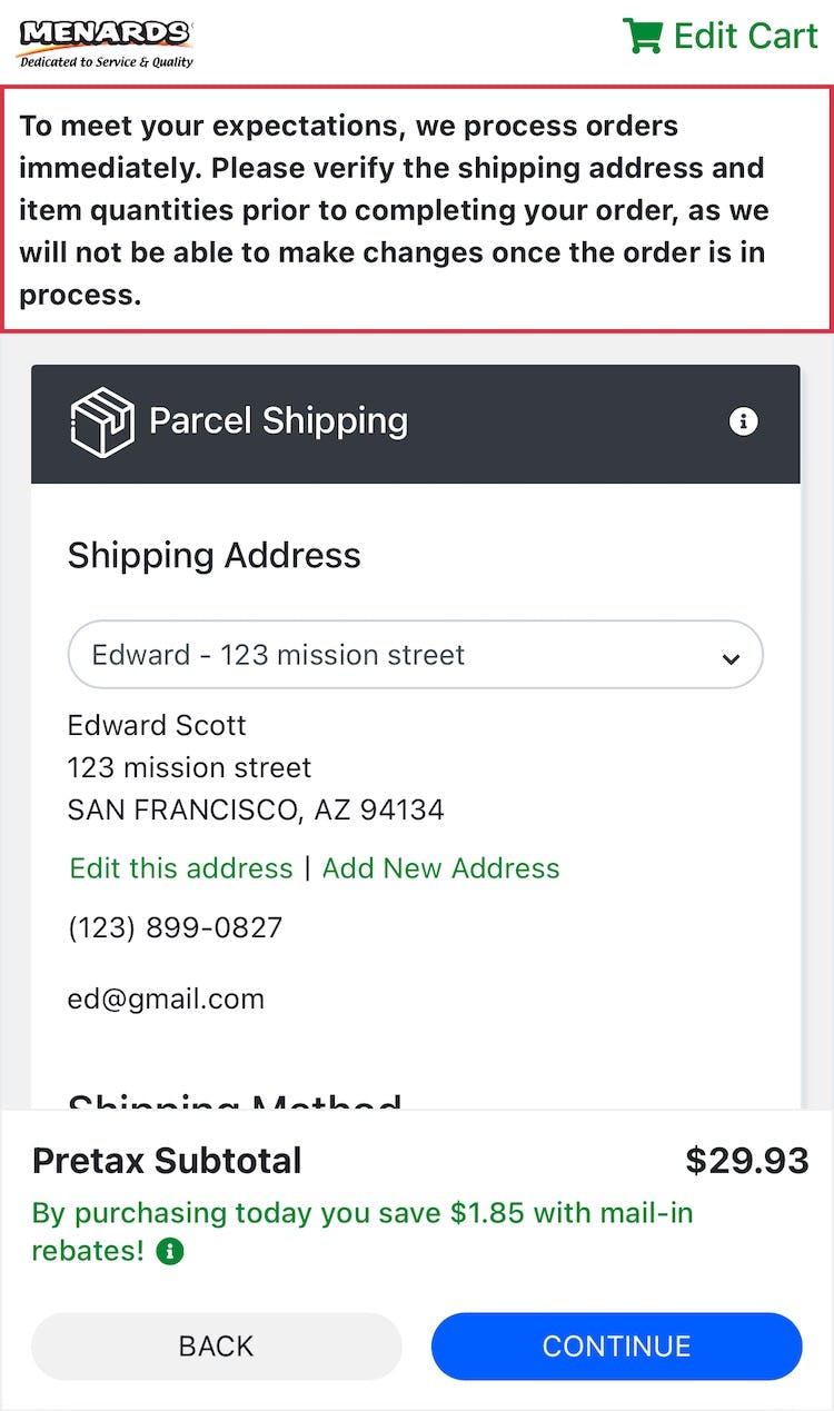
ECS Tuning (first image), Netonnet (second image), and Menards (third image) all allow users to continue through checkout despite entering an address with misspellings or other errors, risking delivery problems down the line.
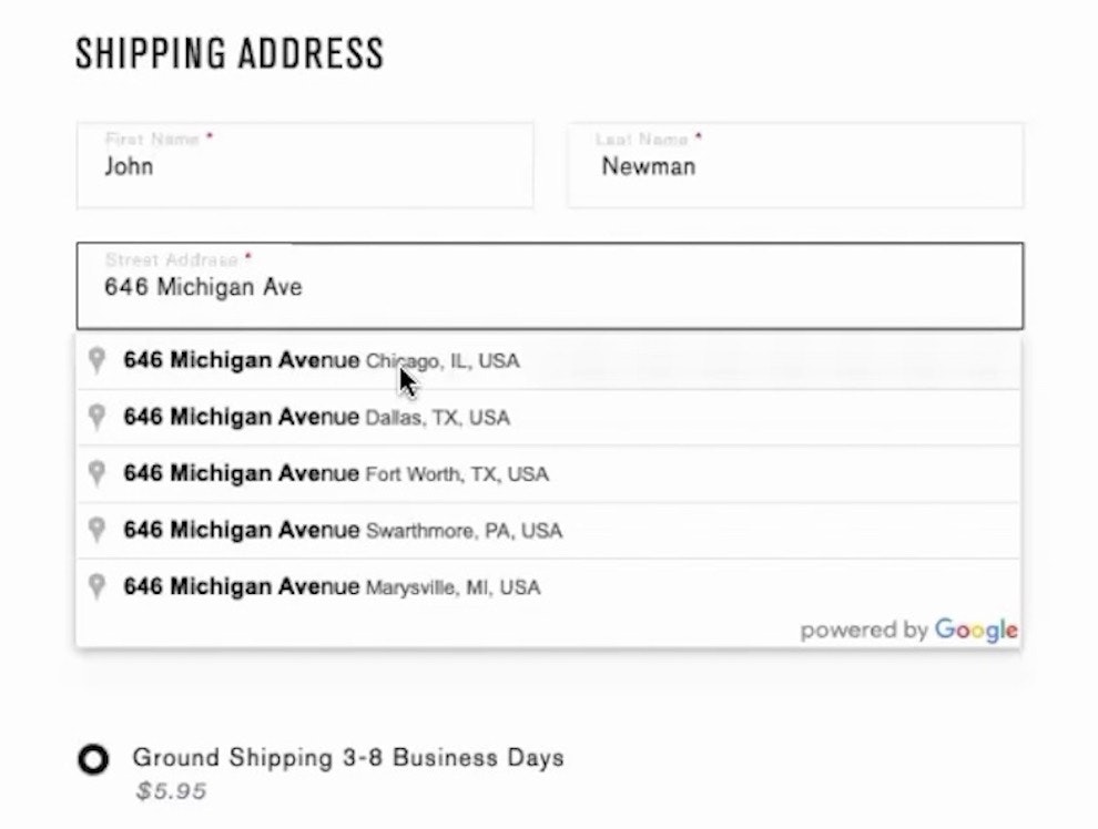
In an earlier round of desktop testing, 9% of participants at American Eagle ended up placing an order with small errors in the shipping address, like a wrong house number or a misspelled street or city name.
Even with an opportunity to review entered data, users are still at risk of missing critical address errors that may result in an undeliverable package.
For example, in one round of checkout testing, 9% of the more than 150 orders placed contained typos or misspellings in the shipping address.
Typically, these involved an incorrectly spelled city name, street name, or a wrong house or apartment number.
In practice, users who submit their order with even minor errors in the address risk never receiving their order, either because the shipping courier eventually misdelivers it (or cannot deliver it) or because the site inevitably cancels the order, risking a lost sale.
However, even those who realize after the order has been completed that their address is incorrect (from reviewing the confirmation step or email, for instance) must spend undue time and effort attempting to remedy the error, likely contacting the site’s customer service to attempt to update the shipping address.
However, due to logistic constraints, often such mistakes cannot be corrected after the order has been submitted, which may necessitate canceling the order — again risking a lost sale if the user does not repurchase with the correct address — or shipping an order the user is doubtful to receive, permanently tarnishing the user’s perception of the brand and their likelihood to later purchase.
How Address Validators Are Key for a Subgroup of Users

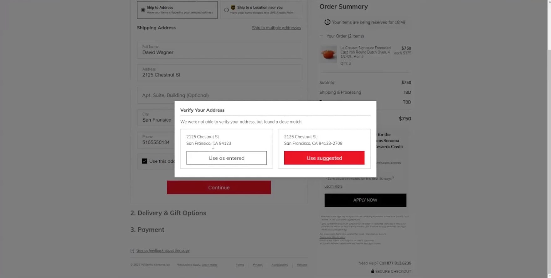
“I guess if it was spelled right, that would help. But they caught that, so that’s good.” The address validation at Williams Sonoma caught this participant’s misspelled city name, which in reality could result in delayed shipping or a misdelivery.
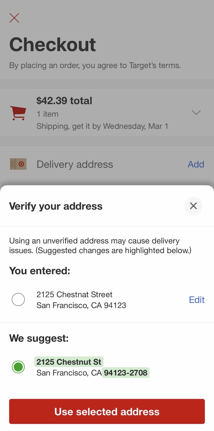
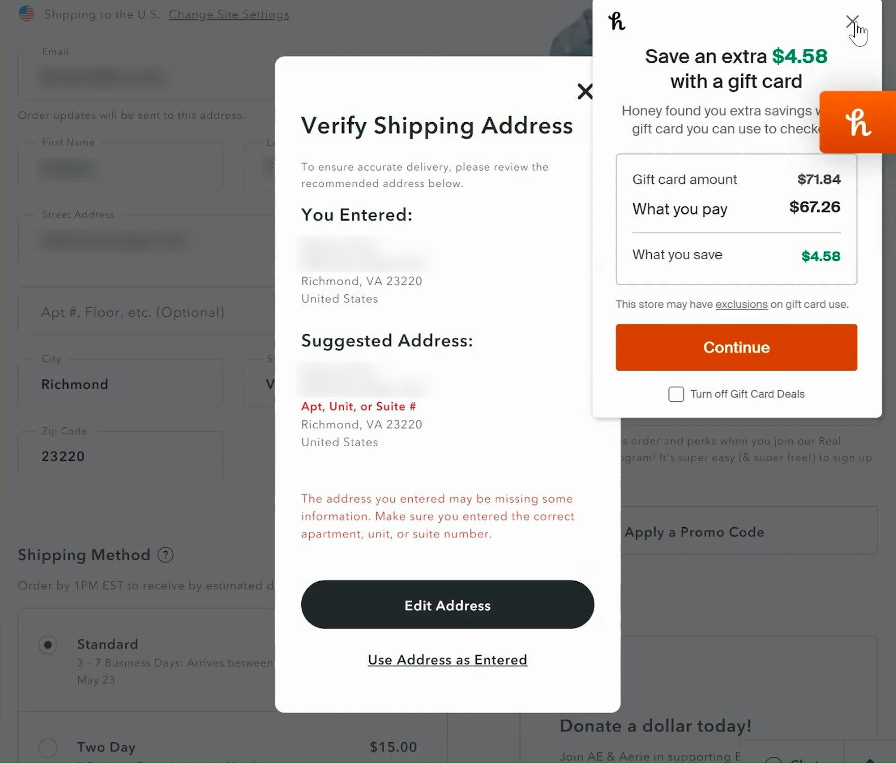
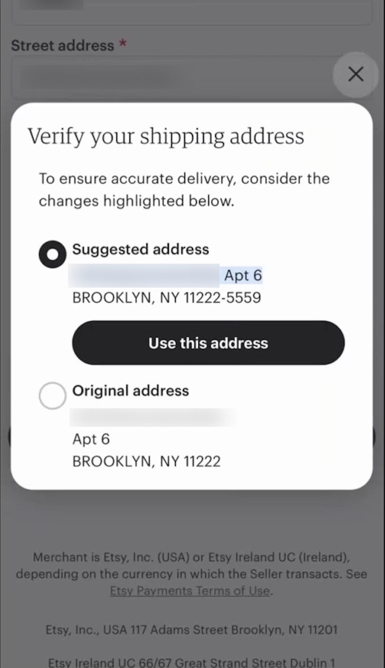
“My big thing on this is making sure that my shipping address is correct. I love the fact that it popped up the suggested option because my understanding is when it does, that’s a verified address that the post office definitely has.” This participant at Etsy appreciated the clear address validator overlay as a failsafe for ensuring he had entered his address correctly.
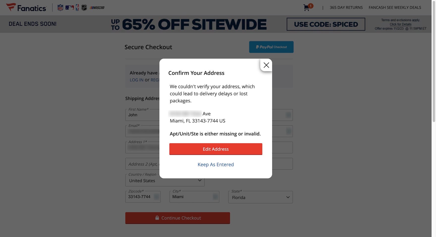
The address validator at Fanatics accurately recognized this address’s missing apartment number, giving the user the chance to update it before continuing.
![“Annoying [chuckles]. But of course it is important that they ship to the correct address.” Regardless of any extra friction introduced by address validators, users appreciate help when they enter incomplete or incorrect addresses, as did this test participant who left out her apartment number on the Nordic H&M site.](https://baymard-assets-cdn.imgix.net/research/media_files/attachments/91993/original/research-media-file-0b56bfdd42095c4e08305f711bdb955d.jpg?auto=format&dpr=2&fit=max&q=50&w=880)
“Annoying [chuckles]. But of course it is important that they ship to the correct address.” Regardless of any extra friction introduced by address validators, users appreciate help when they enter incomplete or incorrect addresses, as did this test participant who left out her apartment number on the Nordic H&M site.
To prevent such severe issues, sites that ship physical products should always integrate an address validator into the “Shipping Address” step of checkout.
Address validators function by querying an address database (e.g., the USPS) to ensure that the address the user typed matches the address the postal service has on file.
While not perfect, they provide a basic verification of a user’s typed address, helping ensure there are no problems delivering orders.
In practice, it is more efficient to check and validate a user’s address before the order is finalized, allowing users the chance to correct any mistakes they’ve made typing in their address without requiring any customer support from the site.
As such, address validators also support the internal needs of sites and brands, reducing the need to provide extensive customer support due to delivery issues, which helps avoid broken customer experiences and the consequent negative site reviews and the risk of lost sales due to canceled or returned undelivered orders.
In particular, mobile sites especially benefit from address validators.
During mobile testing we’ve found that, due to keyboard autocorrect and the difficulty of typing on small touch keyboards, users make errors far more frequently when entering their address on mobile devices.
Furthermore, users on mobile devices have more difficulties noticing errors due to the lack of page overview caused by the small screen.
“And then this happens.” Selecting her address from the site’s “Fully Automatic Address Lookup” feature did not automatically furnish this user’s apartment number at American Eagle (first image). After skipping the “Address Line 2” field and attempting to continue, however, the site’s address validator caught the missing data. Overall, “Fully Automatic Address Lookup” is not a complete solution to ensuring accurate, deliverable addresses.
Additionally, while “Fully Automatic Address Lookup” features can help prevent many common address errors, they may fail to catch other issues that can prevent packages from being delivered, such as a missing apartment, unit, or suite number.
In short, such features — while decidedly valuable — cannot fully ensure the shipping address is complete and deliverable.
Consider Using an Overlay for the Address Validator
“I love this. I like when they verify the shipping address because it adds some assurance that it’s going to be shipped correctly and in the right way.” The prominent address validation overlay gave this participant checking out from Etsy’s mobile site (iOS) extra confidence about moving forward with checkout.
Finally, in testing participants sometimes initially overlooked on-page address validators that were overly subtle, blending in or appearing similar to the standard address form.
As with more general error messaging, styling the address validator UI in an eye-catching way ensures users can most efficiently verify their entry and continue with checkout.
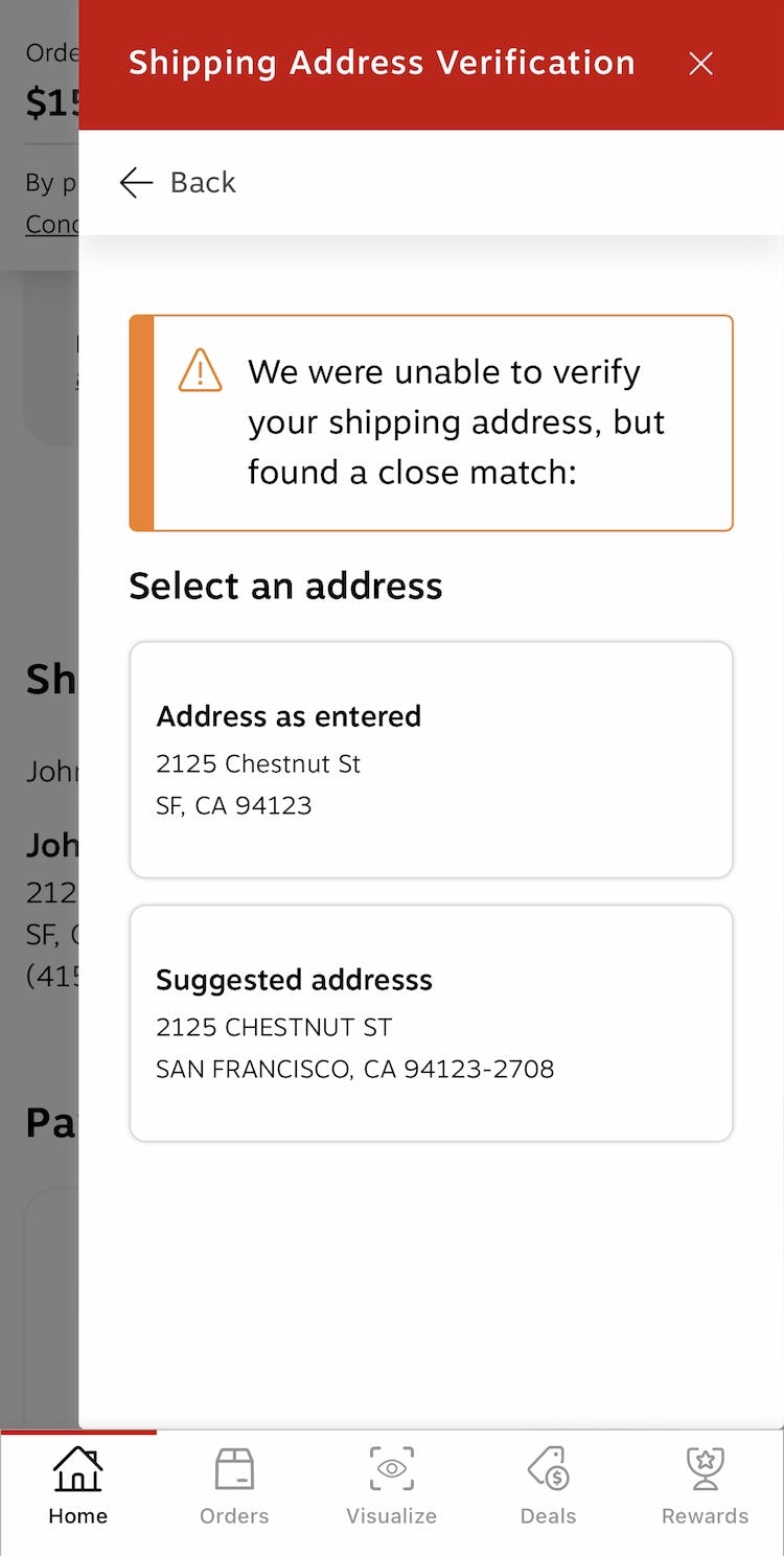
Overall, in testing we observed that an overlay containing the original entry and validator-generated suggestions guaranteed participants were able to verify the shipping address before continuing.
In this instance, the vital task of confirming a valid shipping address outweighs the slowdown of interrupting users’ progress.
If using an overlay, be aware that most users will assume that the browser “Back” button will take them back to the current page they’re on rather than “two steps back”.
In other words, clicking “Back” should exit the overlay.
The notion of perception is the key factor here, since there’s often a difference between what is technically a new page and what users perceive to be a new page — which can create discrepancies between where the user expects the “Back” button to take them and where it actually takes them.
Across all of our usability testing, we observe that if a new view is sufficiently different visually, or if a new view conceptually feels like a new page, it will be perceived as one — regardless of whether it technically is a new page or not.
![“I like that. It lets you know what you’re doing…especially if you’re buying something in a hurry, [there’s] somebody around you, you’re distracted — it allows you to quickly change it.” The address validator at Musician’s Friend (iOS) caught multiple address errors for this participant, including typos in the street name and ZIP code. The on-page messaging and highly visible style helped make sure the address validator was noticed.](https://baymard-assets-cdn.imgix.net/research/media_files/attachments/92000/original/research-media-file-5cb748d8288d8a2c0eb949377ef10188.jpg?auto=format&dpr=2&fit=max&q=50&w=880)
“I like that. It lets you know what you’re doing…especially if you’re buying something in a hurry, [there’s] somebody around you, you’re distracted — it allows you to quickly change it.” The address validator at Musician’s Friend (iOS) caught multiple address errors for this participant, including typos in the street name and ZIP code. The on-page messaging and highly visible style helped make sure the address validator was noticed.
Testing also suggested that on-page messaging could serve as a viable design pattern for presenting address validator suggestions, but performance was more heavily dependent on error highlighting and scrolling, making it at higher risk of being overlooked.
As such, on-page or inline address validator implementations must take extra care to ensure visibility, using visual cues such as color, size, and overall styling to distinguish it from standard on-page text.
Help Users Avoid Address and Delivery Issues
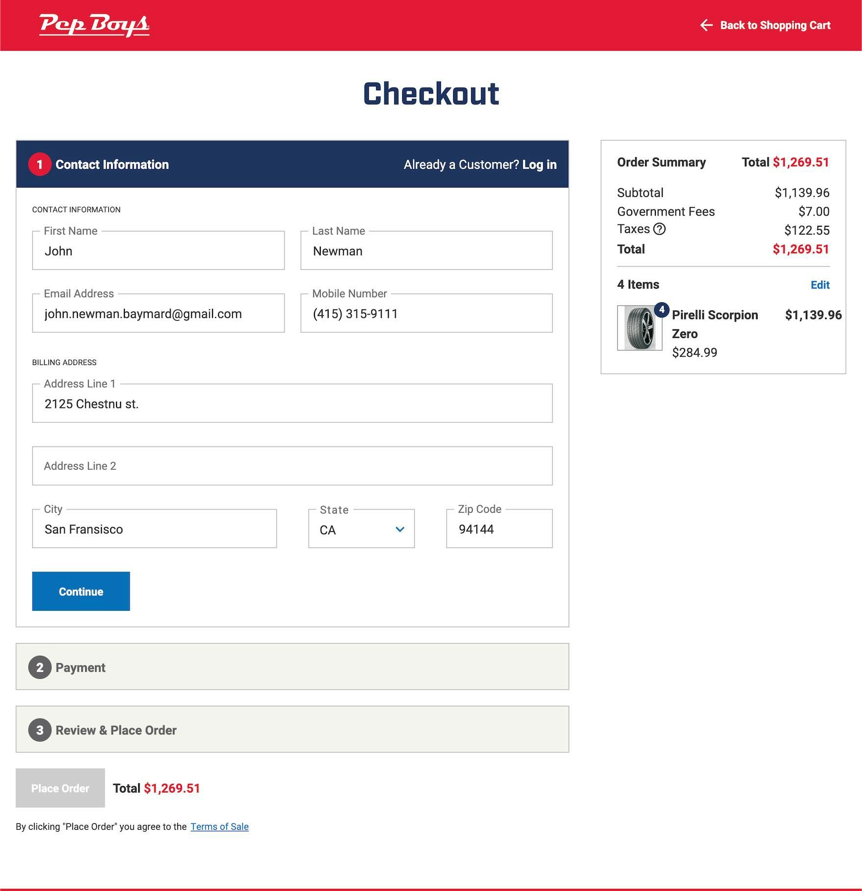
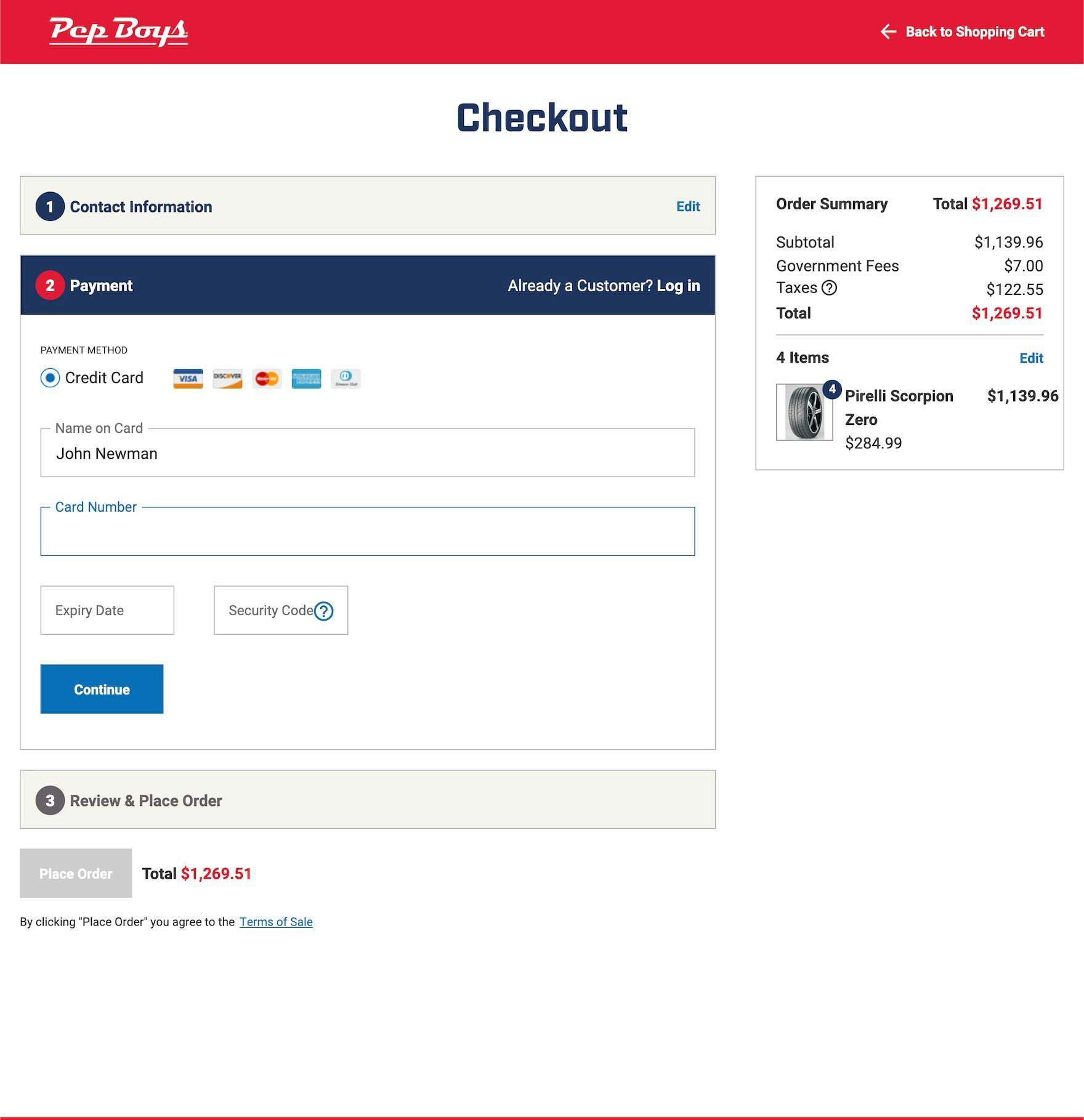
This incorrect address containing multiple errors — a misspelled street name, city name, and mismatched ZIP code (first image) — was readily accepted at Pep Boys, allowing users to continue through checkout without any notifications that the address may result in a missed or delayed delivery (second image).
Most users will proceed through the shipping address step without issues.
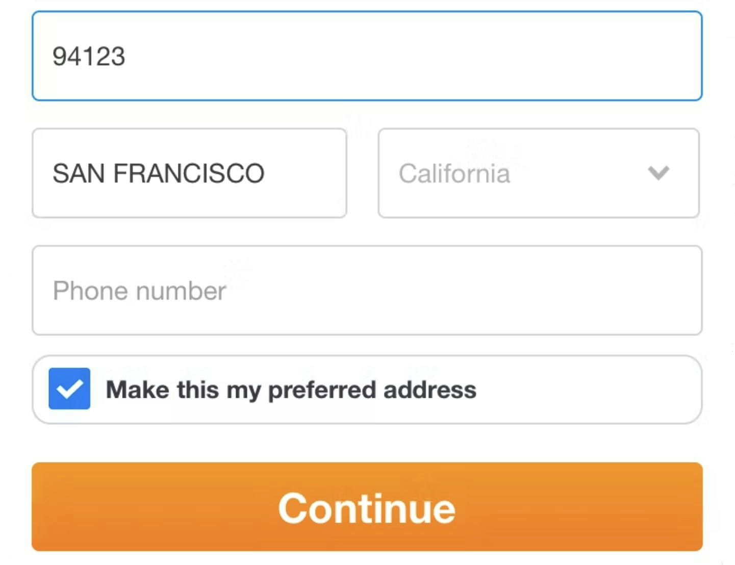
Indeed, over time address entry has gotten easier, with new tools like “Fully Automatic Address” features and zip code autodetection.
However, such features aren’t perfect — and sites need a backup to ensure a user’s address entry is error-free.
Yet 47% of sites don’t provide an address validator — risking canceled orders and lost sales.
This article presents the research findings from just 1 of the 700+ UX guidelines in Baymard – get full access to learn how to create a “State of the Art” ecommerce user experience.
If you want to know how your desktop site, mobile site, or app performs and compares, then learn more about getting Baymard to conduct a UX Audit of your site and app.