Dark Patterns in UX: The Hidden Cost to Ecommerce Conversion (and the Deceptive Practices to Avoid)
Deceptive UX patterns may produce short-term growth metrics, but they carry high long-term costs.
Key takeaways
- Eliminate short-term manipulation to protect long-term revenue
- Prepare for strict, global regulatory enforcement
- Replace deceptive tricks with transparent persuasion
$2.5B
FTC settlement from mass merchant over deceptive patterns
$8M
collective fines issued by the UK CMA for misleading sales tactics
Dark patterns usually arrive disguised as short-term growth tactics. A pre-checked add-on lifts average order value. A countdown timer nudges a hesitant shopper. A cancellation flow buried three menus deep keeps a few more subscribers on your list.
On an analytics dashboard, these look like quick wins, but across the full customer relationship, they rarely are.
Our large-scale ecommerce usability research indicates that deceptive patterns cost precisely what they are designed to protect. Shoppers abandon their carts when unexpected fees appear late. Customers who feel misled file payment disputes, submit support tickets, and take their repeat orders elsewhere.
In 2026, a second risk is prominent. Regulators in the US, the UK, and the EU have transitioned from issuing passive advisory guidelines to launching formal investigations and issuing direct financial penalties.
This guide examines what dark patterns cost ecommerce businesses, how the regulatory landscape has shifted, and which interface patterns to eliminate across cart, checkout, pricing, and subscription flows.
What are dark UX patterns in ecommerce?
A deceptive pattern is an interface designed to lead users into making choices they would not make if they had clear information and an intuitive way to decline.
The critical factor is user autonomy. Not every point of checkout friction or ecommerce persuasion technique qualifies as a deceptive design.
Not deceptive:
- A multi-step checkout flow
- Recommending related products or highlighting a bestselling item
- Highlighting genuine offers or free delivery thresholds (e.g., “Spend $60+ dollars for free shipping)
However, design patterns that specifically counteract the user's conscious intent are deceptive. Examples could include:
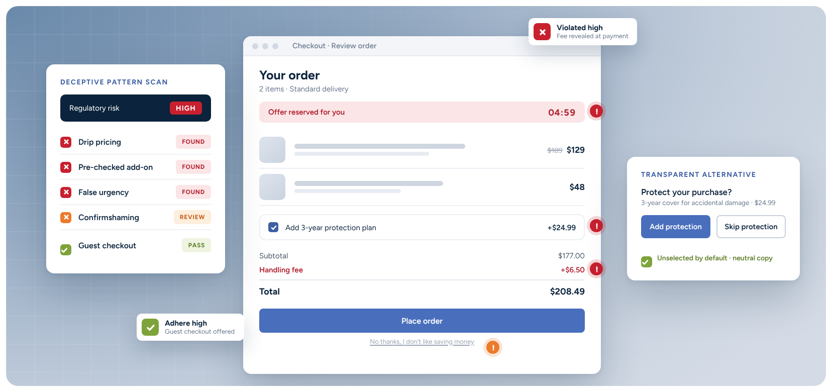
- Concealing costs that are only presented at the payment step
- Introducing asymmetric friction to favored choices
- Manufacturing artificial urgency through untrue product scarcity
Why “deceptive patterns” is becoming the industry standard term
Researchers, design teams, and regulatory bodies have largely shifted from the term “dark patterns” to “deceptive patterns”. The updated terminology describes the core operational failure: user deception, rather than aesthetic styling.
For product and UX teams, the practical takeaway is identical. When regulatory bodies penalize deceptive patterns in digital choice architecture, they are evaluating the specific interface patterns analyzed below.
How do dark UX patterns damage ecommerce performance?
Discussions around deceptive UX often focus exclusively on business ethics. While ethics are foundational, deceptive designs also represent an immediate commercial risk for ecommerce leaders, product owners, UX designers, and directors.
Elevated checkout abandonment
Baymard's quantitative research on checkout abandonment reveals that unexpected fees and missing trust indicators are among the primary reasons shoppers leave without buying:
- 40% of shoppers abandon checkout because extra costs (shipping, taxes, and fees) were too high. Drip pricing tactics that disclose handling fees only on the payment screen directly trigger this reaction.
- 18% abandon because the site forced them to create an account before purchase. Forcing registration creates friction for first-time buyers who simply want to complete a transaction.
- 19% abandon because they did not trust the site with credit card information. When an interface uses hidden selections or obscure opt-out checkboxes, shoppers lose confidence at the exact moment they are asked to submit payment credentials.
Disputes and chargebacks
Pre-selected add-ons and ambiguous subscription renewals consistently generate refund requests and payment disputes. Beyond lost revenue, high dispute rates incur processing penalties and jeopardize merchant account status.
Depressed customer lifetime value
A customer who feels misled by an interface pattern rarely returns. A deceptive flow may secure a single conversion today, but it frequently sacrifices every future order from that user.
Increased support overhead
Buried cancellation links and unannounced recurring fees generate avoidable customer support tickets. Resolving these disputes drains team resources and typically concludes with a manual refund anyway.
Reputational damage and erosion of trust
Shopper frustration surfaces publicly in customer reviews, forum discussions, and social media. That damage lingers long after an interface experiment concludes. Removing a deceptive pattern does not remove the public reviews it created at the time, or the negative publicity that came with it.
Regulatory penalties
Enforcement is now active across multiple major markets, with leading retailers coming under scrutiny for following deceptive design patterns. The following section details the current legal environment.
The regulatory landscape: why 2026 marks a turning point
For years, regulatory agencies handled interface manipulation through non-binding guidance notes. In 2026, enforcement centers on direct monetary fines, formal administrative proceedings, and compulsory interface redesigns.
- United States: Although a federal appeals court vacated the Federal Trade Commission's (FTC) formal “Click-to-Cancel” rule in 2025 on administrative grounds, federal enforcement remains active. The FTC continues to prosecute asymmetric cancellation flows under Section 5 and the Restore Online Shoppers' Confidence Act (ROSCA). In parallel, state auto-renewal statutes in California and Colorado impose explicit online cancellation mandates on subscription providers.
- European Union: On June 19, 2026, the updated rules on distance contracts for financial services (Directive EU 2023/2673) took effect. The directive explicitly prohibits manipulative interface design and requires a prominent, two-click online withdrawal button that mirrors the ease of onboarding. Concurrently, the European Commission is applying the Digital Services Act (DSA), which explicitly references a ban on dark patterns, to major marketplaces.
- United Kingdom: The Competition and Markets Authority (CMA) activated direct consumer-protection powers under the Digital Markets, Competition and Consumers (DMCC) Act. In late 2025, the CMA began formal investigations into drip pricing, false countdown clocks, and pre-ticked add-ons, issuing formal advisory notices to 100 enterprise retailers.
The standard is consistent across jurisdictions; undisclosed fees, manufactured urgency, and asymmetric cancellation flows represent active regulatory liabilities.
Some companies have already paid the price. In 2025, a leading mass merchant agreed to a $2.5 billion settlement with the FTC over allegations that it used deceptive interfaces to enroll shoppers in its subscription service and made cancellation difficult.
$2.5B
fine for a leading retailer over deceptive interfaces
$8M
collective fine for retailers using misleading sales tactics
Others are under investigation. The European Commission opened proceedings against a retailer in February 2026, partly over its allegedly addictive design. In the UK, the CMA fined three well-known businesses a collective $8 million for using misleading sales tactics.
Disclaimer: The above section provides market context and does not constitute formal legal advice.
Deceptive ecommerce patterns to avoid (and compliant UX design alternatives)
The patterns below represent the primary areas where ecommerce flows introduce deceptive friction. Use this matrix to audit your cart, checkout, pricing, and subscription experiences.
| Deceptive pattern | Usability and commercial impact | Recommended UX alternative |
|---|---|---|
| Drip pricing: Revealing mandatory fees, handling charges, or taxes only on the final payment step. | Triggers cart abandonment (responsible for 40% of abandoned checkouts). | Disclose total costs or a reliable shipping calculator on the product page and within the cart summary before checkout begins. |
| Forced account creation: Requiring user registration before order placement. | Drives immediate drop-off from 18% of shoppers who prefer a guest checkout flow. | Provide a prominent guest checkout option. Offer account registration on the order confirmation page using previously entered customer details. |
| Pre-checked add-ons: Defaulting optional warranties, insurance, newsletter signup, or donations to “selected”. | Shoppers who notice the selection feel manipulated; shoppers who miss it file support tickets and chargebacks. | Leave all optional add-ons unselected by default. Clearly describe the value proposition so shoppers can opt in willingly. |
| “Confirmshaming”: Pairing an opt-out choice with emotionally manipulative copy (e.g., “No thanks, I dislike saving money”). | Degrades brand credibility at the moment of commitment. | Use neutral, objective text for both positive and negative actions (e.g., “Add protection” and “Skip protection”). |
| False urgency: Displaying countdown timers that are not tied to an authentic cut-off. | Shoppers who refresh the page and see the timer reset stop trusting promotional claims across the site. | Restrict countdown timers to genuine dispatch deadlines or verifiable promotional sale ends. |
| False scarcity: Showing artificial low-inventory notices (e.g., “Only 2 left”). | Weakens legitimate inventory messaging when shoppers observe persistent stock levels over multiple sessions. | Connect low-stock notices directly to real-time inventory databases, displaying notices only when inventory dips below a fixed threshold. |
| Subscription traps: Making the cancellation process significantly harder than onboarding. | Generates elevated dispute rates and violates emerging parity requirements across the US, UK, and EU. | Match the cancellation path to the signup flow. Provide a direct, self-service cancellation link within the user's account settings. |
| Inflated reference pricing: Using strikethrough comparison prices that do not reflect verifiable past sales. | Destroys price confidence and violates advertising standards. | Use strikethrough comparisons only for prices at which the product was genuinely offered for a meaningful, continuous period. |
| Disguised advertising: Styling sponsored listings to appear identical to organic catalog results. | Decreases search utility and makes shoppers question product relevance. | Apply consistent, prominent visual labels to all sponsored listings and paid placements. |
| Forced continuity: Automatically converting free trial periods into paid billing without prior notification. | Triggers immediate payment disputes and high customer turnover. | Send an automated renewal reminder before the trial concludes, providing a direct link to cancel prior to billing. |
The Definitive Guide to Ecommerce UX Research & Audits
Ecommerce UX research helps you understand why users face issues. Stop the guesswork, prioritize fixes, and boost conversions using Baymard's framework.
What to do instead: use transparent persuasion, not deception
Based on our extensive ecommerce UX research, you should still promote offers, accounts, subscriptions, and email sign-ups — just do it honestly.
For ecommerce and subscription service businesses, the safest bet to build trust and repeat custom is to be transparent:
- Show full costs early, including shipping conditions and promo terms
- Make guest checkout easy to find and invite account creation later
- Make marketing consent explicitly opt-in, and easy to later opt out of
- Keep checkout focused by removing aggressive overlays and forced detours
That approach usually feels less “optimized” on paper, but it performs better by building trust, encouraging completion, and driving repeat behavior.
Five steps to audit your site for deceptive patterns
A team can identify the most common deceptive UX patterns through five targeted checks:
- Conduct a baseline checkout walkthrough as a first-time user. Record every fee, tax, or surcharge that appears after the cart page. Confirm that estimated shipping costs appear before the checkout funnel.
- Review all default selections and form toggles. Inspect every pre-selected checkbox across the cart and checkout. Ensure optional warranties, insurance, and recurring subscriptions require affirmative user action.
- Audit microcopy across decline and cancellation buttons. Check confirmation modals and opt-out buttons for guilt-inducing copy or ambiguous phrasing. Verify that “No” or “Skip” options receive neutral, legible typography.
- Cross-reference urgency displays with backend inventory and logistics. Validate that countdown timers align with dispatch cutoff schedules and that stock warnings correspond to real warehouse counts.
- Compare signup steps against cancellation steps. Map out the exact click path required to enroll in a subscription or recurring service, and compare it against the cancellation flow. If signup was simple but canceling requires multiple steps, the flow carries high regulatory and churn risk.
Internal product teams often become accustomed to subtle friction points. If your cart, checkout, or account management flows are complex, an independent review can help uncover patterns that your team may overlook.
Replace deceptive patterns before they impact your business
Deceptive patterns present an illusion of optimization. While they may lift a single metric on a short-term test, they produce measurable long-term costs through checkout abandonment, payment disputes, support overhead, and legal exposure.
Replacing deceptive flows with transparent alternatives is sound usability practice that protects customer lifetime value. Across more than 200,000 hours of large-scale UX testing, Baymard's research indicates that transparent, predictable user flows consistently deliver superior conversion over time.
Baymard’s UX intelligence platform provides established usability guidelines that help you identify and resolve deceptive patterns on your site. Access hundreds of research-backed ecommerce guidelines and thousands of annotated benchmark examples within Baymard.
Our independent, expert-led UX audit service helps you to quickly identify friction across your site or app. You get a comprehensive UX audit of your cart, checkout, and subscription flows to identify usability issues and compliance risks before they affect your customers.
Explore Baymard PlatformExplore UX Audit Service
Dark UX patterns frequently asked questions
Weekly UX Research, Insights, and Updates
Join 60,000+ UX professionals. Get the latest UX research, practical guides, and Baymard news delivered to your inbox every week.
Loading...