How to Audit Your Checkout Flow for Hidden Friction
Analytics show where users drop off; a UX audit tells you why. Use this research-backed framework to find and fix hidden checkout friction.
Your funnel shows abandonment at the payment step. The page loads. The button works. But users still leave.
This is the problem analytics cannot solve on its own, and it’s exactly what a checkout user experience (UX) audit is designed to find. While your data tells you where people drop off, a structured UX audit tells you why.
With the average ecommerce cart abandonment rate sitting at around 70%, you know just how important it is to keep your checkout process as simple and painless as possible.
In this guide, we provide a research-backed framework to help you surface interaction failures that are invisible to your analytics but devastating to your conversion rate.
The goal is simple: optimize your checkout flow, reduce cart abandonment, and increase your conversion rate.
Why analytics alone will not find your checkout friction points
Analytics tools are excellent at identifying symptoms, but they rarely diagnose the actual problem.
You might see a 15% drop-off on your shipping page, but the data will not tell you that users are leaving because your inline validation triggers too early, or because a discount code field is drawing them away to search Google for coupons.
The most damaging checkout friction is often invisible to the users themselves. They don’t necessarily "rage-click" or file support tickets; they simply feel a mounting sense of effort and close the tab.
A structured UX audit, gives you a systematic way to find these issues before they ever show up in your metrics. It provides a research baseline that no analytics tool can replicate.
Before you start: what you need
You don’t always need a high-end usability lab or a massive budget to run an effective UX audit. You can complete a thorough checkout UX review in a few hours.
To get started, ensure you have:
- Full access to your production or staging checkout flow
- Dual-device testing: Both a desktop and a mobile device (do not rely on browser emulators)
- A structured checklist to record your findings
- Reference data: Ideally, one or two recent session recordings to compare your "ideal" path against actual user behavior
The 7-area checkout UX audit
To find the friction points in your checkout flow, follow this seven-step audit process, informed by Baymard’s thousands of hours of checkout usability testing.
Work through each area in sequence. For each item, note whether it passes, needs attention, or fails. The real value lives in the notes you make; record the specific behavior you observed, not just a binary result.
1. Cart: cost clarity and path into checkout
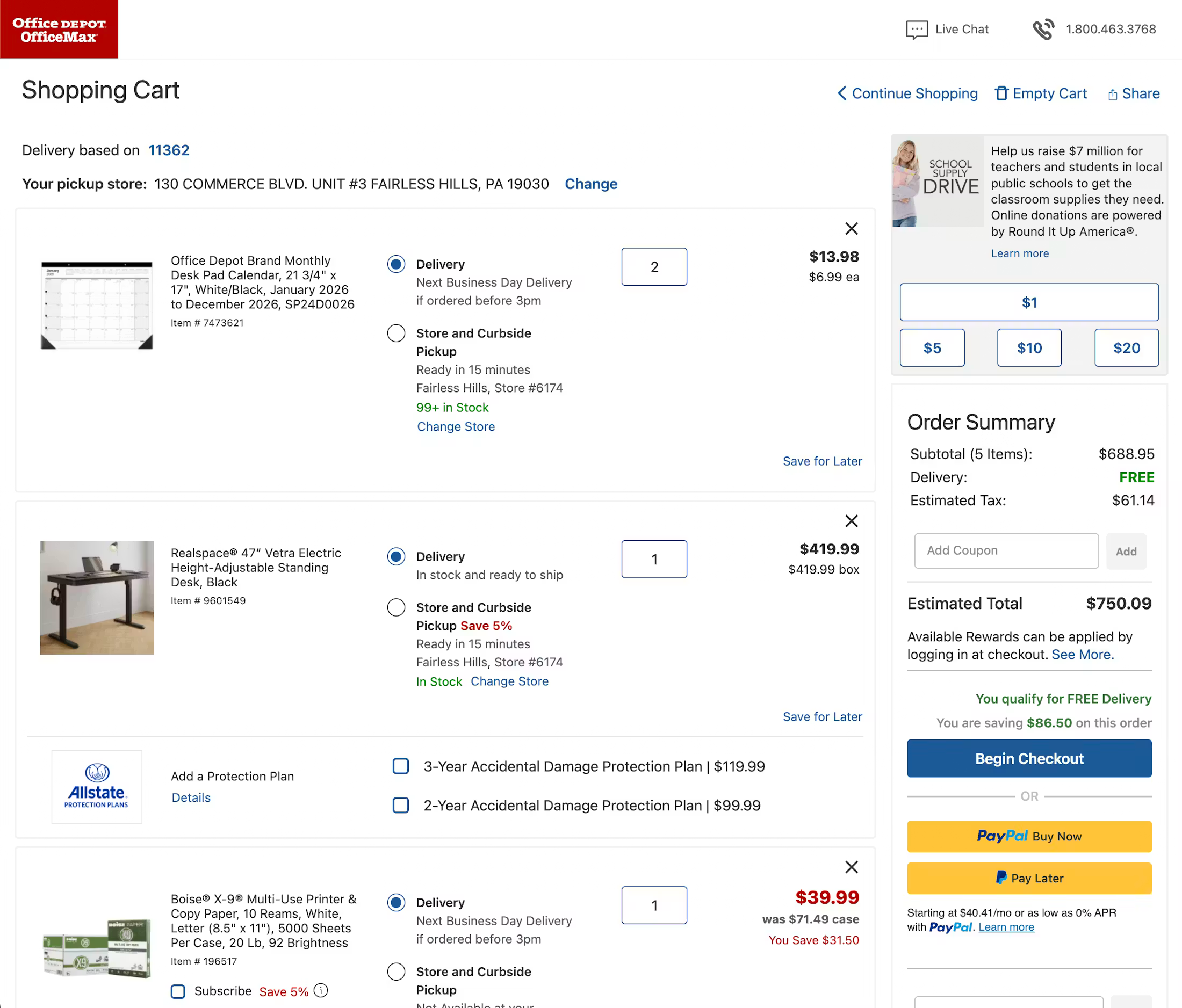
Check for hidden or delayed costs and distractions that pull users away from the purchase.
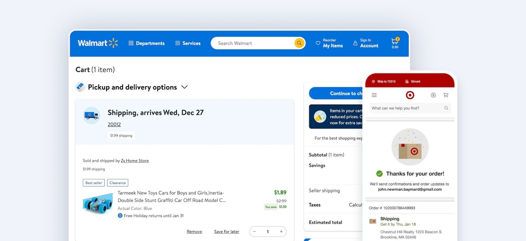
- Are the total costs clear and obvious? Verify that the cart shows the full order cost, or at least a clear estimate, including shipping, taxes, and fees. Users are reluctant to proceed if they cannot evaluate the total cost before entering checkout.
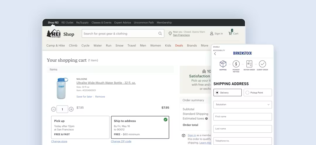
- Is free shipping information integrated? If you offer free shipping, note whether the qualification details appear directly in the order summary.
- Are cart distractions intrusive? Check whether ads or cross-sells dominate the cart or interrupt the path to checkout.
- Do you provide recovery support? Check whether users can save items for later instead of deleting them. Ensure cart contents persist across sessions and that any changes to cart items are clearly communicated.
2. Account selection: forced-account friction
The goal is to ensure the flow is clear, linear, and correctly scoped.
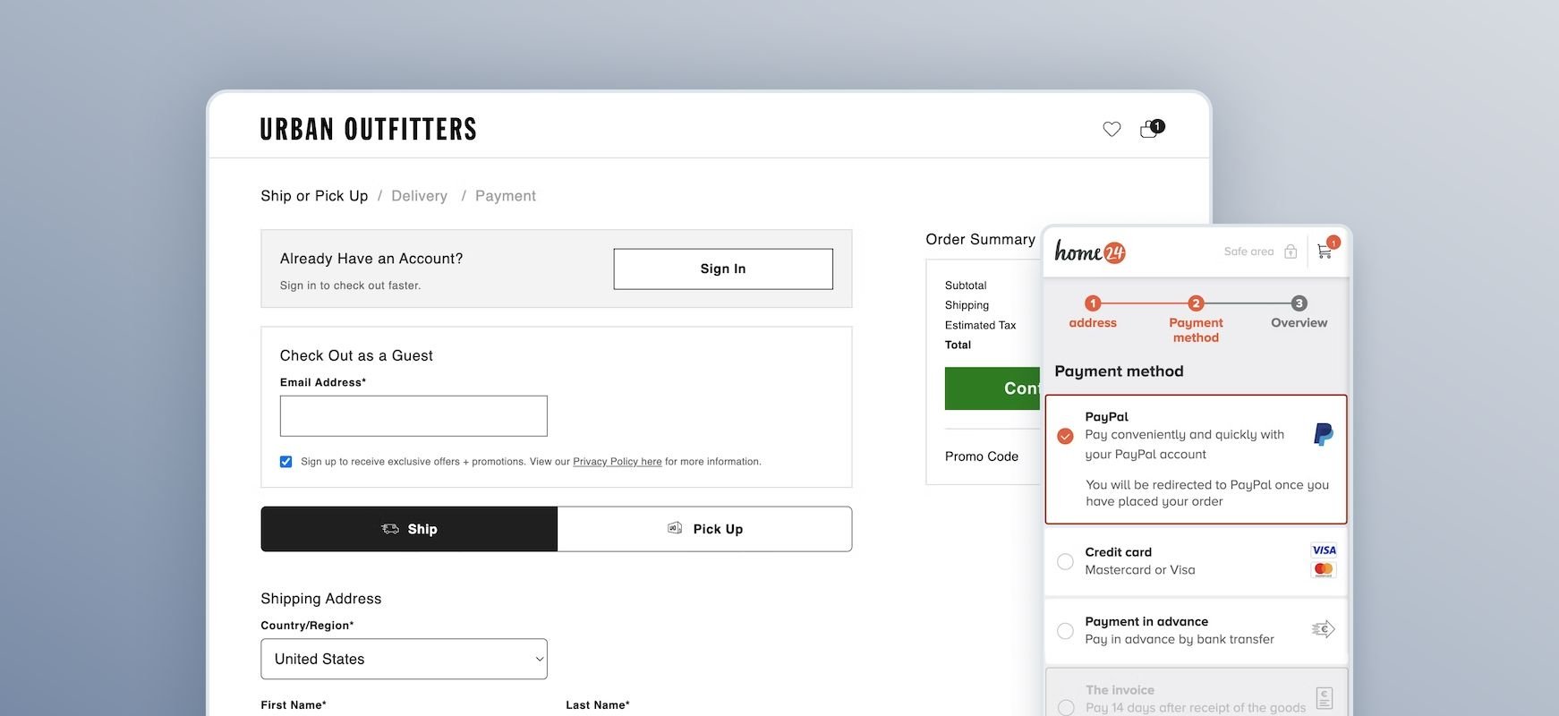
- Is guest checkout offered and visible throughout? Audit whether "Guest Checkout" is offered explicitly and prominently at the start of checkout. It should not be buried below a login form.
- Is registration information clearly worded? Review the wording on your account selection page; unclear phrasing often causes users to assume registration is required.
- Is account creation saved for the confirmation step? Asking users to create an account at the beginning of checkout risks distracting them from their primary goal of finalizing their purchase.
3. Checkout structure: complexity, orientation, and interruptions
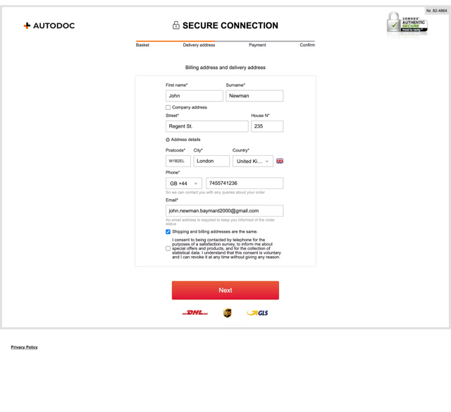
Check whether the flow feels longer or more complex than necessary.
- Is the number of steps in the flow reasonable? Audit the number of visible form fields. Minimize the number of fields users see by default and hide irrelevant options based on context.
- Does “billing address” default to “same as shipping address”? For billing, verify whether “billing same as shipping” is selected by default; this can reduce visible fields by 30–40%.
- Is there a visible progress indicator? Ensure a progress indicator is visible throughout and accurately reflects the remaining steps. Implement steps as links to allow navigation.
- How do accordions behave? If using accordion checkout, verify completed steps collapse into summaries and ensure prior data persists.
- Are there intrusive interruptions in the checkout flow? Audit whether overlays or promotions interrupt progression. If promotions are shown, verify costs and terms are visible by default.
4. Form friction audit
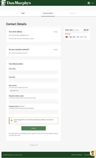
Form fields are the primary points of interaction — and therefore, the primary points of failure.
- Are field labels persistent or do they disappear? Audit whether labels are persistent rather than disappearing placeholders. Place field labels above their respective fields.
- Are required and optional fields obvious? Clearly indicate both to prevent user hesitation.
- Are certain inputs restricted? Be cautious if restricting field characters or formatting, as this often blocks valid input. Use localized input masks for restricted inputs.
- Are forms optimized for mobile input? Verify appropriate mobile keyboards appear for email, phone, and numeric fields. Disable autocapitalization for the email field.
- Is validation and error recovery smooth? Check whether fields validate inline (31% of sites don’t have this). Ensure error messages explain the exact issue and how to fix it. Verify users are autoscrolled to the error or shown an error summary.
- Is user data preserved? Audit whether all entered data is preserved after validation errors. Never delete a user's typed input.
5. Payment friction audit
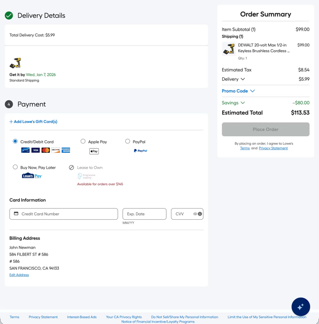
The payment step must reduce hesitation and handle failures gracefully.
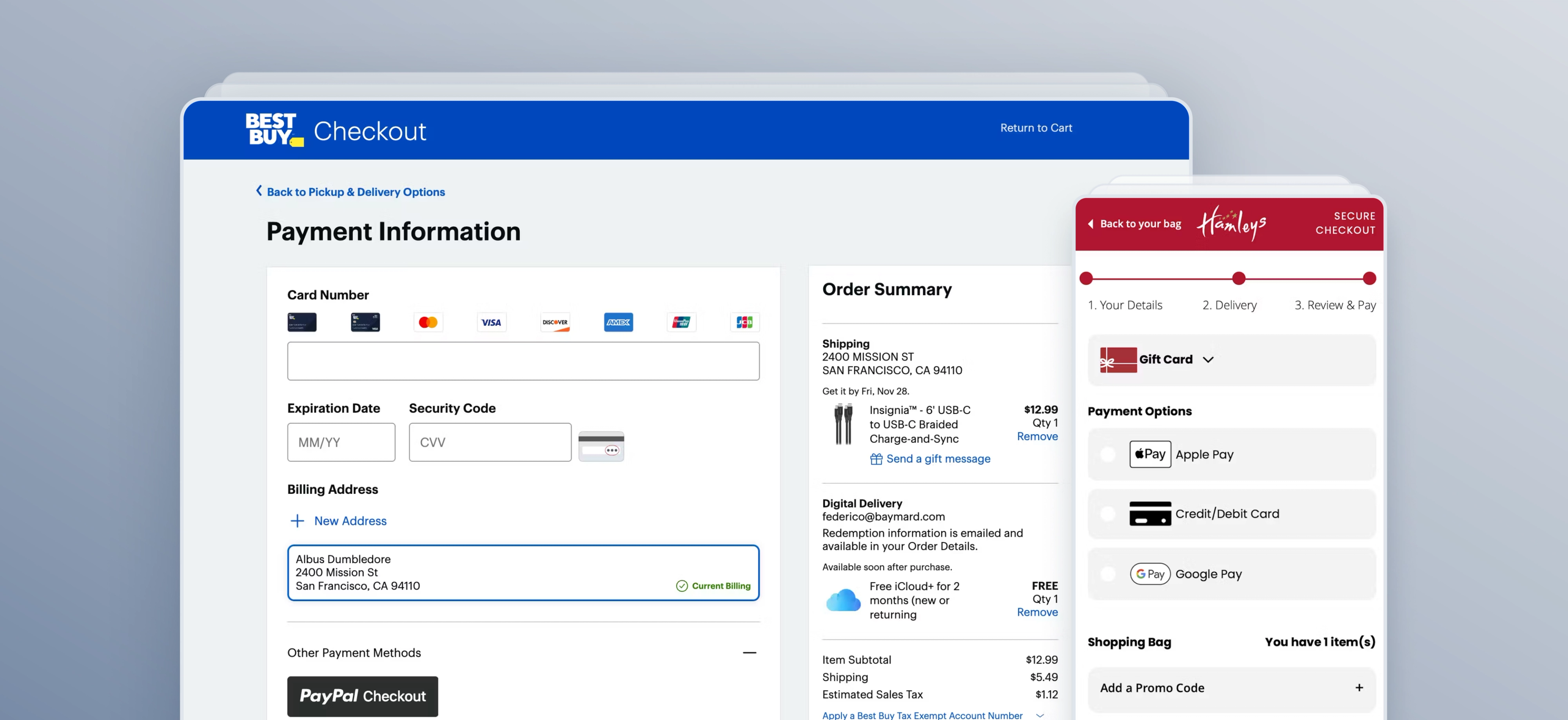
- Are multiple payment options offered? Provide one or more third-party payment options. Do not automatically funnel users into third-party flows without a deliberate opt-in.
- Are buttons labeled clearly? Ensure the primary button clearly states what happens next. If third-party payment is selected, the button should reflect off-site redirection.
- Is card-entry formatted? Luhn validate the card number field and autoformat spaces as the user types. Support users entering data from a physical card by autodetecting card type and clarifying security code locations.
- Is card validity checked at the right time? Check card validity as the user submits the payment step, not after the order is placed. Retain sensitive card data where possible after an error to prevent re-typing (34% of sites don’t do this).
6. Review step audit
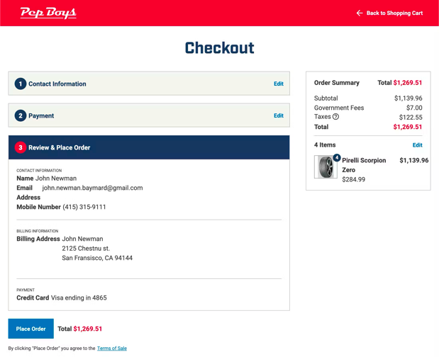
Final order review is a high-anxiety moment where clarity is paramount.
- Does the flow provide a dedicated review step? Ensure users can verify all details before placing the order.
- Is the summary optimized for skimming? The review step should be clear and uncluttered. Do not present important new information for the first time at the review step.
- Is direct editing enabled? For multistep checkouts, allow users to edit data directly at the review step rather than forcing them to navigate back through the entire flow.
7.Confirmation step audit
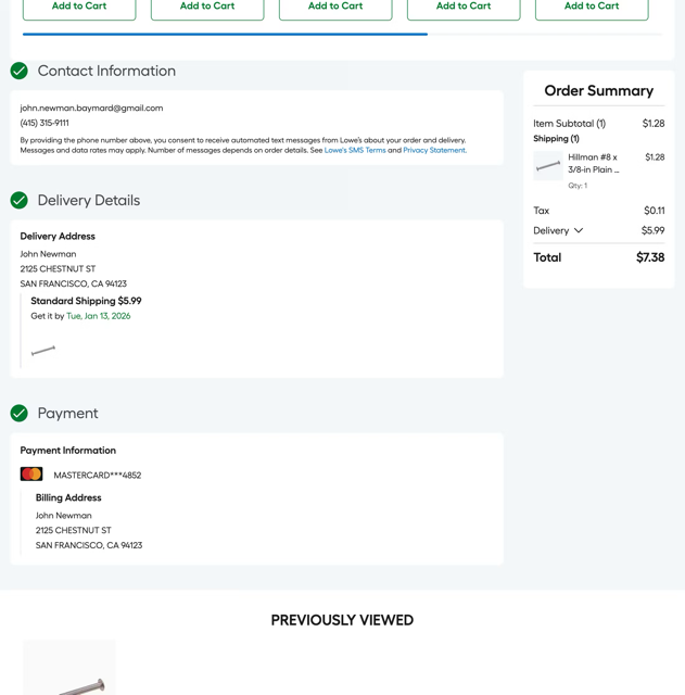
- Is confirmation provided clearly post-purchase? Audit whether there is a clear success message and a visible order number and order details.
- Is email address reassurance provided? The specific email address where the receipt was sent should be displayed. This reduces anxiety for users who worry they may have mistyped their information.
- Does the confirmation email provide enough information? Verify the confirmation email includes the full order details, rather than just a brief acknowledgment, so it can serve as permanent proof of purchase.
- Does the final step maintain process continuity? If using a progress indicator, ensure the "Confirmation" state is represented as the final step in the flow so users feel a sense of completion.
“Ultimately, great checkout usability is not about a single guideline that fixes everything. It’s achieved by putting in place a solid foundation (“getting the basics right”) and then working on all the minor details (“from good to great”) that collectively end up having a significant impact on the checkout experience too.”

Checkout audit checklist template
Having a standardized audit checklist will help you document your observations and findings consistently. Use a central document (like a spreadsheet, Notion database, or similar), and create these columns in your audit sheet (with the corresponding options available where relevant):
- Checkout Step (Cart, Account selection, Shipping/address, Billing, Payment, Review, Confirmation)
- Page/URL (Note which page or stage of the checkout step the issue occurs on)
- Device/Viewport (Desktop, Mobile, App)
- User Type (Guest, Returning user, Logged-in user)
- Scenario (Standard purchase,Validation failure, Promo code, Third-party payment, Mobile autofill)
- Observed Friction (Note down what you see happening at this stage)
- Evidence (Screenshots, recordings, notes)
- Impact on User (Confusion, Delay, Rework, Distrust, Abandonment risk)
- Severity (Low, Medium, High, Critical)
- Baymard Guideline (If you have an active Baymard subscription — or refer to the guidelines referenced throughout in this article)
- Recommendation (Note the recommended fix)
- Owner (Assign a member of your team to the issue/fix)
- Status (To do, In progress, Testing/QA, Complete)
When it comes to completing the sheet, work through your checkout flow logically. Each row of your sheet maps to the issues found in this sequence:
- Cart
- Account selection
- Shipping/address
- Billing
- Payment
- Review order
- Confirmation
Work through the checkout process and observe the behavior in line with the questions in the section above.
Remember to test all devices and platforms
Behavior and user flow can differ greatly depending on the device (desktop, mobile, or app). Be sure to test all device and browser types to get a true picture of your checkout’s friction points.
How to prioritize your findings
An audit will likely result in a long list of issues. To move from a list to an action plan, prioritize your findings based on frequency (how often it happens) and severity (how likely it is to cause abandonment).
Fix first: high frequency + high severity
These are your primary conversion leaks. Examples include broken payment error handling, a hidden guest checkout option, or a mobile "Pay" button that is invisible above the fold.
Fix next: high frequency + medium severity
This is friction that compounds over time, wearing down user patience. Think of missing inline validation, unnecessary optional fields, or an order summary that disappears on the final step.
Fix when possible: low frequency + any severity
These are bugs or UX debt that are good to address but likely will not move the needle on your immediate revenue. For everything else — low frequency and low severity — simply document and monitor them for your next audit cycle.
Overcome unconscious bias
Although auditing your own site is always done with the best intentions, sometimes unconscious bias can creep in or issues can be missed. Baymard can help you overcome that by providing an expert-led, independent view of your site’s performance.
Remember: not every abandonment is avoidable
One thing to remember when auditing your checkout is that a large portion of cart abandonments are likely unavoidable, and are simply a natural consequence of how users browse ecommerce sites. For example, many users are just “window shopping”, saving items for later, or exploring gift options.
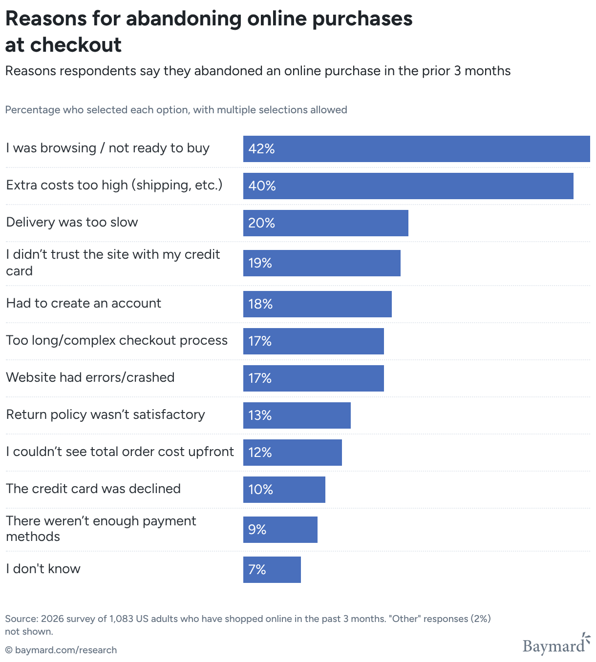
As the chart above shows, Baymard’s quantitative study of reasons for cart abandonment found that more than 42% of US online shoppers have abandoned carts within the last quarter because they were not ready to buy, and that 40% of users have abandoned carts due to additional costs — in other words, not because of the cart or checkout flow’s design.
Find out more about Baymard's expert UX audit service
Justify UX decisions, uncover your top conversion opportunities, and benchmark your site against competitors.
Get research-backed insights to remove the friction from your checkout flow
This audit guide covers the most common checkout UX friction points that Baymard’s research consistently surfaces.
Baymard provides 700+ research-backed UX guidelines and benchmark data across 330+ leading ecommerce sites, from 200,000+ hours of usability testing.