Key Takeaways
- Overall, digital subscriptions & SaaS sites perform slightly better than the average e-commerce site across our benchmarks
- However, our benchmark of 10 B2B and 10 B2C digital subscriptions & SaaS sites reveals there is still room for improvements
- In particular, extra attention should be paid to the “Page Types & Design” and “Plan Matrix” for these sites, as they are core to users’ decision-making processes
Recently Baymard has published a new in-depth Digital Subscriptions & SaaS UX Benchmark Database.
This database contains SaaS UX and digital subscriptions performance rankings for the following 10 B2B and 10 B2C sites:
B2B: Firebase, Slack, Adobe, Zendesk, Shopify, Xero, Basecamp, Zoom, Box, and Microsoft Teams.
B2C: Dropbox, Avast, Codecademy, Evernote, Grammarly, Netflix, HBO Max, McAfee, Norton, and Apple Music.
These sites have been manually assessed by Baymard researchers across 250+ research-based UX parameters relevant for digital subscriptions and SaaS websites.
In this article we’ll analyze this dataset to provide you with an overview of the UX performance of Digital Subscriptions & SaaS, and outline 5 common design pitfalls and strategic oversights applicable to most digital subscriptions & SaaS sites.
This article is divided into the following chapters:
- Digital Subscriptions and SaaS Industry Overview
- Digital Subscriptions & SaaS UX Performance Overview
- Digital Subscriptions & SaaS Plan Matrix
- Digital Subscriptions & SaaS Page Types & Designs
- Simplify Plan and Service Evaluation for SaaS Users
Digital Subscriptions and SaaS Industry Overview
Digital Subscriptions and Software-as-a-Service (SaaS) is a licensing and delivery model in which content or software is licensed on a subscription basis and is centrally hosted.
This model has no physical need for distribution and is deployed almost instantaneously. Unlike traditional products or services, which are conventionally sold as a one-time cost, digital subscriptions & SaaS providers most commonly use a monthly or annual subscription fee.
This model differs from traditional e-commerce sites in a number of ways. First, the catalog of “products” is notably smaller, consisting instead of different plan levels or packaged options.
This subsequently streamlines and reduces the need for robust main navigation options or, in many cases, search engines.
Instead, the focus is on unique page types that outline features, benefits, and use cases (often in lieu of a traditional product page), and nearly always a plan matrix or pricing page that outlines more granular details of different plan (or service) levels for a side-by-side comparison.
This leads to a fairly unique checkout experience for digital subscriptions & SaaS sites. Again, with no physical products, a shipping address is often not required.
Second, given the digital nature of the product or service, guest checkouts are not offered, as registered accounts are an integral part of the service.
Third, the complexity of some of the plan options means that some sites may offer an onboarding wizard before the payment step, and many sites tend to only accept credit cards to facilitate recurring and autorenewing payments.
With that, while many of Baymard’s UX guidelines and suggestions to accommodate user behavior still apply, extra attention must be paid to the “Page Types & Design” and “Plan Matrix” guidelines for these sites, as they are core to these users’ decision-making processes.
Digital Subscriptions and SaaS UX Performance Overview
For this analysis we’ve summarized the 4,750+ digital subscriptions & SaaS usability scores across the 32 topics and plotted the 20 benchmarked B2B and B2C digital subscriptions & SaaS sites across these in the scatterplot above. Each dot, therefore, represents the summarized UX score of one site across the 3–17 guidelines within that respective topic. The top row is the total digital subscriptions & SaaS site UX performance.
Overall, digital subscriptions & SaaS benchmark sites perform slightly better than the average e-commerce site across our benchmarks, with the average desktop site performing “decent”, and the average mobile site performing between “mediocre” and “decent”. This higher overall performance could be attributed to the relatively simple sites, with no complex search, product lists, or filtering options present that could potentially pull their performance ratings down. The slightly worse performance of mobile compared to desktop is similar to what we see consistently across all industries.
Looking at specific e-commerce themes and topics, we see that most digital subscriptions & SaaS sites perform “decent” when it comes to “Homepage”, with more than half of sites being “perfect”. This indicates that these companies have paid a great deal of attention to accommodating users arriving for the first time.
However, performance is “poor” to “mediocre” for most sites when it comes to “Main Navigation”, “Page Types & Designs”, “Plan Matrix”, “Sign-Up & Account Management”, and certain topics within “Checkout”.
In this article, we will focus on “Plan Matrix” and “Page Types & Designs”, as these are core to users’ decision-making processes, and are most suited for discussion in an article.
Digital Subscriptions & SaaS Plan Matrix
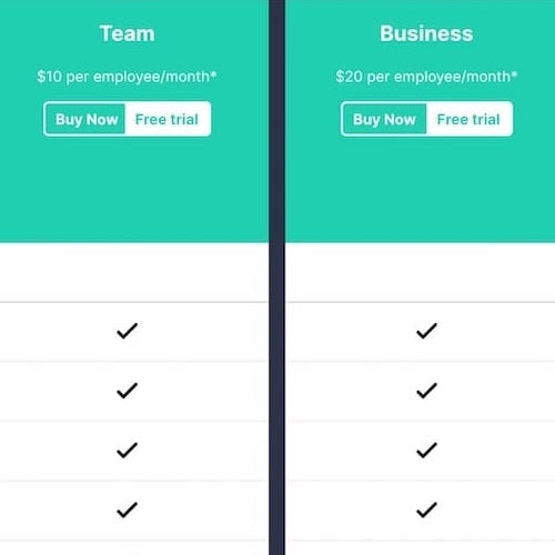
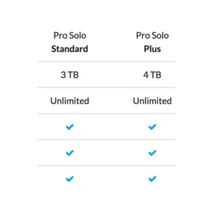
All sites in our benchmark feature a pricing page, indicating its prime importance for allowing users to compare plan pricing and features. The most common design used by nearly all sites is the plan matrix, which proved to be the most effective way to evaluate the type of subscription plan to buy during testing.
However, as observed during testing, users’ most significant challenge when evaluating and comparing plans is understanding the features listed on the plan matrix page.
If users feel uncertain about any of the features listed on the plan matrix page, especially features critical to their specific business needs or features that are only offered with higher-priced plans, they will be delayed or — worse — unable to complete their evaluation and decide which plan to recommend or purchase.
In particular, there are 3 issues digital subscriptions & SaaS sites get wrong when it comes to helping users understand the features listed in the plan matrix.
1) Not Explaining or Defining All Features in the Plan Matrix
During testing, most of the users that viewed the plan matrix page while researching a digital services subscription at some point required assistance to fully understand one or more of the features listed.
For example, understanding seemingly obvious verbiage like “user” for cloud storage and sharing services or comprehending the difference between a “host” and a “participant” for online meetings quickly turned into roadblocks for a few users.
Meanwhile, even users with a lot of technical knowledge and experience were frequently stumped by industry and brand-centric jargon used for features on the plan matrix page that they didn’t immediately recognize or understand.
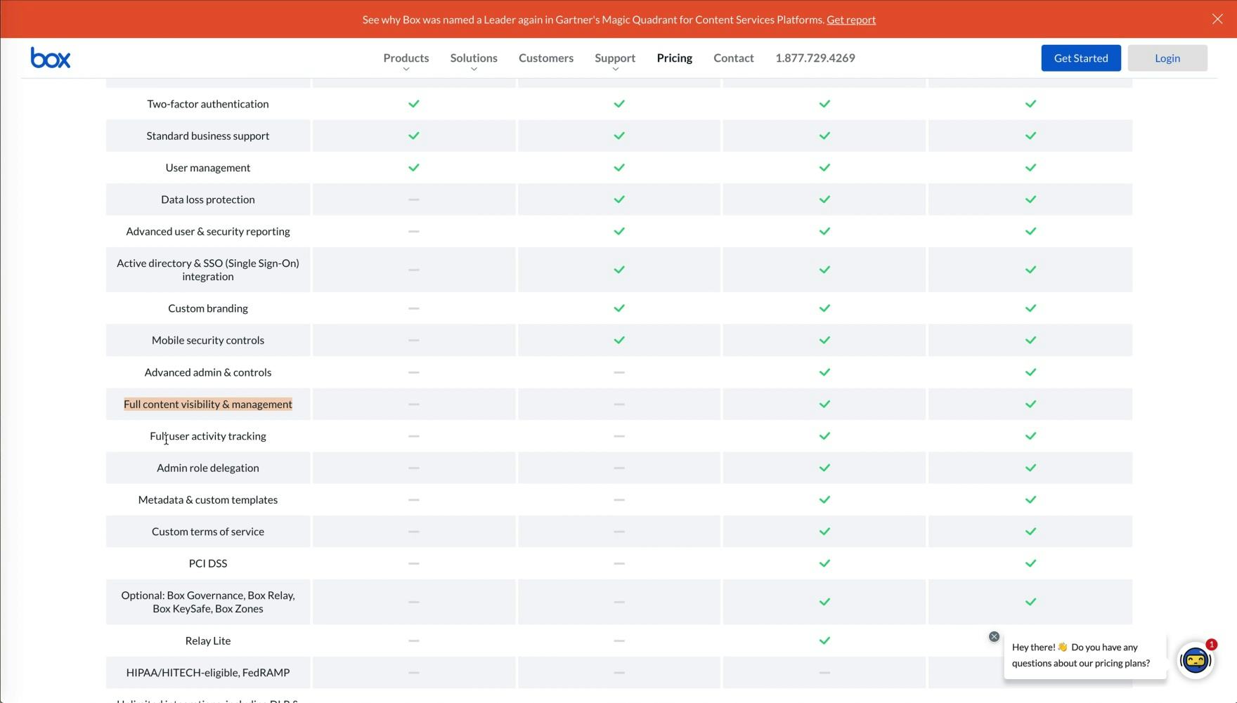
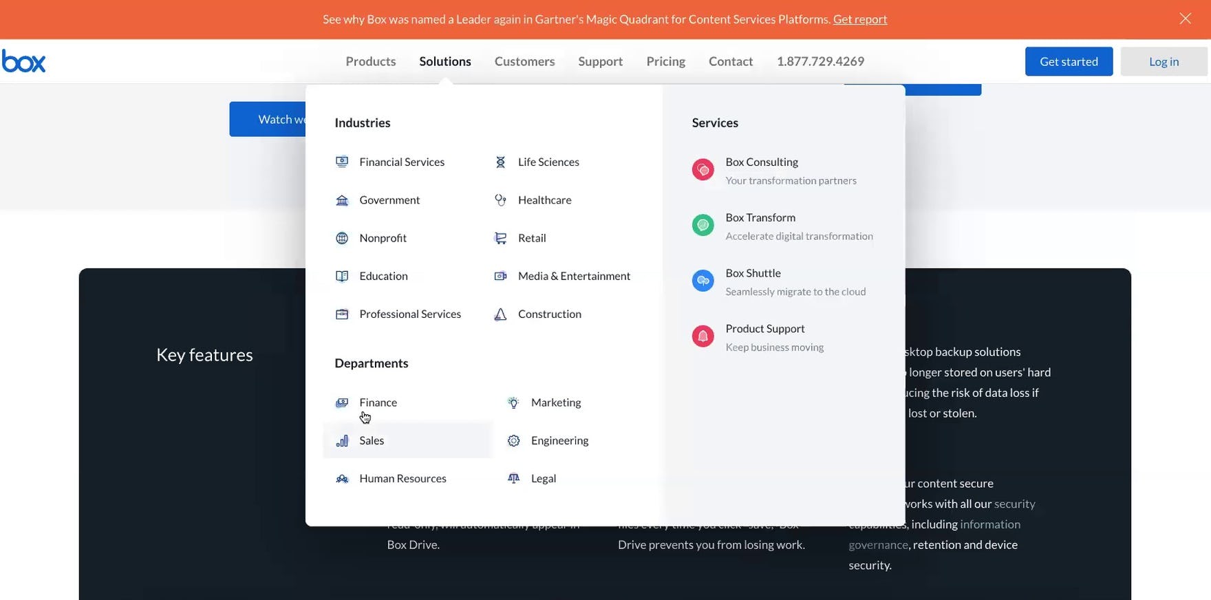
“’Full content visibility & management’ I don’t know what this is. I don’t know if I need it.” A user (a cloud infrastructure manager for an e-commerce company) at Box, which did not define or explain any of the features on its plan matrix page, stated that the feature he didn’t understand was too general to google, so he’d likely need to sign up for a demo.
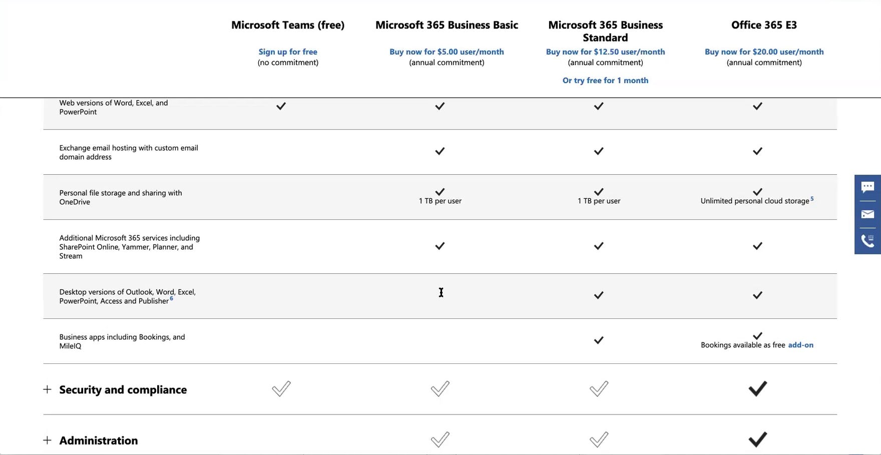
“I don’t even know what ‘MileIQ’ is”, a user (a technical project manager for an e-commerce company) noted while comparing the “Productivity Apps & Services” features for the “Basic” and “Standard” plans on the Microsoft Teams plan matrix page. Without an explanation, users are more likely to overlook unfamiliar or esoteric features that could benefit their business.
Presenting only static text for all the features listed in the plan matrix assumes users will innately recognize and understand every feature. However, this is highly unlikely.
As observed during testing, most users, regardless of their domain knowledge level, will struggle to effectively evaluate and compare plans on sites that use only static text for the features on the plan matrix page.
Moreover, on average, across all test sites, the plan matrix page contained 40 features spanning various domains. While a user may be familiar with some of the listed features, it’s highly unlikely for a user to know what all of the features are.
Manually searching the site, or venturing off-site, for answers costs users valuable time and effort.
Meanwhile, dismissing unfamiliar features as unimportant and unnecessary risks users overlooking the potential benefits these features could bring to their business.
In short, presenting any plan matrix features as static text without any additional context places an undue burden on users and increases the potential for every feature listed on the plan matrix page to be misunderstood.
![“‘Account Rewind’ I think that just means — I like that they have this question mark here. [Reads definition]. Okay, that’s nice.” A user (a product manager for a financial services company) quickly accessed a brief explanation for a couple of unfamiliar features on the Sync plan matrix page using tooltips that triggered on hover. Notably, Sync provides tooltips for all of the features listed on its plan matrix page, streamlining the plan-comparison process.](https://baymard-assets-cdn.imgix.net/research/media_files/attachments/57349/original/research-media-file-049ea01131bad1a078807dcc0a7df01d.jpg?auto=format&dpr=2&fit=max&q=50&w=880)
“‘Account Rewind’ I think that just means — I like that they have this question mark here. [Reads definition]. Okay, that’s nice.” A user (a product manager for a financial services company) quickly accessed a brief explanation for a couple of unfamiliar features on the Sync plan matrix page using tooltips that triggered on hover. Notably, Sync provides tooltips for all of the features listed on its plan matrix page, streamlining the plan-comparison process.
![“‘Enterprise’ has ‘InRoom Link’. No idea what that is. [Clicks tooltip]. Oh, okay.” This user (a customer success manager for a computer software / SaaS company) easily learned the meaning of a feature he didn’t recognize on GoToMeeting’s plan matrix. When asked if the additional explanatory content was sufficient, he confirmed, “Yeah, I think I get the idea”.](https://baymard-assets-cdn.imgix.net/research/media_files/attachments/57350/original/research-media-file-0cbe4d53401702a85fa91a32d6545d32.jpg?auto=format&dpr=2&fit=max&q=50&w=880)
“‘Enterprise’ has ‘InRoom Link’. No idea what that is. [Clicks tooltip]. Oh, okay.” This user (a customer success manager for a computer software / SaaS company) easily learned the meaning of a feature he didn’t recognize on GoToMeeting’s plan matrix. When asked if the additional explanatory content was sufficient, he confirmed, “Yeah, I think I get the idea”.
Therefore, providing quick access to additional context about all features is vital to streamlining the plan-evaluation and -comparison processes.
Presenting all plan-feature details within a tooltip or similar type of interactive content element is ideal because it helps conserve screen real estate on the plan matrix page, which was observed to be quite lengthy on many of the test sites.
2) Not Linking Plan Matrix Features to Relevant Content Pages When Available
Users forced to identify and locate detailed information about plan matrix features manually are more likely to miss this rich content or simply not bother to look for it, risking damage to their overall perception of the suitability of features and their willingness to recommend or subscribe to a plan.
Yet all benchmarked sites fail to consistently link features in the plan matrix to associated rich content pages found elsewhere on the site.
During testing, some sites had additional rich content about some key or complex features — for example, a dedicated “Features” page or content in the support section of the site. Yet many users never found their way to this content, despite initially being intrigued by its corresponding feature listed in the plan matrix.
Other users found the content, but only after stopping their plan evaluation to search for the desired information, sometimes only finding it after several minutes of looking.
Needless to say, the process of trying to manually identify and navigate to a corresponding content section to view more information about a plan feature can be time-consuming, and risks users never finding the feature details they seek — details that could be the deciding factor in their decision on whether or not to subscribe to a service.
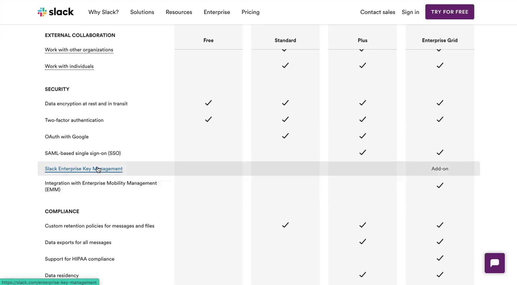
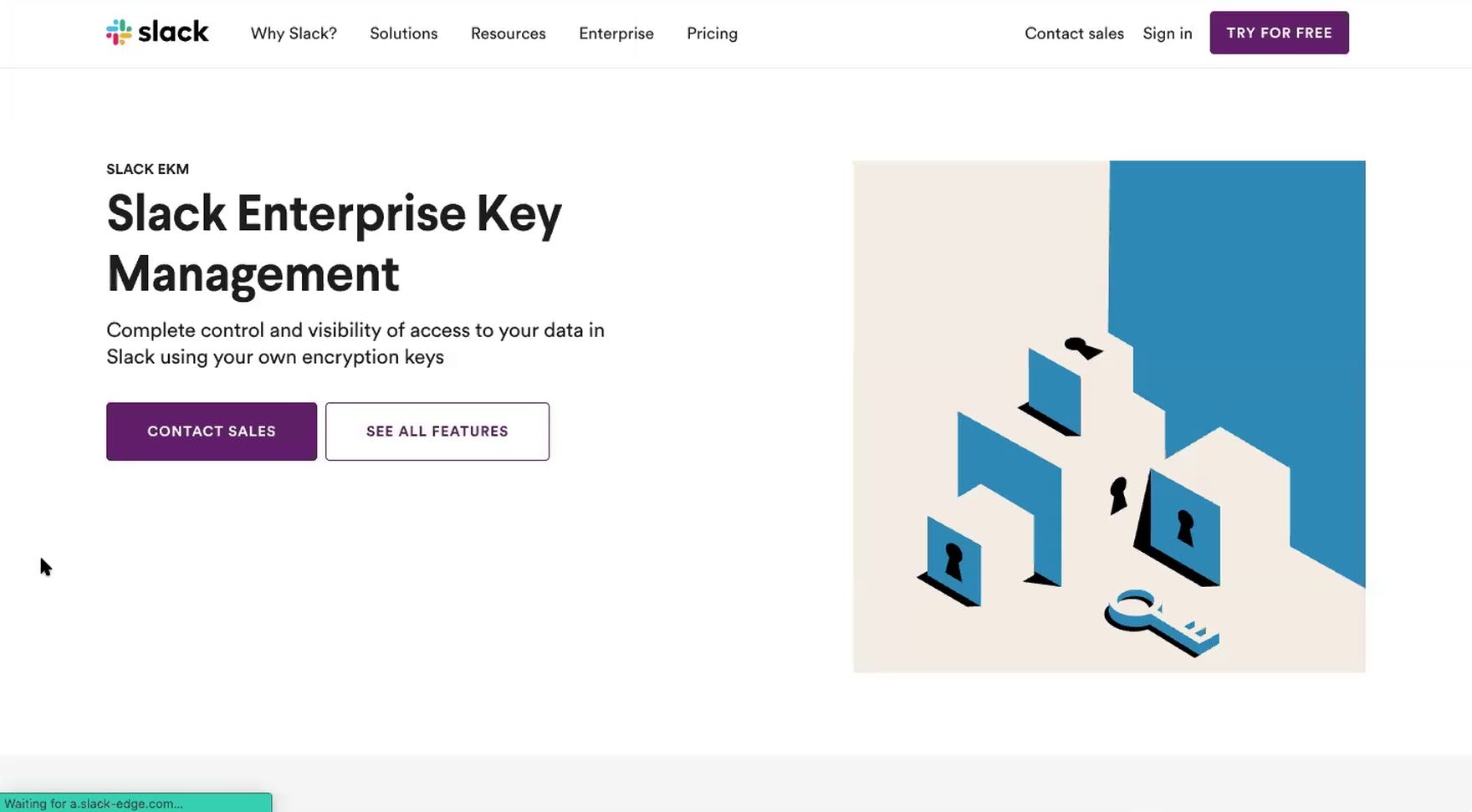
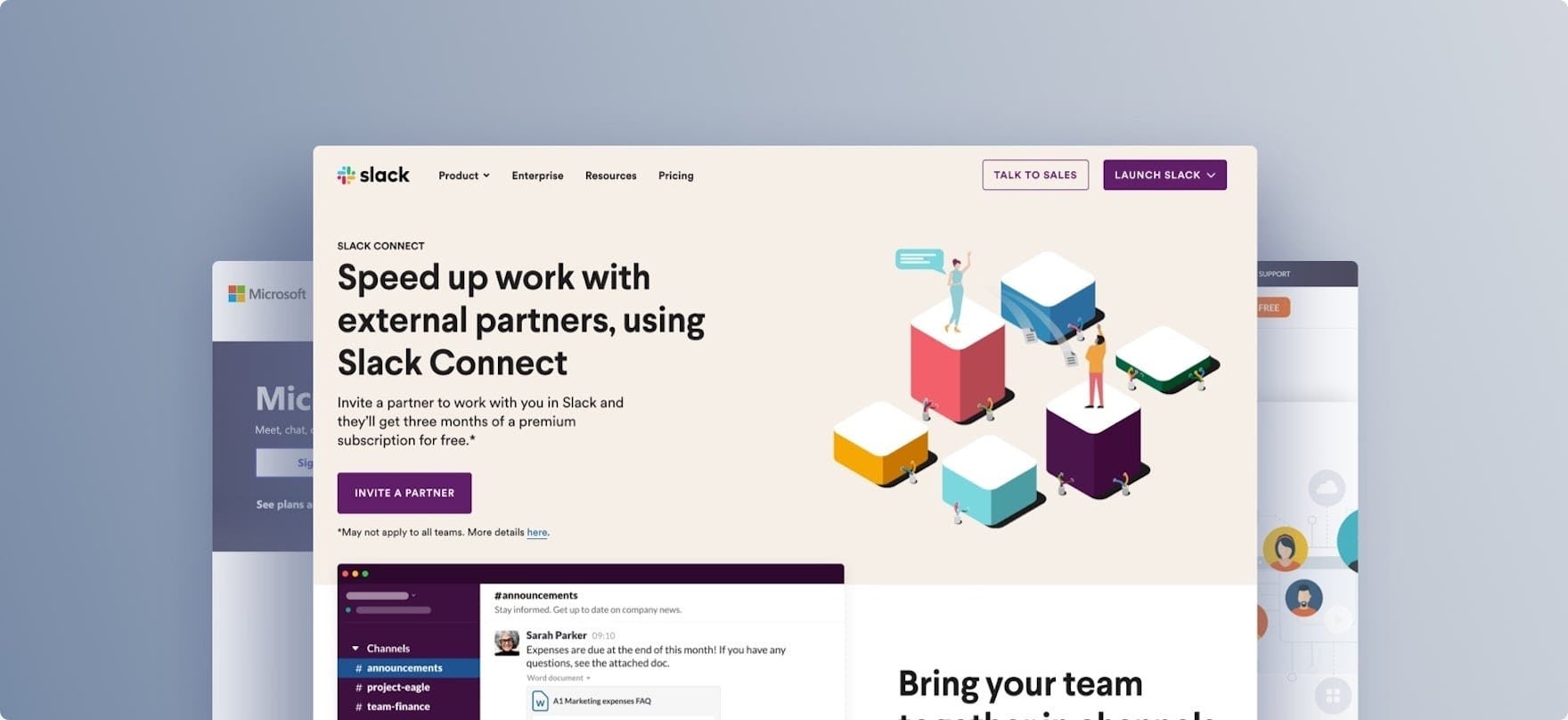
“I don’t know what this ‘Enterprise Key Management’ is…oh, encryption, that’s cool…it might be too advanced for us, but it’s really interesting. I didn’t even know that existed.” A user (a senior business systems analyst for a media production company) discovered a new feature on the plan matrix page at Slack (first image) due to the crosslink to dedicated rich content (second image). However, only a few of the plan matrix features were linked to relevant content located elsewhere on the site.
Therefore, whenever providing additional, detailed content about a feature listed in the plan matrix elsewhere on the site (e.g., a “Feature” page, support articles, etc.), provide a link directly from where the feature is listed in the plan matrix to the dedicated content.
The link can be provided within a tooltip, or the listed feature text itself can be the link (and styled as such). Either of these approaches will ensure users who need just a brief explanation can easily obtain it while others who desire more information have one-click access to it.
As observed during both large-scale testing and benchmarking, while some sites provide links from some features listed in the plan matrix to relevant content pages, no sites do this consistently for all relevant features.
Hence, this is a missed opportunity, as the content already exists. It’s just a matter of linking to that content from where many users first learn about it in the plan matrix.
3) Truncating the Full List of Plan Matrix Features
On average, across all test sites included in our Digital Subscriptions & SaaS study, the plan matrix contained 40 features.
With so many features, truncating the complete list of features may be considered to be an attractive way to ensure the full matrix is available to users (once they click to view the hidden content) and, at the same time, isn’t overwhelming. However, truncating the complete list of features was observed during testing to underperform compared to other design patterns.
During testing, users often overlooked the full list of plan matrix features on sites that hid them behind a link, regardless of how prominently the link was styled. For example, one user, after failing to notice the fairly prominent “Full Plan Comparison” link on Zoom’s plan matrix page, concluded that Zoom just didn’t offer “all the bells and whistles” offered by other test sites that, importantly, did not truncate the full list of plan matrix features.
Consequently, users who miss hidden plan features will falsely conclude that the truncated plan summary they see represents the entire list of plan features rather than just a portion, in which case a subgroup of users will deem the digital service as a whole insufficient for their needs and abandon the site.
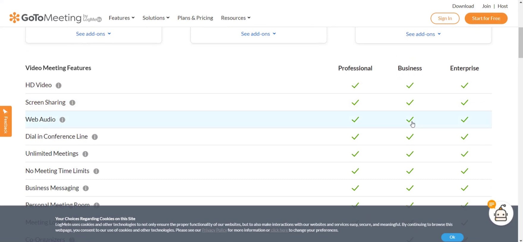
“I like that I can see all the features without having to click.” This user (a senior email coordinator for a large corporation) appreciated that GoToMeeting displayed the full list of plan matrix features.
Given the severity of users potentially overlooking critical features — and thus dropping a digital subscriptions service from consideration altogether — sites should simply avoid truncating the full list of plan matrix features.
Overall, providing immediate visibility to the full list of plan matrix features — even when the list is long — aligns with users’ expectations of the plan matrix page as a one-stop-shop for detailed plan information.
Moreover, displaying the complete list of features was observed during testing to cause the least friction for users attempting to compare plans.
In practice, displaying the full list of features could also positively impact users’ overall perception regarding the breadth and depth of the features offered.
Nevertheless, any potential risk that a subgroup of users could be overwhelmed by a long list of features can be easily mitigated by ensuring the plan matrix itself is easy to scan.
For inspiration, look to Dropbox for their nearly perfect Plan Matrix implementation.
Digital Subscriptions & SaaS Page Types & Designs
Digital subscriptions & SaaS sites tend to feature alternatives to traditional product lists or product detail pages. Many have only a single product or very narrow product range, and so individual features are more heavily showcased, often with each feature being given its own dedicated page.
In addition to dedicated “Feature” pages, digital subscriptions & SaaS sites also often include “Industry” pages (or “Use Case” pages for B2C sites) aimed at helping users understand how the service can solve their particular issues, “Customers” or “Case Studies” pages allowing users to vet the site through “social proof”, and “App Integrations” pages enabling users to verify the product or service’s compatibility with their existing services and processes.
Interestingly, the sites in our benchmark tend towards the extremes, with most performing either “poorly” or “perfectly”, indicating that the sites either have these page types and execute them well, or neglect to include them — or make them difficult to access — leaving users with insufficient information to make a decision.
In particular, there are 2 issues that most digital subscription and SaaS sites get wrong when it comes to Page Types & Designs.
4) Making the “App Integrations” Page Difficult To Find
Users rely on a number of different services for their work and are therefore often extremely interested in finding information on whether a service under consideration has an integration for their critical apps. However, finding this information can be challenging.
“I want to see if they list somewhere the partners that they have integrated with…I don’t think they have that information available here.” Sync didn’t have an “App Integrations” page, but when looking for this information this user (a product manager in IT services) immediately went to the footer.
During testing, it was clear that users relied on a number of different apps for their work.
Moreover, for some users it was equally clear that they were intensely loyal to or dependent on some apps — and therefore were extremely interested in finding information on whether a service under consideration had an integration for their critical apps (e.g., “This needs to integrate with Slack since my whole team’s on Slack”).
To meet this need many sites provide “App Integrations” pages to help users find answers to their app-related questions. However, when the “App Integrations” page isn’t easy to find, users may wrongly assume their desired apps aren’t integrated with a service under consideration — leading them to drop the service from consideration.
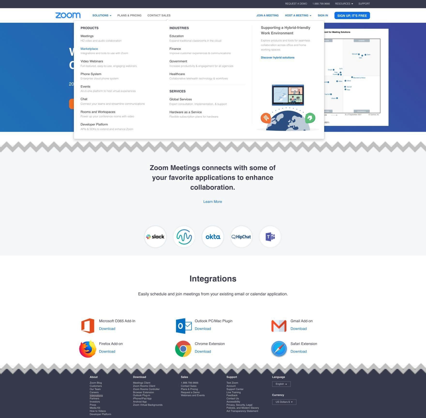
Zoom provides links to its “App Integrations” page in the main navigation, in the footer, and on the homepage to ensure users can quickly access this critical information.
During testing we observed 3 key areas where links to the “App Integrations” page need to be located: in the main navigation, in the footer, and on the homepage.
For many users, information about app integrations is more than just “nice to know” — it’s a crucial component of their decision-making process when selecting a subscription service. Therefore, they will expect a link to an “App Integrations” page to be available alongside other crucial sitewide navigation links in the main navigation.
Likewise, the footer is where many users, through years of experience browsing e-commerce sites, instinctively turn when looking for specific information.
Lastly, providing a link to the “App Integrations” page on the homepage allows users who are getting a feel for what a service offers to quickly understand that app integrations are available, and offers them a way to get more detailed information by clicking the link.
5) Not Having a Dedicated “Industry” Page for Core Industries
Without a strong understanding of how a particular service can meet their work needs, users are likely to simply assume the service won’t, and consequently leave the site for a competitor.
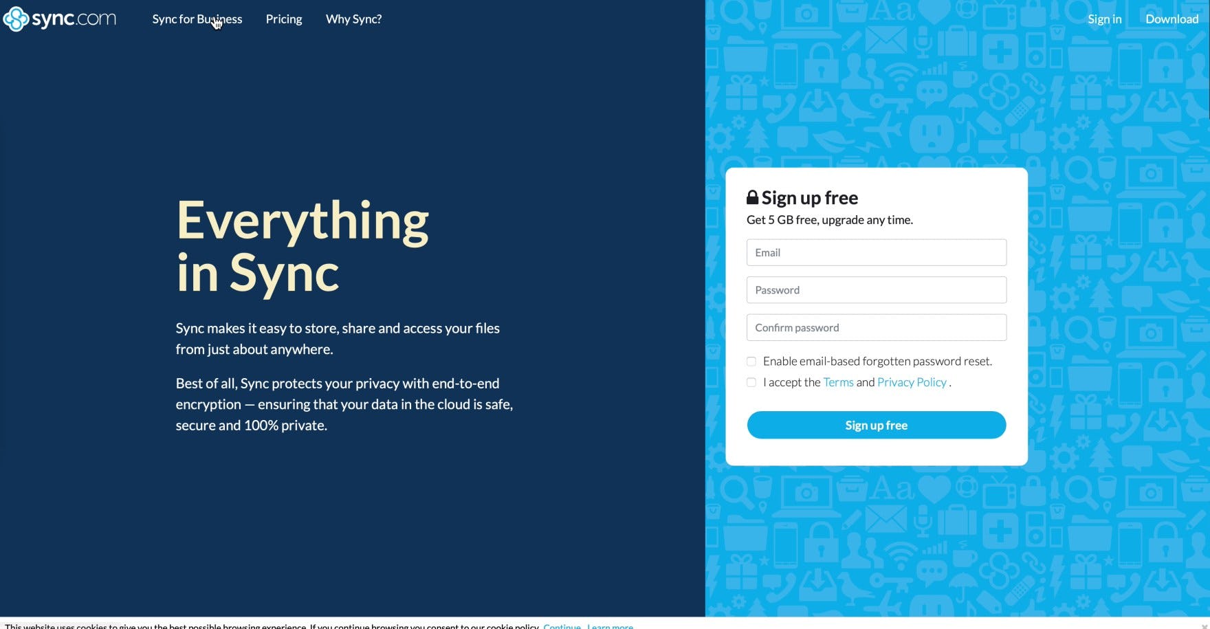
“I don’t really know what it is…I don’t know if I would continue looking at this one, to be honest…It’s not really selling me here. I don’t think it’s unique or captivating or makes me want to go forward with it.” A user (a contracts manager) thought that Sync didn’t offer enough to persuade him that it could be useful for his work.
“The claim ‘Make your team 30% more productive’ — I never really know what that means. It depends on what you’re doing.” Another user (a technical project manager) thought a claim on Chanty’s “Features” page was too general to be useful for her specific context. Neither Sync nor Chanty featured content focused on specific use cases or industries. Consequently, many users on these sites felt that they were “too thin” and had a hard time picturing how they’d use the services.
During testing many users expressed a desire to understand how they could use the service in their day-to-day work — but if the descriptions provided of the service were overly general, they had trouble understanding how the service would fit in with their work needs.
For many sites, providing only descriptions of the service that are for general audiences is a missed opportunity to help persuade individual users that the service would help them and their teams with their various work-related needs —which vary considerably depending on the specific industry or use case a user is shopping for.
Box provides industry-specific pages about how its products and services can benefit individual business sectors that, during testing, users found very compelling. As one user (a senior manager in Financial Services) remarked, “The fact that they hit on all these different areas kind of sells me in trying it out”.
Testing revealed that many users are likely to approach a new service from their unique work context — for example, “How can this be useful for me as someone who works in education/financial services/healthcare/retail etc.?” Sites that offer information specific to these and other industries are likely to perform much better than sites that fail to provide any use cases for the product in specific sectors.
Indeed, users were observed to quickly gravitate towards exploring use cases for their industry, after gaining a general sense of what a service did and what features it provided. When users are provided with information about a service that’s tailored to their specific context, many are much more likely to consider trying, or subscribing to, the service.
While the time required to create detailed pages tailored to specific industries may be daunting, the pages can function as very effective sales tools. A user who’s unsure about a service, upon discovering the ways the service can benefit his or her specific professional context, will very often decide to explore the service more, and at least opt for a trial to see if it meets their needs and the needs of their colleagues.
For inspiration on digital subscriptions & SaaS Page Types & Designs, look to Zoom for a “state-of-the-art” implementation.
Simplify Plan and Service Evaluation for SaaS Users
This high-level analysis of the digital subscriptions & SaaS UX focuses on only 2 of the 32 digital subscriptions & SaaS subtopics included in our benchmark analysis. The 30 other subtopics should be reviewed as well to gain a comprehensive understanding of SaaS UX, and to identify additional site-specific issues not covered here.
Although our Digital Subscriptions & SaaS benchmark has revealed that no sites have a completely broken UX, it’s clear that there’s still room for improvement, as several sites perform “poor” or “mediocre” when it comes to overall performance.
Avoiding the 5 pitfalls discussed in the article is the first step toward improving users’ digital subscriptions & SaaS website experience:
- Not Explaining or Defining All Features in the Plan Matrix
- Not Linking Plan Matrix Features to Relevant Content Pages When Available
- Truncating the Full List of Plan Matrix Features
- Making the “App Integrations” Page Difficult To Find
- Not Having a Dedicated “Industry” Page for Core Industries
For inspiration on other sites’ implementations and to see how they perform UX-wise, head to the publicly available part of the Digital Subscriptions & SaaS benchmark. Here you can browse the Digital Subscriptions & SaaS Website implementations of all 20 benchmarked sites.
Getting access: all 190+ Digital Subscriptions & SaaS Website UX guidelines are available today via Baymard Premium access. (If you already have an account open the Digital Subscriptions & SaaS study.)