Key Takeaways
- The account dashboard is the home base for most users attempting to accomplish account-related tasks
- Long lists of text links to features are intimidating and overwhelming to some users
- Using icons in addition to text improves scannability dramatically — yet 81% of sites don’t
During our large-scale testing on user account self-service UX, participants interacted with a variety of account features, including the credit card flow for editing stored credit cards, order cancellation features, and order returns.
On most sites these tasks are accomplished via the account dashboard — and thus the dashboard UX is critical to determining how easy or difficult it is for users to navigate account features.
Our Premium research findings indicate that, for sites with many account features, long, text-heavy lists of features can intimidate and overwhelm users — adding a great deal of friction to what should otherwise be relatively straightforward tasks for users to accomplish.
Yet our e-commerce UX benchmark shows that 81% of sites rely only on text links to represent account features.
In this article we’ll discuss:
- Why only using links for account features in the dashboard makes it difficult for users to find the account features they’re looking for
- How to improve the dashboard UX to ensure account features are easier for users to locate
Relying on Text Links for Account Features Can Impede Scannability
Throughout all of our e-commerce research, testing has indicated that users find long lists or blocks of text intimidating.
For example, this is the case for product page descriptions, which is typically the most text-heavy area of an e-commerce site. But long lists of links are contrary to footer best practices as well. Moreover, at an even more granular level, having long lines of text negatively affects the readability of e-commerce site text.
When it comes to accessing account features, lists of text links is an issue for the account menu — but also for the the account dashboard UX.
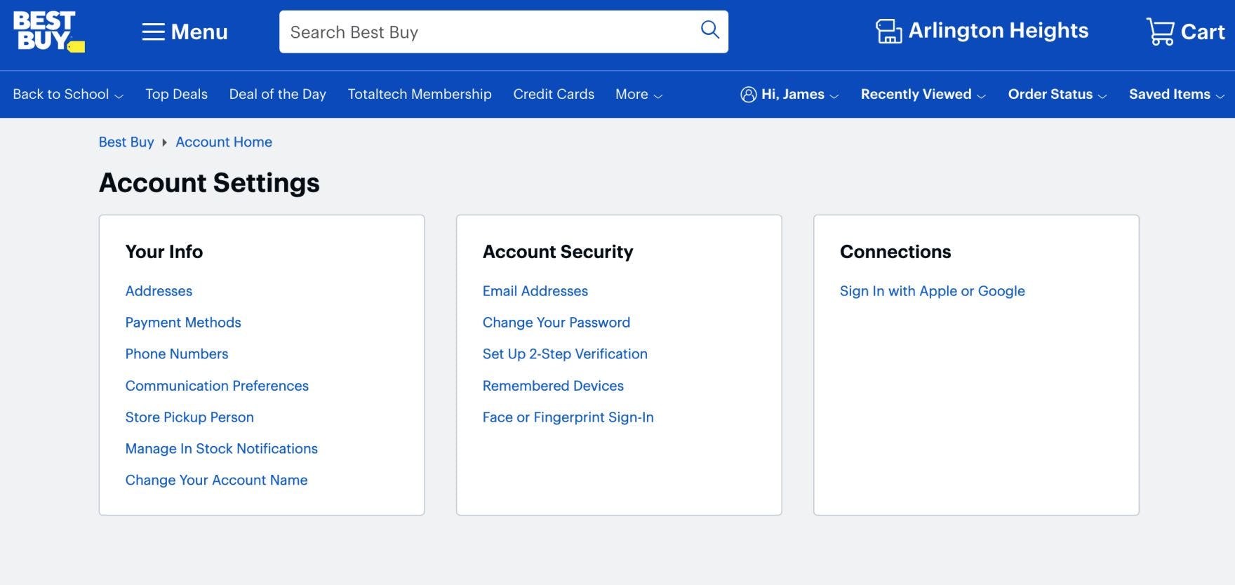
At Best Buy, text links are the only way users can access account features in the dashboard. Lists of text links can be difficult for users to scan.
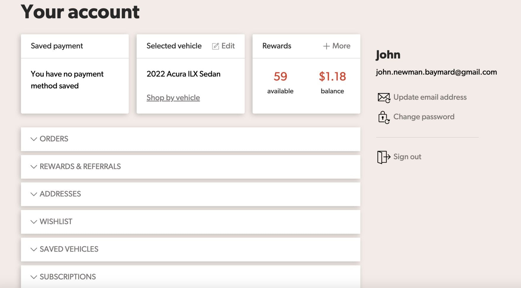
Crutchfield similarly relies mostly on text to highlight the account features available to users.
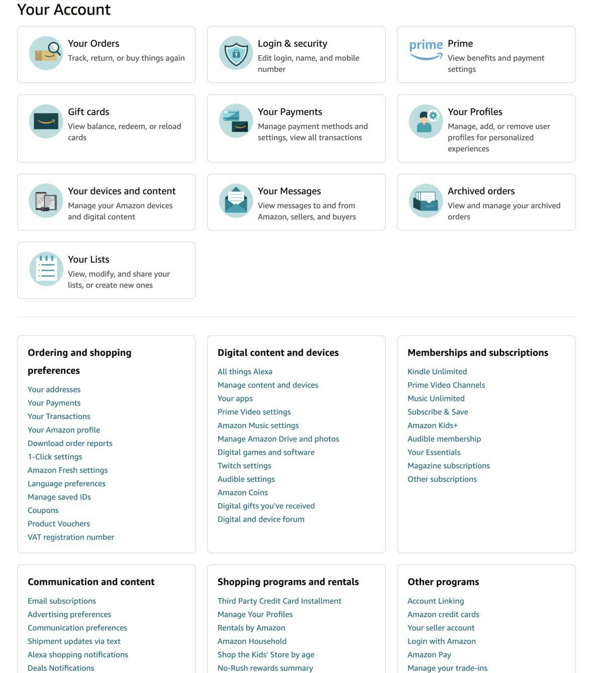
“[I’m looking for] settings on my account to see if I receive emails from Amazon, or how I’m in contact with them.” A participant on Amazon was trying to edit her newsletter preferences but never spotted the “Communication preferences” link in the “Email alerts, messages, and ads” box. She — along with several other participants during testing — eventually gave up and left without updating her communication preferences.
In the worst-case scenario, users will perceive the lists of links as a dreaded wall of text — which for some users is enough of a reason to abandon the account-related task they’re currently trying to accomplish.
Other users may stop to search for the feature of interest — but they’ll be significantly slowed down as they have to read each link to determine if it’s for the account feature they’re looking for.
Indeed, when the dashboard is mainly a list of text links, users are stymied in their goal to efficiently access an account feature and make the necessary changes — resulting in an overall worse account dashboard UX.
Improving the Account Dashboard UX with Icons
To improve the scannability of the account dashboard, consider implementing an “Icon-Based” dashboard.
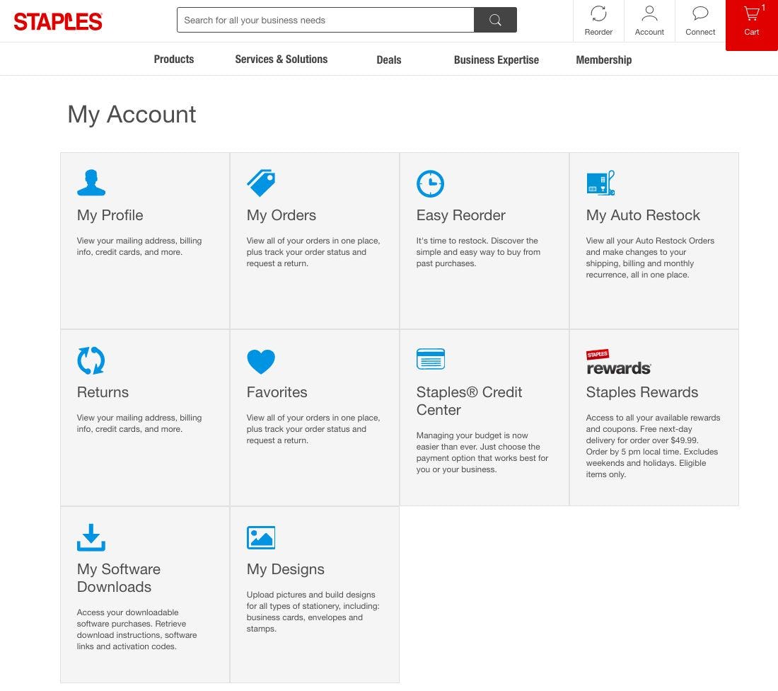
Staples has implemented an “Icon-Based” dashboard, using icons to represent the account features. Note how the interplay of icons and descriptive text can help users access the account feature they are looking for.
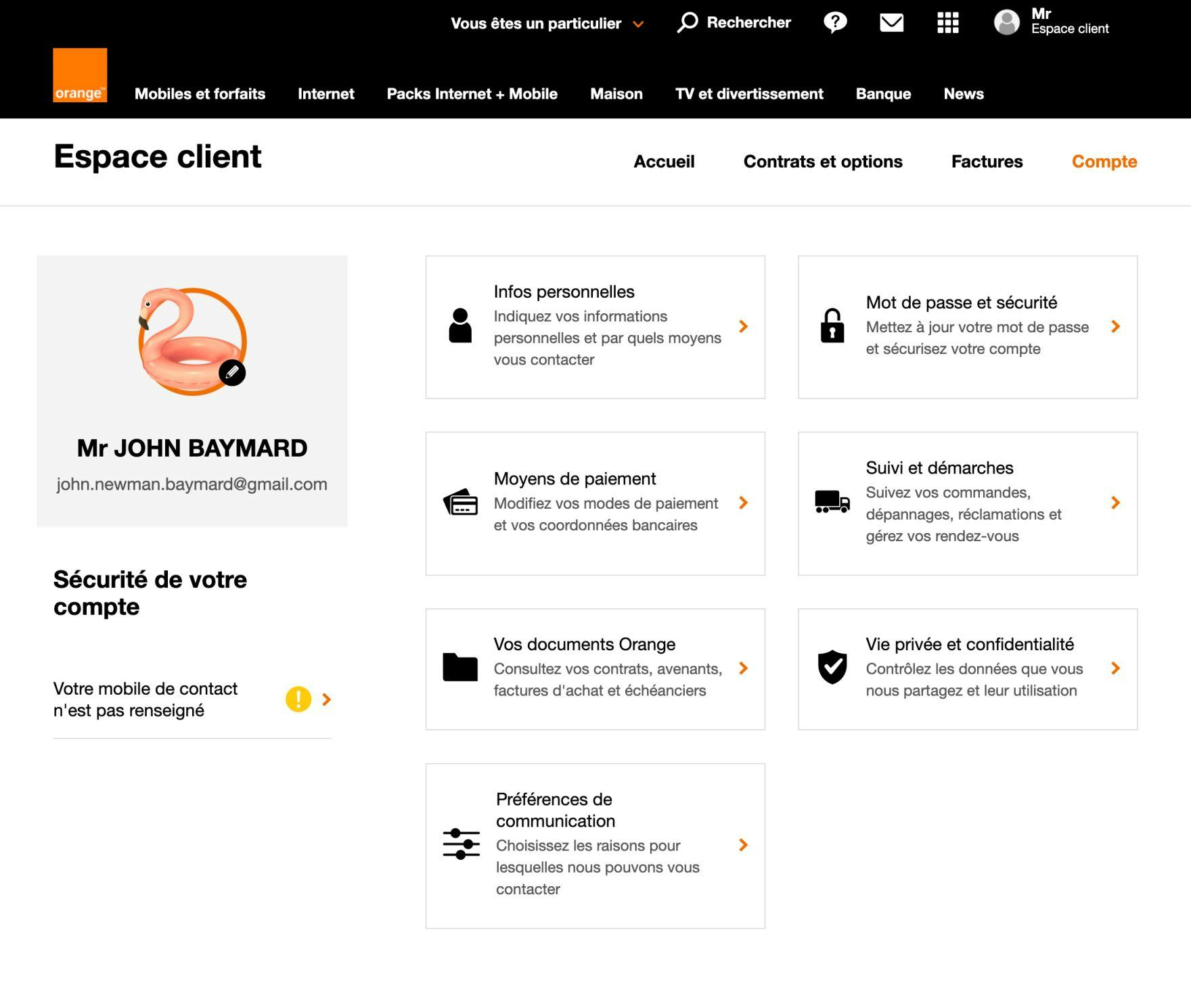
Likewise, Orange’s dashboard icons underscore the navigation options and enhance users’ ability to scan.
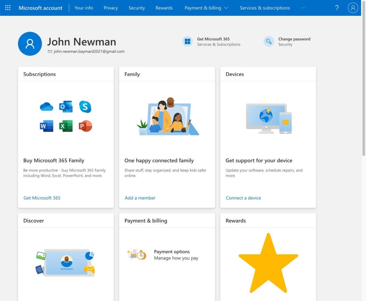
At Microsoft, icons are heavily emphasized, to the point where they dominate much of the “card” for the account feature. (Note how icons also work well with the “Cards” dashboard.)
Testing revealed that adding an icon representative of the account feature — for example, a credit card icon for the “Payments” feature, a map pin for the “Addresses” feature, a star icon for the “Favorites” feature, etc. — significantly improved the scannability of the account dashboard for participants.
On dashboards with icons, users tend to scan the dashboard for the icon representing the account feature they’re trying to access. Then, once they’ve identified the appropriate icon, they read the text accompanying the icon to confirm it’s the one they want.
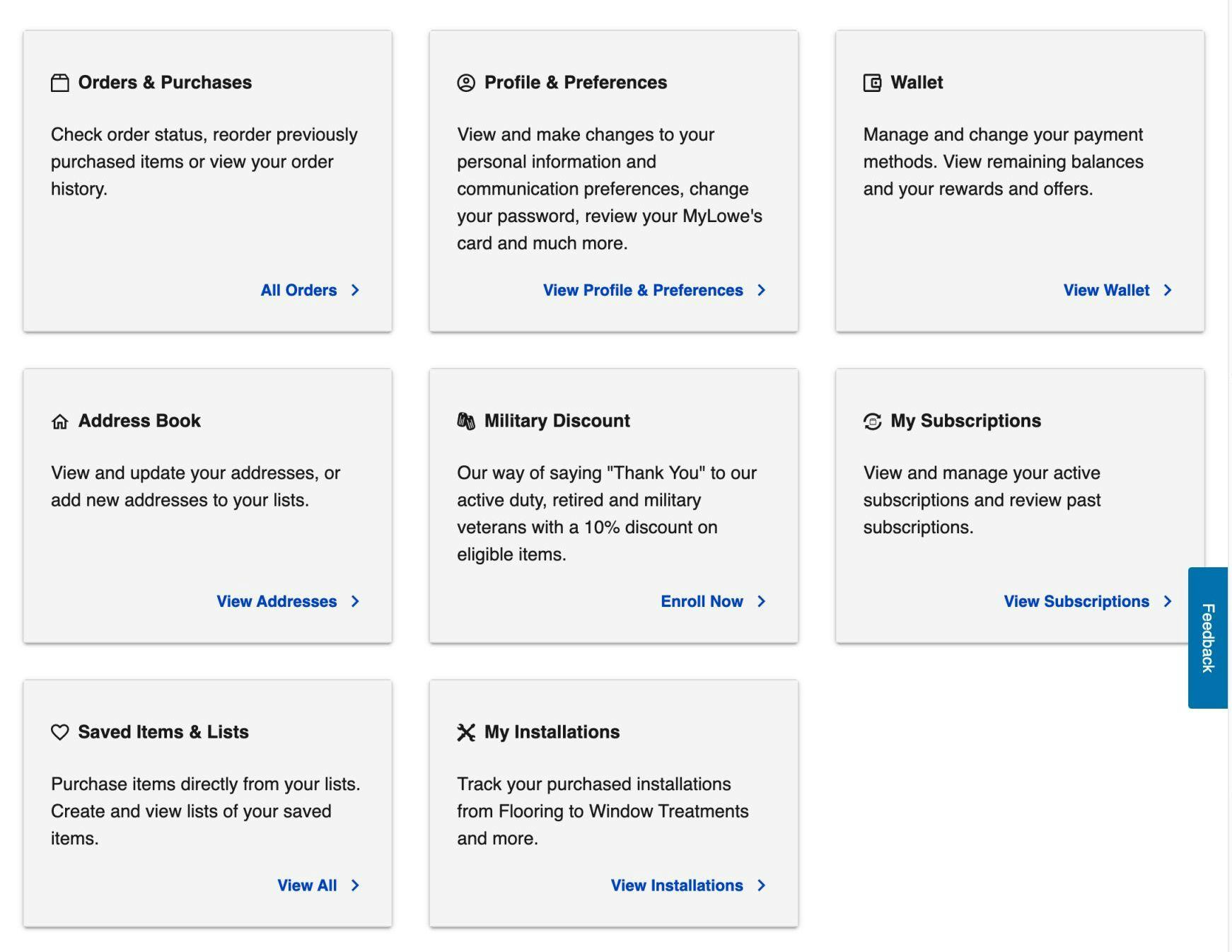
Lowe’s uses icons to represent key account features. While some of the icons could be open to misinterpretation — for example, the dog tags representing the “Military Discount” feature — the accompanying text ensures that any ambiguity is cleared up.
Including text alongside the icon is an important implementation detail, as some participants during testing were observed to puzzle over the meaning of some of the icons.
While testing was inconclusive with regards to which icons best represent specific account features, it was observed that, as long as icons had text accompanying the icon that clarified its purpose, participants had no issues understanding where clicking the link associated with the icon would lead.
While Amazon provides icons at the top of the account dashboard, the site uses lists of text links below. Testing showed that implementing an “Icon-Based” dashboard inconsistently — with some account features having icons and others not — resulted in the account features represented only by text links getting overlooked by participants.
An additional implementation detail to be aware of relates to the consistency with which the icons are used to represent account features.
If icons are used to represent account features inconsistently, then the account features without icons tend to be overlooked by users — after all, an icon is much more attention grabbing for scanning users compared to a text link.
Thus users end up focusing on the account features with icons — sometimes scanning the features multiple times — before they resign themselves to wading through the lists of text links (if they bother to do so).
Help Users Quickly Find the Account Features They’re Looking For
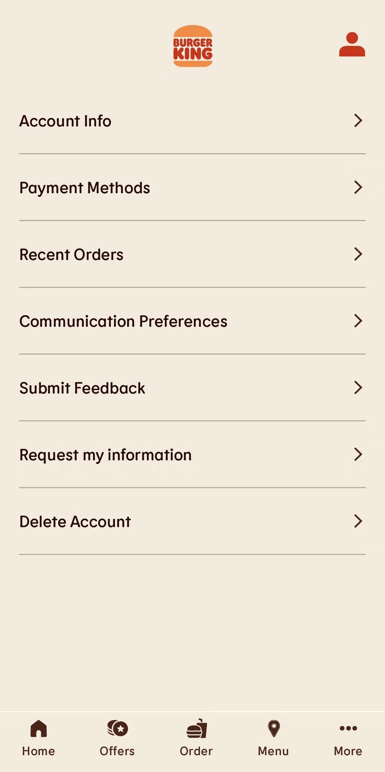
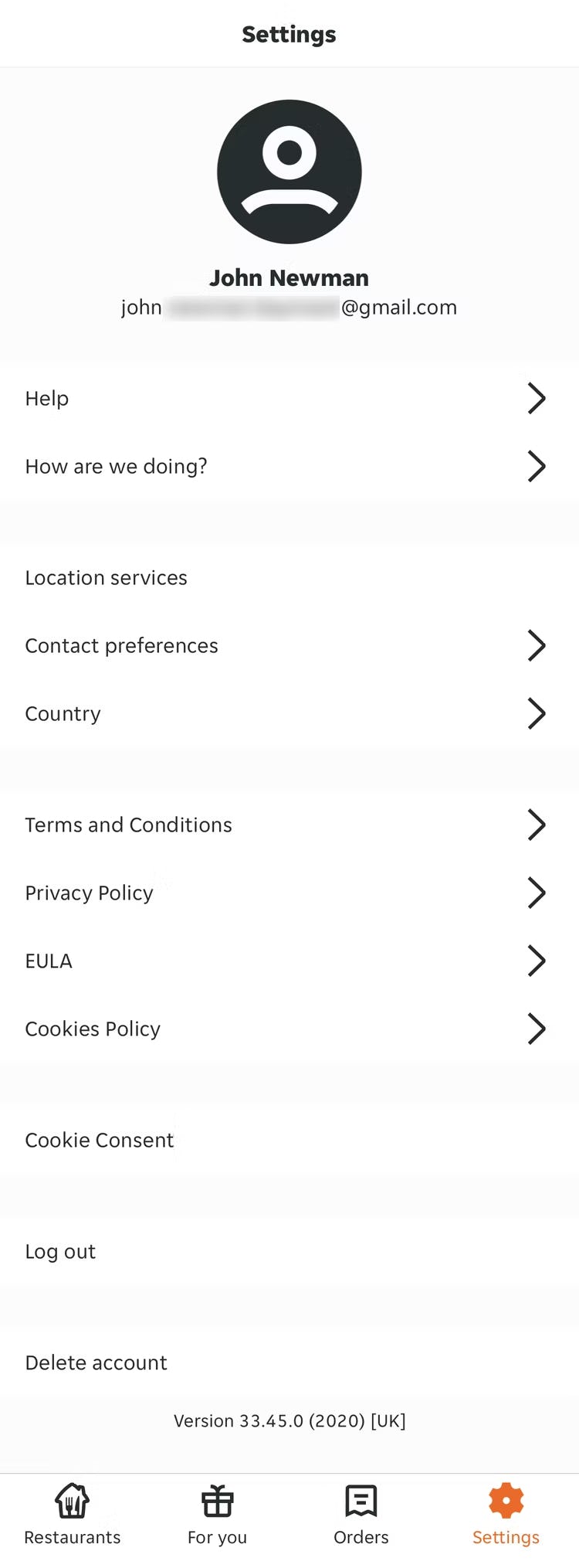
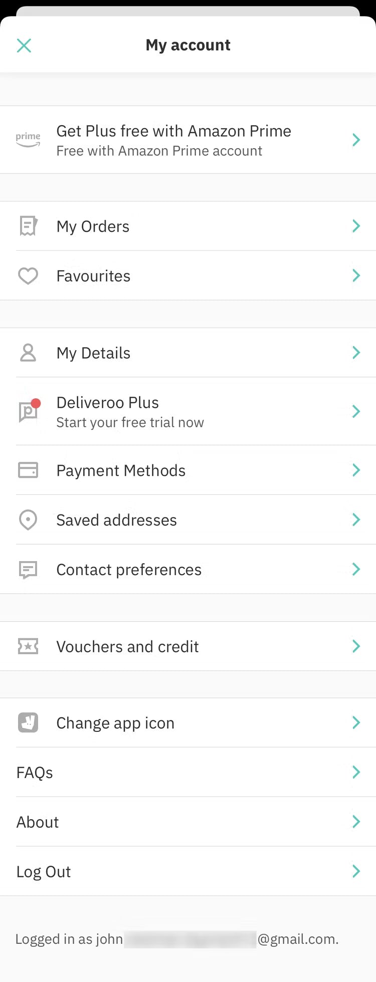
The apps for Burger King (first image) and Just Eat (second image) rely on text links for account features — impeding users’ ability to scan for the account feature they’re looking for.
Account dashboards tend to be infrequently accessed by users — they only go to their account page when they have a specific goal in mind (e.g., change their address, update their credit card, check on an order).
Thus users accessing the account dashboard typically prize efficiency and scannability — they want to access the account feature they’re looking for as quickly as possible, complete their account-related task, and move on with their day.
Providing only lists of text links for account features reduces scannability and the dashboard UX — it becomes unnecessarily difficult for users to access account features.
On the other hand, providing icons is a key detail that supports users’ ability to scan the dashboard, while also giving the dashboard a generally less-intimidating appearance.
Despite the benefits of using icons to represent account features in the dashboard, 81% of sites don’t — a huge missed opportunity to improve the overall account self-service UX.
Getting access: all 65 Accounts & Self-Service guidelines are available today via our Premium research findings. (If you already have an account, open the Accounts & Self-Service theme.) (You may also want to see our e-commerce audit service for information on booking a UX audit of your Customer Account section.)
This article presents the research findings from just 1 of the 700+ UX guidelines in Baymard – get full access to learn how to create a “State of the Art” ecommerce user experience.


![“[I’m looking for] settings on my account to see if I receive emails from Amazon, or how I’m in contact with them.” A participant on Amazon was trying to edit her newsletter preferences but never spotted the “Communication preferences” link in the “Email alerts, messages, and ads” box. She — along with several other participants during testing — eventually gave up and left without updating her communication preferences.](https://baymard-assets-cdn.imgix.net/research/media_files/attachments/71622/original/research-media-file-f879902bddd407b5558535494f8e806c.jpg?auto=format&dpr=2&fit=max&q=50&w=880)
