Key Takeaways
- The average ecommerce site’s Accounts & Self-Service performance is “mediocre” or worse
- Implementing 5 Accounts & Self-Service best practices discussed in this article is a first step to improving your site’s Accounts & Self-Service UX
Key Stats
- 73% of desktop ecommerce sites have a “poor” to “mediocre” UX performance when it comes to Accounts & Self-Service
- 66% of mobile ecommerce sites have a “poor” to “mediocre” Accounts & Self-Service UX performance
- As many as 96% of ecommerce sites get 1 or more crucial Accounts & Self Service UX best practices wrong
Accounts & Self-Service is a unique aspect of the ecommerce user experience.
Unlike the 6 other ecommerce themes Baymard has researched, Accounts & Self-Service is often not part of the “direct purchase funnel” — but rather comes post-purchase.
However, this isn’t to indicate that Accounts and Self-Service UX is less important than other ecommerce themes.
Returning users — those most likely to use self-service features most often — are critically important to a successful ecommerce business, which means the Accounts & Self-Service UX performance can be just as important as the UX performance of the Product Page, Homepage & Category, or any other ecommerce areas when it comes to a site’s overall long-term sales.
In this article we’ll analyze our latest dataset of top ecommerce sites’ Account & Self-Service UX performance to provide you with the current state of ecommerce Accounts & Self-Service UX.
Additionally, we’ll outline 5 common best practices based on our Baymard research findings applicable to most ecommerce sites.
The Current State of Accounts & Self-Service UX
To assess the current state of ecommerce sites’ Accounts and Self-Service UX performance, we’ve summarized the 5,400+ UX performance scores for the 150+ benchmarked sites that have been manually reviewed and scored by Baymard’s team of UX researchers.
In the scatterplot above, in the top row each dot represents the summarized weighted UX performance of one site’s desktop Accounts & Self-Service UX.
The overall Accounts & Self-Service mobile UX performance of the sites is summarized in the “Mobile Customer Accounts” row.
The scatterplot is further broken into Accounts & Self-Service UX performance topics; for example, the “Account Drop-Down”, the “Account Dashboard”, etc.
Finally, the topics can be expanded to reveal the sites’ performance on individual Accounts & Self-Service UX guidelines.
The high-level benchmark results show that 73% of ecommerce desktop sites have an overall “mediocre” or worse UX performance for their Accounts & Self Service implementation.
For mobile, 66% have an overall “mediocre” or worse performance.
Clearly there’s much work to be done when it comes to ecommerce sites Accounts & Self-Service UX performance.
To get started with improving your Accounts & Self-Service UX, below we focus on 5 Accounts & Self-Service UX best practices.
These best practices were chosen as they are broadly applicable to most sites’ Accounts & Self-Service UX performance.
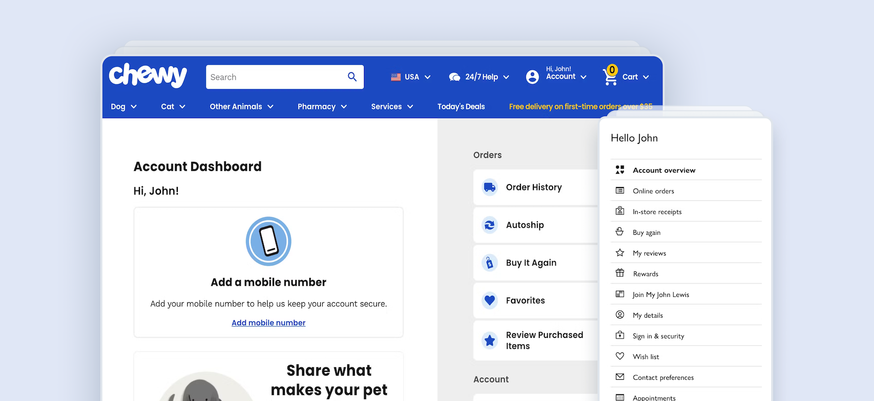
1) Always Provide 7 Key Paths in the Account Menu (96% Don’t)
The account menu is a crucial area for users attempting to accomplish account-related tasks.
During testing, the menu often served as a navigational anchor that users would turn to over and over again, no matter what account feature they were looking for.
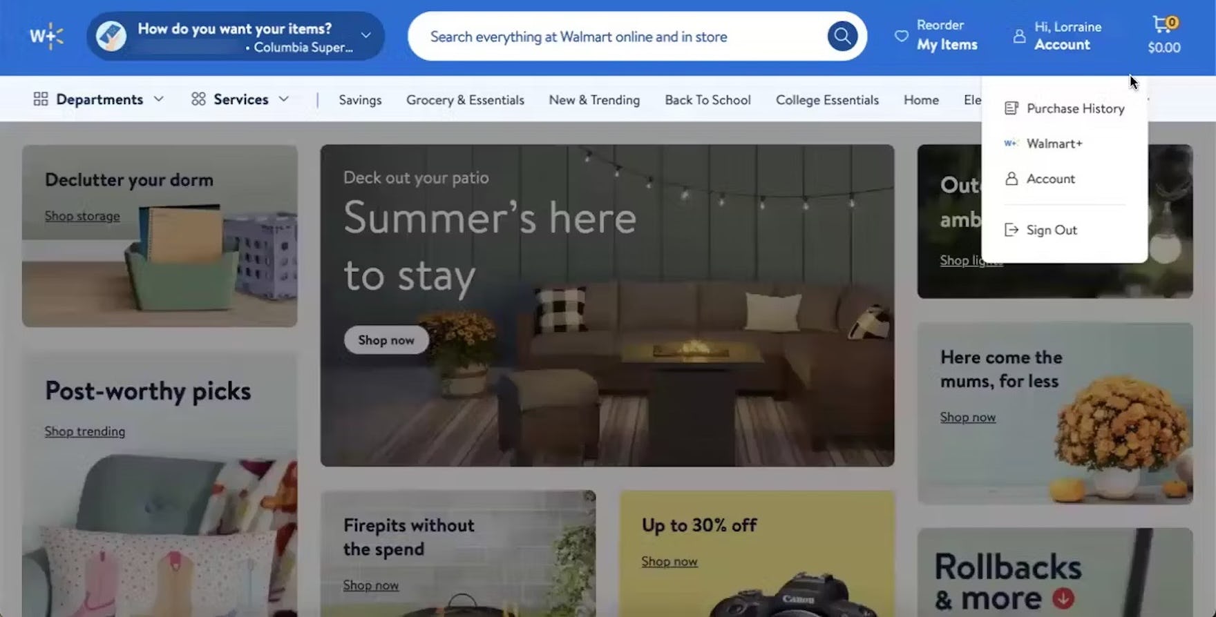
At Walmart, the account menu is heavily truncated to only 3 links, forcing users seeking to accomplish account-related tasks such as managing saved payment options, addresses, passwords, etc. to first navigate to the account dashboard via the “Account” link, then search for a link to the desired feature. In practice, heavily truncated account menus make it more difficult for users to get an overview of the features available and begin desired order- and account-related tasks.

The account menu at GAP is heavily truncated to 3 account-related links, plus links to check gift card balances and international shipping. Prioritizing features that only a subgroup of users will find useful over core account features creates unnecessary navigation friction for a majority of users.
However, when paths to primary account features aren’t available, users can feel lost and resort to searching the account dashboard (if available) or elsewhere in the account section of a site.
As we observe in testing, this inefficiency will lead some users to take longer than necessary to complete their account-related tasks — while others will give up entirely.
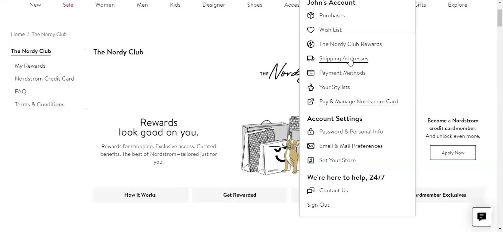
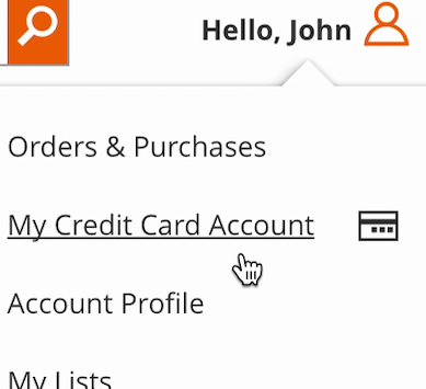
“So I go to my name first, and then I go to my shipping addresses”, explained a participant at Nordstrom seeking to add a new shipping address. He opened the account menu and quickly spotted the “Shipping Address” link to the address book. Notably, the account menu contained direct paths to his orders, loyalty program activity, managing his payment methods, shipping addresses, wishlist, and password. The heading “John’s Account” was also linked directly to his account dashboard.

To better understand what features should be provided in the account menu, Baymard commissioned a quantitative study with 1,026 US online shoppers to understand what account features are generally the most important to users. The findings support our qualitative research (“Contact customer service” is often provided in the sitewide header outside of the account menu).
Given users’ instinctual behavior to immediately open the account menu when seeking to begin specific account-related tasks such as changing a payment method, an address, or a password, sites should take advantage of the account menu by always including direct links to these core features: the account dashboard, orders, payment, loyalty, wishlist, addresses, and passwords.
2) Provide Paths to All Features from the Account Dashboard (78% Don’t)
While many users will try to find the account feature they’re looking for in the account menu, testing revealed that the account dashboard must still serve as a general starting point from which users can access all account features.
Indeed, during testing, 52% of participants used an account dashboard page when provided to navigate to desired features.
However, when the path to a desired order- or account-related feature is missing or difficult for users to find on the account dashboard, it adds undue time and unnecessary friction to the process of accomplishing order- and account-related tasks.
In practice, not providing access to all account features on the dashboard results in users having to find an alternative route, often through the account menu.
However, testing revealed many issues with account menus, including the absence of key features, poor styling and structure, and a lack of personalization.

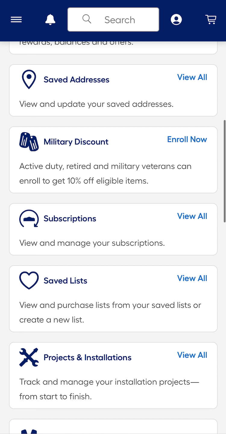
At Lowe’s, paths to key order- and account-related features are provided as direct links or grouped into broader categories such as “Account Settings” on the dashboard (first image). Clear labeling and secondary text descriptions provide additional context for all features, including site-specific secondary features like “Military Discount” and “Projects & Installations”, which may be unfamiliar to users (second image).
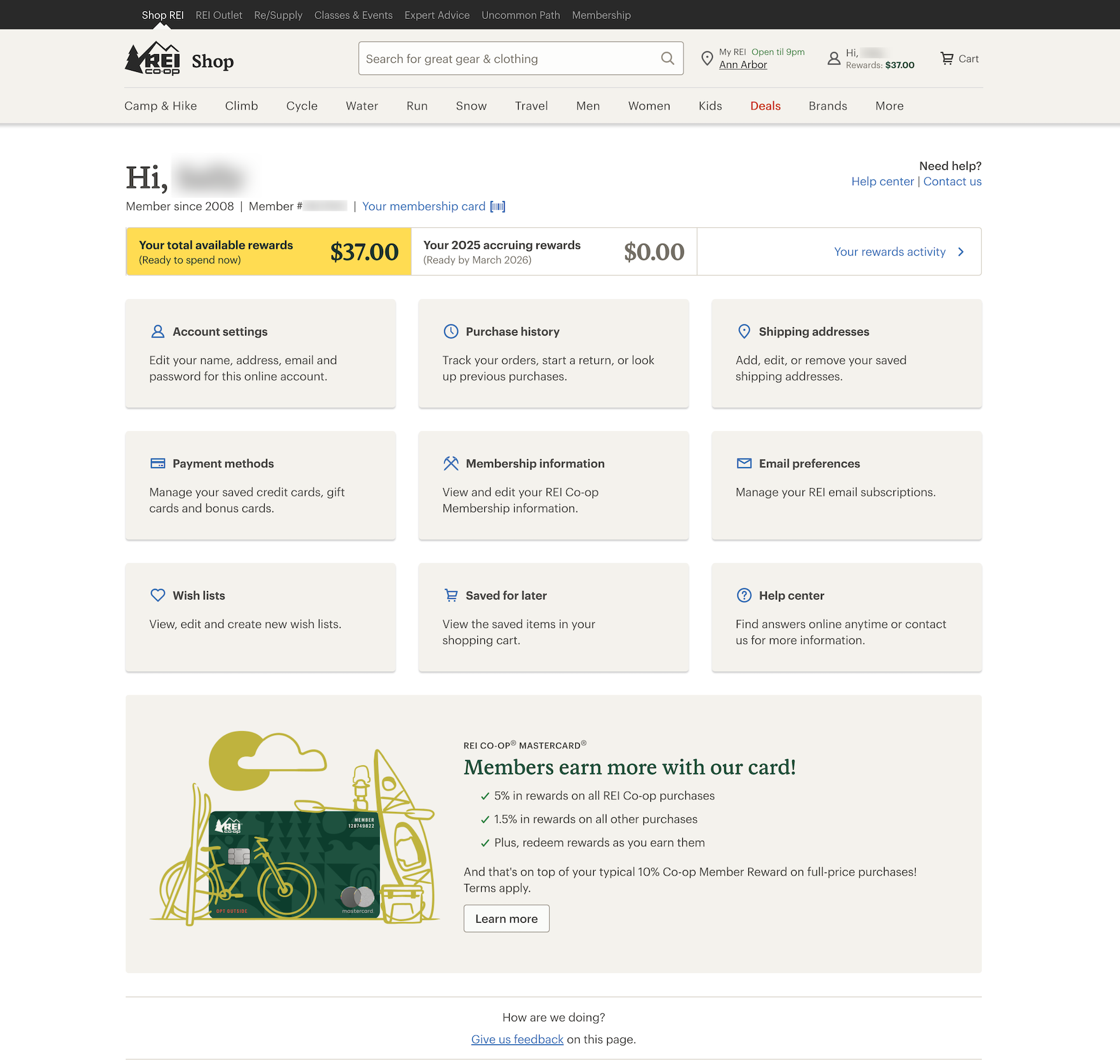
REI’s account dashboard provides direct links to orders, stored addresses and payments, loyalty information, and lists. Meanwhile, related features are grouped under “Account settings” and “Help center”.
Therefore, sites must provide access to all account features through direct links, or by grouping and nesting related features within broader categories on the dashboard.
Doing so ensures users can efficiently and effectively manage all of their account information and orders.
After all, every site, especially those with extensive or complex account features, won’t be able to include all of them in the account menu.
3) Provide a Fake “Editing” Flow When Updating Credit Card Numbers (81% Don’t)
“Umm…I can’t edit the card number…Why can you even “edit” the stored card if you can’t change the card number?”
While storing users’ credit cards can be a major convenience factor, users also need to update their stored credit cards from time to time.

Our 2025 data shows that most users will need to update their credit cards at some point for all their online ecommerce accounts.
In fact, our quantitative study on self-service and accounts revealed that 36% of users get a new credit card at least once a year, and 61% at least every couple of years.
And yet testing revealed that the process of updating a credit card on a site doesn’t always meet users’ expectations.

“So it won’t let me update the card, but I can update the address or the expiration date.” At GAP, a participant struggled to understand that the interface would not allow him to edit his credit card number.

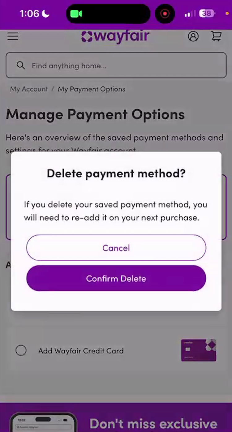
“‘Manage credit and debit card’, and, so we’re going to edit that, and I would click on that. Okay. Well, okay. It looks like it’s only giving me an option to delete it, not actually update it. Let me see if there’s another way. Nope. Okay. Let me go back on and maybe I missed something. Nope. Looks like that might be the only way. Let me see if maybe there’s a different option on this. Nope. Well, it looks like I will have to delete the debit card and then reenter it.” A participant at Wayfair spent 2.5 minutes figuring out she had to delete the existing card and re-add it to edit the expiration date.
In particular, many users will seek to “edit” their existing credit card number — users simply don’t know enough about PCI compliance and card regulations to understand why it’s not possible for the site to store, display, and allow them to edit their outdated card information.
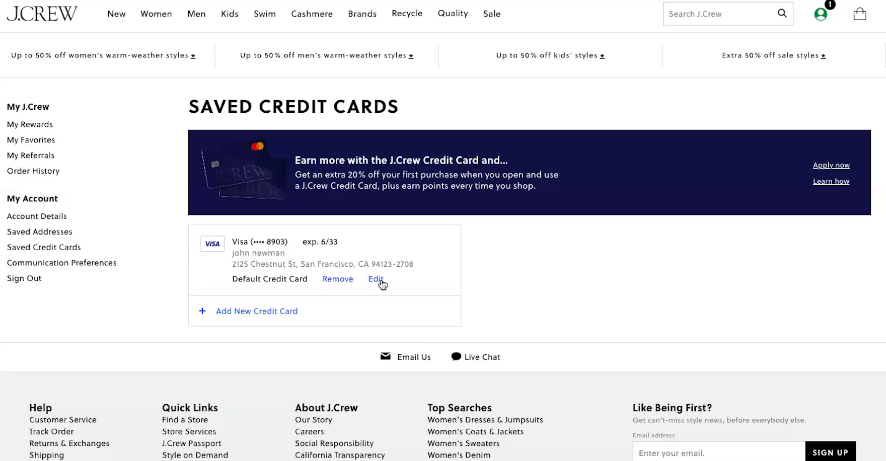
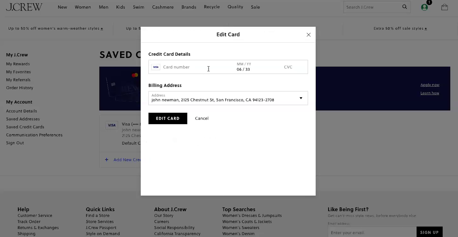
At J.Crew, a participant chose to “edit” the credit card. First, the old partially hidden card number was shown (first image). But as the participant clicked “Edit” a field appeared allowing the participant to type in the new credit card details (second image). In effect, the stored credit card interface provided what appeared to be a 1-step process for editing credit card data. In reality, the interface created a fake edit feature by combining 2 processes — deleting an old card number and adding a new one — within a single “edit card” task.
Instead, allow users to “edit” their stored credit card information by creating an illusion of editing the card number.
This is done by combining the processes of deleting the old card and adding a new credit card into one “Edit Card Number” flow.
By automating the process of removing the old credit card number and adding a new one, this can be framed as an “Edit” flow — as depicted above.
4) Provide a “Cancellation Requested” Order State

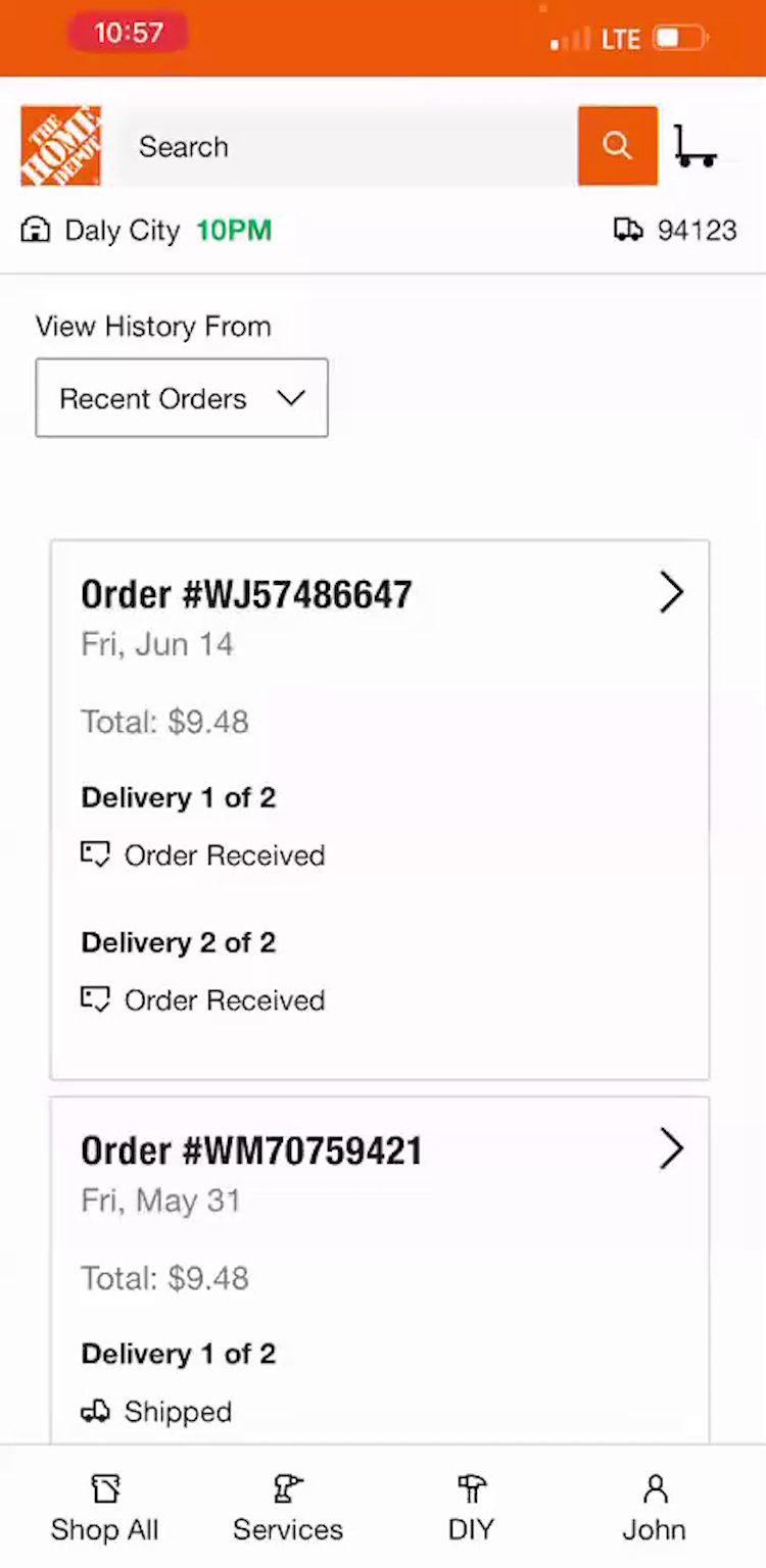
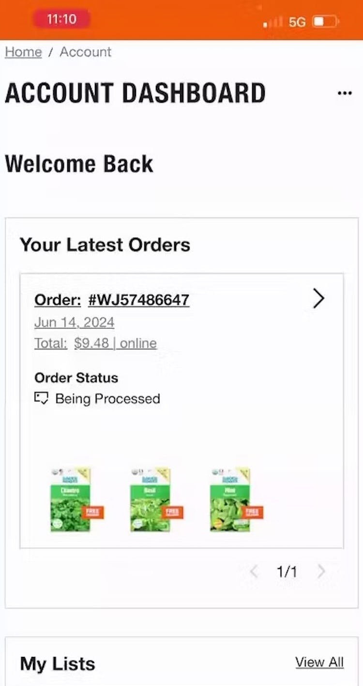
“So I will get an email if the cancellation is approved because it depends on, I guess, how far along it is in the processing and getting ready to ship”. At Home Depot, a participant attempted to cancel an order, and received a confirmation message stating that the attempt had been registered (first image). Returning to her order history, she was surprised to see that the order she was attempting to cancel was still listed as “Received”, leading her to speculate that there was a lag between her request and when that information (whether or not the cancel request was successful) may show up on the site (second image). She returned to the order details page 11 minutes later, only to find that the order status had changed from “Received” to “Being Processed” (third image). She then left the site, uncertain as to the status of her cancellation request.
Cancelling an online order can often be a task that’s fraught with anxiety.
Most users understand there’s a limited amount of time available to cancel an order, and are anxious to avoid having to go through the hassle of actually returning a product if the order can’t be cancelled.
That said, every ecommerce setup has its own set of logistical constraints when it comes to cancelling an order.
For instance, some sites may be able to process a cancellation immediately after the user clicks the “Cancel” button, others will take up to an hour, and still others may take a full business day.
Thus there’s a conflict between what a user needs and what a site may be able to provide: users want to know the status of their cancellation request, while sites may not be able to provide that information.
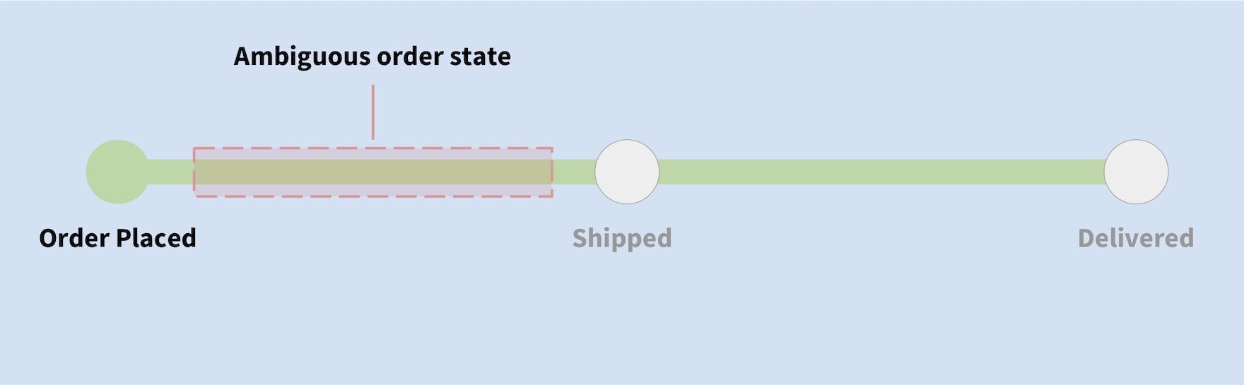
Immediately after submitting a cancellation request, users are often presented with an interface that neglects to provide an accurate overview of the order’s current state, leading to the assumption that their request wasn’t received.
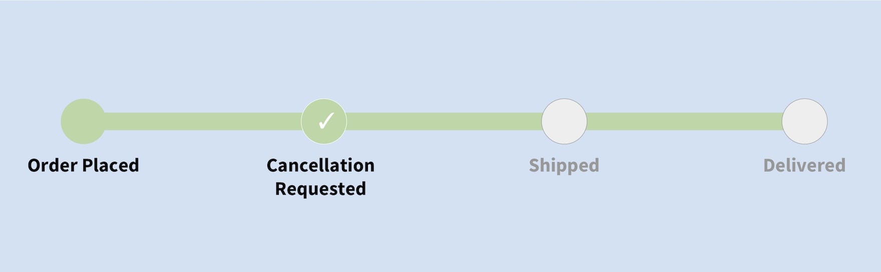
When processing an order cancellation, use of a “cancellation requested” order state, especially in the moments immediately after the request, may mitigate some of the ambiguity of the order’s current state.

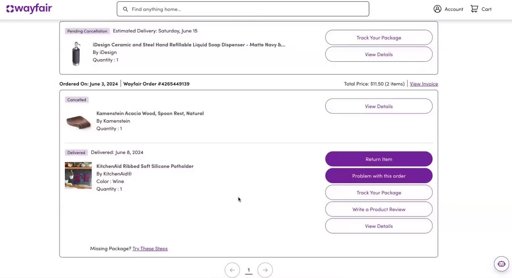
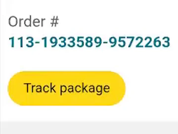
“It says ‘cancellation pending’”. At Wayfair, a participant noted the “Cancellation pending” message after he clicked to cancel an order (first image). Checking the order history page, he confirmed that the status of the order was listed as “Pending Cancellation” (second image).
In order to assuage users’ anxiety, while at the same time providing accurate information, it’s important to have a “cancellation requested” state.
This “cancellation requested” state should be indicated on the order history page, order details page, and elsewhere in the accounts section of the site where the order is listed.
Finally, a confirmation email should also be sent, further reinforcing that the cancellation request has been received.
Note: there’s insufficient benchmark data to provide a compliance rate for this guideline.
5) Integrate All Order Tracking Info and Events Within the Ecommerce Site Itself
As described in #1 above, Baymard’s quantitative study shows that the single most important self-service feature for users is tracking of open orders — primarily order status and arrival date.
Yet despite its importance to users, many sites outsource all or parts of the order and shipment tracking — like the shipping courier — to third-party sites.
However, visiting a courier site to track, typically, only the parcel for the order can add considerable complexity to the overall user experience of placing and tracking an order.
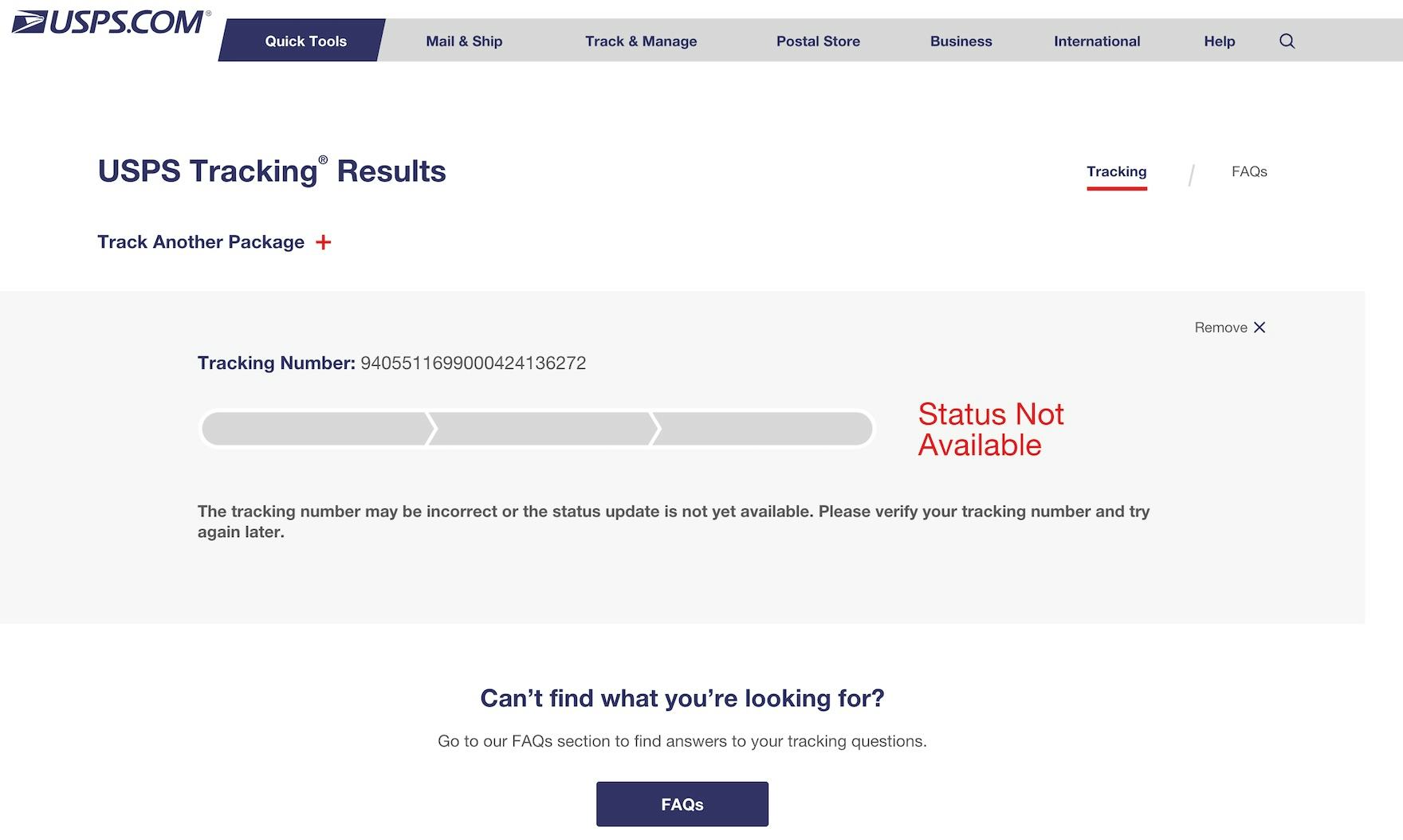
At many third-party courier sites (like USPS here), users looking for tracking info will instead often see a message like “Status not available” for several hours until the tracking info becomes available on the courier’s tracking page.
In particular, the transition from the ecommerce site to third-party sites — along with the fact that the courier sites only contain package info and not the full order info and features — was in testing observed to cause significant usability issues.
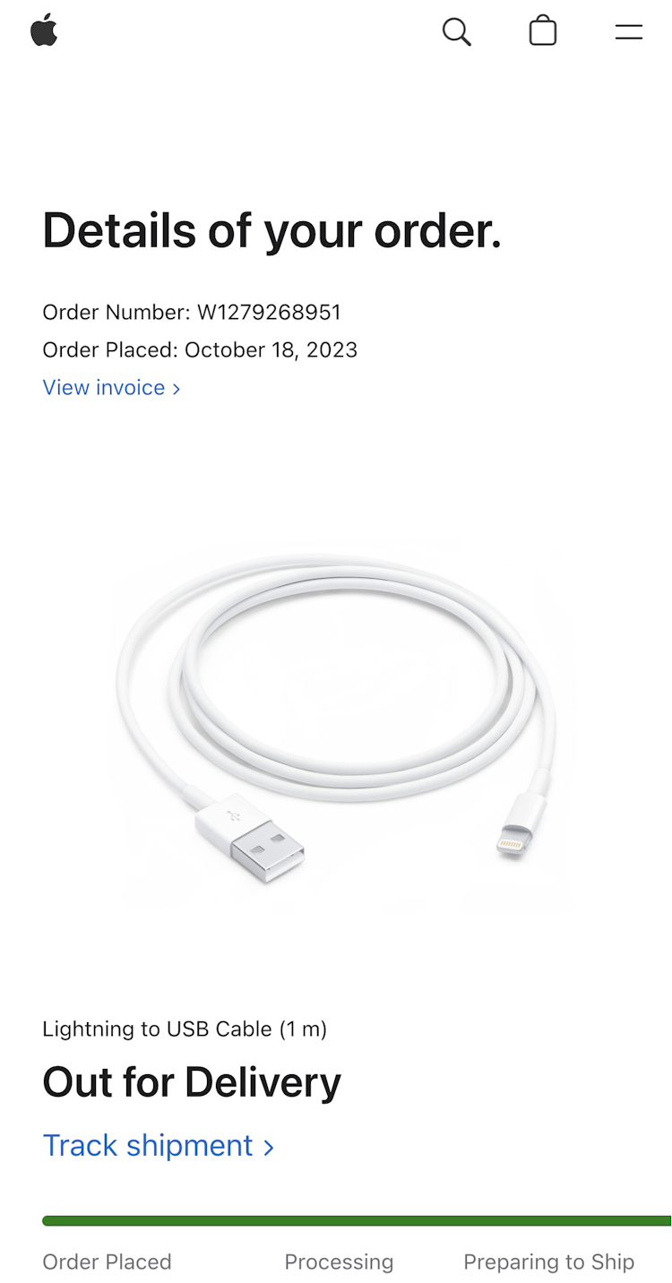
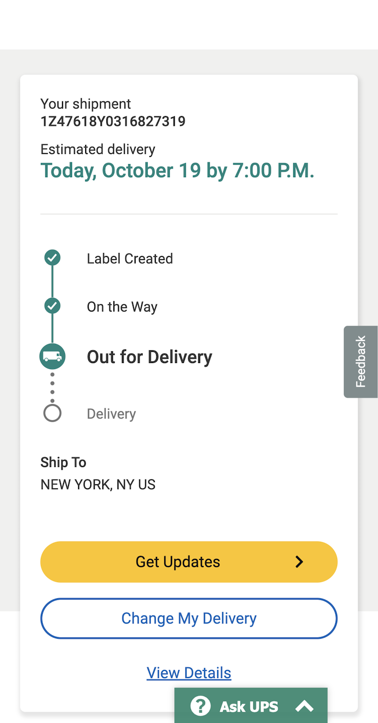
It can be jarring for users to go from a retailer’s site (Apple in this case) to a 3rd-party shipper’s site — information may be missing or incoherent, and the user experience often suffers as the retailer has no control over how the 3rd-party shipper presents information to users.
Furthermore, any site switch sometimes causes technical or practical issues (especially on mobile devices) that can mar users’ overall order experience — with some users blaming the ecommerce site instead of the third-party courier for the poor experience.


For a better order-tracking experience, sites can provide all the tracking details that users would need — such as delivery date, courier name, and shipment subevents — on their own order-tracking page.
Doing so ensures a site controls the user experience and provides a much more seamless transition for users visiting the account area of the site.
Note: there’s insufficient benchmark data to provide a compliance rate for this guideline.
Set Your Site Apart by Having a High-Performing Accounts & Self-Service UX
Our ecommerce UX benchmark shows that most benchmarked sites (73%) perform “mediocre” or worse when it comes to Accounts & Self-Service UX.
Clearly there’s still a long way to go before ecommerce sites are meeting the needs of their users.
Even if a site has otherwise good UX — for example, a high-performing homepage or product page — a poor user experience in the accounts area of the site can leave users with long-lasting negative impressions of the site.
Implementing the 5 best practices discussed in the article should be among the first steps toward improving users’ Accounts & Self-Service experience:
- Always provide 7 key paths in the account menu (96% don’t)
- Provide paths to all features from the account dashboard (78% don’t)
- Provide a fake “editing” flow for users updating credit card numbers (81% don’t)
- Provide a “cancellation requested” order state
- Integrate all order tracking info and events within the ecommerce site itself
Getting access: all 5,400+ UX performance scores, 4,300+ worst and best practice, and the UX insights from researching the Accounts and Self-Service experience are available immediately and in full within Baymard. (If you already have access through an account, open the Accounts & Self-Service study.)
If you want to know how your desktop site, mobile site, or app performs and compares, then learn more about getting Baymard to conduct a UX Audit of your site or app.