What is a UI Badge? Definition & Ecommerce Best Practice Examples
Discover research-backed best practices for badge copy, placement, and visual hierarchy to prevent clutter and maximize user impact.
Key takeaways
- Use badges only for meaningful differences such as genuine sale prices or low stock
- Exercise restraint to preserve signal value and prevent visual clutter
- Keep copy brief and familiar by using short, self-explanatory text
Badges are among the smallest UI elements in a product list. A well-placed badge helps users make faster, more confident decisions during scanning.
But used incorrectly, they can add visual noise that distracts and confuses users, preventing them from converting.
This guide covers what badges are in an ecommerce context, the different types, and the research-backed principles that determine whether a badge helps users or gets in the way.
What is a badge UI component in ecommerce?
A UI badge is a small visual label or indicator attached to a UI element to communicate status, categorization, urgency, or quantity without requiring the user to interact with or open the element. You might also see them referred to as a “label”.
Its job is to help users scan faster and judge relevance at a glance, so you should use it only when that extra signal meaningfully helps users decide on their course of action (rather than simply as a decorative accent).
Where are UI badges used in ecommerce?
Badges can be used in several ecommerce contexts.
Product cards on PLPs
Often, a badge is a short text label, sometimes combined with color or iconography, which is applied to a product thumbnail or card in a product listing page (PLP), search results page, or other list-based UI.
Badges highlight a specific product attribute worth noting at the scanning stage, before the user clicks through to the product detail page (PDP).
Common examples of badge microcopy include:
- “New”
- “Sale”
- “Best Seller”
- “Low Stock”
- “Sponsored”
- “Exclusive”
These badges serve two purposes:
- Drawing the user’s attention to specific products as they browse
- Communicating product status that influences purchase intent
Navigation icons
Badges can also be used to show a quantity or numerical value. Often, these are seen next to or over the cart icon, wishlist icon, or notification bell carrying a small numeric badge (e.g. “3”) to indicate quantity or unread notification state.
These are notification badges and are used to communicate a count that requires user action or awareness.
Promotional and editorial information
Badges can sometimes be found on homepage hero banners, category page tiles, or editorial content indicating “Featured” or “Trending” products, or campaign labels. They can also be used to show promo information, such as “50% Off” on qualifying items.
Availability and urgency
You might also use badges to display availability information and generate a sense of buying urgency or “FOMO” (fear of missing out). This includes messages like:
- “Low Stock”
- “Only 3 Left”
- “Selling Fast”
This type of badge should be used sparingly. Only employ it to create legitimate urgency where the stock situation is genuine. A badge in this context should only appear when the stock availability threshold is actually met, and should never be a permanent fixture on product cards.
Trust and certification
People buying products online often rely on trust signals to give them the confidence that a website is legitimate and trustworthy. Badges can be used to denote product information and website security that builds trust, such as a third-party validation, ethical attribute, or certification relevant to the product.
Examples include:
- “Certified Organic”
- “Carbon Neutral”
- “Cruelty Free”
- “FSC Certified”
- “Verified Reviews”
When not to use badges
Avoid using badges when the information is universal, obvious, vague, or of low value.
Also, don’t use badges as a substitute for core content structure. If price, product attributes, or other essential details are missing or poorly organized, a badge won’t fix that underlying usability problem.
Anatomy of a UI badge
Badges typically contain the following components:
- Container: Typically a pill or rounded rectangle (for text labels), or a small circle (for numerical counts).
- Label or count: The text or number inside the container. Should be as short as possible (1–2 words for text badges, a number for notification badges).
- Color: The primary indicator of meaning alongside the text. Typical badge colors are red for sale/urgency messages, green for in stock/new labels, and grey for neutral/informational content.
- Position: Usually top-left or top-right of the element it's attached to for product card badges, and the top-right corner of the icon for notification badges.
3 UI badge best practices
Badges are essentially a tool used to gain a user’s attention. Their effectiveness depends entirely on being used with restraint.
Here are three best practices for badges and labels in ecommerce, derived from Baymard’s 200,000+ hours of large-scale usability testing.
1) Use badges only for meaningful differences
A badge should only appear when the information it communicates would genuinely influence a user's decision to click through or purchase, and when that information is not already visible in the standard layout.
For example, a “Sale” badge is only relevant on a product listing page if the products shown are not all in the promotion. The badge distinguishes that product from full-price items.
If that badge appeared on every product card in a dedicated sale category, it’s irrelevant and redundant, as the category context already communicates the promotion.
Before adding a badge, ask yourself: Does this information change what a user would do?
If not, the badge isn’t needed.
2) Keep badges to a minimum so they retain signal value
It can be tempting to badge everything, but that only dilutes the value. If most items carry a badge, it stops functioning as a highlight and can even have the opposite effect, as users become blind to them.
Users rely on list-item scanning to compare options efficiently. When there are too many visual callouts present, it makes it harder for users to find the products they want and assess their options.
This is one of those design decisions where less is more.
3) Use plain language for badge text
Badge labels need to be short, concrete, and self-explanatory, because they’re consumed during rapid scanning. Avoid brand-specific phrases, internal campaign names, or vague promotional wording.
To be valuable and useful, the meaning and purpose of the badge should be immediately obvious. Copy should be familiar, specific, relevant, and easily readable when scanning the page.
UI badge examples and best practice design inspiration
If you’re auditing your website or beginning a new design sprint and want to address UI badge usage, here are some best practice examples you can take inspiration from.
Get an objective heuristic evaluation of your site’s UX
Align stakeholders, uncover your top conversion opportunities, and benchmark your site against competitors.
Microsoft’s PLP badges highlight savings information
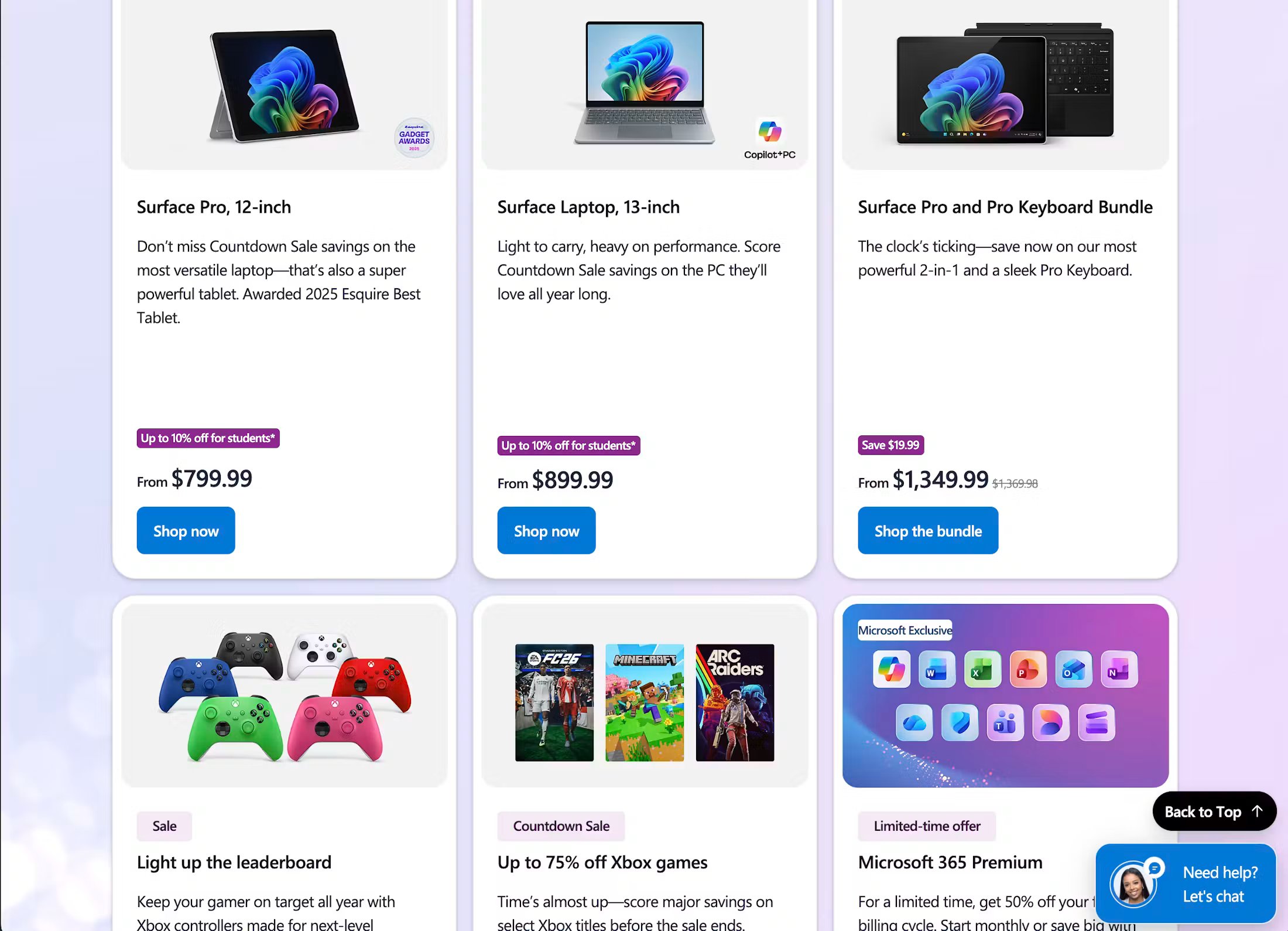
Microsoft uses badges on its PLPs to showcase relevant promotional information, such as discounts on laptops and tablets for students, and monetary savings on bundle products.
The labels are easy to see when scanning the page, making them a useful addition to the browsing experience.
Glossier’s “best seller” highlight badges
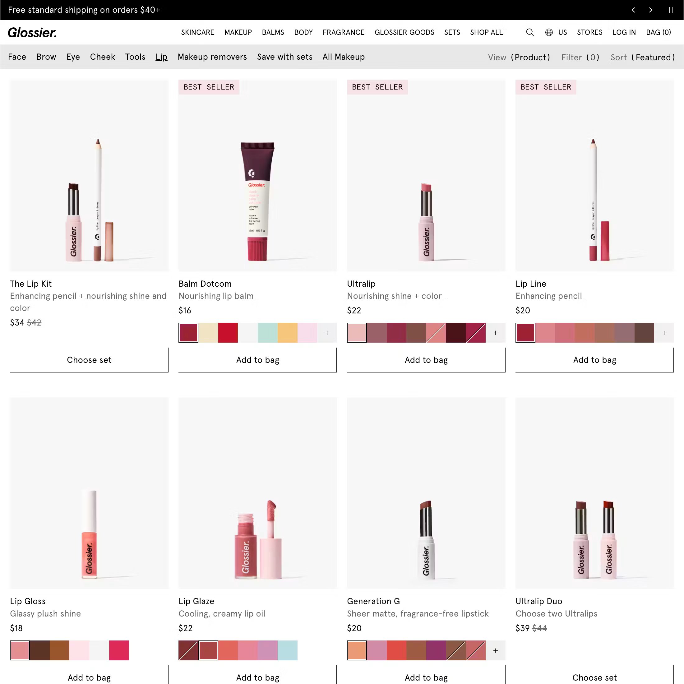
Glossier also uses badges effectively on its PLPs to draw attention to popular products.
While badges are used sparingly to avoid overwhelming the user, certain products are labeled with a “best seller” tag, which helps to spotlight trending items.
Bodybuilding’s mobile PLP badges
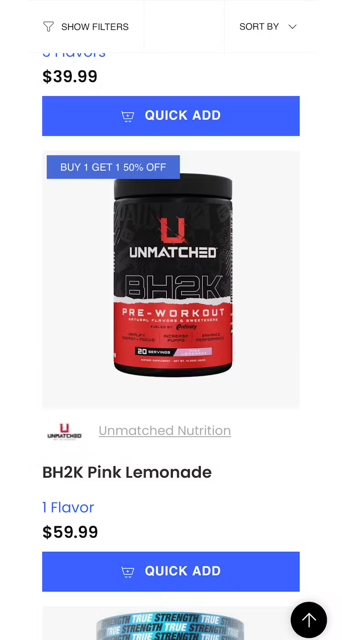
Bodybuilding uses labels and badges to selectively highlight unique purchasing attributes and promotional information in its product lists. In the example above, the product in the viewport has a clear and easy-to-spot badge showcasing that the product is part of a “buy one, get one half price” offer.
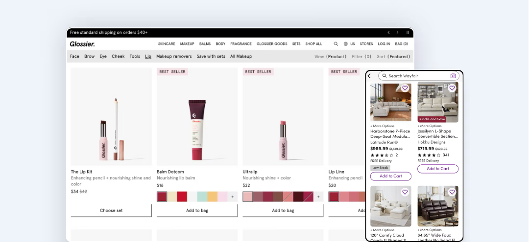
Wayfair uses availability status badges to drive urgency
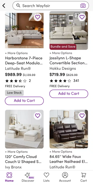
On Wayfair’s mobile app, the product list shows promotional information, while some products also display a badge showing “Low Stock”. This helps to set user expectations of real product availability to help users make informed decisions.
Back every UI design and UX decision with data
Inside Baymard, you can find more proven, research-backed guidance for creating ecommerce experiences that users love. The platform includes detailed implementation guidelines, annotated page designs, and tools to help you quickly review and optimize your website, all grounded in 200,000+ hours of usability testing.
Badge UI frequently asked questions
What is a badge in ecommerce?
A badge is a short visual label applied to a product card or thumbnail in a product list, search results page, or similar listing UI. It surfaces a specific attribute (such as “New”, “Sale”, “Best Seller”, or “Low Stock”) at the scanning stage, before the user clicks through to a product page, so they can make faster, better-informed decisions about which products to investigate further.
What is the difference between a badge and a label in ecommerce?
In ecommerce UX, the terms badge and label are typically used interchangeably to describe small visual callouts on product cards in list views. Some design systems make a distinction by treating labels as broader UI text elements and badges as specifically overlaid visual chips, but in the context of product listing pages, both refer to the same component: a short text element that highlights a specific product attribute during scanning.
How many badges should appear in a product list?
As few as necessary. Baymard's research shows that overuse of badges undermines their function. If most items in a list carry a badge, they are less effective because they contribute to visual clutter. The specific proportion depends on the catalog and the badge's eligibility criteria, but if badges appear on a large share of products in a typical listing, the criteria are probably too broad.
What makes good badge copy?
Badge text should be short, familiar, and self-explanatory. Users read badges during scanning, so any copy that requires a pause to read is failing its purpose. Avoid internal campaign language, brand-specific phrases, or vague promotional wording. “New”, “Sale”, “Low Stock”, and “Best Seller” work because they're immediately obvious to any user.
Weekly UX Research, Insights, and Updates
Join 60,000+ UX professionals. Get the latest UX research, practical guides, and Baymard news delivered to your inbox every week.
Loading...
