Product Listing Page (PLP) UX: Definition & Ecommerce Best Practices
Optimizing your product listing pages (PLP) is vital. Learn 5 ecommerce best practices to improve navigation, filtering, and scannability.
Key takeaways
- PLPs help users to discover the items in your product catalog
- Every UX decision on a PLP should support fast comparison and reduce friction
- Filtering, scannability, and visual cues are all vital for PLP best practice
80%
of ecommerce sites have serious usability flaws on their product listing pages
28%
of ecommerce sites don’t display applied filters on PLPs
A product listing page is where product discovery actually happens. These five areas determine whether users find what they're looking for, or leave your website to find it elsewhere.
What is a product listing page (PLP)?
A product listing page (PLP) is the page on an ecommerce website that displays a grid or list of products within a category, filtered set, or search result. It sits between the site navigation and the individual product detail page (PDP), and is where the majority of browsing, filtering, and comparison takes place.
In some contexts, teams refer to PLPs as category pages, but the two terms aren't interchangeable. A category page is often an intermediary navigational hub that links to multiple PLPs. A PLP is the page that displays an actual, filterable product grid.
PLP meaning in ecommerce
“PLP” stands for product listing page.
Depending on the platform, the same concept may go by different names. For example, Shopify calls it a “collection page”; others use “category page” or “search results page”. Whichever name is used, the function is the same: a PLP is the part of the journey where users decide which products are worth clicking into. Its UX quality determines how many of those users make it to a PDP and eventually to checkout.
5 PLP UX best practices for ecommerce
PLPs are a high-volume, fast-scanning environment. Users here are making quick decisions across many products simultaneously, and deciding (usually in a matter of seconds) whether to click through to a product or keep scanning.
Every design decision on a PLP should support fast, confident comparison and reduce friction on the path to the product page.
1. Ensure filters help users narrow down effectively
Filters help to reduce a large product set to a manageable one. Their usability directly determines how many users find a suitable product, and how many give up and leave.
Here are some important considerations for filtering, based on Baymard’s extensive usability testing:
- Show result counts next to each filter option — users need to know whether a selection will narrow the set to zero before they apply it
- Support multi-select within filter categories — a user searching for blue or navy shoes should be able to select both without deselecting one to select the other
- Display applied filters as removable chips, visible above or adjacent to the product grid — users should always be able to see what's shaping their current view and remove individual filters without resetting everything (28% of sites don’t do this)
- Include category-specific filters for key product attributes (like "RAM" or "Processor Speed" for computers) so users can drill down based on their desired spec
Desktop vs. mobile filtering
On desktop, keep filters visible in a persistent panel. On mobile, use a sticky filter drawer triggered by a fixed “Filter” button to keep controls accessible without consuming screen space.
Best-in-class filtering example
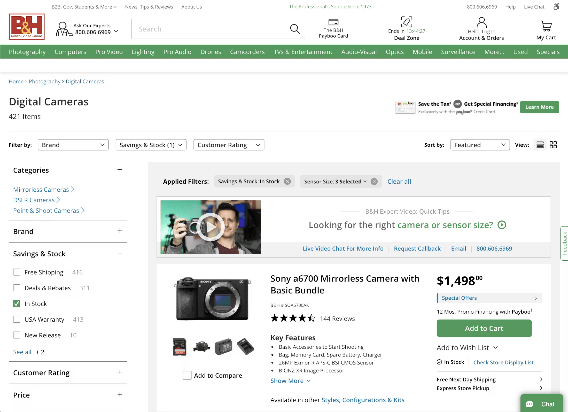
B&H Photo provides positive filtering experience on its desktop product listing pages:
- Includes prominently placed popular filters (like “Brand”, “Price”, and “Ratings”)
- Includes category-specific filters which are explained in more detail via tooltips
- Applied filters are also displayed above the product list
- Each filter option shows the number of results a user can expect
2. Make the product list or grid easy to scan
Users scan PLPs, often quickly skimming the page to find items of interest. Product cards need to surface the information to help make a quick decision without requiring a click to the PDP.
Here are some research-backed ways to make your PLPs more scannable:
- Distinguish product attributes from the title — use spacing, line breaks, and distinct styling to separate attributes from the product name
- Present essential information like price and key product attributes directly on the list page
- Keep the displayed attributes uniform across similar items to avoid user confusion
Best-in-class scannable PLP example
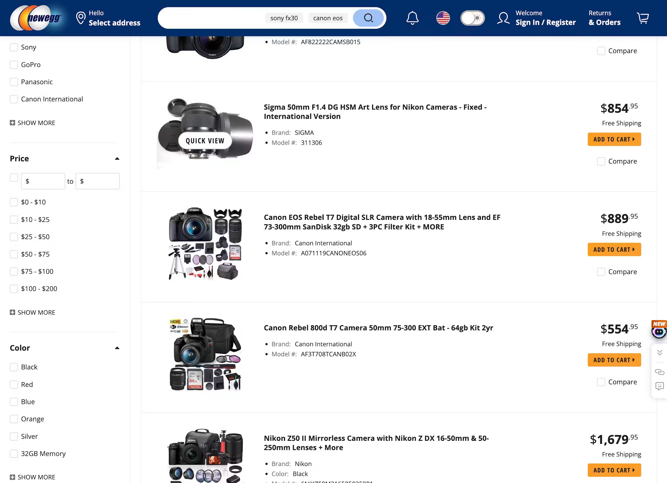
Newegg’s PLP is presented in a way that makes it easy to scan:
- Product titles are bold and prominent
- Key features like price, brand, and model number are displayed for each item
- Consistent image thumbnails provide a view of the product at a glance
3. Ensure thumbnails and visual cues help users make their decision
For many product types (particularly apparel, furniture, and home decor), the thumbnail is a primary tool users rely on to decide whether to explore or ignore an item. If a visual is missing, misleading, or lacks sufficient information, users frequently overlook suitable products.
“When sites offer only one or two thumbnails in the product list, users are almost guaranteed to need to click or tap through to the product page to see all product attributes that are best assessed visually.”

When optimizing PLP visuals, you should:
- Provide thumbnails for every item — no product in the list should be left without a visual representation
- Represent the actual product accurately — thumbnails should clearly show what is being sold, including quantities (e.g. multipacks that may impact the user’s perception of value
- Display options like color via interactive swatches and update the main thumbnail when a user selects a variation
Best-in-class visual PLP example
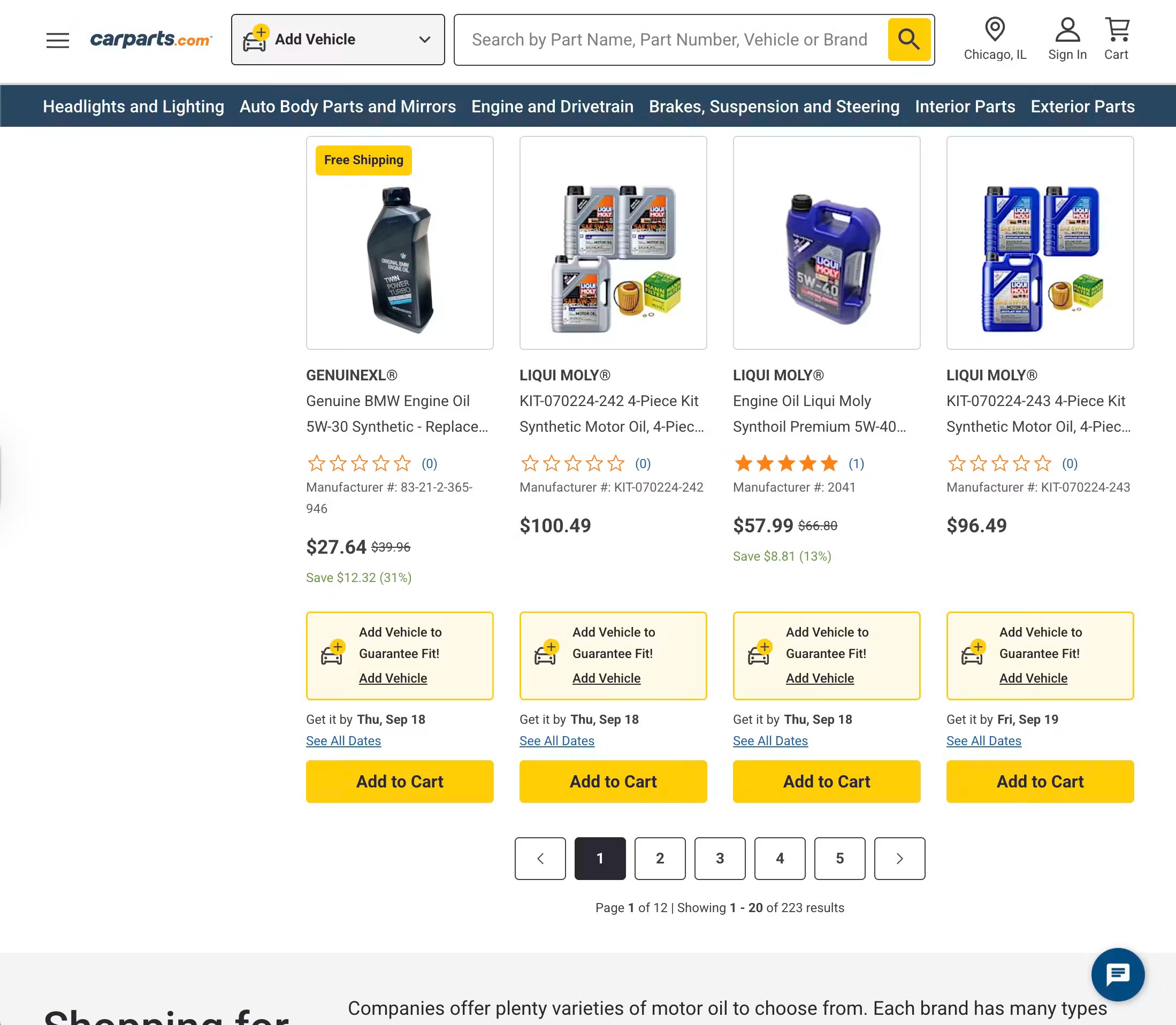
This PLP from CarParts.com adheres to UX best practices with its visually accurate product thumbnails:
- All products on the PLP have a product image and thumbnail
- All items within a product are shown in the thumbnail (e.g. the 4-piece motor oil kit shows all items included)
- Multipacks are visually represented to set user expectations
4. Preserve the user’s browsing flow
Because they’re product discovery pages, users click and jump around PLPs a lot.
As well as showcasing your product catalog, a good listing page should help users stay oriented while browsing and discovering. If layout, loading, and back navigation provide a poor experience, users can lose their place, feel lost, and can abandon.
You should:
- Match the layout to the product type — grid view for visually driven products, list view for spec-heavy products, or adapt dynamically if your catalog is mixed
- Prioritze “Load More” over endless scrolling, and size batches sensibly for desktop and mobile
- Always return users to the same place in the list after they visit a product page and then come back
Best-in-class browsing flow example
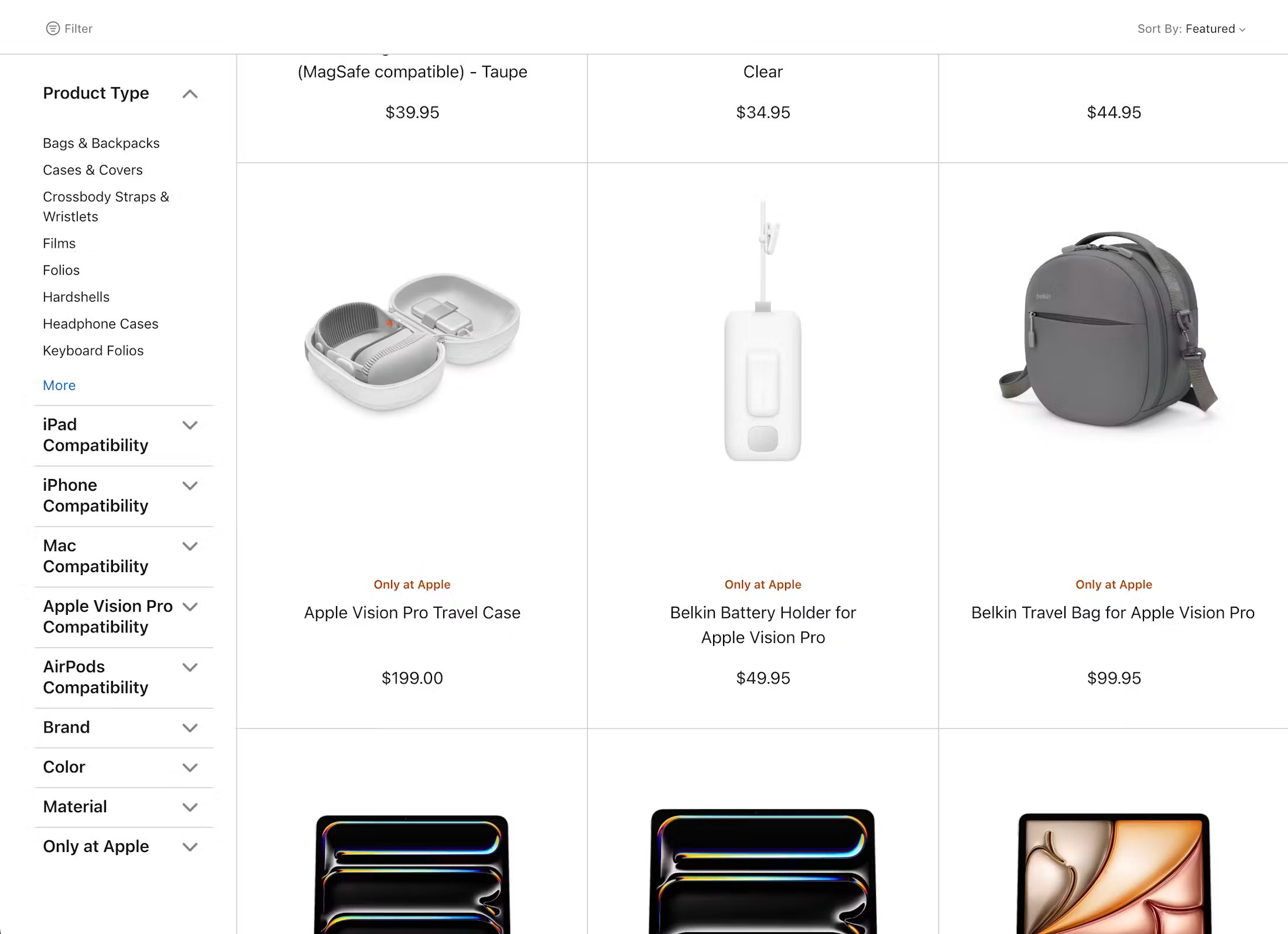
On Apple’s website, if a user visits the product page and then hits the “back” button, they’re automatically returned to the point in the PLP where they were before clicking the product. This means they don’t need to scroll all the way back down from the top of the page.
5. Handle variations and comparison directly in the listing page
A user-friendly PLP should reduce friction as much as possible. Two of the biggest detours are caused by forcing users to look through product variants (which can often look like duplicate listings) and forcing them onto the product page to compare with similar products.
Here’s how to avoid that friction within the PLP itself:
- Combine product variations into one listing item rather than showing separate items for each color or style
- For spec-heavy product categories (such as electricals), provide comparison tools directly from the list
- If you offer comparison, make differences easy to see with a “Show Differences” tool and a scannable table structure
Best-in-class product flow example
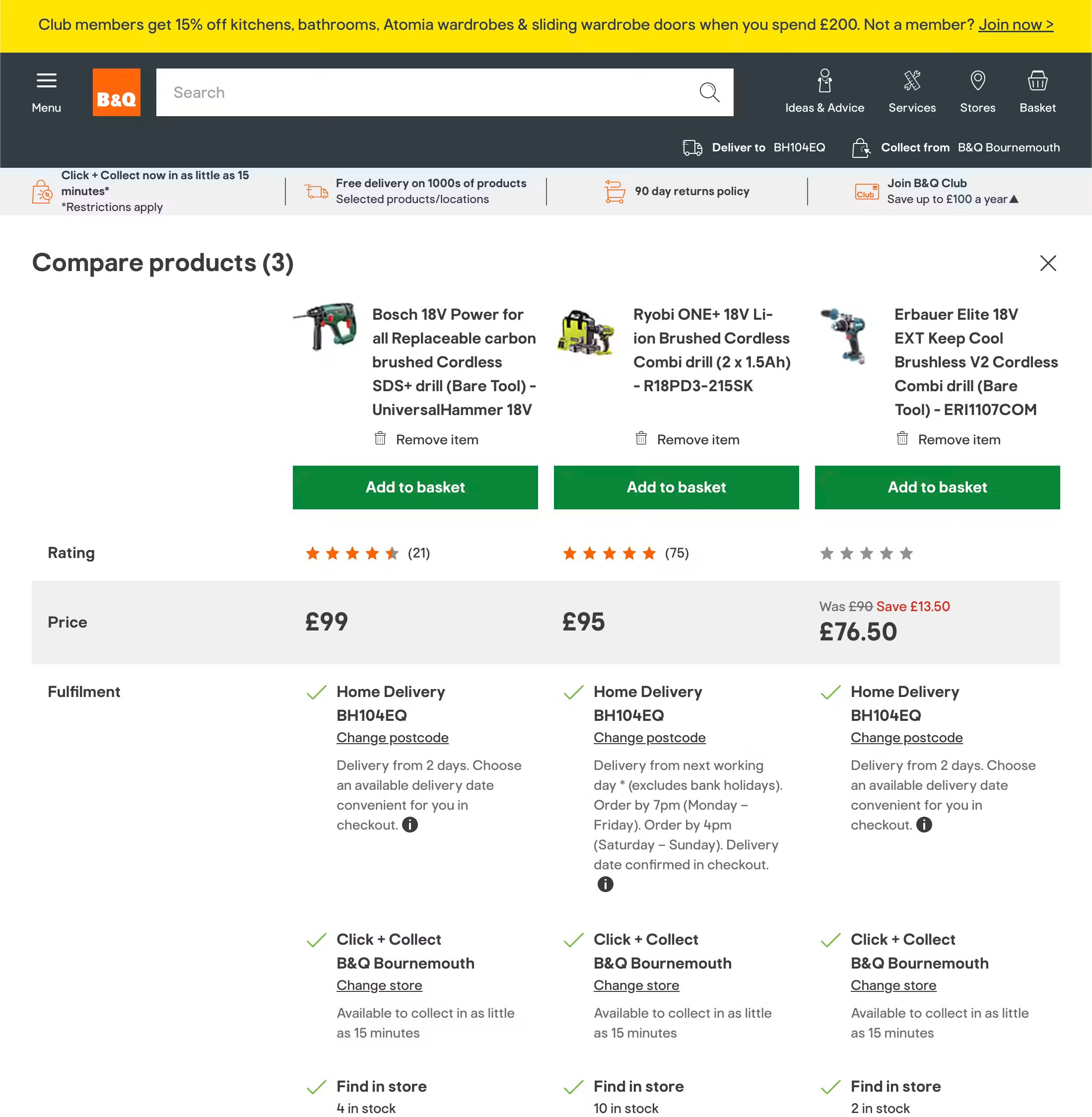
B&Q’s PLP allows shoppers to compare products of interest directly in the list. This helps users to quickly see the differences between products at a glance, and enables faster decision making.
PLP best practice: What good looks like
The five best practices for PLPs outlined above are just a starting point, and are a snapshot of Baymard’s in-depth, large-scale usability testing across 330+ leading ecommerce sites.
No retailer gets every aspect of PLP UX right all of the time. In fact, our research shows that.
80%
of ecommerce sites have serious issues with their product lists.
The key is to identify the most prominent friction points on your PLPs and address them to ensure the user experience is as seamless as possible.
Inside Baymard, you can find more proven, research-backed guidance for creating PLPs that users love. The platform includes detailed implementation guidelines, annotated page designs, and tools to help you quickly review and optimize your PLPs.
Frequently Asked Questions
What does PLP stand for in ecommerce?
PLP stands for product listing page. It’s the page on an ecommerce website that displays a grid or list of products within a category, search result, or filtered set. Depending on the platform, the same concept is sometimes called a category page or, in Shopify, a collection page.
What is the difference between a PLP and a PDP?
A PLP (product listing page) displays multiple products in a browsable grid or list; it's where users scan and compare products at a category level. A PDP (product detail page) displays a single product in full, with imagery, description, specifications, pricing, and an add-to-cart option. The PLP is the discovery page; the PDP is where the user makes their purchase decision.
What is the difference between a PLP and a category page?
A category page is often a navigational hub. It acts as a landing page that links to multiple PLPs within a broader category. A PLP is the page that displays an actual, filterable product grid. In practice, the terms are sometimes used interchangeably, but they describe distinct page types with different UX roles.