During our large-scale usability testing, breadcrumbs performed a lot of heavy lifting on mobile sites, for two reasons in particular:
- Mobile users’ current location in the site hierarchy is much less evident due to the main navigation typically being hidden
- Navigating via the main navigation menu on mobile often requires more effort compared to desktop, where the main navigation is permanently visible, and users can typically access categories — and even subcategories if hover navigation is offered — with a single click.
Yet our newest mobile benchmark reveals that, of mobile sites that even have breadcrumbs, 36% fail to include the full category hierarchy in the breadcrumbs on mobile product pages. This is important because our large-scale mobile usability testing reveals that this omission results in mobile users not always understanding where they are on a site and makes it difficult to navigate up the category hierarchy.
Ultimately, this can lead users to feeling lost, and uncertain of how to find the product they’re looking for.
In this article, we’ll cover our mobile research findings on how to best implement breadcrumbs on mobile product pages, including:
- Why only including select layers in the breadcrumb path is detrimental to users
- 2 ways overly long breadcrumb paths can be avoided
- 1 verified design pattern for long breadcrumb paths
- 2 design patterns for long breadcrumb paths to approach with caution
- 2 implementation details to ensure breadcrumbs are immediately obvious and accessible
The Problem with Incomplete Breadcrumb Paths
It can be quite challenging to fit the complete set of breadcrumbs into a small mobile viewport.

L.L.Bean doesn’t include any breadcrumbs on the product page, which should always be avoided.
The worst approach observed during testing is simply not providing any breadcrumbs at all. This should be avoided for both mobile and desktop sites.
Indeed, both our mobile and desktop testing reveals that breadcrumbs are critical, especially for mobile users, to help them understand where they are on a site, as well as to provide them access to additional hierarchy layers.
Yet 20% of desktop sites don’t have breadcrumbs on the product page, while a massive 65% of mobile sites don’t. This severely limits users’ ability to understand where they are on a site and access other areas of a site easily.
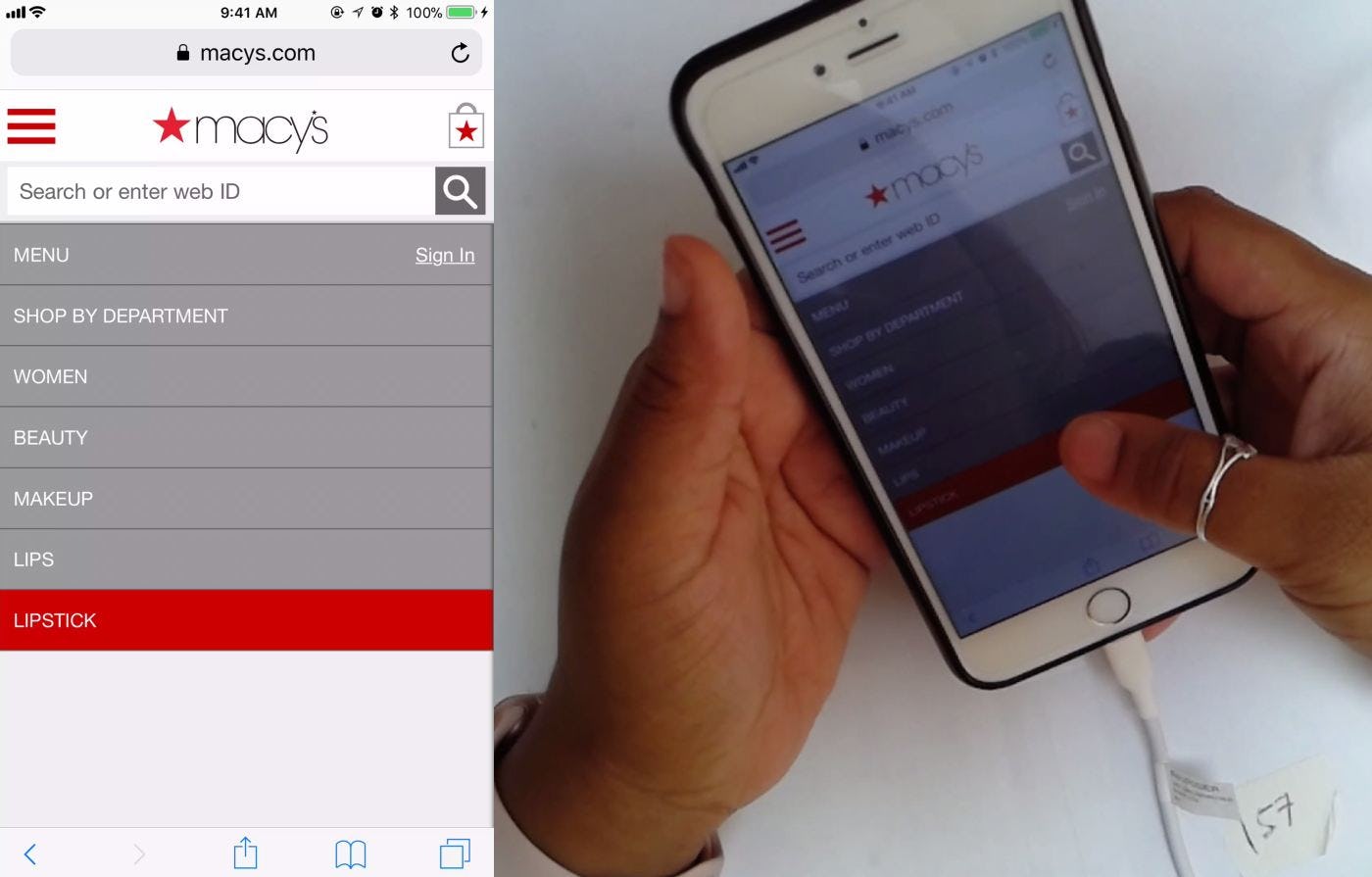
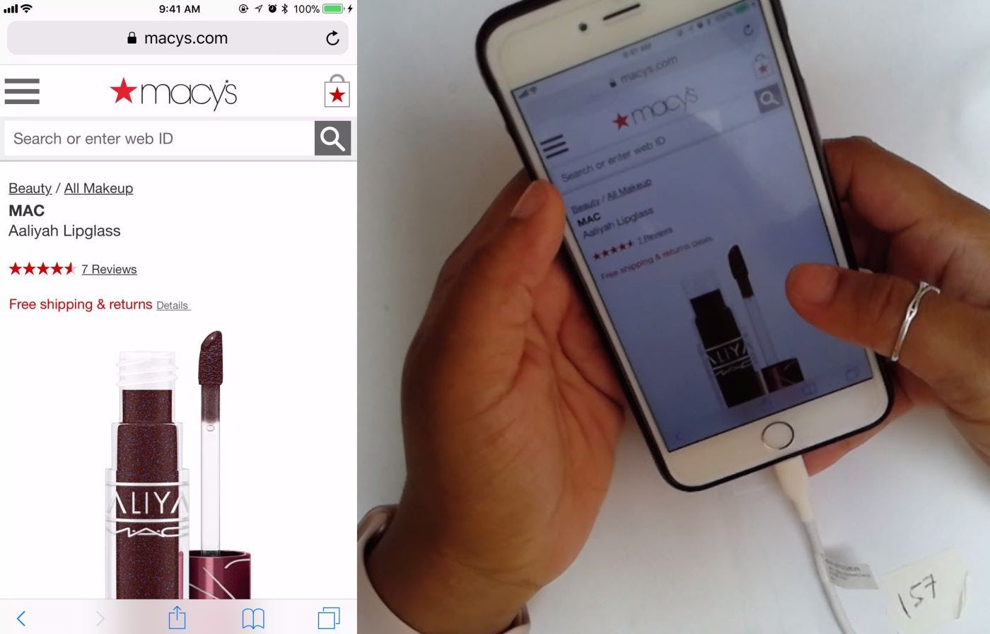
A user during testing arrived directly to a product page on the Macy’s mobile site from an external link. She wanted to browse other lipsticks, but the “Lipstick” subcategory wasn’t represented in the breadcrumbs (first image), so she resorted to using the navigation menu to navigate to the “Lipstick” product list (second image). Luckily the main navigation made it easy to traverse up the hierarchy. The absence of the current scope from the breadcrumbs — especially when ample space exists on the page — leads to misinterpretation of the site structure and needlessly increases users’ efforts to navigate.
An alternative method observed during mobile testing is to drop some of the hierarchy layers from the breadcrumb to reduce its length.
However, omitting key hierarchy layers from breadcrumbs can mislead users about how products are organized and where they are within the overall site structure, creating a disorienting and potentially tap-intensive shopping experience.
When breadcrumbs don’t include all core category and subcategory hierarchy levels, it increases the risk users will make ill-informed navigation decisions because they’re unaware that the choices presented to them don’t represent the full site structure.
Users may consequently jump further up in the hierarchy than they realize to browse other relevant items, and then have to tap to return to the category in which they were browsing, resulting in an arduous and time-consuming navigation experience.


At Victoria’s Secret and Crate & Barrel, only the parent subcategories “Pajama Sets” (first image) and “Sofas” (second image) are included in the breadcrumbs. This design approach to breadcrumbs on mobile limits users’ understanding of where they are within the overall site structure by restricting visibility to only the subcategory to which the current product belongs. It also restricts users’ mobility to higher hierarchy levels because they can’t skip past the current subcategory.
Another work-around for controlling the length of breadcrumbs on mobile is to display only the parent category or subcategory to which the current product belongs.
For example, displaying only “Furniture” or only “Sofas”, instead of “Furniture > Living Room Furniture > Sofas” on a product details page.
Breadcrumbs that contain only the current scope do support a common user behavior of needing to go “one step back”. However, this design pattern poses some problems for users.
For instance, presenting just the parent subcategory offers users only a small glimpse of where they are in the hierarchy, which interferes with their ability to understand more broadly how products are categorized and where they are in relationship to that overall category structure.
Also, while displaying only the current scope may reduce the risk of mistaps as users try to navigate up the hierarchy, it severely restricts how far users can go with a single tap because they can go up only one level at a time.
These issues can be particularly troubling for users who arrive at a page in a nonlinear fashion (e.g., from an internal or external search, or from a featured promotion) because these users don’t benefit from having navigated through the hierarchy to reach it.
A potentially even more harmful consequence of including only the parent category or subcategory in the breadcrumbs is that it risks uncertainty for some users about where the breadcrumb link will take them.
Specifically, is this a “Hierarchy” breadcrumb, which will transport the user to the parent subcategory, or a “History” breadcrumb, which behaves similarly to the browser “Back” button, returning the user to the parent subcategory with any applied filters and sorting adjustments intact?
Either way, the behavior will not align precisely with all users’ expectations, leading to disorientation and frustration for some.
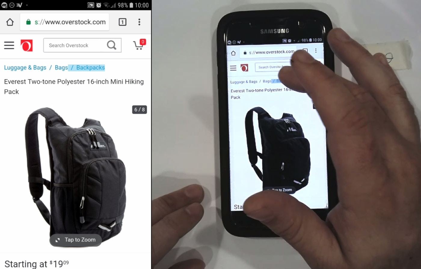
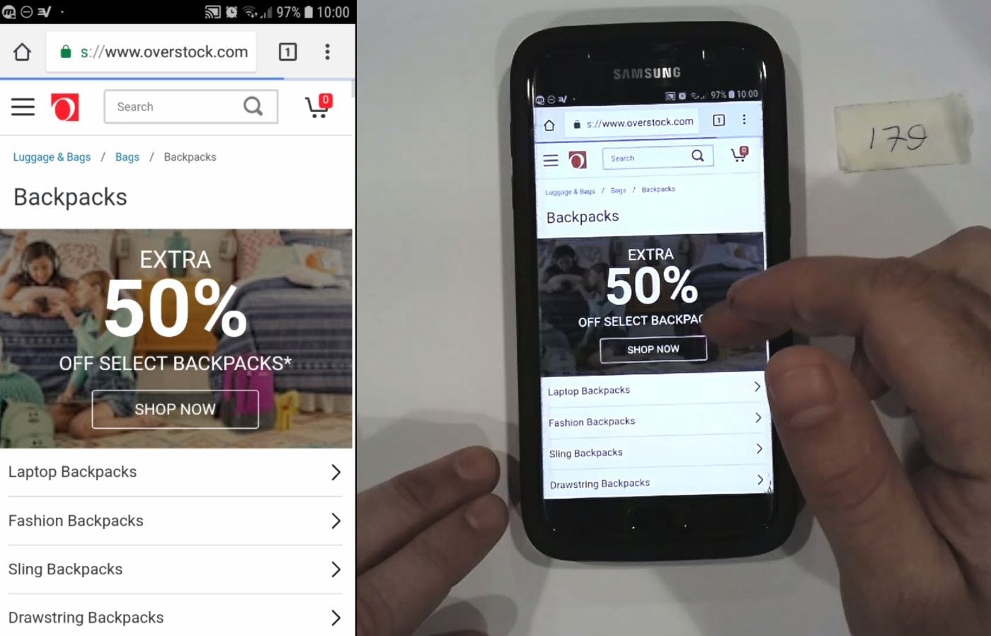
Having lost interest in the backpack he was viewing, this user at Overstock tapped the parent category breadcrumb link (first image) to move up one level in the hierarchy to “Backpacks” (second image), then continued on to browse “Lightweight Backpacks”. Ready access to all the major categories for the current product details page in the “Hierarchy” breadcrumb made this easy.
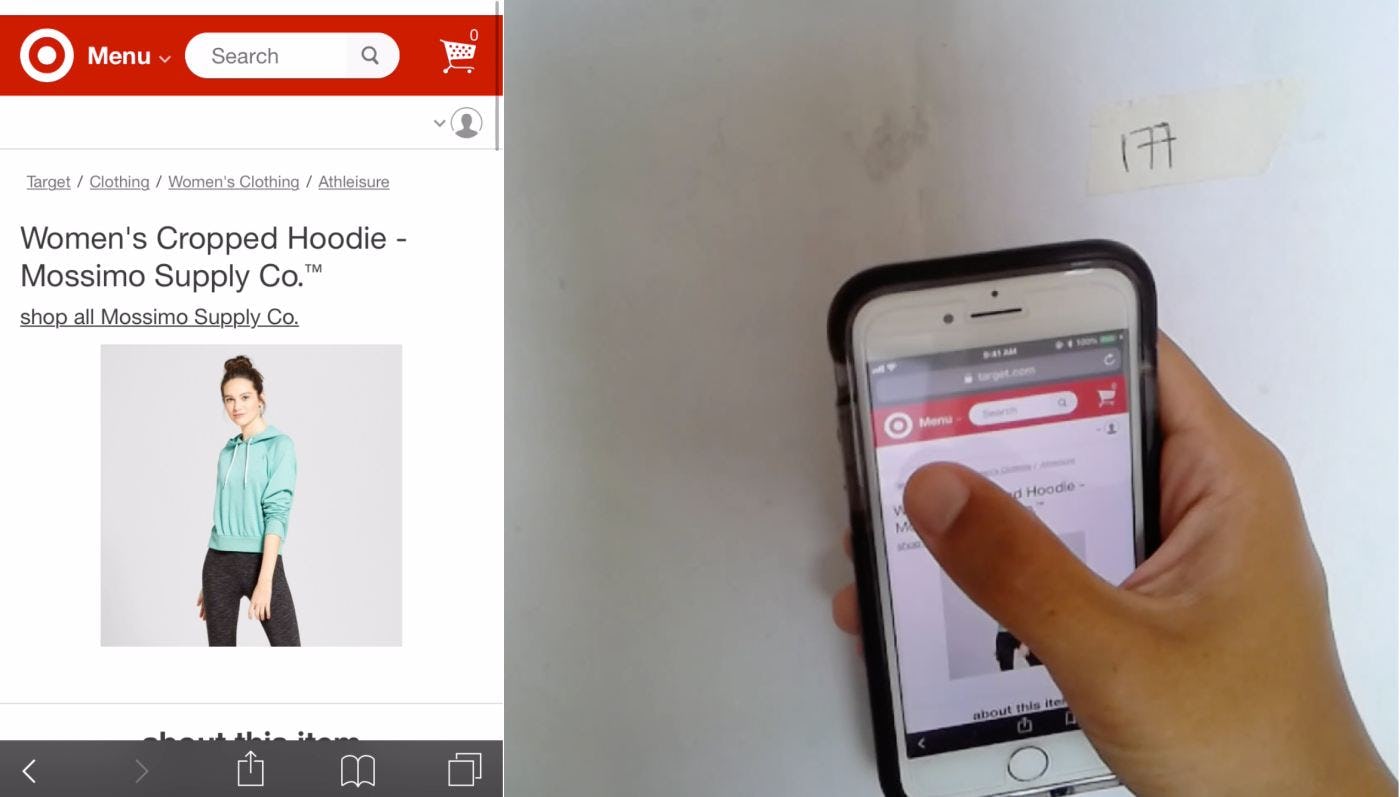
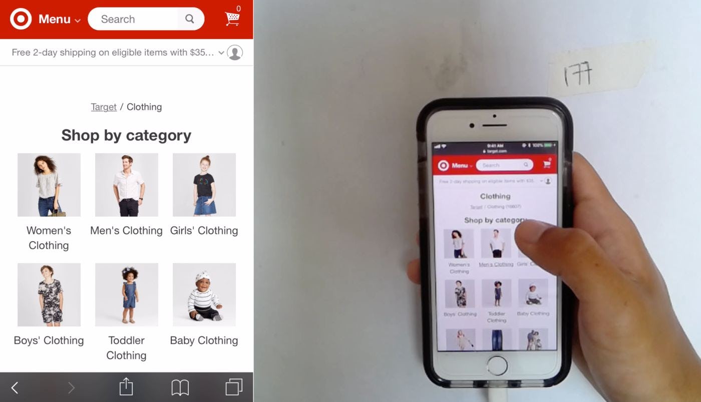
After arriving directly to a product details page from off-site (first image), this user at Target jumped several levels up the hierarchy with a single tap (second image) to navigate deeper into an alternate “Clothing” category. Displaying the complete hierarchical path, as Target did, allows mobile users to quickly skip over layers to change from one product category to another.
Therefore, at minimum, include all key category levels — but ideally the full category path — leading to the current product in the “Hierarchy” breadcrumbs.
It’s important to remember that, on mobile sites in particular, it’s difficult for users to establish and maintain a sense of overview (i.e., “Where am I?”). Failing to provide the full category hierarchy in the breadcrumb paths on the product page makes this even more difficult — and when users feel “truly” lost, or just that finding a product will be “too difficult”, some will abandon the site altogether.
2 Ways to Avoid Overly Long Breadcrumb Paths
Many sites fail to display the full category path for breadcrumbs on the product page because the paths would be too long.
Yet our testing revealed that there are 2 ways in particular that overly long paths can be avoided in the first place:
- Avoid overcategorization
- Suppress the homepage and product page layers of the hierarchy
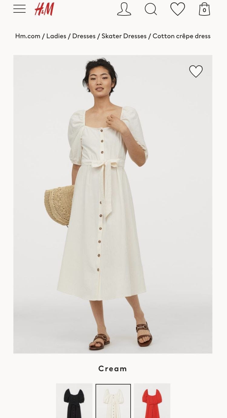
1. Avoid overcategorization. H&M has incorrectly implemented what should have been filters as categories (“Skater Dresses, Cotton Crêpe Dress”). This leads to a very long breadcrumb path on the product page. Instead, if these dress types had properly been implemented as filters, then the path could have ended at “Dresses”.
1. Avoid overcategorization. First and foremost, avoid overcategorization because this increases the length of “Hierarchy” breadcrumbs unnecessarily.
Before simply eliminating subcategories to prevent lengthy breadcrumbs on mobile product pages, review the product hierarchy itself for signs of overcategorization (e.g., if what should have been filters have been incorrectly implemented as categories), as this typically results in too many hierarchy levels, and, subsequently, too many breadcrumb elements. It’s more than 50% of e-commerce sites that suffer from overcategorization.
Also, review category labels to identify opportunities to shorten and simplify. Ensuring category labels are unique and descriptive — yet concise — also reduces users’ scanning efforts as they look for and navigate to products of interest.

2. Suppress the homepage and product page layers of the hierarchy. At HP, the homepage and the title of the current product page are reproduced in the “Hierarchy” breadcrumbs. This makes for a very long breadcrumb path on the product details page.

2. Suppress the homepage and product page layers of the hierarchy. American Eagle doesn’t display either “Home” or the current product page in the breadcrumbs. During testing, users were unaffected by the exclusion of breadcrumb elements representing the homepage and current product details page.
2. Suppress the homepage and product page layers of the hierarchy. Suppressing the homepage layer and the current product page of a breadcrumb on mobile is a logical step to shorten breadcrumbs.
To reach the homepage, users can tap the site logo, permanently visible in the global header of most mobile sites, at any time. Additionally, suppressing the product page layer, which is typically the longest portion of a “Hierarchy” breadcrumb, on mobile significantly shortens breadcrumbs and reduces clutter at the top of the page.
Notably, the absence of the homepage and product page layers from the breadcrumbs had no negative impact on users during testing.
How to Implement Long Breadcrumb Paths
Testing revealed one design pattern to explore if breadcrumb length on the product details page is still an issue after the hierarchy and category labels have been reviewed and tweaked where necessary, and the homepage and product page layers have been excluded — namely, making breadcrumbs swipeable.
Implementing breadcrumb links as a horizontally swipeable element saves space while still allowing users access to the complete, or near-complete, hierarchy via a standard mobile gesture, to which testing revealed most users are naturally predisposed.
If implementing breadcrumbs as a swipeable element, it’s important to ensure the intended interaction is absolutely clear to users.

Swipeable breadcrumbs representing the complete hierarchy displayed at the top of the product details page on Hayneedle increase users’ awareness of their current location within the overall site structure and provide one-tap access to all hierarchy levels, without using up additional, valuable screen real estate.
In particular, truncating either the beginning or the end of the breadcrumb enables users to immediately determine that they can swipe left or right to view and access additional hierarchy layers. Sites with swipeable breadcrumbs were among those that performed particularly well during testing.
Be Cautious of Breadcrumb Wrapping and Elision
Two additional design patterns for implementing breadcrumbs containing the complete hierarchical path can also be considered. However, these should be considered only by sites with a shallow hierarchy, and implemented cautiously:
- Wrapping breadcrumbs to a second line
- Eliding hierarchy midlayers


1. Wrapping breadcrumbs to a second line. Breadcrumbs representing the complete hierarchy wrap to a second line on TigerDirect and Northern Tool, even after replacing the item name in the product page layer with a much shorter item number. Caution is warranted with this approach to ensure sufficient sizing and spacing of individual breadcrumb elements.
1. Wrapping breadcrumbs to a second line. For sites with a shallow hierarchy, wrapping breadcrumb links containing the complete hierarchical path to a second line may be a viable option because the actual occurrence of instances where wrapping is necessary may be low.
However, the value of breadcrumb links on mobile is severely undermined if users are unable to effectively target them, and wrapping breadcrumb links to a second line significantly increases the risk of mistaps if individual breadcrumb elements are not sufficiently sized and spaced. Typical minimum mobile hit area size is 7x7mm and spacing between elements is 2mm — which can be hard to fit (although not impossible).
Furthermore, wrapping breadcrumb links to a second line can contribute to a cluttered presentation at the top of the page, which makes it difficult for users to differentiate breadcrumbs from other elements and increases the likelihood they will be overlooked.
Therefore, wrapping breadcrumb links to a second line should be considered only by sites with a very shallow hierarchy where the occurrence of wrapping is likely to be low.


2. Eliding hierarchy midlayers. Midlayers of the hierarchy are visibly elided at REI, replaced by an ellipsis (first image). When tapped, the hidden layers are revealed (second image). While exposing the corresponding top-level category in addition to the parent subcategory for the current product helps users recognize the breadcrumbs and increases their awareness of the overall site structure, this approach can severely impede users’ interactions.
2. Eliding hierarchy midlayers. Visibly eliding midlayer breadcrumb links with an ellipsis can inform users that additional hierarchy levels exist without taking up extra screen real estate.
At the same time, this approach 1) relies on users noticing the small-sized ellipsis, 2) presumes they understand the expected interaction to expose hidden midlayers, and 3) requires them to take action merely to understand the depth of the hierarchy and their current location in it.
In other words, eliding hierarchy midlayers shifts a lot of effort onto the user, thereby increasing the likelihood that some users will overlook, dismiss, or otherwise ignore the breadcrumbs.
Furthermore, breadcrumbs containing elided midlayers risk defying users’ expectations if tapping an exposed breadcrumb link simply reveals the rest of the hierarchical path instead of transporting them to the corresponding product list.
It also doubles users’ navigation efforts because those intent to browse products corresponding to a breadcrumb link that is exposed by default are required to tap twice to reach them.
2 Additional Implementation Details
However breadcrumbs are implemented, they can still easily get lost in a mobile viewport when not uniquely and appropriately styled, sufficiently sized, or adequately spaced from other page elements.
During testing, a few users had difficulty recognizing breadcrumbs on the product details page, increasing the time and effort to navigate to other items of interest. When users overlook breadcrumbs, it results in an overall less-intuitive, and more tap-intensive, navigation experience.
Two implementation details are crucial to preventing breadcrumbs from being overlooked:
- Avoid crowding breadcrumbs with other elements at the top of the product details page
- Provide sufficient visual cues to communicate tappability
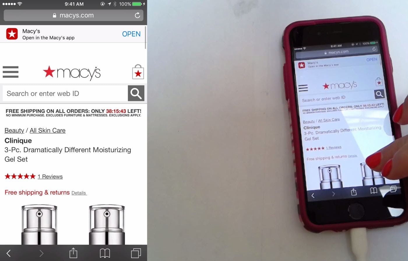
1. Avoid crowding breadcrumbs with other elements at the top of the product details page. This user scrolled a Macy’s product details page for 15–20 seconds in search of a way to view a product list, before finally discovering and tapping the “All Skin Care” breadcrumb link. When breadcrumbs are buried among other similarly styled elements, such as the various textual elements rendered in the same color, or not spaced appropriately — note the breadcrumb’s placement almost directly on top of the product headline — they can be more challenging for users to recognize.
1. Avoid crowding breadcrumbs with other elements at the top of the product details page. Identifying breadcrumbs on the product details page can be difficult when too many similarly styled elements are displayed too close to the breadcrumbs.
A cluttered presentation prevents users from effectively differentiating among unique elements, increasing the likelihood that users will overlook some of them.
Therefore, breadcrumbs must be styled uniquely from other elements and surrounded by sufficient white space to prevent them from becoming lost.
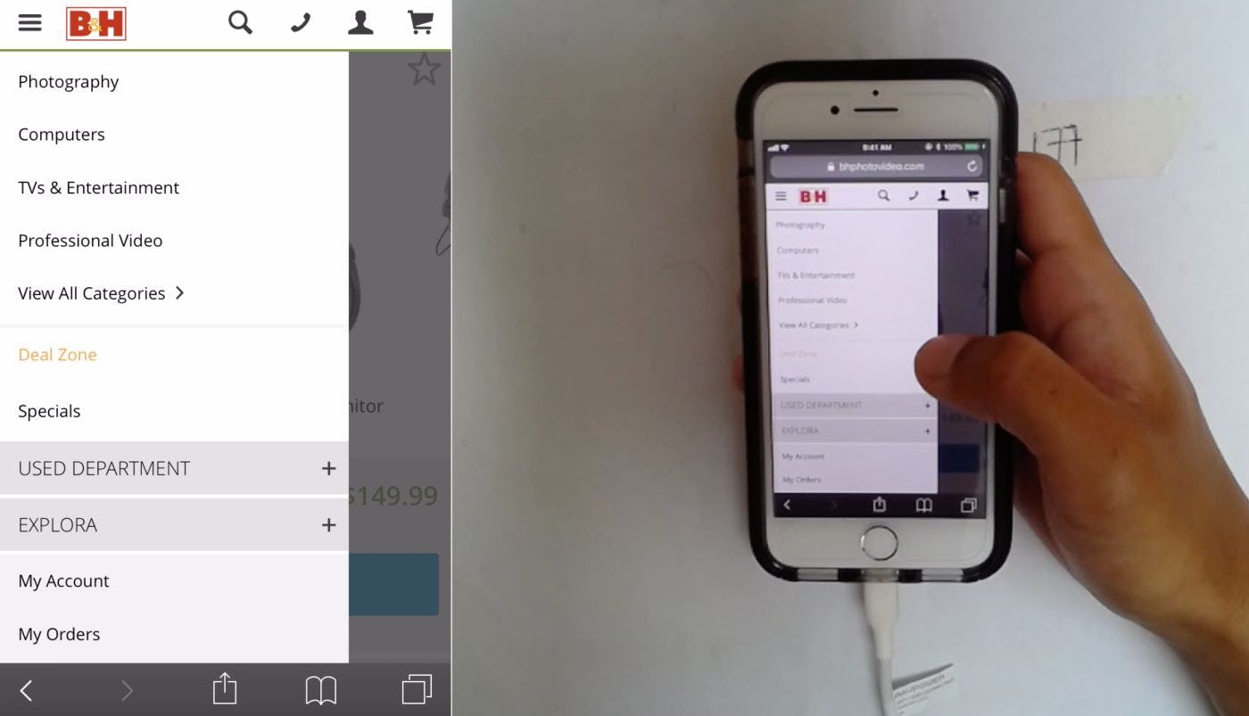

2. Provide sufficient visual cues to communicate tappability. After arriving directly to a product details page from an external link, this user at B&H wanted to browse other headphones. He overlooked the breadcrumbs (first image) and instead engaged the main menu (second image) to navigate to the category product list for headphones, increasing the number of taps to reach the same page. Note how the breadcrumbs aren’t underlined and the separators are visually subdued. Mobile users are more likely to overlook elements such as breadcrumbs if they don’t look obviously tappable.
2. Provide sufficient visual cues to communicate tappability. Unlike desktop users, who benefit from underlining or color changes when they hover the mouse cursor over a clickable element, mobile users can’t leverage this visual feedback to help them identify if something on a page is interactive.
Weak visual cues force mobile users to tap merely to learn if an element is actionable, risking wasted taps, and frustration. Some users may even develop a habit of utterly dismissing links that don’t look tappable, causing them to miss out on valuable information and increasing the number of taps used to reach products and content of interest.
Therefore, it’s critical to style breadcrumbs to make it abundantly clear to mobile users that they are indeed tappable.
Styling breadcrumbs with an underline by default and including conventional separators such as a “>” or “/” between each linked hierarchy layer helps to highlight them to mobile users as breadcrumbs and tappable elements, as well as visually differentiate them from other text on the page, increasing recognition.
Help Users Understand and Access the Site Hierarchy

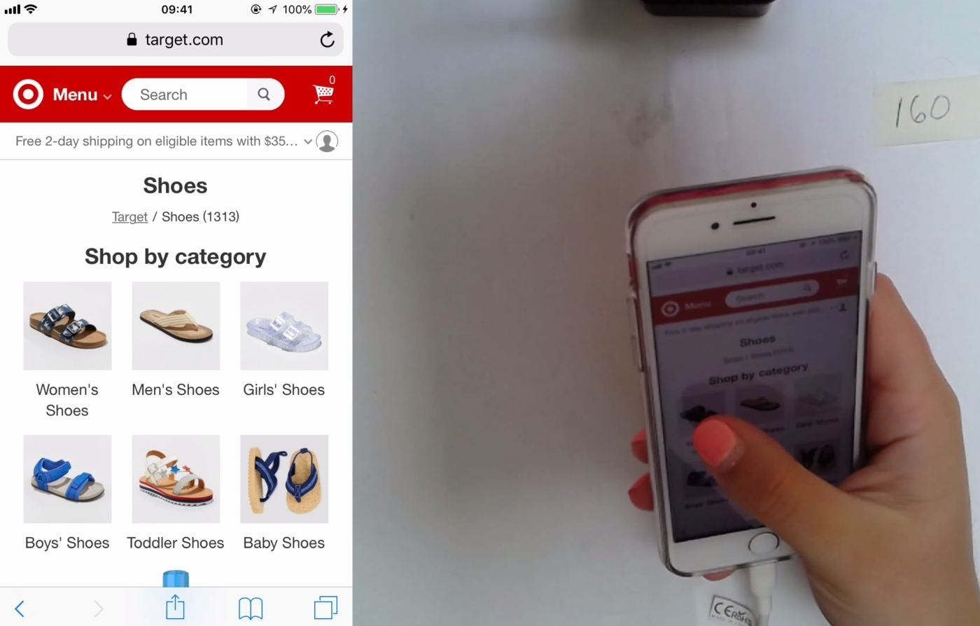
This user at Target quickly identified the breadcrumb links on a product details page for a men’s sneaker (first image) and used them to navigate up the site hierarchy and switch to a sibling category, “Women’s Shoes” (second image). Styling breadcrumb links differently than other page elements and providing adequate white space around them ensures they don’t get lost. Displaying breadcrumbs with an underline by default on mobile reinforces tappability visually.
When breadcrumbs are hard to find or fail to provide access to the complete hierarchy path, it undermines their primary purpose to immediately inform mobile users exactly where they are and support one-tap access to higher hierarchy levels to explore other related items or jump to sibling categories.
During testing, users were generally more successful using breadcrumbs on sites that offered complete, or nearly complete, “Hierarchy” breadcrumbs. Yet our mobile benchmark data reveal 36% of sites with breadcrumbs don’t display the complete hierarchy. (And 65% of sites don’t display mobile breadcrumbs at all.)
Furthermore, to avoid overly long breadcrumb paths it’s important to
1) avoid overcategorization, and
2) suppress the homepage and product page layers of the hierarchy.
Breadcrumb paths that are still too long should be implemented as a horizontally swipeable element, while breadcrumb wrapping and elision should be approached cautiously (or simply avoided in favor of horizontally swipeable breadcrumbs).
Finally, for the breadcrumbs to be easily found and identified they should
3) be styled differently than other textual page elements,
4) be provided with ample surrounding white space,
5) include visual separators, and
6) be underlined by default.
An easy-to-spot breadcrumb element, which represents the full category path, will allow mobile users to retain an overview of where they are in a site’s hierarchy and quickly access the paths they’re looking for — ultimately making it easier for users to find products of interest.
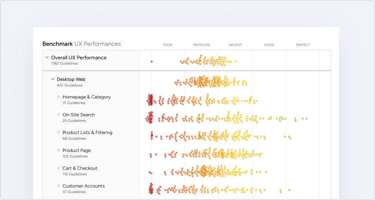
This article presents the research findings from just 1 of the 650+ UX guidelines in Baymard – get full access to learn how to create a “State of the Art” ecommerce user experience.