The Checkout UX Guide: Optimizing Your Ecommerce Order Flow with Research-Backed Insights
Maximize revenue by removing checkout friction. Learn research-backed strategies for improving your checkout UX and reducing abandonment.
70.22%
is the average cart abandonment rate according to Baymard's research
The average ecommerce site loses a significant portion of users at checkout — Baymard’s research puts the average cart abandonment rate at 70.22%.
Yet most of those losses are UX-fixable.
As a UX designer or senior stakeholder, though, you know that making changes to the checkout flow can cause anxiety, uncertainty, and, in some cases, a negative impact.
This in-depth guide is designed to help you identify friction points in your ecommerce site’s checkout process, and make evidence-based, research-backed design decisions to improve checkout UX.
Here’s what we’ll cover:
- Checkout UX must-haves
- How leading ecommerce sites handle checkout
- An audit checklist to help find friction points in your flow
- How to make the business case for checkout UX investment
- Best-in-class examples of good checkout implementations
- Additional resources to help you improve your flow
1. The standards: Checkout UX must-haves
Relying on gut-feel and half-baked theories won’t work. Particularly with a project as impactful as checkout optimization, it’s important to base your recommendations and suggestions on proven best practices.
Understanding user friction points, buyer behavior, and areas for improvement can help define a roadmap that gets stakeholder buy-in and makes a measurable impact on your conversion rate.
Here are some of the must-have features of an optimal checkout flow, all based on Baymard’s extensive usability testing.
Keep the checkout flow linear and predictable
The best checkout flows feel linear because users never have to wonder where they are, what happens next, or whether going back will break something.
“One of the worst usability violations we discovered during our user testing was non-linear checkout processes. Sites with a non-linear checkout process left several of the test participants confused and intimidated. Having a non-linear checkout process confuses and intimidates customers as it breaks with their mental model of a linear checkout. The solution is simple: keep your process completely linear – never show the same page twice.”

So, the key here is to keep your checkout process almost boringly clear. Here’s how:
Maintain a literal progress path
If you use a multistep checkout, the progress indicator must be a 1:1 map of the checkout process; hiding or grouping steps causes disorientation. Additionally, make past steps clickable, as users naturally attempt to use indicators for backward navigation.
Further resources:
- Guideline #611: Checkout Steps and Corresponding Process Steps
- Guideline #613: Links in Process Steps
Make forward actions explicit
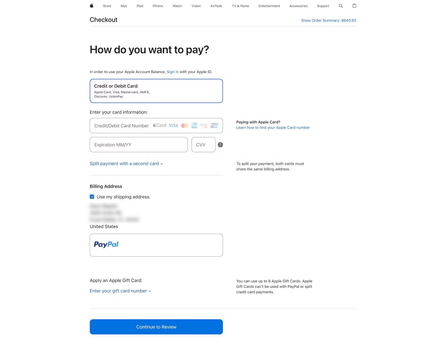
Replace generic "Continue" labels on primary buttons with descriptive copy like "Continue to Payment" to tell users exactly what follows. This reduces "click hesitation," especially before final order placement or third-party redirects.
Further resources:
- Guideline #586: Clarifying Primary Button Functionality
- Guidelines #672: Third-Party Payment Flow Design
- Article: Payment Method UX: Designing Payment Selection
Eliminate flow interruptions
Remove mid-flow cross-sells, newsletter pop-ups, and forced account creation that break the user’s momentum. Prioritize guest checkout as the default path, deferring registration until after the order is confirmed.
Further resources:
- Guideline #579: Implementing Cross-Sells in the Checkout Flow
- Guideline #709: When to Use Overlays in the Checkout Flow
Ensure safe backward navigation
Support the browser’s back button and ensure all form data is persisted to prevent tedious re-entry. Use "Edit" links on the review page to allow direct changes without forcing users back through the entire sequence.
Further resources:
- Guideline #648: Collapsing Checkout Accordion Steps
- Article: Always Collapse Completed Accordion Checkout Steps into Summaries
- Topic Guide: Browser “Back” Button
Standardize the review step
The review page should be a summary of known facts; introducing new fees or shipping costs here destroys user trust. Ensure the "Place Order" action is unmistakably prominent so users don't mistake the review page for a final confirmation.
Further resources:
- Guideline #2384: New Information at the Review Step
- Guideline #545: Optimizing the Review Step
- Guideline #556: "Place Order" Button Placement
Minimize form fields (only ask for what you need)
To maximize conversion, minimize the "interaction cost" by reducing the number of fields and ensuring those that remain are effortless to complete. Here are some tips to reduce form frustrations.
Reduce visible effort and fields
The perception of work is as damaging as the work itself. Substantially cut form length by defaulting the billing address to match shipping, hiding "Address Line 2" behind a link, and using a single "Full Name" field instead of splitting it. Preselecting smart defaults and hiding rarely used inputs prevents "form fatigue".
Further resources:
- Guideline #566: "Shipping Address" and "Billing Address"
- Guideline #562: How to Display "Address Line 2"
- Guideline #557: Customer Name Fields
- Guideline #668: Number of Form Fields
- Guideline #576: Hiding Redundant Checkout Fields and Options
- Article: Form Field Usability
- Article: 5 Ways to Minimize Form Fields in Checkout
Prioritize scannability and clarity
Use persistent labels placed above fields to ensure they remain visible during and after typing, which is critical for mobile and long forms. Explicitly mark both required and optional fields; leaving either of these to "assumption" can lead to hesitation and avoidable errors.
Further resources:
- Guideline #683: How to Label Form Fields
- Guideline #685: Placement of Form Field Labels
- Guideline #686: Indicating Required and Optional Fields
Support natural typing flow
Don't fight the user's input habits. Avoid restrictive formatting and "Apply" buttons for standard fields; instead, auto-apply changes and allow for natural spacing and characters. On mobile, ensure the correct keyboard type (numeric vs. alpha) is triggered and disable autocorrect for names, addresses, and emails to prevent "helpful" typos.
Further resources:
- Guideline #727: Updating Information and Highlighting Changes in the Checkout Flow
- Guideline #659: Restricting Field Input Characters and Formatting
- Guideline #658: How to Implement Restricted Inputs
- Guideline #1100: Appropriate Mobile Keyboard Layouts
- Guideline #948: Where to Disable Mobile Keyboard Auto-Correct
- Article: Consider Using Localized Input Masks for ‘Phone’ and Other Restricted Inputs
Streamline address and payment entry
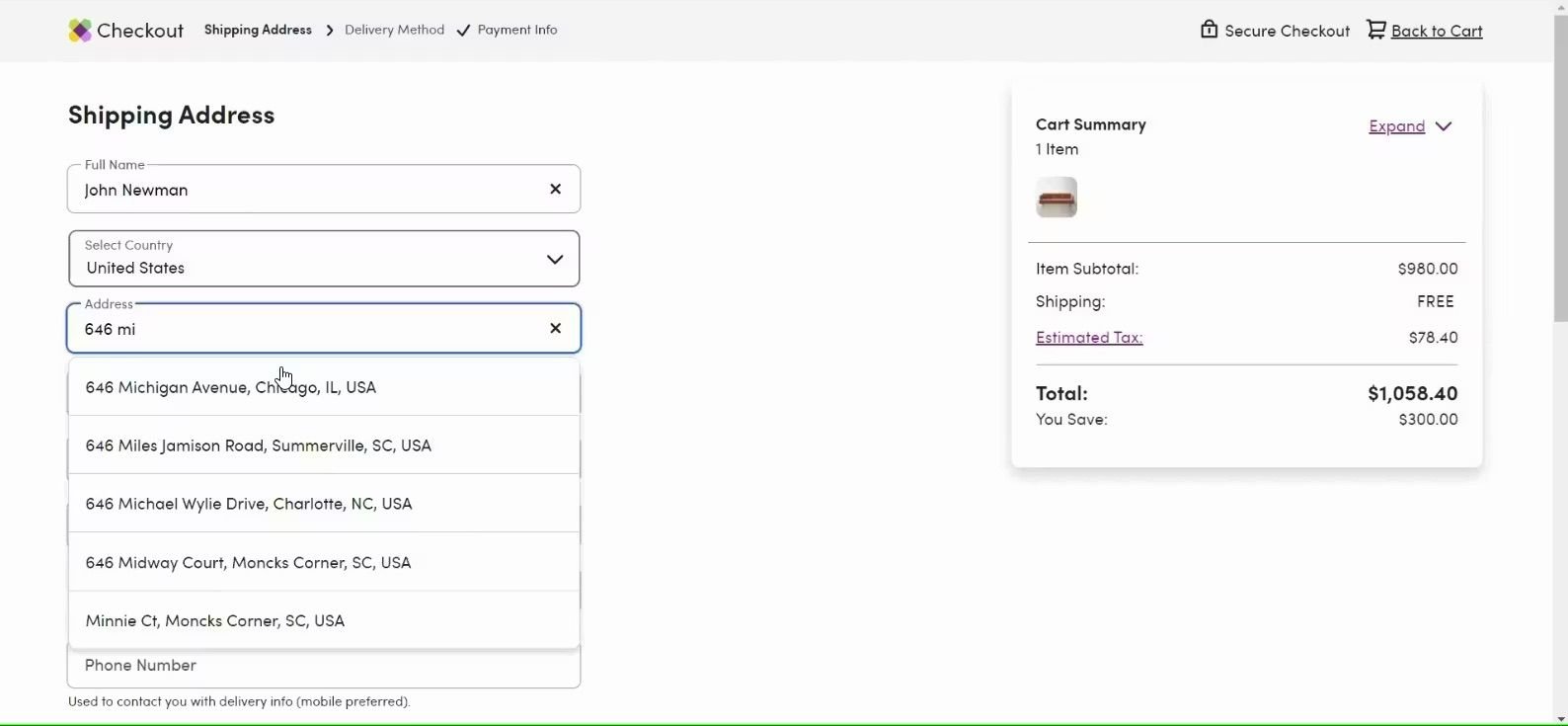
Address and credit card entry are the highest friction points. Use automatic address lookup and ensure full compatibility with browser autofill. For payments, use Luhn validation and auto-format card numbers with spaces so the digital field mirrors the physical card, making it easier for users to verify their info.
Further resources:
- Guideline #2266: Address Lookup Features
- Guideline #565: Country-Specific Address Fields
- Guideline #618: Optimizing Checkout Steps for Browser Autofill
- Guideline #594: How to Display Users' Credit Card Number Input
- Topic Guide: Credit Card Number Form Field
- Topic Guide: User Address Forms
Offer guest checkout prominently
Lack of guest checkout functionality is one of the leading causes of cart abandonment.
19%
of surveyed US adults reported abandoning an order in the previous three months because they did not want to create an account.
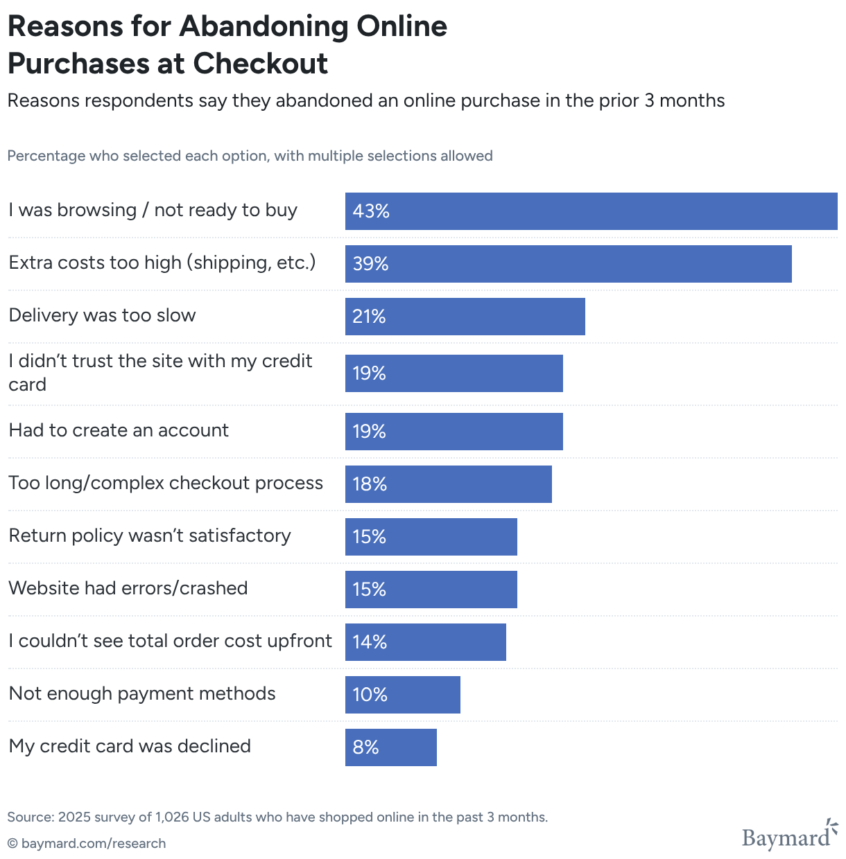
Despite that, 62% of ecommerce sites don’t make the guest checkout option the most prominent. This all but renders it invisible, according to Baymard’s research.
This video provides a helpful overview of how to design a smooth guest checkout:
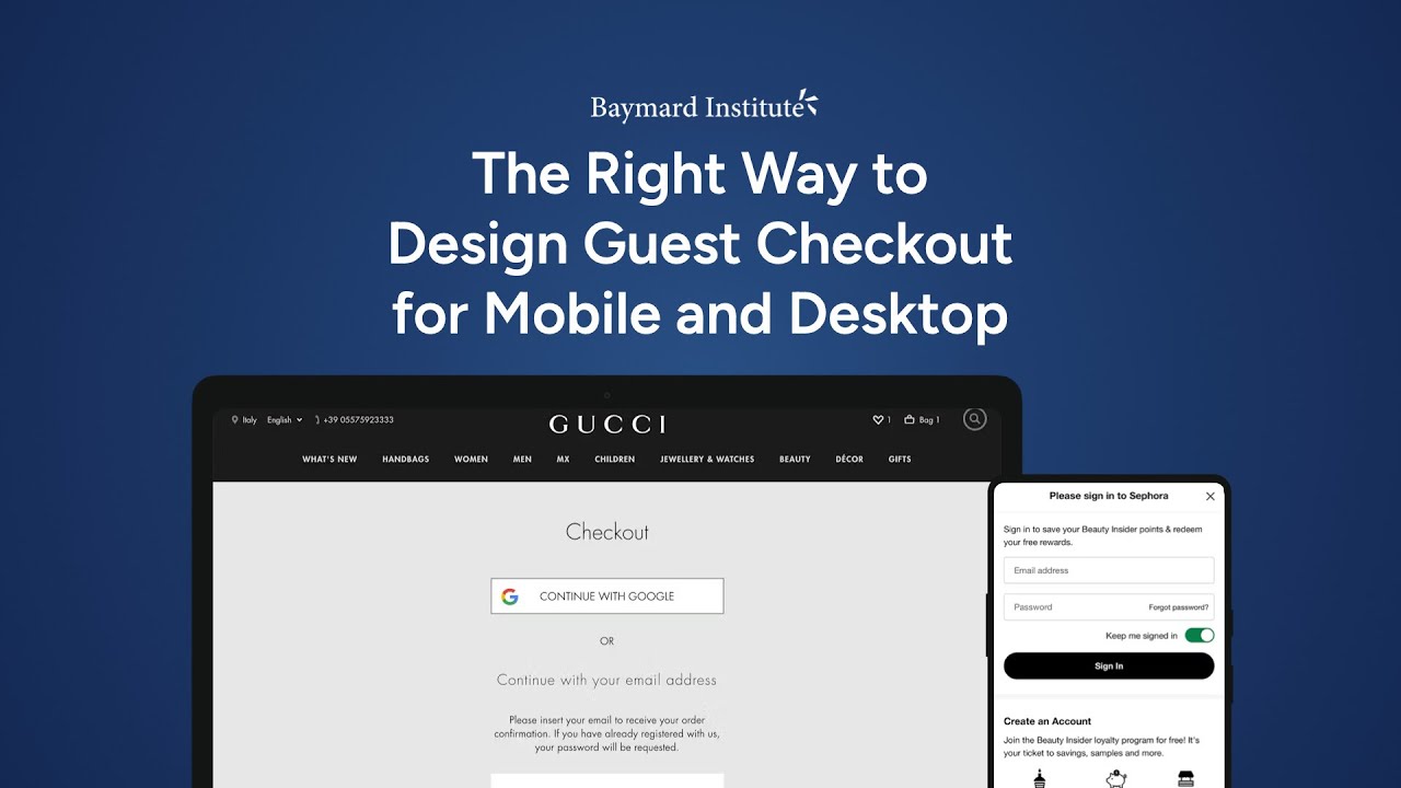
Here are some additional tips for making your guest checkout visible and usable.
Prioritize visual prominence and placement
The hierarchy of your account-selection page dictates the user's perceived options. On mobile, limited screen real estate makes this even more critical; if the "Guest Checkout" option is placed at the bottom of the page, it can be entirely obscured by the mobile keyboard when the sign-in field is focused.
- Top-level placement: Always position the guest option at the top of the account-selection step, above the sign-in and registration fields.
- Button vs. link: Users frequently overlook guest options presented as simple text links. To ensure a clear call to action, use a high-contrast button that matches the visual weight of the sign-in action.
Further resources:
Use explicit and reassuring labeling
Ambiguous labeling creates click hesitation. Users who want to avoid registration are scanning specifically for the word "Guest."
- Standardize terminology: Use clear labels like "Guest Checkout" or "Checkout as Guest." Avoid vague phrasing such as "Continue with email," which fails to reassure the user that a password won't be required later.
- The "silent" guest flow: If your site defaults everyone into a guest flow and performs a "live account lookup" (adding a password field only if an email is recognized), use microcopy at the top of the page to explicitly state that the user is not being registered.
Further resources:
Address the mobile keyboard conflict
A common but overlooked failure occurs when a site automatically triggers the "Email" or "Password" keyboard upon page load. This interruption can hide the guest checkout button beneath the fold or behind the keyboard itself. By placing the guest option at the very top, you ensure that even with the keyboard active, the path to a guest purchase remains visible and accessible.
Make errors recoverable and specific
Effective error handling prevents abandonment by making recovery effortless and ensuring users never have to repeat their work.
Ensure errors are immediately actionable
Users should never have to hunt for a mistake. If a submission fails, use inline field errors placed adjacent to the input and visually highlight the field itself.
If there is a single error, scroll the user directly to it. For multiple errors, provide a summary at the top of the page while maintaining inline markers to ensure nothing is missed, especially on mobile.
Further resources:
Use specific, adaptive messaging
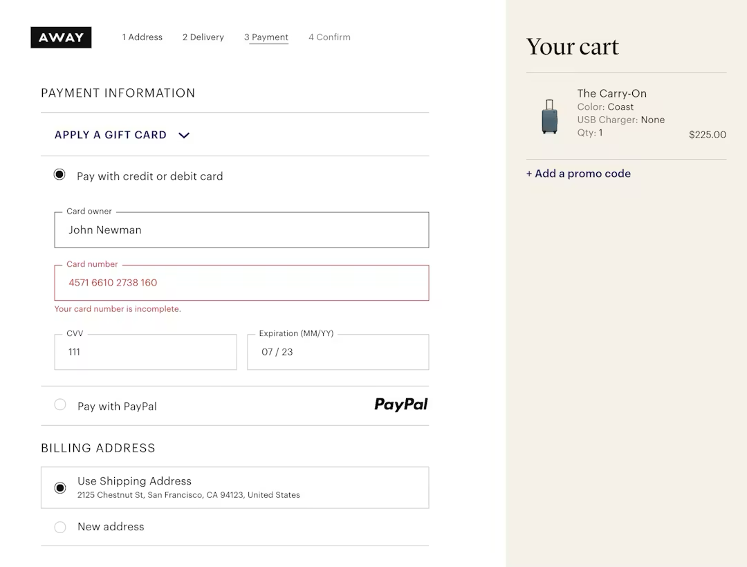
Avoid generic labels like "Invalid input," which force users to diagnose the problem themselves. Error messages should use plain language to state exactly what is wrong and how to fix it — such as "ZIP code is too short" or "Missing '@' in email address", yet 98% of sites don’t do this.
Further resources:
- Guideline #722: Using "Adaptive Error Messages"
- Article: Improve Validation Errors with Adaptive Messages
Never clear entered data
Clearing form fields after an error is one of the most damaging UX failures. Preserve all user input, including selections and typed data, to prevent the frustration of re-entry.
Payment field sensitivity is a key consideration. Retaining card data during recoverable errors is critical; forcing a user to re-type a 16-digit number due to a minor typo elsewhere is a direct abandonment risk.
Further resources:
- Guideline #720: Preserving User Input When Errors Arise
- Guideline #723: Retaining Data in Credit Card Fields
- Article: Retain Data in Sensitive Credit Card Fields after Validation Errors
Prioritize payment validation and prevention
Address errors at the moment they occur rather than after a final submission attempt. Use front-end Luhn validation to catch card typos immediately and autoformat spaces in the card number field to help users verify their own entry.
Timing is also key here. Reveal payment issues at the payment step so users can recover while they still have the context and their card in hand.
Further resources:
Enable recovery across steps
In multistep checkouts, users often catch errors during the final review. Allow them to edit prior information directly from the review page without forcing them to navigate backward through every preceding step.
Further resources:
- Guideline #2387: Order Review Steps for Multistep Checkouts
- Guideline #552: Enabling Users to Edit Previously Entered Data
Validate without aggression
Implement live inline validation that flags errors after a user finishes a field, rather than while they are still typing. If a submission fails, preserve all entered data to prevent abandonment and autoscroll the user directly to the error. Clearing a form is a critical checkout UX failure.
Further resources:
- Guideline #718: Real-Time Validation of User Input
- Article: Usability Testing of Inline Form Validation: 31% Don’t Have It, 4% Get It Wrong
Support multiple payment methods
The goal of payment selection is to offer flexibility without sacrificing speed. Baymard’s research shows that 10% of US online shoppers have abandoned a checkout because the site didn’t offer their desired payment option.
But overwhelming users with too many options or forcing them into unexpected flows can cause abandonment.
You should offer multiple payment methods, but keep the choice simple and explicit. Here’s how.
Offer choice without complexity
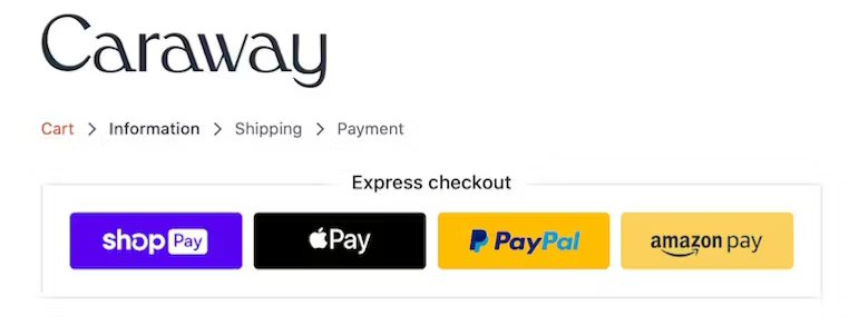
Always provide at least one third-party payment option (e.g., a digital wallet) alongside credit cards, as many users depend on these alternatives. To maintain momentum, preselect the most popular method (usually credit card) and show its fields by default so the majority of users can proceed without a deliberate choice.
Further resources:
Ensure explicit redirection
Never "auto-funnel" users into third-party flows (like PayPal or financing) without an intentional selection. If an alternative method is chosen, the primary button label must change to reflect the next step (e.g., "Continue to PayPal") and include helper text explaining that they will be redirected and then returned to the site.
Further resources:
Surface terms and fees early
Total transparency is required before a user commits to a payment method. 14% of surveyed US online shoppers say they have abandoned orders because they weren’t able to see the total order cost up front before initiating the checkout.
“If a specific option — such as financing or installments — introduces extra fees, interest, or a specific payment schedule, surface these details in a scannable summary within the payment context rather than burying them in the review step or legal fine print.”
During our usability study of the ecommerce checkout experience, we found that users have a hard time figuring out what actually happened when changes — such as an updated shipping cost — don’t appear instantly and in close proximity to the input applying those changes.
Further resources:
- Guideline #732: Essential Price Info for the Cart
- Guideline #2378: Details of Financing Options
- Guideline #2381: Summarizing Key Financing Details
Optimize the card entry path
Since the card form remains the primary fallback, it must be highly forgiving. Reduce friction by autodetecting card types, autoformatting spaces for easier verification, and using Luhn validation to catch typos immediately. Crucially, always preserve entered data during errors to prevent the "re-typing fatigue" that leads to abandonment.
Further resources:
- Guideline #2441: Entering Data from a Physical Credit Card
- Article: Format the “Expiration Date” Fields Exactly the Same as the Physical Credit Card
Maintain a dynamic interface
A high-converting payment section should follow a logical hierarchy:
- Show a simple method selector with the dominant choice preselected
- Reveal only relevant fields for the selected method to keep the UI clean
- Update the primary call-to-action (CTA) dynamically based on the selection
- Ensure all user inputs are preserved when switching between different payment methods
2. Industry benchmarks: How leading sites handle checkout
Baymard has audited 320+ ecommerce checkout flows, and there are some common themes.
In line with the guidance in the above section, Baymard’s research finds that leading checkout experiences generally:
- Make guest checkout prominent
- Remove distractions
- Show full costs early
- Support cart review
- Minimize form complexity
- Make payment entry forgiving
- Provide strong error recovery and order review
Here are some things to consider, based on how the leading performers handle their checkout process.
How many steps do top ecommerce sites use?
The goal of checkout architecture is to reduce perceived effort, not just the number of steps. Baymard’s checkout benchmark shows the average checkout has 19.9 form elements, while an optimized flow can be as short as 12.
What does a good checkout flow look like?
The "best" checkout flow is one that feels manageable, linear, and transparent, regardless of whether it uses one page or several.
Here are some ways to emulate that with your own checkout.
1. Entry & account selection
- Enclosed design: Strip away main site navigation to prevent "pogo-sticking" back to product pages, leaving only a logo "escape hatch"
- Guest checkout first: Present "Guest Checkout" as the most prominent, primary option to bypass the 19% abandonment rate associated with forced registration
- Literal progress bar: Initialize a progress indicator that perfectly matches the technical steps to come; never hide or "collapse" steps in the display
2. Shipping & contact information
- Minimize visible fields: Hide "Address Line 2" behind a link and use a single "Full Name" field to reduce the perceived work of the form
- Input automation: Enable browser autofill and use "Shipping = Billing" as the default to eliminate redundant typing
- Scannable formatting: Use top-aligned, persistent labels and trigger the correct mobile keyboards (e.g., numeric for ZIP codes)
3. Payment selection & entry
- Intelligent defaults: Preselect the most popular method (usually credit card) to allow the majority of users to skip a manual decision
- Explicit redirects: If a third-party wallet (like PayPal) is chosen, update the button to "Continue to [Provider]" to signal an off-site redirect
- Harden the card form: Use Luhn validation and auto-format spaces in the card number field so the digital UI matches the physical card
4. Error handling (active throughout)
- Preserve input: If a validation error occurs, never clear the fields — especially sensitive card data — as re-typing is a major abandonment trigger
- Adaptive feedback: Use inline validation and specific messages (e.g., "ZIP code is too short") rather than generic "Invalid" text
- Guided recovery: Autoscroll the user directly to the first error to provide immediate focus on the fix
5. Order review
- Summary of knowns: Use this step to confirm existing info; avoid introducing surprise taxes or fees that should have been disclosed in the cart
- Direct editing: Allow users to fix details directly from this summary without forcing them to click the browser "Back" button through every step
- Accordion summaries: If using an accordion layout, ensure previous steps collapse into readable summaries to maintain context
6. Final commitment
- Precise button labels: Replace vague "Continue" text with an explicit "Place Order" or "Pay & Place Order" button
- Final transparency: Ensure the button is the most prominent element so the Review step isn't mistaken for a final confirmation page
3. Audit checklist: Finding friction in your checkout flow
Use this checklist to run a UX audit of your current checkout flow. Each item reflects a pattern we commonly see cause friction for shoppers in usability testing.
Get an expert-led, independent UX audit of your site
If you’re tight on time or resources, let us do the heavy lifting. Baymard's UX Audit Team can help you uncover usability issues with a full-site UX audit.
Flow and navigation
- Is a progress indicator visible throughout the checkout?
- Can users navigate back to previous steps without losing data?
- Are users redirected to checkout after login (not to the homepage)?
Forms and fields
- Are optional fields clearly marked (or removed entirely)?
- Does address autocomplete work correctly for your key markets?
- Are inline validation errors specific and actionable?
- Is the billing address set to match shipping by default?
Guest checkout and account creation
- Is guest checkout available without an account?
- Is account creation deferred to post-purchase?
- Is the distinction between "guest" and "account" clear on the checkout entry screen?
Payment
- Are accepted payment methods displayed on the cart or checkout entry page?
- Does the payment form pass the card type automatically (Visa, Mastercard, etc.)?
- Are payment errors specific — does the user know what went wrong?
Trust and security
- Are security indicators (SSL badge, payment logos) visible near the payment form?
- Is the return/refund policy accessible from the checkout page?
- Does the order summary remain visible throughout the flow?
Mobile
- Are form fields using the correct keyboard type on mobile (numeric for card numbers, email for email fields)?
- Are tap targets large enough throughout the mobile checkout?
- Is the CTA button visible without scrolling on the payment step?
Redesigning your checkout flow?
Review your wireframes and designs with the UX-Ray Figma Plugin. It analyzes your designs and provides a list of UX insights prioritized by severity.
4. ROI & data: The business case for checkout UX investment
Checkout UX improvements are among the highest-ROI interventions in ecommerce.
Baymard’s research findings further reveal that the average large-sized ecommerce site can gain as much as a 35% increase in conversion rate just by making design changes to their checkout process.
One of your biggest challenges as a UX professional is often influencing the roadmap at the exec and C-suite level. Here are some useful data points and evidence-backed research insights to help build a stronger case for change.
Proving abandonment (show why users are leaving)
Stakeholders often assume users just change their minds. Baymard’s research proves otherwise:
- 39% leave due to unexpected extra charges like shipping or taxes
- 19% drop because of forced account creation or a hidden guest path
- 18% quit because the process was too long or complex
- 10% drop off because their preferred payment wasn't an option
These insights are your conversation starters when lobbying for a checkout update.
Discover more quantitative checkout insights
Baymard’s Quantitative Insights deliver visual, survey-backed data of user habits and preferences across key areas of the ecommerce user experience, including cart and checkout.
Framing the argument: Tie UX issues to revenue, not just user experience
To avoid being dismissed, tie these checkout UX issues to lost revenue, not just user experience. Come armed with internal data that supports your case.
Calculate the potential uplift in revenue based on a modest 1% improvement in conversion rate following your checkout optimization project.
For example, let’s say your site gets 1,000,000 monthly sessions and has an Average Order Value (AOV) of £100:
- Current state: A 2.00% conversion rate generates £24,000,000 in annual revenue.
- The 1% lift: Improving the flow to 2.02% (a fractional 1% relative improvement) adds £20,000 in monthly revenue.
- The annual result: This modest optimization captures £240,000 in "found money" per year without spending a single extra penny on marketing or acquisition.
To make the ROI concrete for stakeholders, use this "Revenue Recovery" model. It demonstrates that even a fractional improvement in checkout efficiency translates into significant annual gains.
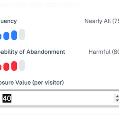
The Hidden Cost of Bad UX: How Much Revenue Are You Leaving on the Table?
How much revenue is your site losing each month because of unnecessary UX friction? Find out what you could recover with Baymard's Opportunity Sizing Calculator.
The priorities (high ROI/low effort)
To get stakeholders on side quickly, focus your quick wins roadmap on these benchmarked abandonment drivers:
- Explicit guest checkout: Make it the primary, most obvious path
- Early cost transparency: Surface shipping and fees in the cart, not the final click
- Form pruning: Remove non-essential fields and "Address Line 2" behind a link
- Resilient error handling: Never clear a user's data and scroll them directly to the fix
Your bottom line pitch for stakeholder buy-in
“Checkout UX investment is revenue recovery, not cosmetic design. We are removing the technical and psychological barriers that prevent high-intent users from completing the transaction they’ve already started.”
5. Best-in-class examples: Checkout UX done right
The patterns above come to life across different checkout implementations in Baymard’s benchmark. Here are examples of elements done well, and why.
Crate & Barrel app: guest checkout front and center
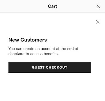
Crate & Barrel doesn’t just offer guest checkout; it makes that the most prominent option on its app’s checkout flow, reducing user uncertainty and friction.
Northern Tool’s linear checkout process steps
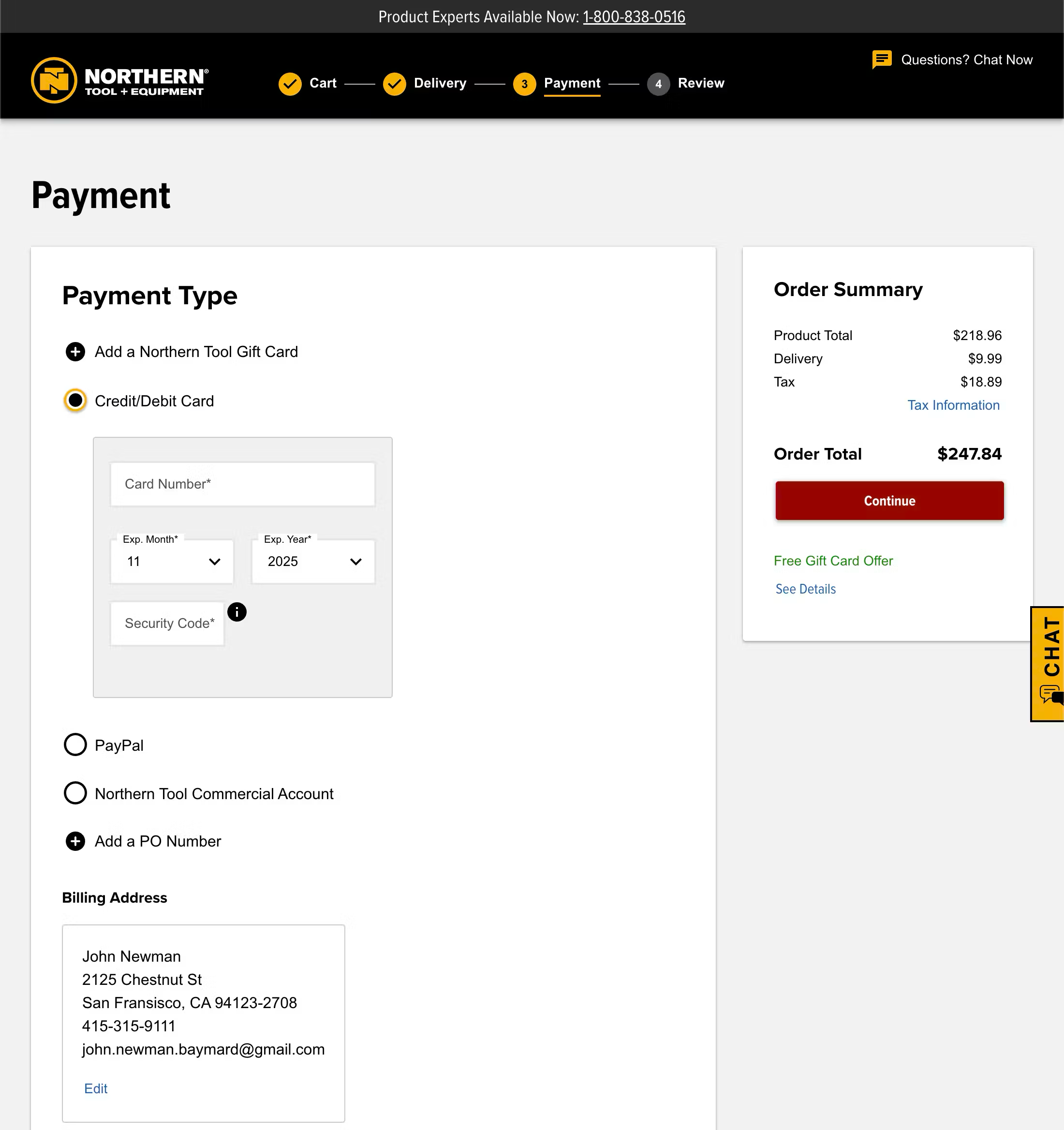
Northern Tool’s checkout flow is linear and clearly defined throughout the entire process. Process steps are provided for a multistep process. Clear and descriptive labels are used for the process steps, with each distinct step visually indicated on-screen.
Office Depot surfaces additional costs early in the flow
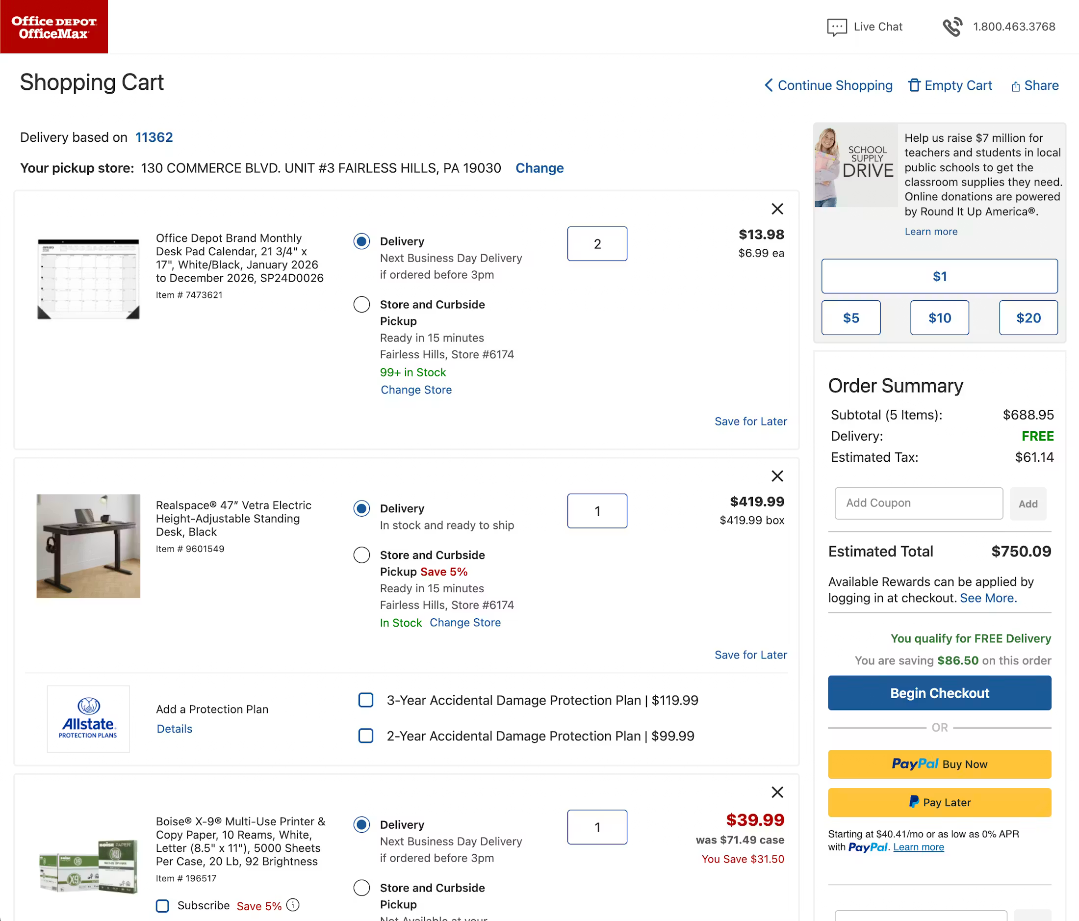
To avoid any nasty surprises and unexpected extra costs, Office Depot provides clear tax estimates, shipping costs, and additional fee information right at the beginning of the flow, in the cart.
Lowe’s simplifies mobile keyboard input
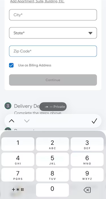
On the Lowe’s mobile site, all form fields in the checkout flow invoke the appropriate keyboard layout (letters for text entry e.g. address, and numbers for phone number entry). This saves the user from having to switch from the standard keyboard layout and, in the case of numeric inputs, minimizes typos, as these specialized keyboards have much larger keys that reduce the chance of accidental taps.
Macy’s simplifies address entry with auto lookup
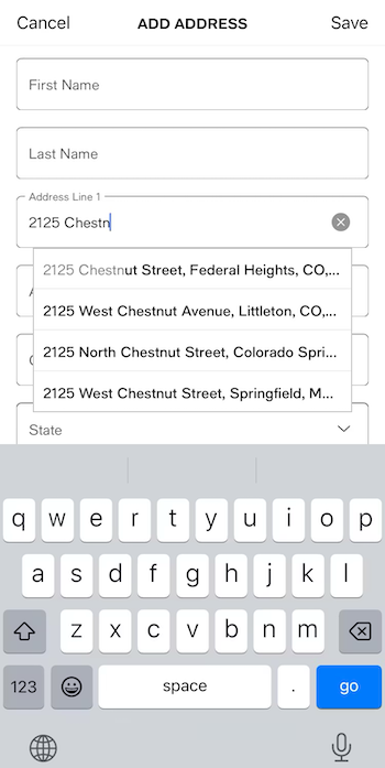
On its app (as well as mobile and desktop sites), Macy’s provides an automatic address lookup feature that auto-updates as the user begins to type their address. In the example above, the suggestions persist despite a typo in the user’s entry.
This implementation saves time for shoppers and also reduces the chances of an error. In testing, Baymard observes that many users actually expect this feature to be present during checkout.
Apple preserves form entry on error
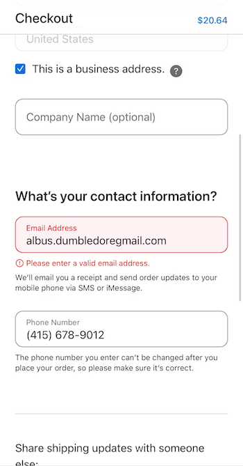
On Apple’s mobile checkout, the site retains all information entered into each field even if the submission triggers an error. This prevents users from needing to reenter previous entries and selections, keeping them focused on the task at hand: resolving the error and continuing to move forward with the process.
Optimize your checkout flow with research-backed guidelines
The recommendations in this guide are drawn from Baymard's 200,000+ hours of ecommerce UX research.
With a Baymard subscription, you get access to 700+ actionable research-backed UX guidelines, benchmark data across 330+ leading sites, and 7,700+ best (and worst) practice annotated checkout and cart page designs.
Weekly UX Research, Insights, and Updates
Join 60,000+ UX professionals. Get the latest UX research, practical guides, and Baymard news delivered to your inbox every week.
Loading...