
Key Takeaways
- Our 2025 Desktop Web UX benchmark includes 50,000+ UX performance scores across 130+ leading ecommerce sites
- The average Desktop Web ecommerce site is rated as “mediocre” overall, and none achieve the rating of “good”
- Avoid the 10 common UX pitfalls identified in the article to begin improving your site’s Desktop Web UX
Key Stats
- 67% of desktop sites perform “mediocre” or worse
- Only 7% of the sites have performances that are downright “poor”
- All guidelines referenced in this article are violated by at least 63% of sites
Baymard’s 2025 benchmark of desktop ecommerce UX — based on our extensive Baymard research findings — contains 50,000+ desktop site elements that have been manually reviewed and scored by Baymard’s team of UX researchers.
The benchmark also includes 40,000+ worst and best practice Desktop Web examples from leading ecommerce sites in the US and Europe.
In this article, we will analyze this dataset to provide you with the current state of Desktop Web UX, and outline 10 common Desktop Web UX pitfalls with corresponding best practices applicable to most desktop ecommerce sites.
The Desktop Web UX Benchmark Scatterplot
In this analysis we’ve summarized 50,000+ UX performance scores across the 46 topics for the Desktop Web platform and plotted the 130+ benchmarked sites’ user experience across these topics in the scatterplot above.
These individual site scores are represented in the scatterplot. Each dot, therefore, represents the summarized UX score of one site, across the 360+ guidelines that apply to the Desktop ecommerce experience.
The current Desktop Web UX performance of benchmarked ecommerce sites is listed in the first row. Expanding that row will reveal the UX performance breakdowns within the 5 themes and 46 topics that constitute the overall Desktop ecommerce performance.
The 2025 Current State of Desktop Web UX
The Desktop ecommerce UX performance average for the leading US and European ecommerce sites is “mediocre,” with none of the benchmarked sites having a “good” or better performance average.
On the other hand, while there aren’t any standout performances, there aren’t very many “poor” performances either, with only 7% of sites obtaining an overall “poor” performance score.
This leaves nearly all sites in a tight cluster of “decent” (33%) and “mediocre” or worse (67%).
This indicates that there remains ample room for improvement when it comes to the Desktop ecommerce user experience.
In the following article, we’ll provide a more detailed walkthrough of Desktop Web ecommerce UX performances and their competitive landscape, along with “missed opportunities” to watch out for.
Specifically, we’ll discuss 10 general Desktop UX pitfalls to be aware of for 10 of the 46 topics across 4 different themes of Desktop Web UX:
- Homepage & Category Navigation: Intermediary Category Pages
- Product Lists & Filtering: List Item Thumbnails
- Product Lists & Filtering: List Item Info
- Product Lists & Filtering: Filtering: Scope & Logic
- Product Page: Shipping, Returns, and Gifting
- Product Page: User Reviews
- Cart & Checkout: User Information & Address
- Cart & Checkout: Order Review & Confirmation
- Cart & Checkout: General Form Design & Checkout Layout
- Cart & Checkout: Form Field Usability & Design
The particular guidelines discussed in this article were chosen because many sites in our benchmark fail to get these right.
And that failure has an impact: not adhering to these best practices is especially likely to cause moderate-to-severe issues for end users.
(Note: If you have access through your Baymard account, find the full list of best practice guidelines by navigating to the Desktop Web study)
Homepage & Category Navigation: Intermediary Category Pages
“Intermediary Category Pages” are essentially category landing pages where users are provided with thumbnails and descriptions of subcategories, guides, and other category-related content.
Our large-scale testing revealed that “Intermediary Category Pages” can fulfill a valuable role for a subgroup of users who are unsure about what product to buy.
However, our Desktop ecommerce UX benchmark also shows that 13% of sites don’t provide “Intermediary Category Pages”.
The average site performs “poorly” when it comes to Intermediary Category Pages, with 42% of sites obtaining “poor” or worse performance scores.
Most alarmingly, 30% of sites had very “poor” performances, highlighting the need for drastic improvements within this topic.
One contributing factor to this poor performance was how sites treat “inspirational images”.
1) Provide Direct Access to Products Depicted in Inspirational Images (63% Don’t)
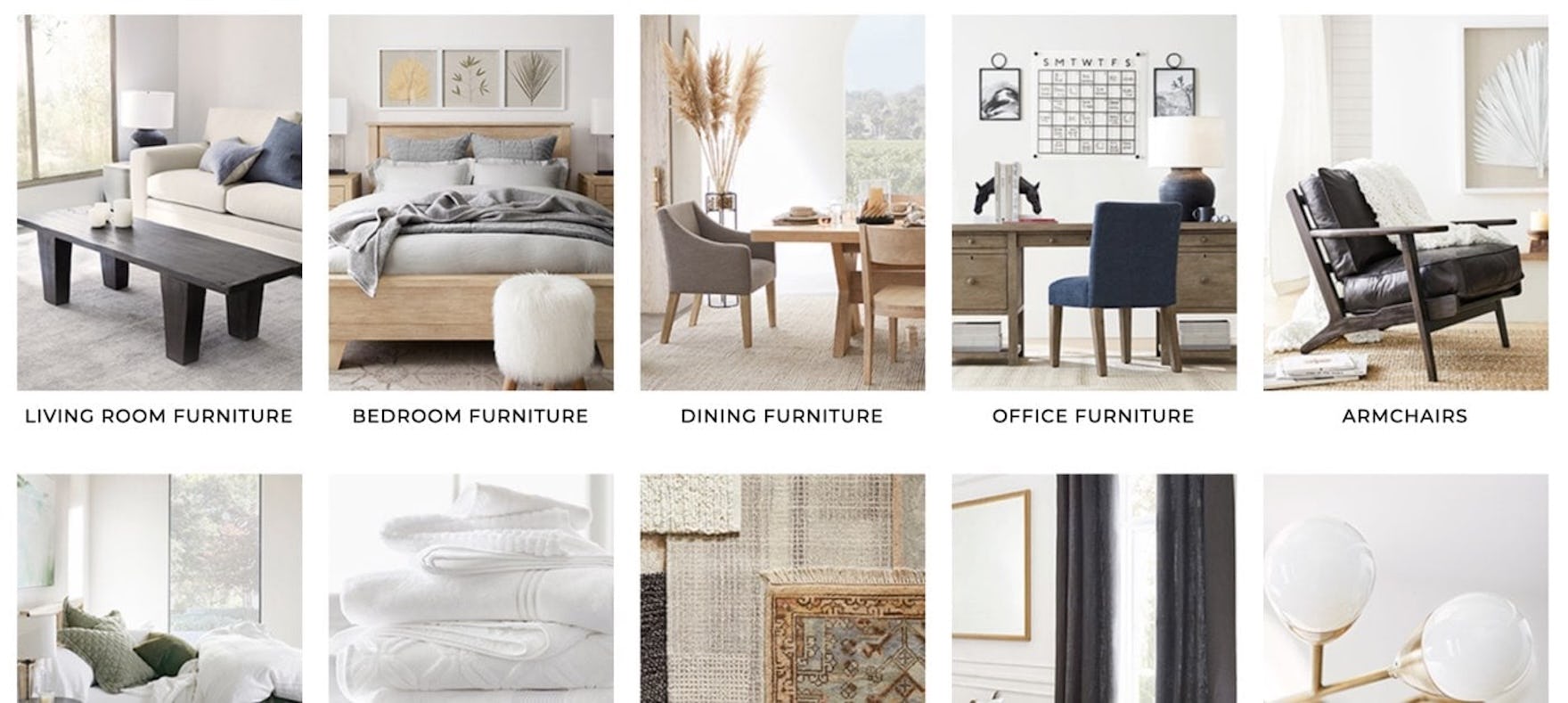

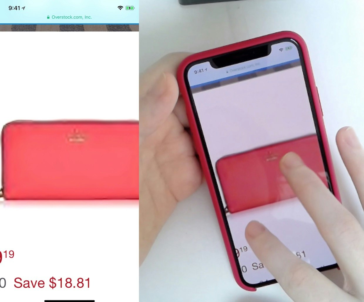
A user browsing at Pottery Barn might be interested in the upholstered dining chair prominently featured in this category image (first image). However, it is not evident on the resulting listing page, even after extensive scrolling (second image). Determined users might strive to locate this chair via navigation or search, but many will give up their attempt to find it or possible alternatives.
Inspirational images are often used as an illustrative representation of a product category, such as a model wearing an outfit with a winter coat to represent the “Outerwear” category or a beautifully furnished room to represent the “Living Room Furniture” category.
But what happens when users want that particular coat in the image designed to promote “Outerwear” in general, or want that particular rug in the image designed to promote “Living Room Furniture”?
![“Noo…arrgghhh, it only added the sofa. I would like to get the sofa table”, a test participant at IKEA exclaimed while hovering and clicking the table in the image. Laughing in despair he continued, “I want this — what do I do…I want this one! [pointing at the table]”.](https://baymard-assets-cdn.imgix.net/research/media_files/attachments/146969/original/research-media-file-36d663b33c7a4f81e3a832c0195d7d7a.jpg?auto=format&dpr=2&fit=max&q=50&w=880)
“Noo…arrgghhh, it only added the sofa. I would like to get the sofa table”, a test participant at IKEA exclaimed while hovering and clicking the table in the image. Laughing in despair he continued, “I want this — what do I do…I want this one! [pointing at the table]”.
Users grow frustrated when they want a product in an inspirational product image but can’t navigate to it, either because the image links to a category from which those products weren’t evident or because the image isn’t a link at all.
When users must manually scan and search the site to hunt down the product on their own, many will quickly give up the search, deciding it requires too much effort.
Failing to provide access to products depicted in inspirational imagery not only inconveniences and frustrates users, but it also presents a sizable missed opportunity for sites to upsell.


The inspirational images on this J.Crew intermediary category page feature an explicit “Shop the Look” link that opens an overlay featuring all of the depicted items (first image). When items are out of stock (second image), the layer informs users of this fact.


At Room&Board, inspirational images on this intermediary category page include a link labeled “Shop the Room” (first image) in the lower-right corner that leads to a curated page with all of the depicted items (second image).
Luckily, sites have several options for making products featured in inspirational images easy to find, as we detail in our article on linking products to inspirational images.
- Include the products directly on the page near the inspirational image.
- Provide a link to a curated page or overlay containing the depicted items
- Link the image to a product list that includes the depicted items at the top of the list
- “Tag” individual products in the inspirational image.
Given the benefits for users, it’s surprising that 63% of benchmark sites still don’t provide clear access to products featured in inspirational images.
Product Lists & Filtering: List Item Thumbnails
Product thumbnails are vital to users for scanning product lists, visually assessing items, and determining suitability.
So when issues arise with those thumbnails, users spend more time searching lists, they struggle to determine whether products are worth investigating further, and consequently they overlook otherwise suitable products.
Unfortunately, these issues are very prevalent: within the topic of List Item Thumbnails, 48% of sites had “mediocre” or worse performances and an alarming 28% of sites had “poor” performances.
Notably, many sites don’t provide a sufficient number of product thumbnails.
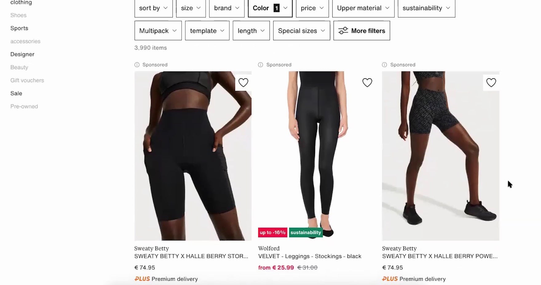
2) Always Provide 3 or More Product Thumbnails in Product Lists and Search Results (67% Don’t)


“Here, you’re not able to scroll through different pictures. It looks like they just have two options: with the model and then just the shorts.” A participant browsing for shorts at Nicce (first image) was disappointed that only 1 additional thumbnail was provided for each item, on hover (second image). He resorted to opening the product pages of several shorts in different tabs in order to see more images (third image): “So maybe I’ll open the item, and then I’ll get more views. Well, it’s a little bit of an inconvenience…[when arriving at the product page] yeah, clearly more pictures now!”


“I like the middle one in the bottom row, but I probably would click on it to see if that’s a slab or if that’s a leaf.” This participant at Ashley Furniture couldn’t tell from the default thumbnail (first image) nor the “Lifestyle” thumbnail on hover (second image) whether the tabletop was one solid piece or extendable, so she had to click through to the product page to find additional images.
The primary purpose of product lists is for users to quickly and accurately determine which products to investigate further and which to discard.
When users scan lists, they heavily rely on thumbnails, and multiple rounds of testing revealed that 2 images are often not enough for most users to get sufficient visual information about the product.
When sites offer only 1 or 2 thumbnails in the product list, users are almost guaranteed to need to click or tap through to the product page to see all product attributes that are best assessed visually.
Indeed, while 2 thumbnails might have been sufficient in the past (our previous recommendation was to show 1 additional thumbnail on hover), testing showed that some users now want and expect the product list to offer the richer functionality of a product page — and wanting more images is part of this phenomenon.


“I like how you don’t have to click into the different items to look at different pictures. They just have a scroll here that’s really useful…Sometimes on the main picture it’s hard to tell…it’s really nice that they have different viewpoints and zoomed in as well,” enthused a participant at Puma perusing running shorts. After noticing carousel arrows appear when he hovered over the thumbnails, he immediately began clicking them for other items, using the extra views to help him better evaluate the shorts (first through third images).


“I like how it has the different views that you can see, like right in this aspect right here. That makes it super convenient!” exclaimed a participant at Express while clicking through a thumbnail carousel for a pair of jeans (first to third images). Confident after viewing multiple thumbnails of the jeans, she opened its product page and immediately added the jeans to her cart: “I do like those. So I click it! And then add it in.”
Therefore, to maximize the visual information available to users scanning list items, access to additional thumbnails should always be provided in the product list and search results.
Importantly, 1 additional thumbnail won’t be enough for most users — 2 additional thumbnails should be considered a minimum, while 3+ will provide users with even more information.
On desktop, providing permanent arrows or carousel dots or displaying such indicators on hover both performed well for participants.
An overly subtle approach, where there’s no indication given at all of additional thumbnails, should be avoided.
Product Lists & Filtering: List Item Info
List Item Info is one of the worst performing topics in Product Lists & Filtering — the average site performed “poorly” in the area, with 72% of sites performing at a level of “mediocre” or worse.
When sites do not consistently provide relevant and useful list item information, users may struggle to determine which products are worth investigating further.
They may subsequently overlook otherwise suitable products or spend excessive time and energy “pogo-sticking” between prospective product pages and the product list.
Poor-performing sites neglected to include some basic list item information that would have otherwise been expected and could easily have been included.
3) Always Include the User Ratings Average in List Items and Search Results (88% Don’t)
“The only downside is that on Newegg, a lot of them don’t have reviews. So I couldn’t just rely on this. I’d have to look at what content creators are saying about certain computers. Get their take.” The absence of user ratings averages on Newegg’s product list — which were available on the product details page — tempted this test participant to go off-site for opinions on items of interest. When users go to other sites to read reviews, there is a risk that they’ll never return.
“Yeah, I think it’s a shame I cannot see any stars, or how they’re rated by other customers. If it has really good reviews, I’m willing to pay a little bit more.” When user ratings aren’t included in list items, such as here at Zalando, a subset of users will be dissuaded from exploring the product further.
For most industries and site types, user ratings averages will be vital attributes to include in the list item, as also discussed in “Allow Sorting by ‘Price’, ‘User Rating’, ‘Best-Selling’, and ‘Newest’”.
Indeed, during testing, participants relied extensively on user ratings to help them choose which products they wanted to explore further.
When participants scanning list items or search results were unable to get an indication of how others felt about the products, many were unable to properly judge their suitability.
As a result, some participants considered leaving the site to seek out opinions elsewhere instead, rather than pogo-stick between the list and product details page.
![“And I do like that their reviews [ratings] are on this front page. I like that, because it makes it easier.” When both user rating averages and the number of ratings are shown in list items, as seen here at L.L. Bean, users don’t need to visit multiple product pages to see how each item rates.](https://baymard-assets-cdn.imgix.net/research/media_files/attachments/89691/original/research-media-file-4ba8ed0970e3bdf36771d317c47ae7d4.jpg?auto=format&dpr=2&fit=max&q=50&w=880)
“And I do like that their reviews [ratings] are on this front page. I like that, because it makes it easier.” When both user rating averages and the number of ratings are shown in list items, as seen here at L.L. Bean, users don’t need to visit multiple product pages to see how each item rates.
Thus, including the user ratings average for each item in a product list helps provide the user with optimal conditions for evaluating each item.
Additionally, besides the ratings average it is essential to also include the number of ratings that the average is based on and of course to allow users to submit ratings and reviews of products in the first place.
4) Display “Price Per Unit” For Multiquantity Items (87% Don’t)
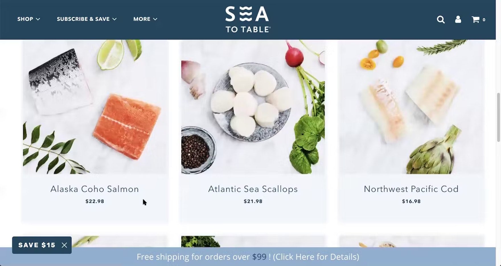
“I’m assuming it’s price per pound. So that’s an assumption on my part…I would’ve liked to have seen that it’s ‘$22.98 a pound’”. At Sea to Table, participants are given the price of the product, but not the “price per unit” — or in this case “price per serving”.
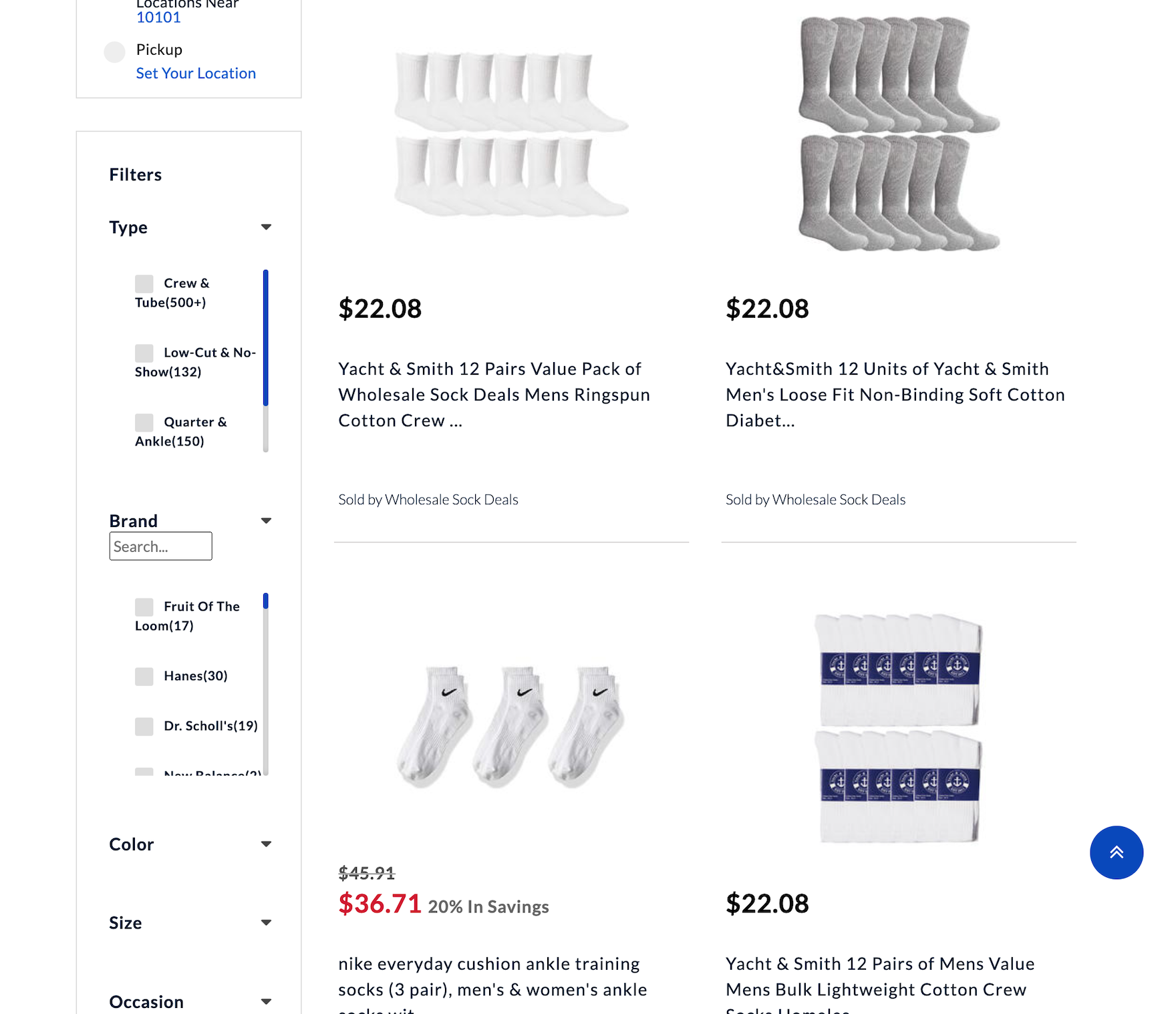
The way that Sears displays their sock price here requires the user to calculate the price per pair, which does vary significantly — Nike socks cost almost 7 times what Yacht & Smith cost.
In testing, when participants compared items that were offered in different quantities or volumes, but only the total prices were displayed, they found it difficult to work out which items offered the best value.
This can quickly grow challenging when deciding among several different products; moreover, users aren’t always correct in their calculations, which can lead them to abandon products that would have suited their needs.
Similarly, if users don’t have the patience to work it out they could miss out on the best value product.
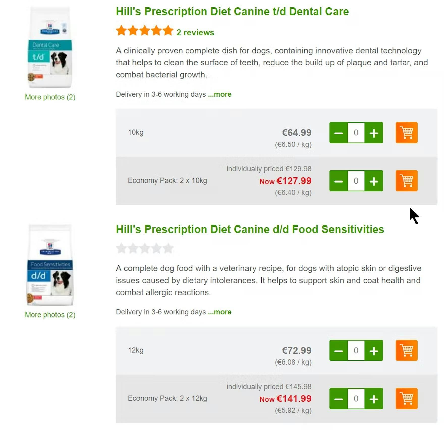
By providing unit costs such as “€6.40 / kg”, Zooplus makes it easier for users to select between pack sizes. Users don’t have to spend time calculating unit prices so the comparison process is easier and quicker.

Wayfair here breaks down the price of 4 chairs into price per chair, which is very helpful for the user trying to compare individually price chairs to groups of 4 like these.
To avoid users cutting short their comparison process because they feel unable to make an informed decision, sites should calculate and display the price per unit.
Of course, the total package price should still be displayed — price per unit should be an additional piece of information in the list item, assisting users in evaluating and comparing products.
Multiquantity items should therefore have two important price points — the total package price and the “price per unit”.
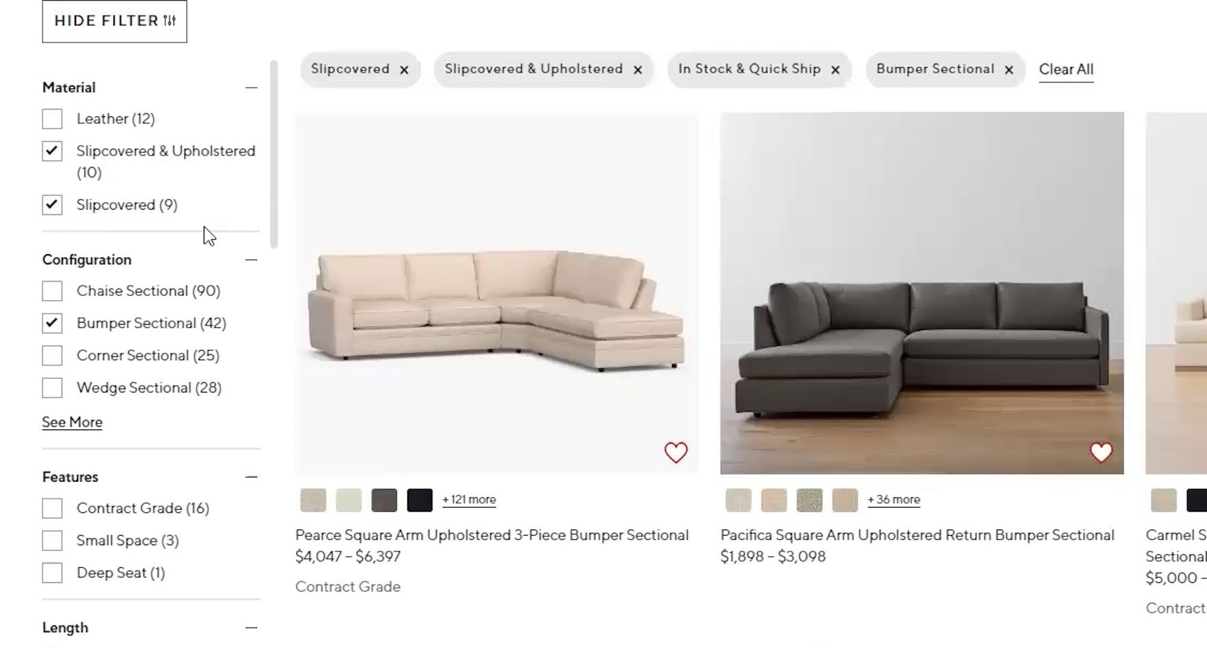
Product Lists & Filtering: Filtering Scope & Logic
Filtering Scope and Logic is one of the best-performing topics within Product Lists & Filtering.
The average site performed at a level of “mediocre” in Filtering Scope & Logic, with 43% of sites performing at a level of “mediocre” or better and 25% of sites with “poor” or worse performances.
Indeed, small improvements can be seen in areas concerning filtering logic, such as combining filtering options of the same filtering type, ensuring filter options are inclusive, and avoiding needlessly resetting filtering settings.
However, there is still improvement to be made, especially in the area of industry-specific filters.
5) Always Explain Industry-Specific Filters (66% Don’t)
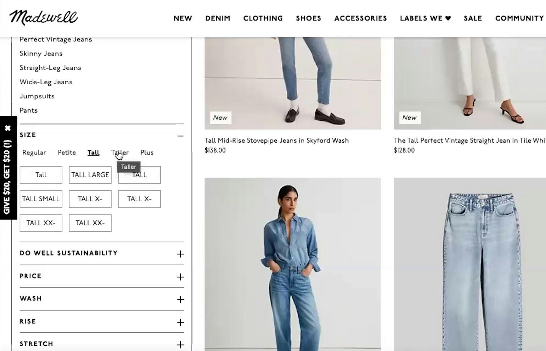
“Oh wow, they have ‘Tall’ and ‘Taller’. I’ve never seen ‘Taller’…I wonder how tall that is.” Without knowing more specifics about the filters, users at Madewell may not apply them and instead have to wade through a larger list with unsuitable items.
“‘Slip cover’…can they just say ‘fabric’? …I don’t know what that is. I’m just not too familiar with the terminology, I guess.” While some users at Pottery Barn will understand the term “Slipcover”, those who don’t may overlook suitable items mixed in with many undesired ones simply because filters were misunderstood or unapplied.
When sites use technical or unfamiliar language in filter types or options, users may be less likely to apply filters — and overlook what in reality are very suitable filters.
On the other hand, failing to understand a site’s filter terms could also mean that users may apply filters that they thought meant something else, resulting in product lists that show too many unsuitable items or too few suitable ones.
Additionally, users who encounter ambiguous filter options can end up spending time applying and removing filter options just to understand their effect on the product list.
This becomes a tedious process, in particular when the information or thumbnails for each item in the product list do not adequately convey the differences in specs or features between the products.
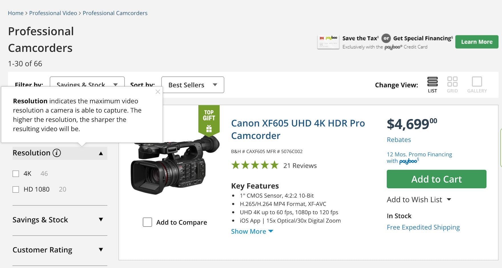
B&H Photo provides tooltips that explain technical terms like video “Resolution”, making it easier for novices to select from the available options.
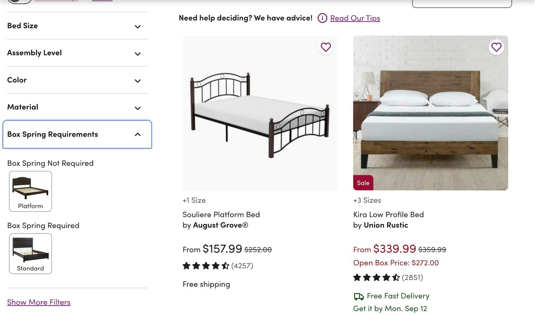
Filter options for “Box Spring Requirements” here at Wayfair are accompanied by thumbnails that illustrate each of the 2 options, allowing users who have never encountered the term “Box Springs” before to choose the right option for their needs.
Clearly labeled filters help users reduce the noise by narrowing down a large list to a smaller, more relevant list that improves the odds users will find a suitable product.
Throughout testing, 3 approaches proved effective in reducing terminology-related issues in filters:
- Avoid industry jargon altogether, if possible
- Explain industry-specific or ambiguous terms that must be retained
- Provide thumbnail images for filters with attributes that can be assessed visually
Doing so will allow users to adequately narrow product lists.
Product Page: User Reviews
User Reviews are, after the product images, the most utilized part of the product page when users are trying to evaluate a product’s suitability.
Despite their importance, 46% of sites had “mediocre” or worse implementations.
With just over half of sites (54%) sitting within the “decent” or better performance bracket, it’s clear that while sites get some implementation details right, many areas still need improvement.
The reasons for lingering substandard User Review implementations are many, and this topic (still) contains the highest number of “missed opportunities” in our Product Page study.
One such missed opportunity is in how companies treat negative user reviews.
6) Respond to Negative User Reviews (79% Don’t)


Neither Office Depot nor Walmart allow manufacturers to respond to negative reviews, which could harm users’ perception of the site and deter them from purchasing certain products, or possibly any product.
Negative reviews can be unpleasant for businesses to read, but they also have their uses:
- They help users succeed in finding the right product (for them).
In the user’s product-exploration process, quickly being able to dismiss non-matching products (based on information in a negative review) can help speed up the process of locating another alternative product on the site.
- Negative reviews increase trustworthiness of the overall product rating.
Users commonly seek out negative reviews because they do not trust only positive reviews, and thus negative reviews create an authentic context for all reviews.
- Negative reviews are an important feedback mechanism.
Negative reviews help multiple-brand sites identify flagging brands and help single-brand sites identify quality control issues, needed product revisions, and even products that should be discontinued.

Here at Lowe’s, Whirlpool has the opportunity to respond to negative user reviews, indicating their interest in solving customer issues and potentially protecting viewers’ perception of their brand.

In a previous study, we heard a user spell the benefit of responses to negative reviews explicitly: “He wrote this on April 17. and he got a reply on April 22…I feel more comfortable with this product and Lowe’s as a company. I know that if another product I buy has this problem they are gonna do their best to solve the problem. It just dissuades me from that one product, it does not dissuade me away from Broil King as a whole.” A user was confident in purchasing from Lowe’s and with the Broil King brand after reading the site’s response to a negative review.
Responding to negative reviews marks an opportunity for sites to mitigate potentially damaging sentiments left by a reviewer.
Our testing shows that when company responses were provided on negative reviews, 37% of users factored the site’s response positively into their evaluation of the negative review, their evaluation of the product, and their evaluation of the ecommerce brand itself.
Cart & Checkout: User Information & Address
On the topic of User Information & Address, the average site had a “mediocre” performance with 59% of sites obtaining “mediocre” or worse performance scores.
Furthermore, an alarming number of sites (38%) have “poor” or worse performances.
Given that 18% of abandonments occur because the checkout process is “too long” or “complicated” — an almost direct translation to the form-filling experience — sites must continue optimizing checkout fields, particularly ones sourcing customer and address information.
Improving the user experience within User Information & Address is not just about getting 1 or 2 important fields right, but rather ensuring all the small UX details for the collection of fields as a whole.
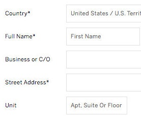
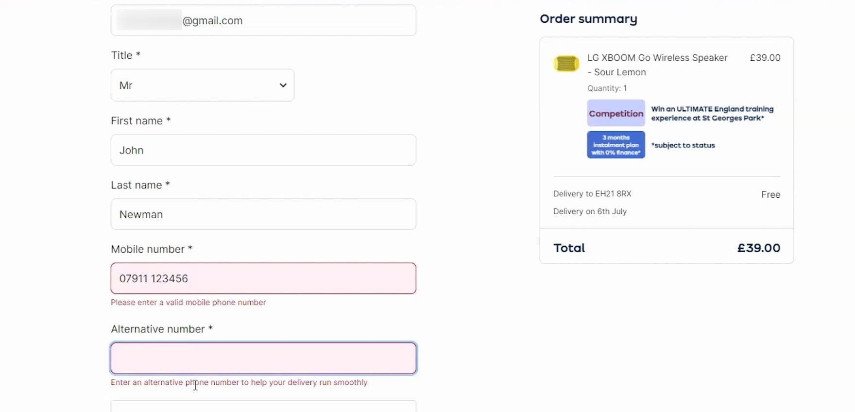
7) Hide “Address Line 2” Behind a Link (71% Don’t)
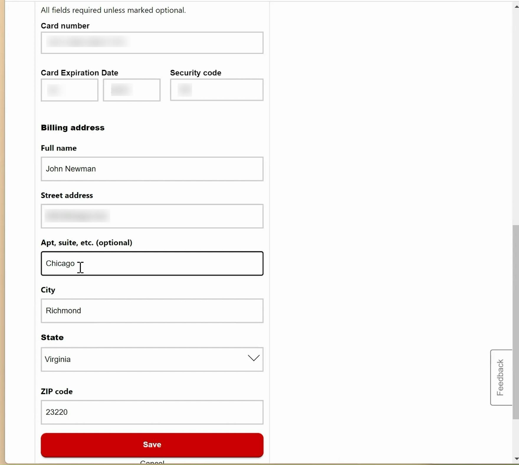
“Oh, that’s not the apartment. There we go.” A participant at CVS accidentally began typing in the “Address Line 2” field before realizing the error.

Here at Victoria’s Secret, Address Line 2 is listed as “Apt., Suite or Floor” but not noted as optional, putting hasty users at risk of typing into it by mistake.
The “Address Line 2” form field — where users add an apartment number, suite, or other “secondary” address information — can be a surprising hurdle for some users to overcome when filling out their address information.
In fact, our usability testing shows participants coming to a halt and puzzling over the field, inputting incorrect information in the field, or simply becoming distracted by the field and staring at it, without ever entering any information into it.
In general, many users try to get through long checkout forms as quickly as possible.
Consequently, users will often not read the labels and instead rely on the general location of the field to infer what should be typed in it.
Hence, many users inputting their address information are likely to not read the label “Address Line 2” — instead, they’ll simply continue filling out their address information, only to realize later that they’ve entered information in “Address Line 2” that shouldn’t be there.
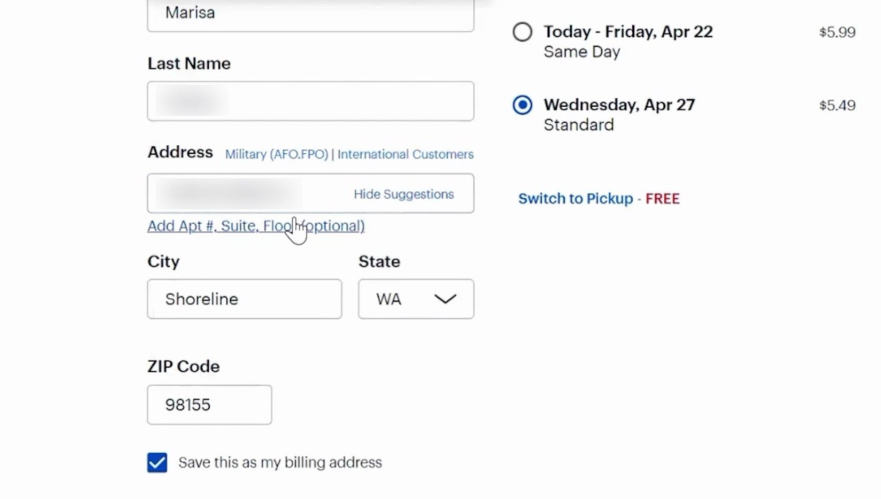

At Best Buy, a participant opened the “Address Line 2” field (first image) and entered her unit number (second image)


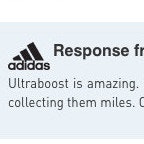
Adidas uses a “Fully Automatic Address Lookup” (which we highly recommend) to determine whether an “Address Line 2” is necessary. The initial input just requires the user to type their address (first image), and users only receive the option to add an “Address Line 2” after the address has been validated (second image). Users without any further information can move on, while users who need to add further information can do so.
The solution is to hide “Address Line 2” behind a link.
When “Address Line 2” is hidden behind a link, users who do not need it will not accidentally misuse the space, but users who need it can still access the line.
Hiding “Address Line 2” behind a link is, for most sites, a way to improve the checkout experience without requiring many resources to implement — in other words, low-hanging fruit.
The “Address Line 2” field can seem insignificant, but it is one of those 10–20 smaller improvements that it takes to lift the checkout experience from acceptable to exceptional.
Cart & Checkout: Order Review & Confirmation
The Order Review & Confirmation step shouldn’t be overlooked, as we consistently observe that it can cause users to abandon their purchase — even this late in the checkout flow.
Furthermore, the abandonments observed at this point in the flow are very often entirely preventable.
The average site in this area had a “mediocre” or worse performance (53%), while the performance average as a whole is brought down by many sites with “very poor” performances (21%).
Thus, the majority of sites have plenty of opportunities for improvement.
8) Always Collapse Completed Accordion Steps into Summaries (73% Don’t)

This checkout review at Lumens uses an accordion style that does not summarize the completed steps. This can make it difficult for customers to backtrack, and can lead to unnoticed errors.
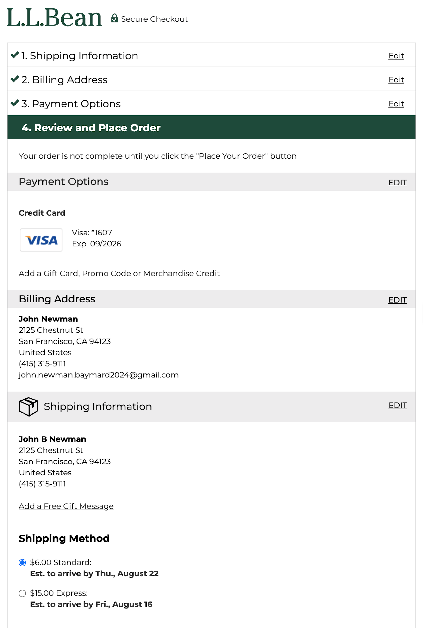
Here at L.L. Bean, an accordion-style checkout review is also used. Although the site keeps several of the last order inputs visible (payment, address, and shipping info), the fully collapsed previous steps still make information review and backtracking more complicated than it needs to be.
Across multiple rounds of Baymard’s checkout testing, we’ve repeatedly observed participants rely on order summary information to verify their data and selections.
However, unlike traditional multistep checkouts, accordion-style checkouts (where users progress through individual expanding and collapsing sections of data entry) often lack a separate order review step, which is critical for allowing users to fully verify their previously entered data and selections before finalizing their order.
Effectively, without an efficient way to review order information, users of accordion checkouts may hesitate to submit their order or waste valuable time and effort revisiting previous steps.

The accordion checkout at Everlane provides a clear overview of previously entered data, allowing users to review their order information as they go.

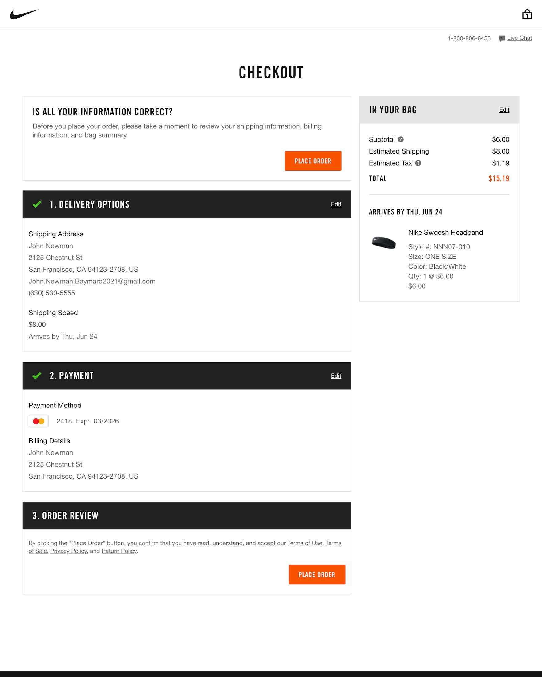
At Nike, the input and selections from each previous checkout step collapse into visible summaries as users progress, as shown here on the payment (first image) and order review (second image) steps.
Yet the accordion checkout can meet the needs of users looking to review their information by collapsing accordion steps into summaries.
In doing so, accordion checkouts efficiently enable users to review their previously entered information in a seamless way.
In fact, during eye-tracking sessions we observed participants routinely scanned the summaries of their prior steps throughout the checkout flow.
What’s more, over time, this practice of collapsing accordion checkout steps into summaries has become an established web convention, making it an expected component of accordion checkouts.
Cart & Checkout: General Form Design & Checkout Layout
For the topic of General Form Design and Checkout Layout, the average site had a “mediocre” performance, with 50% of sites obtaining “mediocre” or worse performance scores.
UX violations within this subtopic can be particularly detrimental given how impactful the layout and design of the checkout are on users’ ability to navigate the checkout process easily.
Redundancies should be removed wherever possible, and users should have greater clarity and assistance as they work their way through the many inputs required of them.
For example, one key form of assistance that most websites do not consider is “Adaptive Error Messages”.
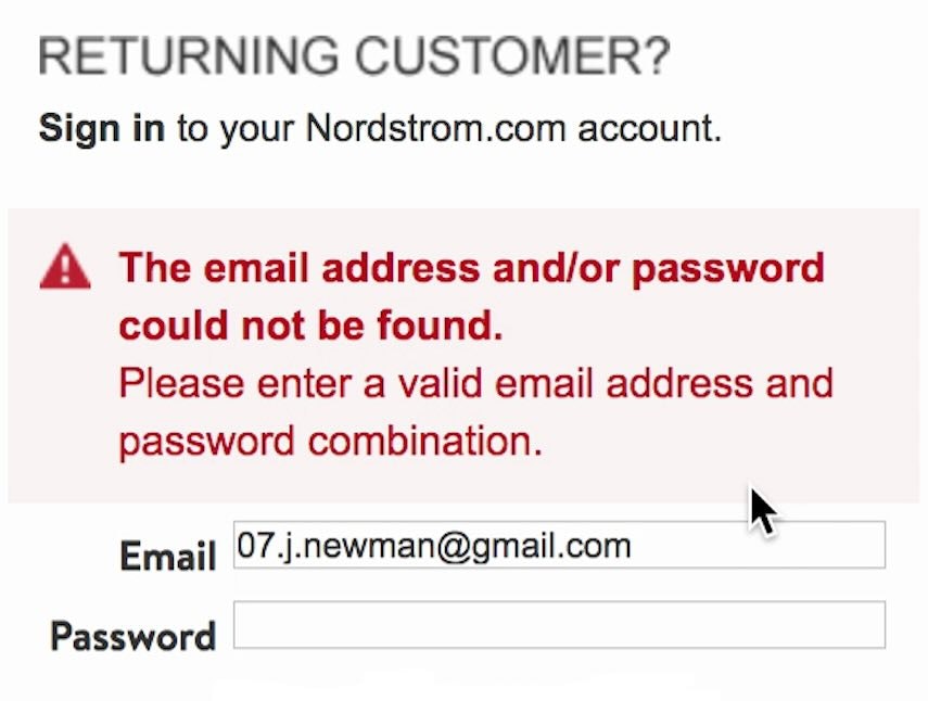
9) Use “Adaptive Error Messages” that Match the User’s Specific Subissue (90% Don’t)
“It doesn’t like that phone number. Do you want me to put ‘+44’ in front of it or something like that? I wouldn’t have thought so, but I don’t know why that’s not working… I’d go to another site at this stage. It’s obviously not working.” During testing at Appliances Online (UK), this participant could not determine how to resolve the issue with the “Mobile number” field based on the vague error messaging. As it turned out, the problem was that the site would not accept input with a space.
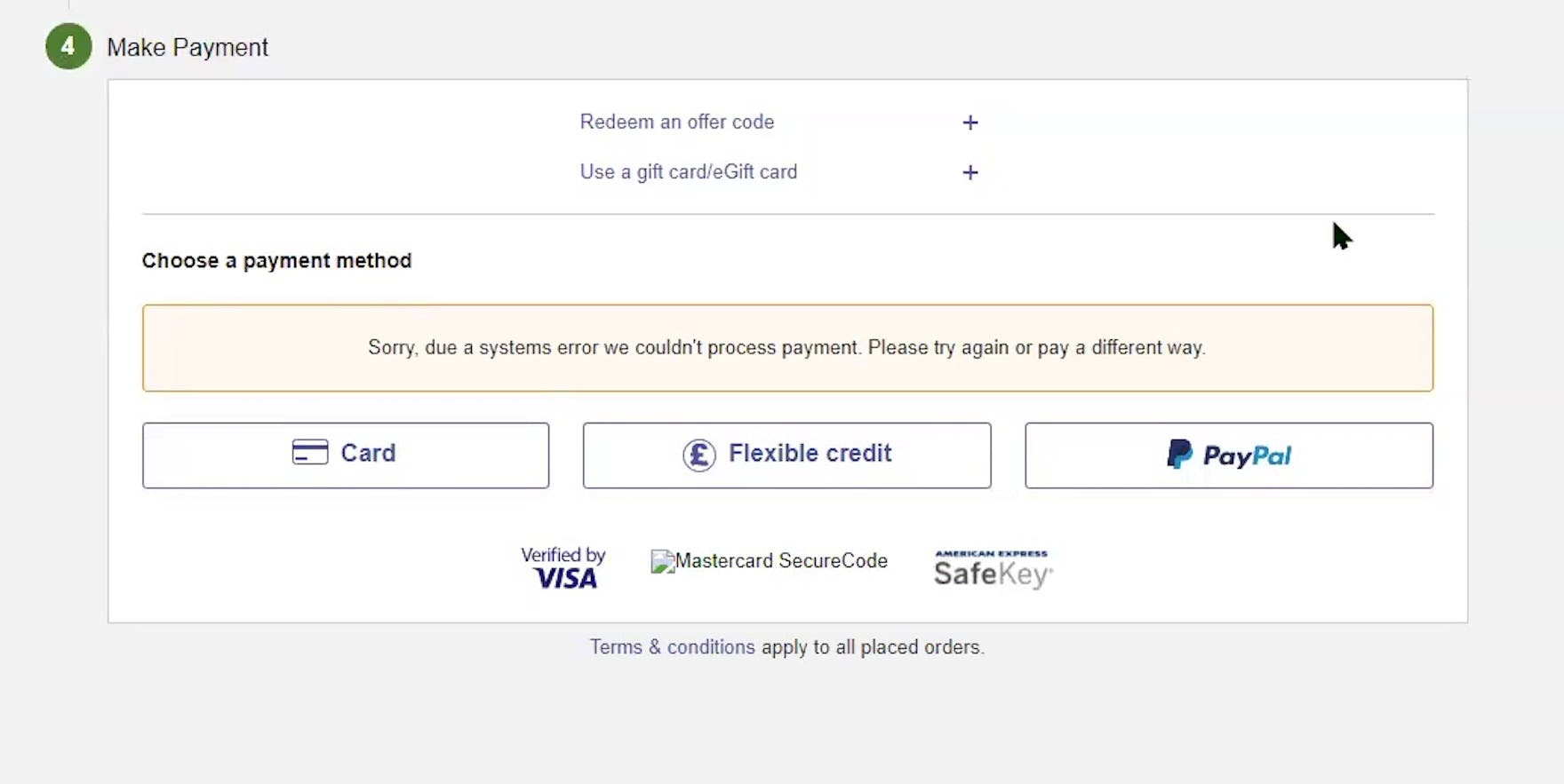
“But this message could mean absolutely anything. That systems error could be corruption on your phone line, problem at Currys, problem at the bank, problem at their bank, problem at your bank, your bank problem at MasterCard or Visa. It doesn’t really say anything.” Unclear error messaging when credit cards were declined were a common problem observed during testing EU sites. When users can’t work out what the problem is, they could easily abandon their efforts.
Error messages inform users when their input is not accepted in a specific field, but unfortunately many ecommerce sites have only one or two possible error messages per field.
For example, an email field may have messages that read “The email is invalid” (or “Provide a valid email address”) when the input is incomplete or poorly formatted and “Email cannot be blank” when the field is left empty.
By not providing users with specific information to correct their errors, the time that it takes for users to correct an error increases exponentially.
In testing, we observed participants take up to five minutes to resolve simple errors for tasks such as signing in, solely due to vague error message wording.
Users who are unable to understand why the error occurred or users who are unable to resolve the error, because of the generic message, will technically be locked out from completing their order, and are almost guaranteed to abandon their order.
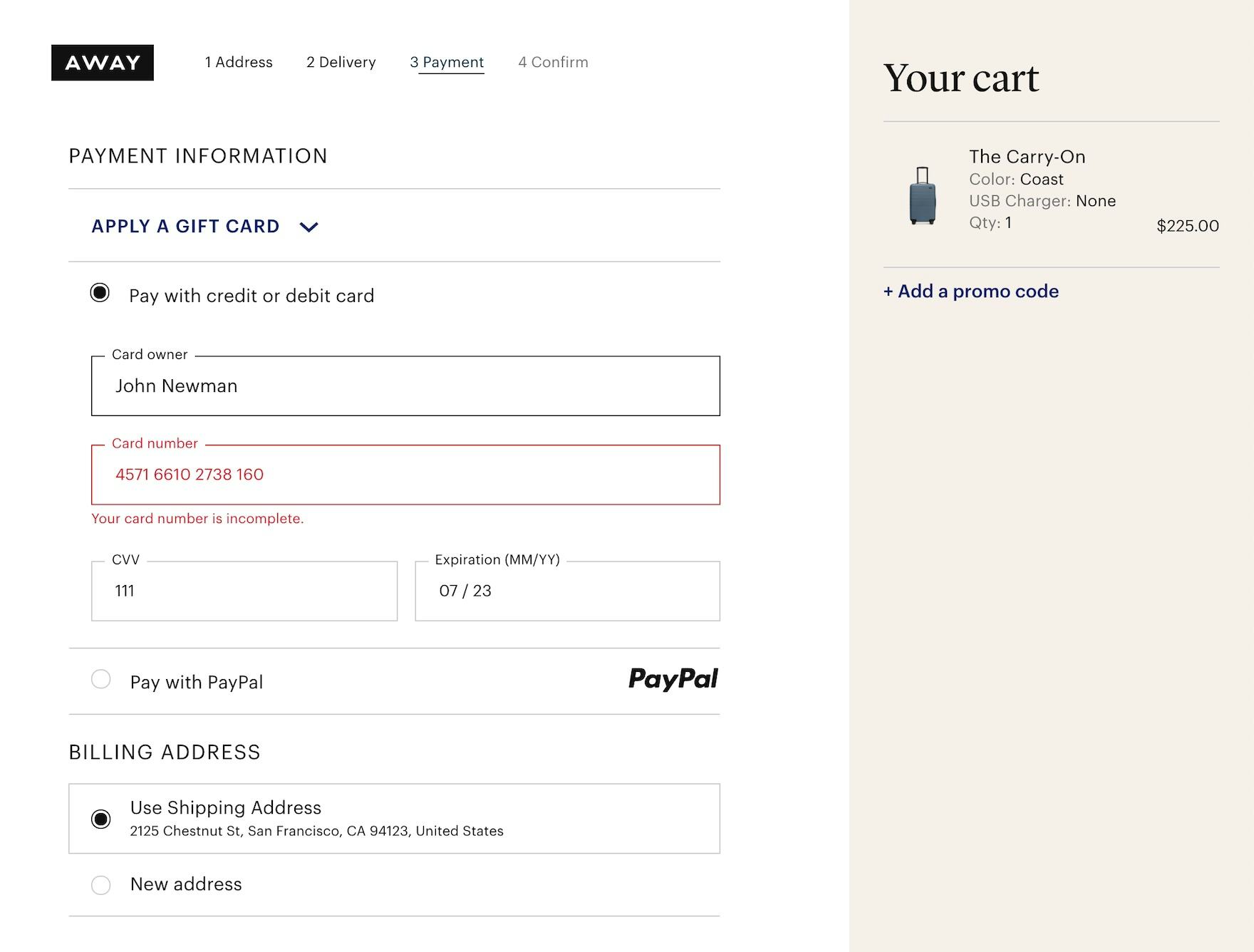
The error message at Away clearly communicates the precise issue with the card number — “Your card number is incomplete” — rather than a more generic message like “Your card number is invalid”.
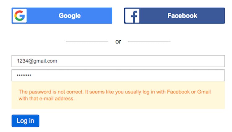
Note how Doodle, instead of just saying “invalid login”, helps users along if they try to sign in via the email and password fields, but have an account tied to a social media account. Users are provided with a message stating, “It seems like you usually log in with Facebook or Gmail with that email.”

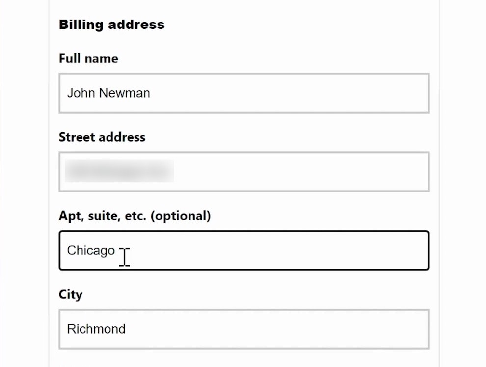
Target similarly clarifies the address-validation errors, with a message worded just for the instances where users have left out a street or apartment number.
To give users the clearest indication of the issue and how to resolve it, sites should instead use “Adaptive Error Messages”, which change depending on the exact subrule that invoked the validation error.
For example, if a user inputs, “john.newman@gmail” in an email field, an “Adaptive Error Message” would read, “This email address is missing part of the domain (such as ‘.com’).”, whereas if they had typed “john.newmangmail.com” the message would specifically become “This email address is missing the @ character”.
During testing, errors that gave specific details improved the error-recovery time for all users — but most importantly it dramatically reduced the number of participants who got completely stuck and had to give up on completing their purchase.
While it may seem resource-intensive to have multiple error messages per field, the back-end validation logic already has all rules for a valid and invalid input, so providing Adaptive Error Messages is just about letting users know on the front-end what the back-end error logic has already specified.
We see in practice that specifying at least 4–7 messages for the most complex inputs — like site-specific or unconventional form fields, card number, cardholder name, security code, password, phone, and email — goes a long way towards improving the error-recovery process.
Cart & Checkout: Form Field Usability & Design
When it comes to the topic of Form Field Usability and Design, the average site had a “mediocre” performance, with 59% of sites obtaining “mediocre” or worse performance scores and 33% of sites obtaining “poor” or worse performances.
The average site here typically had a wide spectrum of usability issues, ranging from poorly designed form fields to little to no input support.
Many sites had issues with poor form field design, where input interfaces were inadequately suited for their input type, input formats were unclear, and little to no distinction was made between required and optional fields.
10) Mark Both Required and Optional Fields (72% Don’t)

Here at Dunelm, the “Your Details” section does not make clear which information is required and which is not. This is an ineffective design given that phone numbers are often optional (and when they are required, we recommend explaining why).

Likewise, Wayfair does not tell the user what information is required and what is optional.
Our large-scale Cart & Checkout testing reveals that failing to explicitly mark both required and optional fields leads to unnecessary validation errors, user confusion over which fields they must complete, a slower checkout process, and even abandonments.
When encountering forms where only the optional fields were marked, 32% of participants during testing had a validation error because they did not complete a required field.
Only marking fields that are required was not better: on forms where only required fields were marked, the completion rate of an optional phone number field was almost identical to sites where it was required.
In these cases, users may feel pressured into providing information they’d rather not disclose, and as privacy is a common reason for checkout abandonments, just a few users making such misinterpretations will lead to abandonments.

Crate & Barrel helpfully marks all “required” fields as such.

Zalando notes all optional and required fields, leaving little room for confusion.
Explicitly marking both required and optional fields provides users the information they need to quickly move through a form.
By explicitly denoting both optional and required fields, users aren’t forced to infer anything but can instead stay focused on just the one form field they are filling out.
Users are consequently able to progress more seamlessly through the entire form, field by field, as they don’t have to backtrack and scan previous fields to make sure they haven’t skipped a required field or filled out an optional field they on second thought prefer not to.
Testing also verified that using an asterisk was sufficient to indicate required fields when used on steps where the optional fields were marked as “Optional” after or close to the field label.
Desktop Web UX Has Room for Improvement
When 0 of the 130+ major ecommerce sites we have benchmarked achieve an overall rating of “good” for their Desktop Web UX, the room for improvement is clear.
But hidden within the data is a reason to be encouraged: the persistent standards of good UX.
Many of the best practices noted above are essentially the same as they were in previous years.
In fact, our very first best practice listed above, “Provide Direct Access to Products Depicted in Inspirational Images”, has been benchmarked by us consistently since 2013.
It may be discouraging that the percentage of sites violating that advice has gone up markedly since 2018, when only 9% of sites violated the guideline (compared to 63% in this year’s benchmark), but at least the preferred UX has not changed.
Things like the speed of internet connection and the role of AI may change, but usability testing of the type that Baymard performs can reveal lasting patterns in user behavior.
To get a full accounting of these patterns, consider accessing the 35 topics that we did not address in this article.
This high-level analysis of the current state of Desktop UX focused on only 10 of the 46 Desktop Web topics included in our ecommerce UX benchmark analysis.
Reviewing the 35 other topics will ensure you gain a comprehensive understanding of the current state of Desktop Web UX and help you identify and solve the additional site-specific issues not covered here.
Still, adhering to these 10 Desktop Web ecommerce UX best practices is a great first step:
- Provide direct access to products depicted in inspirational images (63% don’t)
- Always provide 3 or more product thumbnails in product lists and search results (67% don’t)
- Always include the user ratings average in list items and search results (88% don’t)
- Display “price per unit” for multiquantity items (87% don’t)
- Always explain industry-specific filters (66% don’t)
- Respond to negative user reviews (79% don’t)
- Hide “address line 2” behind a link (71% of sites don’t)
- Always collapse completed accordion steps into summaries (73% don’t)
- Use “Adaptive Error Messages” that match the user’s specific subissue (90% don’t)
- Mark both required and optional fields (72% don’t)
And these practices are not restricted to Desktop Web ecommerce, though that has been our focus here — our research has found that Desktop Web UX shares 76% of its issues with Mobile UX, and 74+% of the issues we find are shared across industries selling physical products.
Thus whichever platform and industry you are in, given the high failure rate of these 10 practices, your ecommerce site will stand out as a paragon of usability if you adhere to these.
This article presents the research findings from just a few of the 700+ UX guidelines in Baymard – get full access to learn how to create a “State of the Art” ecommerce user experience.
If you want to know how your desktop site, mobile site, or app performs and compares, then learn more about getting Baymard to conduct a UX Audit of your site or app.