Progress Indicators for UI/UX: Definition & Ecommerce Best Practices
Research-backed best practices for steppers and loading states to keep shoppers oriented and moving toward purchase.
Key takeaways
- Ensure steps match the real process
- Make previous steps clickable
- Provide immediate feedback between steps
A progress indicator is a promise about what's happened and what’s coming.
It only helps if it's true, if it lets users look back, and if it reassures them while the next step loads.
In this article, we’ll reveal the best practices behind useful progress indicators, and how they can help you deliver a better ecommerce experience for your users.
What is a progress indicator?
A progress indicator is a UI component that shows users where they are in a multi-step process. It often shows how many steps remain, so users know what to expect and how far they've come. Common forms include numbered or labeled steppers, progress bars, and completion percentages.
In ecommerce, progress indicators are most closely associated with checkout. A typical sequence might be:
- Cart
- Account selection/guest checkout
- Contact entry
- Delivery information
- Payment
- Review
- Order confirmation
The same pattern can also support multi-step forms, account creation, and returns flows.
Two UI components may look similar but do different jobs:
- Loading indicators, such as spinners and skeleton screens, show that the system is working on something right now (i.e., that the page is loading). They don't describe a journey.
- Page controls show a user's position in a swipeable set of content, such as a carousel or onboarding screens. They show position, not progress through a task.
Where are progress indicators used in ecommerce?
Progress indicators can be particularly useful in several ecommerce contexts. Here are some of the common places they can be used:
- Checkout: The primary use. The indicator shows the sequence from entering details through to review and confirmation.
- Account creation and onboarding: Multi-step sign-up flows or preference settings.
- Returns and claims: Guided, step-by-step processes for sending items back or reporting a problem.
- Configurators: Multi-part setup for custom or made-to-order products.
Not every checkout needs a visible stepper. Single-page and accordion checkouts communicate progress through their structure instead. Add a progress indicator only where it clarifies the journey, otherwise, it's just clutter.
Types of progress indicators
Here’s a quick overview of the key types of progress indicators, and when you should use them.
Type | How it works | Best for |
|---|---|---|
Numbered or labeled stepper | Discrete steps with names, such as:
| Short, fixed sequences where each step has a clear name |
Progress bar | A continuous bar showing the proportion complete | Longer flows where step labels aren't needed. Less suited to flows where steps vary in effort. |
“Step X of Y” text | A compact text indicator, sometimes shown as a percentage | Mobile, where space is limited |
Accordion sections | Completed sections collapse into summaries, and the active section stays open | Checkouts that show progress through structure rather than a separate bar |
Breadcrumb-style trail | A linear path of previous steps shown as links | Flows where users often need to go back |
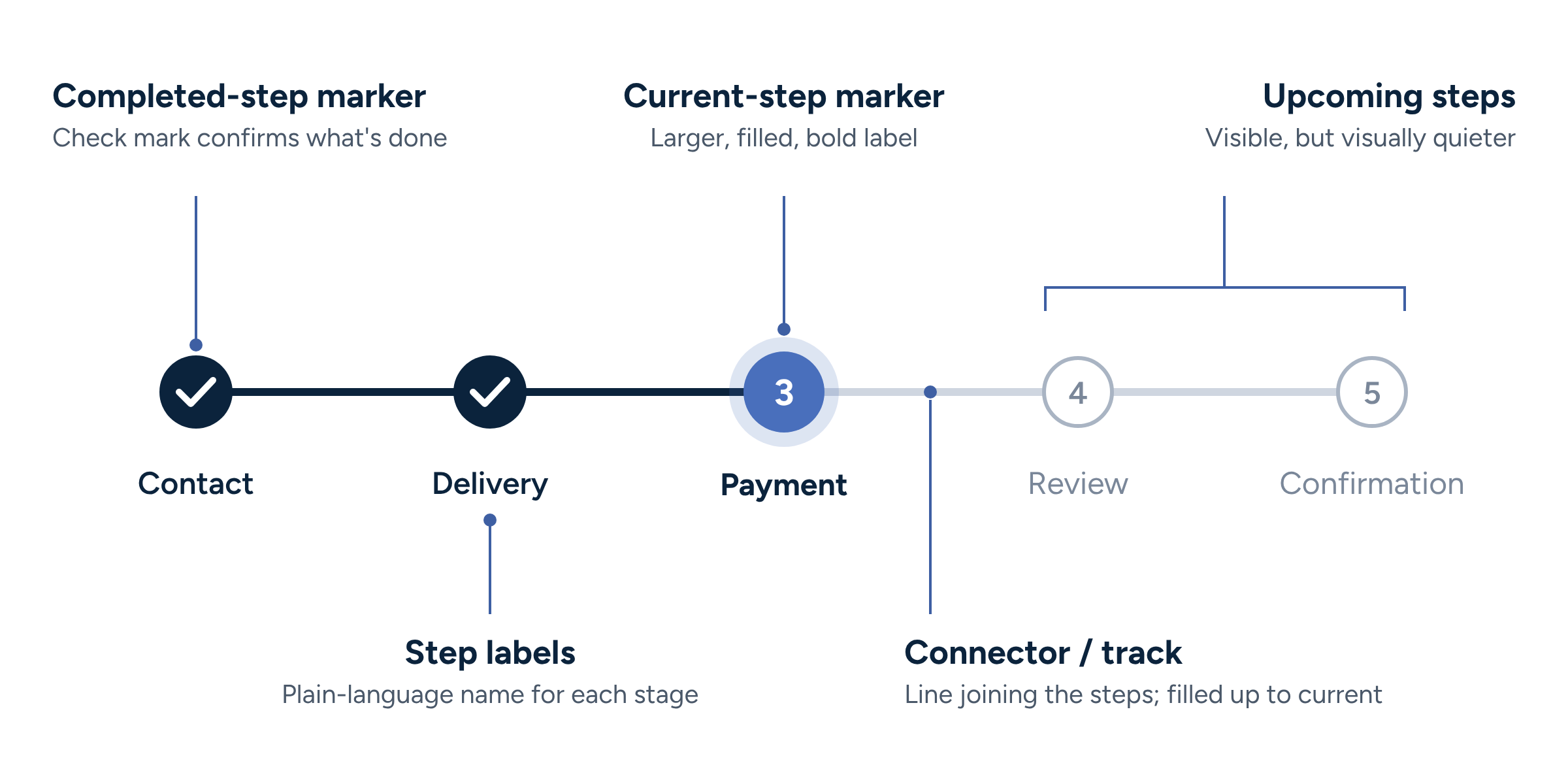
Anatomy of a progress indicator
- Step labels: plain-language names for each stage
- Current-step marker: the clearest visual signal of where the user is, shown through emphasis, fill, or color
- Completed-step marker: usually a check mark, confirming what's done
- Upcoming steps: visible, but visually quieter than the current step
- Connector or track: the line or bar joining the steps
The difference between complete, current, and upcoming steps should never rely on color alone. Use shape, icons, weight, or labels as well, so the states are clear to users who can't distinguish the colors.
3 progress indicator best practices
A progress indicator exists to reduce uncertainty. These three practices address the most common ways it ends up increasing uncertainty instead.
1. Ensure the steps align with the actual process
A progress indicator must reflect the actual number of steps users will go through, not a simplified version.
Based on our research, you should avoid combining multiple real screens into one visible step or hiding steps users will still encounter, because that makes the process feel misleading and disorienting.
- Provide visual process steps that are an exact match for each step of the process
- Avoid omitting or combining process steps
- For checkout flows, include the cart, account selection, and order confirmation steps
- Don't let steps appear or disappear without warning
2. Make prior steps clickable
The progress indicator should also help users navigate back to earlier steps. Users often try to click previous steps, and when those steps aren’t interactive, they’re forced to hunt for other ways back or rely on repeated browser-back behavior.
If someone wants to revisit shipping, contact info, or payment details, clickable prior steps reduce friction and give users a stronger sense of control.
What this looks like in practice:
- Make previous steps clickable
- Ensure clicked steps take users back predictably to the right place
- Style step links so they look interactive, not like static labels
- On mobile, make tap targets large enough to use comfortably
3. Show progress and loading feedback between steps
The moment between steps is where uncertainty peaks. The shopper has clicked "Continue," and nothing visible has changed yet. Did it work? Should they click again?
Many users get uncertain and assume something has broken or gone wrong.
5 seconds
until users become anxious and impatient when a new step or page is loading
Based on Baymard’s research, you should always show a loading indicator when moving between steps or submitting a critical action. This is especially important in checkout, where delays of even a few seconds can trigger repeated clicks or abandonment.
Important details to include:
- Show a spinner or other loading state immediately after submit
- Disable the primary button during loading to prevent duplicate actions
- If progress stalls, update the message rather than leaving users staring at a frozen interface
Payment UX: Research-Backed Standards for Ecommerce Checkouts
The payment step is the highest-anxiety moment in checkout. Here’s how to keep users moving toward purchase.
Progress indicator examples and design inspiration
Here are some examples of ecommerce sites using progress indicators in line with the best practices above.
Fat Brain Toys
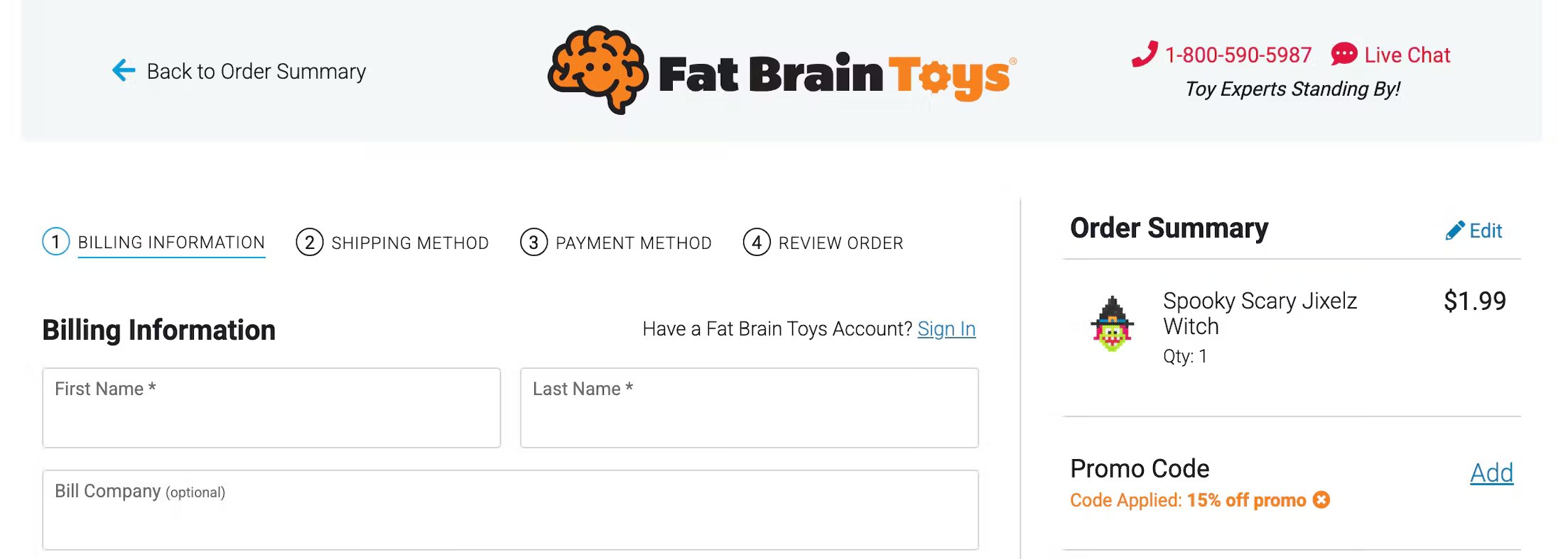
In this example, Fat Brain Toys’ multistep checkout includes process steps with clear and descriptive labels for each step.
Away
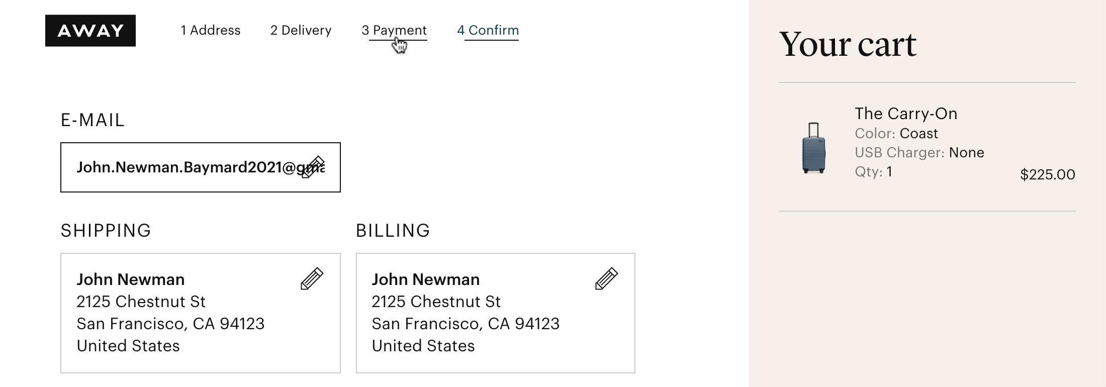
Away’s checkout includes progress indicators that are clickable, making it easy for users to jump back and edit inputs at previous steps if they need to.
OBI
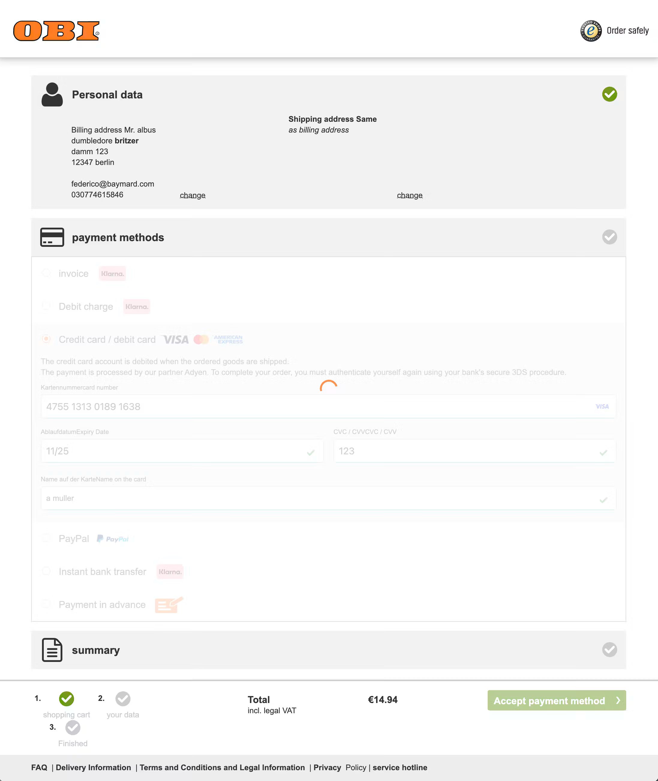
The example above shows the payment step at OBI, with a loading indicator that appears when the user submits the payment. The previous and upcoming steps are visible, along with indicators just above the footer.
Common progress indicator mistakes
As a quick reference point, watch out for the usability issues below that can harm your users’ experience:
- A stepper that leaves out the review or confirmation step
- A step count that changes partway through the flow
- Completed steps that aren't clickable, or that lose data when revisited
- Future steps that are clickable and let shoppers skip required information
- No visible response after clicking "Continue"
- Relying on color alone to show which step is current
- Fake or exaggerated progress, such as bars that jump ahead and stall
- A progress indicator on a one-step form, where it only adds clutter
How to Audit Your Checkout Flow for Hidden Friction
Use this research-backed framework to find and fix hidden checkout friction.
Progress indicator frequently asked questions
What is a progress indicator in UX?
What is the difference between a progress indicator and a progress bar?
Do you need a progress indicator in checkout?
Access our 700+ actionable UX guidelines and performance benchmarks based on 200,000+ hours of user testing across 40+ ecommerce industries.
Weekly UX Research, Insights, and Updates
Join 60,000+ UX professionals. Get the latest UX research, practical guides, and Baymard news delivered to your inbox every week.
Loading...