Ecommerce UX Audit: How to Find What's Hurting Your Conversion
Stop guessing. Learn how to conduct a comprehensive ecommerce UX audit across your entire funnel using a research-backed framework.
If you want to improve your conversions, you need to stop being reactive and start being proactive.
Right now, your analytics are likely telling you where users are dropping off, and your A/B tests are telling you which headline performs better. But neither can tell you why users are actually struggling, or where the hidden UX landmines are that your metrics don’t surface.
Analytics and split testing only measure what's already happening on your site. A structured UX audit helps you uncover critical conversion friction points — such as flawed filter UI, vague error messages, or a bloated checkout — before they tank your revenue.
This guide walks you through a comprehensive ecommerce UX audit across the entire funnel, from homepage and product listing pages (PLPs) to the final checkout, on both desktop and mobile.
By the end, you’ll be set to build a prioritized roadmap of UX fixes, complete with severity ratings and concrete design solutions, all grounded in thousands of hours of usability testing.
What does a full-site UX audit cover?
A full ecommerce UX audit evaluates every major stage of the user journey:
- Homepage and navigation
- Product discovery (search, filtering, and category pages
- Product detail pages
- Cart and checkout
It should also review the mobile user experience across all of the above.
Each stage has its own unique UX patterns, failure modes, and research-backed standards. This is exactly why a generic, one-size-fits-all checklist won't cut it. It will only surface the blindingly obvious issues while completely missing the subtler, high-impact friction points.
Most teams default to auditing the checkout first because it's the highest-stakes flow. That’s a smart instinct, but it’s incomplete because it doesn’t take into account the users who never make it that far. Navigation problems upstream lose users before they ever reach the cart.
Similarly, a flawed product page that fails to build buying confidence drives costly returns, not just exits.
Think of a full-site audit as a prioritization tool. It highlights exactly where in the journey you are losing the most users, showing you exactly where to direct your deepest investigations. The final output isn't a rigid design specification; it’s a prioritized list of issues to drive your roadmap decisions.
Baymard UX Audit Deepdive
Find out how Baymard's expert UX audit service helps you justify UX decisions, uncover your top conversion opportunities, and benchmark your site against competitors.
Before you start: Scoping and preparing the audit
All good UX audits are built on solid foundations. Here’s how to prepare the audit to ensure it has maximum impact.
Define the scope
A full-site audit of a large ecommerce site is a serious undertaking. It can take an experienced practitioner days or weeks depending on site complexity. If you're short on time, you might want to focus on one area at a time, starting with the highest-impact areas first.
Checkout and product pages typically yield the most direct conversion lift.
Choose your evaluation framework
Without a structured evaluation framework, an audit is just a list of opinions. You need a research-backed set of guidelines specific enough to handle nuanced ecommerce patterns. A general usability framework will only find surface-level problems; an ecommerce-specific framework will find the revenue leaks (and show you how to fix them).
Baymard's guidelines cover 700+ ecommerce-specific UX patterns across all major page types and flows, drawn from over 200,000 hours of human-led usability research.
Access research-backed UX guidelines
Make best-in-class design decisions and improve conversions with 200,000+ hours of validated, industry-specific UX research and benchmarks.
Set up your evaluation environment
- Audit the live site, not a staging environment or prototype. Staging environments often behave differently from production, and you need to see the actual interaction behavior, error states, and edge cases that real users encounter.
- Audit desktop and mobile separately. Many issues are device-specific: a problem that's invisible on desktop is sometimes a critical failure on mobile. A combined pass almost always misses them.
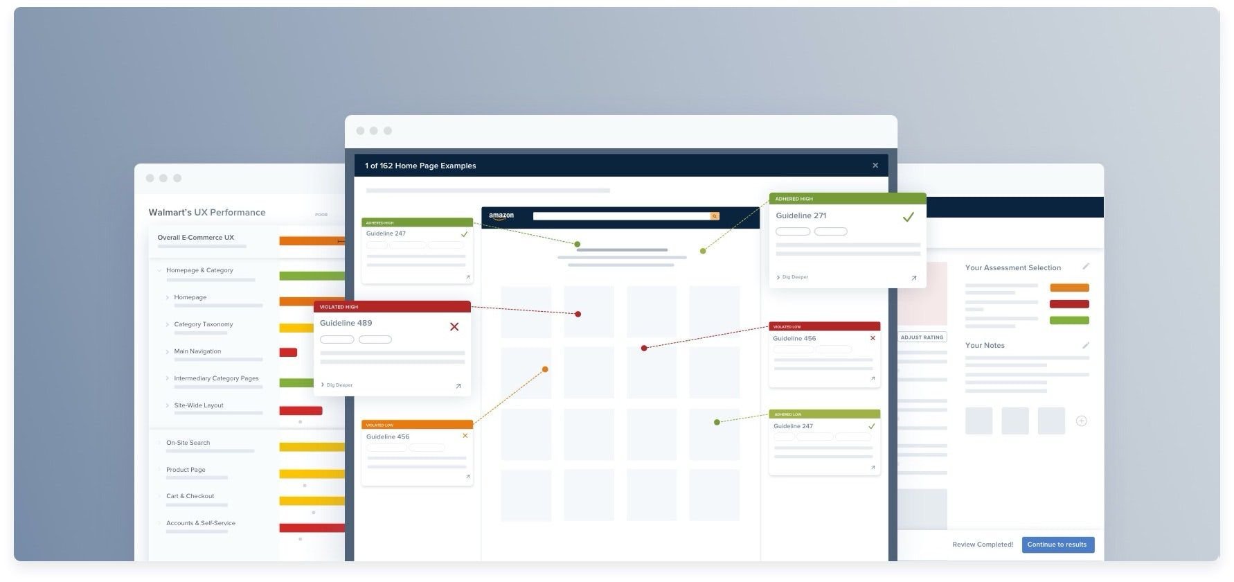
- Standardize your documentation. From your very first click, track everything using a consistent format: Location, Description, Standard Violated, and Severity. Inconsistent documentation makes it hard to present your research and impossible to track.
The six areas of an ecommerce UX audit
Work through each area in sequence. For each area, the goal at this stage is to identify which issues exist and rate their severity, not to design solutions. Save the fixes for after you've completed the full audit and prioritized the findings.
Area 1: Homepage and navigation
Here, you’re evaluating whether users can orient themselves, understand the site's offer, and find what they're looking for from the entry point.
Here are the key diagnostic questions to ask.
Does the homepage clearly show what the site sells?
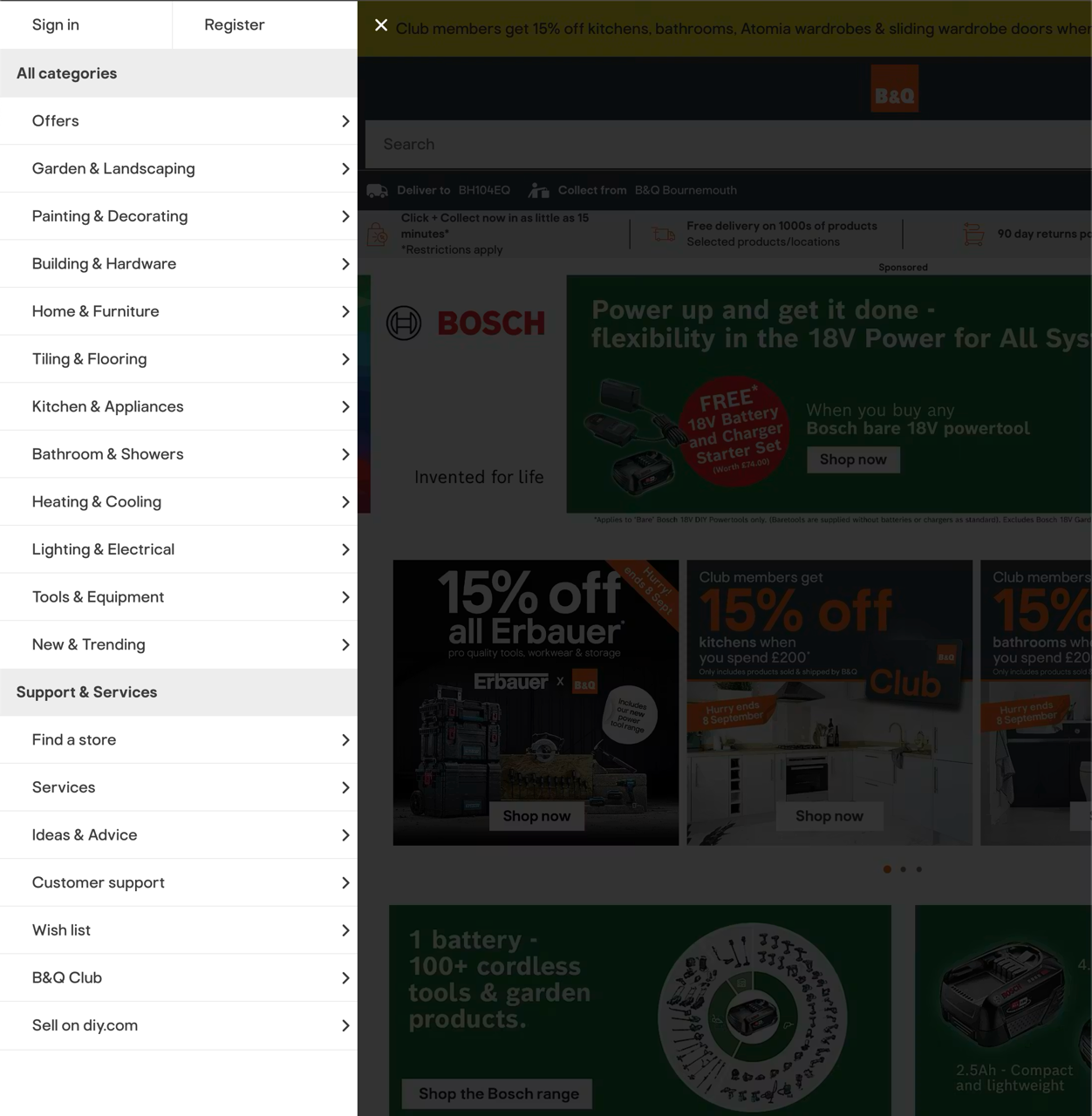
Your homepage needs to instantly broadcast the true breadth of your product range, especially for first-time visitors.
Over-focusing on a narrow set of promos, seasonal campaigns, or a couple of shiny hero products causes users to misread your site entirely. They'll assume you don't carry what they need and bounce, even when the exact product is actually available.
Are the categories clear, distinct, and non-overlapping?
This is one of the single biggest navigation failure points in ecommerce. The moment your category labels overlap or feel ambiguous, you force users to play a guessing game. Once shoppers start guessing, product discovery becomes slow, frustrating, and a massive conversion drain.
Does the main navigation make the product hierarchy obvious?
Shoppers should be able to glance at your navigation menu and immediately digest the site’s top-level structure.
Hiding your entire catalog behind generic entry points like “Shop” or “Products” adds unnecessary friction, especially on mobile where product categories need to be exposed right at the first level.
Does the homepage build confidence and urgency without hurting findability?
Your homepage shouldn’t just shout marketing promos; it needs to prove that your brand is credible, secure, and worth buying from.
High-converting homepages seamlessly surface trust signals alongside smart merchandising shortcuts, without letting promotional banners hijack and crowd out your core product discovery.
Area 2: Product discovery (search, filtering, and category pages)
Next, you need to understand whether users can actually find the products they're looking for efficiently, using both search and browse paths.
Users should be able to enter from either browsing or search, narrow down without friction, and always understand why they’re seeing this set of products. If they can’t do that, product discovery starts to feel like manual sorting work, and that’s where drop-off happens.
“When ecommerce search works, it can feel almost magical; you simply type in what you’re looking for and it’s served up in mere milliseconds.”

Can users find and switch to search immediately when browsing gets slow?
Search should be highly visible, because most shoppers use it frequently (78% use it “often” or “every time” they shop online).
The search bar should be prominent enough that users can switch from browsing to searching instantly.
Do filters let users narrow by the attributes they actually care about?
This is one of the biggest product discovery breakpoints. Generic filters aren’t enough; shoppers need both important high-frequency filters (like price, brand, ratings, color, and size), and the category-specific attributes that actually separate one item from another.
Is filtering fast, flexible, and easy to understand once people start using it?
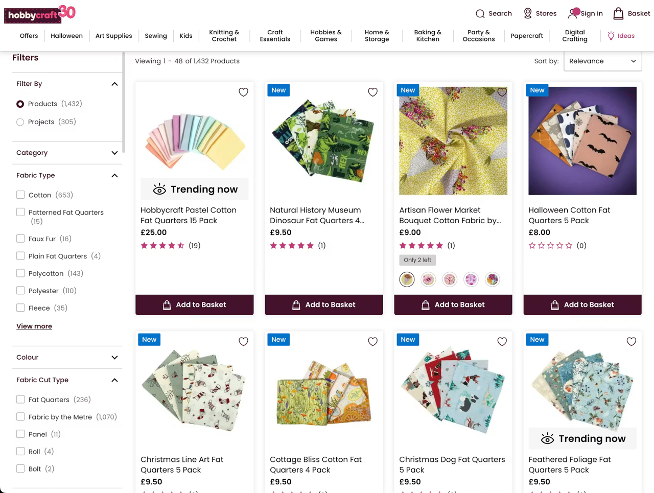
This example from Hobbycraft shows several category-specific filters available to help users narrow their selection
Even relevant filters fail if the interaction model is clumsy. Users must be able to combine options seamlessly, see results update without heavy friction, and instantly understand what they’ve already applied.
Do category pages help users define the right scope before showing huge product lists?
Too many sites throw users into lists that are too broad, too early. For large catalogs, intermediary category pages are essential because they help users choose a well-defined subcategory before they get buried under thousands of products.
Does the discovery experience support common shopping intentions, not just taxonomy logic?
Users don’t always shop by perfect catalog logic. Many want to discover items by sale status, brand, or newness. Those paths should be effortless to find in both product lists and search results.
Area 3: Product detail pages
The next area to review is the product detail page (PDP). Does the PDP provide total clarity and detail, allowing users to make a confident, accurate purchase decision without leaving the page?
A good product page makes users feel: “I completely understand this item, I know exactly what I’m getting, and I’m comfortable buying it right now.”
If your page creates a shred of uncertainty in any of those areas, users will stall, leave to compare elsewhere, or abandon entirely.
Poor PDP design also directly inflates your return rates. When users are forced to guess on critical details, they buy blind, and when the product arrives and misses expectations, they send it back.
“It’s often on the product page where users make up their mind on whether or not they want to purchase the item.”
Run through these critical areas when auditing your PDPs.
Can users visually evaluate the product with confidence?
Strong product imagery is critical. Users rely heavily on product images to judge fit, quality, scale, and features before they ever think about pressing "add to cart".
Image galleries should contain enough high-quality images that show the product from multiple angles, include all the key visuals and relevant features to scale, and have high resolution and zoom quality.
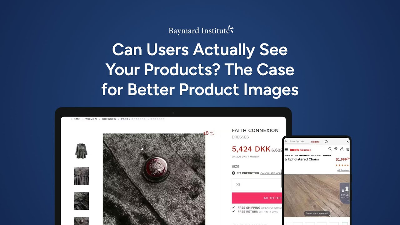
The gallery should also signpost where additional images are available but hidden in the current view.
Is the buy section immediately clear and easy to act on?
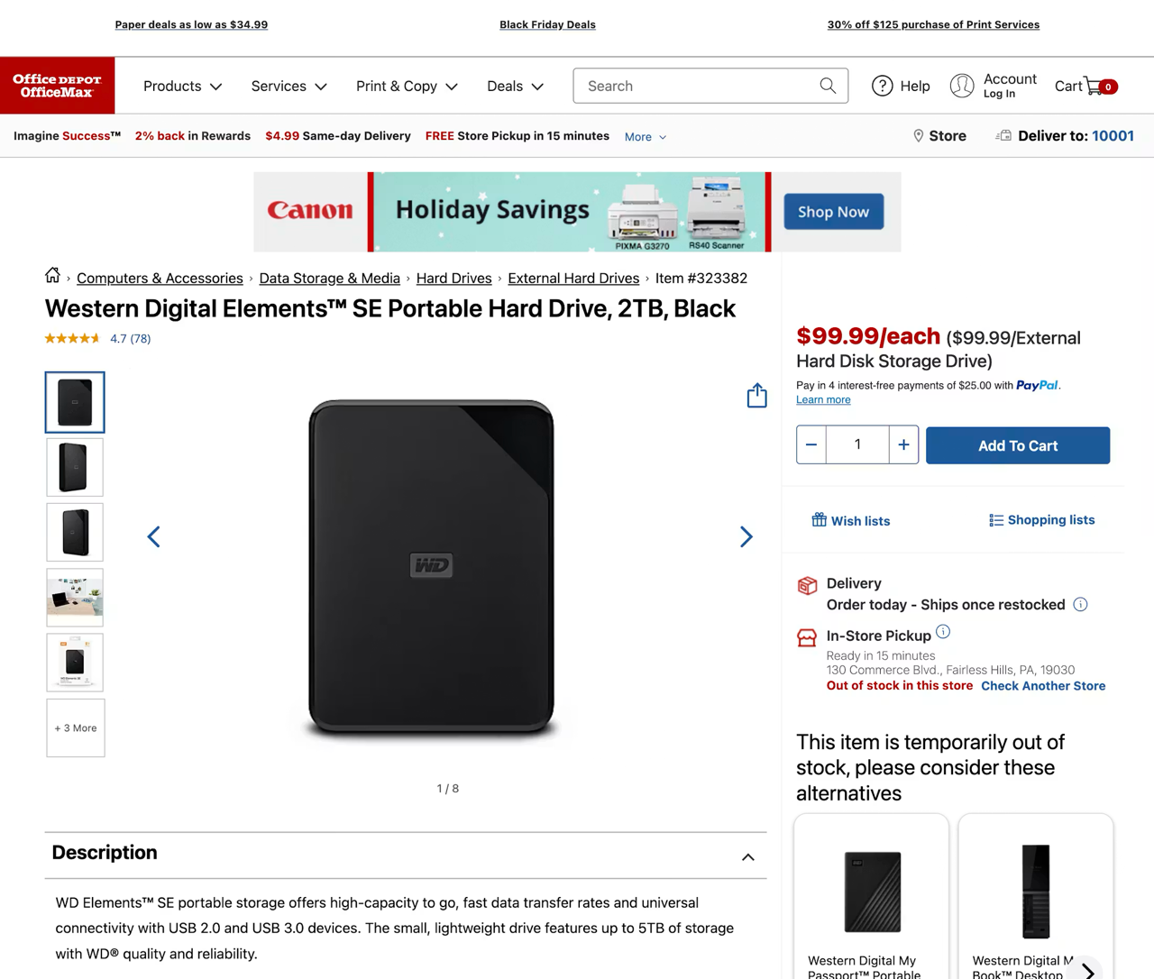
Office Depot’s ‘Add to Cart’ button is clearly visible and prominent on the product page
The buy section should make the next step obvious; the primary call to action (CTA) should be “add to cart”.
If price, availability, and your primary CTA are visually diluted by surrounding clutter or competing buttons, users will hesitate right at the moment of conversion.
Are variations and configurations easy to understand and select?
This is one of the most common PDP friction points. Users should never have to decode size, color, availability, or customization logic just to figure out if the specific version they want is actually available.
Does the page provide the information users need to decide, not just marketing copy?
A high-converting PDP supports quick scanning and deeper evaluation. Users need detailed, plain-language descriptions and specs that answer real product questions, and that information must be easy to find without digging through tabs or long walls of text.
Does the page reduce purchase anxiety around shipping, returns, and availability?
Users don’t evaluate a product in isolation; they evaluate the total risk of buying it online. That includes information about shipping costs, returns information, and stock availability.
Shipping cost, estimated delivery timing, return policy, and stock status all shape whether users feel safe moving forward. Make sure these are all prominent and easy to access.
Area 4: Cart
The cart is the last opportunity to confirm the purchase before the user commits to the checkout flow. Issues here don't always cause immediate abandonment; users sometimes proceed through checkout and then drop off when they encounter a cost or variant detail they didn't expect. That pattern is hard to diagnose without auditing the cart specifically.
The cart should therefore give users the information and control they need to review their intended purchase before committing to checkout.
Here’s how to audit your cart.
Can users understand the full cost before they commit to checkout?
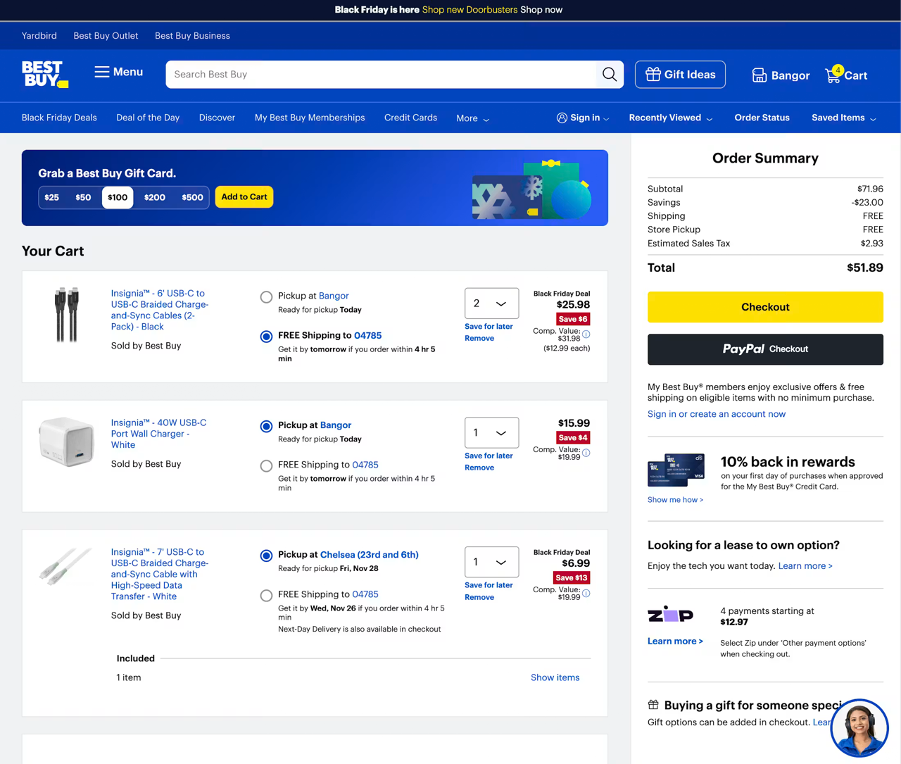
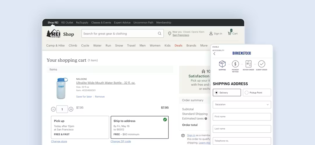
On Best Buy, the cart page clearly displays the full order cost, including all fees and shipping costs ahead of checkout
This is one of the most critical cart checks. If users can’t see a clear order total (including shipping, taxes, and other fees), many will hesitate or abandon rather than start checkout half-informed.
Can users verify each item without going back and forth to product pages?
The cart acts as a review step. Users need enough product detail to confirm they picked the right item, variation, and quantity, and they should be able to jump back to the product page easily if they need more information.
Is editing the cart quick and easy?
Users should be able to update quantities, remove items, or fix mistakes without friction. Clumsy quantity controls, delayed updates, or difficult remove flows create needless friction at exactly the wrong moment.
61%
of sites in our ecommerce UX benchmark make it unnecessarily difficult for users to update the quantity of cart products, by using either only an open text field or a drop-down, rather than both together.
Does the cart support save/recover behavior?
This is widely underestimated. Many users use the cart as a temporary storage and comparison tool, so if items disappear, can’t be saved, or require account creation to preserve them, you create avoidable abandonment.
Is the cart focused on order review and checkout, rather than distractions?
The cart’s main job is to help users confirm their order and proceed. Ads, aggressive cross-sells, financing promos, or oversized secondary modules often cause distractions or push the order summary and line items out of view, leading to confusion and abandonment.
Area 5: Checkout
At this point, you need to check that the checkout flow is structured, clear, and free of the friction patterns that cause abandonment. This is the point where your customer parts with their money, so it’s extremely important to get it right.
Can users start checkout without being forced into an account decision?
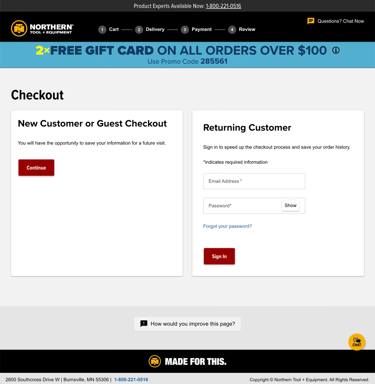
Northern Tool’s checkout gives users a clear and obvious decision between signing into an account or completing the purchase as a guest
This is a major checkout risk. If users are pushed to sign in or create an account before they can proceed, many interpret it as friction; 18% of shoppers have abandoned a purchase because they were forced to create an account.
There should be a prominent guest checkout option to overcome this.
Does the checkout feel short and simple?
A lot of bad checkouts overwhelm users by showing too many fields, redundant options, and unnecessary steps. Good checkout UX reduces visible effort through smart defaults, hidden optional fields, autofill support, and removal of anything that doesn’t directly help to complete the order.
Can users recover from mistakes without losing progress?
This is one of the most important checkout audit focus areas, because user errors are inevitable. What matters is whether users can find the problem quickly, understand what went wrong, and fix it without retyping half the form.
Is the payment step easy to complete and hard to mess up?
Payment is where a lot of otherwise-fine checkouts fail. Users need payment fields that support typing accuracy, clear validation, and sensible alternatives if their preferred method isn’t standard card entry.
Can users review and confirm the order confidently before placing it?
Users need a proper chance to catch mistakes before submission. In multistep checkouts especially, the review step is where users verify addresses, shipping choices, payment details, and totals without having to backtrack through the whole flow. The final order button should be prominently displayed to ensure the user can complete the purchase effectively and efficiently.
Area 6: Mobile experience
Given that many shoppers browse and buy on their smartphones, you need to ensure you also audit your site’s mobile performance.
The mobile experience should allow users to stay oriented, act quickly with one hand, and avoid getting buried by hidden content or cramped interactions. Mobile issues span the full purchase journey outlined above, including search discoverability, navigation depth, filter and product-page scannability, cart clarity, and checkout form friction.
Here’s how to review your site’s mobile usability performance.
Can users find their next step immediately on every key page?

Swanson Vitamins’ search bar is clearly visible across the site
On mobile, users have much less page context at any given moment. That means core actions like search, menu, add to cart, view cart, and checkout need to be obvious without extra hunting, because small visibility issues compound fast on small screens.
Does the mobile experience help users stay oriented as they move between pages?
Mobile users lose context easily because they only see a small slice of the interface at once.
Good mobile UX consistently reinforces where users are, how they got there, and how to get back without losing progress or filtering work. Users should be able to move back and forth between pages without losing filter states or cart contents.
Can users narrow and evaluate products without excessive scrolling or tapping?
This is where many mobile sites become exhausting. Users should be able to refine large lists and evaluate product details without opening endless overlays, jumping through tabs, or scrolling through bloated pages.
Filters should be easy to open, apply, review, and remove on mobile screens. And on long product pages, content should be grouped into clear, collapsed sections to avoid endless scrolling.
Is the mobile cart and checkout optimized for low-friction completion?
A lot of mobile checkout problems come from desktop patterns being compressed rather than redesigned. Users need simple quantity editing, readable order summaries, guest checkout, forgiving form behavior, and payment steps that are easy to complete from a handheld device.
Check that quantity updates and item removal are easy to perform on touch screens, and that form errors can be fixed quickly without having to retype large sections of text.
Does the mobile journey surface decision-critical information early enough?
Because mobile users are working with less visible context, they’re especially vulnerable to late surprises.
Key cost, delivery, returns, and stock information should appear early and repeatedly during the checkout process to help build and maintain purchase confidence.
Severity rating and prioritization
Not all UX issues carry the same weight. While some flaws create massive, conversion-killing friction that drives immediate site abandonment, others simply cause minor speed bumps, user doubt, or temporary frustration.
To help you understand how to prioritize, here’s how Baymard evaluates UX issues against 700+ established guidelines from 200,000+ hours of usability testing.
Severity (impact)
How deeply does a violation damage the user experience? We track this across three levels.
- Interruption: Brief friction in the user’s activity
- Disruptive: A full stop where users must actively problem-solve
- Harmful: A complete roadblock that usually forces site abandonment
Frequency (volume)
How many of your users are actually going to run into this issue? Drawn from extensive usability testing, this ranges between:
- A few
- Several
- Most
- Nearly all
- All
Defining importance to establish UX priorities
Combining Severity (how bad it is) with Frequency (how often it happens), we calculate an overall importance rating for every single guideline:
- Essential: Non-negotiable — harmful issues noted by several or most users
- Impactful: Issues that are disruptive to the user experience and should be fixed
- Detail: Nice-to-haves that can smooth the experience further
How to maximize your ROI
While your primary focus should always be fixing Harmful and Disruptive issues first, a smart approach is to balance this data against development effort. A highly frequent, moderately severe issue that takes an hour to fix can often yield a much faster return on investment than a rare, critical bug that requires weeks of engineering resources.
Turn findings into a stakeholder-ready output
Finding the issues is one thing, but securing stakeholder buy-in to act on the findings is another. You need to present the evidence in a way that highlights the problem, the reason, the impact, and the fix.
For every critical and major finding, add one sentence on the likely conversion impact. This is what makes the audit presentable to a director or product team.
Instead of "the error message isn't specific enough", try "this error message doesn't tell users which field failed, so users who make a payment error can't recover without leaving the checkout; this is likely contributing to the 40% drop-off at this step."
The finding plus the implication help make the business case.
No time to run your own audit? Get a helping hand
A structured ecommerce UX audit — run against research-backed standards, across the full user journey, with consistent severity ratings — is one of the highest-ROI activities a UX team can undertake.
The areas above highlight just some of the observed UX issues across hundreds of ecommerce stores. This provides a helpful starting point to evaluate your site against established best practices and UX benchmarks.
The thing is, it can be a time-consuming process.
Baymard’s UX audit service means you can hand it over to our experts. A Baymard audit empowers your organization with actionable insights drawn from over 200,000 hours of research.
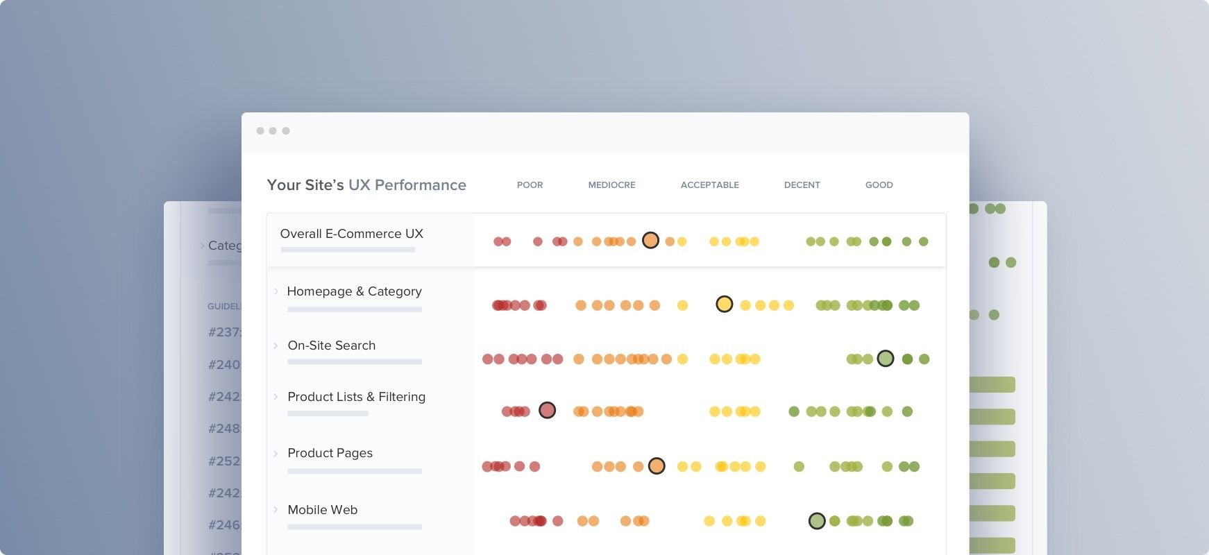
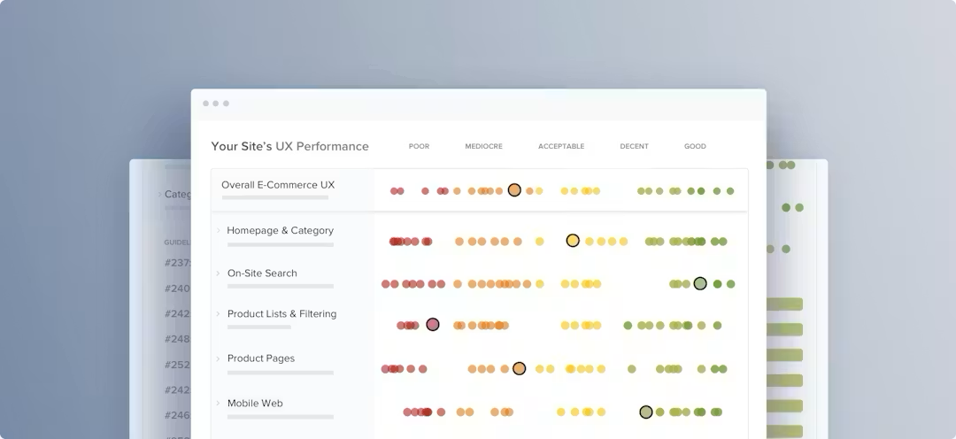
You’ll learn how your website's UX performance stacks up against your competition, and get a prioritized roadmap of the most important and impactful UX improvements.