Search Bar UI: Definition & UX Design Inspiration
Learn how to design intuitive, high-converting search interfaces grounded in Baymard's usability research.
Key takeaways
- Ensure the search field is prominent and easily discoverable with an obvious submit button
- Guide shoppers with autocomplete and predictive keyword, category, and product suggestions
- Persist queries in the input field for easy refinement
56%
of sites fail to adequately support users’ search needs
In ecommerce, the search bar is one of the primary product discovery mechanisms.
This article covers on-site search bars as a UI component, including anatomy, variants, and UX design considerations.
You’ll also learn best practices for search bar implementation and get inspiration from leading ecommerce examples, grounded in thousands of hours of Baymard’s search UX research.
What is a search bar?
A search bar (sometimes referred to as a site search or search field) is a UI input component that allows users to query a site's content or product catalog by typing keywords, phrases, or other identifying information (such as product numbers or SKUs).
Like navigation and filters, a search bar helps users discover products. The interface should return relevant results based on the user’s search query.
It's the preferred entry point for users who arrive with a specific product, brand, or category in mind. These are users who already know what they want and are trying to find it as directly as possible.
Why are search bars important for ecommerce sites?
People looking to buy online often need to refine their searches to find the perfect product, but not all websites cater well to their needs.
56%
of sites fail to support users’ search needs adequately.
Search bars have a number of benefits for users browsing ecommerce websites and product catalogs:
- Faster product findability: Users can go directly to what they want instead of browsing through categories
- Supports many search intents: Users can search by product type, feature, compatibility, or use case, not just exact names
- Reduces reliance on site taxonomy: Search helps when users don’t understand or don’t want to use the navigation structure
- Helps users refine and recover: Autocomplete and editable queries make it easier to adjust searches instead of starting over
- Finds more than products: Search can also help users locate help content, policies, and other site information
“If users can’t find the product they’re searching for, they can’t buy it. This not only leads to lost sales here and now, it also makes users less likely to return in the future as they obviously won’t go to a store they don’t expect to carry the product they are interested in.”

Anatomy of a search bar UI
A search bar is made up of several constituent parts.

- Input field: The text entry area where users type their query. Should include visible placeholder text (like “search products”) that disappears when the user begins typing.
- Search icon: Typically a magnifying glass (loupe), positioned to the left or right of the input field. Serves as a visual label for the component, and on mobile is often the trigger to expand a collapsed search field.
- Submit button: May be a visible, labeled button (an arrow, or the magnifying glass itself), a word (“Search”), or implicitly triggered by the Enter key or the return key on a mobile keyboard, with the behavior set via the enterkeyhint attribute.
- Clear button (X): Appears once the user has typed, allowing them to clear the field without backspacing character by character. Essential for longer queries and for users who want to start a new search without leaving the current results page.
Search bars may provide predictive suggestions in a dropdown below the input field once the user begins typing.
An increasing number of search bars (especially on mobile) also now feature a voice search input — a microphone icon which, when clicked or pressed, enables voice-to-text input.
“Proper design of the search field, autocomplete suggestions, and the search results page will win you half the battle.”
Types and design variants of search bar UI
There are several ways to implement and present a search bar within your wider website interface. Here are some of the most common types.
Persistent/always-visible search bar
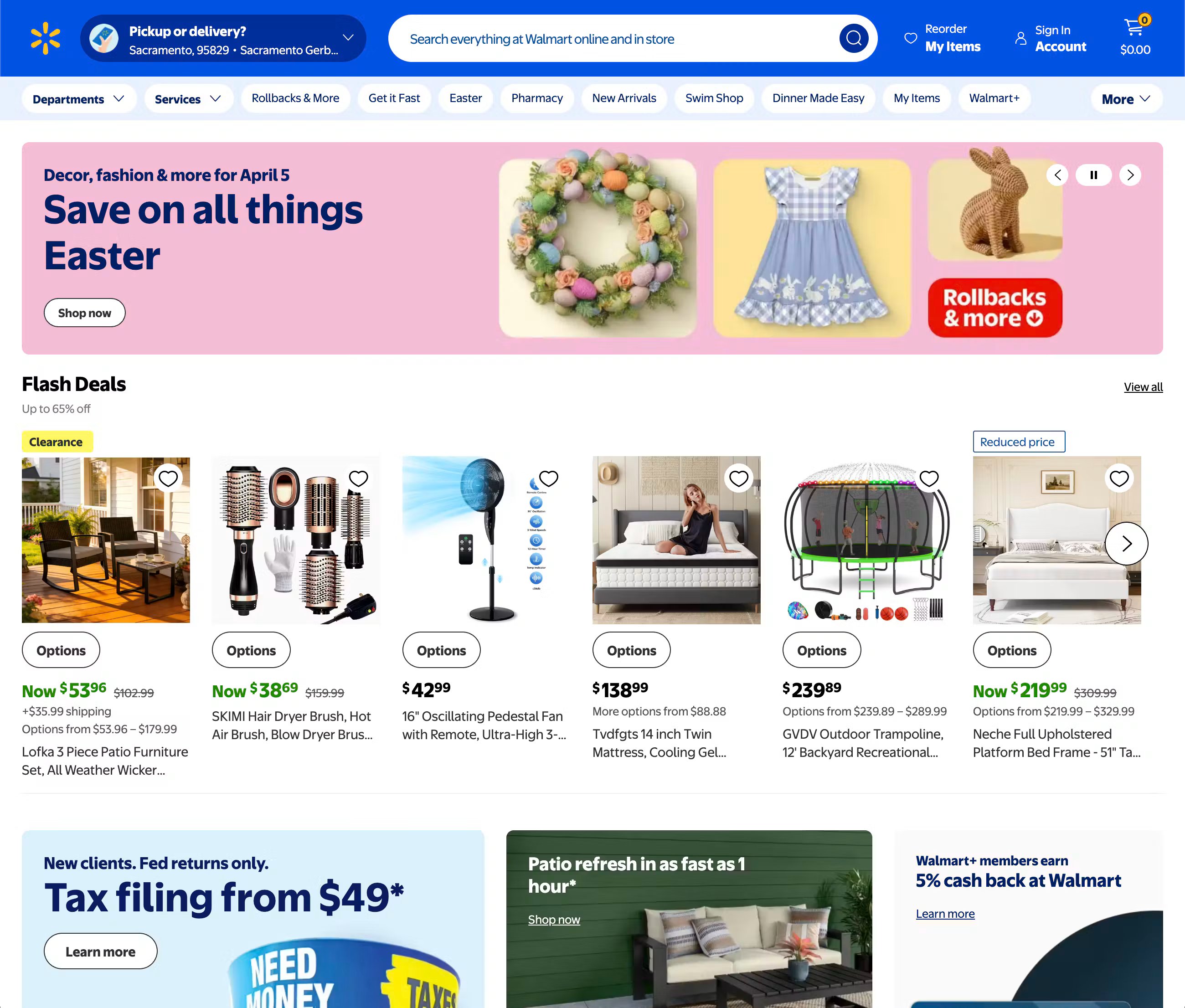
The search field is always visible in the header, typically spanning a significant portion of the header width. This is the most common style, particularly on large-catalog ecommerce sites where search is the primary navigation mode rather than a supplementary feature.
A persistent search bar signals immediately to the user that the site supports and encourages search-led browsing. Its prominent position indicates to users how they can find products.
Icon-triggered/expandable search

Some websites show a more minimalist search function, with a magnifying glass icon in the header that expands into a full input field when clicked or tapped. This can be common on sites where navigation is the primary browsing mode and search is secondary, or where header space is limited by other navigation elements. It’s also common on mobile websites, where space is limited due to the screen size.
However, use this with caution, as its reduced prominence can mean some users miss it altogether.
Full-screen overlay search
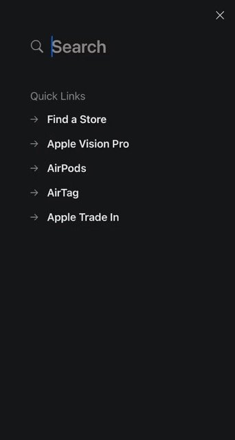
On some ecommerce sites, the search feature is more immersive. Activating the search field triggers a full-screen overlay containing the input and predictive results. This approach is popular on mobile and increasingly used on desktop for search-centric experiences, as it removes distractions and focuses the user’s attention on the search.
The overlay approach is particularly effective when predictive results include visual elements (like product thumbnails and category images) that benefit from more display space than a standard dropdown allows.
Uncover your biggest conversion blockers
Find tailored UX opportunities proven to improve usability and conversions, prioritized by impact.
Search with category scoping
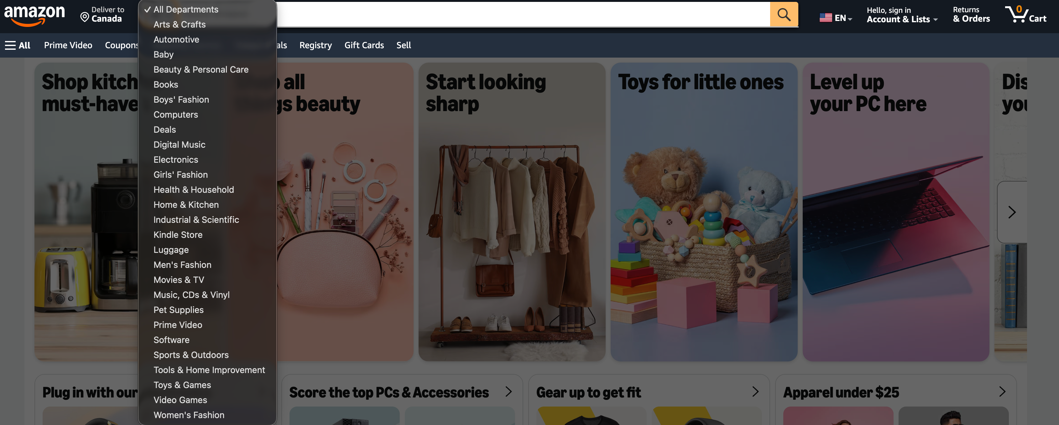
Some retailers allow users to instantly narrow their search to a particular product category. A dropdown immediately to the left of the search field allows users to restrict their query to a specific department or category before searching.
This can be a useful approach for sites with a very large product catalog, but should be avoided for smaller websites to prevent user friction caused by narrow search results.
3 search bar UX best practices for ecommerce
Looking to optimize your search experience? Here are three search bar UI best practices to follow.
1) Make the search bar prominent and easy to submit
Users shouldn’t have to hunt for search. If the field is visually muted or the submit action is unclear, users slow down on a very basic task before search has even begun.
If search is part of your product-finding strategy, the field needs to be prominent and clearly identifiable (especially on mobile).
Based on our research, you should:
- Make the search field look like an actual input, not a decorative header element
- Place a clear submit button next to the input field
- Avoid overcrowding it with competing UI components that reduce discoverability
2) Use autocomplete to help users form better queries
Autocomplete shouldn’t just be seen as a typing shortcut. Its real value is that it helps users perform better searches, avoid dead ends, and learn the site’s terminology.
The best search bars:
- Show keyword query suggestions, not just products
- Return suggestions quickly and predictably
- Keep suggestions relevant, non-redundant, and easy to scan
If you only show product suggestions, or your suggestions are confusing and laggy, users lose confidence fast. Baymard’s research finds that autocomplete works best when it guides query creation, rather than overwhelming users with a cluttered mini results page.
3) Let users refine searches instead of starting over
A good search bar keeps working after the first search. Users often iterate on queries several times, so clearing the field or making edits awkward creates unnecessary friction.
Based on our research, you should:
- Persist the query in the search field on the results page
- Make it easy to tap back into the field and edit
- Ensure the clear control doesn’t interfere with the query text
When the original query remains visible, users can quickly adjust one or two words instead of retyping from scratch.
Ecommerce-specific considerations for search bar UI
While search is commonplace across all website types, for ecommerce stores, there are some additional considerations that help users get the most out of the UI.
Searching and filtering should be complementary, not competing
Search and filter solve adjacent but distinct problems. Search handles known-item queries (e.g., “Nike Air Max 90”) and category-level queries (e.g., “men's running shoes”). Filters allow the user to refine within a result set — for example, narrowing by size, color, price, or brand after the initial query has been run.
The best ecommerce sites integrate the two harmoniously. Search results pages should expose the same filter and sort controls as category pages, so users can narrow a search result set exactly as they'd narrow a category or product listing page (PLP).
Search scope and catalog depth
Your store’s catalog size often dictates the website’s search behavior. On small-catalog sites, navigation is usually sufficient, and search is a convenience feature. But for sites with large product catalogs (such as tools, electronics, or fashion) and thousands of SKUs, search is often the primary discovery mechanism. Users would struggle to locate a specific product through navigation alone, so being able to quickly find it via the search bar becomes more important.
Design investment in search should therefore scale with catalog depth. A persistent, feature-rich search bar with strong predictive suggestions is the right default for a 10,000-SKU catalog. An icon-triggered expandable field may be adequate for a site with a couple of hundred products.
Product identifier search
On B2B, trade, and specialist retail websites, users often search by SKU, model number, or part number, rather than by product name. For example, a user who needs a specific replacement part doesn't want to browse categories; they want to enter the identifier they already have and land directly on the product.
The search bar's placeholder text should signal this capability: “Search by product name, brand, or part number.” The search backend needs to handle these queries accurately.
Search bar UI examples and design inspiration
If you’ve recognized the need to improve your search UX, here are some search field UI best practice examples to use as inspiration.
Grainger's prominent and easy-to-use mobile search bar
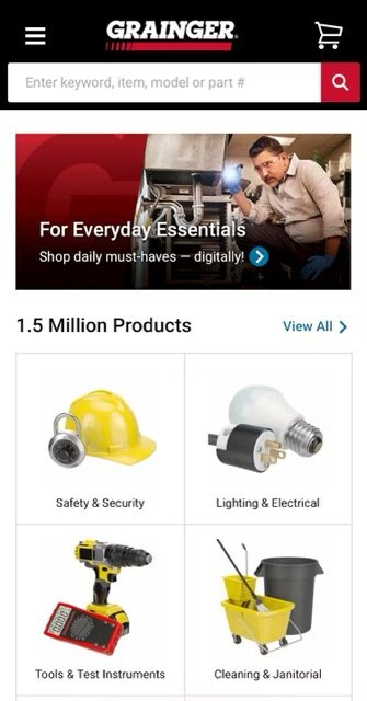
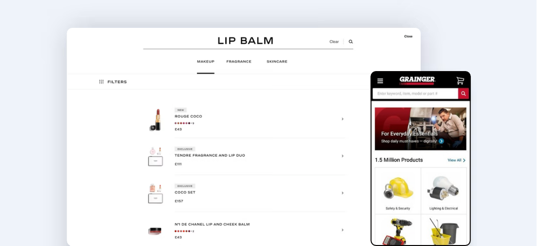
Grainger’s mobile shows a clearly visible search field, with relevant placeholder text that indicates the user can search by keyword, product name, or part number. This is particularly useful since the store contains 1.5 million products, and so search is a key part of the user’s website experience.
Thomann’s intelligent search autosuggest
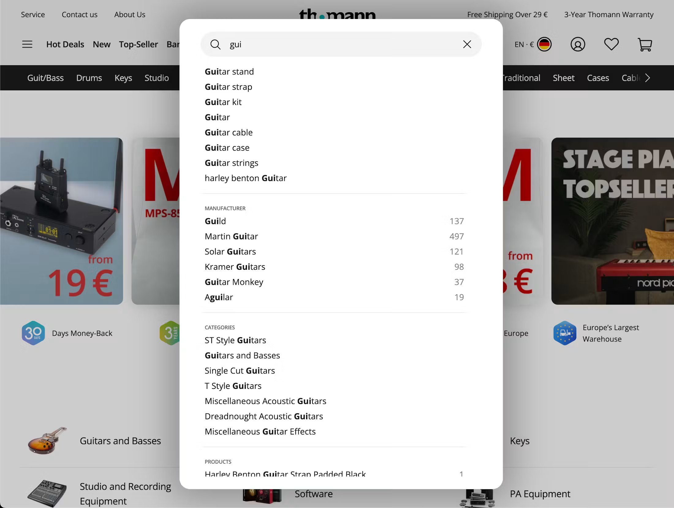
Thomann’s website shows a best-practice autocomplete implementation. When the user starts typing (in the example above, beginning the search for a guitar), the autosuggest triggers with relevant search terms. The autocomplete also displays relevant product names, manufacturers, and categories, allowing the user to further refine their search from within the search bar itself.
CHANEL’s persistent search query implementation
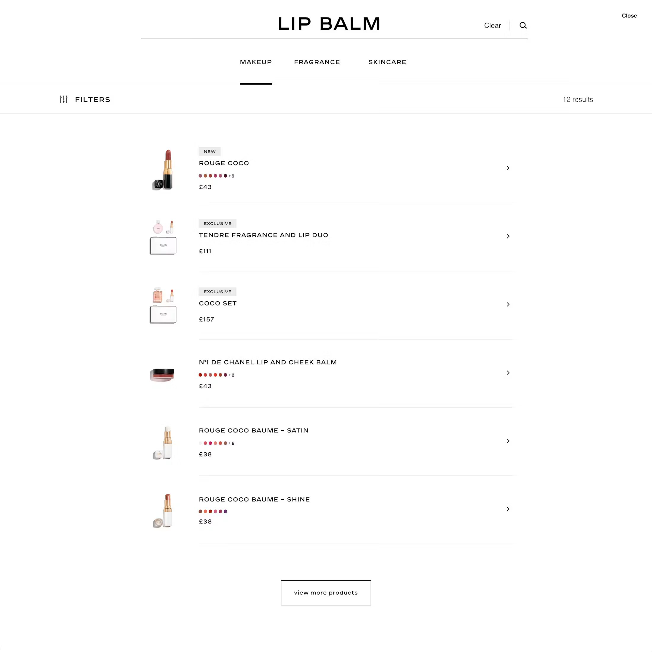
On the CHANEL website, the user’s search query remains in the search field even after the results are displayed. This makes it easier for the user to refine their search without having to retype all or part of the query.
Uncover your biggest conversion blockers
Find tailored UX opportunities proven to improve usability and conversions. Get a list of top UX improvements prioritized by impact and best-practice implementation examples.
Search bar UI: Frequently asked questions
What is a search bar in web design?
A search bar is a UI component that accepts text input and queries a site's content or product catalog in response. It typically consists of an input field, a search icon or submit button, and, often, a predictive suggestions dropdown that surfaces results as the user types. In ecommerce, the search bar is one of the primary mechanisms for product discovery, alongside navigation and filters.
Where should a search bar be placed on a website?
The header is the standard placement — it keeps the search bar visible and accessible at every point in the browsing experience. On mobile, the header should be sticky so the search field is reachable without scrolling back to the top of the page. The decision between a persistent visible input field and an icon-triggered expandable field depends on catalog size and how central search is to the site's discovery model. Large-catalog retailers should default to persistent; small-catalog or editorial sites can use icon-triggered.
What is predictive search in ecommerce?
Predictive search — also called autocomplete or search suggestions — surfaces matching products, categories, brands, or popular queries below the search input field as the user types, before they submit a search. Well-implemented predictive search reduces the number of keystrokes required to reach a result, surfaces relevant products the user might not have known to search for, and significantly reduces zero-results states by guiding users toward queries the catalog can fulfill.
Weekly UX Research, Insights, and Updates
Join 60,000+ UX professionals. Get the latest UX research, practical guides, and Baymard news delivered to your inbox every week.
Loading...
