How to Use Heuristic Evaluation to Find UX Issues Fast
A structured expert review helps identify key usability violations, prioritize friction points, and optimize user flows across your site.
Key takeaways
- Use ecommerce-specific heuristics to catch critical friction points that generic frameworks miss on checkout, product, and search pages
- Follow a structured multi-pass process by evaluating as a first-time user, testing error states, and combining findings from multiple reviewers
- Prioritize issues by user impact rather than fix difficulty, making sure to evaluate mobile experiences in dedicated sessions
Done well, a heuristic evaluation surfaces the majority of significant usability issues on your site and gives you a prioritized issue list that can drive your roadmap.
Here's how to run a heuristic evaluation that actually finds what's costing your site conversion — with a step-by-step process, ecommerce-specific guidance on where to focus, and the common mistakes that cause evaluators to miss the issues that matter most.
What is heuristic evaluation?
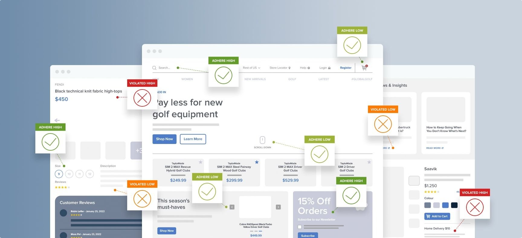
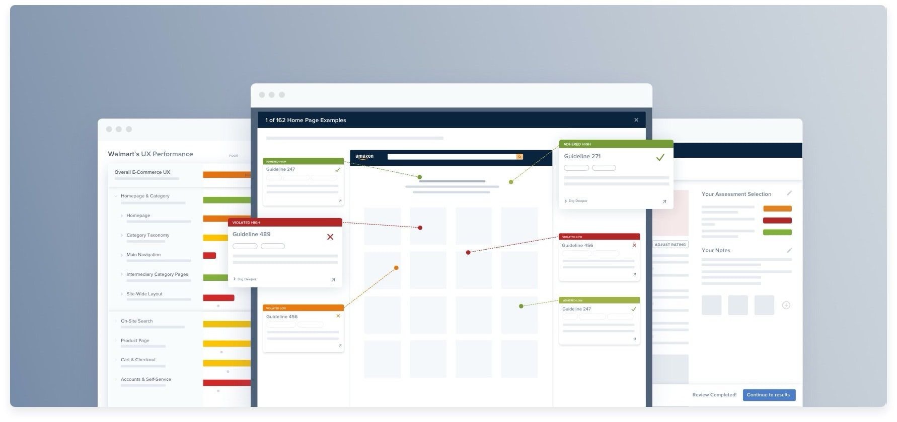
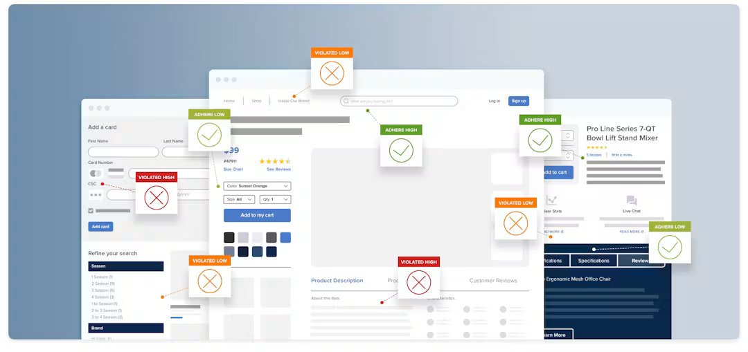
A heuristic evaluation is a structured expert review of a site or interface against a set of established usability principles (heuristics). One or more evaluators work independently through a defined scope, identify violations of those principles, and produce a list of findings with severity ratings.
What a heuristic evaluation isn’t
This arguably matters just as much. Here are some things a heuristic evaluation isn’t.
It's not a substitute for usability testing
Heuristic evaluation finds issues that violate established principles. Usability testing finds issues specific to how your users interact with your site. Both answer different questions.
A heuristic evaluation will surface a missing guest checkout option, which is a violation of established ecommerce standards. But it won't tell you that your specific audience finds your product photography insufficient and makes them hesitant to buy.
You need both user research methods to build a true picture of user behavior.
It's not an opinion review
“I don't like how this looks” is not a heuristic finding. ”The payment error message says ‘transaction failed’ without specifying whether the issue is the card number, expiry, or billing address — violating the error recovery heuristic” is.
The quality of a heuristic evaluation depends on the rigor of the guideline set used and the discipline of the evaluators applying it.
It's not a one-person job
Evaluations with three to five independent evaluators find significantly more issues than single-evaluator reviews. If you're a solo practitioner, run the evaluation independently and note this as a limitation when presenting findings. Ideally, find additional evaluators to run the same review and reduce missed issues.
Before you start: Scoping the evaluation
Here are some considerations when scoping your heuristic evaluation.
Define the scope
A full-site heuristic evaluation is rarely the right starting point. It can be too broad to be rigorous, and too time-consuming to complete in a single session without the quality degrading toward the end.
Instead, scope to a specific area: the checkout flow, the product page, the search and filtering experience, or the cart. Each deserves its own evaluation because the patterns and failure modes are different, and the heuristics most likely to surface findings differ between them.
If you're running your first evaluation, start with checkout. It's the highest-stakes flow, the most well-documented in terms of research standards, and the area where findings are most directly connected to conversion impact.
Select your evaluation framework
Your heuristics are your evaluation criteria. They determine what you look for and what counts as a finding — which means the framework you choose directly determines the quality of findings you produce.
Nielsen's 10 heuristics are a useful starting point, but they were designed for general software interfaces in the early 1990s, not for the specific flows and failure patterns of ecommerce. They won't tell you whether your checkout progress indicator is correctly implemented, whether your product filtering follows established patterns, or whether your payment error messages give users enough information to recover. For ecommerce, you need a more granular standard.
Baymard's guidelines cover 700+ ecommerce-specific UX patterns across checkout, product pages, search, navigation, and mobile — derived from 200,000+ hours of usability testing rather than theoretical principles. This helps you to identify the issues with the highest conversion impact.
Access research-backed UX guidelines
Make best-in-class design decisions and improve conversions with 200,000+ hours of validated, industry-specific UX research and benchmarks.
Set up your evaluation environment
Evaluate on the live site, not a prototype or staging environment. You need to see actual interaction behavior, real error states, and the edge cases that only appear in production.
Evaluate on desktop and mobile separately, not in the same session. Mobile-specific issues are often underrepresented in evaluations that treat mobile as an afterthought to a desktop UX review. Give each a dedicated session.
If you're using multiple evaluators, brief them independently before they share findings. Cross-contamination — where one evaluator's findings influence another's — reduces issue discovery. Independent evaluation, then consolidation, is the correct sequence.
Your step-by-step heuristic evaluation process
Work through the following process for each area you're evaluating. Take notes as you go — don't rely on memory. The value of a heuristic evaluation is in the documentation, not just the discovery.
Step 1: Walk through the flow as a first-time user
Before evaluating against heuristics, complete the flow yourself as a new user would — from entry point to completion, without skipping steps or using shortcuts you know from familiarity with the site.
Note your first impressions, including:
- Any moment of hesitation
- Anything that required extra thought
- Anything you had to look for
This first pass surfaces the most obvious issues and helps you build an accurate mental model of the flow before you evaluate it systematically. It also helps you notice the moments where your familiarity with the site lets you proceed more easily than a new user would.
Step 2: Walk through again, against your heuristics
On your second pass, explicitly evaluate each step against your guideline set. For each heuristic or guideline, ask
- Does this step violate this principle?
- Is there a specific UI element or interaction that fails to meet this standard?
Be specific in what you record. “The error handling is poor” is not a finding. “The payment error message says 'transaction failed' without specifying whether the issue is the card number, the expiry date, or the billing address — the user has no way to know which field to correct” is a finding. Specificity is what makes the evaluation actionable rather than directional.
Work through every heuristic for every step. Don't skip a heuristic because you don't expect a violation. The most common source of missed findings is an evaluator who limits their attention to the areas they already suspect are problematic.
Step 3: Document each finding consistently
Every finding should be documented with four elements, in the same format across your entire findings list:
- Location — Where on the site or flow the issue occurs. Be specific: “Payment step — card number field”, not “checkout”.
- Description — What the issue is, described objectively. Note what happens, and what's wrong with it.
- Heuristic violated — Which principle or guideline the issue violates. This is what distinguishes a finding from an observation.
- Severity rating — How serious the issue is (see step 4 below).
Use a spreadsheet rather than sticky notes or a running document. You need to be able to sort and filter findings by severity and by location so that you can easily prioritize.
Step 4: Rate the severity of each finding
Severity rating helps turn your heuristic evaluation into a prioritization tool rather than just an issue list. Use a consistent four-point scale:
| Rating | Definition | Action |
|---|---|---|
| Critical | Prevents task completion or causes significant user error. Directly impacts conversion. | Fix immediately |
| Major | Causes significant friction or confusion. High likelihood of abandonment or failure. | Fix before next release |
| Minor | Causes friction but users can work around it. Lower abandonment risk. | Fix when resources allow |
| Cosmetic | Violates a principle but has minimal real-world impact. | Address in a future design update |
Rate based on likely user impact, not your personal reaction to the issue, and not how easy the fix would be. When in doubt, rate higher. It's easier to downgrade a finding in a team review than to justify why a critical issue was rated minor.
Step 5: Consolidate findings across evaluators
If you're using multiple evaluators, collate individual findings lists before anyone discusses them. Sharing findings before consolidation creates anchoring — evaluators unconsciously adjust their ratings toward what others have found rather than reporting independently.
Compare the lists. Issues independently found by two or more evaluators can be considered reliable. Issues found by only one evaluator warrant discussion — some will be genuine findings the others missed, while others may reflect the individual evaluator's particular focus or expertise.
Resolve severity disagreements through discussion, defaulting to the higher rating unless there's a strong consensus for lower.
Heuristic evaluation for ecommerce: Where to focus
The following guidance applies specifically to ecommerce. These are the flows and areas where heuristic violations have the greatest impact on conversion, and where general heuristic frameworks are most likely to miss the specific issues that matter.
Checkout flow
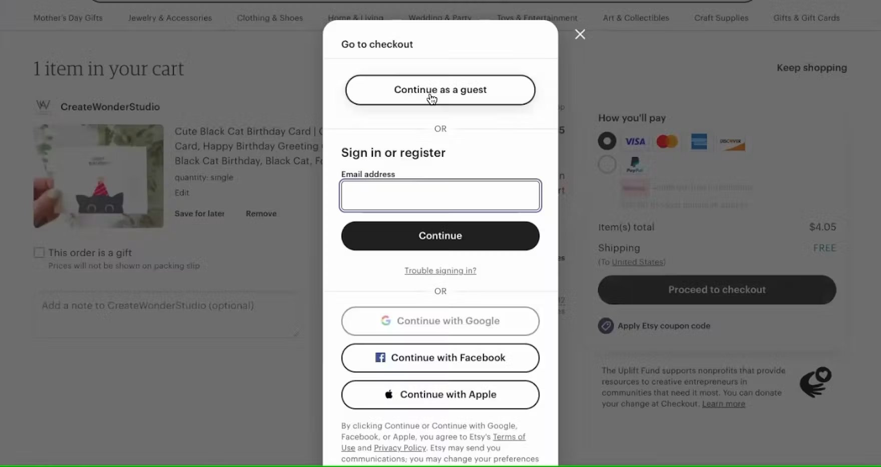
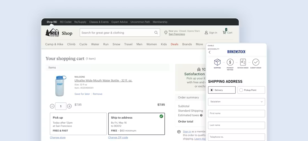
Checkout is the highest-stakes area of any ecommerce usability evaluation. Violations here have a direct, measurable impact on conversion. They're also well-documented in terms of research standards, making them straightforward to identify against a structured guideline set.
“With users so close to completing their purchase, it is almost unbearable to think about them leaving their cart because of an unnecessary barrier to checkout.”

Priority checkout flow heuristics
- Error prevention
- Error recovery
- Visibility of status (progress indicators)
- Call-to-action (CTA) copy and labeling
- User control and freedom
Common high-severity findings
- Missing or non-prominent guest checkout
- Payment errors that clear all entered form data
- Progress indicators that misrepresent the number of remaining steps
- Billing address that doesn't default to match shipping
62%
of sites fail to make “Guest Checkout” the most prominent option.
How to Audit Your Checkout Flow for Hidden Friction
Use this research-backed framework to find and fix hidden checkout friction.
Product pages

Product page UX is also a highly important area. Violations create the expectations gap that drives returns and reduces purchase confidence.
“The product page is the centerpiece of users’ product-purchasing decisions, as nearly all users go through product pages before deciding whether or not they’ll purchase an item.”

Priority product page heuristics
- Product information accuracy
- Presence of essential information (size guides, comparison tools, specification tables)
- Flexibility and ease of use (zoom, alternate image views)
Common high-severity findings
- Lack of relevant detail in product descriptions
- Insufficient or poor-quality product imagery
- Size guides that apply to a whole category rather than a specific product
- Delivery costs that are absent from the product page and only surfaced at checkout
40%
of shoppers say they've abandoned an online purchase at checkout because of extra charges like shipping, taxes, or fees.
Search and filtering
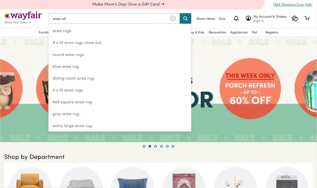
Search and filtering is a frequently under-evaluated area. Search UX violations often go undetected in heuristic evaluations because evaluators focus their attention on the conversion journey rather than the discovery experience. These are the issues that often appear only in edge cases (no-results states, unusual query types) that a friction-free evaluation never triggers.
“Poor-performing ecommerce Search leads to frustrating search experiences, time wasted refining queries, and abandonments as users are unable to find products they’re looking for.”
Priority search and filtering heuristics
- Error recovery (no-results handling and search failure states)
- User control and freedom (filter removal, result sorting)
- Visibility of search scope (results count, active filter indicators)
Common high-severity findings
- No-results pages with no recovery path or alternative suggestions
- Search logic that doesn’t support product type or attribute searches
- Key filters (like size, color, price) are missing
- Result counts that don't update when filters are applied
68%
of ecommerce sites have a “No Results Page” implementation that is essentially a dead-end for users.
Mobile experience

Mobile-specific UX violations are often underrepresented in heuristic evaluations, which are conducted primarily on desktop. Conduct a separate mobile evaluation pass for each flow and treat it as a distinct evaluation, not a quick spot-check at the end of a desktop session.
“Our extensive mobile research indicates that an average site will fail at some point to meet a user’s UX needs.”
Priority mobile heuristics
- Error prevention (correct keyboard types, tap target size)
- Visibility of system status (CTA button visibility without scrolling)
- Flexibility and efficiency of use (form field autocomplete, address lookup)
Common high-severity findings
- Hidden or missing mobile search
- Long single pages causing key CTAs and information to be pushed below the fold
- Difficult-to-complete mobile forms at checkout
- Intrusive modals and overlays
- Controls with tap targets too small for reliable touch interaction
75%
of mobile ecommerce sites are only “Mediocre” according to Baymard’s large-scale usability testing.
Common mistakes in heuristic evaluation (and how to avoid them)
These are some common oversights that cause heuristic evaluations to miss the issues that have the greatest conversion impact.
Using too few heuristics
Evaluating against 10-20 broad, generic heuristics on an ecommerce site misses most ecommerce-specific issues. The heuristics are too general to surface checkout-specific violations, product page failures, or mobile interaction problems.
Use a more granular, ecommerce-specific guideline set. This is what determines the quality of your findings, not the rigor of your evaluation process.
Evaluating only the successful path
Most evaluators walk through the ideal user journey; correct inputs, no errors, no edge cases.
However, many heuristic violations occur in error states, edge cases, and recovery paths. For example:
- What happens when the postcode lookup fails?
- How is a declined payment handled?
- What is shown when a product is out of stock?
- What does the user see when a coupon code is invalid?
Deliberately trigger these failures and errors during your evaluation. If you can't trigger them naturally, note them as untested areas in your findings.
Rating issues based on how easy they are to fix (rather than their impact)
Just because an issue is deemed difficult to fix, doesn’t mean it should be rated lower. A critical issue that takes three sprints to fix is still critical. Severity rating should reflect user impact.
Development effort is a separate consideration that belongs in the prioritization conversation, not the evaluation itself. Conflating the two produces a list of findings that's optimized for delivery convenience rather than user impact.
Skipping a mobile-specific review
Many violations only appear on smaller screens and mobile devices with touch interaction, or with mobile-specific keyboard behavior. They're often invisible on desktop and obvious the moment you pick up a phone. Always conduct a separate mobile pass.
Not documenting findings consistently
An issue list without locations, descriptions, violated heuristics, and severity ratings is hard to act on and impossible to track over time. Consistent documentation is what separates a heuristic evaluation from an informal design review. It ensures your findings are usable in a stakeholder conversation once the evaluation is complete.
Your evaluation is only as good as the heuristics behind it
The process above gives you the method. But the quality of a heuristic evaluation depends on the rigor of the guidelines you evaluate against.
For ecommerce organizations, the evaluation framework that finds the issues with the highest conversion impact is one grounded in ecommerce-specific usability research.
Baymard’s UX Intelligence platform includes 700+ research-backed ecommerce UX guidelines covering checkout, product pages, search, navigation, mobile, and more. This gives you and your team a structured heuristic evaluation framework built from 200,000+ hours of ecommerce usability testing.
Remove the guesswork from UX design
Make best-in-class design decisions and improve conversions with 200,000+ hours of validated, industry-specific UX research and benchmarks.