UX Audit Checklist & Template Framework for Designers
Identifying friction is only half the battle. Discover how to document, prioritize, and build a business case for UX fixes using Baymard's research-backed audit framework.
Key takeaways
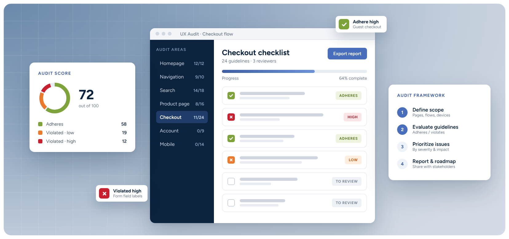
- Audit the end-to-end shopping journey
- Prioritize issues by severity, frequency, and importance
- Build a revenue-backed business case
A UX checklist is a great place to start when evaluating your site’s performance. But without a follow-up plan, it’s little more than a list of observations. It essentially tells you what to look for, then leaves you on your own the moment you find something.
That's where most UX audits fail.
Say you identify a problem with the guest checkout flow. Now what?
How do you write it up so a colleague can reproduce it? How do you rank it against the other issues you found? How do you convince a product director it deserves a sprint? And how will anyone agree on what “fixed” looks like?
Your audit checklist tells you where to look. It’s what you do with that list that’s important.
This article covers both parts. First, you’ll find a five-section checkout UX audit checklist, built on patterns observed in Baymard's ecommerce usability research. Then, a practical framework for what comes next: documenting findings, prioritizing them, building a business case, and measuring the result.
The checklist covers the full shopping journey, from homepage and product discovery through to checkout.
Where to focus first
A full ecommerce UX audit covers every stage of the journey. Problems anywhere can lose a sale. A shopper who can't find the right category never reaches a product page. A shopper who can't tell whether a jacket will fit never adds it to the cart.
Checkout is the highest-intent step in the conversion funnel because users who get this far have already decided to buy. When the user experience falls short here, you lose customers who are ready to convert.
70.22%
average documented online shopping cart abandonment rate
Baymard's research puts the average documented cart abandonment rate at 70.22%, but not all of these abandonments are caused by fixable UX problems; some are just natural browsing behavior.
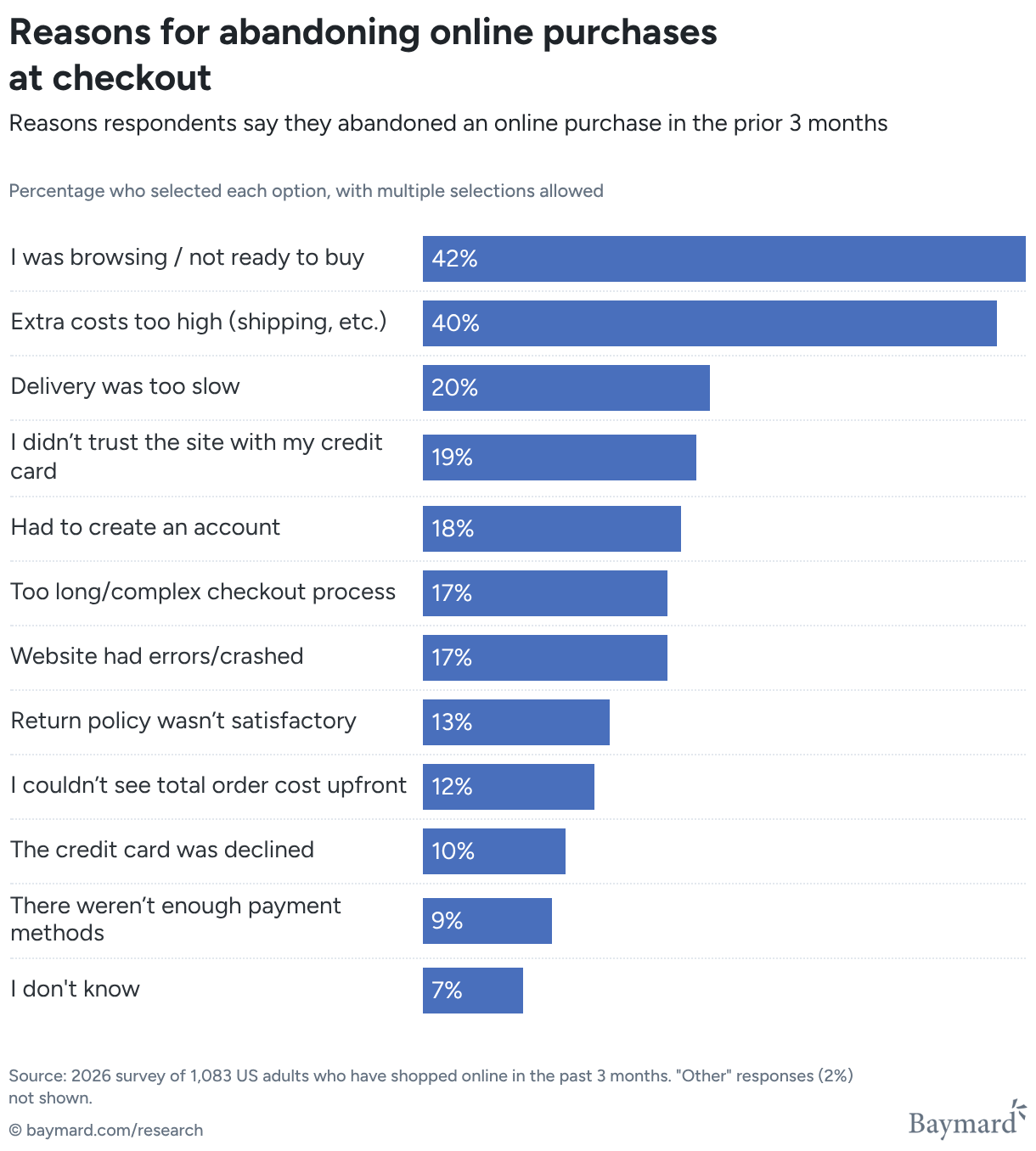
The interesting part is why users abandon. Baymard's data shows 42% of US shoppers have abandoned a cart because they simply weren't ready to buy. You can’t design your way around that.
But there are several UX issues that are fixable, such as:
- Unexpected costs at order confirmation
- Forced account creation
- Long or complicated flows
- Missing payment methods
These are all UX and design issues that your checkout audit should focus on. Prioritizing fixing these issues can help you reduce cart abandonment and enable you to recover revenue.
The ecommerce UX audit checklist: 5 areas to review
The checklist below follows the shopping journey, from when a user first lands on your site to completing their order. It also includes a dedicated mobile pass, which is a step you shouldn’t skip.
Each of these areas follows key areas that Baymard's research has observed as causing friction in our large-scale usability testing over 15+ years.
For every item, record whether it’s a “pass”, “issue”, or “not tested” if the area is not applicable for your site.
Note: “Not tested” is important as it stops gaps in your review from being mistaken for passes.
Ground your audit in established, data-backed standards to add weight to your observations and recommendations.
1. Homepage and navigation
What to audit: Whether shoppers can understand what you sell, find the right area of your product catalog, and narrow down to relevant products quickly by browsing or searching.
Homepage and category taxonomy
- Is it clear within a few seconds what the site sells and who it's for?
- Do navigation labels use the words customers use, rather than internal merchandising terms?
- Does the category structure match how shoppers think about your products?
- Can shoppers move between major areas of the site without losing their place?
Search
- Is the search field easy to find on every page, including on mobile?
- Do autocomplete suggestions help shoppers reach products and categories faster?
- Does search handle misspellings, synonyms, and product codes or model numbers?
- When a search returns no results, does the page suggest a way forward rather than a dead end?
Filters
- Do filters reflect the attributes shoppers actually use to choose between products?
- Are result counts shown, so shoppers can avoid selections that lead to zero results?
- Can shoppers remove a single filter without resetting all the others?
64%
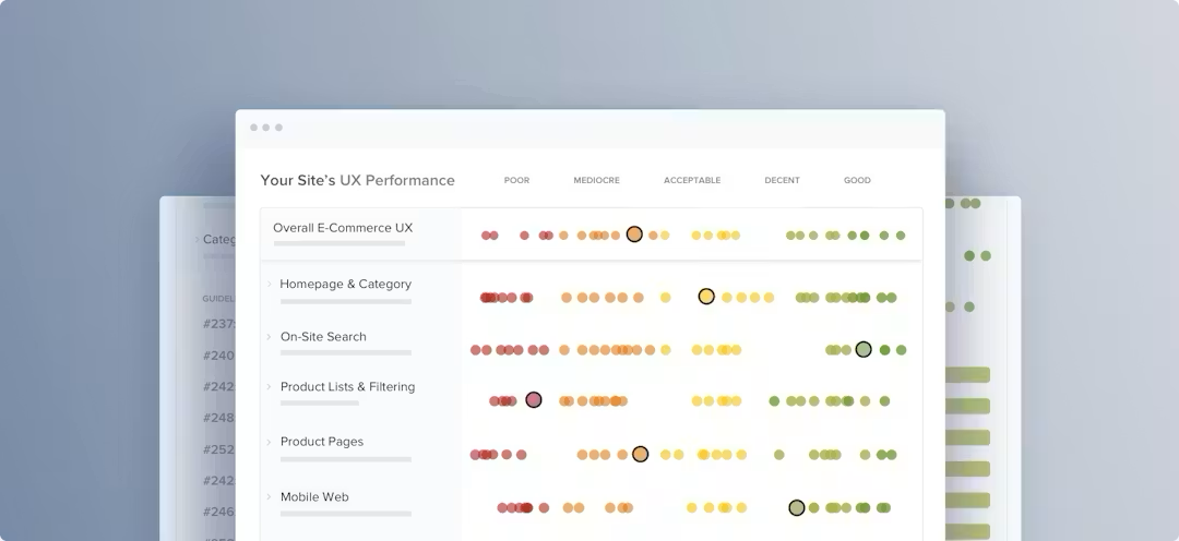
of websites have a mediocre-to-poor homepage and category navigation UX performance, making this a key area for improvement.
2. Product lists
What to audit: Whether shoppers can scan, compare, and shortlist products efficiently, without having to click into every product page to get basic information.
- Does each product card show what shoppers need to decide whether to click (such as name, price, rating, and key variants such as colors)?
- Are product images consistent in style, crop, and background, so the list is easy to scan?
- Are applied filters visible above the results, with a clear result count?
- Are sort options available and clearly labeled?
- When shoppers return from a product page, does the list keep their scroll position and filters?
- Are badges such as “New” or “Sale” used sparingly enough to stand out?
Shoppers typically scan product listing pages (PLPs), rather than reading them line-by-line. Without adequate information available during that scanning process, you risk the user abandoning and shopping elsewhere.
48%
of desktop ecommerce sites have a “decent” or “good” Product Page UX performance
38%
of mobile sites have a “decent” or “good” Product Page UX performance
3. Product pages
What to audit: Whether product pages give shoppers enough accurate information to buy with confidence, and to buy the right thing.
“Nearly all users go through a product page before making any purchase, and it’s often on the product page where users make up their mind on whether or not they want to purchase the item. This makes the product page the centerpiece of your users’ ecommerce experience.”

Do images show the product from enough angles, with zoom and close-up detail where texture or finish matters?
- Does the description answer the questions a shopper would ask if they could handle the product in a store?
- Is size, fit, or specification information specific to this product, rather than a generic category chart?
- Are delivery estimates and the returns policy visible on the product page, not only revealed at checkout?
- Are reviews easy to find and easy to assess, with useful sorting or filtering?
- If a shopper adds to cart without choosing a required variant, is the error clear and close to the selection?
Product page issues don't only cost conversions; inadequate information can also lead to high return rates. A shopper who buys based on incomplete information is more likely to send the item back when it doesn't meet their expectations.
4. Checkout
What to audit: Whether shoppers who have decided to buy can complete their order without unnecessary effort, confusion, or doubt.
“With users so close to completing their purchase, it is almost unbearable to think about them leaving their cart because of an unnecessary barrier to checkout.”

Flow and forms
- Is a progress indicator visible, and does it reflect how the shopper experiences the flow?
- Can shoppers go back a step without losing what they've entered?
- Are optional fields clearly marked, or removed if they serve no operational purpose?
- Are inline validation errors specific about what went wrong and how to fix it?
- Does the billing address default to match shipping?
Guest checkout
- Is guest checkout genuinely prominent, not buried below sign-in fields?
- Is account creation deferred until after purchase?
- Does a button that promises guest access avoid leading to mandatory password creation?
Payment and trust
- Are accepted payment methods shown before the payment step?
- Is card type detected automatically from the card number?
- Can shoppers tell whether a payment error is a mistyped number, a wrong CVV, or a declined card?
- Are security indicators near the payment form, and is the order summary visible on the payment step?
If you only have time to review one area properly, start with a checkout UX audit. It's where the most severe UX issues are found (since they tie directly to cart abandonment), and where the business case for fixing them is easiest to tie back to revenue.
Checkout UX Guide
Optimize your ecommerce order flow with research-backed insights
5. Mobile
What to audit: Whether the whole journey works on a smartphone. Consider things like one-handed browsing, the keyboard open and appearance, error correction, and returns from third-party payment providers.
- Are tap targets large enough throughout, including filter controls, variant selectors, and edit links?
- Is search easy to reach, and does the filter panel work well as a drawer or overlay?
- Do form fields trigger the right keyboard? Numeric for card numbers, email keyboard for email fields?
- Are primary CTAs, such as “Add to cart” and “Place order”, visible without scrolling at key steps?
- Do sticky headers or banners leave enough screen space for the content shoppers came to see?
- Can every modal and overlay be closed easily?
Note: Treat mobile as a separate pass, not a quick check at the end of a desktop review.
75%
of mobile ecommerce sites’ performance is only “Mediocre”
What to do with your findings
Working through this checklist will give you a list of observations and UX friction points, but it needs more context to be turned into an actionable audit that drives your design and development roadmap.
Here's how to make that step.
Write up each issue effectively
When recording your observations, make it simple for a colleague to replicate. Each finding should be reproducible. For each issue, record:
- Context: the page, device, browser, and type of shopper affected
- Steps: exactly what you did, in order
- Observed behavior: what happened, described in plain language
- Customer consequence: what this means for the shopper trying to buy
- Proposed change and acceptance criteria: what should change, and how you'll measure the fix
Prioritize by severity, frequency, and importance
Not every issue is equally damaging. Some create friction, causing users to stop and become frustrated, while others cause shoppers to abandon the site completely.
Prioritization is key in defining which issues to fix first. But it should be done on an agreed framework.
The easiest way to do this is to define importance by combining the severity of an issue with its frequency.
| Rating | What it measures | How to record it |
|---|---|---|
| Severity | How damaging the issue is for a shopper who hits it | Interruption (the shopper is briefly interrupted), Disruptive (the shopper comes to a full stop and has to resolve the issue), Harmful (the shopper can't complete their task, and often abandons the site) |
| Frequency | How many of your shoppers are likely to run into the issue | A few, several, most, nearly all, or all |
| Importance | Severity and frequency combined into one overall rating | Essential (direct roadblocks that most shoppers are likely to hit), Impactful (real friction for a meaningful share of shoppers), Detail (minor friction on its own) |
When it comes to developing fixes, start with the essential issues, as these are often direct roadblocks to purchase. But don't dismiss the details. Individually, they're unlikely to cause abandonment, but collectively, they add up to a high-friction experience.
Once you know how important an issue is, weigh that against the cost of fixing it. Teams that prioritize this way tend to see the best return on their investment.
How to Present UX Research Findings to Get Buy-In From Stakeholders
Firsthand insights from Baymard’s experienced UX team.
Build a business case tied to revenue and ROI
Stakeholders are more likely to provide resources and budget when your recommendations are delivered in revenue terms.
“When you frame UX decisions in the context of business decisions and how they impact the business, it's easier to push things through.”

Use this simple formula to build an estimate:
Affected sessions × expected conversion lift × average order value = estimated monthly revenue impact
To make the impact more credible, scope it to the affected segment. If an issue only affects mobile shoppers filtering a single category, model the estimate on that segment, rather than inflating the impact across the whole site (which can lead to unrealistic expectations).
Also show a range, rather than a single number. Model a conservative, mid-range, and optimistic lift. This encourages discussion and a ballpark, whereas a single number can build doubt.
The Hidden Cost of Bad UX
How much revenue is your site losing each month because of unnecessary UX friction? Find out what you could recover with Baymard's Opportunity Sizing Calculator.
Measuring the results
It’s important to decide how you'll judge success before you ship the fix. Record this information:
- Hypothesis: what you expect to change, and why
- Segment: which sessions/pages are being measured (e.g. mobile only, or product listing page filters)
- Decision: decide what result will lead to a “keep”, “roll back”, or “keep watching” decision
Setting these first means you have clear criteria to measure the result from.
Note: Low traffic is a common problem with focused fixes. If an issue affects a small segment, you may never get a statistically precise answer. In that case, be explicit about it. Combine directional data with qualitative evidence, such as fewer support tickets or a clean re-test on the original devices.
When to go beyond a self-directed audit
A self-directed audit using this checklist and Baymard’s guideline library is a great way to quickly identify and fix user friction points. Many ecommerce UX teams use it to keep ongoing visibility of UX performance between major reviews.
There are situations, though, where an expert-led UX audit will surface findings that a self-directed review may miss, because:
- Your team is too close to the product to see what a first-time user would struggle with
- Your findings need to carry weight with C-suite or board-level stakeholders, whereas external findings are harder to dismiss as internal advocacy
- You’re unsure how your site compares to your competitors and other leading ecommerce websites
Baymard's UX Audit Service can cover your full site or be scoped to a specific area such as checkout. It delivers prioritized findings with severity ratings and benchmark context, plus a roadmap your team can take straight into sprint planning.
Up to 5%
conversion lift seen by Baymard audit customers from Baymard suggestions.
Discover the top 40 UX improvements for your site and see how you stack up against your closest competitors.
Turn observations into decisions that move the needle
A checklist tells you where to look. What really makes an impact is using that checklist to record findings so others can reproduce them, ranking them on agreed criteria, putting honest numbers behind them, and deciding in advance how you'll know they're fixed.
Do those four things, and a list of observations becomes a backlog your team can act on and a case your stakeholders can approve.
Baymard provides 700+ research-backed UX guidelines and benchmark data across 330+ leading ecommerce sites, from 200,000+ hours of usability testing. This helps you review and audit your site to identify the friction points costing you conversions and revenue.
UX audit checklist FAQs
What is a UX checklist?
A UX checklist is a structured list of user experience criteria used to evaluate a website or app. Each item describes a pattern or standard to check, such as whether error messages are specific or whether guest checkout is available. The most useful checklists are grounded in usability research rather than general design opinion.
What should a website UX audit checklist include?
A website UX audit checklist should follow the full user journey. For ecommerce, that means homepage and navigation (including search and filters), product lists, product pages, and checkout, followed by a separate pass on mobile. Checkout deserves the most scrutiny, since it's where shoppers who have already decided to buy are most likely to be lost.
What is the difference between a UX checklist and a UX audit?
A UX checklist tells you what to look for. A UX audit is the full process of finding, documenting, prioritizing, and acting on issues. A completed checklist gives you pass or fail observations. An audit turns those observations into reproducible findings, rates them by severity and frequency, and connects them to a business case your stakeholders can act on.
Weekly UX Research, Insights, and Updates
Join 60,000+ UX professionals. Get the latest UX research, practical guides, and Baymard news delivered to your inbox every week.
Loading...