Key Takeaways
- Sites often bungle their chance to retain users as they check out
- This can lead to missed additional purchases and users who never return
- This article offers 4 proven ways to retain users in the areas of account creation UX and user-created product photos
Key Stats
- 54% of sites don’t wait until the purchase confirmation step to give users the option to create an account
- 57% of sites don’t provide compelling benefits for creating an account at their site
- 69% of sites don’t include social media visuals on their product pages
In post-checkout UX, the goal for many ecommerce sites is to retain and engage users after their initial purchase.
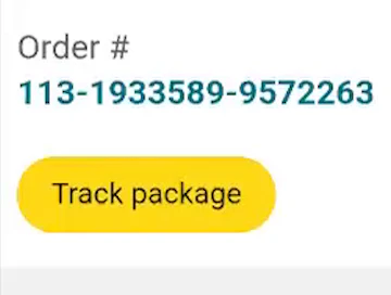
For example, some sites include order tracking directly on their site so that users return to check the status of their package (and hopefully find something else that they want while there).
This kind of repeated visit can ultimately produce a lifelong user, and so post-checkout UX opportunities like this should not be ignored.
In this article, we’ll dive into Baymard’s research findings to identify two opportunity areas for easy wins in post-checkout UX: account creation and user-created product photos.
These areas provide easy wins because they simply make it easier for users who want to continue engaging with the site post-checkout.
Yet our ecommerce UX benchmark shows that 69% of sites don’t do 1 or more of the following 4 best practices, missing out on opportunities to further engage with users.
This article describes 4 ways to improve the post-checkout UX:
- The most effective time to encourage users to create accounts
- The best way to present the value of account creation to users
- The reasons why users should be encouraged to upload images with their reviews
- The logic and method for integrating social media images into ecommerce UX
1) Save Account Creation for the Confirmation Step (54% Don’t)

Here at the start of Dunelm’s mobile checkout flow, users are asked to create an account, sign into their account, or check out as a guest. Inviting users to create an account so early can derail users’ checkouts.

At the start of their desktop checkout flow, JCPenney asks users if they want to check out as a guest or as an account holder, or to create an account. This complicates the checkout by adding decisions to make and blank fields to fill out, potentially disrupting the user’s progress.
During Baymard’s large-scale testing, most participants explained that they are likely to create accounts at sites they repeatedly visit, and in practice having an account at a site saves users time and makes checking out more efficient.
But interrupting all guest users to suggest they create an account too early — before or in the middle of the checkout process — caused some participants to halt their progression through checkout.
In other words, creating an account at the beginning of checkout (at the account selection step) was perceived by many participants to be a significant burden.
Making the problem worse, some users will consequently associate the majority of the form fields in the checkout flow with account creation rather than recognizing them as standard checkout fields they would have to complete regardless of whether they create an account or check out as a guest.


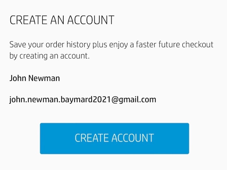
Neiman Marcus (first image) and Crate & Barrel (second image) allow users to create an account after their checkout is complete, when users are easily incentivized to do so and the risk of disrupting the checkout has passed.
To keep users focused on the primary goal — getting through the checkout process — save the option to create an account until after checkout is complete.
In testing, this implementation performed better than presenting the invitation at either the start or the middle of the checkout process.
By saving account creation for the confirmation step, users don’t have to evaluate the pros and cons of creating an account before they’ve finalized their order — instead, they can proceed with completing their purchase.
In practice, any opportunity to delay users’ choices until after the order has been placed creates a checkout flow that is easier to complete — and, more importantly, feels easier to complete for the end user.
Saving account creation for the confirmation step may also increase users’ willingness to create an account, as users are less likely to associate the bulk of checkout fields — such as address and payment information — with account creation, as they will already have completed them as part of the guest checkout process.
Consequently, creating an account will then only consist of creating a password — and all of the guest user’s information can be automatically saved for the next time they return.
In effect, sites that don’t invite guest users to create an account following checkout miss a key opportunity to entice users to sign up.
2) Always Provide the Benefits of Creating an Account (57% Don’t)

ASOS does not mention any benefits that come from creating an account with them.


Zalando and Urban Outfitters here do not provide substantial reasons for users to take the steps involved in creating an account.
Unfortunately, even if sites pick the right time to encourage users to create an account, it’s not enough to simply provide a password field and a message saying, “Create an account for faster checkout next time”.
In general, we’ve observed that most participants need more convincing to create yet another ecommerce account.
And the specific reasons matter — mentioning vague or unexplained “benefits” of account creation can be nearly as detrimental as not mentioning any benefits at all.
In testing, this was especially the case for sites that highlighted unique incentives such as rewards programs without explaining what the rewards actually are and how to redeem them.
Essentially, users are likely to be unconvinced to create an account when the benefits presented appear too vague or not enticing enough to be worthwhile.

After completing checkout at L.L. Bean, users are succinctly given a few reasons why creating an account could be worth their time, and are invited to create an account.

Likewise, the benefits of account creation are provided at Macy’s. In testing, eye-catching graphics like these seen here were particularly attractive to participants.
In testing, we’ve observed that participants positively responded to a variety of featured account benefits.
Foremost, users often appreciate that having an account will save them from having to retype data when they visit the site again, especially in mobile ecommerce UX, where typing issues and typing fatigue are frequent problems.
Another standard benefit that sites can highlight is registered users’ comprehensive access to past order details and tracking, allowing them to easily monitor order status.
“I find it really convenient, for electronics, that I can log in and see when I bought it if something breaks…and if it is something you frequently buy, then it is nice that you can go in and place the order again”.
As one participant shared, “I find it really convenient, for electronics, that I can log in and see when I bought it if something breaks…and if it is something you frequently buy, then it is nice that you can go in and place the order again”.
For visual implementation, we observed that bulleted lists and eye-catching graphics often performed better at capturing participants’ attention than simple lines of text, which tended to be quickly scanned and risk being skipped entirely.
Providing the benefits of creating an account is a “low-cost” UX opportunity: a few lines of text can result in more registered — and loyal — users.
3) Encourage Users to Submit Photos with Reviews

Swanson Vitamins does not provide the user with an option to upload a photo along with their review, which is a lost opportunity to capture and showcase the “real world” photos that our test participants have said they value.


Neither Costco (first image) nor Tesco (second image) allow users to upload photos along with their reviews. This is a wasted opportunity — users value photos of products “in the wild” (rather than just in professional photos) and a site’s review submission page is a natural place for past buyers to submit them.
Product images are essential for evaluating an item, and users increasingly seek user-submitted content to build confidence that a product meets their needs.
During testing, we’ve found that images submitted by users after their purchase often provide crucial details missing from a site’s standard images, such as how a makeup shade looks on different skin tones or creative styling ideas for clothing and decor.
Users often find user-submitted product images more objective, reliable, and trustworthy than site-provided ones, which can seem overly polished or enhanced.
Past buyers tend to share a range of both negative and positive experiences, while site images tend to focus on only the positives.

Neiman Marcus allows users to upload photos or videos when they submit their review. In testing, participants found these photos helpful in understanding the real-world appearance of products.

At Urban Outfitter's, reviewers are encouraged to submit up to six images with introductory text explaining that people find them “more helpful than text alone”.
Thus user-submitted product images serve as social proof that allows users to view products in real-life settings, assess size and scale, and uncover unexpected details — boosting confidence in their purchase.
To support this, actively request images in the review form, and encourage uploads of one or more photos.
Oh, see this reviewer has pictures! That’s cool, because now I see what it looks like on her, and she’s 5’1”. You know this model’s probably not 5’1”. I really like the pictures. (Participant, Product Finding study)
Furthermore, making reviewer-submitted images easy to find and simple to navigate reinforces their value and can motivate others to share their experiences too.
4) Add Social Media Visuals to the Product Page (69% Don’t)

Gilt does not integrate social media visuals into its product pages, and some users will be turned off when the only available images of the product are in staged, professional photos.

McGee & Co. do not provide users with social media visuals of their products, disregarding users who want to see products in the context of real rooms.
Alongside review images, incorporating social media photos can further boost buyer confidence.
Some users seek inspiration for styling or want to confirm a design idea they have in mind, and social media images offer an authentic look at specific product attributes that may not be fully captured in brand-provided photos.
In testing, participants were eager to see social media images from past buyers of the product they were considering, since each social media image represents a unique and verifiable instance of a real person buying and using a product.
Thus the mere presence of social media images is a positive signal in itself separate from the image contents or composition.
Users expect to see social media content on the product page as a category of visual information in its own right, distinct from both site-provided and reviewer-submitted images, even as they serve overlapping roles.
When that insight is missing from the product page, some users will struggle to be fully confident in the product, and a subset will not feel comfortable purchasing without first leaving the site to seek them out.

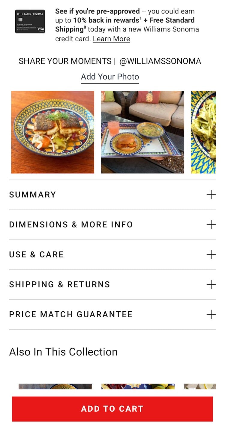
Both IKEA (first image) and Williams Sonoma (second image) curate photos from users who have uploaded them to their brand’s Instagram accounts, helping users decide whether the products are suitable.
To give users ample “visual social proof” from real users, sites should curate social media images from platforms like Instagram and integrate them on their product pages.
In terms of implementation, users respond well when social media images link to a larger, “shoppable” version of the image that provides links or other direct access to the products featured.
Sites can further improve the user experience by using labels to reference the original post or platform the image is sourced from, or to denote whether the posting is a promotion.
Sites are cautioned here not to include many social media posts from paid sources, since an abundance of “paid promotion” posts will diminish the feeling of authenticity the images are meant to convey.
Social media is the preferred source of product information for many users, and the place where many buyer journeys begin, so incorporating this content on the product page is increasingly important.
Sites will need to adapt as the relevance of different social media platforms and content formats shifts over time, but at minimum, embedding images or videos from these platforms relevant to the product in question reduces the likelihood of users leaving the site to seek them out.
Retain Users by Engaging Them Post-Checkout

At the French site La Redoute, Instagram posts that show their products are prominently featured on the product page, which lets users see the clothing in use by real people.
Mastering post-checkout UX requires sites to understand the unique willingness to engage with a site late in checkout and at certain points after checkout is complete.
As users finishing buying a product, their curiosity about when it will arrive can motivate them to stay engaged with the site through creating an account to more easily track its delivery.
Later, users form their in-person opinion of the delivered product, and sites can encourage users to provide reviews with photos or to share their commentary of the product over social media, which has a special significance for users when used on product pages.
All of this engagement means more attention to a site and its products.
What’s more, we have tested, effective tools for encouraging that engagement and increasing the potential that users who check out will become users who check back in:
- Save account creation for the confirmation step (54% Don’t)
- Always provide the benefits of creating an account (57% Don’t)
- Encourage users to submit photos with reviews
- Add social media visuals to the product page (69% Don’t)
While not all users will end up creating an account or providing reviews or social media visuals, adopting these 4 tools for engagement will encourage some users to do so — providing a site with more registered users and additional valuable content.
This article presents the research findings from just a few of the 700+ UX guidelines in Baymard – get full access to learn how to create a “State of the Art” ecommerce user experience.
If you want to know how your desktop site, mobile site, or app performs and compares, then learn more about getting Baymard to conduct a UX Audit of your site or app.