At Baymard, we’ve just released a new UX benchmark with 10 “Mass Merchant” UX case studies.
This follows from our large-scale user testing of Mass Merchant UX and adds to our existing ecommerce UX benchmark.
In this article, we give you a snapshot of the overall UX performance.
10 Mass Merchant UX Case Studies and the Overall Performance
These are the 10 in-depth Mass Merchant UX case studies.
The 10 sites have been manually assessed across 500+ research-based UX parameters relevant to Mass Merchant ecommerce, resulting in 5,600+ weighted UX performance scores and 4,600+ best practice examples from these desktop and mobile sites.
Each of the 5,600+ UX performance scores from the 10 Mass Merchant and Department Store case studies is summarized in the interactive scatterplot below — showing you how they perform collectively and individually:
The overall UX performance of the Mass Merchant sites ranges from “poor” to “good”, with most sites in the “mediocre” to “decent” range.
Here are some of the overarching UX issues.
The industry performance highlights user experience challenges across the industry, particularly regarding product discoverability, cost transparency, and the consistency of product data.
While homepages presented the main navigation categories and a broad range of product types, ads occupied prime positions, and intermediary category pages gave no route to a full product list.
Search often struggled with synonyms, misspellings, and sorting for search results that disregarded relevance.
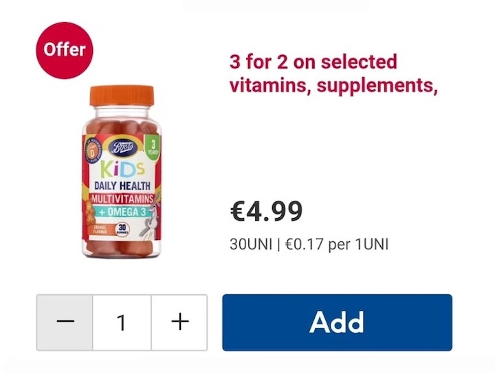
Product lists omitted unit prices, stock status, and the attributes that distinguish similar items, which made product evaluation more difficult.
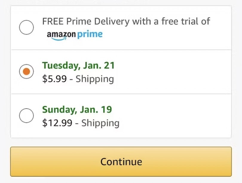
Furthermore, order cost and delivery timing stayed unstated until late in the flow.
Specifically, multiple product page “Buy” sections provided no estimate of the order total or a date it would arrive, and in checkout, shipping options were frequently labeled by speed rather than by a delivery date.
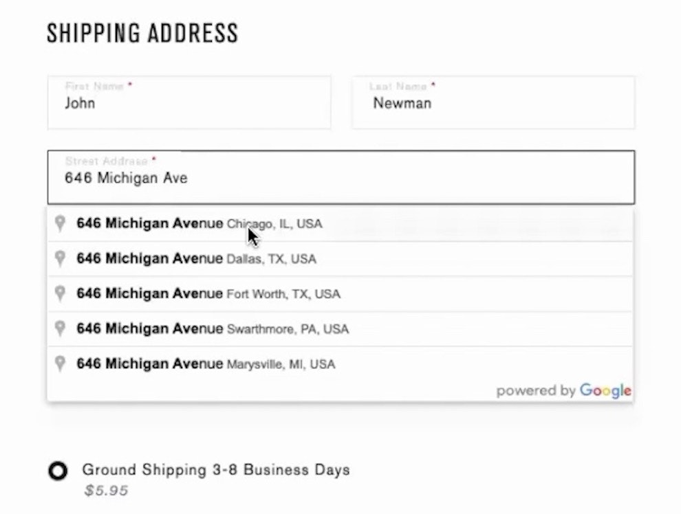
These friction points, combined with address entry that was largely unaided and account menus whose paths were incomplete and ambiguously named, created a shopping environment that hindered product comparison and efficient checkout.
In summary, with only 1 site delivering a “good” overall user experience, there is plenty of room for improvement.
A publicly available overview of the research and benchmark can be found on our Mass Merchant UX research overview page.
Getting access: all 5,600+ UX performance scores, 4,600+ best practice examples, and the UX insights from researching the Mass Merchant ecommerce industry are available immediately and in full within Baymard. (If you already have access through an account, open the Mass Merchant UX Benchmark collection.)
If you want to know how your Mass Merchant or Department Store desktop and mobile sites perform and compare, then learn more about getting Baymard to conduct a Mass Merchant & Department Store UX audit of your site.