

Mobile UX Trends 2026: 10 Best Practices
July 14, 2026 (Updated)
Avoid Using “Horizontal Tabs” for the Main Product Page Sections (29% Don’t)
July 8, 2026 (Updated)
Always Signpost Hidden Thumbnails in Image Galleries
June 10, 2026 (Updated)
Use a Fake “Editing” Flow When Updating Credit Card Details (78% Don’t)
June 2, 2026 (Updated)
AI Heuristic UX Evaluations with a 95% Accuracy Rate (Human-Level Accuracy)
May 28, 2026 (Updated)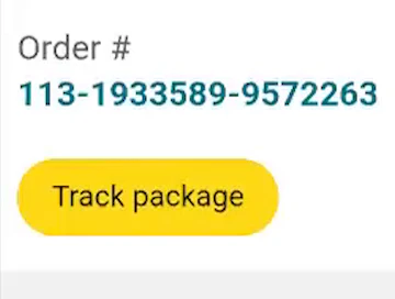
Always Provide 6 Key Order-Tracking Details on the Ecommerce Site
May 5, 2026 (Updated)
Mobile App UX Trends: The Current State of Ecommerce App UX (11 Common Pitfalls & Best Practices)
April 14, 2026 (Updated)
Product Page UX 2026: 10 Pitfalls and Best Practices
March 18, 2026 (Updated)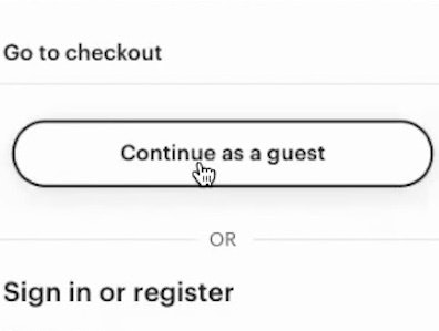
Checkout UX 2025: 10 Pitfalls and Best Practices
November 25, 2025 (Updated)
Ecommerce Gifting UX: 4 Ways to Provide a Superior Gifting UI and Flow
November 20, 2025 (Updated)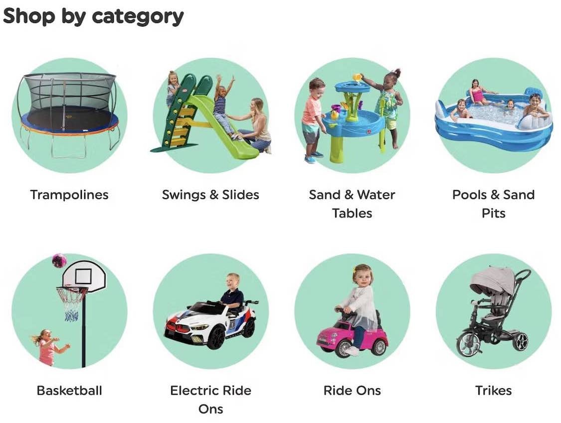
Homepage and Category Navigation UX 2025: 67% of Mobile Sites Have Mediocre-to-Poor Performance
September 30, 2025 (Updated)
10 Cyber Monday UX Best Practices
September 16, 2025 (Updated)
Product List UX 2025: 8 Common Pitfalls & Best Practices (80% Have Serious Issues)
September 9, 2025 (Updated)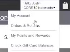
Accounts & Self-Service UX 2025: 5 Common Pitfalls & Best Practices
August 14, 2025 (Updated)
Video Games UX Benchmark: 2,500+ Performance Scores and 1,800+ Best Practice Examples
August 5, 2025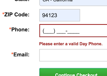
Phone Number UX: Always Explain Why the “Phone Field” Is Required (39% Don’t)
July 29, 2025 (Updated)
4 “Online Grocery” Ecommerce UX Best Practices
July 15, 2025 (Updated)
5 UX Best Practices for Travel Accommodation and Tours and Experiences Sites
July 1, 2025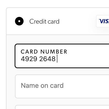
The ‘Credit Card Number’ Field Must Allow and Auto-Format Spaces (80% Don’t)
June 5, 2025 (Updated)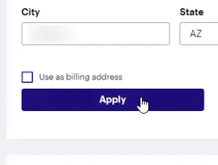
Checkout UX: Avoid “Apply” Buttons for Most Fields (22% of Sites Don’t)
May 14, 2025 (Updated)
5 Best Practices for Communicating Sustainability in Ecommerce
April 22, 2025
Ecommerce Homepage UX: Can Users Infer the Breadth of Your Product Catalog?
April 10, 2025 (Updated)
10 UX Requirements to Follow for a User-Friendly Homepage Carousel Design
April 3, 2025 (Updated)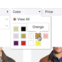
Horizontal Filtering Toolbars: 2 Reasons to Be Cautious
March 13, 2025 (Updated)
Desktop UX Trends: 10 Common Pitfalls & Best Practices
March 6, 2025
5 UX Best Practices for Apparel E-Commerce (90% Get One or More Wrong)
February 25, 2025 (Updated)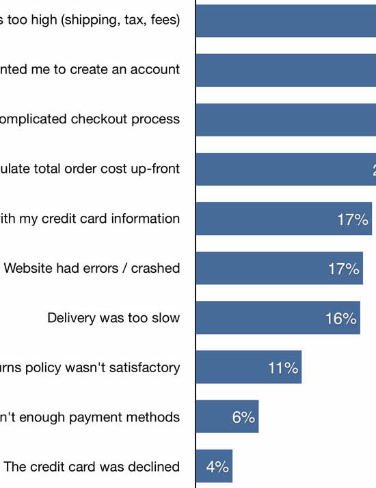
Reasons for Cart Abandonment – Why 70% of Users Abandon Their Cart (2025 data)
February 2, 2025 (Updated)
Drop-Down Usability: When You Should (and Shouldn’t) Use Them
January 28, 2025 (Updated)
The New Baymard Figma Plugin: Add UX Best Practice Cards to Any Figma Project
November 27, 2024
Always Provide 3 or More Product Thumbnails in Product Lists and Search Results
November 5, 2024
Checkout Optimization: 5 Ways to Minimize Form Fields in Checkout
June 26, 2024
Always Allow Users to Combine Multiple Filtering Values of the Same Type — an ‘OR’ Logic (15% of Sites Don’t)
January 23, 2024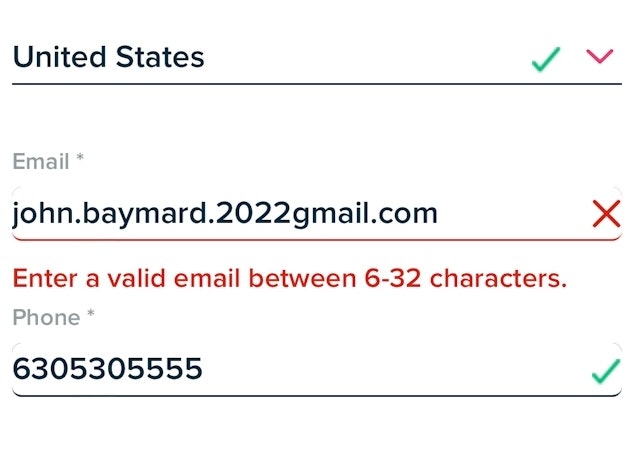
Usability Testing of Inline Form Validation: 31% Don’t Have It, 4% Get It Wrong
January 9, 2024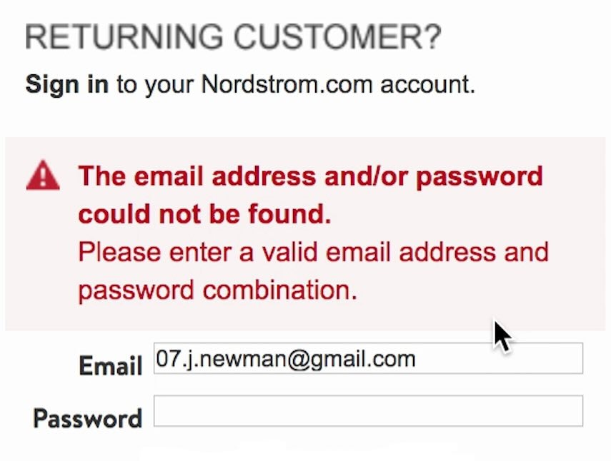
Improve Validation Errors with Adaptive Messages (98% Don’t)
December 14, 2023
Top 1% E-Commerce UX Awards — 2023 WINNERS
December 5, 2023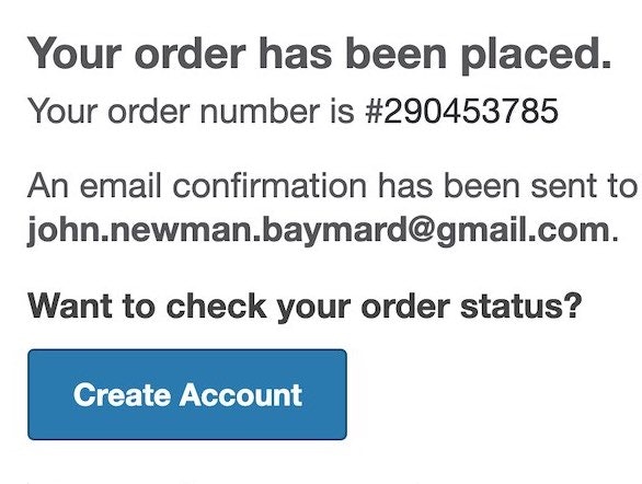
6 Ways to Get More Out of Your Order Confirmation Page
November 8, 2023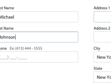
Form Field Usability: Avoid Extensive Multicolumn Layouts (16% Make This Form Usability Mistake)
October 31, 2023
Testing ChatGPT-4 for ‘UX Audits’ Shows an 80% Error Rate & 14–26% Discoverability Rate
October 18, 2023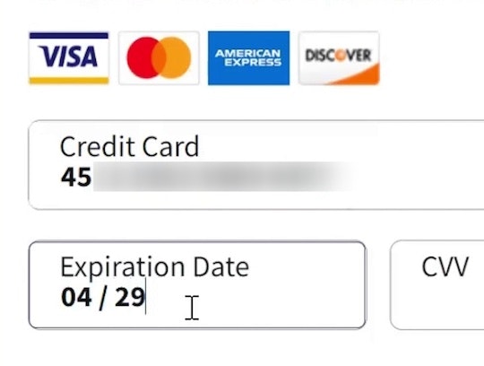
Format the “Expiration Date” Fields Exactly the Same as the Physical Credit Card (72% Don’t)
October 3, 2023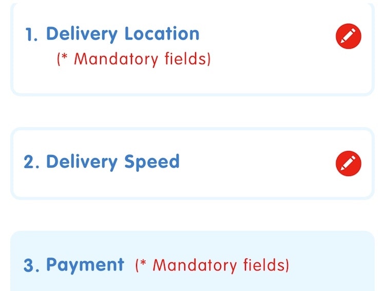
Always Collapse Completed Accordion Checkout Steps into Summaries
September 27, 2023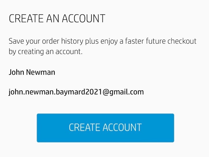
Save Account Creation for the Confirmation Step (42% Don’t)
September 19, 2023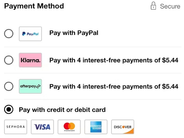
Payment Method UX: Designing Payment Selection
September 5, 2023
2 Key Design Principles for Product Listing Information (64% Get at Least 1 Wrong)
August 22, 2023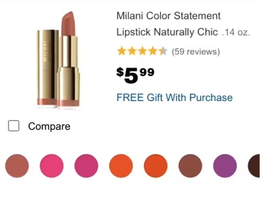
Make All Color Swatches Available in Mobile List Items for Visually Driven Product Types (57% Don’t)
August 8, 2023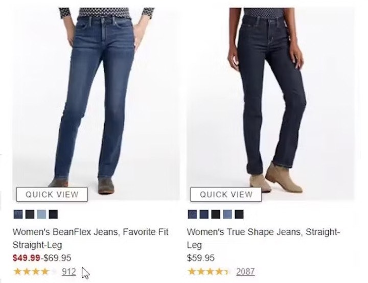
Product Listing UX: What Information to Display in Product Listings (50% Get It Wrong)
May 30, 2023
Provide a Hover Delay of 300–500 MS for Hover-Based Drop-Down Menus (60% Don’t)
January 31, 2023
Make Product Categories the Top-Level Navigation Items on Mobile Sites (33% Don’t)
January 24, 2023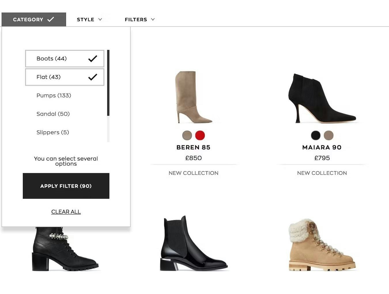
Overcategorization of the Product Catalog Can Lead to Abandonment (Yet 75% Get It Wrong)
January 3, 2023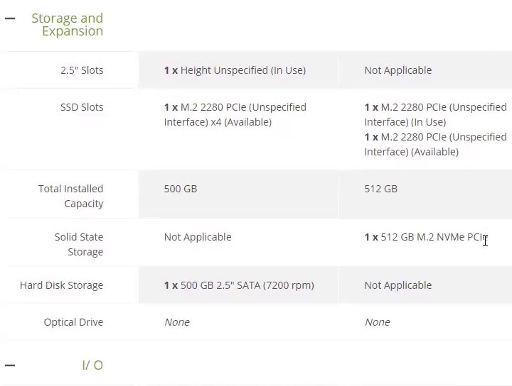
4 Ways to Optimize the Comparison Feature for Scanning
October 19, 2022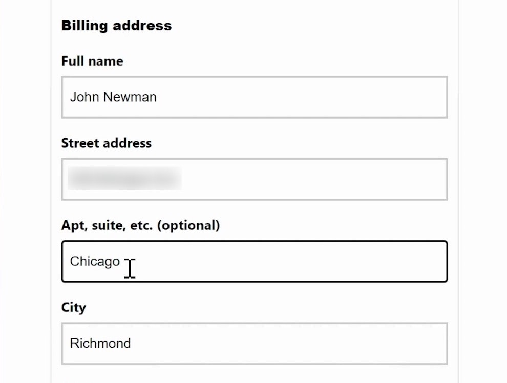
Form Usability: Getting ‘Address Line 2’ Right
October 4, 2022
Provide “Quick Views” for Visually Driven Products (50% Don’t)
August 9, 2022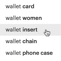
9 UX Best Practice Design Patterns for Autocomplete Suggestions (Only 19% Get Everything Right)
August 2, 2022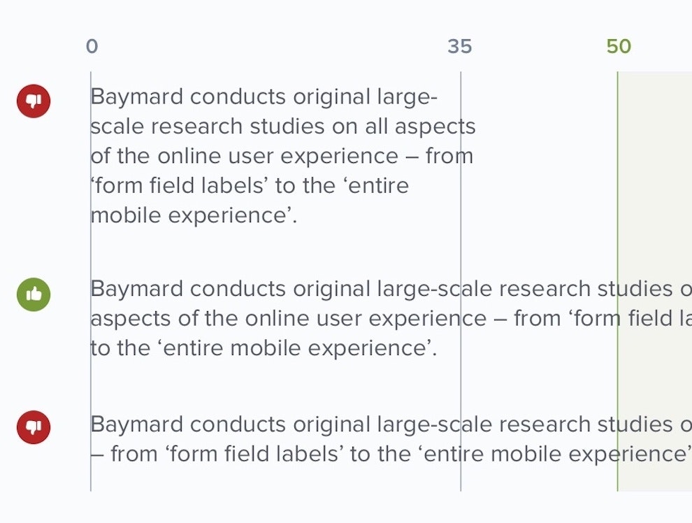
Readability: The Optimal Line Length
May 10, 2022
94% of the Largest E-Commerce Sites Are Not Accessibility Compliant
June 29, 2021
Understanding Mobile E-Commerce UX: 5 Overarching Issues
January 26, 2021
Mobile UX: Avoid Using Subpages within the Product Details Page (26% Don’t)
November 2, 2020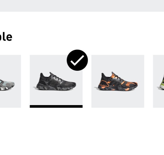
Always Use Thumbnails to Represent Additional Product Images (76% of Mobile Sites Don’t)
October 20, 2020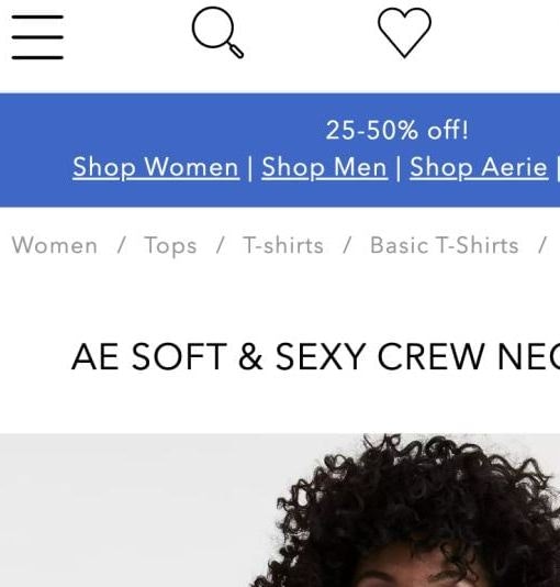
6 Important Aspects of Well-Performing Mobile Product Page Breadcrumbs
September 21, 2020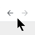
4 Design Patterns That Violate “Back” Button UX Expectations – 59% of Sites Get It Wrong
July 20, 2020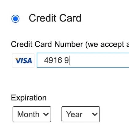
5 ‘Credit Card Form’ Implementations That Make ‘L.L. Bean’ Best-in-Class
June 30, 2020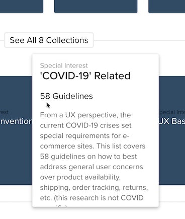
Six ‘COVID-19’ Related E-Commerce UX Improvements to Make
May 5, 2020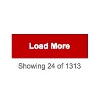
Product List UX: The Number of Products to Load by Default (52% Get it Wrong)
January 7, 2020
Mobile E-Commerce UX: Deemphasize ‘Install App’ Ads or Avoid Them Entirely
August 20, 2019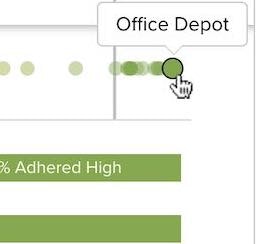
5 ‘Order Review’ UX Implementations That Make Office Depot Best-in-Class
July 15, 2019
Checkout Optimization: From 16 Form Fields to 8 Fields (keynote presentation)
June 21, 2019
The ‘Order Returns’ Experience is Critical for Customer Retention — Yet 54% of Sites Have a Returns Interface with Substantial UX Issues
June 3, 2019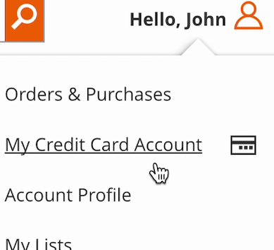
Self-Service UX: Distinguish Primary from Secondary Paths in the ‘My Account’ Drop-Down (71% Don’t)
March 20, 2019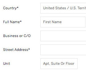
E-Commerce Checkouts Need to Mark Both Required Fields and Optional Fields Explicitly (Only 14% Do So)
October 2, 2018
Dashboard Design: Dashboard Cards Must Be Highly Consistent and Appropriately Styled
August 8, 2018
Structuring Product Page Descriptions by ‘Highlights’ Increases User Engagement (Yet 78% of Sites Don’t)
April 24, 2018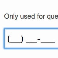
Consider Using Localized Input Masks for ‘Phone’ and Other Restricted Inputs (64% Aren’t Taking Advantage of Input Masking)
November 28, 2017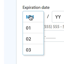
5 Common Usability Pitfalls of Custom Designed Drop-Downs (31% Have Drop-Down UI Issues)
November 14, 2017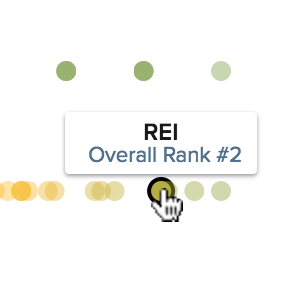
7 Product Page UX Implementations that Make REI Best-in-Class
October 18, 2017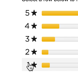
Ratings Design UX Research: 5 Requirements for the ‘Ratings Distribution Summary’ (65% of Sites Get it Wrong)
August 8, 2017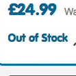
Allow Users to Purchase Temporarily ‘Out of Stock’ Products by Increasing the Delivery Time (68% Don’t)
July 18, 2017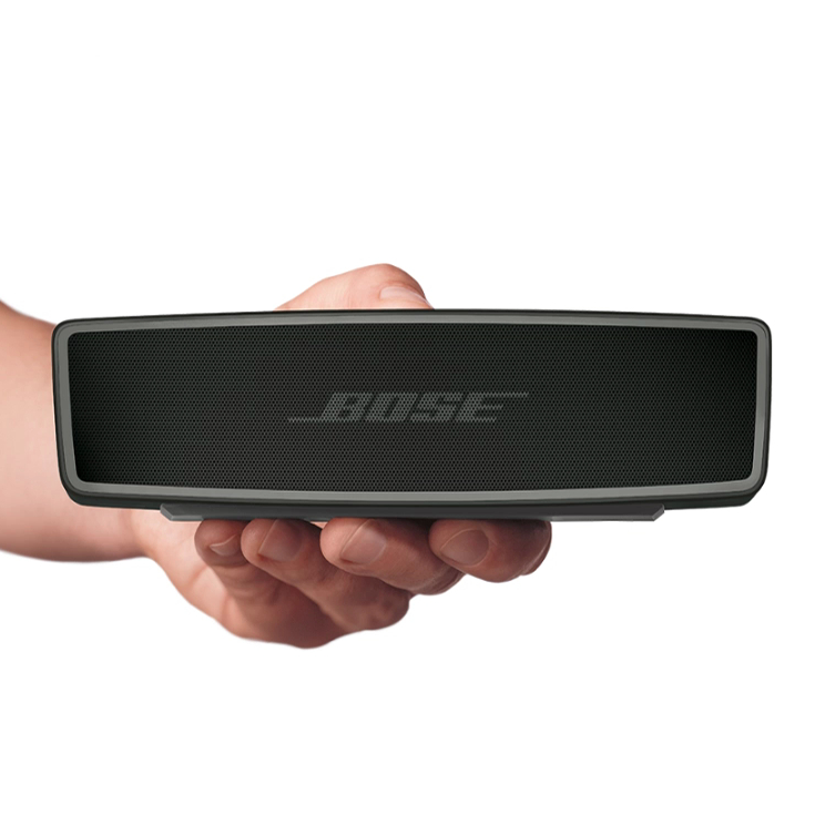
Product Page UX: All Products Need at Least One ‘In Scale’ Image (28% Get It Wrong)
May 30, 2017
3 Strategies for Handling Accidental ‘Taps’ on Touch Devices
March 28, 2017
How Users Perceive Security During the Checkout Flow (Incl. New ‘Trust Seal’ Study 2023)
October 5, 2016
42% of Mobile Homepages Risk Setting Wrong Expectations for Their Users
February 17, 2016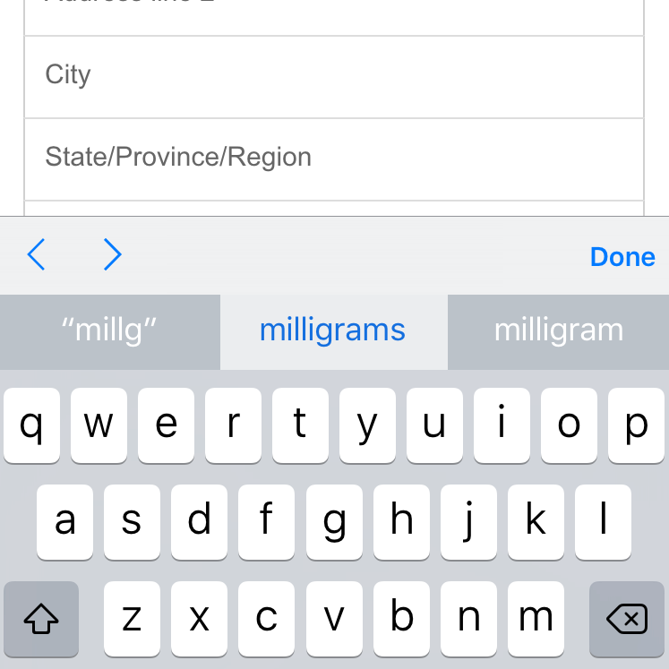
‘Touch Keyboard’ Implementations Have Improved Just 9% Since 2013 (60% Still Get it Wrong)
December 15, 2015
Responsive Upscaling: 11 Ideas for Large-Screen E-Commerce Design
August 18, 2015
6 Guidelines for Truncation Design
May 21, 2014
Avoid Inline Scroll Areas (26% Get it Wrong)
May 6, 2014
Avoid These 5 Types of E-Commerce Graphics
March 4, 2014
E-Commerce Sites Need 2 Types of Breadcrumbs (68% Get it Wrong)
December 10, 2013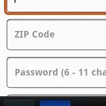
Mobile Form Usability: Never Use Inline Labels
June 4, 2013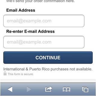
Field Label UX: Place Labels Above the Field
March 19, 2013
Accordion Style Checkouts – The Holy Grail of Checkout Usability?
September 18, 2012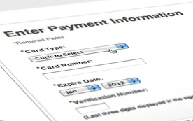
Visually Reinforce Your Credit Card Fields (89% Get it Wrong)
August 21, 2012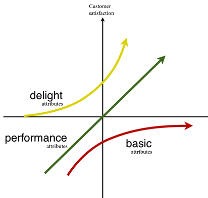
UX and the Kano model
February 7, 2012
One Page Checkouts – the Holy Grail of Checkout Usability?
April 26, 2011
User Experience Research, Delivered Weekly
Join 60,000+ UX professionals and get a new UX article every week.

Explore Other Research Content

334 top sites ranked by UX performance.

18,000+ annotated designs for systematic inspiration.

Code samples, demos, and key stats for usability.