Key Takeaways
- Our UX benchmark of 71 e-commerce websites shows that the performance of Checkout UX is mediocre to decent overall.
- The average site has 31 preventable usability issues in the checkout flow
- Avoiding the 18 common UX issues discussed in this article is a good first step towards improving users’ checkout experience
After e-commerce sites have invested vast resources in “first in mind” strategies, Pay Per Click campaigns, beautifully crafted homepage imagery, perfect category taxonomies, faceted search logic, etc., it seems almost unbearable that 69% of users — after having added items to their cart — then choose to abandon their purchase.
During Baymard’s 12 years of large-scale checkout usability testing we have also consistently found the checkout design and flow to frequently be the sole cause for users abandoning their cart during the checkout flow.
Our Checkout UX benchmark database now contains 37,200+ checkout site elements that have been manually reviewed and scored by Baymard’s team of UX researchers (embedded below), with 19,295 best- and worst-practice examples from the top-grossing e-commerce sites in the US and Europe (performance verified).
In this article we’ll analyze this dataset to provide you with the current state of e-commerce Checkout UX, and outline 18 common design pitfalls and checkout best pratices applicable to most e-commerce sites.
The Current State of Checkout UX: Checkout Flow Insights
For this analysis we’ve summarized the 37,200+ checkout usability scores across the 17 topics and plotted the 71 benchmarked checkout flows across these in the scatterplot above. Each dot, therefore, represents the summarized UX score of one site across the 4–12 guidelines within that respective topic. The top row is the total checkout UX performance.
Our latest Checkout benchmark reveals that 23 of the 71 top-grossing US and European e-commerce sites have a “decent” Checkout UX performance, with 6 more rating “good”. None was rated “perfect”.
However, 36 sites have checkouts that are “mediocre”, while 8 sites have checkouts that are downright “poor”.
Our benchmark also reveals that the average site has 31 preventable usability issues in their checkout flow.
Below we’ll discuss the UX performance and 18 general checkout best practices & pitfalls to be aware of for 7 of the 17 subtopics of Checkout UX:
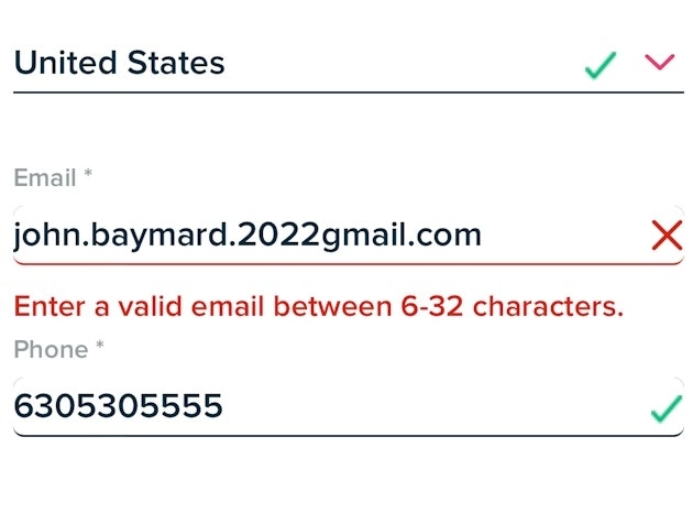
- Account Selection & Creation
- Shipping & Store Pickup
- Credit Card Form
- Order Review
- Field Labels & Microcopy
- User Interactions & Distractions
- Field Design & Features
These subtopics were chosen as they are the most interesting or the most suitable for discussion in an article.
(If you’re brand-new to UX, read What Is UX? before diving into the research.)
Account Selection & Creation
Our benchmark reveals that the overall Account Selection & Creation UX performance is generally “mediocre” to “poor”, with a surprisingly high number of implementations that, from an end user’s perspective, will be considered “broken” (17%).
The majority of sites have an account-selection step design that makes it needlessly difficult for users to actually locate that guest option — something we frequently observe during usability testing to cause users to overlook the guest path entirely.
In particular, there are 2 UX issues sites often suffer from when it comes to Account Selection & Creation during checkout:
1) 65% of Sites Don’t Make “Guest Checkout” the Most Prominent Option
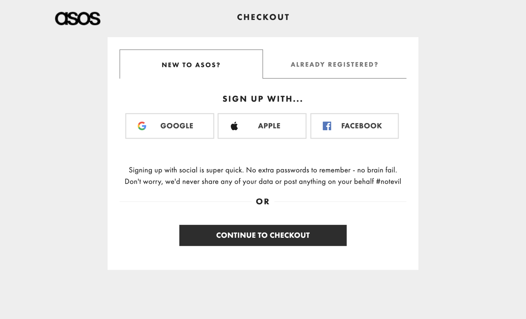
At ASOS, to check out as a guest, users must first open the “New to Asos?” tab as the “Already Registered” tab is open by default. Then, users have to recognize that “Continue to Checkout” represents “Guest Checkout”. Checking out as a guest, therefore, is needlessly difficult.
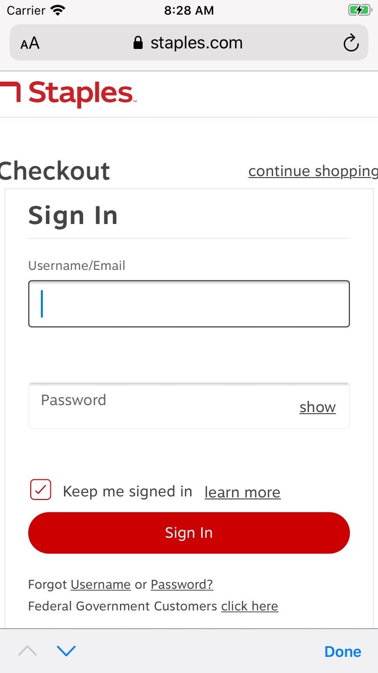
Likewise, at Staples’s mobile site the “Guest” option isn’t visible in the interface when the page first loads.
During desktop testing, our eye-tracking test data reveal that users expected the “Guest Checkout” option to be located in the upper-left hand portion of the screen — yet on sites where “Guest Checkout” wasn’t placed there, we observe that 14% of users were unable to figure out the checkout step and ended up abandoning the site.
During mobile testing issues were just as severe, with 53% of users having severe issues identifying, seeing, and selecting the “Guest Checkout” option at the account-selection step during checkout. This was often due to the “Guest” option being pushed down in the interface, where it frequently went unseen.
For both desktop and mobile, it’s key that the “Guest” option is the most prominent option on the account-selection step — the upper-left option on desktop, and the top option on mobile — to ensure users can easily find it. (On mobile “Guest” checkout can also just be made equally prominent to other account options.)
Despite the importance of this issue, 65% of sites don’t make “Guest Checkout” the most prominent option.
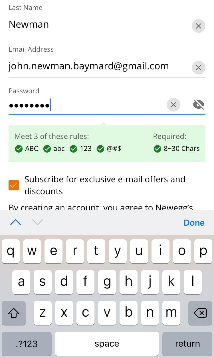
2) 80% of Sites Have Overly Complex Password-Creation Requirements
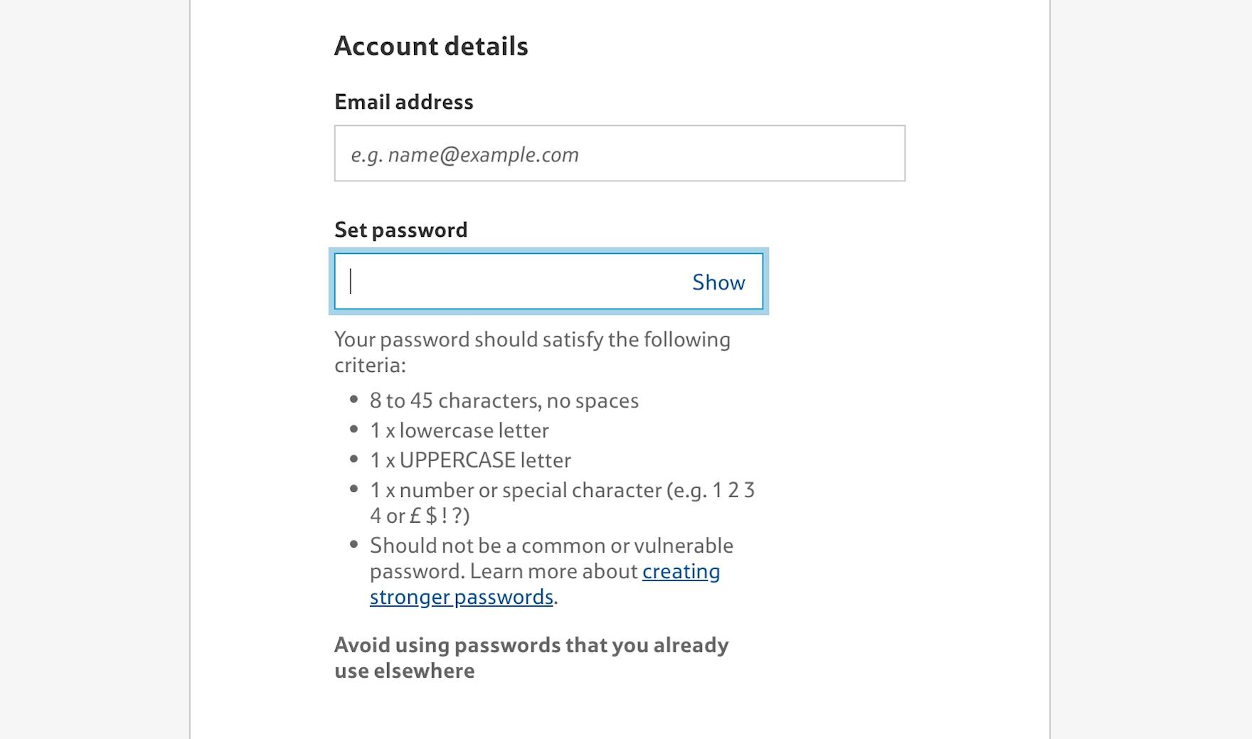
During our testing, we observe that extensive and strict password rules can cause up to an 18.75% checkout-abandonment rate among existing account users when they have trouble signing in.
In particular the password-reset email is a very weak link in the “forgot password” chain, as any issues with the password-reset process technically locks a user out of their account, at which point abandonments are very likely.
Given the severe usability implications of too-strict password rules, and subsequent abandonments from account owners as they try to reset their password, sites should impose the fewest number of password requirements allowable.
Indeed, if sites want to minimize account sign in and password-reset friction as much as possible, we recommend making the only password requirement to be 6 lowercase letters.
Despite the importance of this issue, 80% of sites have overly complex password-creation requirements.
(Note: Lowering password requirements below what’s typically recommended for, e.g., a device password is generally possible for e-commerce sites because there are two essential security measures available, as discussed here.)
For inspiration on “perfect” Account Selection & Creation implementations, see Nordstrom, Lowes, and Etsy.
Shipping & Store Pickup
16% of sites achieved “perfect” implementations of Shipping & Store Pickup. This is offset, however, by the 39% of sites that perform very poorly.
With the increasing importance of store pickup over the last year, sites need to ensure that this aspect of their checkout process is optimized.
In particular, there are 4 issues sites get wrong when it comes to Shipping & Store Pickup:
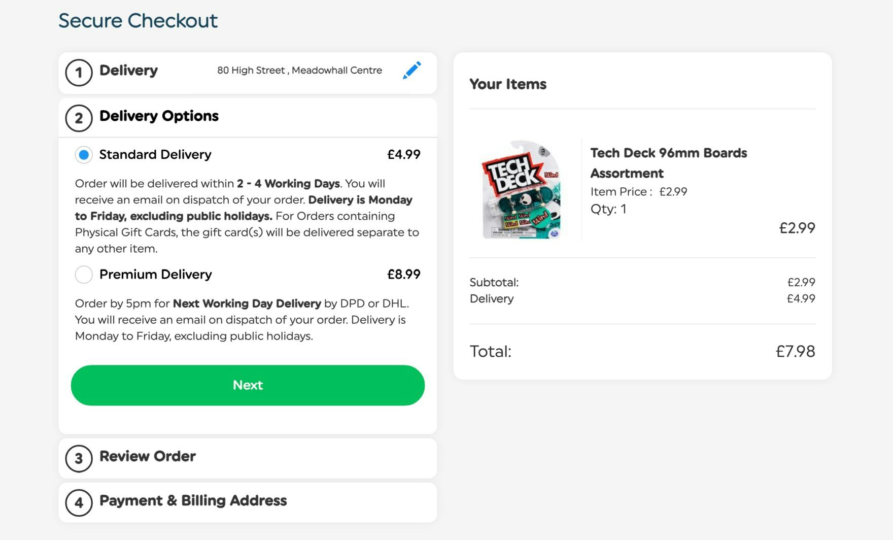
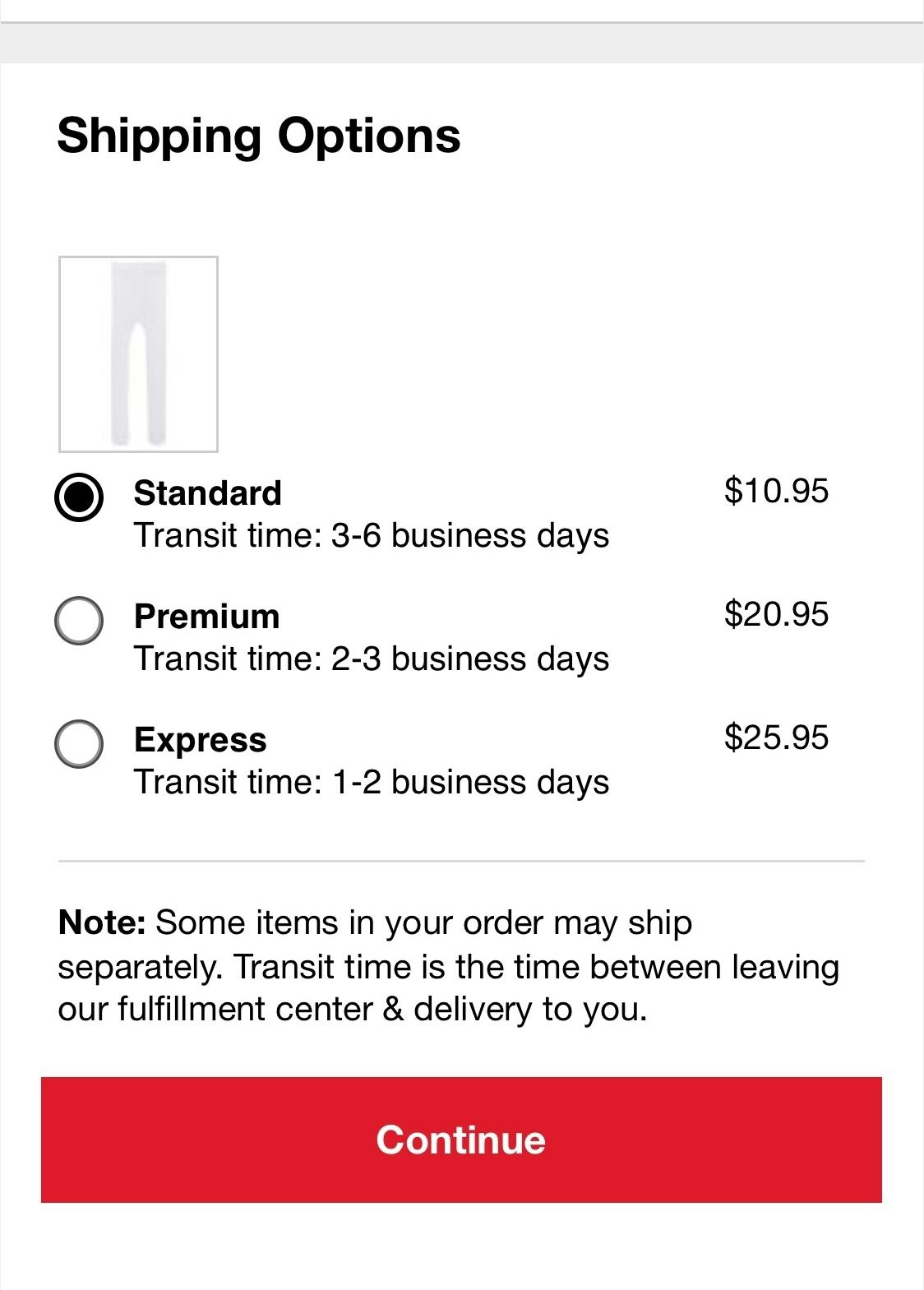
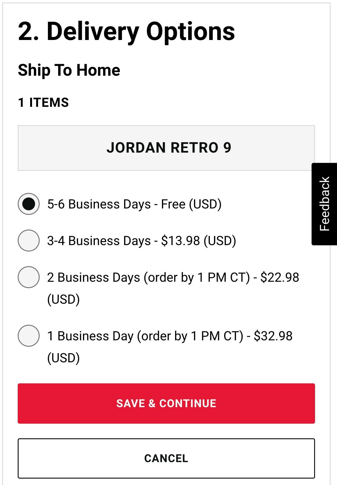
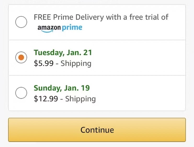
3) 36% of Sites Use “Delivery Speed” Instead of “Delivery Date”
When it comes to delivery speed, users have one main concern: “When will I receive my order?” The solution historically used within e-commerce is to clearly state the shipping speed for each of the shipping options; for example, “Standard: 2 Business Days – $4.95”.
However, this is a very business-centric way of conveying the information. Displaying “Shipping Speed: 2 Business Days” forces users to research, calculate, and sometimes even guess when they will actually receive their order.
This not only makes it less transparent when the order will be received, but it also introduces a lot of choice complexity into the checkout process during the user’s delivery selection.
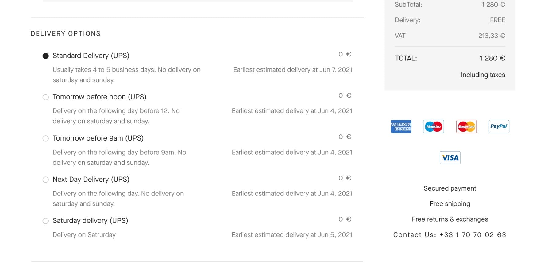
Instead, providing a delivery date, or a date range, allows users to immediately understand when they’ll receive their order (e.g., “Delivery on April 4th” or “Delivery April 4th–8th”).
Despite the importance of this issue, 36% of sites still use “Delivery Speed” instead of “Delivery Date”.
4) 96% of Sites Don’t Show the Cutoff Time as a Countdown
At Van Cleef & Arpels, there are numerous delivery options but no cutoff time indicated. As such, users could miss out on a delivery option of choice.
Foot Locker only provides a time zone–specific cutoff time.
In addition to the delivery date, many users want to know when they have to place their order to have their package delivered by that date.
While true for all users, this is especially important for those who’ve selected an expedited shipping option — and have paid more to have their order arrive quicker.
Users will interpret a displayed delivery date as a promise for when they’ll receive their items; therefore, not providing a cutoff time runs the risk of a user selecting a shipping option but missing the nonspecified cutoff time — and getting their order later than they expected.
To address the issue caused by showing the cutoff time — if one is even provided — as a static time zone–specific time and date, the cutoff time should instead be displayed as a countdown. For example, “Order in the next 43 minutes to receive your order by Tuesday April 4” instead of “Order by 9AM ET to receive your order by Tuesday April 4”.
Despite the importance of this issue, 96% of sites don’t show the cutoff time as a countdown.
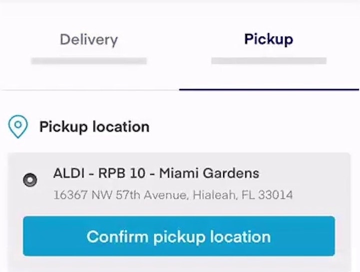
5) 63% of Sites Don’t Present “Store Pickup” Within the Shipping Selector Interface
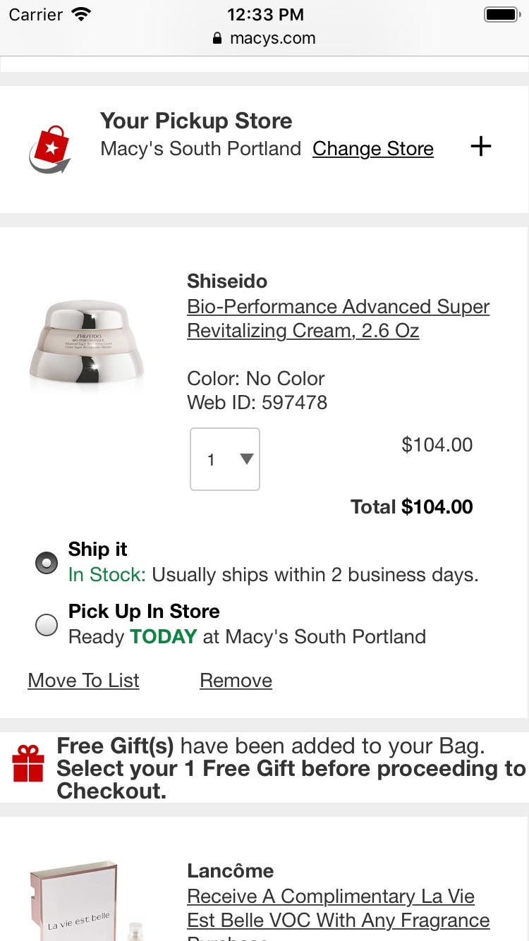
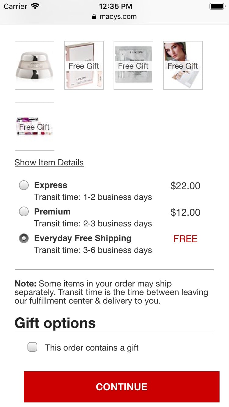
Although “store pickup” is available in the cart as a coequal option with shipping (first image), when reaching the shipping method section at the delivery and shipping methods step at Macy’s it’s completely hidden from the user that there’s also the option to pick up the order in a store (second image). Users finding shipping too expensive or too slow aren’t shown the free and faster alternative, and are thus needlessly provoked into abandoning their purchase.
Store pickup is becoming a widespread feature among omnichannel sites. A common implementation found on many e-commerce sites is to provide the option for store pickup either before the checkout (e.g., at product pages or in the cart) or as the very first option mentioned during checkout.
While it’s okay to have store pickup there, it isn’t enough, as most users view store pickup as just another “shipping” option — and thus expect to find it alongside the other shipping options in the shipping selector interface.
Despite the importance of this issue, 63% of sites don’t present “Store Pickup” within the shipping selector interface.
6) 75% of Sites Make It Too Difficult to Compare “Store Pickup” to Shipping Options
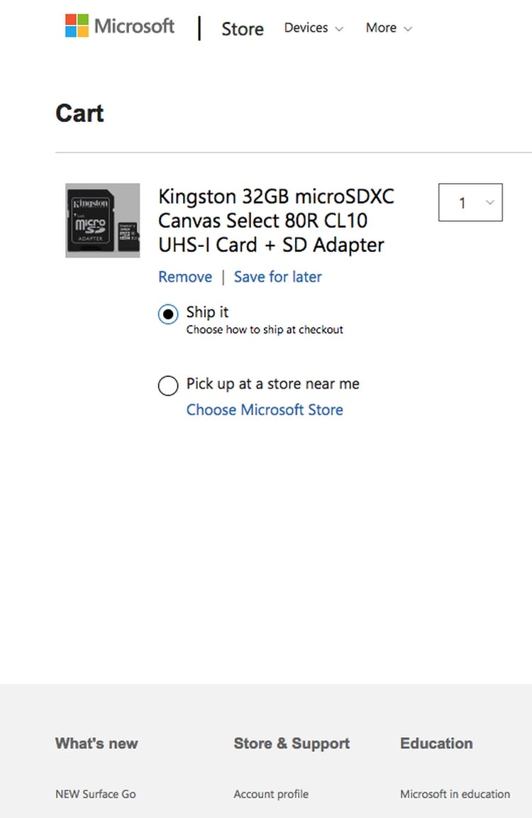
At Microsoft there’s no estimate for shipping cost and speed in the cart.
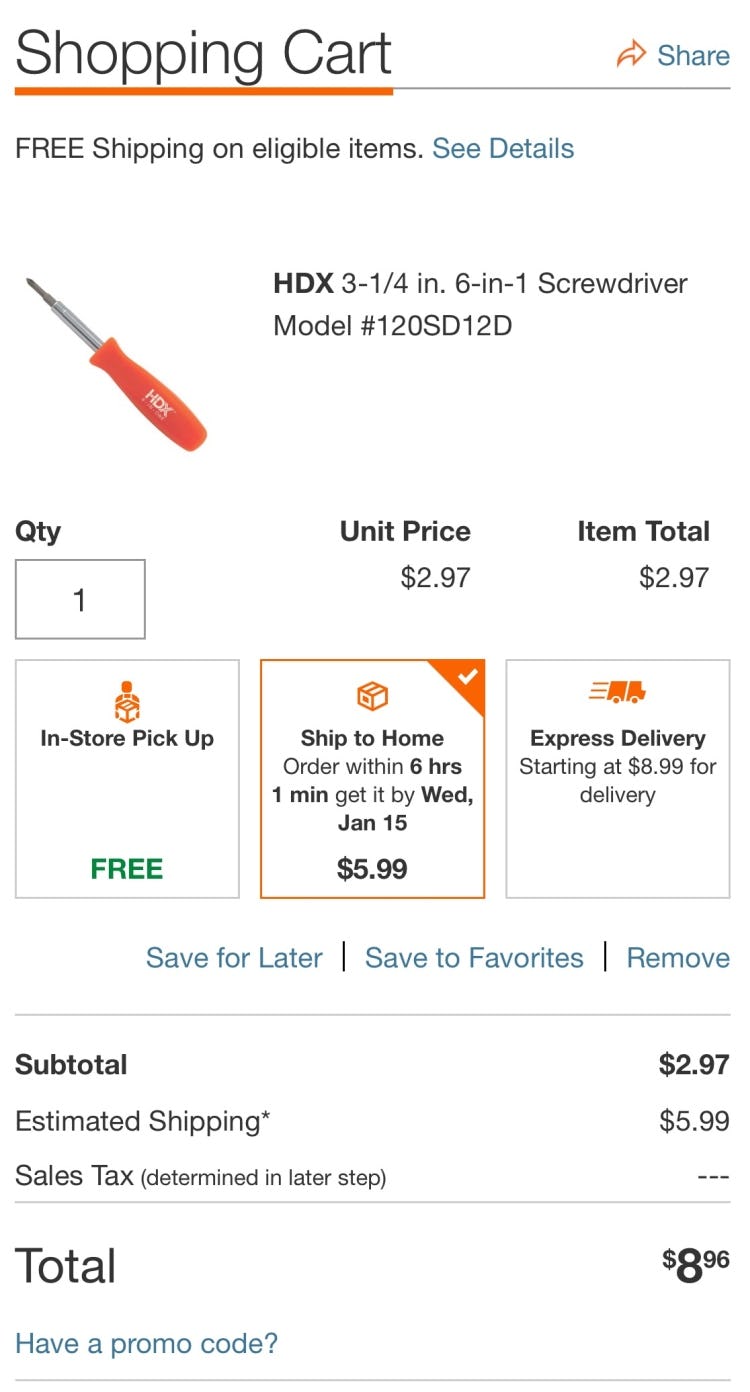
Home Depot provides the shipping cost and speed in the cart.
In-store pickup, when presented as an option _ before_ the shipping method selector interface (e.g., on the product page or in the cart), should be presented to the user with enough information for them to make an informed decision.
For example, in order for a cost-conscious user to evaluate if the extra hassle of going to a store is worthwhile, they will need to know exactly how much they are saving — that is, what the cheapest shipping options would otherwise cost and how far they will have to drive.
Similarly, for urgent purchases, deciding between pickup and shipping will depend on the available expedited shipping options and their speed and cost, compared against how far away the nearest store is that currently has the item in stock.
Despite the importance of this issue, 75% of sites make it too difficult to compare “Store Pickup” to shipping options.
For inspiration on “good” Shipping & Store Pickup implementations, see JCPenny, Staples, and Chewy.
Credit Card Form
While the Credit Card Form is still among the weakest aspects in the checkout flow of many sites, we find that 23% of sites are rated from “good” to “perfect”.
However, it’s worrying that the performance of 25% of sites is rated “poor”.
While the Credit Card Form doesn’t require a lot of typing during the checkout, the 3–5 credit card fields are by far the most complex inputs in the average checkout.
In particular, there are 4 issues sites get wrong when it comes to the Credit Card Form:
7) 48% of Sites Don’t Use Luhn Validation
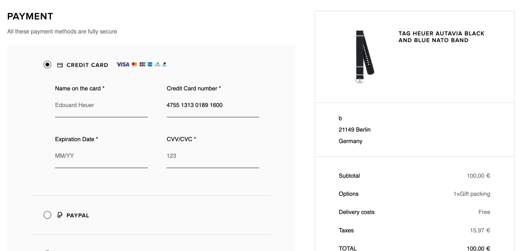
A mistype in the credit card number field at TAG Heuer is not flagged to the user, who is therefore unaware of the error.
Typing the typically 15–16-digit credit card number string without errors can be difficult for users.
During testing, typos were common, and thus validation errors were as well — which can result in abandonments.
Thus any help users can be given to type their credit card number correctly should be provided.
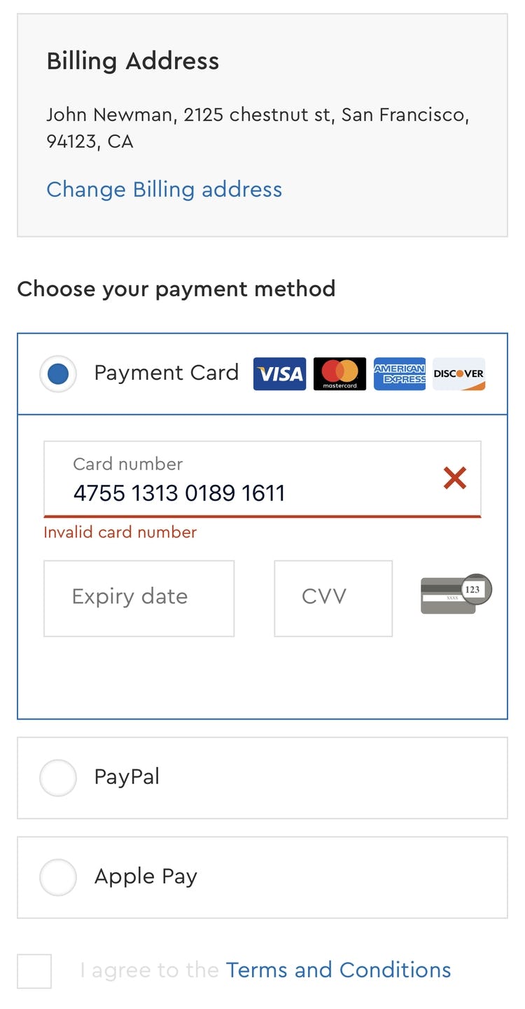
Luhn validation checks to see if the card number entered by a user is plausible.
All credit card numbers follow a pattern that will allow a simple Luhn/Modulus 10 checksum validation. Note that the check doesn’t submit and verify the card data with the payment processor.
In other words, the Luhn validation can’t say if the card is valid or has sufficient funds — it can only check if the card number sequence has been incorrectly typed.
However, simply alerting the user upfront that the card number entered contains a typo — and can therefore never be a valid card number — will allow users to correct it before the entire card payment form is submitted.
Despite the importance of this issue, 48% of sites don’t use Luhn validation.
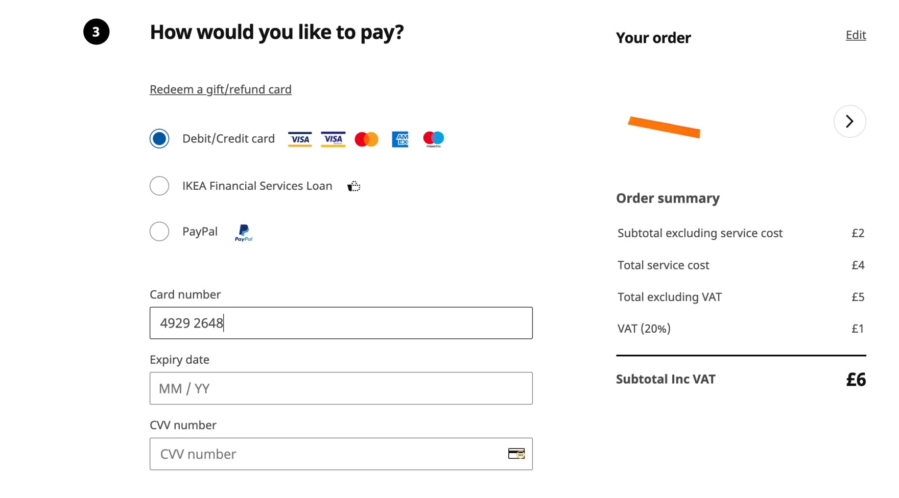
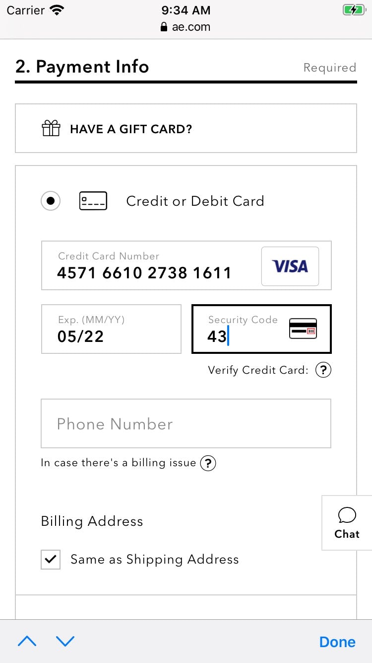
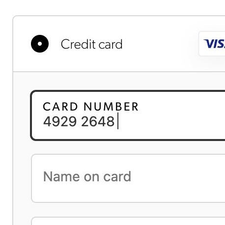
8) 40% of Sites Don’t Autoformat Spaces in the “Credit Card Number” Field
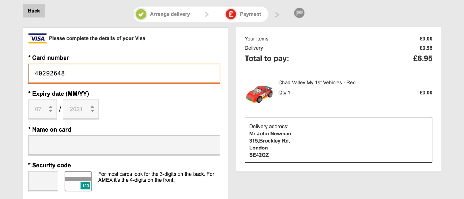
Argos doesn’t autoformat spaces in the “Card number” field, making it that bit harder for users to check their inputs.
By contrast, IKEA automatically formats spaces in the card number field, making it easier for users to check what they are typing.
During testing, some “Card Number” fields didn’t apply any formatting to the card number either as it was being typed or after a subject had completed typing the entire string.
If users end up with a 16-digit long, uninterrupted credit card number in the “Card Number” field it’s very difficult to check if the typed number is accurate.
A single typo when transferring the 15–16 digit string printed on the credit card to the “Card Number” form field will cause a validation error, which by itself can lead to abandonments.
Even worse, many sites will, when payment validation errors occur, also clear out all the typed card data — forcing users to reenter all of their card data.
Therefore, to make entering the credit card number as easy as possible, use an input mask for the card number for the appropriate card type after it’s been autodetected.
Despite the importance of this issue, 40% of sites don’t autoformat spaces in the “Credit Card Number” field.
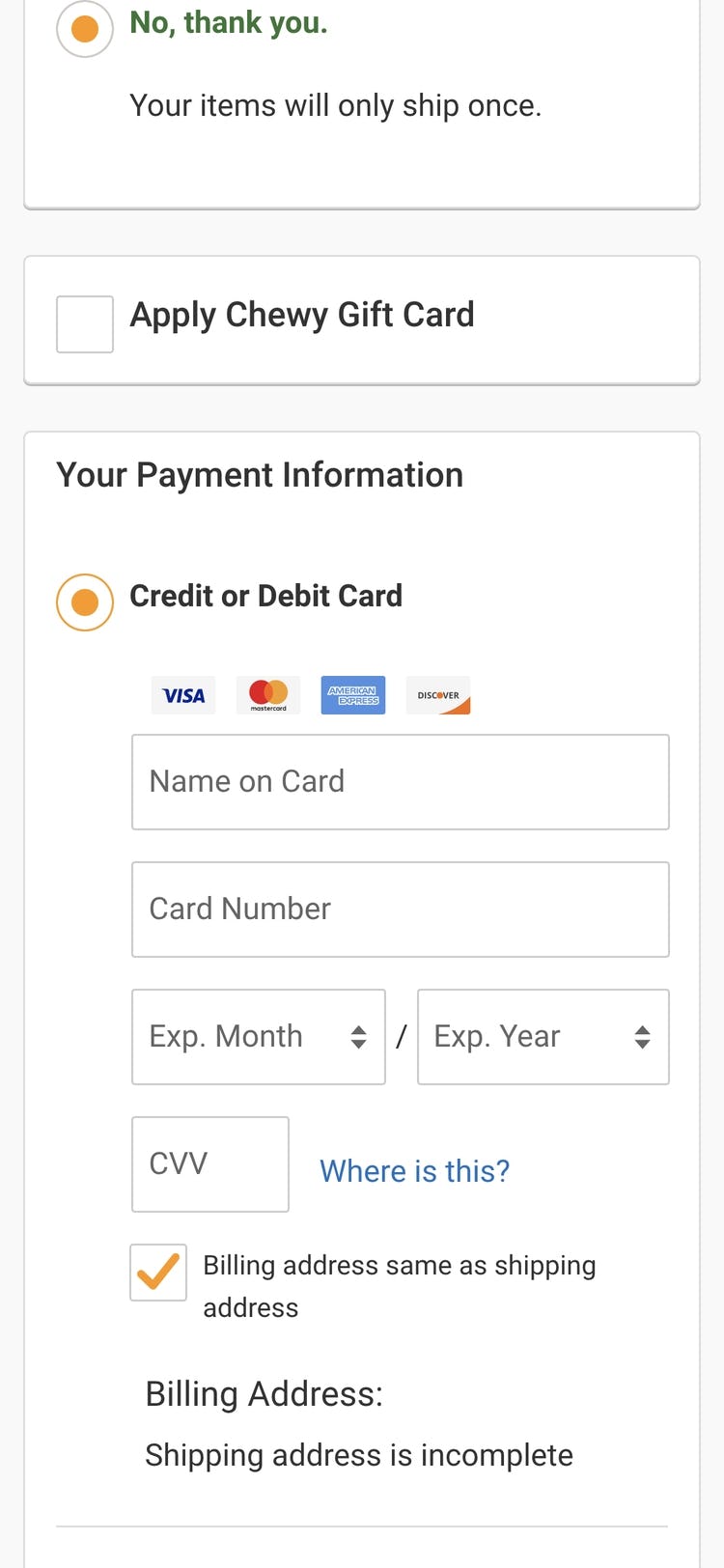
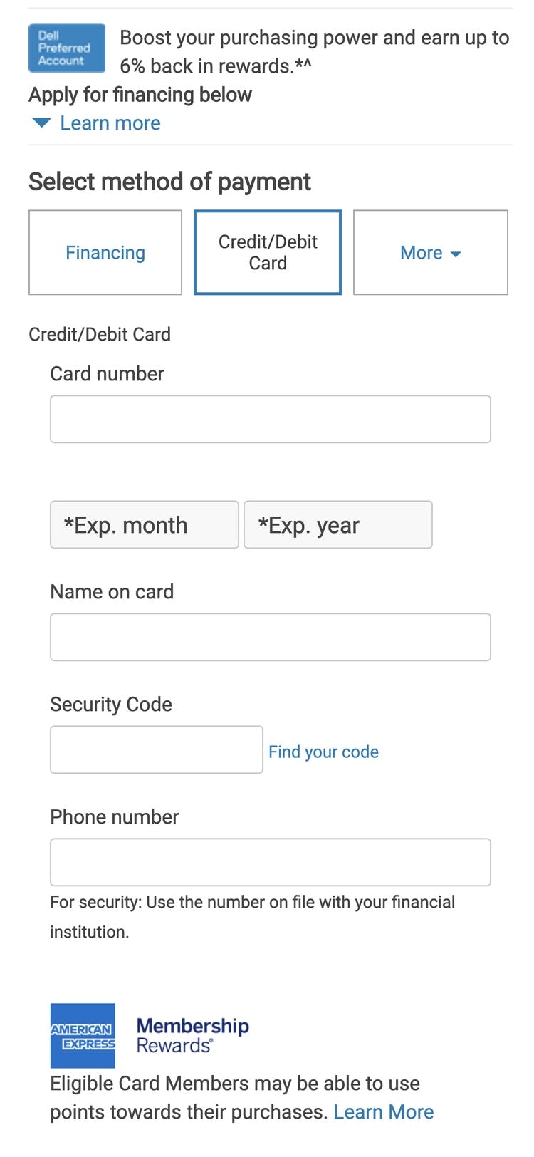
9) 38% of Sites Don’t Match the Credit Card Field Sequence to the Physical Card Sequence
Just over 1/3 of the users during testing who encountered this layout inputted their credit card number in the “Name on Card” field (seen here at Chewy).
On the other hand, the sequence of fields at Dell allows users to enter information as it appears on their cards, reducing the likelihood of any errors.
Users are likely to enter information in fields in the same order in which they appear printed on the physical card.
When the form fields that are to contain this information are presented to users “out of order”, errors are bound to occur, where users enter the information seen on the card in the wrong form fields.
In fact, when we tested sites where “Cardholder Name” was the first field, as many as 33% of users typed their full credit card number in the cardholder field.
At a minimum, this causes needless form-filling friction, but it may also lead to security issues as some users then copy and paste sensitive card information (as observed during testing), not to mention needless card validation errors for those users who end up submitting the form.
It’s therefore key to match the credit card field sequence to the physical card’s sequence, which for most cards would be “Card number” > “Expiration date” > “Cardholder name” (if included at all), and then always “Security code” as the last field.
Despite the importance of this issue, 38% of sites don’t match the credit card field sequence to the physical card sequence.
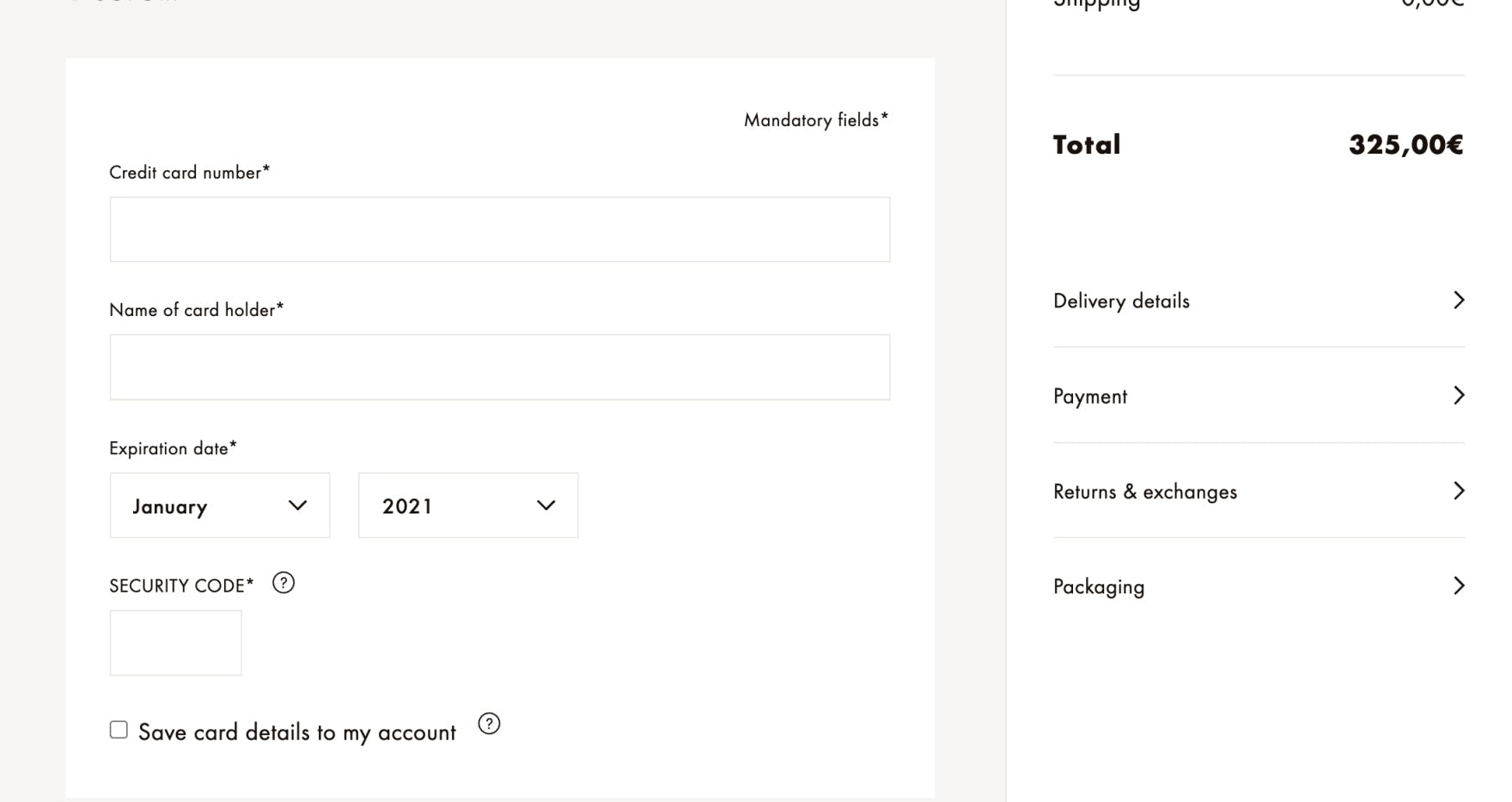
10) 50% of Sites Incorrectly Format the “Expiration Date” Field
The “Expiration date” field at Louis Vuitton displays the month name and a 4-digit year, neither of which matches what is seen on credit cards.
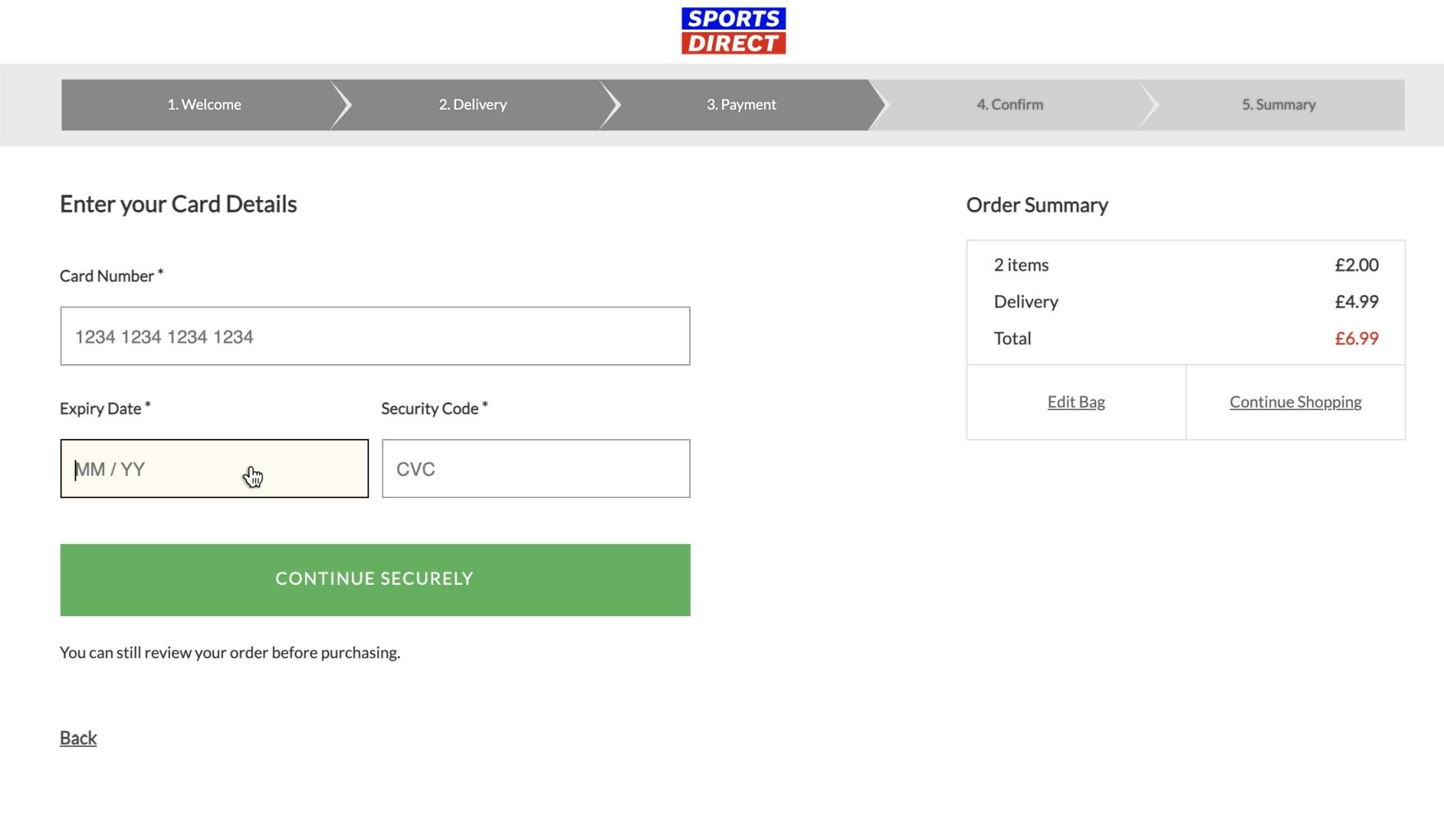
The format of the “Expiry Date” field on Sports Direct, however, is a perfect match for how it appears on credit cards, making it easier for users to recognize and input.
The ISO 7813 standard specifies the characteristics of “Financial Transaction Cards”.
It specifies that all financial transaction cards should show the card’s expiration date in one of the following two formats — “MM / YY” or “MM-YY” — with the first being by far the most common for credit cards.
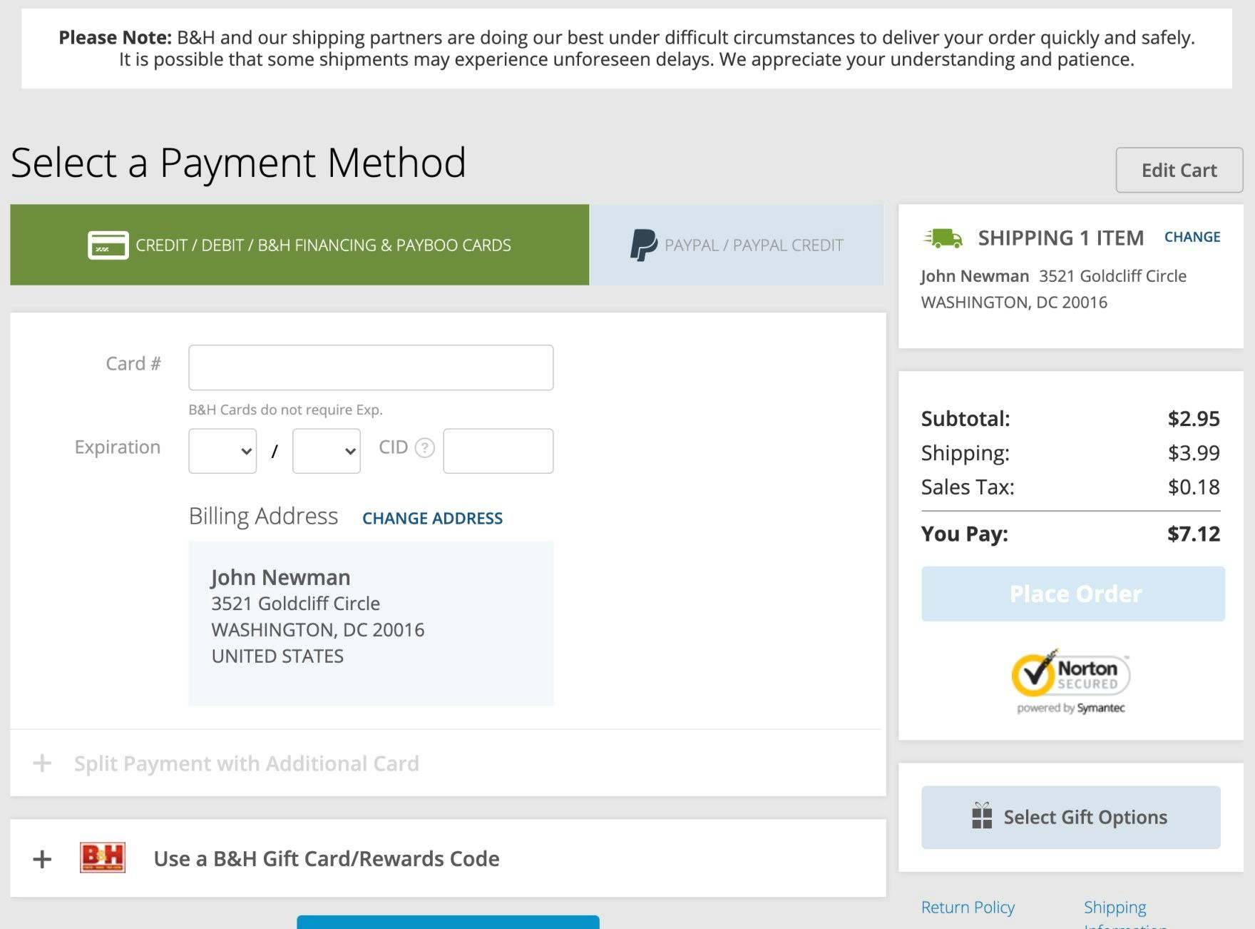
This represents two digits for the month and two for the year — for example, “02 / 18”. However, many sites still employ nonstandard formatting, which interrupts the input flow for users who use the keyboard to input the expiration date information.
Despite the importance of this issue, 50% of sites incorrectly format the “Expiration Date” field.
For inspiration on “perfect” Credit Card Form implementations, see Foot Locker and John Lewis.
Order Review
The order review step shouldn’t be overlooked, as we consistently observe that issues on this step can easily cause users to abandon their purchase — even this late in the checkout flow.
Furthermore, the abandonments observed at this point in the flow are very often solely due to design and flow — as in, they are entirely preventable.
This is an area of weakness generally, with 42% of sites rating “poor” or worse, and only 26% rating “good” or “perfect”.
In particular, there are 2 issues sites get wrong when it comes to the order review step:
11) 80% of Sites Don’t Allow Users to Edit Data Directly at the Review Step
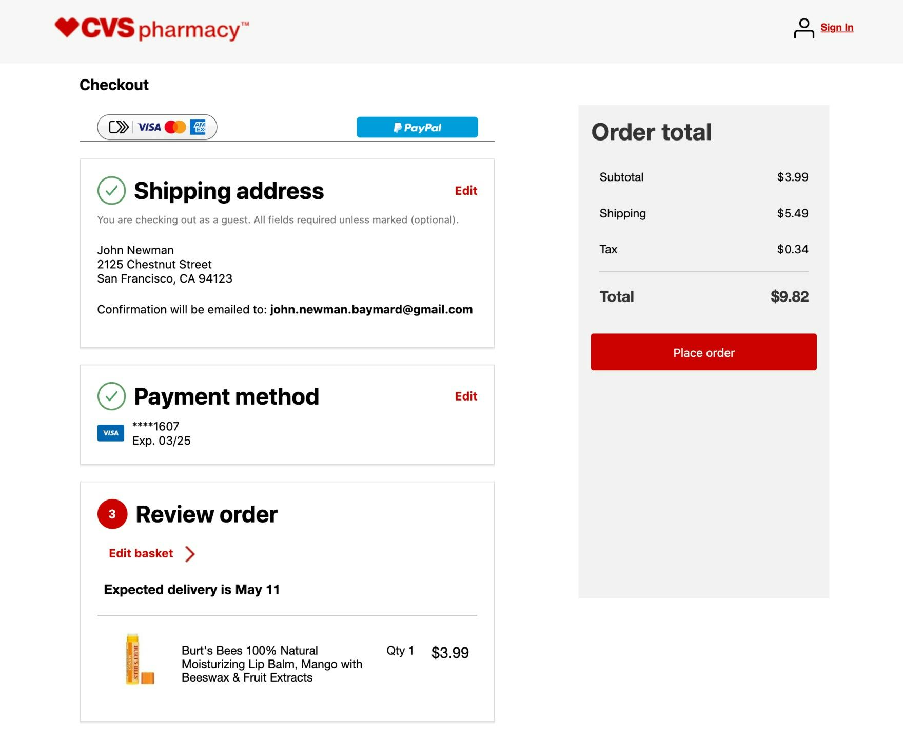
When wanting to edit the shipping address at CVS, users at the review step are forced back to the shipping address step, and then must proceed back to the review step in a linear fashion.
During testing, the task of editing data at the review step was often observed to be a cumbersome process.
During testing, on some sites “Edit” links would send users backwards in the checkout flow, causing a great deal of confusion and frustration both when moving backwards and forwards after corrections had been made.
The combination of some disorientation going backwards, and having to complete the same checkout flow once more when moving forwards, makes editing even simple typos a highly complex and discouraging experience.
Instead, users should be allowed to edit data at the review step via inline form fields or page overlays.
Despite the importance of this issue, a worryingly high 80% of sites don’t allow users to edit data directly at the review step.
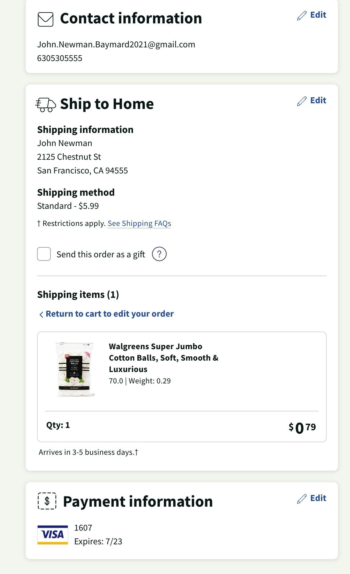
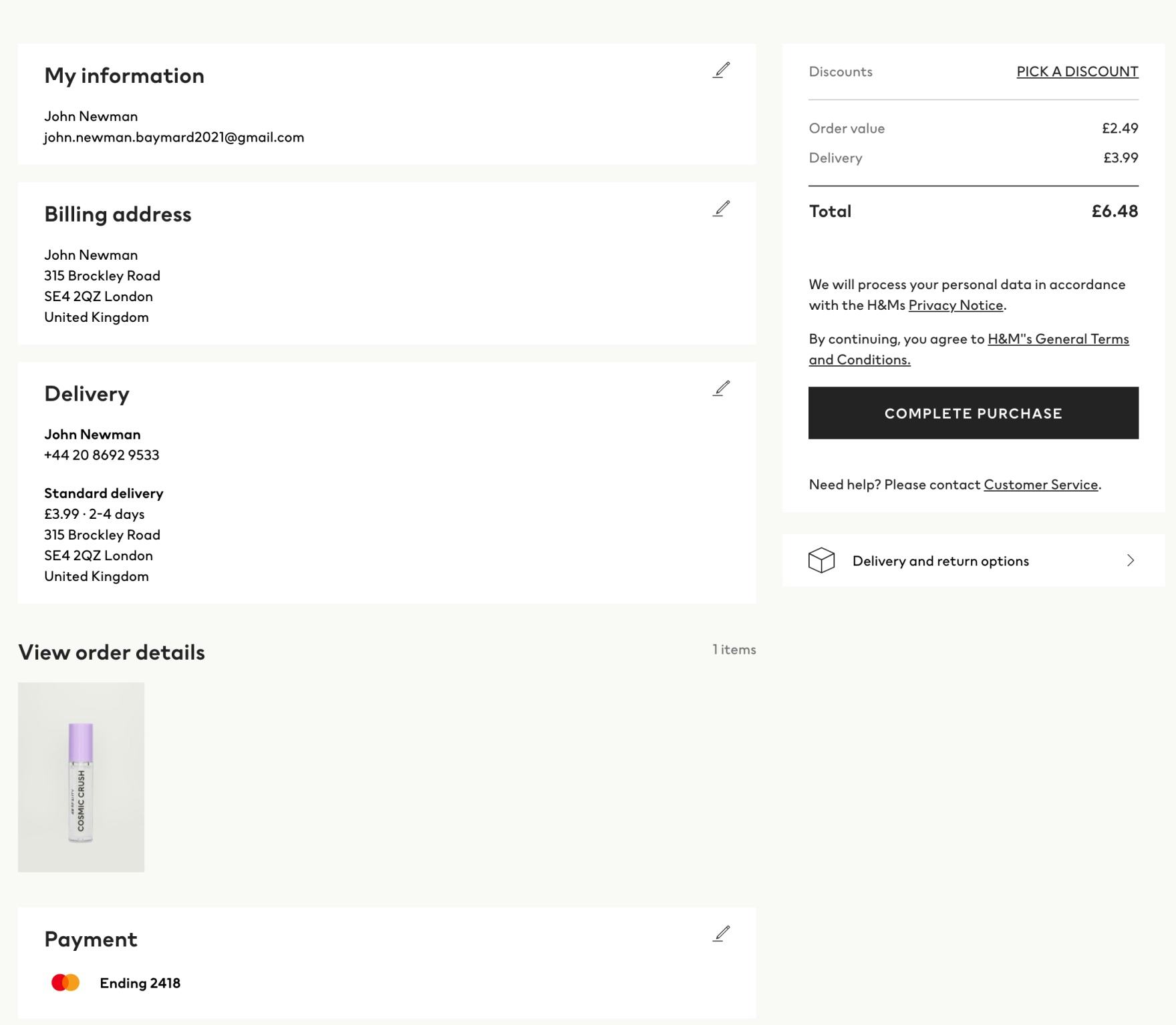
12) 49% of Sites Don’t Provide Separate “Edit” Links for All Distinct Information Groups
Grouping information at the review step, and using only a single “Edit” link for the separate information groups (e.g., one “Edit” link for both the “Billing Address” information and the “Payment Method” information), may seem like a good way to present a simpler interface for users to review.
However, users are confused when the piece of information they need to edit doesn’t have a corresponding link — for example, “I need to edit my “Shipping Address’, but there’s only an “Edit” link for “Shipping Method’“.
Therefore, it’s important to provide separate “Edit” links for each information group, and to make sure the links are proximate to their information groups.
Despite the importance of this issue, 49% of sites don’t provide separate “Edit” links for all distinct information groups.
For inspiration on “perfect” Order Review implementations, see Office Depot, and Kohl’s.
Field Labels & Microcopy
Given that Field Labels & Microcopy is technically one of the easiest areas to improve within the checkout flow, it’s surprising to see that a majority of sites still have issues, and that 44% of sites perform downright poorly.
Form field labelling issues often stem from the fact that form field labels are written by web professionals, such as developers, designers, product managers, or others working in the web industry.
This “insider knowledge” can often be a problem, as it is difficult for any web professional to then truly empathize with users.
In particular, there are 2 issues sites get wrong when it comes to Field Labels & Microcopy:
13) 45% of Sites Use Jargon in the Checkout Microcopy
For most sites, a large proportion of the user base may only visit the site infrequently.
This makes users sensitive to site-specific naming. While site employees may understand site-specific terminology or industry terms, it will often be confusing for users.
In practice, it’s often very difficult for industry insiders to “unlearn” this everyday work jargon, and it often takes an industry outsider to identify it.
Sites should therefore carefully consider microcopy and determine it’s really something a general user would understand.
For example, using the nonstandard term “CSC” instead of “Security Code” will cause some users to pause while working out its meaning.
Opting for more widely used language will help avoid unnecessary confusion for users.
Despite the importance of this issue, 45% of sites use jargon in checkout microcopy.
14) 85% of Sites Don’t Mark Both Required and Optional Fields Explicitly
When encountering a form where only the optional fields were marked — required fields were unmarked — 32% of users during testing encountered a validation error because they did not complete a required field.
Forms where the required fields were marked and the optional fields were not did fare better in testing in terms of needless validation errors.
When no fields are marked, often because all are required, users often fail to notice text at the beginning of the form stating “All fields are required” — and thus leave some blank, assuming they’re optional.
In short, it’s best to be explicit and mark both required and optional fields in forms to ensure there’s no confusion.
Despite the importance of this issue, 85% of sites don’t mark both required and optional fields explicitly.
For inspiration on “perfect” Field Labels & Microcopy implementations, see Gilt, Staples, and REI.
User Interactions & Distractions
User Interactions & Distractions perform well or even perfectly for 21% of sites. That said, users will encounter a poor or “broken” performance on another 30% of sites.
There are 2 elements in particular that should be carefully implemented to ensure that interaction issues are minimized.
15) 57% of sites Don’t Support “Back” Button Use for Navigating to Any Previous Checkout View
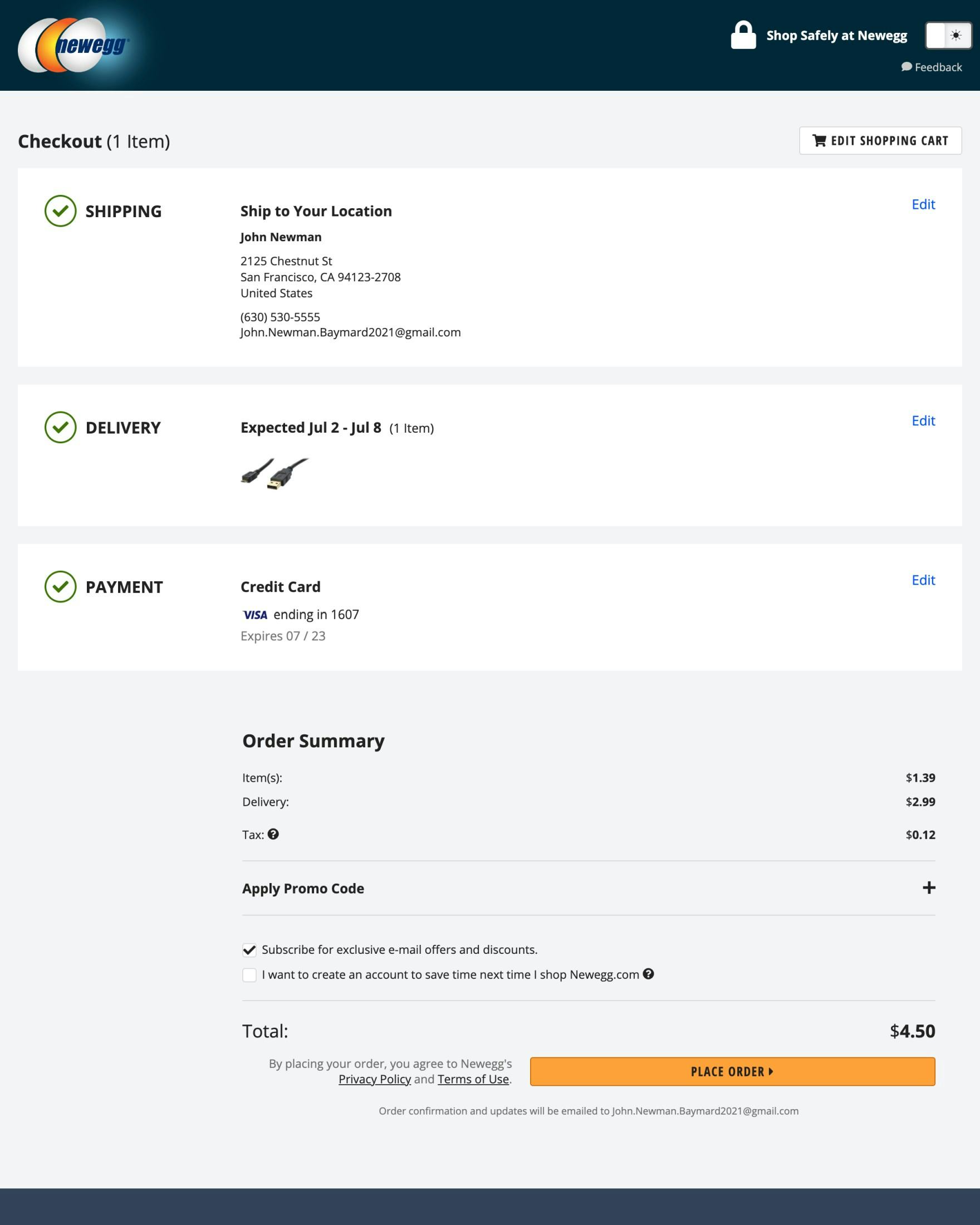
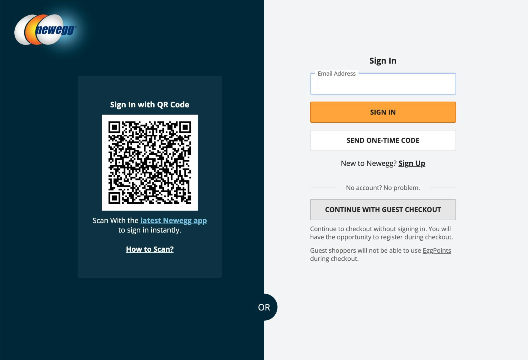
When the “Back” button is clicked on the “Order Summary” page on Newegg (first image), which uses an accordion checkout, users are taken all the way back to the account selection page (second image), and any data they had supplied is lost. Having to start the checkout process again will frustrate users.
Over many rounds of testing on desktop and mobile, we’ve observed that users expect the “Back” button to take them back to what they perceived to be their previous page.
This expectation applies sitewide, including in accordion checkouts.
In fact, accordion checkouts are generally not perceived as a one page checkout with multiple collapsed sections but as a multistep process with summaries.
On sites where the accordion steps are technically implemented as a single page with one URL, users wanting to go backwards to a previous checkout “step” — e.g., to edit previously entered information — will be sent all the way back to the cart or even the account selection step.
Instead, it’s key that accordion checkouts ensure that the browser “Back” button takes users back to the previous viewed step — regardless if it’s technically the same or a separate page.
That said, a surprisingly high 57% of sites don’t support “Back” button use for navigating to previous checkout views.
16) 82% of Sites use “Apply” Buttons Rather Than Auto-Updating and Highlighting Changes
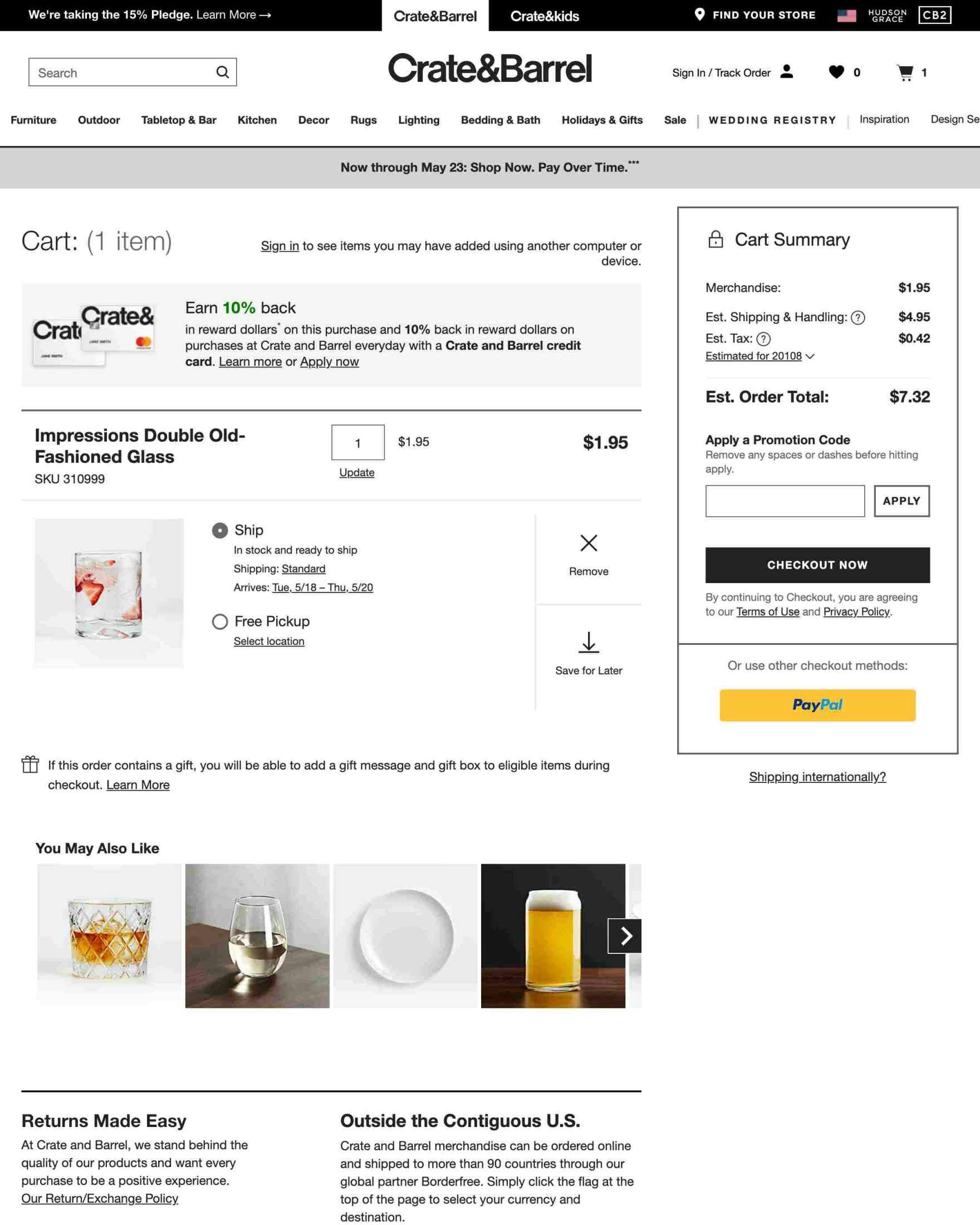
The “Apply” button for promotion codes on Crate & Barrel could easily be overlooked, meaning discounts would not be reflected in the final cost.
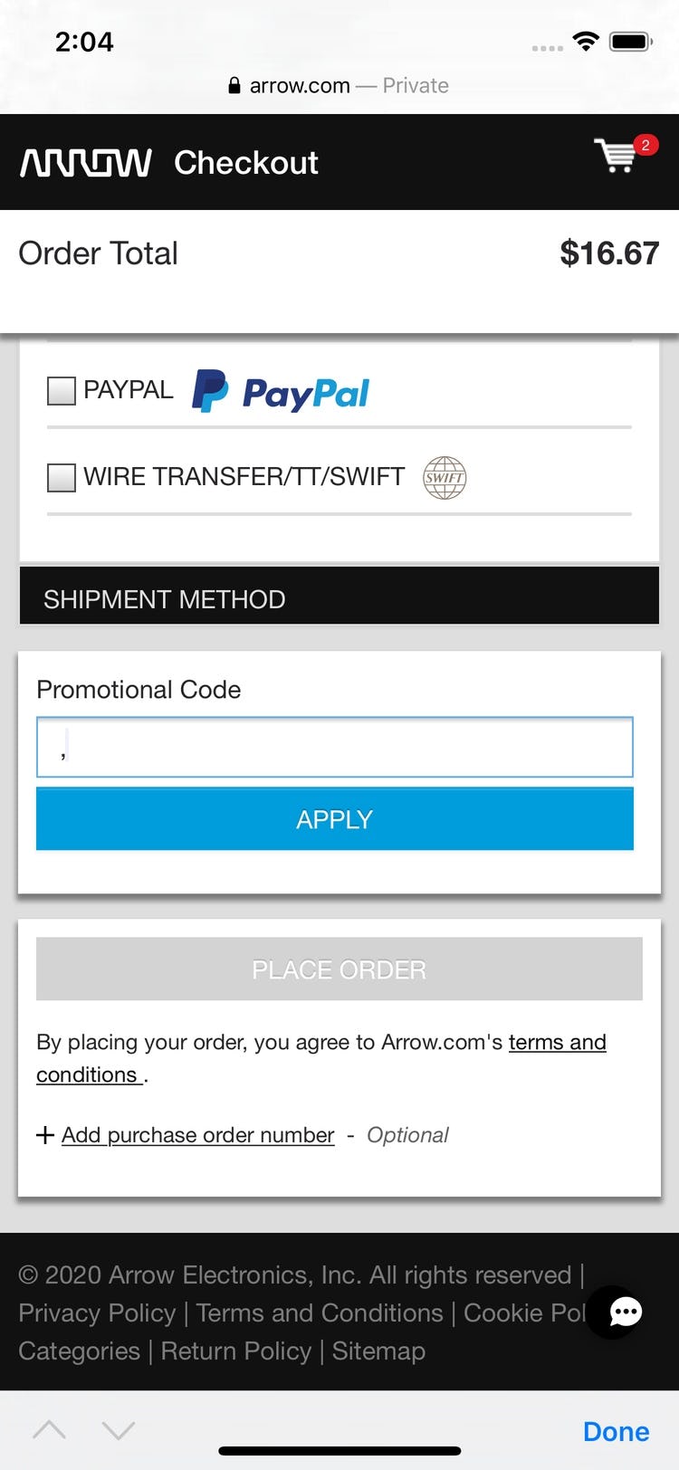
At Arrow, the “Apply” button for “Promotional Code” dominates the mobile viewport. Users could easily mistake this button for the primary button, causing unnecessary friction.
During our large-scale checkout usability studies we found that whenever an “Apply” button was used to submit only a section of a checkout form it was either not clicked (even if the related field was filled out) or was mistaken for the primary button.
When, for example, a promotion or coupon code is entered, it’s not always clear to users that they have to also click on an “Apply” button for the code to be saved and accepted.
The second problem — users mistaking the “Apply” button for the primary button — is caused by the fact that users generally don’t expect more than one button in a checkout form.
Therefore, if they see an “Apply” button, they could assume that clicking it will submit the entire form and take them to the next step. This misconception can obviously be a critical problem since it can effectively halt the entire checkout process — potentially leading to abandoned orders.
For an issue that can cause abandonments, it’s very surprising that 82% of sites use “Apply” buttons in checkout forms.
For inspiration on “perfect” User Interactions & Distractions implementations, see Hayneedle, Overstock, and ASOS.
Field Design & Features
37% of sites have Field Design & Features that perform well or even perfectly, but on 32% of sites the performance is “poor” or even broken.
There are in particular 2 missed opportunities when it comes to Field Design & Features:
17) 81% of Sites Don’t Choose the Right Interface Type for Optional Inputs
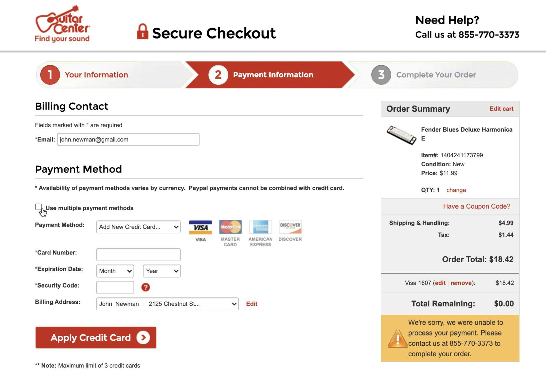
At Guitar Center, two optional fields — “Use multiple payment methods” and “Billing Address” — are shown, despite the fact that only a minority of users actually need to input data in these fields.
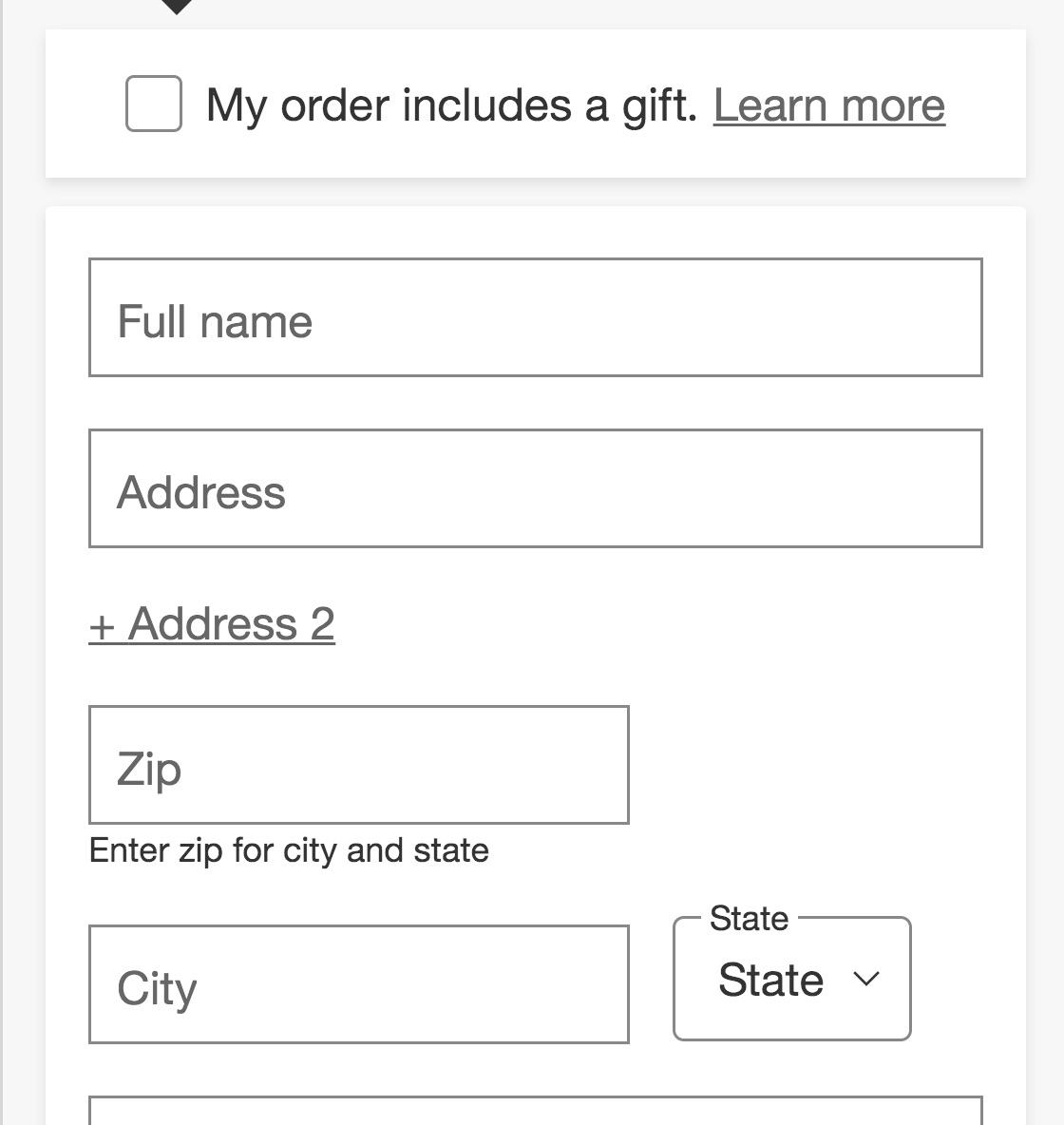
At Target, “Address Line 2” is hidden behind a link, allowing the majority of users who don’t need to interact this field to skip it quickly.
It might seem that having optional fields and selections in the checkout comes relatively “risk free” — as users will simply skip such optional fields entirely if not relevant to them.
However, during testing, it became very clear that optional fields and values were the sole cause for disrupting users’ checkout flows, causing anything from users needlessly interacting with completely irrelevant fields, taking 5–30% longer to complete checkout steps, doubting the correctness of order data, getting validation error messages, or submitting orders with incorrect information.
The most common cause of issues in these fields was the incorrect interface types used.
The right interface type for optional inputs depends on several factors, but in general uncommon inputs (e.g., “Address Line 2”) should be hidden behind a link.
Additionally, using radio buttons and drop-downs for entirely optional inputs should be avoided.
Despite the importance of this issue, 81% of sites don’t choose the right interface type for optional inputs.
18) 56% of Sites Don’t Use Localized Input Masks for Restricted Inputs
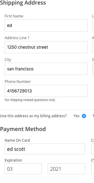
At Gilt there’s no input masking for the “Phone Number” field.
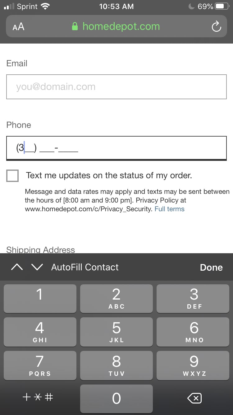
Home Depot provides an input mask for the “Phone Number” field.
During testing, when provided with a formatting example for a field in the checkout, 89% of desktop users entered, for example, their phone number in a different format from what the site had recommended.
Generally, sites should be extremely cautious about restricting users’ inputs — particularly when they’re only used for input formatting.
However, for sites that either have inputs for which there’s no way around character restrictions, or for sites that are willing to spend technical resources on perfecting the form-filling experience, input masks were observed to perform very well — if considerable technical due diligence is first performed.
For example, phone number fields often include input masks.
Despite the importance of this issue, 56% of sites don’t use localized input masks for restricted inputs.
For inspiration on “perfect” Field Design & Features implementations, see Costco, Target and Sephora.
Checkout UX Is Getting Better but Still Has a Long Way to Go (Our Outlook on Checkout Flow)
This high-level analysis of the current state of Checkout UX focuses on only 7 of the 17 Checkout subtopics included in our Benchmark Analysis. The 10 other subtopics should be reviewed as well to gain a comprehensive understanding of the current state of Checkout UX, and to identify additional site-specific issues not covered here.
Although our benchmark has revealed that only 11% of sites have a “poor” Checkout UX, it’s clear that there’s much room for improvement, given that the performance of 51% of sites is “mediocre”. Furthermore, no site has a “state of the art” Checkout.
Avoiding the pitfalls, by adhering to the following the 18 checkout best practices, described in this article is the first step toward improving users’ Checkout experience:
- Make “Guest Checkout” the Most Prominent Option (65% Don’t)
- Avoid Overly Complex Password-Creation Requirements (80% Don’t)
- Use “Delivery Date” Instead of “Delivery Speed” (36% Don’t)
- Show the Cutoff Time as a Countdown (96% Don’t)
- Present “Store Pickup” Within the Shipping Selector Interface (63% Don’t)
- Make It Easy to Compare “Store Pickup” to Shipping Options (75% Don’t)
- Use Luhn Validation (53% Don’t)
- Autoformat Spaces in the “Credit Card Number” Field (40% Don’t)
- Match the Credit Card Field Sequence to the Physical Card Sequence (38% Don’t)
- Correctly Format the “Expiration Date” Field (50% Don’t)
- Allow Users to Edit Data Directly at the Review Step (80% Don’t)
- Provide Separate “Edit” Links for All Distinct Information Groups (49% Don’t)
- Avoid Jargon in the Checkout Microcopy (45% Don’t)
- Mark Both Required and Optional Fields Explicitly (85% Don’t)
- Support the “Back” Button for Navigating To Any Previous Checkout View (57% Don’t)
- Auto-Update and Highlight Changes Rather Than Using “Apply” Buttons (82% Don’t)
- Choose the Right Interface Type for Optional Inputs (81% Don’t)
- Use Localized Input Masks for Restricted Inputs (56% Don’t)
For inspiration on other sites’ implementations and to see how they perform UX-wise, head to the publicly available part of the e-commerce UX benchmark. Here you can browse the Checkout implementations of all 71 benchmarked sites.
For additional inspiration consider clicking through the Cart & Checkout Page Designs, as these showcase Checkout implementations at the top 71 US and European e-commerce sites and can be a good resource when considering redesigning a Checkout flow — not only of what to emulate, but also of what to avoid.
This article presents the research findings from just a few of the 650+ UX guidelines in Baymard Premium – get full access to learn how to create a “State of the Art” e-commerce user experience.
If you want to know how your website performs and compares, then learn more about getting Baymard to conduct a UX Audit of your site.
